NECA Shipping | Visual Identity

Ahmet Kerim Madenoğlu


About
NECA Shipping is an Athens-based maritime brokerage working across
vessel chartering, dry bulk transportation and project cargo.
The identity was created to give the company a clear, contemporary
presence while staying connected to the movement and rhythm of the sea.
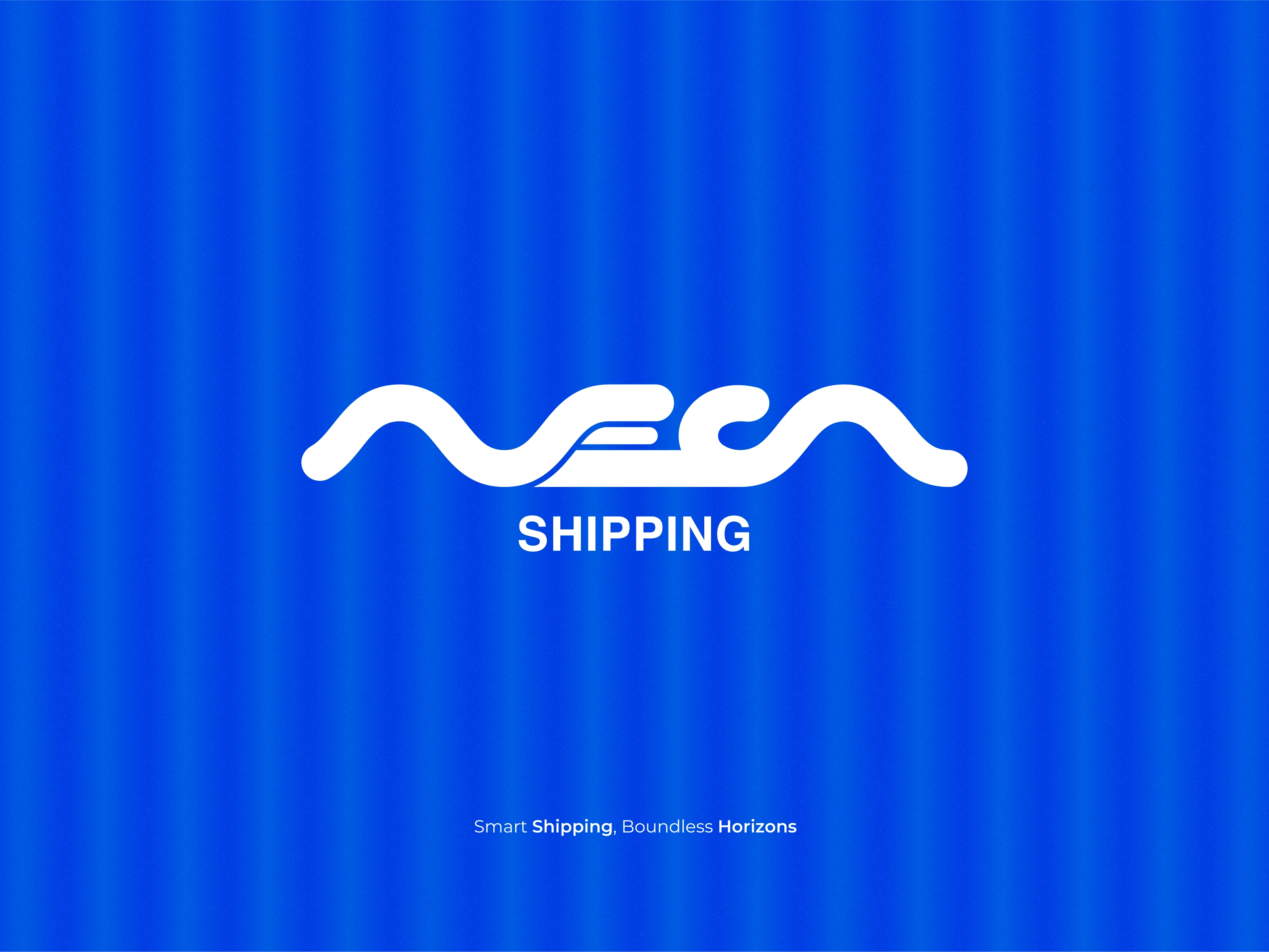
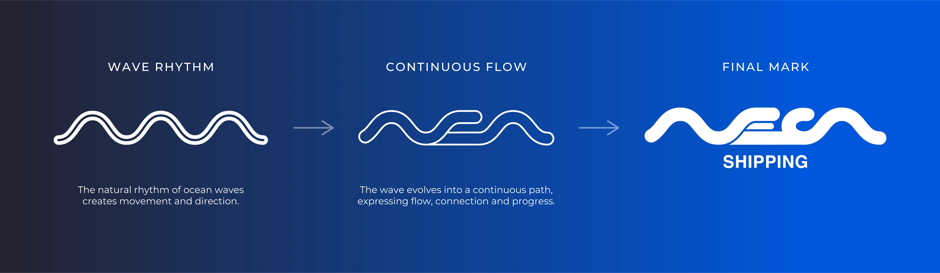
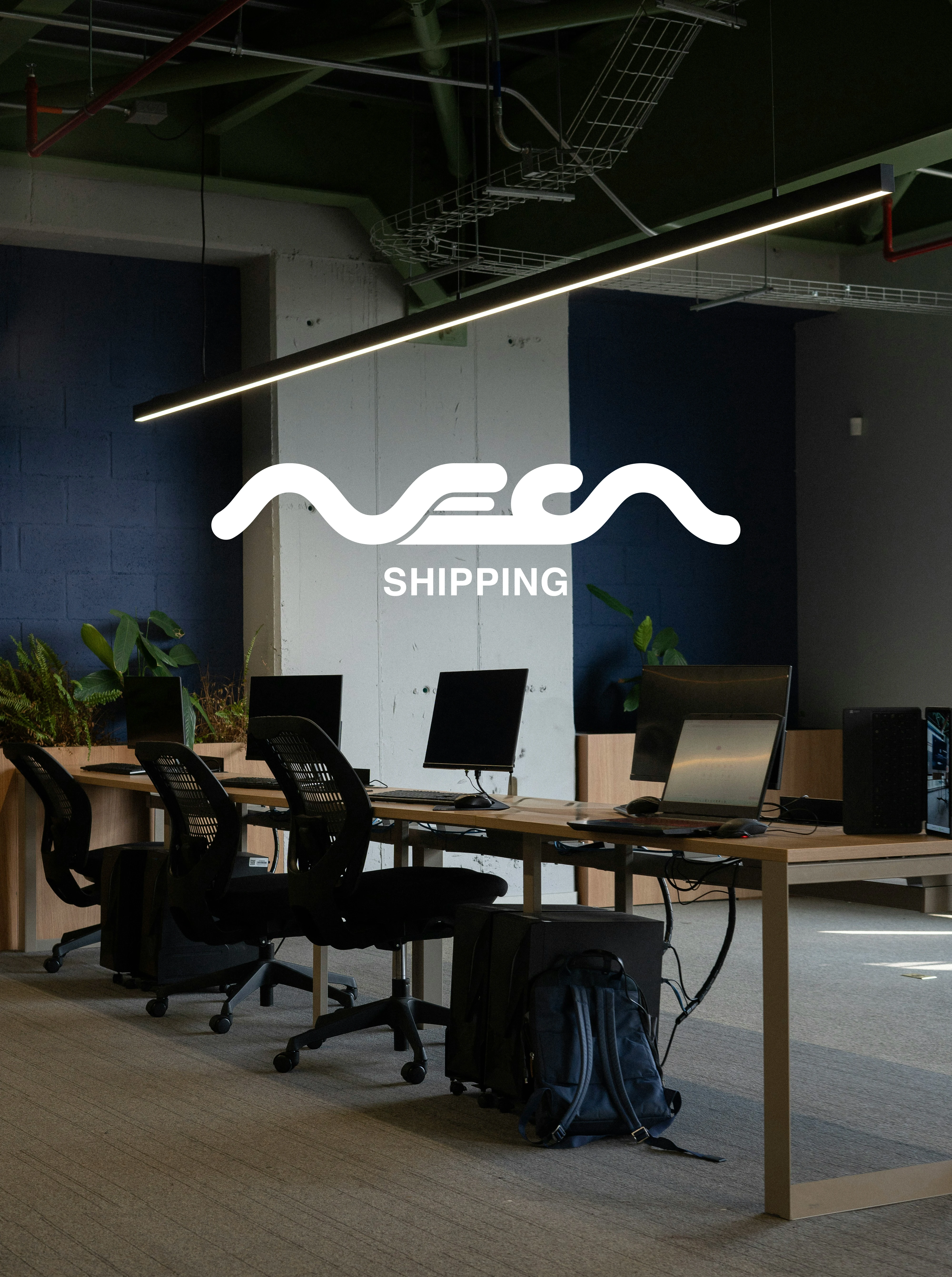
Rather than relying on familiar maritime symbols, the logo turns the NECA
name itself into a fluid, continuous form.
Client: NECA Shipping
Industry: Maritime / Shipping Brokerage
Scope: Logo Design, Visual Identity
Role: Art Direction, Logo Design, Identity Presentation
Built Around Movement
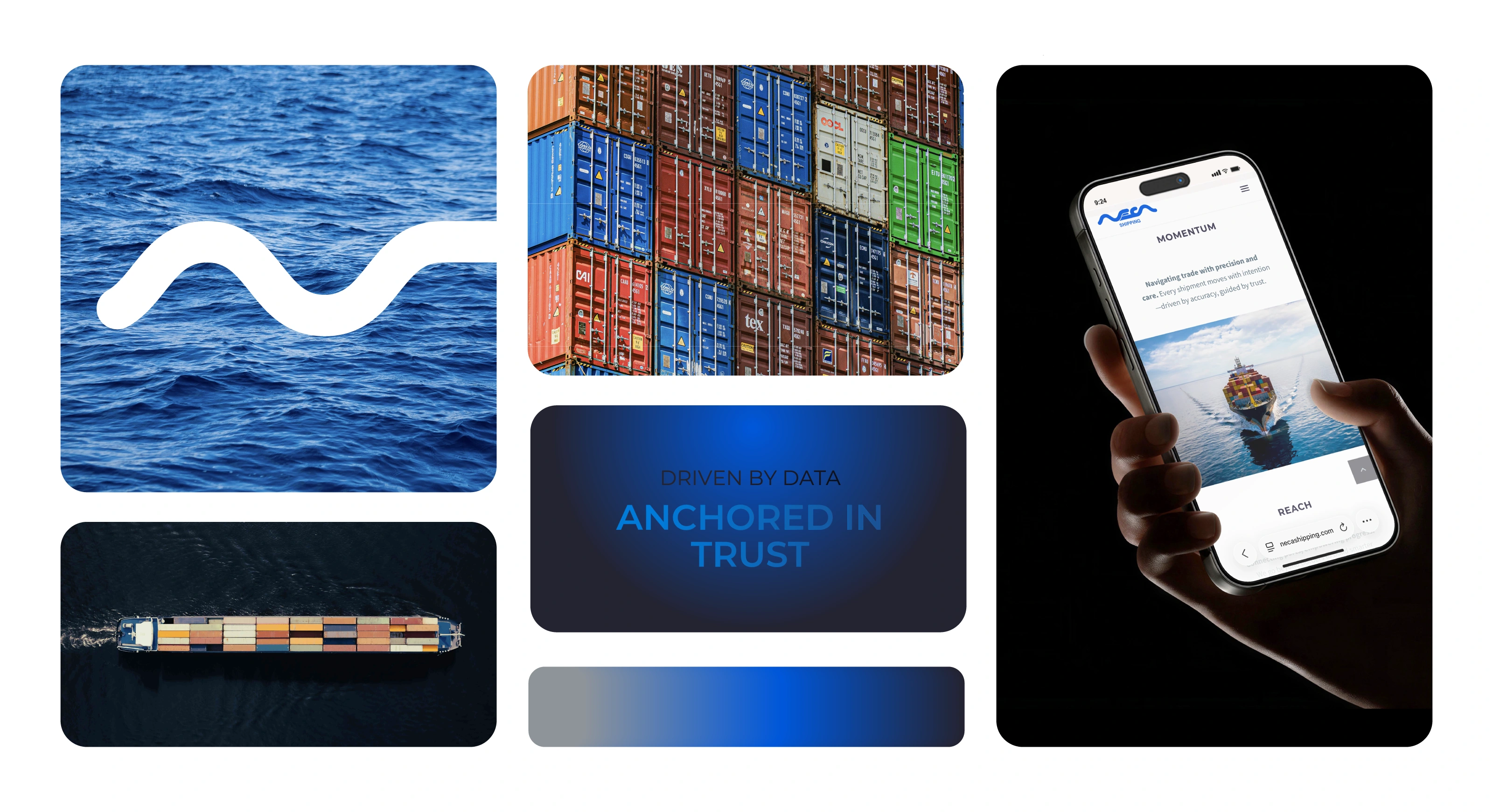
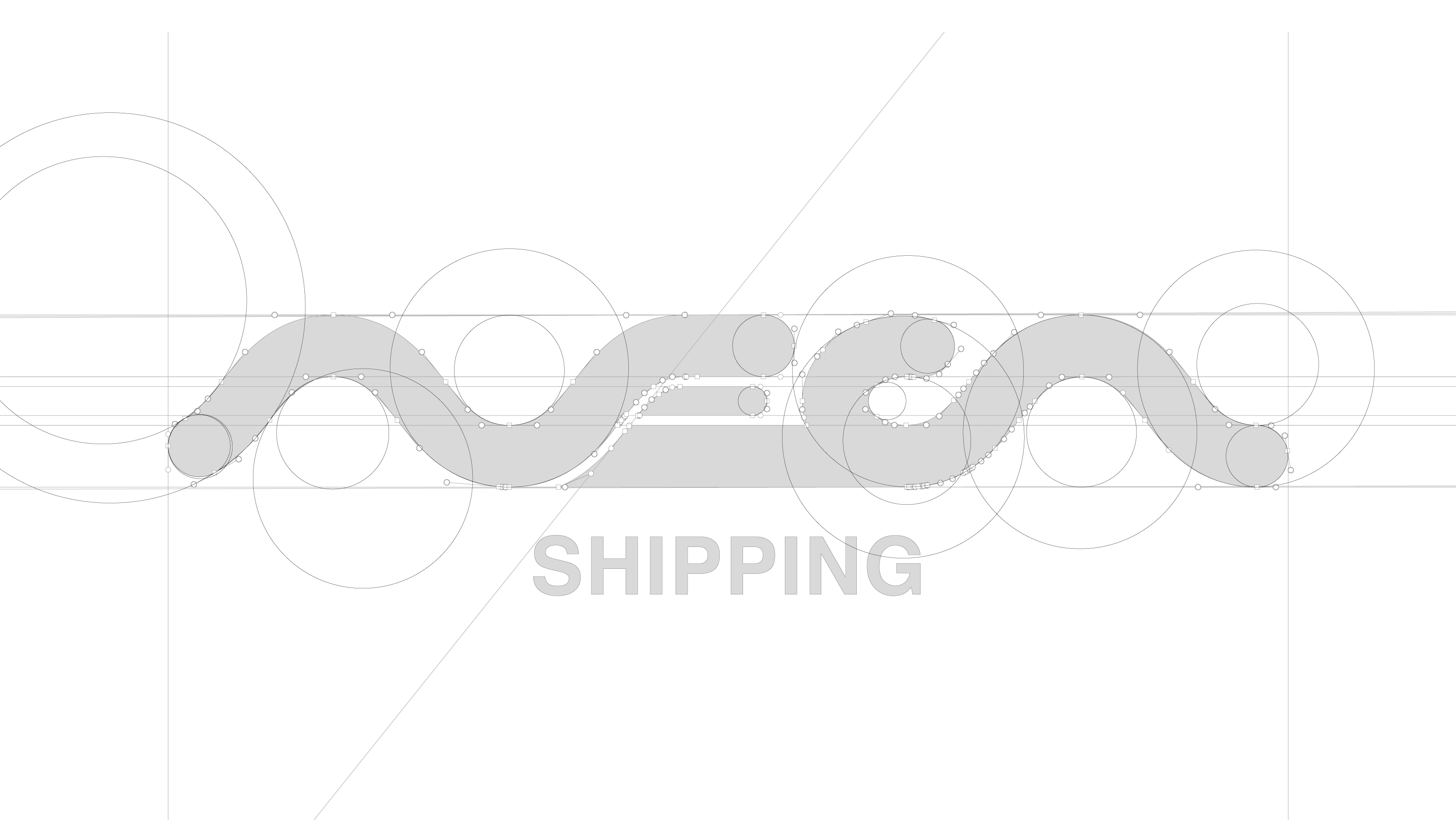
The NECA mark is built around continuous movement. Its letterforms flow into one another, drawing from waves, maritime routes and the motion of a vessel without relying on literal nautical symbols.
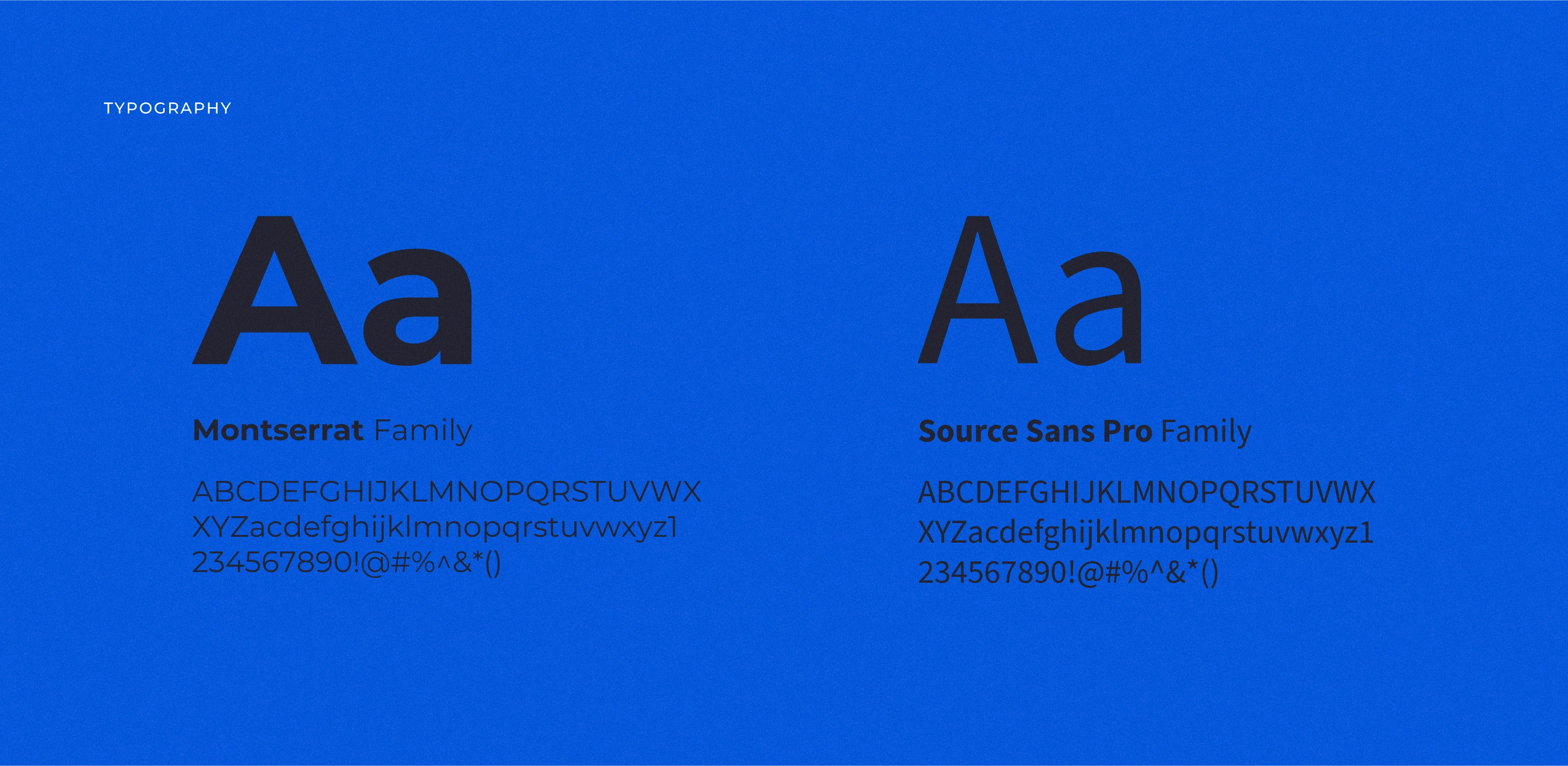
Montserrat and Source Sans Pro work together to create a clear and flexible typographic system combining a strong visual voice with everyday readability across digital and corporate communication.


Like this project
Posted Aug 15, 2026
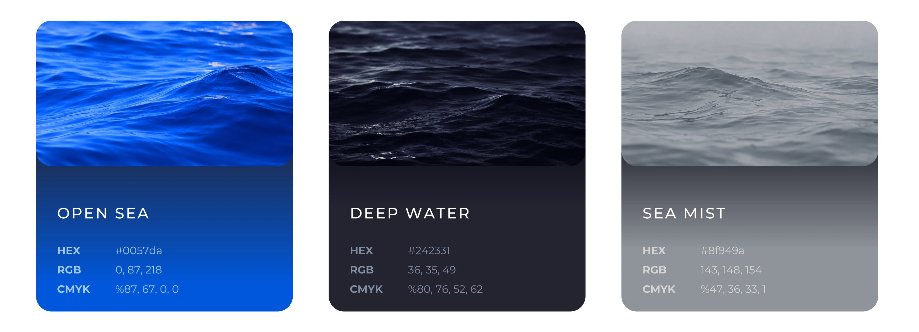
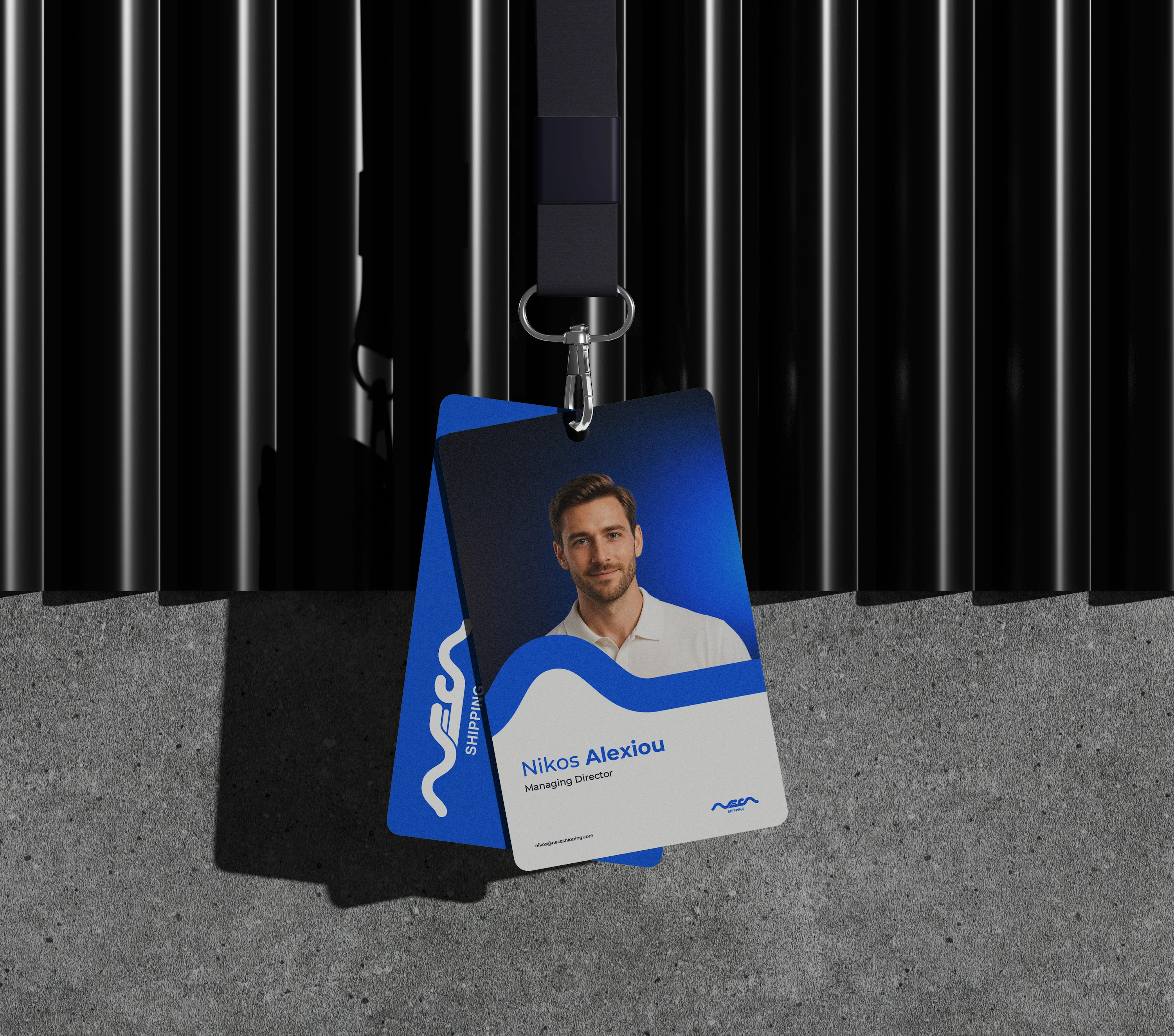
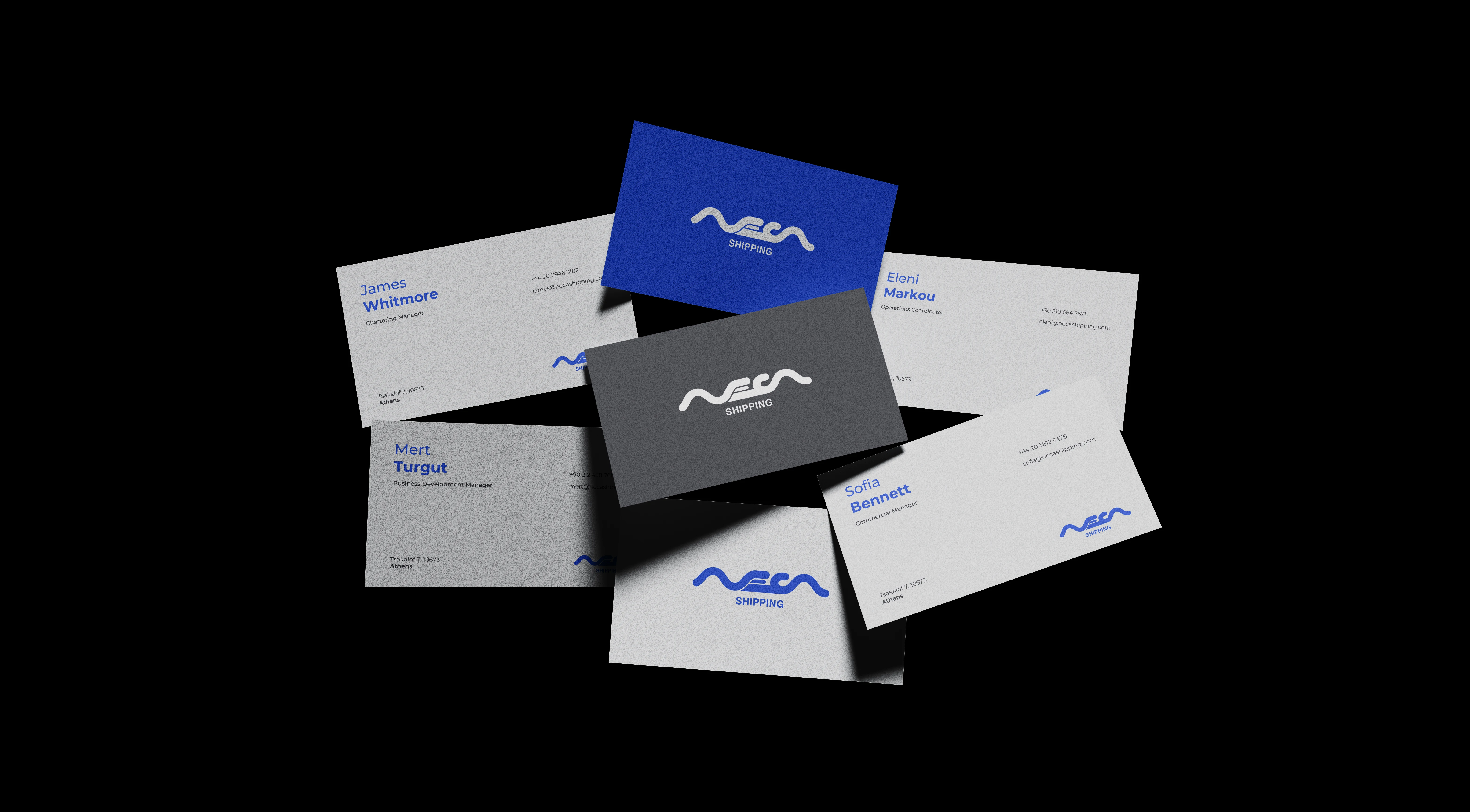
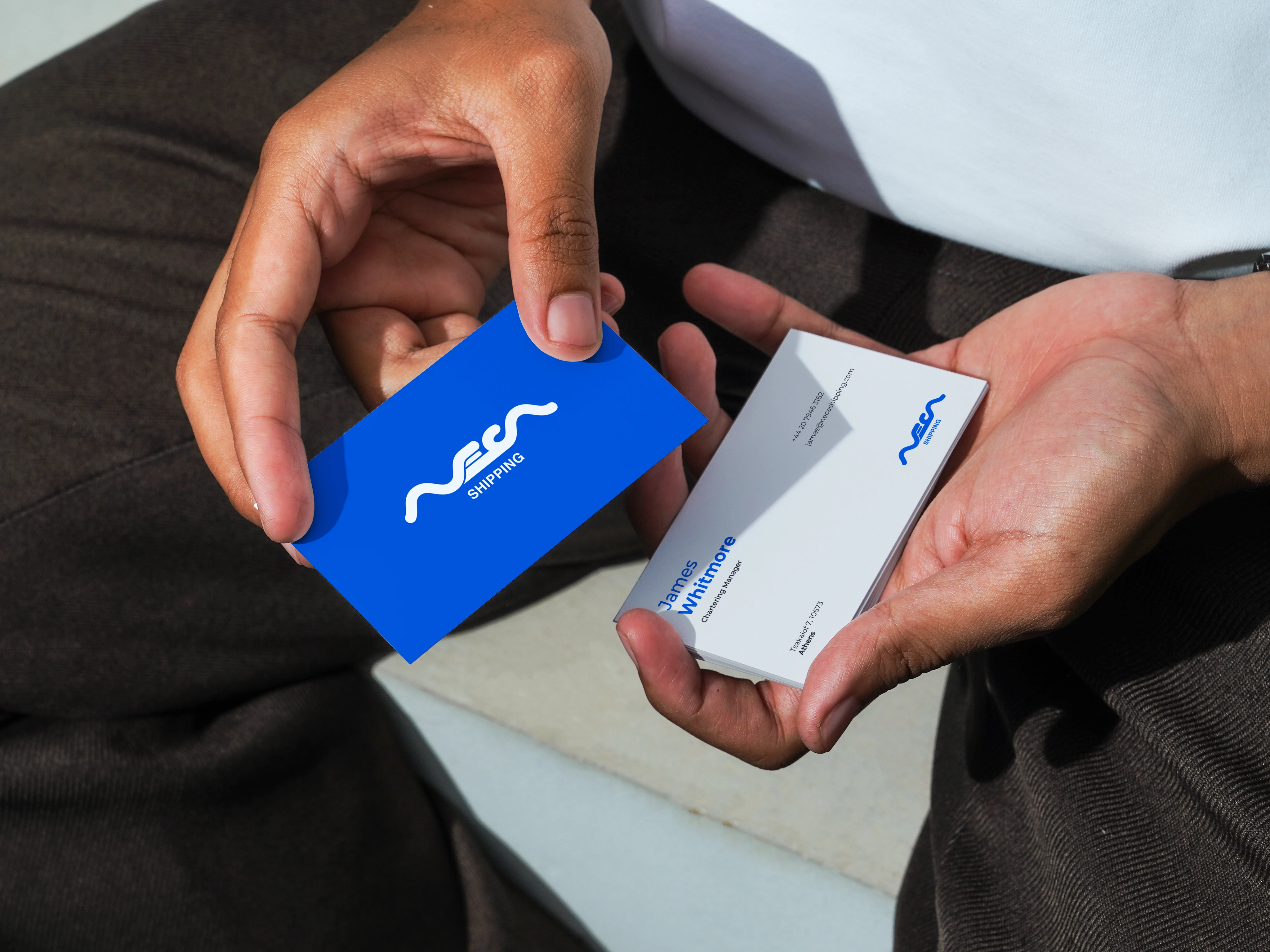
Visual identity for NECA Shipping, an Athens-based maritime brokerage, combining a fluid logo, maritime color system and corporate applications.