Retriever Tech PH: Mobile App Redesign & Enhancing Experience
Overview
Project Duration: 3 months
Role: UX/UI Designer
Problem Statement
The previous designer of the application was not able to complete a satisfactory UI and UX design. The designer’s lack of experience and analysis used wrong dimensions for a mobile based application and induced numerous missing links. Consequently, it caused inconvenience during implementation and deployment stage of the application.
Goal
Building strong foundation in design through the application of standard dimensions and design principles. Research and study the flow and behavior of related applications. Optimize user experience design. Design process should retain the main purpose of the application.
Design Process
Old Design
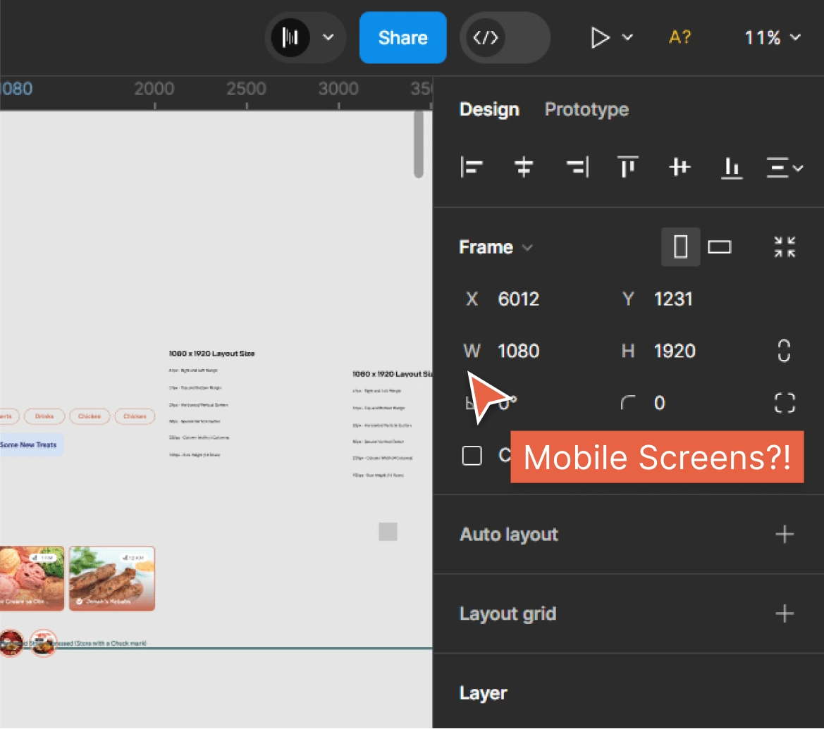
The previous designer used dimensions of 1080 x 1920(Standard dimension for web pages) for mobile screens, but this might cause issues during client presentations. The problem is that there isn't a device that fits exactly with these dimensions in the prototype in Figma. This could also create problems during development because things like font sizes and image dimensions won't match between the design and the actual product.
Typography and Colors
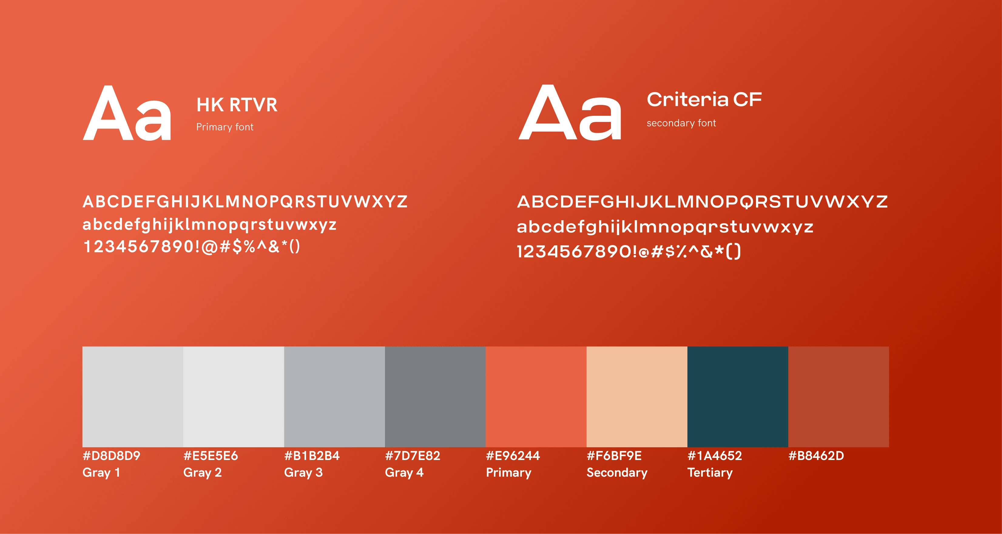
All typography and color choices must adhere strictly to the specified fonts and colors, which have been specifically selected by the client. The client strongly discourages the use of any fonts and colors that are not provided.
High Fidelity
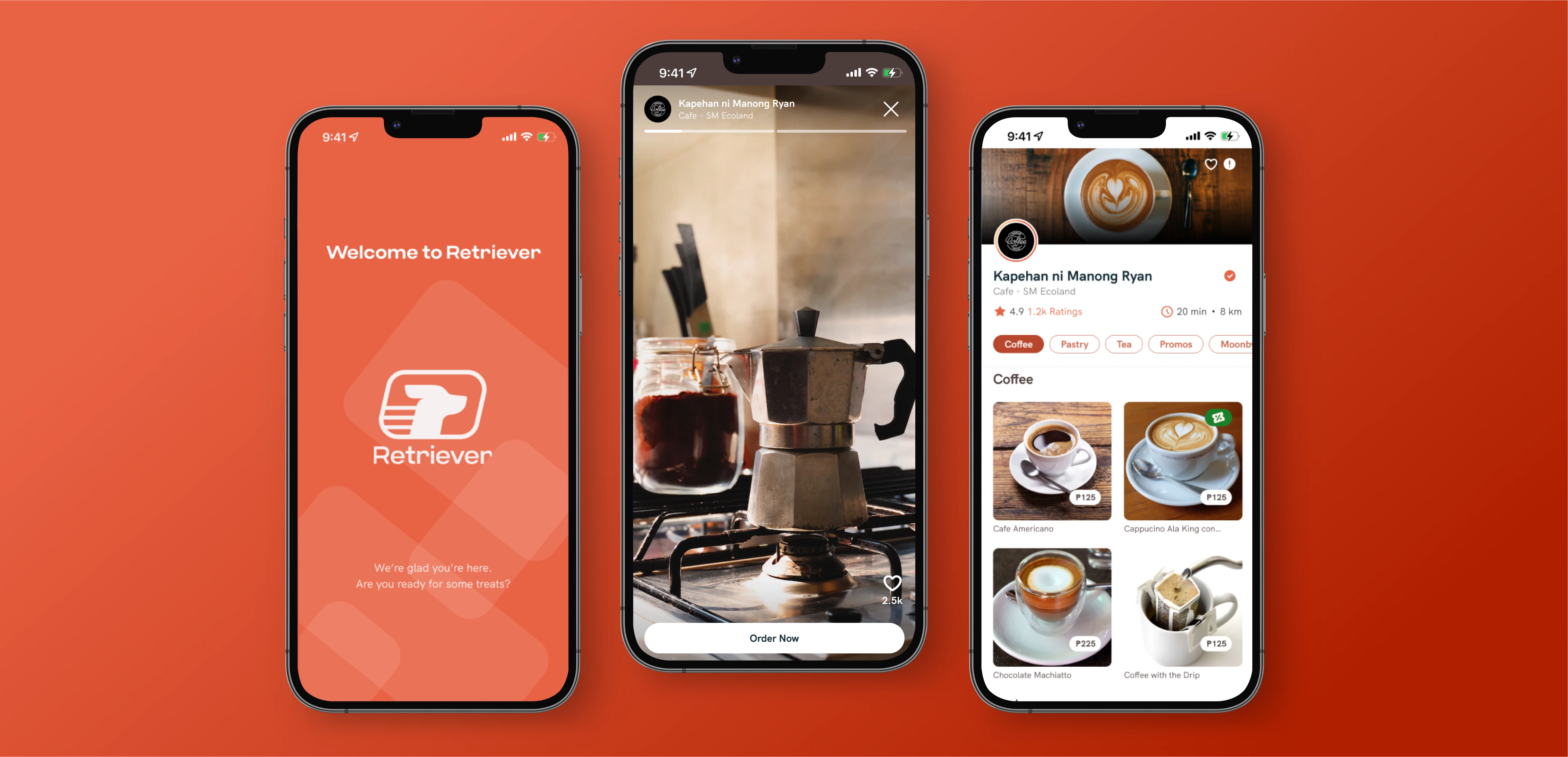
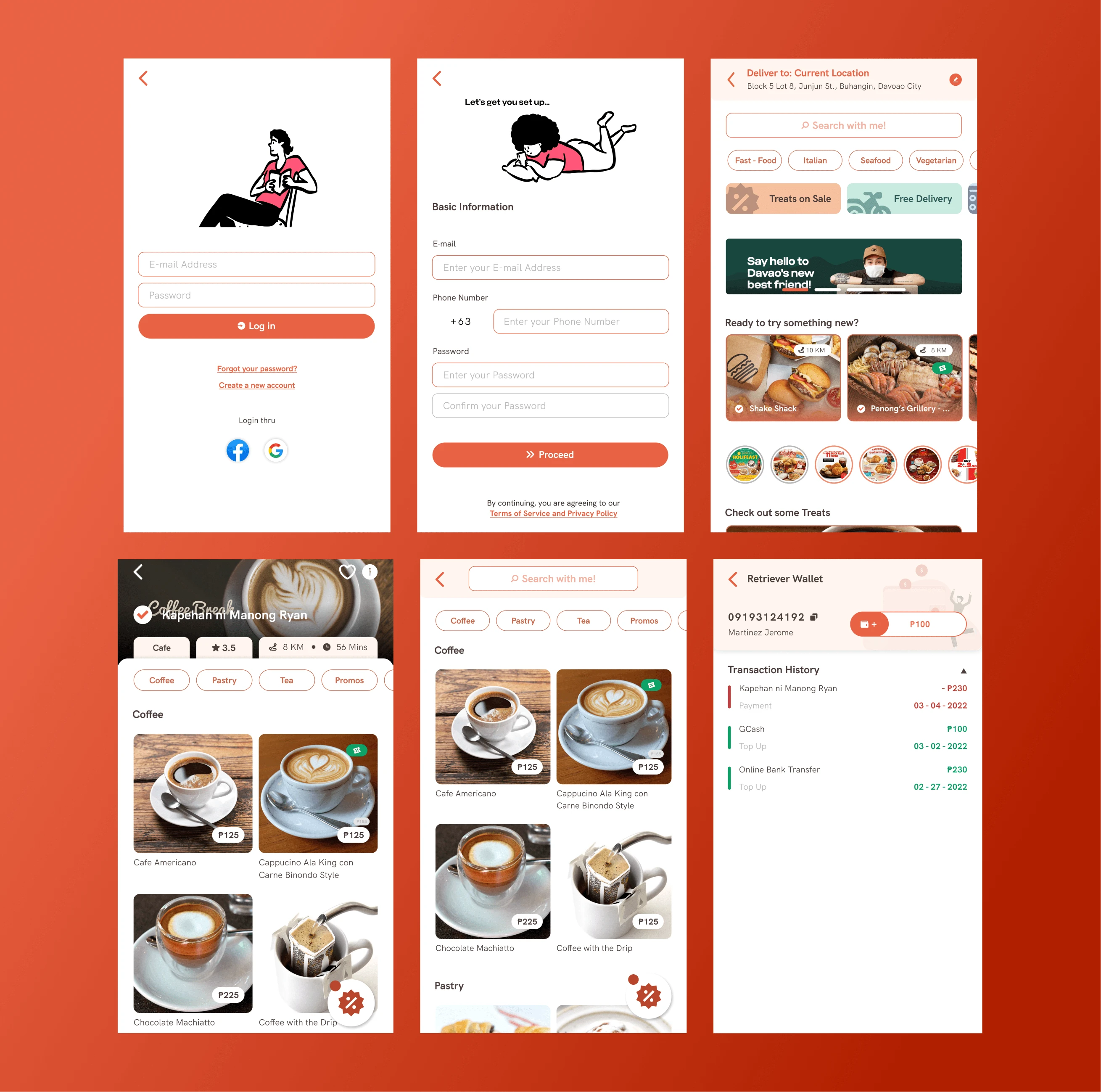
While working on this project, I created a total of 54 screens. I focused on filling in the empty states, ensuring success messages were clear, and refining the details pages and forms for various actions. The project presented its challenges, but the satisfaction of successfully addressing these issues and meeting the client's expectations made it fulfilling.
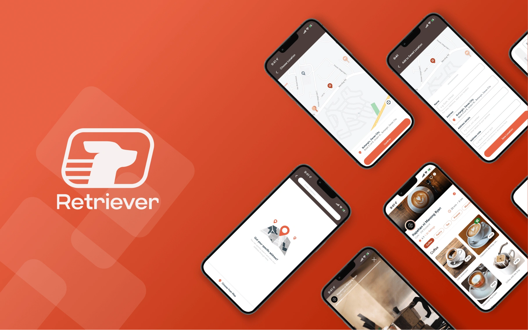
Check more details in my portfolio..
Like this project
Posted Feb 19, 2024
Redesigned the mobile app interface to improve user experience and streamline navigation, resulting in a 30% increase in user engagement.
Likes
0
Views
26

