Mika Matcha Branding
Hitakshi Yadav
Brand Intent
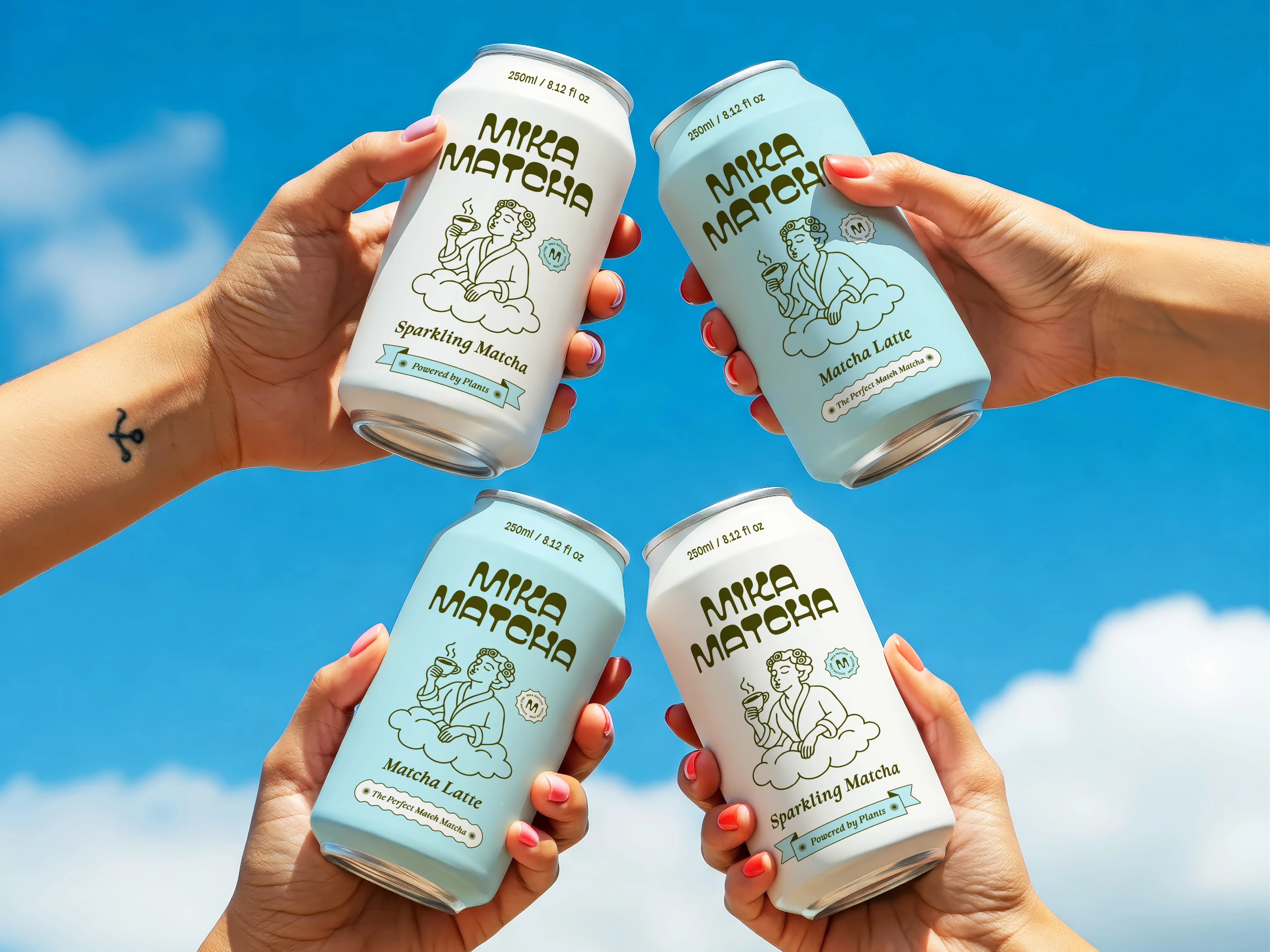
Mika Matcha sets out to break the usual green matcha visuals by introducing a fresher and more playful identity. The aim was to create a look that feels modern, light, and instantly memorable while staying true to its plant-based roots.
Design Approach
• Used soft pastel tones to create an unexpected yet refreshing direction.
• Added a friendly illustrated character to give the brand charm and personality.
• Chose rounded, modern typography to match the youthful tone.
• Kept layouts simple and airy for a clean, lifestyle-ready look.
Visual Outcome
The final identity brings a bright, uplifting vibe through expressive illustrations and smooth typography. The result is a matcha brand that feels fresh, memorable, and distinctly different from traditional green-heavy matcha aesthetics.
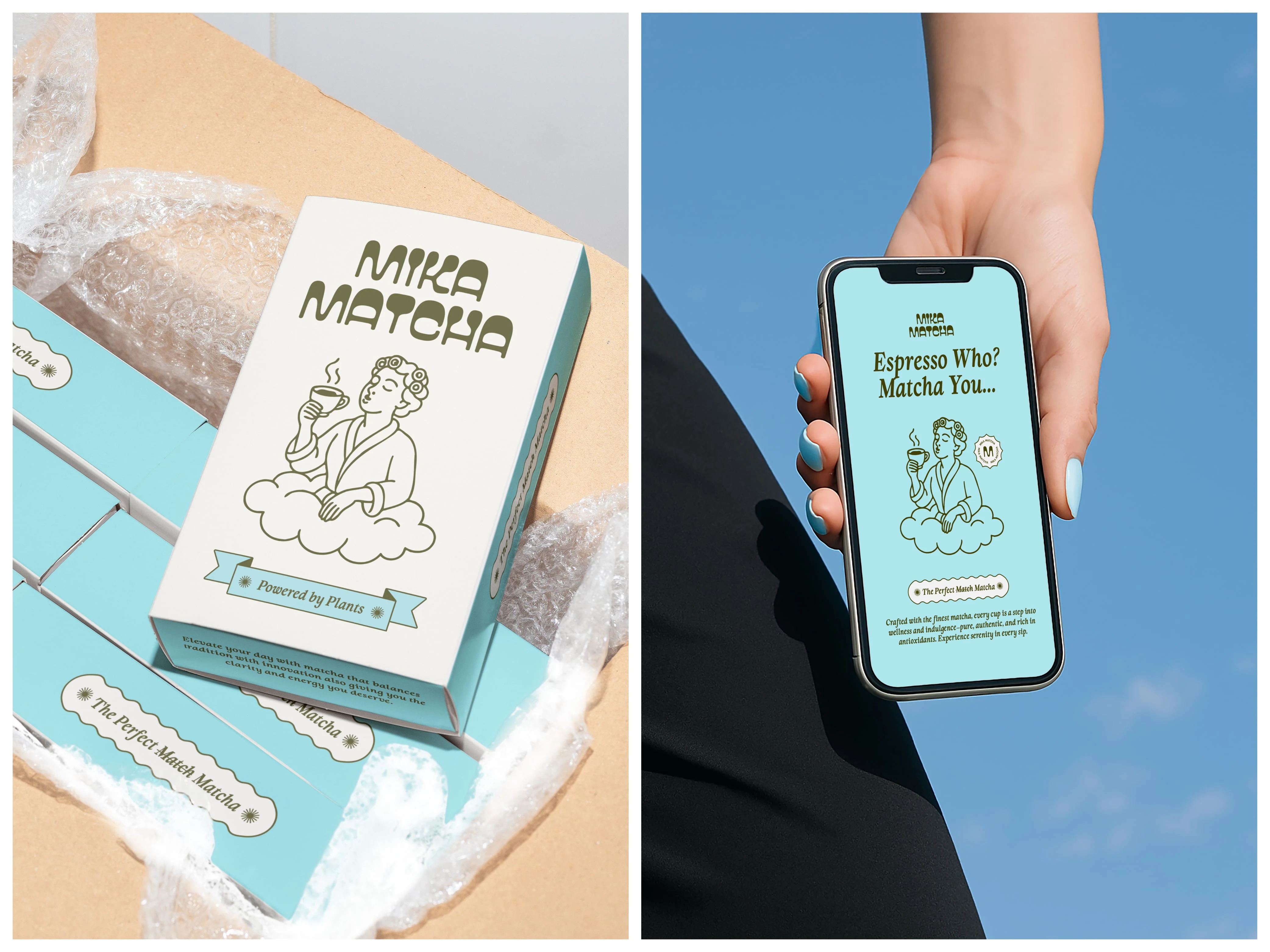
Packaging and phone screen design
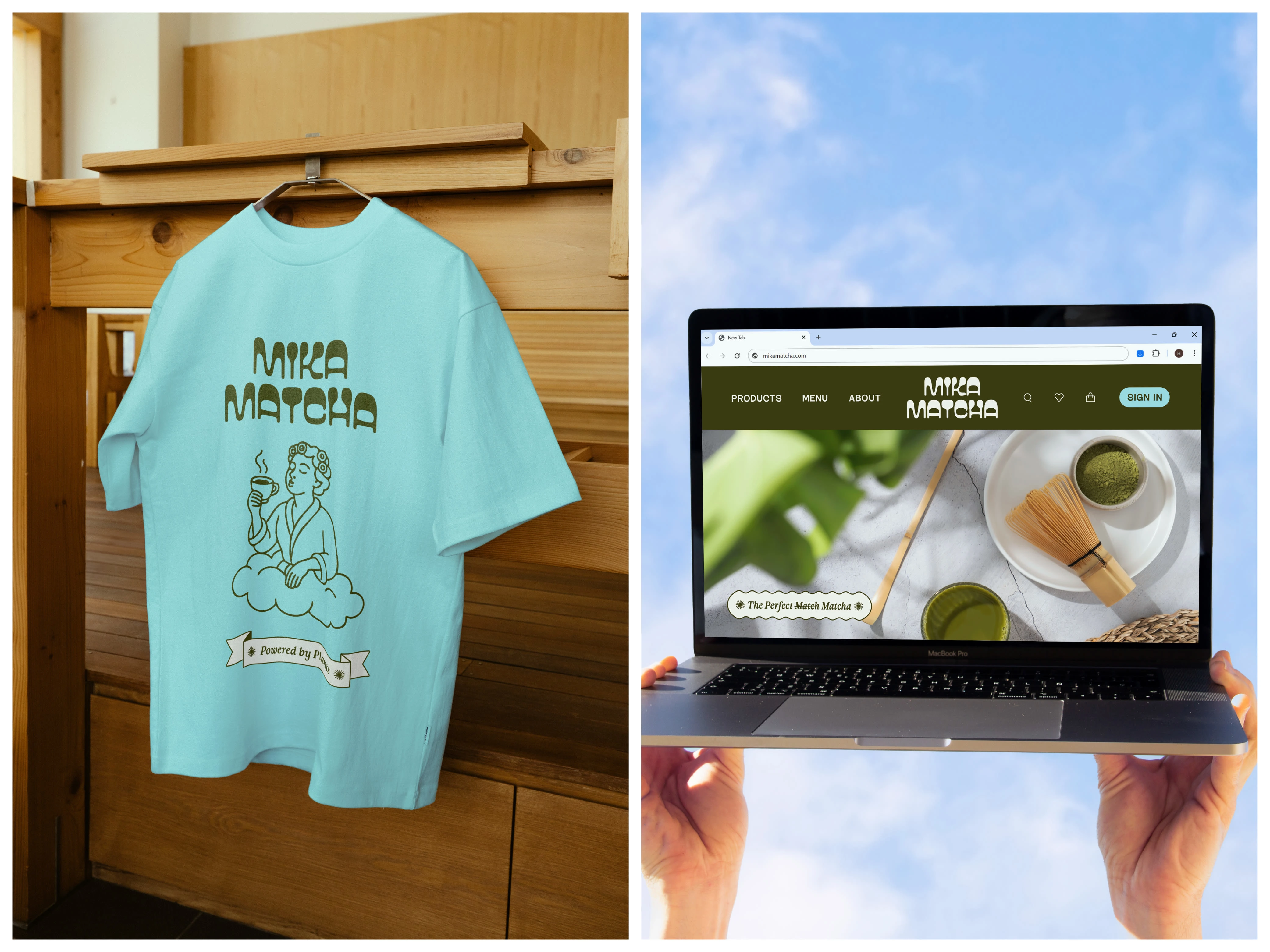
T-shirt and webpage design
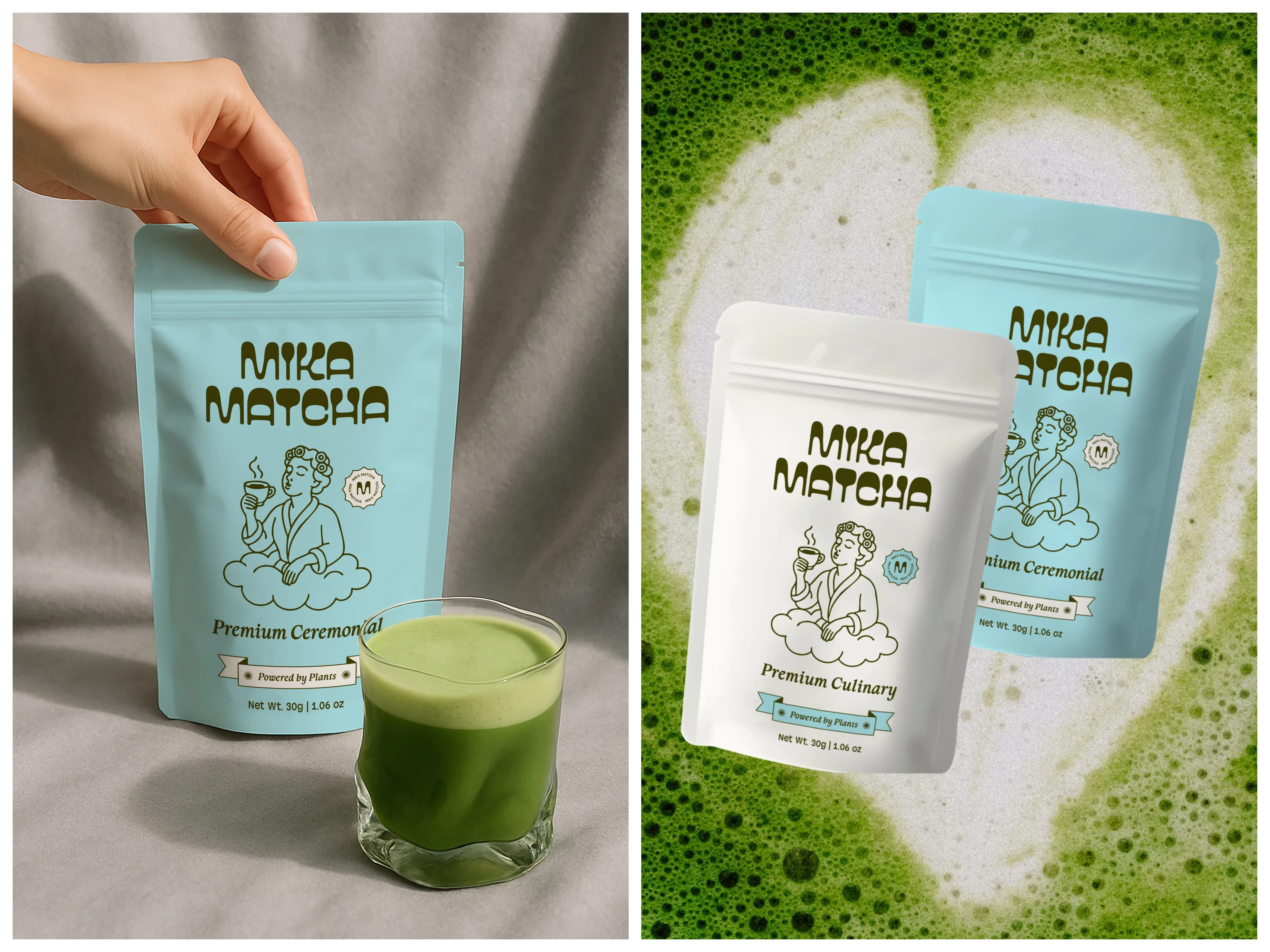
Matcha pouch design
Matcha Pouches Design
• Selected a soft, airy palette that communicates freshness and adds a calm, modern charm to the packaging.
• Introduced a playful illustration to make the product look inviting and memorable.
• Used clean, rounded fonts to keep the branding modern and easy to recognize.
• Kept the overall layout minimal so the matcha quality becomes the clear focus.
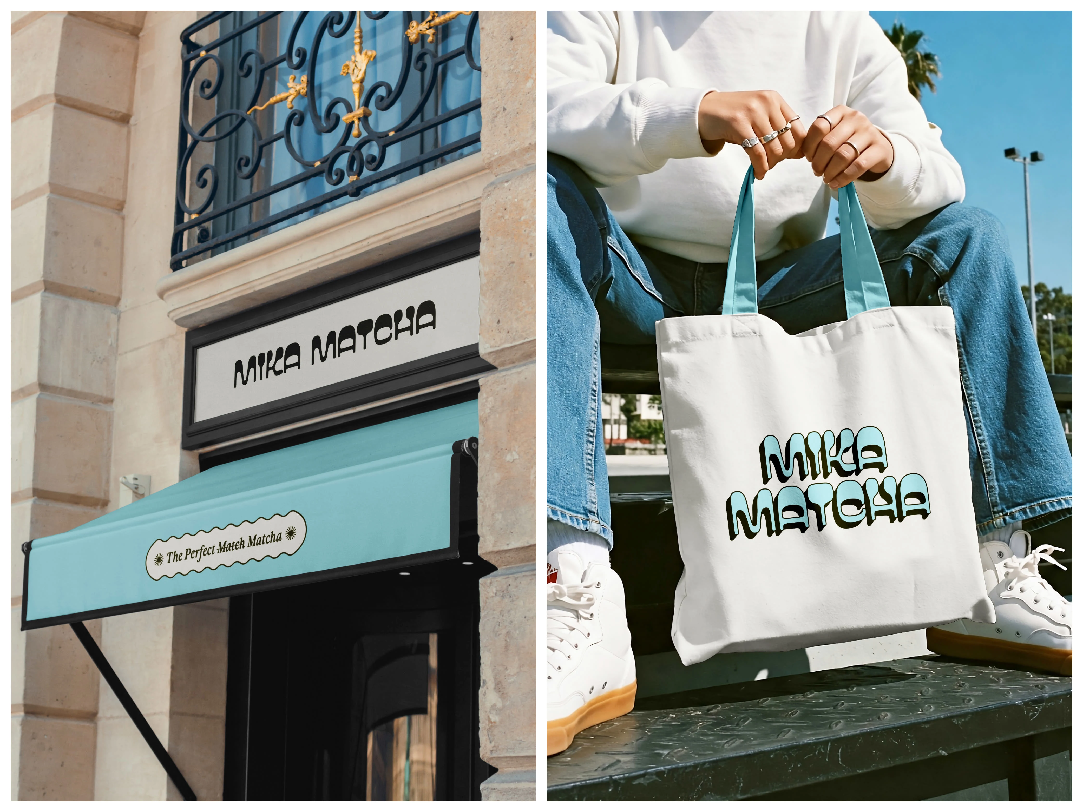
Store front and tote bag design
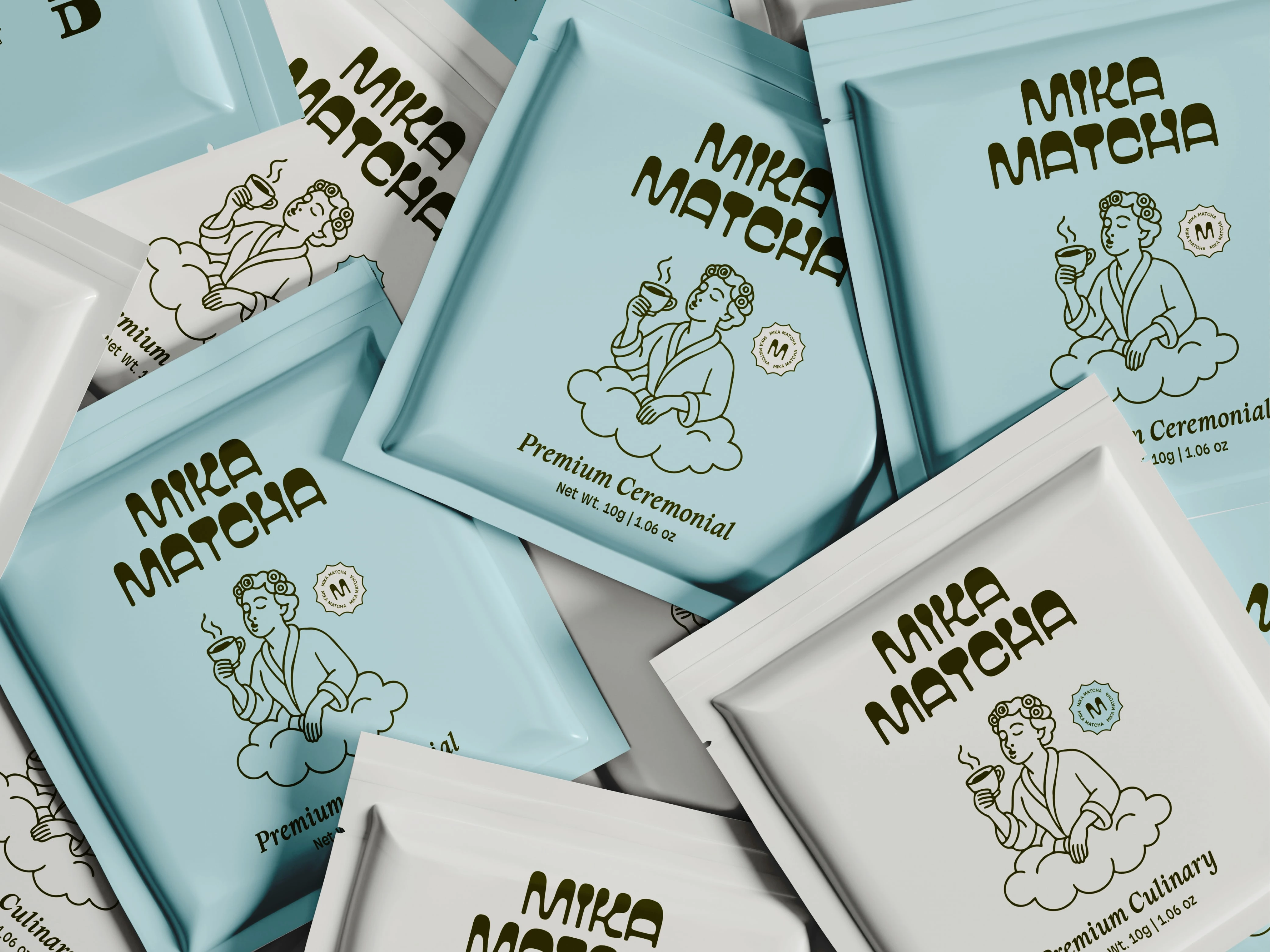
Matcha sachet design
Thank you! ❤️
Appreciate your time! For more design collabs, let’s cook something fresh together.
Like this project
Posted Nov 14, 2025
Created a fresh, modern brand identity for Mika Matcha using calm pastel tones and playful illustrations.