Eto: Afro-textured Hair Extension Brand Website and Emails

Edewede Agenmonmen


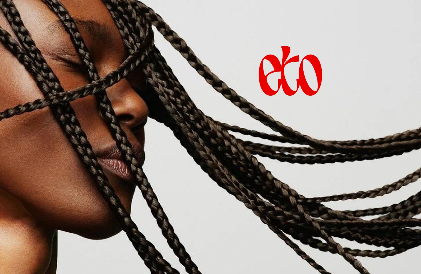
Eto is a spec project for an afro-textured hair extension brand.
"Eto" is the Esan word for "hair." Esan is one of the languages spoken in Edo State, Nigeria, and every product is named after an Esan word with its own meaning.
I designed the homepage, a product page, a page explaining the names, and a two-email welcome series in Figma, then built the site live on Shopify using the Horizon theme.
Scope: Website Design, Shopify Build & Email Marketing
Approach: Conversion UX, trust-driven product storytelling, and content hierarchy designed to reduce pre-purchase hesitation
Tools: Figma → Shopify (Horizon theme)
Approach:
Building a site that earns trust quickly, shows the product clearly, and gives a new visitor every reason to buy without feeling like they're being sold to.
Solution:
A homepage that gets visitors to the right product without detours
A product page that answers every question a buyer might have before they have to ask it
A story page that makes the naming system feel meaningful rather than gimmicky
Two emails that lead with who the brand is before asking for a sale
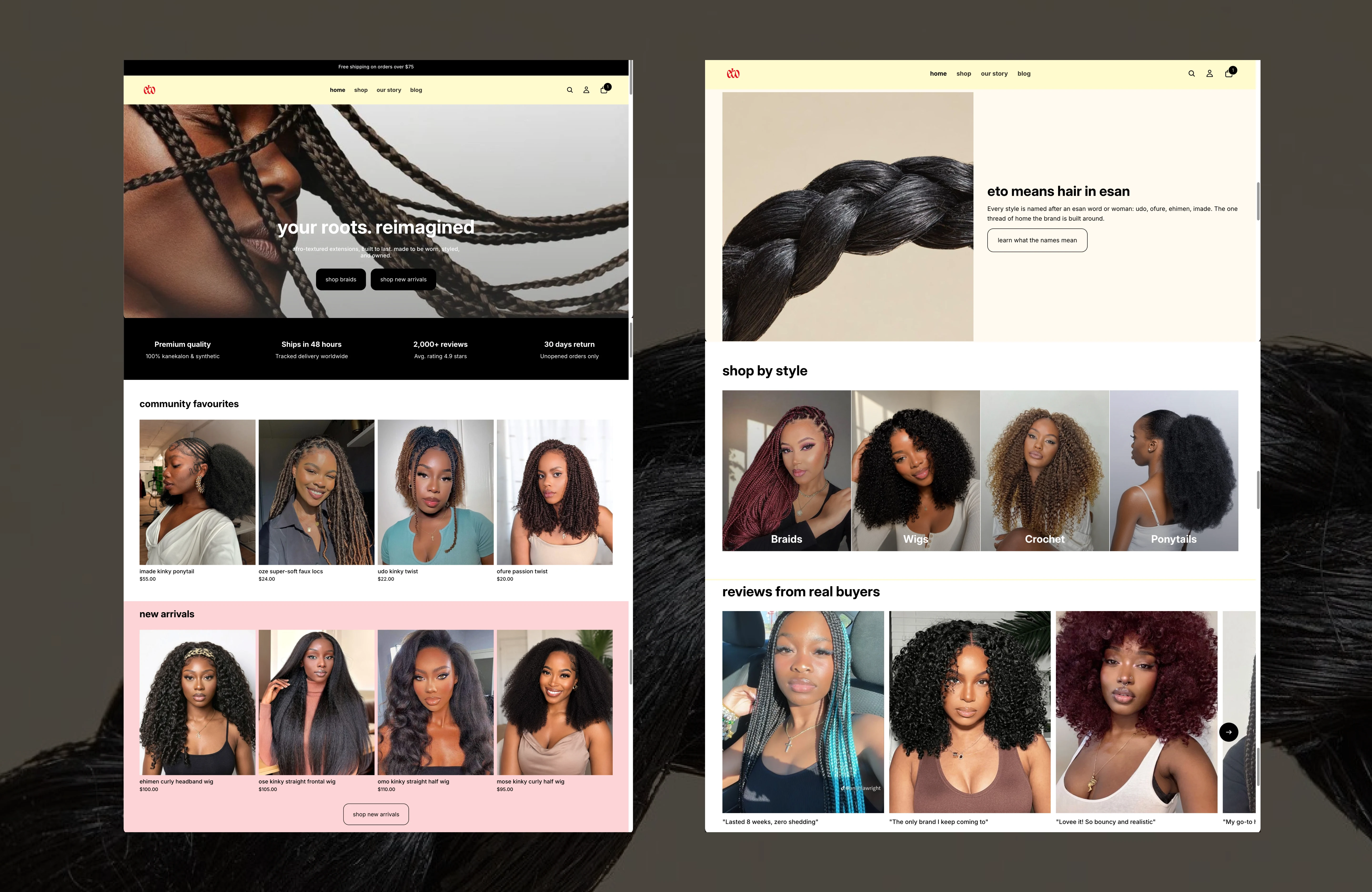
The Homepage
Most visitors arrive from social media already looking for a specific style, so this space just confirms they're in the right place and moves them toward the products fast.
The section explaining what "Eto" means sits much further down, after bestsellers and new arrivals, framed in a soft cream panel that visually sets it apart from the white product grids above and below it. That placement is deliberate; a visitor who's already browsed a few products is in a better position to enjoy a short brand story than someone who just landed on the page. Putting it above the fold would ask people to read about the brand before they've even seen what it sells.
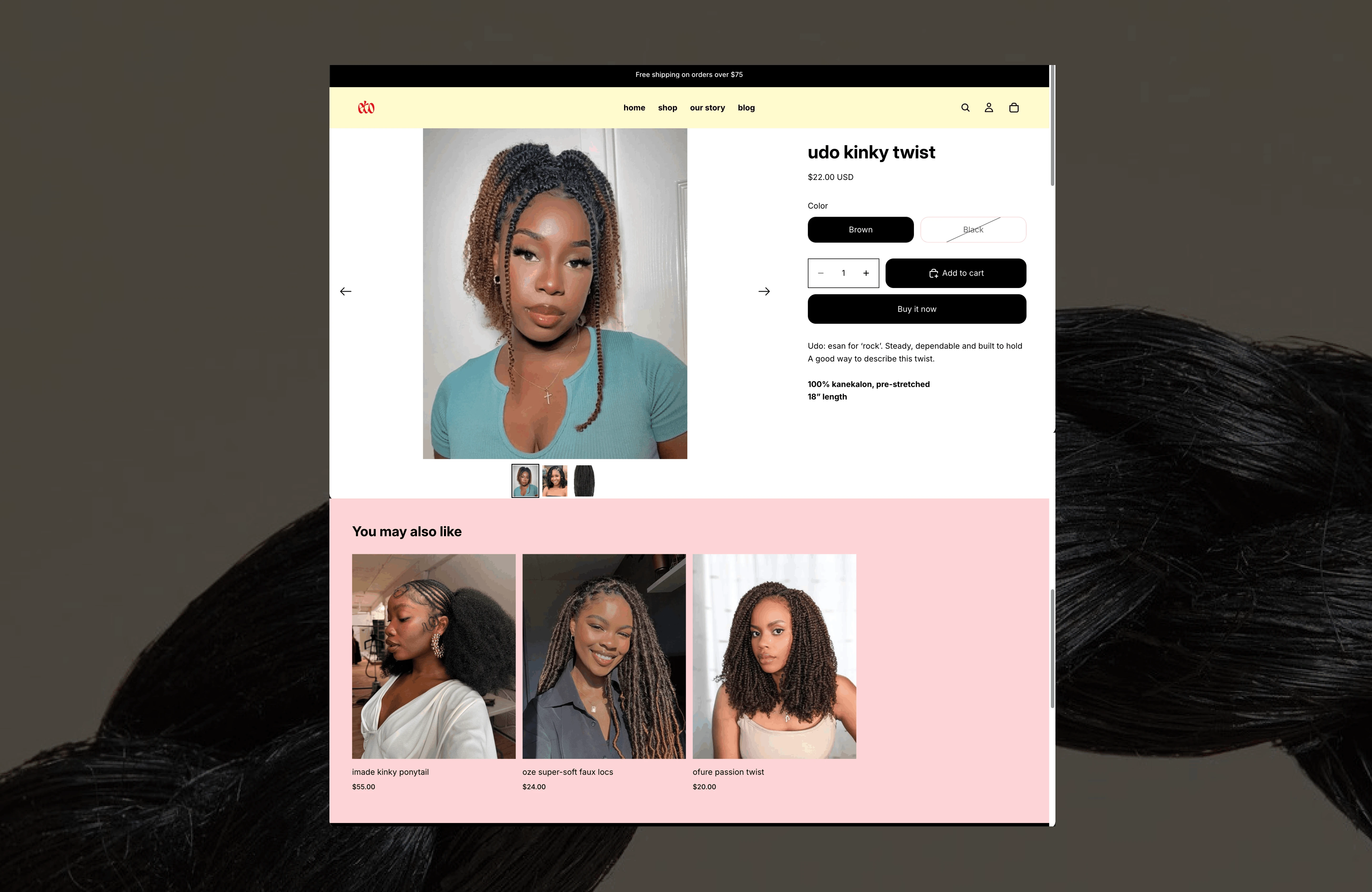
The Product Page
Photos, price, colour swatches, and a bundle-quantity guide sit together in one clean panel, so a shopper can make every decision without leaving the top of the page.
Each product's name and meaning (e.g. "Udo - Esan for rock") opens the description in the same plain text as the rest of the copy, not as a separate callout, but never something that has to be read before adding to cart.
Reviews and related products sit below in a simple grid to build trust without competing for attention.
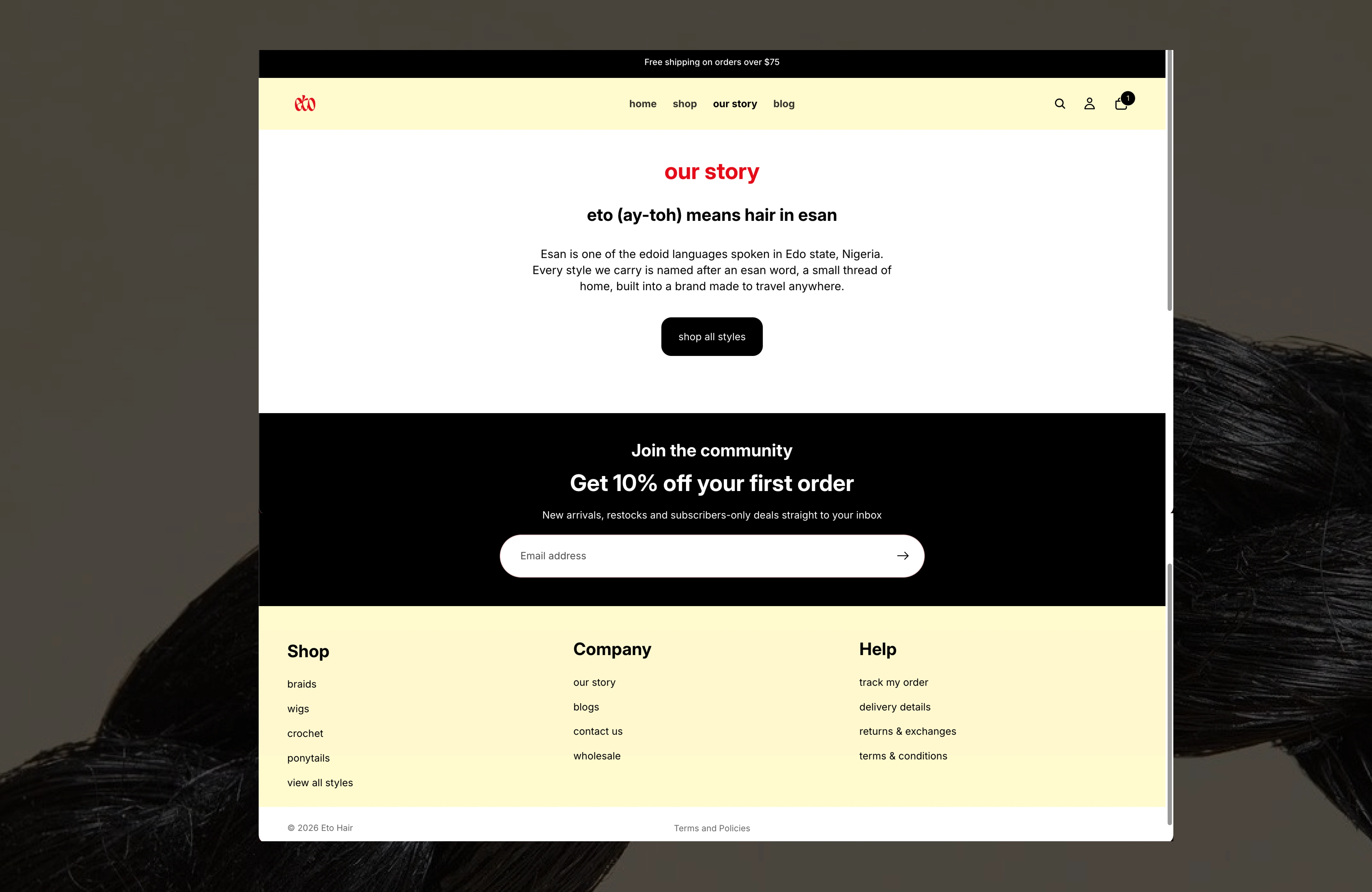
Our Story page
A single cream page built like a short dictionary: the word "Eto" and its meaning up top, followed by a clean list of all product names, each with pronunciation, meaning, and a link to its matching product.
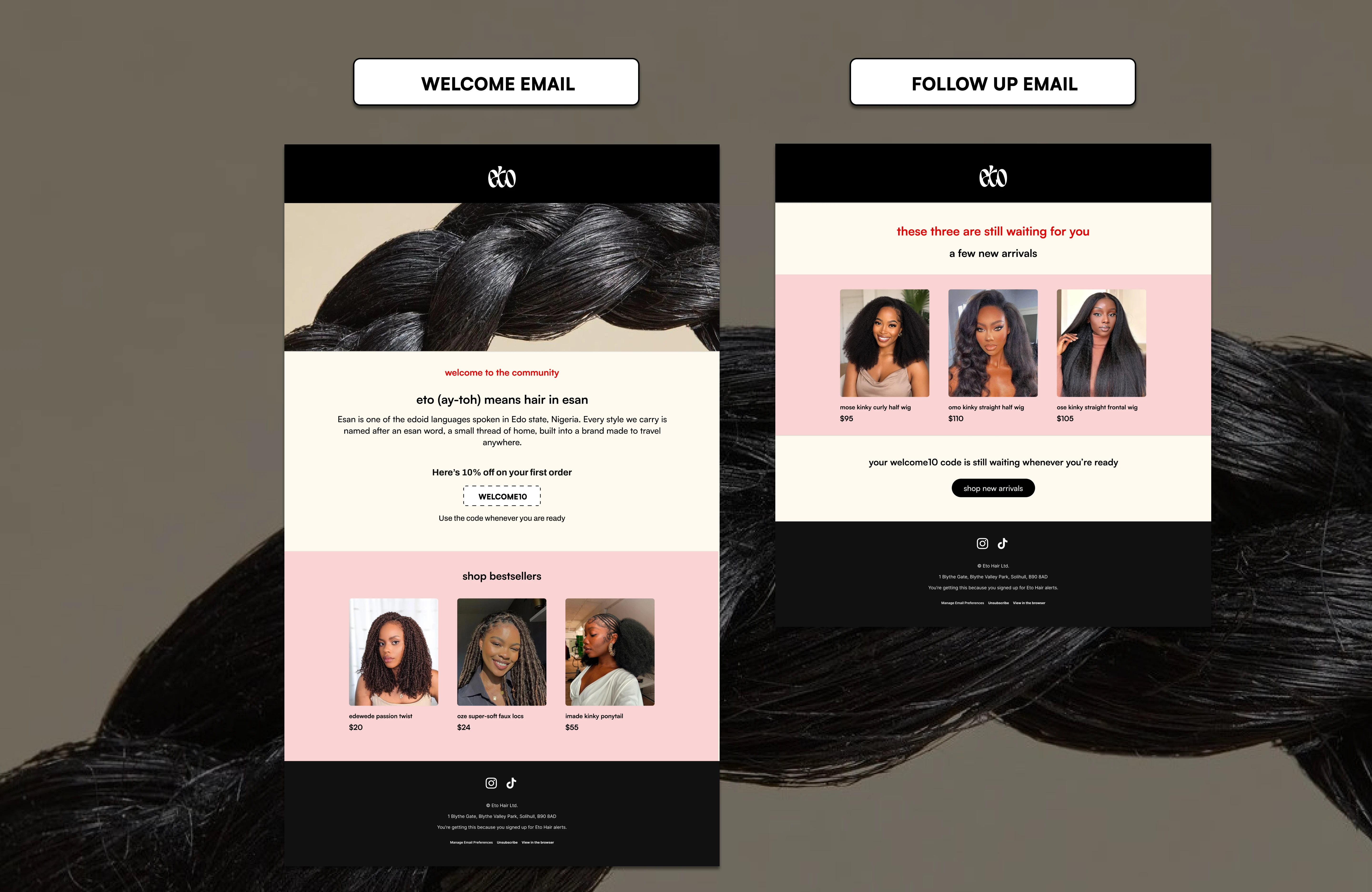
Welcome Email
The first email pairs the brand's naming story with a 10% discount code, giving both equal visual weight so a new subscriber remembers why Eto is different, not just that they got a discount.
The second, sent a few days later, features different products in the same layout and drops any urgency language, since the code doesn't expire. This way it reminds but doesn’t pressure them.
Like this project
Posted Oct 12, 2026
Designed and built a website for a hair extension brand and welcome email series on Shopify using Figma.
Likes
0
Views
2