Fintech Payment App UI Design

Ömer Kuzu


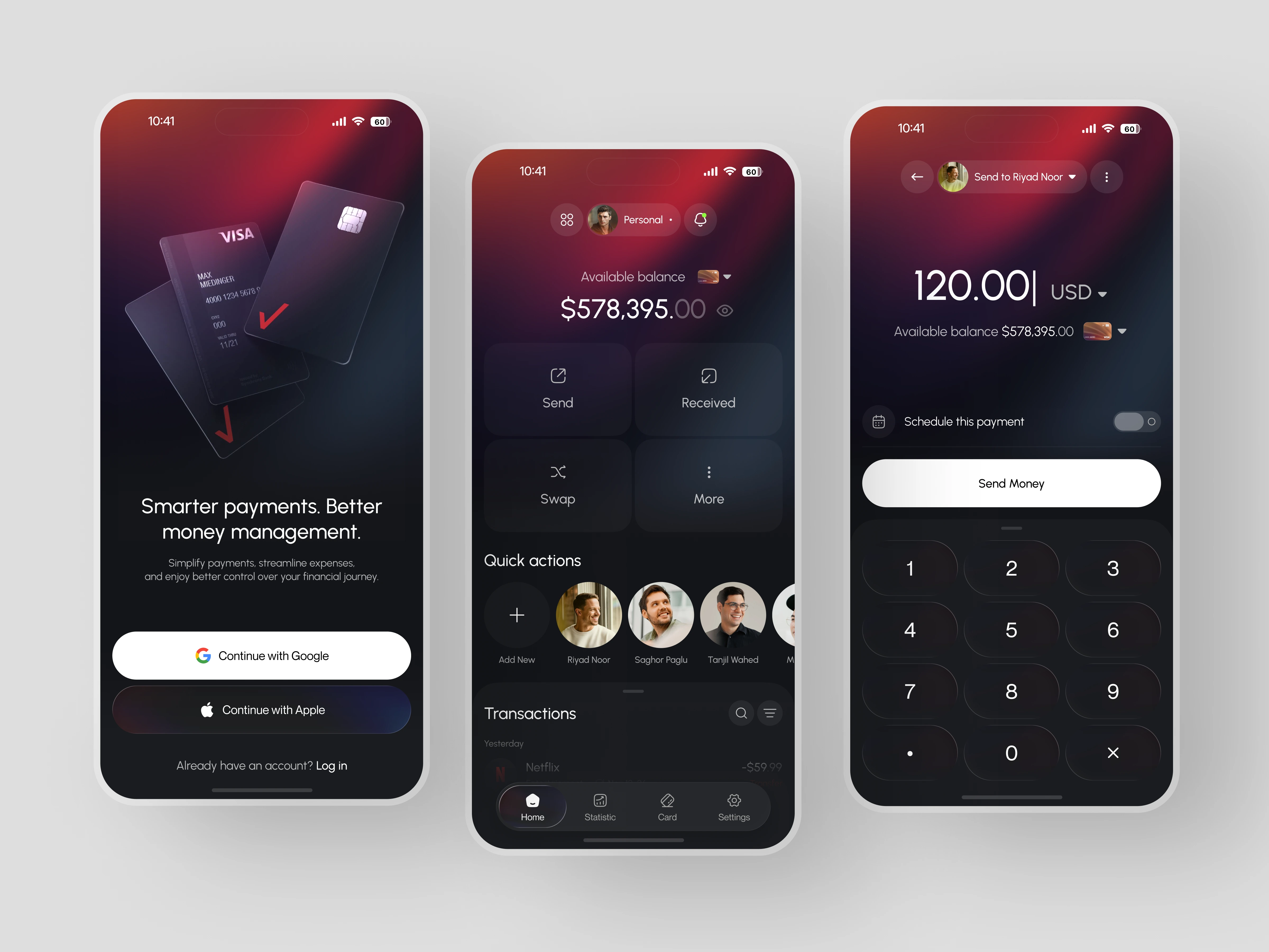
A wallet app that knows who you send money to more than it knows how to make that complicated.
Problem
Digital wallet apps are built around the transaction, not the person receiving it. The transfer flow sits behind navigation layers, the home screen leads with balance data rather than action, and the visual design either feels too sterile for everyday use or too light for users managing real money. The product ends up feeling like a tool built for the bank, not the person holding the phone.
Solution
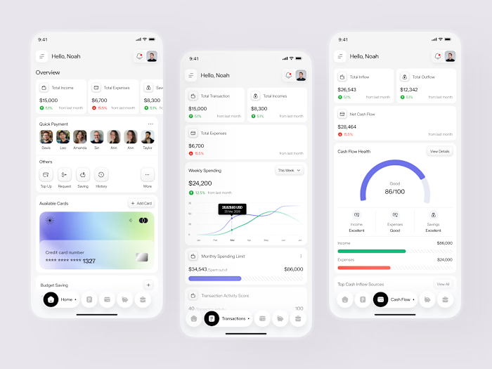
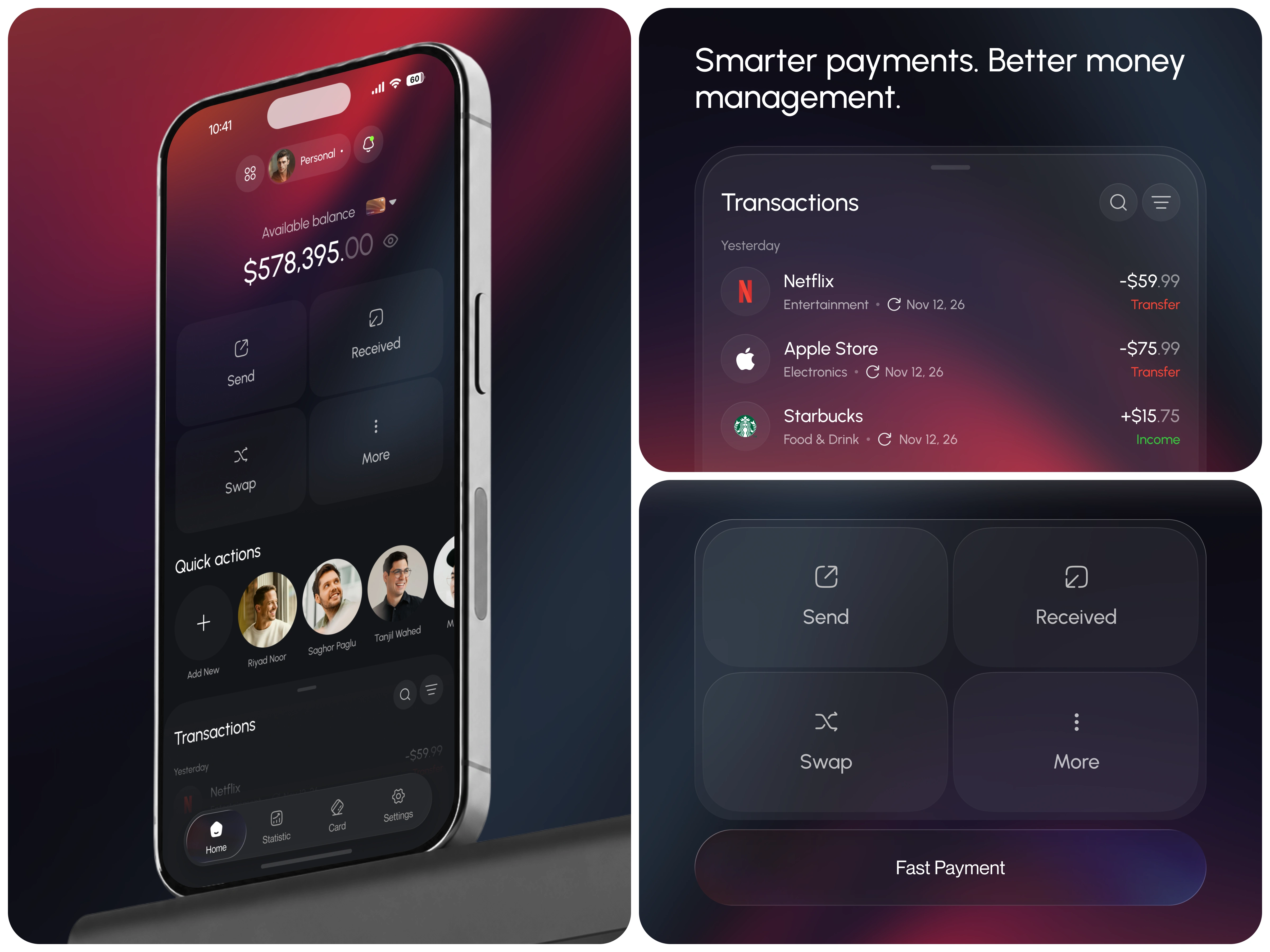
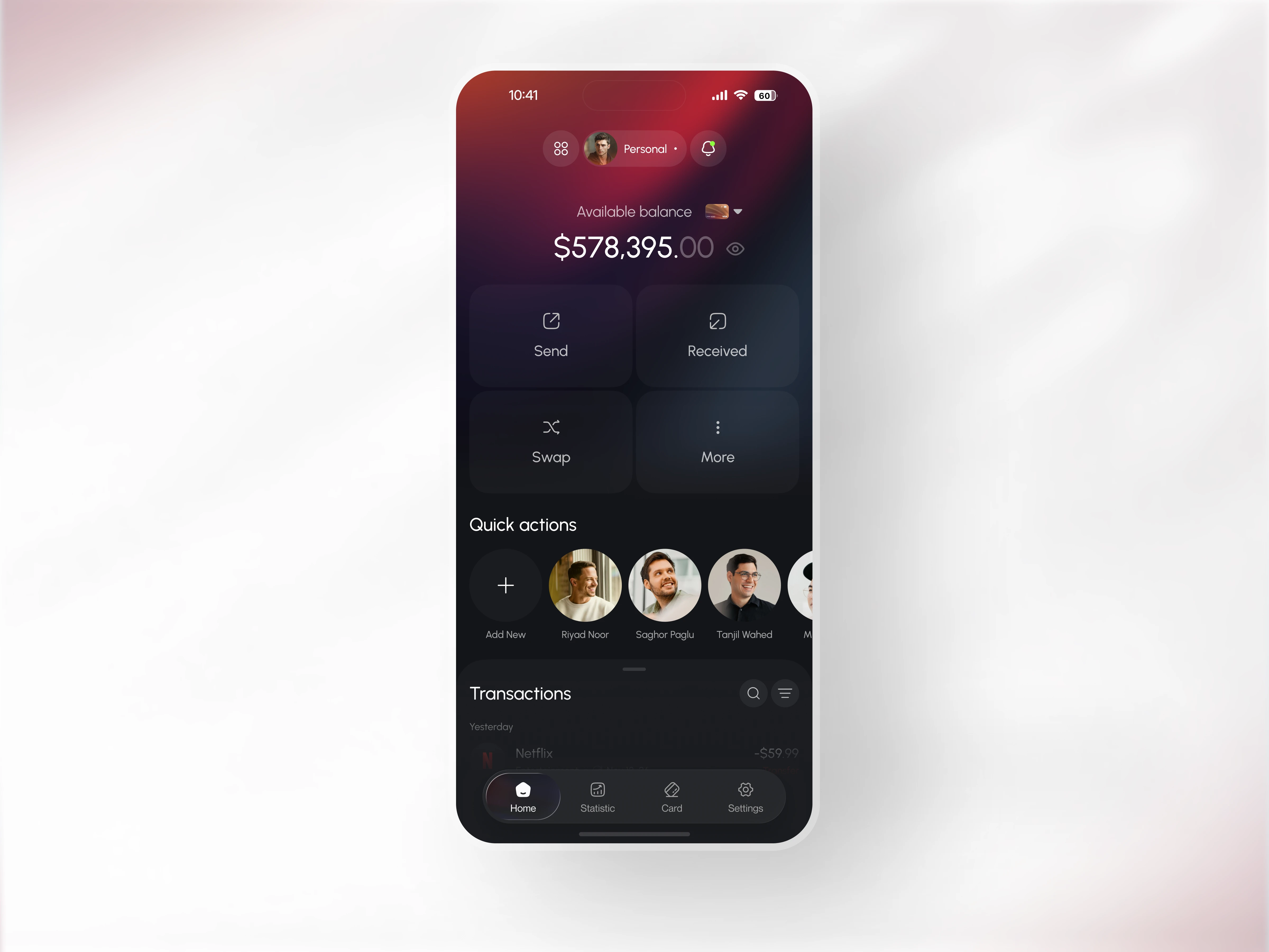
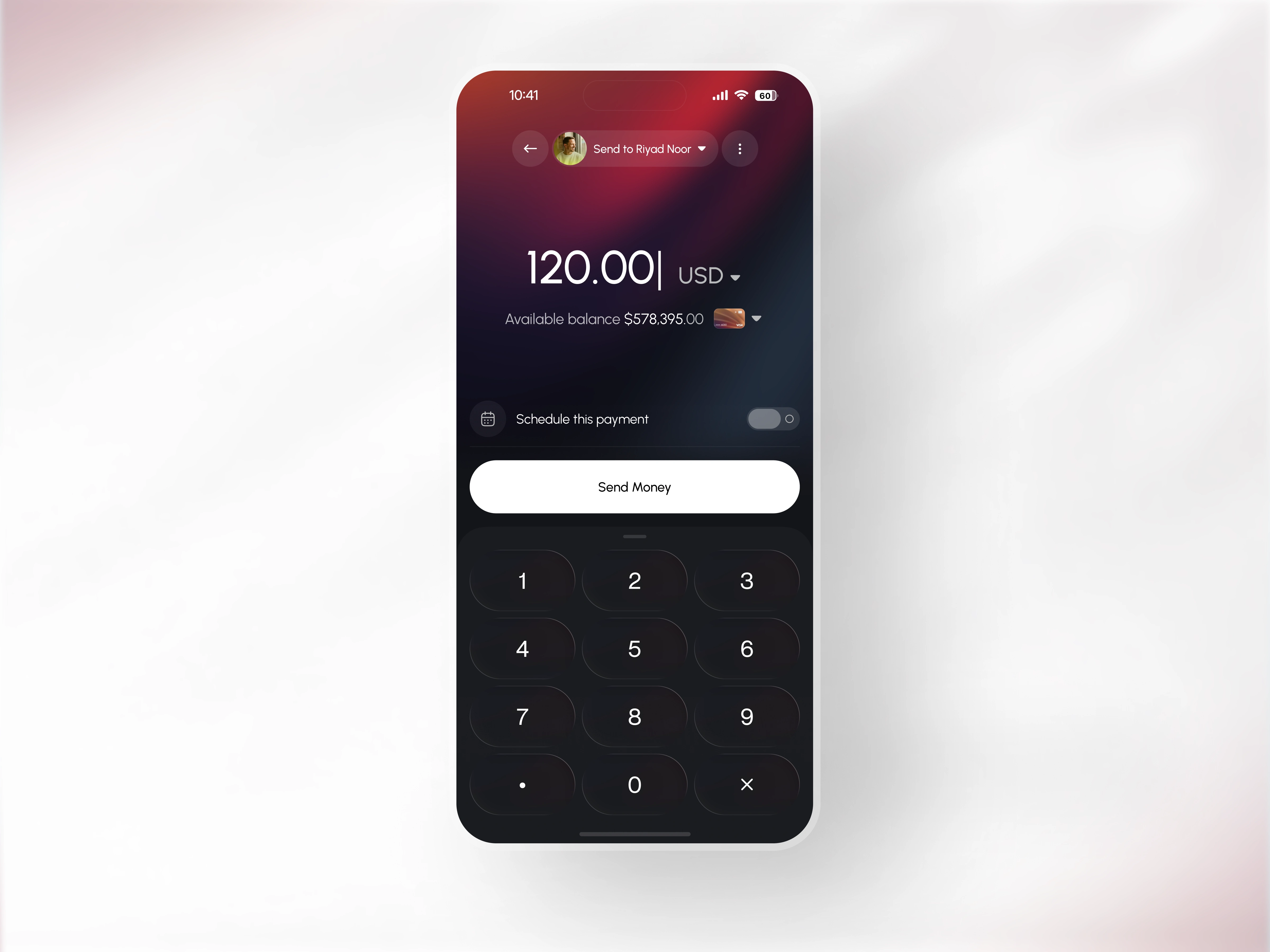
This fintech wallet app design reorders the entire product logic. The contact row lives on the home screen so the most common action sending money to someone you already know starts with a face, not a form. The numpad transfer screen carries balance, recipient, currency selector, and a scheduled payment toggle in one view. No detours. The deep red gradient runs across all three screens giving the app a visual authority that most payment products avoid but this one commits to completely.
Design Focus
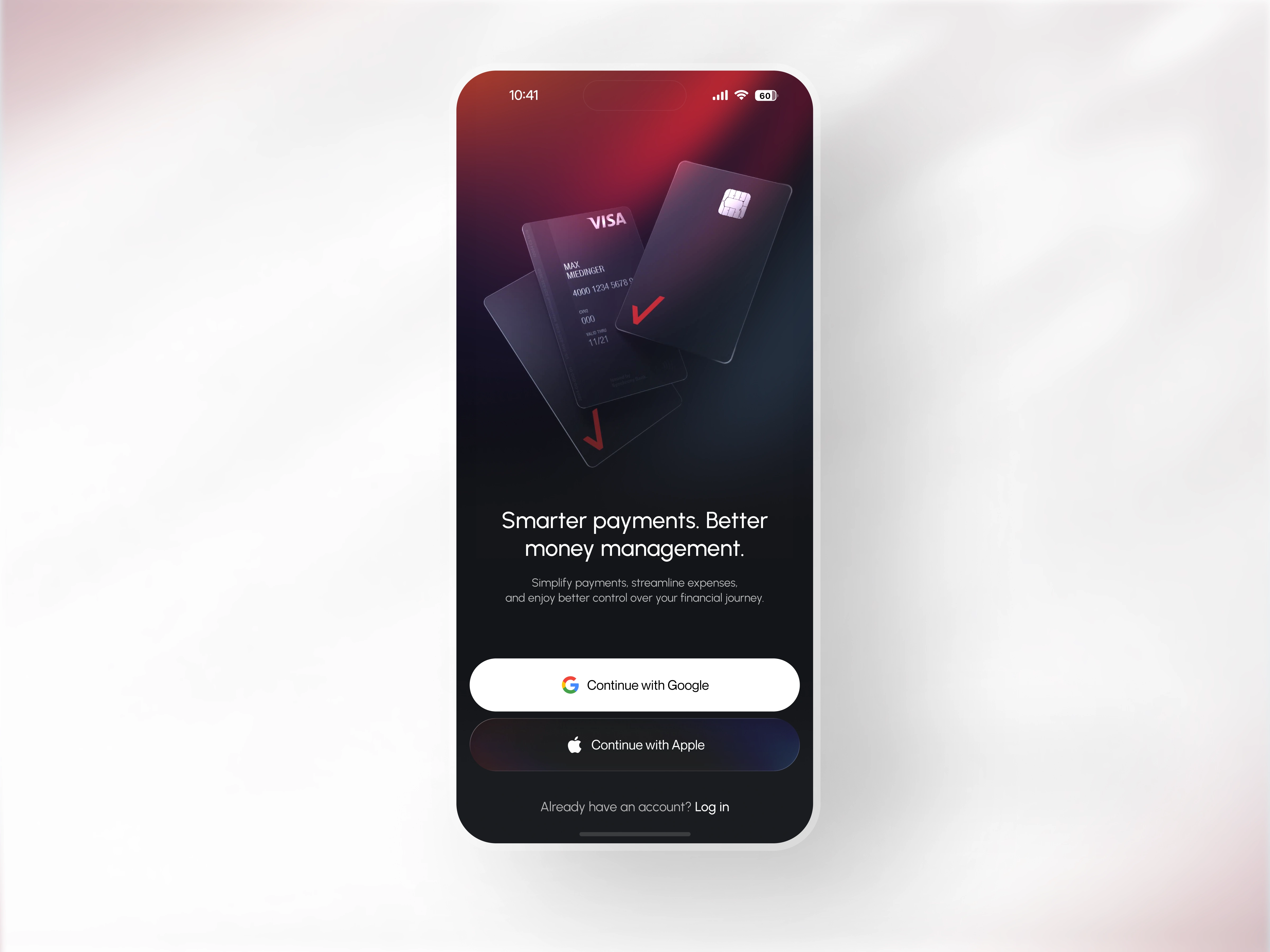
Physical Visa card rendering on the splash screen grounds a fully digital product in something the user already trusts before onboarding begins. Dark surfaces with high-contrast white type keep every number readable under any lighting condition.
Feature Highlights
- Fintech wallet mobile app with contact-based quick send row - surfaced directly on the home dashboard
- Numpad transfer screen with live balance, currency selector, and scheduled payment toggle all in one view
- Deep red gradient identity running clean across onboarding, home, and transfer screens without a single break
Building a fintech, digital banking, or payment app that needs to feel this direct? Let's design it together.

Continue the Creative Journey on Our Other Dribbble Profiles:
Like this project