UI/UX Design Portfolio
Background
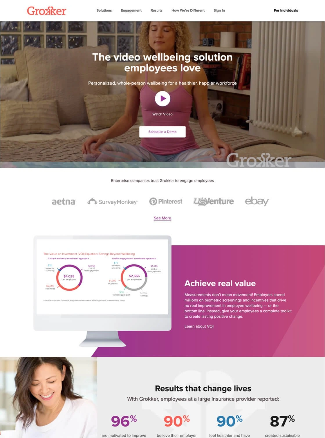
Grokker is the on-demand well-being solution that goes beyond exercise, incorporating nutrition, mental health, sleep, and financial well-being to measurably engage employees. Lacking a major web presence aimed at enterprise clients, Grokker came to SmartBug® with a vision to increase awareness in this audience. We worked with Grokker to elevate its current brand style and create a website that incorporates polished visuals and showcases metrics to better educate prospects and investors. The result is a modern website designed to meet Grokker’s growth goals.
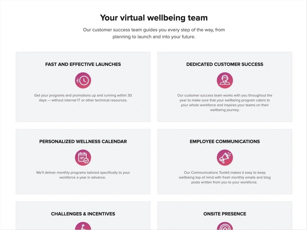
Understanding Pain Points
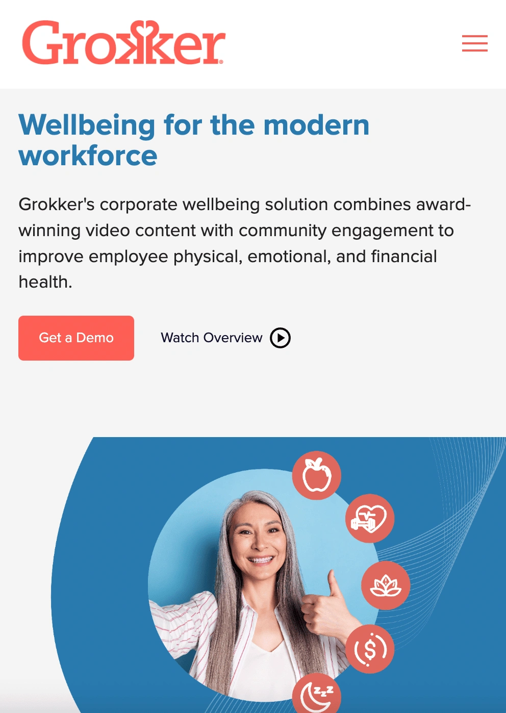
We identified the hurdles of HR decision makers, including budget, resources, and dispersed workforces. These played a huge part in UX decisions.
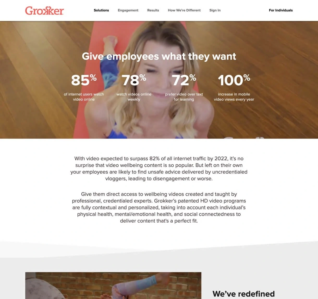
Communicating the Value
Proposition to ensure potential customers understand Grokker is the only complete well-being solution, we prioritized clear benefit-driven messaging.
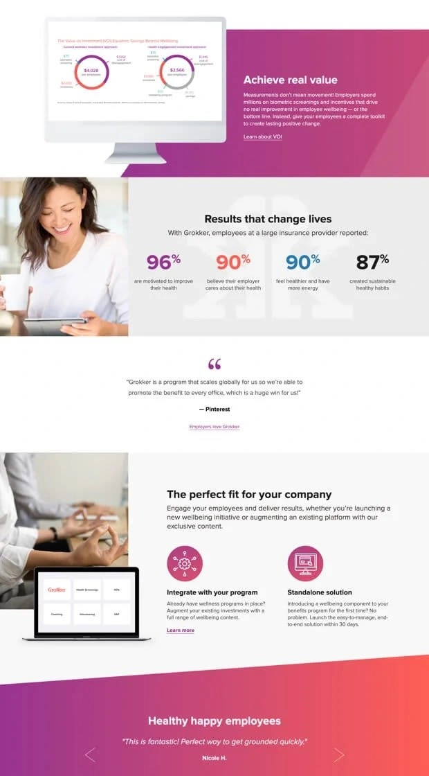
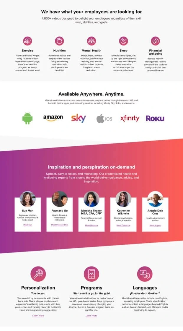
Creating a Clean Design
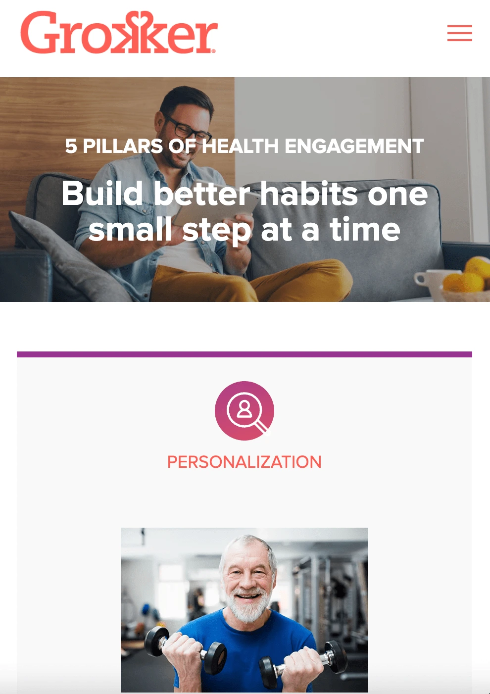
Using angular lines and a bright color palette of salmon and purple, we created a clean web design that matches this modern brand.
Adding Motion
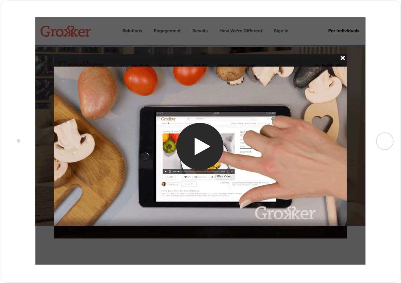
Video is an essential part of Grokker's platform, so we integrated motion footage into the homepage design, as well as key interior pages.
Like this project
Posted Dec 10, 2021
Likes
0
Views
147
Clients

Salesforce
SmartBug Media

