Uni Pay, Brand Identity & Visual Design
Kiran R
About
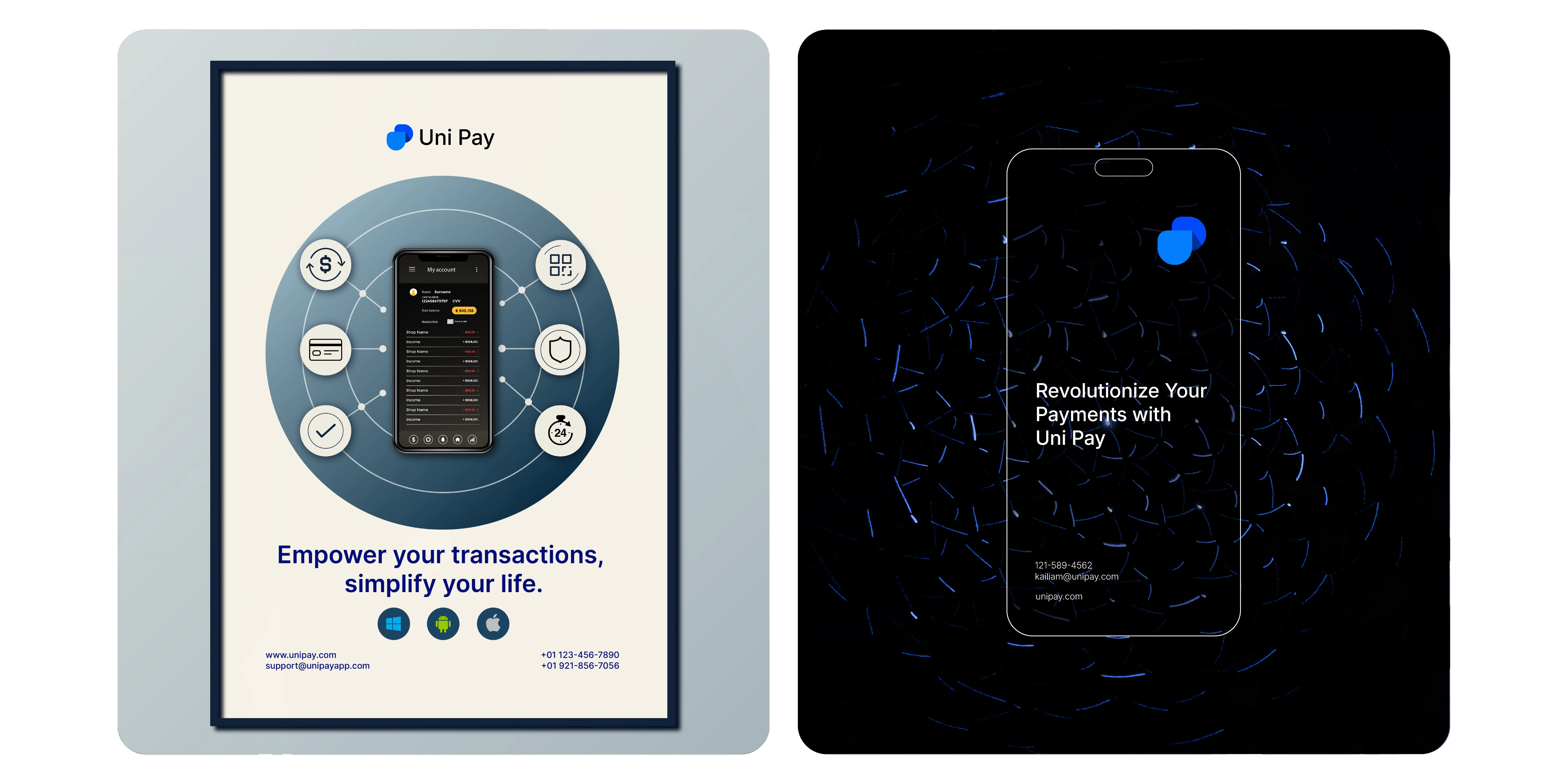
Uni Pay is a modern digital payment platform built to simplify transactions while strengthening human connection. Rooted in the philosophy of “You and I Pay,” Uni Pay isn’t just a tool—it’s a shared experience. It enables individuals and businesses to connect, pay, and grow together through fast, secure, and unified financial solutions. Whether you're sending money, paying bills, or making purchases, Uni Pay ensures every transaction is seamless and personal.
Concept
At the heart of Uni Pay lies the idea of unity and collaboration. The name itself—U N I Pay (You and I Pay)—embodies inclusivity and partnership. Uni Pay is designed not just to facilitate payments, but to foster meaningful connections. By integrating third-party verified apps and enabling effortless cross-platform transfers, it unites fragmented financial experiences into one harmonious ecosystem.
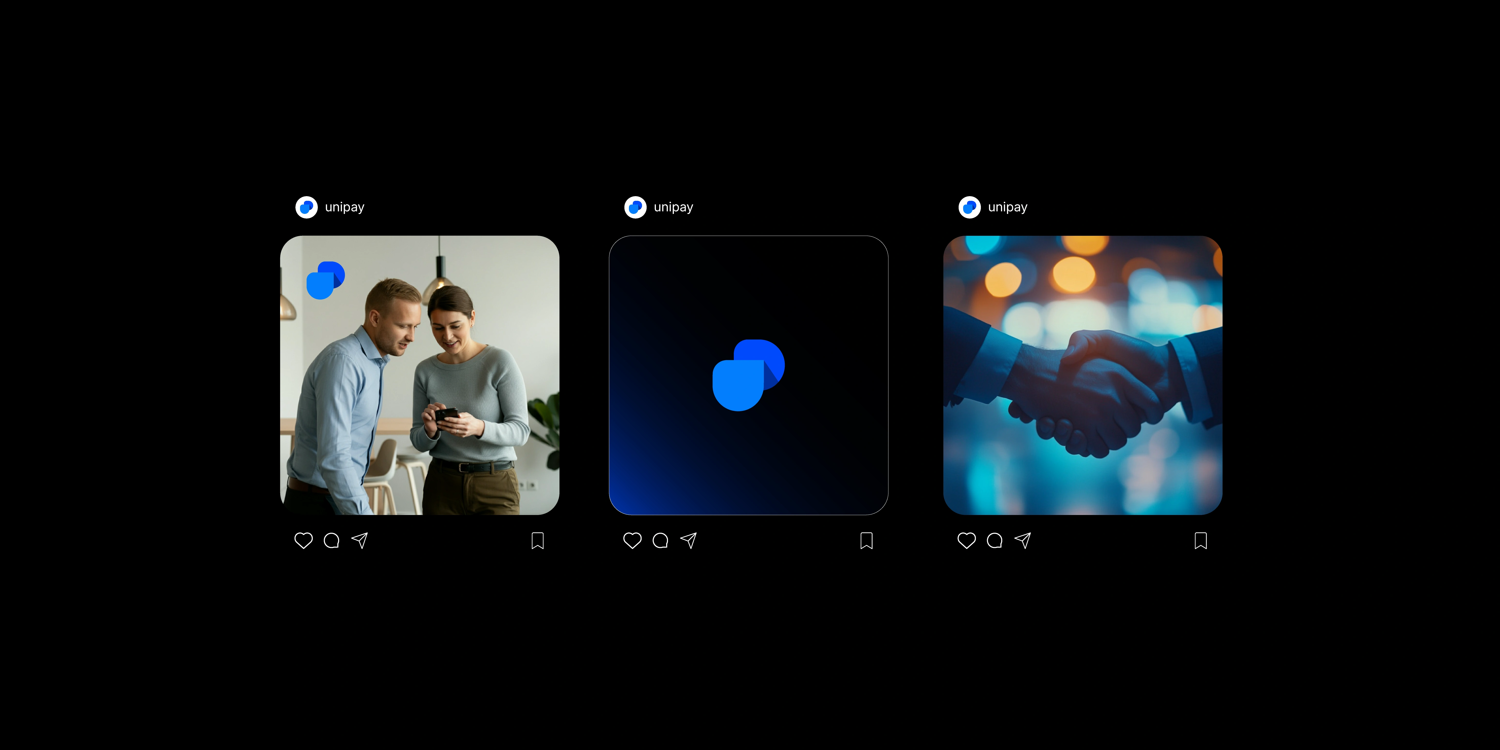
Logo
The Uni Pay logo is a powerful visual metaphor. It features two interlinked shapes: the “U” in the foreground and a flipped “P” in the background—connected by a subtle shadow line. This combination signifies unity, duality, and mutual exchange. The U and P aren’t just initials; they represent you and pay, forming a cohesive identity that visually reflects the brand’s inclusive message.

Visual Identity
Typography: The primary font is the Inter type family—a clean, modern, and highly legible font that reinforces Uni Pay’s clarity and forward-thinking design.
Color Palette: Centered around tones of Tealish Blue and Deep Sky Blue, the palette evokes trust, reliability, and digital sophistication. These hues reflect Uni Pay’s mission to deliver secure and user-friendly services while maintaining a professional yet approachable visual tone.


Like this project
Posted Jun 19, 2025
Built a clear, unified brand identity for Uni Pay that conveyed trust, connection, and modernity across all visual and messaging touchpoints.