Pilates Community Studio - Brand identity
Diana Nova
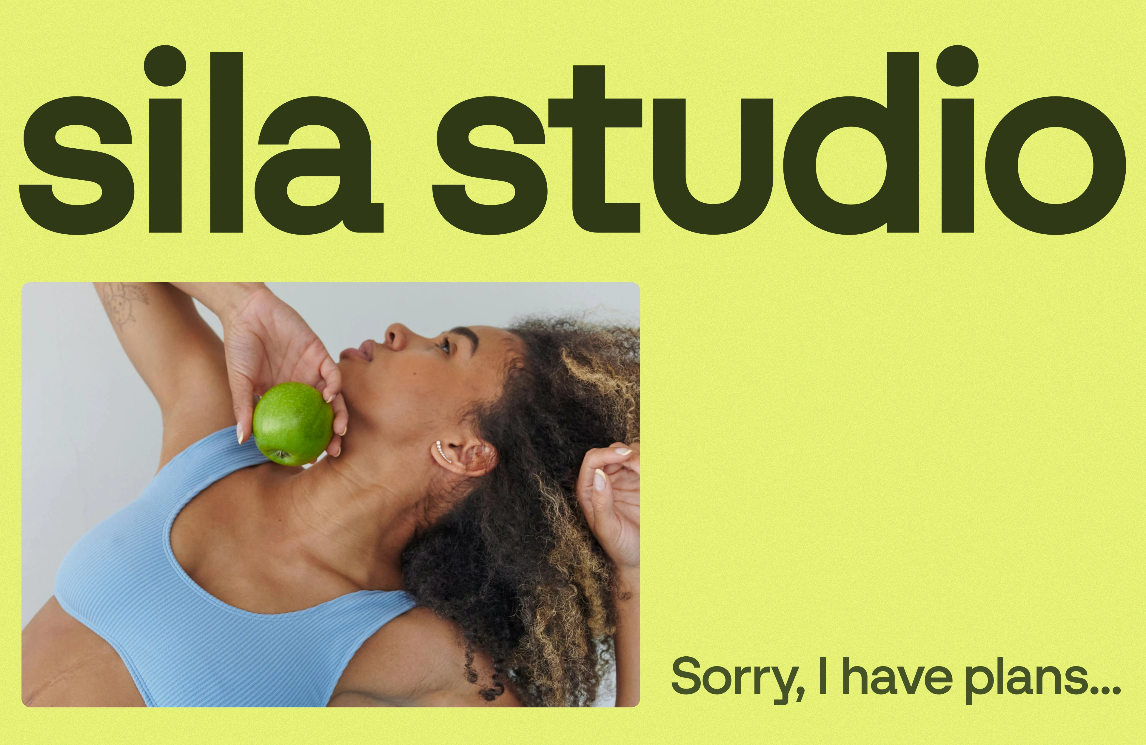

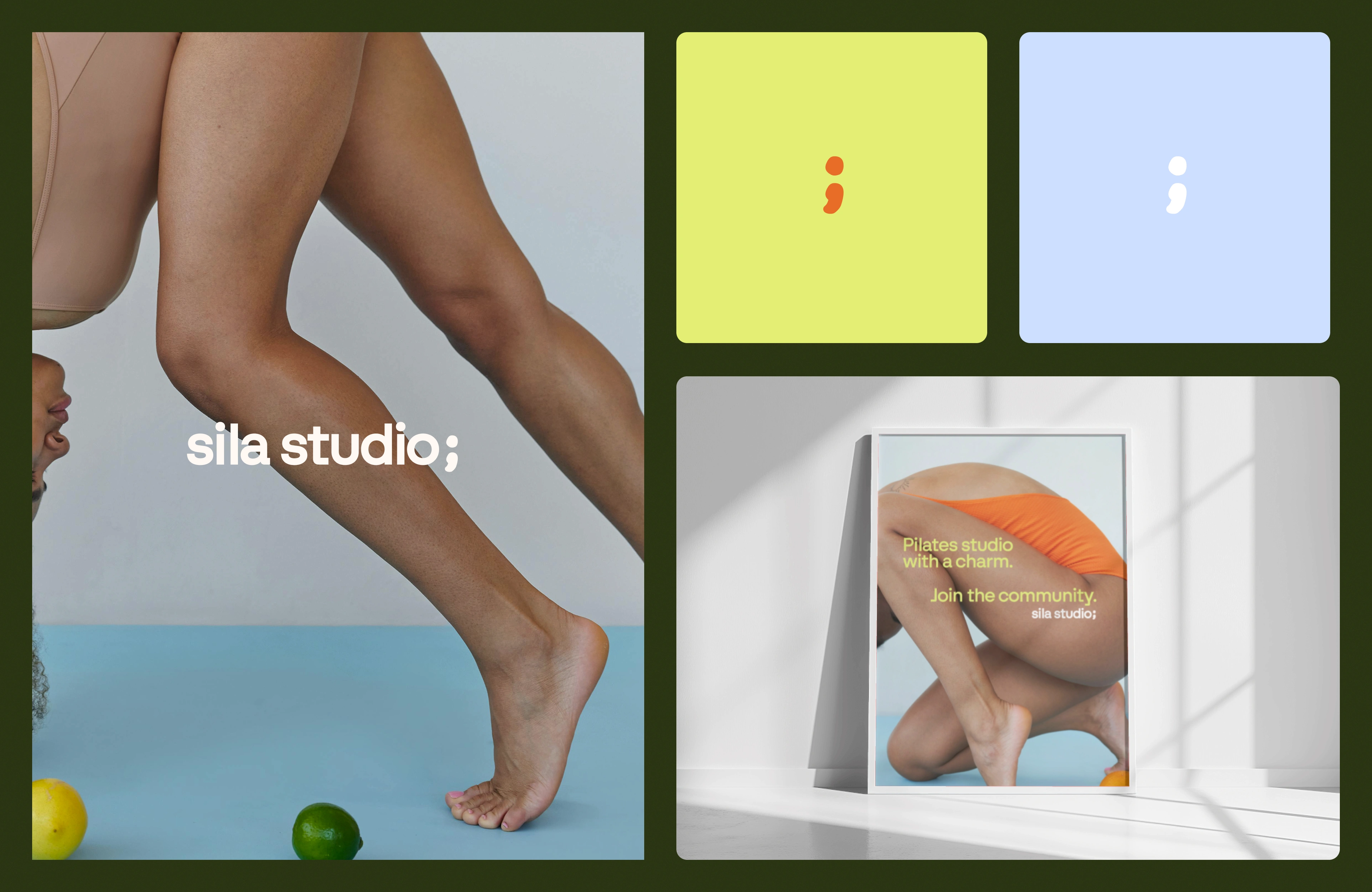
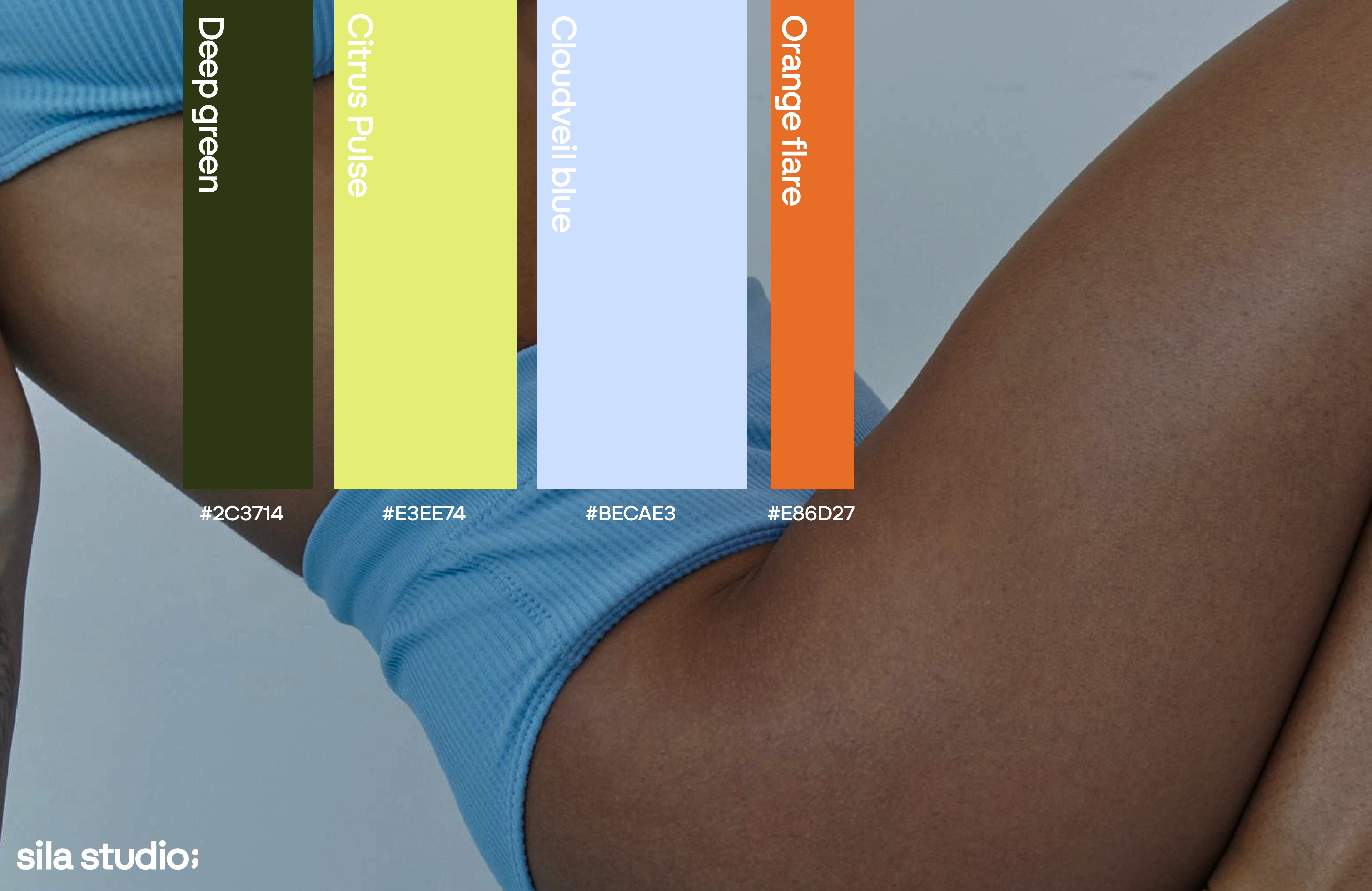
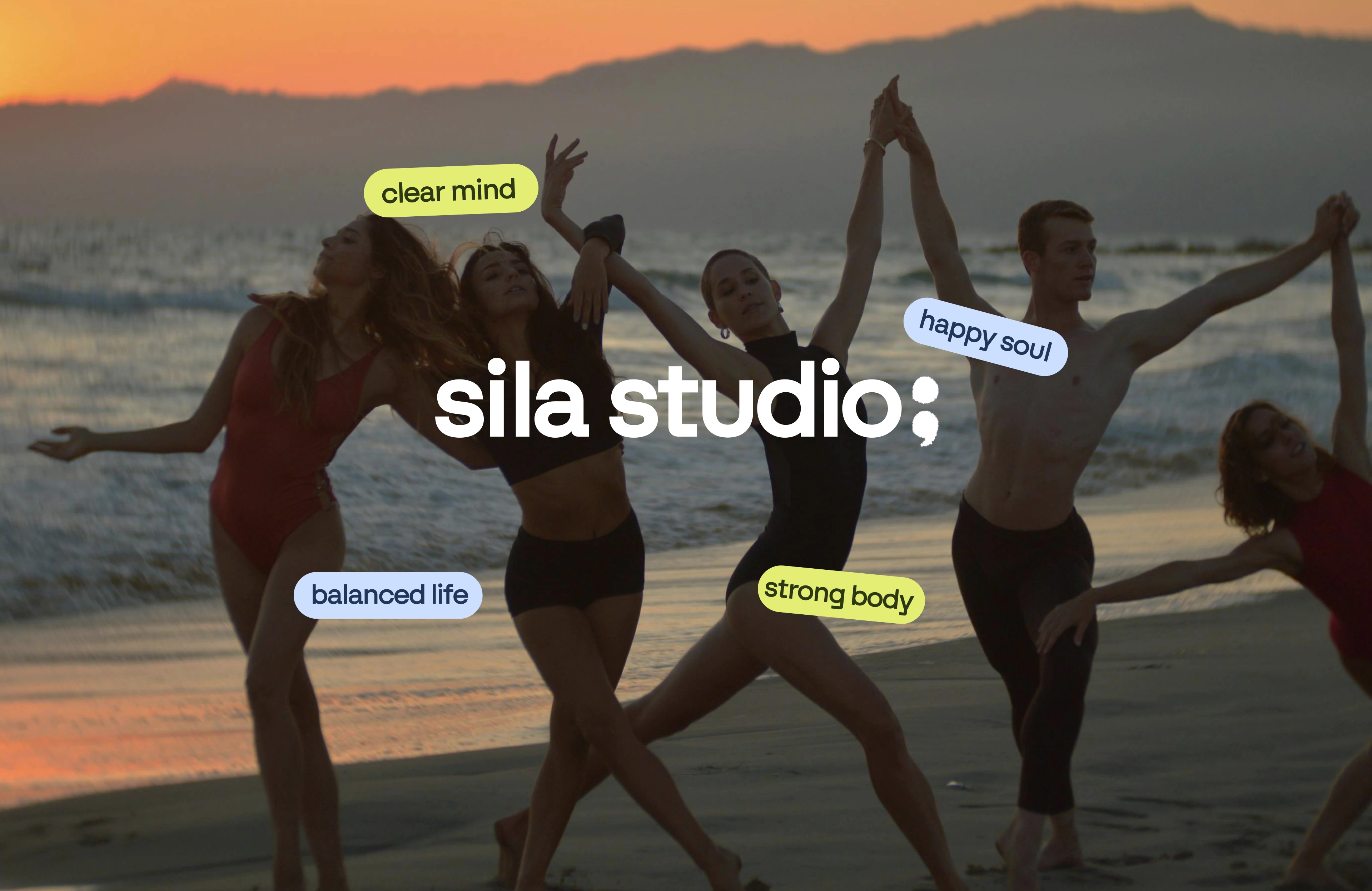
Sila Studio is a contemporary Pilates space built around connection, balance, and empowerment. The brand identity captures the studio’s vibrant community spirit through an uplifting color palette of light blue, dark green, striking yellow, and bright orange - standing out in a market often defined by minimal and neutral tones. The visual language reflects minimalism and calmness, keeping a sense of calm and inclusivity that mirrors the studio’s approach to wellness.
Client: Sila Studio — Service: Brand Identity — Year: 2025 — Design by Diana Nova


Like this project
Posted Oct 10, 2025
Brand identity capturing pilates studio’s vibrant community spirit through an uplifting color palette of blue, dark green, striking yellow, and bright orange.