Design sytem

Abhishek Lokare
Why Sleek?
Rizzle over time has grown to become the largest OTT/Entertainment platform in India and we are trying to go into the B2B segment. We wanted to keep the experience similar to the Rizzle brand, so there was a strong need for these platforms to speak a common and consistent language.
This was immediately followed by a need to have developmental efficiency. A design system was required to stop duplication of work, build an efficient set of coded components, and a faster go-to-market.
Problem Statement
Currently, there was no design system in place so there were so many inconsistencies in font sizes, color, etc. After going through the existing library and small style guide, we found duplicate text styles, that were never used in the product.
The approach (Design System Planning)
I have started thinking about how can we build a design system which can consider the current branding and some new exploration for the new product that we were going to build.
I have added a separate project altogether to explain how we went into planning and researching building the design system. You can find it here - Design System Planning
Overview
Here I will just try to cover the overview of the approach
Planning out what to build
Build the Visual library elements for the camera file
Parts, Product, and Designers (Picking which elementals to build)
Repeat Steps 1, 2 & 3 to move forward
For the whole process, you can find it here - Design System Planning
Challenges
A few road-blocks we faced while making the design system-
Time constraint was the bigger challenge, getting the stakeholder's buy-in was a crucial step to making this project a success
Building a classy look yet usable components
Creating a scalable design system that can be used for a variety of products to come and scale in the future
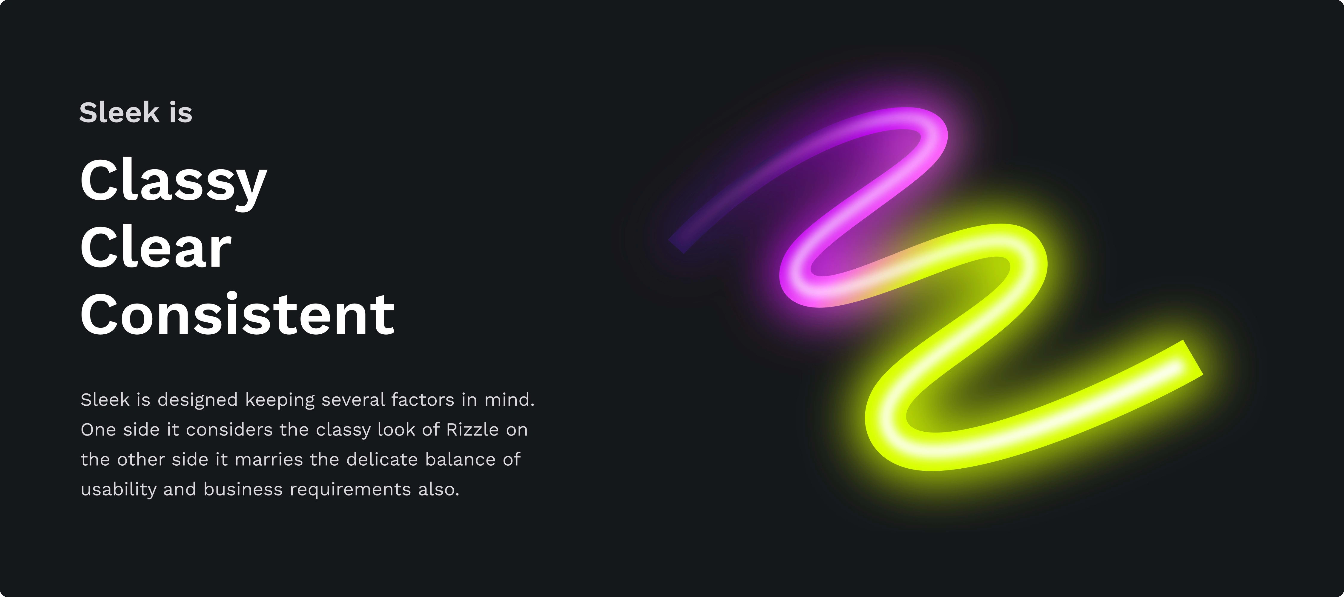
Key Elements of Sleek
Color palette
Color in user interface design runs much deeper than simple aesthetics. Clever use of UI colors can help communicate a brand’s message, convey a website’s structure and improve object recognition for better user engagement.
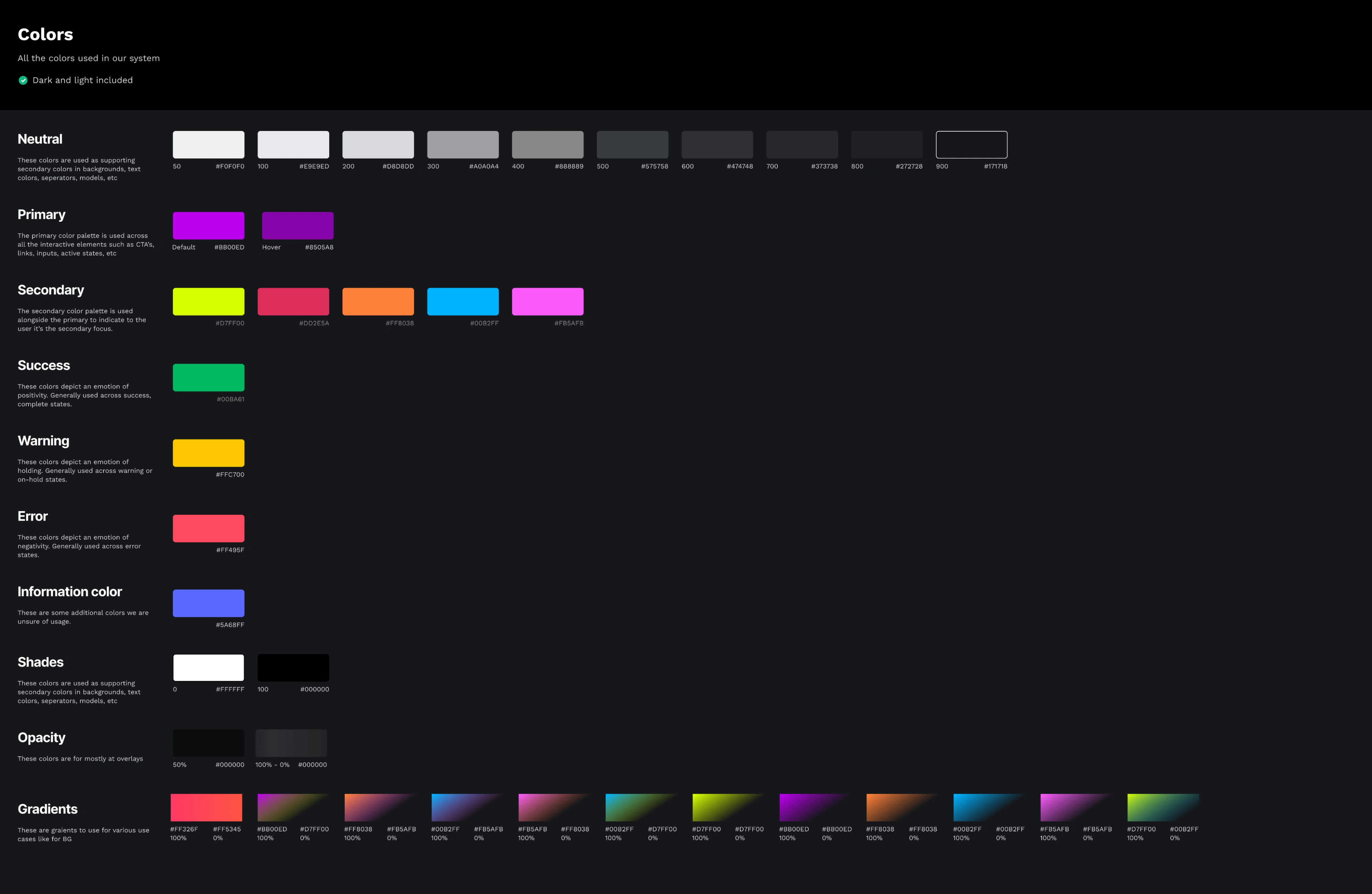
Removing redundant colors and having all the colors in one place for everyone to use with the proper naming conventions
Devised naming structure for consistent communication between designers and developers
Icons
Defined sizes
All line icons
Defined colors
Recognizable, minimal & bold
Typography
We used existing fonts on the product which is Worksans but specified all the sizes and weights. Also, we defined colors and standard rules for every use case.
Grid system
Some Screens designed using Sleek
Results
Few of the results there were observed after the v1 is launched
Increased speed from designers across teams
Fewer bugs related to UI components
Consistency across all the design outputs
Faster transfers and decreased the dev efforts
Learnings
In my career, I have worked on 2 design systems, based on the learnings of the previous design system I was able to build the design system with less guesswork and more of a planned approach.
Building this design system took a lot of collaboration and iterations. Learning Auto Layout and Component Structure helped me greatly in building a scalable design system. It has significantly improved our workflow, consistency across our products, and collaboration across the organization.
Like this project
Posted Sep 29, 2023
Design system
Likes
0
Views
0