Inside Wood Identity
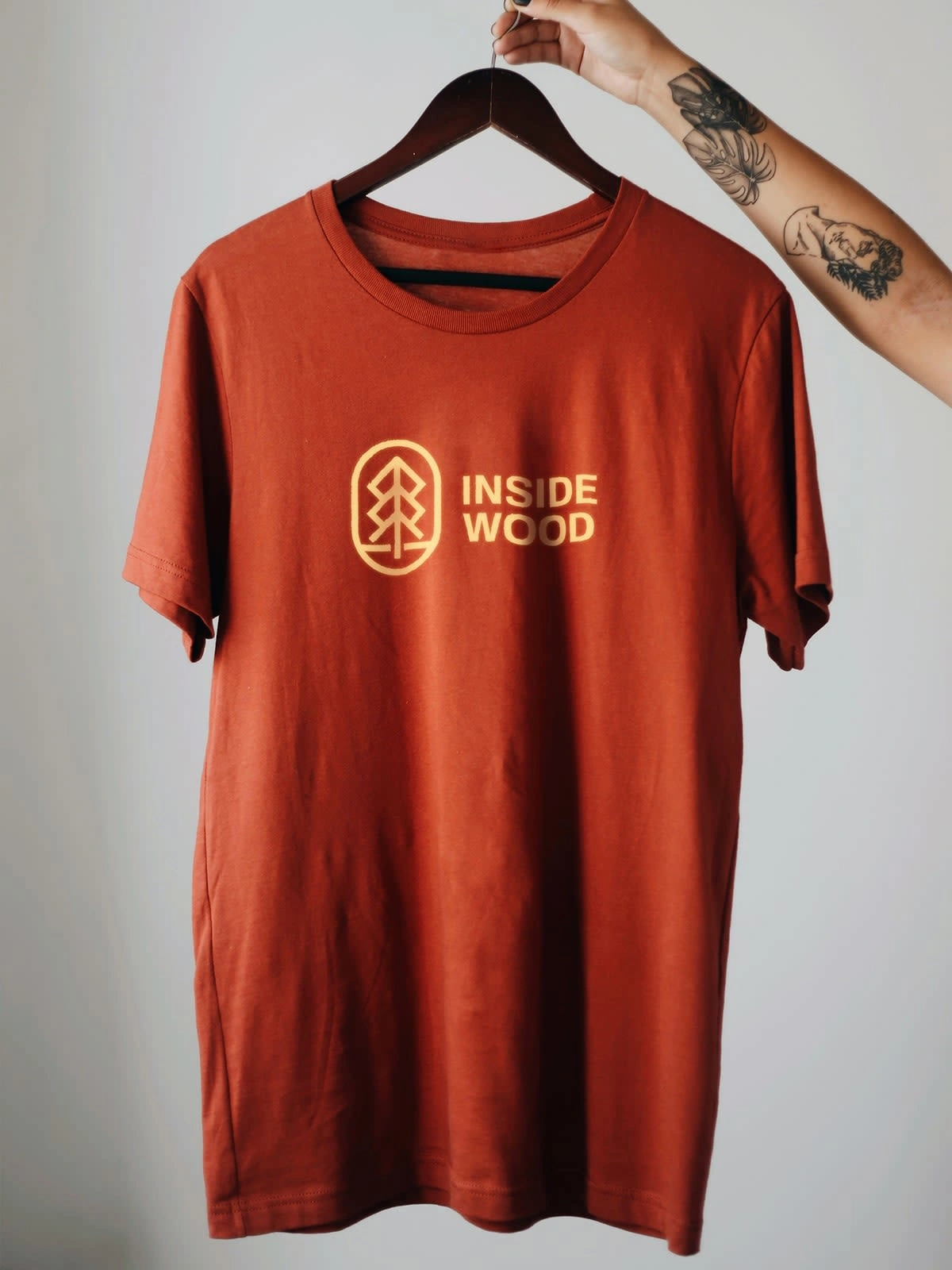
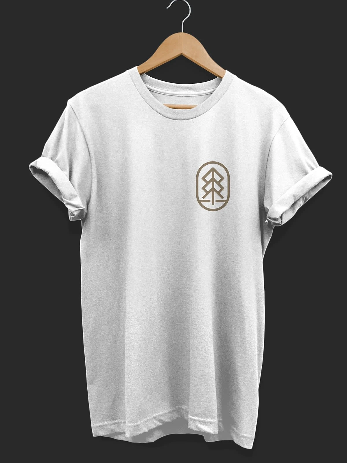
"Inside Wood" is an apparel company with focus on minimal approach.
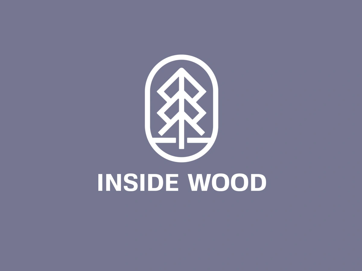
The target of the company is to attract minimalist people and millennials. So, a clean and sophisticated look was important. Their production facility is located near a quiet and beautiful forest, hence the name "Inside Wood”
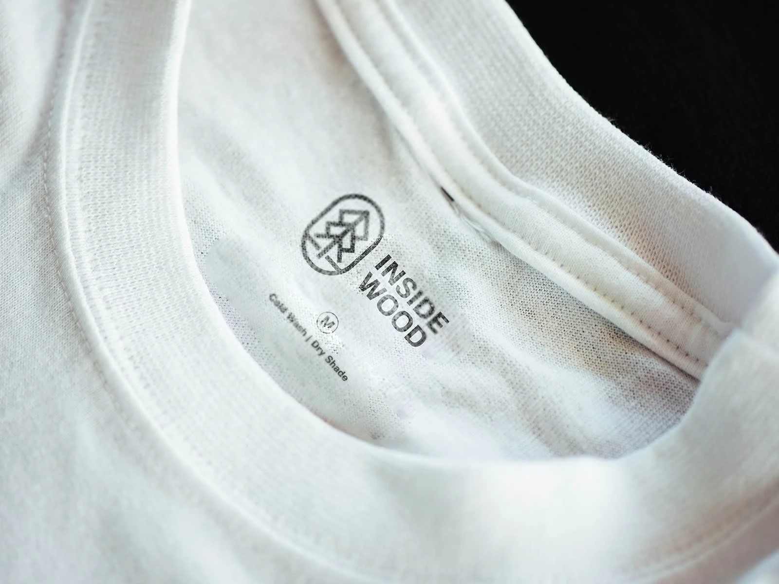
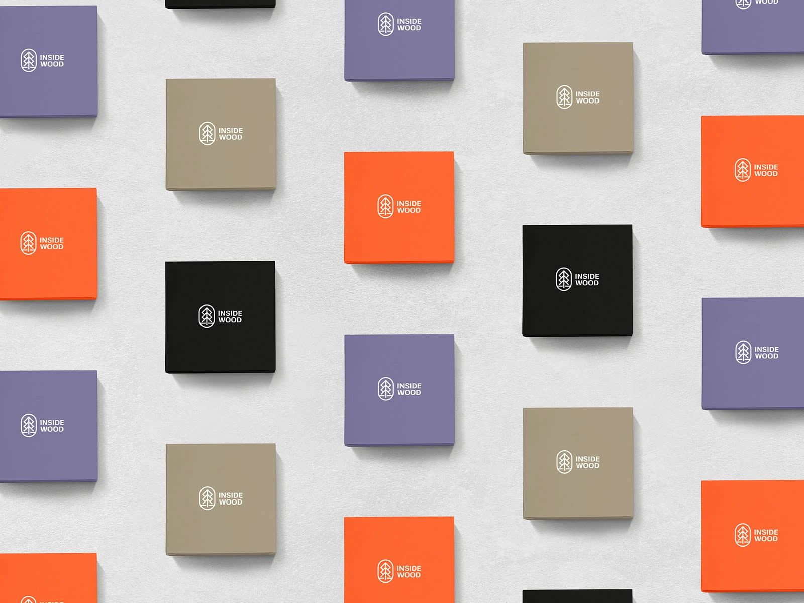

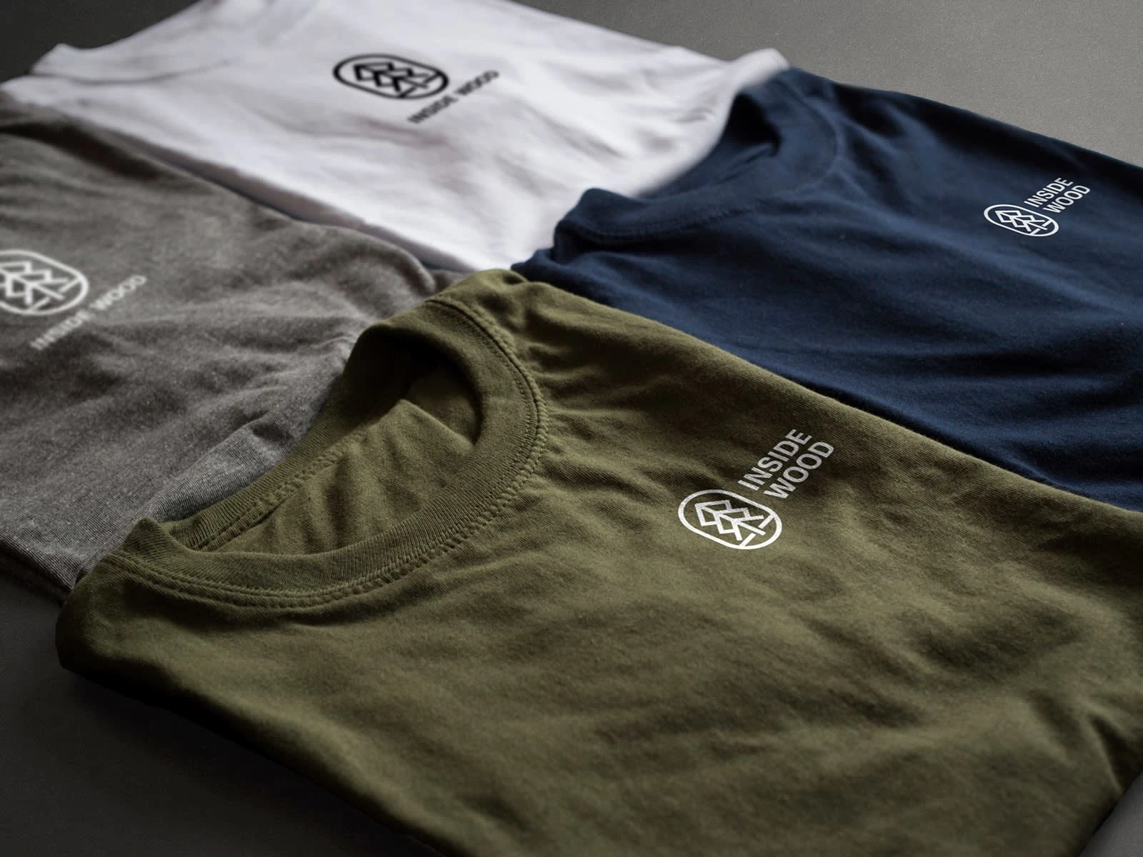
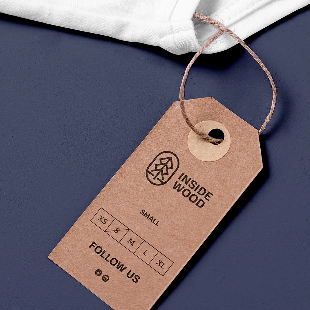
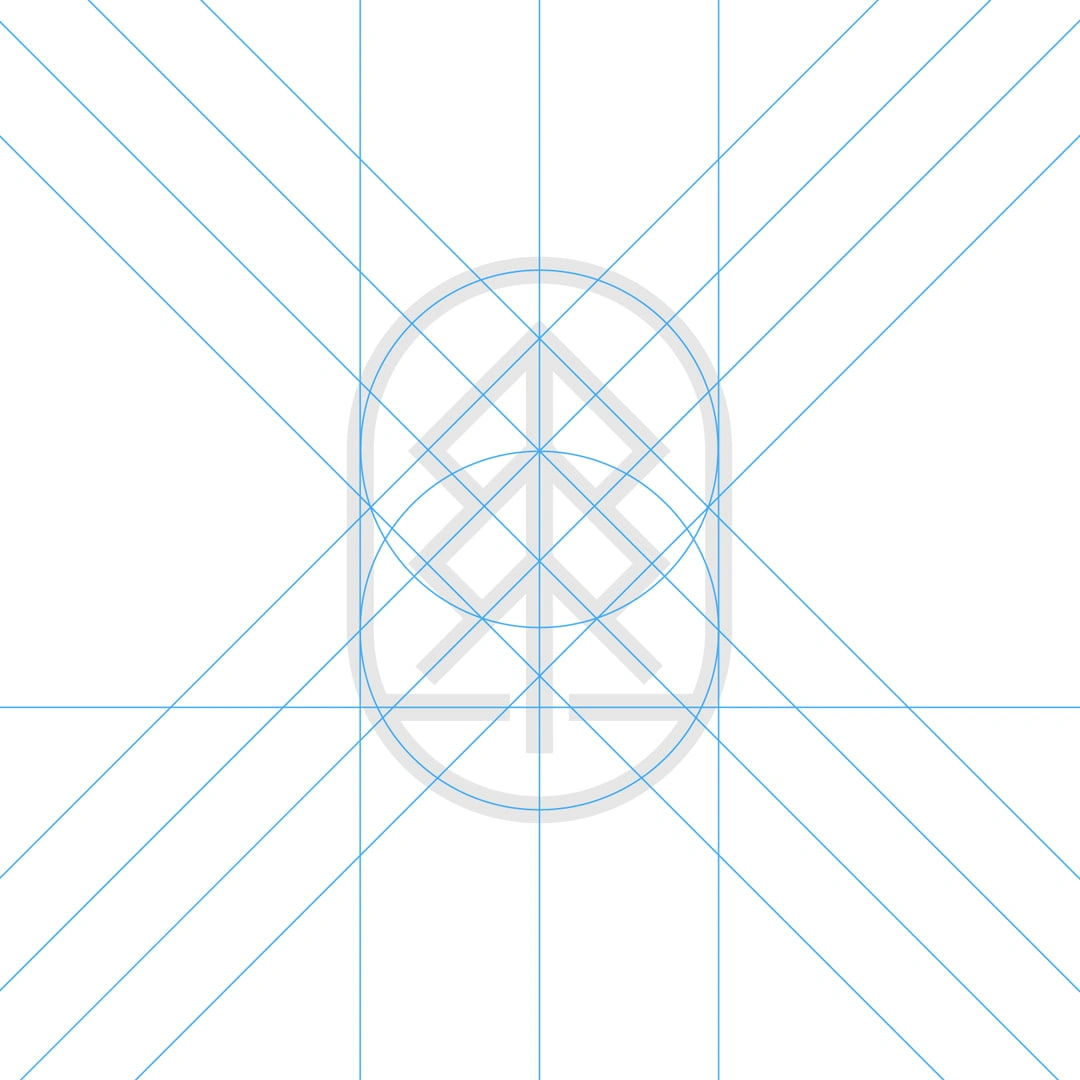
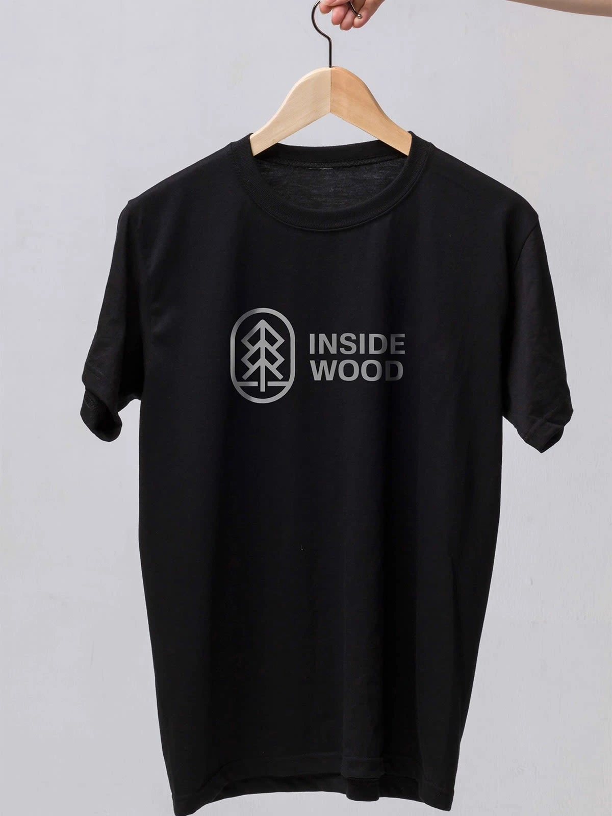
The client wanted the icon to be sophisticated and clean, and at the same time represent their unique location and their love for nature. We agreed on a simple yet unique tree icon which they loved.
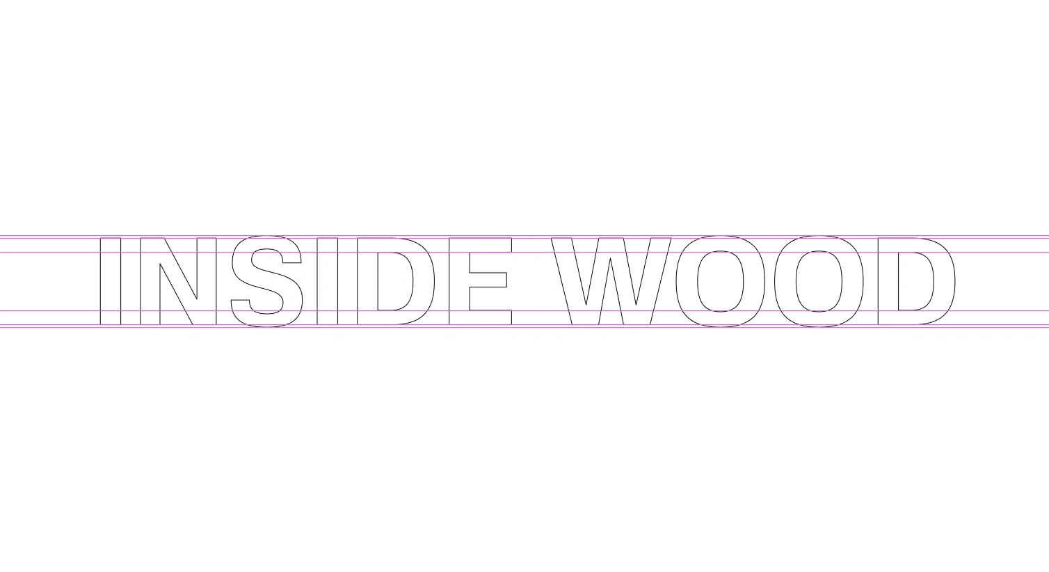
Pairing the icon with the right typeface is critical. After a lot of case study and experimenting, we settled on this clean sans-serif approach. We tried various compositions with script types and serifs but finalized this.
Like this project
Posted May 11, 2022
"Inside Wood" is an apparel company with focus on minimal approach.

