Raymond Portfolio Website Design

Henry Adekunle


Raymond Portfolio Website Design
Raymond — Freelance Graphic Designer Portfolio
Project Overview
Raymond is a personal portfolio website designed for a freelance graphic designer who wanted a digital presence that felt as creative and distinctive as the work itself.
The goal wasn't simply to create another portfolio with a collection of projects. I wanted the website to feel like part of the designer's brand — confident, expressive and memorable, while still making the work easy for potential clients to explore.
The final direction combines bold typography, high contrast, neon accents, strong imagery and editorial-style layouts to create a portfolio that immediately communicates personality and creativity.
The Challenge
A designer's portfolio has to do more than showcase good work. It needs to communicate who the designer is, what they can do and why someone should work with them within a very short amount of time.
The challenge was to create a website that could:
Make a strong first impression.
Showcase projects without making the portfolio feel repetitive.
Give the designer a recognisable visual identity.
Make important information easy to find.
Balance experimental design with practical usability.
Encourage visitors to move from simply viewing the work to actually getting in touch.
The Design Approach
I built the experience around a strong visual identity rather than using a conventional portfolio template.
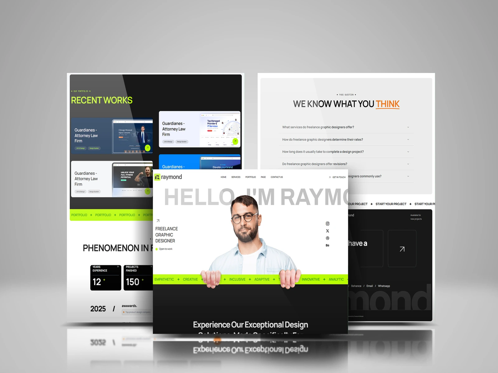
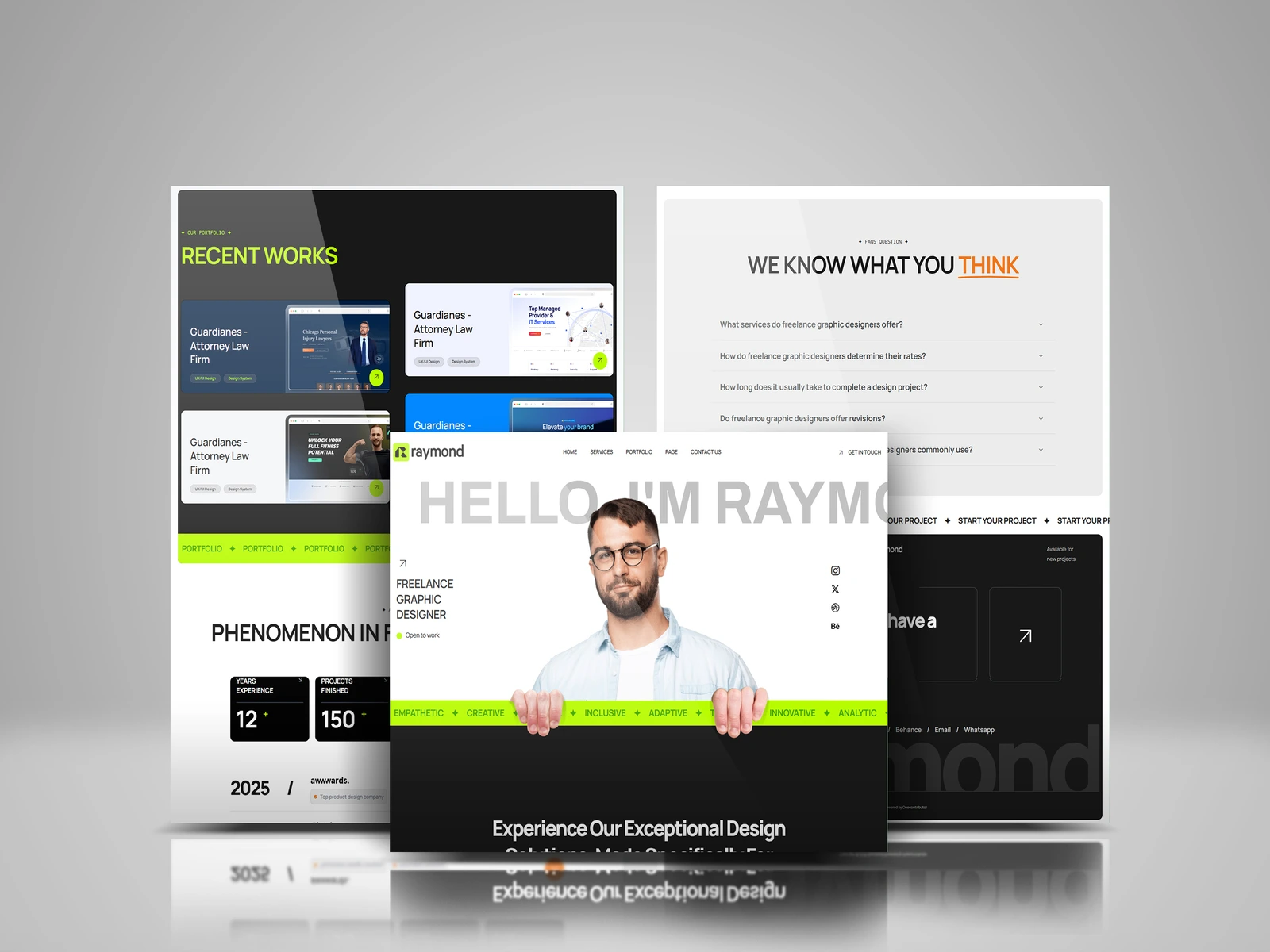
The homepage opens with a bold introduction — "HELLO, I'M RAYMOND" — paired with a large portrait that gives the website an immediate human connection.
From there, the experience moves into the designer's services, selected work, experience and supporting information.
The layout uses oversized typography and large sections to create a sense of scale, while smaller details such as the moving-style text strips, social links and accent elements add personality throughout the experience.
Raymond design detail
Visual Direction
The design uses a black-and-white foundation with a vibrant lime accent. This creates a strong contrast that allows important elements such as buttons, labels and project details to stand out.
I intentionally kept the visual system relatively simple so that the portfolio itself remained the main focus.
The combination of:
Bold typography + high contrast + editorial layouts + vibrant accents
gives the website a creative-agency feel while still working as a personal portfolio.
Portfolio & Case Study Experience
The Recent Works section was designed to make the projects feel like featured pieces rather than a basic image grid.
Each project gets enough space to communicate what it is, while the surrounding layout creates a visual rhythm that keeps the page interesting.
The portfolio can also be extended into individual project case studies, allowing visitors to explore the designer's process, decisions and final results in more depth.

Raymond full page
FAQ & Supporting Content
To make the website useful beyond the visual portfolio, I included sections such as FAQs and project information.
The FAQ section answers common questions potential clients may have about services, pricing, timelines and revisions. This helps reduce uncertainty before someone decides to make contact.
The website also highlights experience and completed projects through large numerical statistics, giving visitors a quick understanding of the designer's background and level of experience.
Process & Build
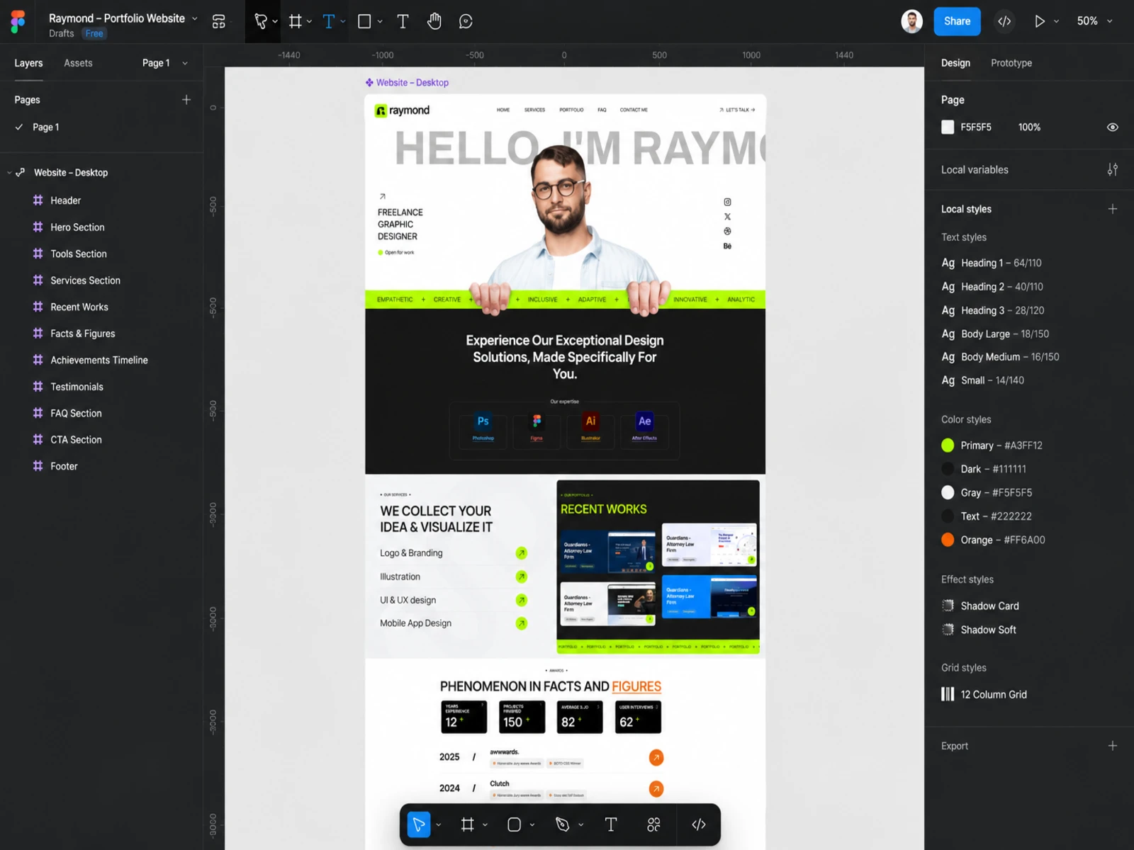
I worked through the project in two stages: wireframe in Figma, design and build in Framer.
Wireframes in Figma. I mapped the portfolio structure first: intro, services, recent works, selected experience and contact. Because the site's job was to make the designer memorable, the wireframes focused on rhythm and pacing as much as content, so each section gave the work room to breathe.
Design in Figma. With the structure set, I developed the visual identity: black-and-white foundation, vibrant lime accent, oversized editorial typography and high-contrast layouts. Responsive behaviour was part of the design from the start so the bold type held up on smaller screens.
Build in Framer. I translated the design into a Framer build with breakpoints and motion details, keeping the interactions purposeful so the personality came through without slowing the portfolio down.
The Result
The final website feels less like a traditional portfolio and more like a digital identity for the designer.
It combines personality, project presentation and useful information into one cohesive experience. Every major section has a purpose — from the introduction and work showcase to the FAQs and contact-focused areas.
The result is a portfolio that doesn't just say "I'm a graphic designer." It visually demonstrates the creativity, confidence and attention to detail that a potential client can expect from working with Raymond.
Raymond portfolio design
Like this project
Posted Aug 31, 2026
Portfolio website for freelance graphic designer Raymond, designed in Figma and built in Framer. Bold typography, high-contrast layouts, and a visual identity that shows the work itself.
Likes
2
Views
7