
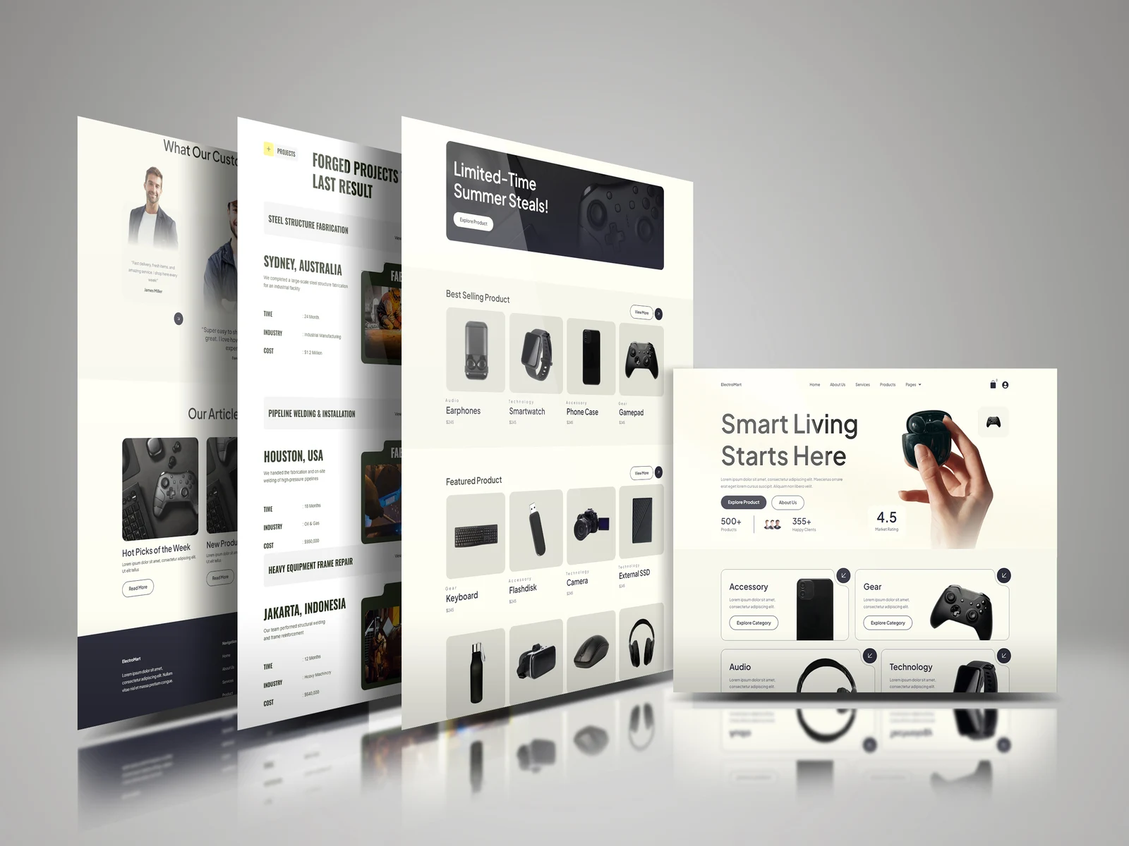
Smart Living — E-commerce Website Design Case Study
Project Overview
Smart Living is a modern e-commerce website concept designed for a technology and accessories brand. The goal of the project was to create a clean, premium shopping experience that makes it easy for customers to explore products while giving the brand a strong and polished visual identity.
The website focuses on products such as earphones, smartwatches, gaming accessories, cameras, storage devices and other everyday tech essentials. Rather than creating a typical crowded online store, I wanted the experience to feel more curated, modern and visually engaging.
The Challenge
Most e-commerce websites try to display too much information at once. This can make the shopping experience feel overwhelming, especially when there are multiple product categories and a large number of products.
For this project, the challenge was to create a website that could:
Present a wide range of products without making the interface feel crowded.
Make navigation between categories simple and intuitive.
Give featured and bestselling products more visual attention.
Create a premium technology-focused look while maintaining usability.
Keep the design clean and adaptable across different pages and screen sizes.
The main goal was to balance visual storytelling and functionality.
My Approach
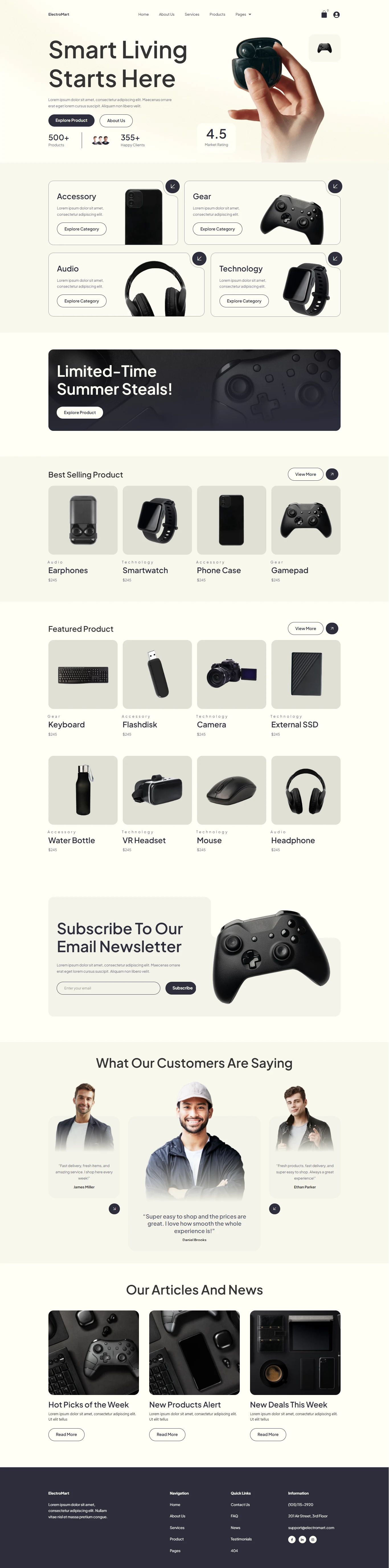
I started by focusing on a structured and minimal layout. The homepage was designed to immediately introduce the brand through a large hero section featuring a clear message: “Smart Living Starts Here.”
From there, I organised the shopping experience into clear sections, including:
Best-selling products
Featured products
Product categories
Customer statistics and social proof
Individual product visuals and calls to action
The idea was to guide visitors naturally through the website instead of presenting everything to them at once.
Design Direction
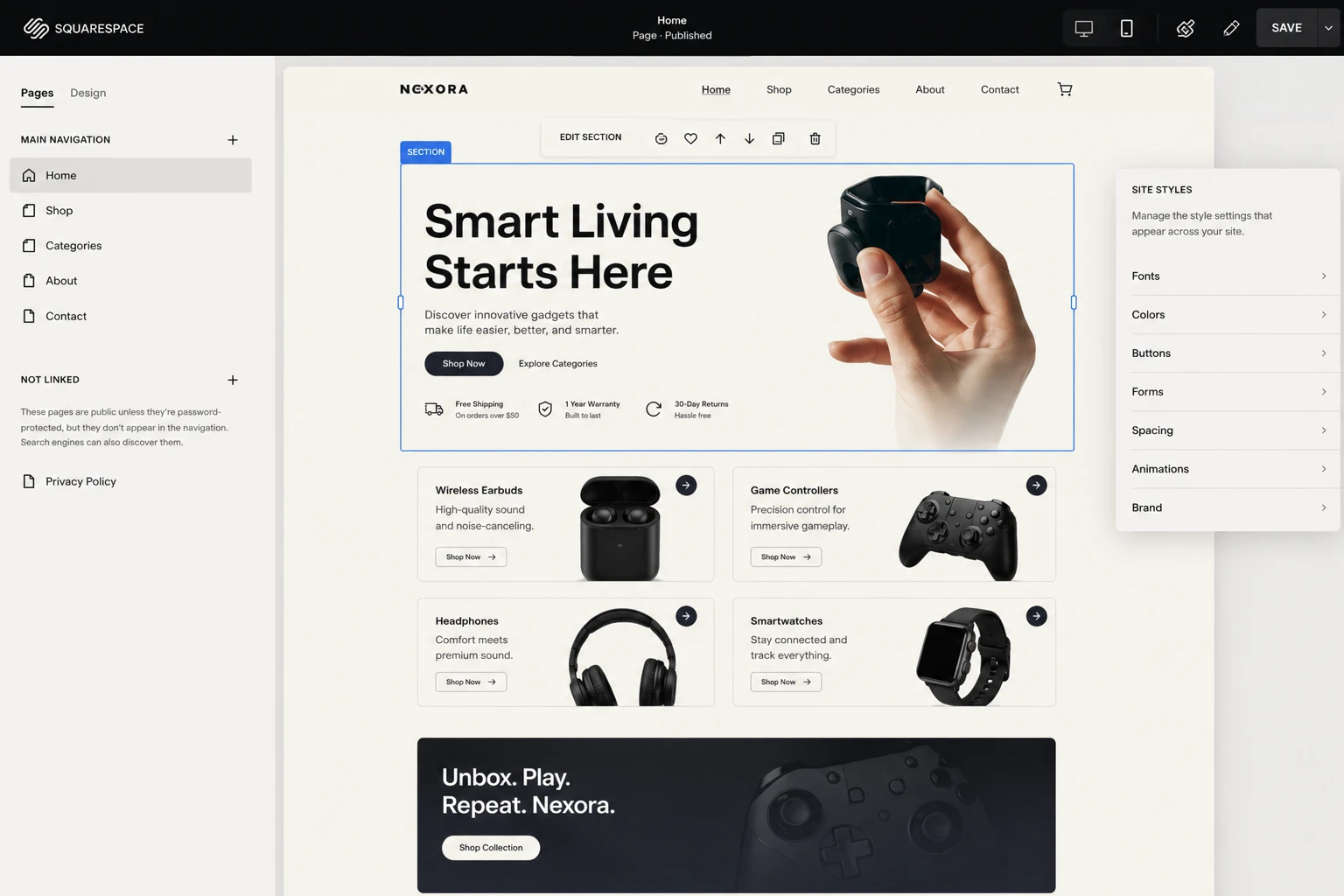
The visual direction combines a minimal e-commerce interface with a premium technology aesthetic. I used plenty of whitespace, soft neutral backgrounds, subtle borders and product-focused imagery to keep attention on what matters most.
Product cards were designed to feel clean and consistent, while the use of larger imagery helps individual products stand out. The interface also uses rounded elements and subtle visual hierarchy to make the website feel approachable rather than overly corporate or technical.
The overall experience was designed to communicate three things:
Modern. Simple. Premium.
Key Features
Product Discovery
Products are organised into clearly defined sections, making it easier for users to discover different items without immediately needing to search through a large catalogue.
Category-Based Navigation
Dedicated categories such as accessories, gear, audio and technology help customers quickly move towards the products they are interested in.
Featured and Bestselling Sections
Important products receive stronger visual placement, helping the brand highlight popular or promoted items.
Strong Visual Hierarchy
Typography, spacing and card layouts were carefully structured to guide the user's attention from the main message to products and calls to action.
Scalable Design System
The design direction was created with consistency in mind, allowing the same visual system to be extended across product pages, category pages, project pages and other areas of the website.
The Result
The final result is a modern e-commerce experience that feels visually polished without sacrificing simplicity. Instead of relying on excessive animations or complicated layouts, the design uses strong imagery, clear structure and thoughtful spacing to create a smooth browsing experience.
The project demonstrates how a technology e-commerce brand can present a large product catalogue while still maintaining a clean and premium identity.
Smart Living was designed around one simple idea: make discovering technology feel as good as using it.
2 likes · 6 views · Aug 28, 2026
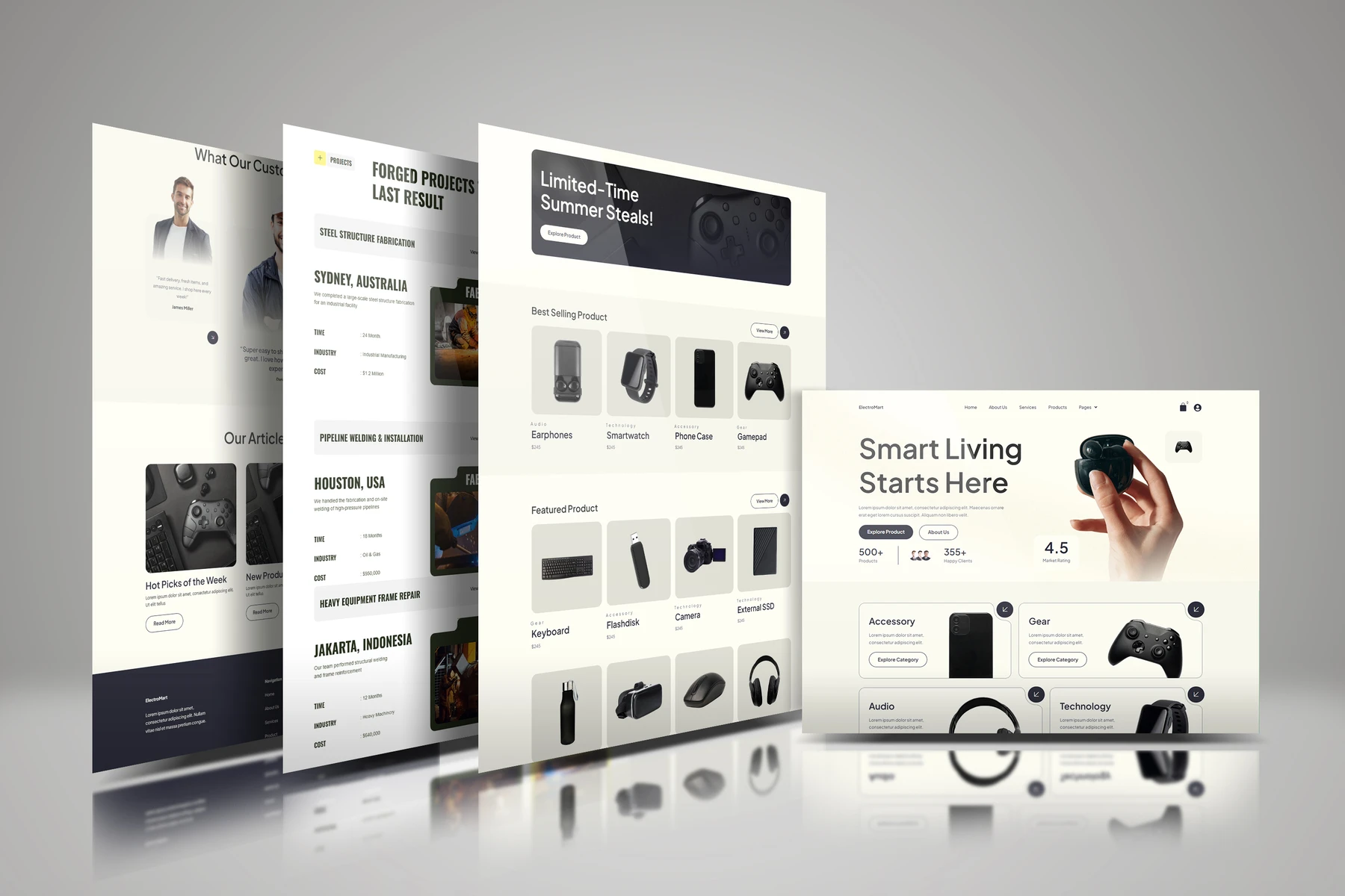
Designed a clean, modern e-commerce website for Smart Living tech brand.


