Conversion Focused HTML Email Designs for Ecommerce

Peter Garrett
eCommerce Marketer
Email Marketer
Email Marketing Designer
Figma
HTML5
Klaviyo

light mode
In the competitive landscape of ecommerce, effective email marketing can be a game-changer. My email marketing design services are tailored specifically to enhance conversion rates and drive sales. Here’s why partnering with me will give your business the edge it needs:
1. Conversion-Focused Designs
Each email I create is meticulously crafted with a clear purpose, ensuring that your message is not only delivered but also resonates with your audience. Here’s how I achieve this:
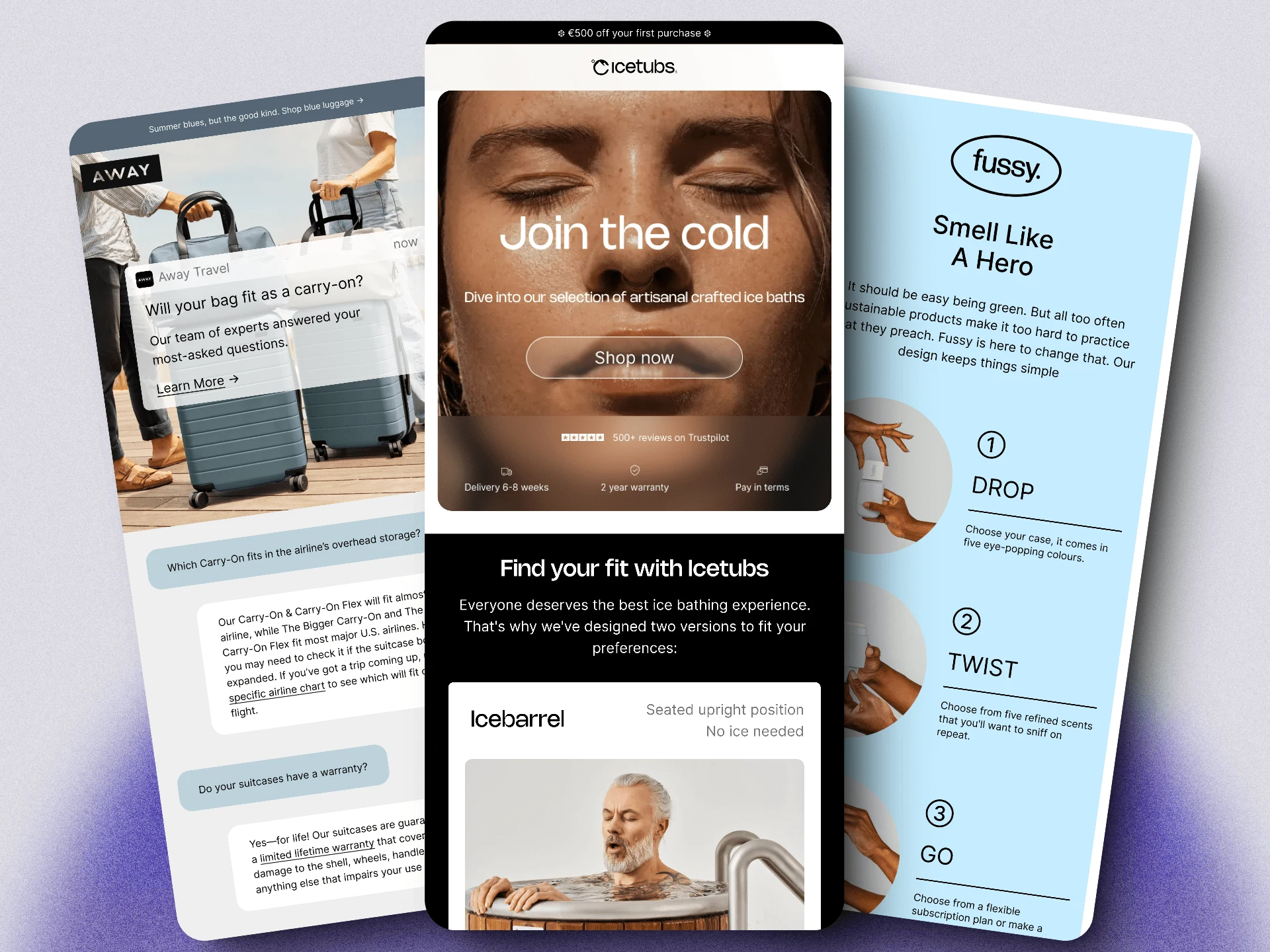
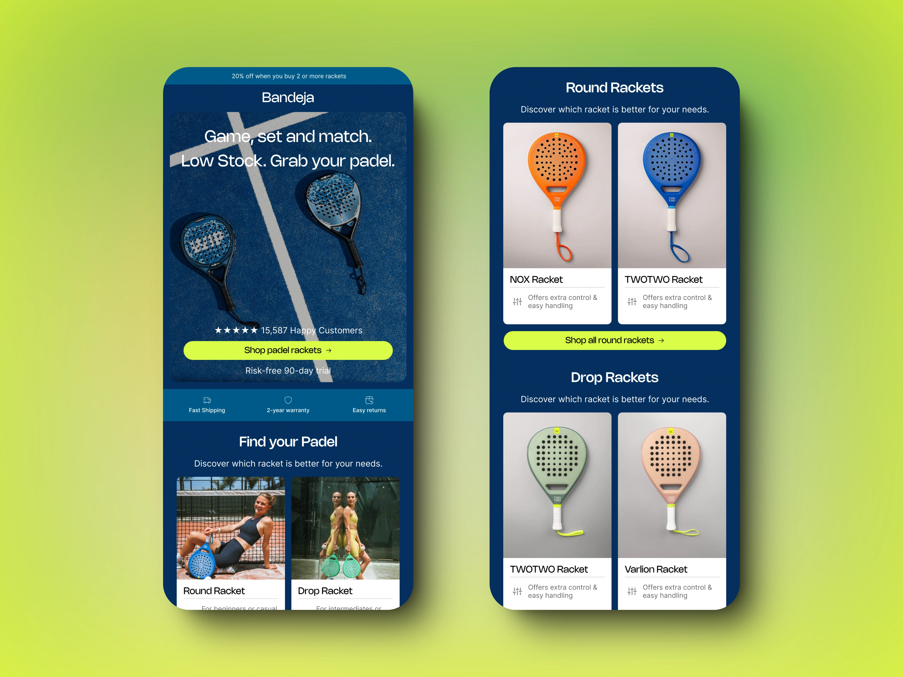
Prominently Placed CTAs Above the Fold: I strategically position Call-to-Action (CTA) buttons where they are immediately visible, making it easy for recipients to take the desired action without scrolling. This placement increases the likelihood of clicks and conversions.
Clear and Compelling Messaging: Every email has a focused message, whether it’s handling objections, guiding customers to the right product, or explaining how to use a product. This clarity helps reduce decision fatigue and drives action.
2. Clean, Clear, and Responsive Designs
In today’s multi-device world, your emails need to look great everywhere. My designs are:
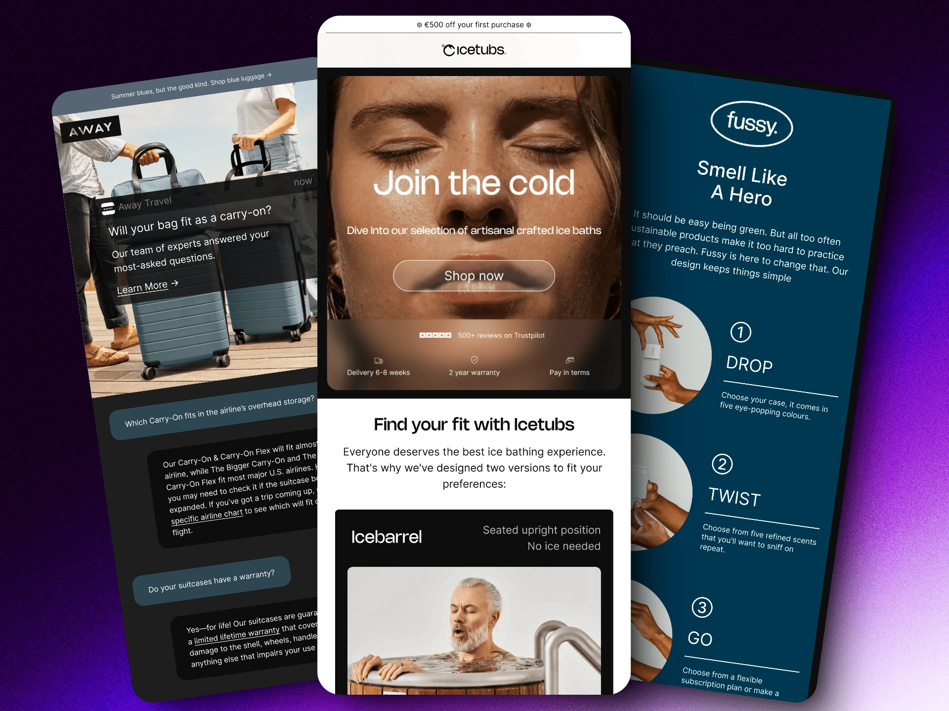
HTML-Based: Unlike many marketers who cut corners with image-only emails, I use HTML to create emails that are visually appealing, accessible, and functional across all devices and email clients. This approach ensures that your emails are adaptable to both light and dark modes, providing a seamless experience for all users.
Responsive Design: I ensure that every email is fully responsive, meaning they look and function perfectly on desktops, tablets, and mobile devices. This adaptability is crucial for reaching your audience wherever they are.

dark mode
3. Enhanced Deliverability
Emails designed with HTML tend to have better deliverability rates. Here’s why:
Less Likely to be Marked as Spam: Image-only emails often trigger spam filters, reducing the chances of your emails reaching the inbox. My HTML designs include a good balance of text and images, making them less likely to be flagged as spam and more likely to be opened and read.
4. Building Trust and Credibility
Trust is a crucial factor in online shopping. My designs incorporate elements that build and reinforce trust:
Trust Signals: I include customer reviews, testimonials, and trust badges next to CTAs. These trust signals reassure recipients about the quality and reliability of your products, encouraging them to make a purchase.
Consistent Branding: Consistency in design helps in building brand recognition and trust. I ensure that all emails align with your brand’s visual identity, creating a cohesive and professional look.

Conclusion
Choosing my email marketing design services means opting for a strategic, data-driven approach that prioritises conversions, user experience, and deliverability. With clean, responsive designs that incorporate trust-building elements and clear CTAs, your ecommerce business can expect higher engagement and increased sales.
*Please note, these emails are a personal project created to demonstrate my skills in email design. I am not affiliated with Away Travel, Icetubs or Fussy. These are intended for personal use only.


