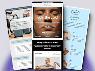
Email Templates Redesigned for Engagement

Peter Garrett
Email Marketer
Email Marketing Designer
Email Development
Figma
HTML5
MailChimp
Tourism Northern Ireland
Project Overview
I overhauled the email design templates for Tourism Northern Ireland, enhancing their weekly newsletters, event and exhibition invitations, marketing campaigns, funding opportunities, and surveys. The goal was to optimise these emails for engagement and conversion, improve mobile compatibility, enhance accessibility, and ensure consistency across all communications.
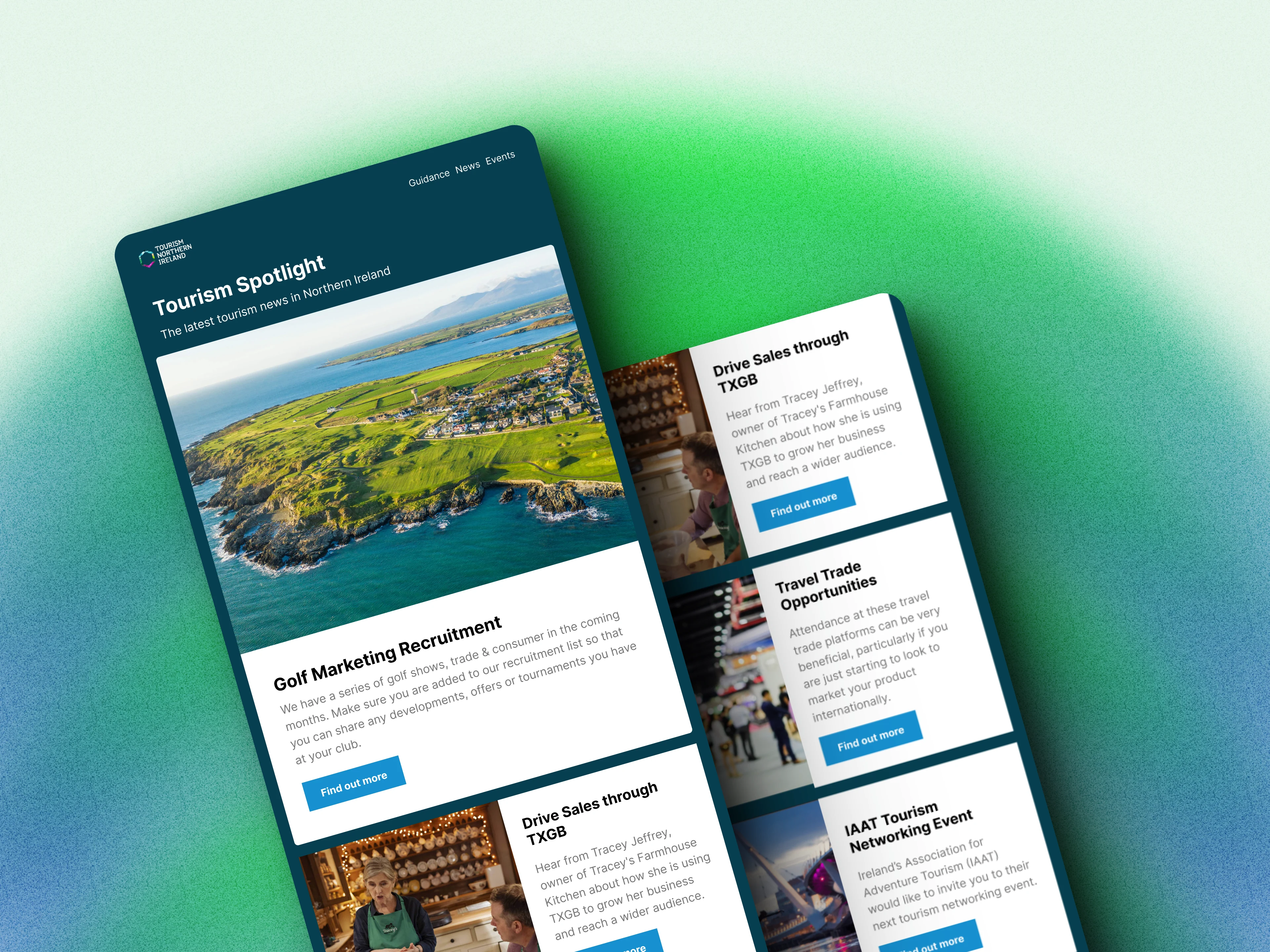
Newsletter Redesign
The existing designs had a number of issues:
Weak Call to Actions: Existing emails used ineffective hyperlinks like "click here," which did not drive engagement effectively.
Non-Responsive Design: Emails displayed broken layouts on smaller screens, with distorted images and text, leading to a poor mobile user experience. Designs were also not optimised for dark mode.
Deliverability Issues: Large image file sizes caused emails to be marked as spam or clipped, reducing their effectiveness.
Inconsistent Designs: Different teams created emails from scratch, leading to inconsistent designs and deviations from branding guidelines. The existing email designs did not align with the new website’s branding, resulting in an outdated look.
Email design improvements

Optimised Layout:
Structured emails using the F-pattern design to establish a visual hierarchy, focusing readers on specific elements in the campaigns.
This helped direct attention to key areas, improving overall readability and engagement.
Enhanced Call to Action:
Introduced clear, prominent call-to-action buttons to boost clicks and engagement.
Hyperlinked images to capture interest and prompt immediate action.
Placed buttons at the top and bottom to maximise conversions and make the desired action clear and easy to execute.
Summarised key event details prominently at the top of the email with a clear call-to-action to increase visibility and the number of signups.
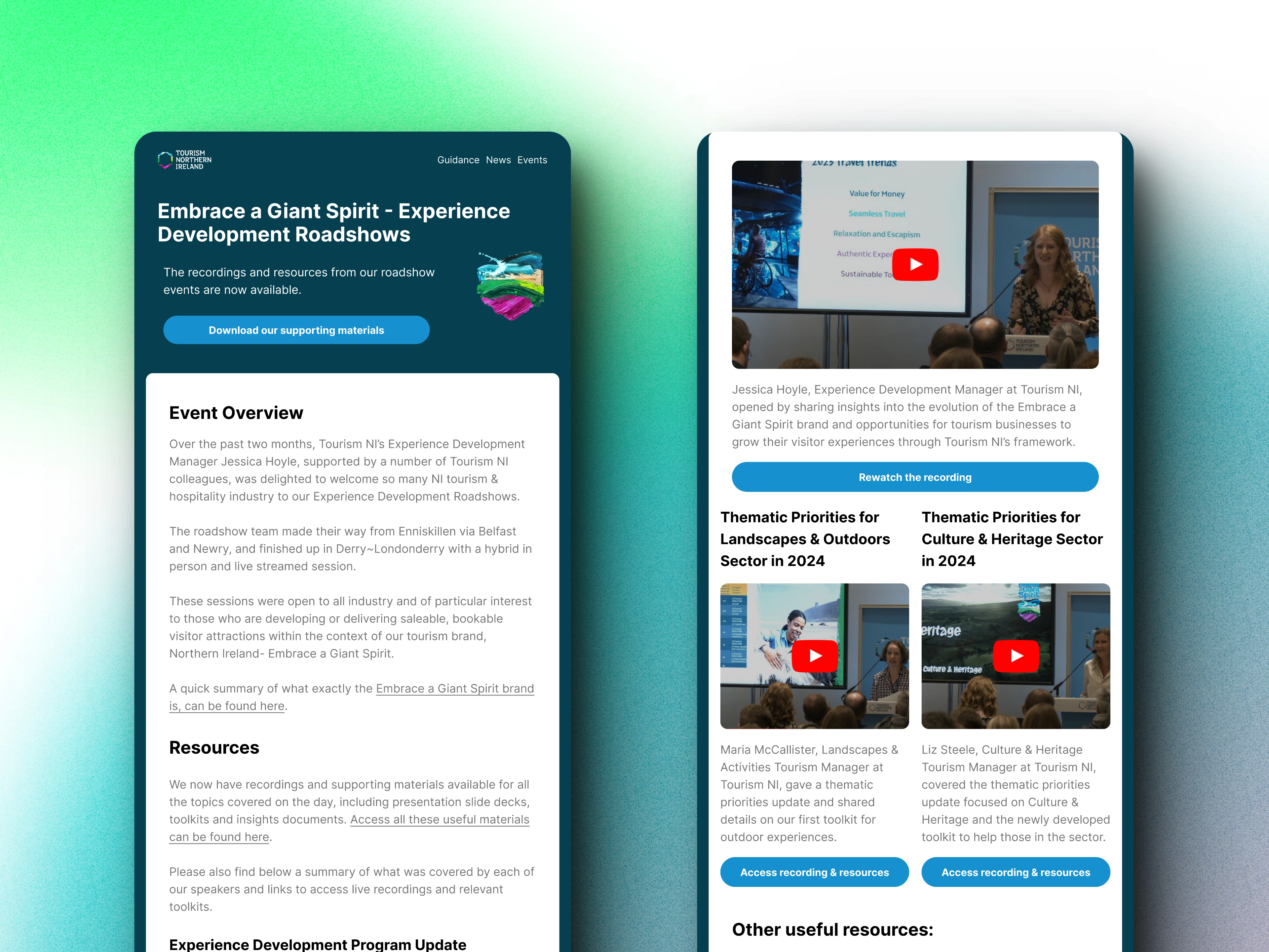
Mobile-Friendly Design:
Redesigned templates to ensure images and text were responsive and legible on all devices.
Conducted extensive testing to ensure compatibility across various email clients and devices, guaranteeing a consistent user experience.
Improved Accessibility:
Optimised emails for dark mode and added alt tags to all images to meet accessibility standards.
Ensured font sizes and contrast ratios were considered to make emails accessible to all users, including those with disabilities.
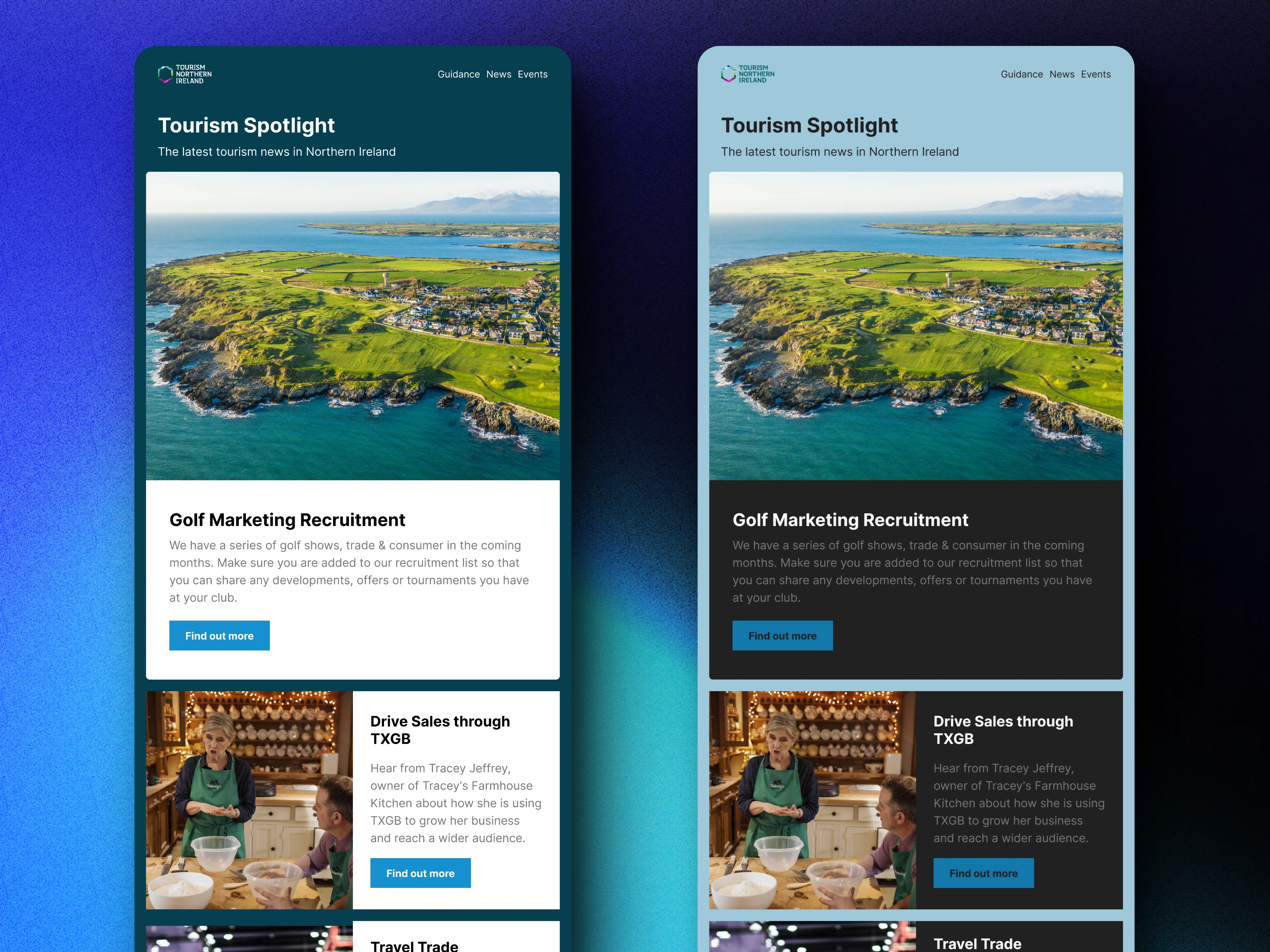
light mode (left) & dark mode (right)
Optimised Image Management:
Reduced image file sizes to improve deliverability and prevent emails from being marked as spam.
Used image formats and compression techniques to maintain visual quality while reducing load times.
Consistent Brand Templates:
Developed standardised email templates for all use cases across teams and departments, ensuring design and branding consistency.
Streamlined the email creation process, resulting in clean, professional designs that adhered to branding guidelines.
Each template was rigorously tested for error-free designs, saving time and maintaining brand integrity.
Results
The new email templates delivered several key benefits:
Increased Engagement: Clear call-to-action buttons and optimised design led to higher click-through rates, fewer unsubscribes
Enhanced Mobile Experience: Responsive design ensured emails were legible and visually appealing on all devices.
Improved Accessibility: Dark mode compatibility and alt tags made emails accessible to a broader audience.
Better Deliverability: Smaller image sizes reduced spam incidents and email clipping.
Consistent Branding: Standardised templates ensured a cohesive brand image and saved time for the marketing team.
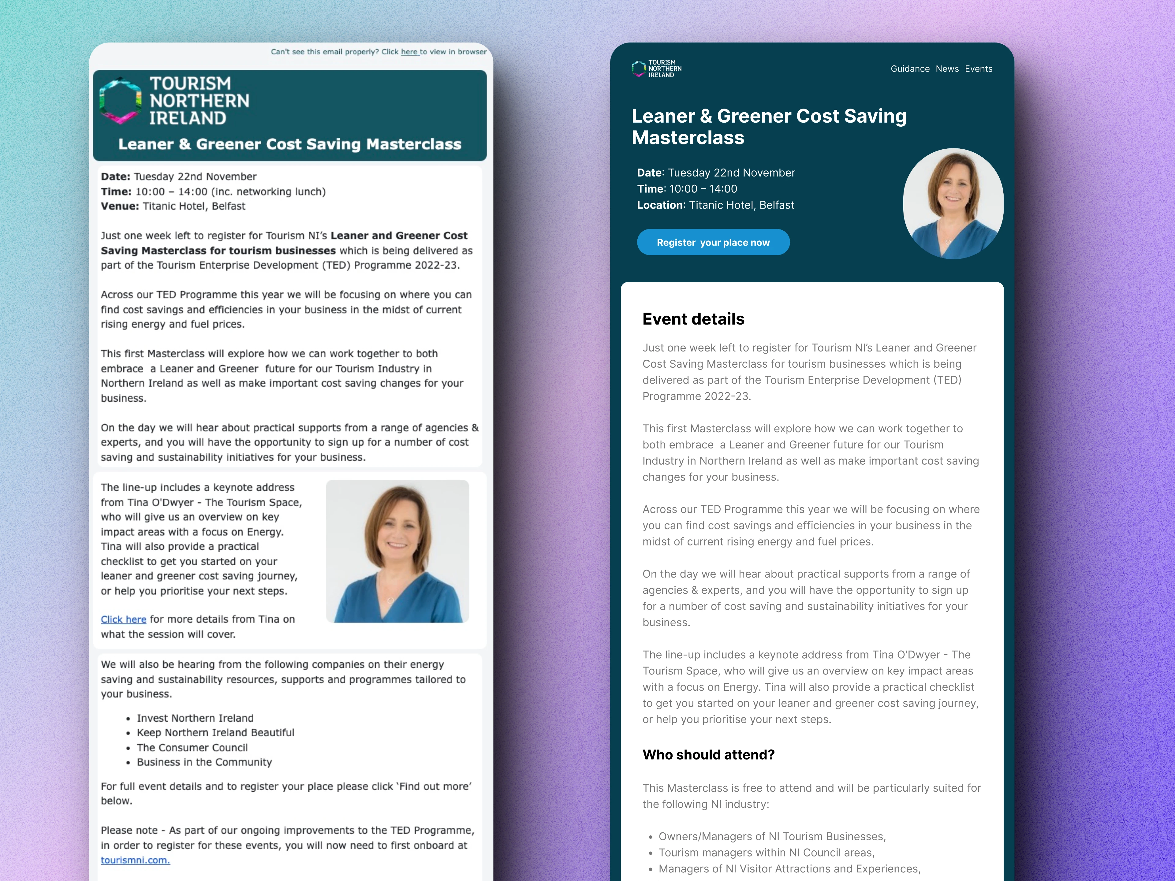
Before → After Example


