Webflow Website & UI Design for Mentorvist (Figma + Dev)
Sachin Kumar
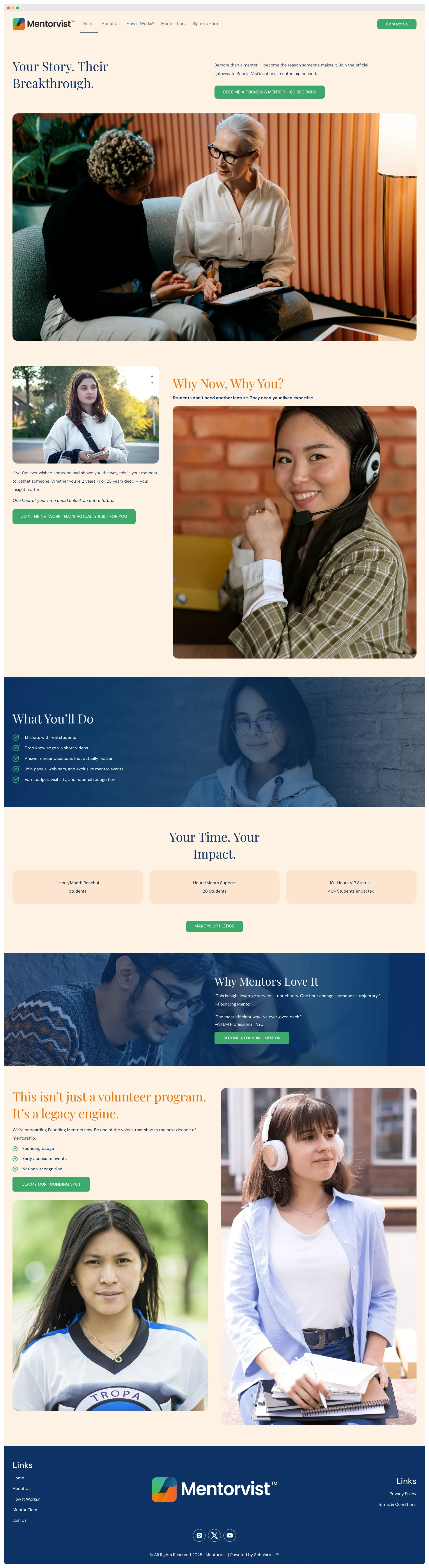
Hero Section
Designed a clean and modern hero section with clear messaging, brand-aligned colors, and a strong CTA. The layout directs the user’s attention toward the value proposition and encourages immediate action.
About Us
Kept it concise and readable with proper spacing, soft background, and a professional tone. The goal was to introduce Mentorvist’s mission in a simple and trustworthy manner.
How It Works
Built this section in a 3-step layout with icons and short texts for quick understanding. Each step flows visually left to right, making it easy for users to grasp the process at a glance.
Mentor Tiers
Created a clean card layout with consistent structure and hover effects. Each tier is clearly defined to help users differentiate and choose based on their goals.
Join Us Section
Used bold visuals and a focused message to encourage mentors to sign up. The section stands out with color contrast and a simple CTA button to drive conversions.
Footer
Structured with quick links on both sides, centered logo, and clean social icons. It’s functional, minimal, and ensures a smooth end to the page flow.
Responsive Layout
The entire site was designed mobile-first. All sections adjust smoothly across screen sizes, with optimized spacing, touch-friendly CTAs, and clean readability on smaller devices.
Like this project
Posted Jun 13, 2025
Planned in Figma and built in Webflow—fully responsive, CMS-integrated website for Mentorvist with clean UI, smooth UX, and fast performance.
Likes
0
Views
0
Timeline
Apr 13, 2025 - Apr 30, 2025