Packaging Design That Sells Itself
Packaging Audit
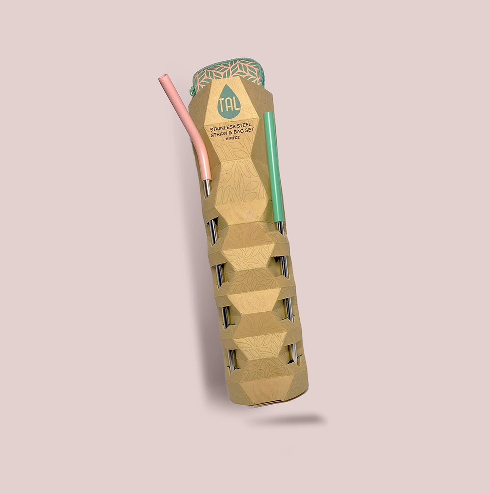
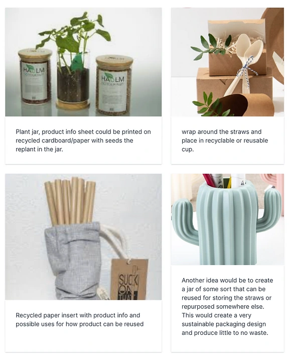
After choosing 4 products to do a packaging audit on, I chose to focus my sustainability repackaging project on Tal hydration reusable straws. While doing this, I reviewed how the product was packaged, what the package looked like, the experience while opening the packaging. From there, I discovered the problems with Tal hydrations packaging design. The main problem that I encountered with the packaging design related to sustainability. Although the packaging was pretty small and easy to open; the purpose of the brand, what they stand for, along with the purpose of the product was based on reducing waste and reducing plastic waste-creating an eco-friendly product. However, the packaging of the product itself was contradicting to this. Immediately I recognized that the straws were wrapped in plastic, using a shiny ink on the cardboard that could have complications with recycling. Next I encountered the bag for the straws being stuffed with more plastic waste. After auditing the product, I gathered some inspiration, and brainstormed the potential the product had for creating a more sustainable package.
Creative Brief
MoodBoard
Sketches
My sketches represent a couple of different directions I could take the project and an idea of how I could create more interesting packaging for Tal Hydration. The sketches allowed me to consider how the product could be showcased with each packaging design. This is where I chose my direction for which packaging I would choose and how I would weed the straws through the package.
Form Storming
For the form storming project, I abstracted, removed, scaled, and simplified certain pieces of the product.
This gave me different assets to use throughout my packaging redesign.
Packaging Forms
Once I got a general idea of the packaging style I was going to go with I created a few different designs and mockup sizes. Doing this allowed me to further explore the direction that would work the best for my final product package. By going with the more unique style I felt that this would draw the attention of the consumer, leading them towards an all around more sustainable and reusable straw option. From here, I realized that one size hexagon all around would not work to weed the straws through the packaging while still showcasing the Tal logo and product information.
In the bottom left model, I combined two of my previous mockups in order to create something that would suite the product needs. With this packaging form I was able to weed the straws through the packaging and have plenty of room for the logo and product information. Using the thicker paper on this one allowed me to get a better idea of what the actual product would look like and if there were any changes that would need to be made. The size of this was a bit large for the product, since I am focusing on minimal waste and sustainability that was something that I needed to work on.
View more of my process for this project here...
Like this project
Posted Nov 3, 2024
led a product packaging design project, creating visually striking and functional packaging that aligned with brand identity and enhanced shelf appeal.
