Pizza Sales Analysis Dashboard
Sharon Selvaraj
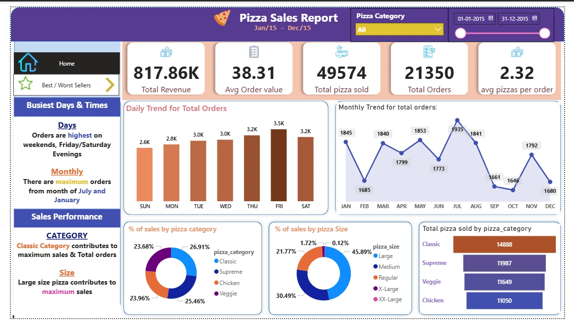
🍕 Pizza Sales Analysis Dashboard – Power BI
This Power BI dashboard offers an insightful overview of pizza sales performance across categories, sizes, timeframes, and product types. Using SQL-based KPIs and visualizations, this project transforms raw sales data into actionable business intelligence for stakeholders in the food and beverage industry.
📌 Objective
To build a visually interactive dashboard that helps pizza business stakeholders:
Monitor revenue and order trends
Understand customer preferences for pizza types and sizes
Identify best and worst-performing pizzas
Drive decisions based on daily, monthly, and hourly patterns
🧾 Dataset Overview
The dataset used for analysis includes order-level sales data with the following columns:
Column Name Description order_id Unique identifier for each order order_date Date of the order order_time Time the order was placed pizza_name Name of the pizza pizza_category Category (e.g., Classic, Veggie, Chicken) pizza_size Size (e.g., S, M, L, XL) quantity Number of units ordered total_price Total price for that order item
📈 Key Metrics (KPIs)
Total Revenue:
SUM(total_price)Average Order Value:
SUM(total_price) / COUNT(DISTINCT order_id)Total Pizzas Sold:
SUM(quantity)Total Orders:
COUNT(DISTINCT order_id)Average Pizzas Per Order:
SUM(quantity) / COUNT(DISTINCT order_id)📊 Visualizations
📅 Daily Trend of Total Orders
Chart Type: Bar Chart
Insight: Identifies fluctuations in order volumes by date to find peak and low-demand days.
🕐 Hourly Trend of Total Orders
Chart Type: Line Chart
Insight: Tracks order activity by hour to pinpoint peak ordering times.
🍕 % of Sales by Pizza Category
Chart Type: Pie Chart
Insight: Highlights revenue contribution by categories like Classic, Veggie, Chicken.
🍽️ % of Sales by Pizza Size
Chart Type: Pie Chart
Insight: Visualizes sales performance by pizza sizes (S, M, L, XL, etc.).
📦 Total Pizza Sold by Category
Chart Type: Funnel Chart
Insight: Shows volume of pizzas sold per category for comparison.
🏆 Top 5 Best-Selling Pizzas
Chart Type: Bar Chart
Metrics: Based on revenue, quantity sold, and total orders.
Insight: Identifies most popular pizzas to aid menu strategy.
⚠️ Bottom 5 Worst-Selling Pizzas
Chart Type: Bar Chart
Metrics: Based on revenue, quantity sold, and total orders.
Insight: Flags underperforming items for potential improvement or removal.
🧠 Power BI Techniques Used
Power Query Editor
Data loaded from SQL Server (
SHARON-1997\SQLEXPRESS)Cleaned and transformed columns
Extracted date and time components
Filtered by month/quarter as needed for trend analysis
Data Modeling
Created date and time-based measures
Defined KPIs using DAX measures
DAX Formulas
Used for calculating average values, totals, and percentages
Used to support dynamic filtering and visuals
💼 Business Impact
This dashboard empowers restaurant owners and managers to:
Recognize peak business hours and prepare accordingly
Stock ingredients based on popular categories and sizes
Promote best-sellers and optimize poorly performing items
Make data-driven decisions to maximize profitability
🛠️ Tools & Tech Stack
SQL Server for backend query execution
Power BI Desktop for dashboard creation
DAX for measures and KPIs
Power Query for data transformation
📷 Dashboard Preview
🙋♀️ About Me
I’m a data enthusiast with a passion for transforming raw datasets into meaningful visual stories. With a focus on business intelligence, I help organizations uncover insights and make smarter decisions.
💼 Role: Aspiring Data/Business Analyst
🌐 LinkedIn
📞 +91 8015697940
Like this project
Posted Jun 3, 2025
Created a Power BI dashboard for pizza sales analysis in the food and beverage industry.
Likes
0
Views
1
Timeline
May 1, 2025 - May 10, 2025