Redesigning 9Cabs Group Ride Feature for Drivers

Sai Kaligotla


Press enter or click to view image in full size
Designing a High-Trust Group Ride Experience for Drivers
Follow
8 min read
·
Jan 10, 2026
Share
A real-world UX case study for 9Cabs at GoCodeDesigns.
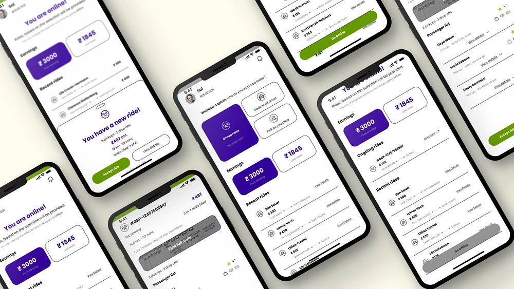
While working at GoCodeDesigns, I redesigned the driver experience for 9Cabs’ group ride feature, an exclusive offering that allows multiple passengers with different pickup and drop-off locations to share a single ride.
The challenge was not missing data.
It was poor decision clarity.
This case study shows how research, UX principles, and information architecture were used to reduce driver confusion, increase trust, and improve ride acceptance for a complex, real-world system.
Project context
9Cabs offers an exclusive group ride option where drivers can accept a single ride containing multiple passengers, each with:
Different pickup points
Different drop-off points
Different fares
Different assistance or luggage needs
From a business lens, this improves:
Vehicle utilization
Revenue per trip
Ride completion efficiency
From a driver’s lens, this introduces:
Higher cognitive load
Higher risk
Higher chance of surprises
This mismatch is where the UX problem lived.
My role
At GoCodeDesigns, I worked on this project as part of the product design team.
My responsibilities included:
Primary user research with drivers.
UX problem definition.
Information architecture.
Interaction design.
UI design for driver-facing screens.
Collaboration with PMs and developers.
Why this problem mattered
Drivers make accept or reject decisions under time pressure, often while driving or navigating traffic.
For single rides, ambiguity is manageable.
For group rides, ambiguity kills adoption.
If drivers do not understand a group ride in under 5–7 seconds, they reject it.
That single insight shaped the entire redesign.
Existing experience overview
Before redesign, the group ride experience had the following characteristics:
Ride type selection relied on icons only.
Micro-copy said “Welcome, select icon to start”.
Group rides were visually treated like normal rides.
Pickup and drop-off showed only one location.
Dense text with no visual hierarchy.
No clear confirmation of fare inclusion.
Passenger details lacked critical context.
Result
Drivers hesitated, misinterpreted, or rejected group rides entirely.
Press enter or click to view image in full size
Primary research
Research methods used
Driver interviews (in-person and remote)
Contextual inquiry during live ride acceptance
Internal discussions with ops and support teams
Review of support tickets related to cancellations
User interviews
Sample questions
What makes you reject a ride immediately?
What do you look at first when a ride comes in?
What worries you about group rides?
Have you accepted a ride and later regretted it? Why?
Key insights from interviews
Drivers scan, they do not read.
Price alone is not enough. Effort matters.
Hidden stops feel dishonest.
Payment uncertainty reduces trust.
Assistance needs discovered late cause frustration.
Affinity mapping outcomes
After clustering interview data, five dominant pain areas emerged:
Ride type confusion
Accidental online toggles
Route complexity uncertainty
Fare clarity and trust
Passenger-level surprises
These clusters directly became design problem statements.
Competitive analysis
Platforms analysed
Uber (shared rides)
Ola (pooled rides)
InDrive
Rapido
Findings
Most platforms optimize for passengers first
Drivers often discover complexity after acceptance
Group ride mental models are poorly represented
Insight:
No competitor clearly communicated group ride complexity at the decision point.
This was an opportunity.
Press enter or click to view image in full size
Persona
Press enter or click to view image in full size
Empathy mapping
Press enter or click to view image in full size
Key Design Challenges & Solutions (Annotated)
Each section below corresponds to a numbered annotation in the designs, showing how specific usability issues were identified and resolved.
1. Ride Type Selection Was Unclear and Guess-Based
Problem
The initial ride selection screen relied entirely on icons to represent different ride types. The supporting micro-copy simply stated “Welcome, select icon to start,” which failed to explain the difference between a regular ride and the group ride option. As a result, drivers were forced to rely on memory or assumptions, increasing hesitation and incorrect selections.
This was especially problematic for the group ride feature, which is conceptually more complex than a standard ride.
UX Principle Violated
Recognition over Recall
Design Solution
The ride selection screen was redesigned using a bento-style grid layout that combines icons with clear text labels. Each ride type is now explicitly named, making the group ride option self-explanatory without requiring prior knowledge.
Outcome
Drivers can immediately understand the available ride types, reducing confusion and improving discovery of the group ride feature.
Press enter or click to view image in full size
2. Online / Offline Toggle Caused Accidental State Changes
Problem
The initial design used a toggle switch placed in the top navigation bar to control online and offline status. This placement made it difficult to reach with one hand and led to accidental toggles, especially while driving or navigating the app quickly.
Get Sai Kaligotla’s stories in your inbox
Join Medium for free to get updates from this writer.
Subscribe
Subscribe
Remember me for faster sign in
Unintentional offline states directly impacted ride availability and driver earnings.
UX Principle Violated
Error Prevention and Accessibility
Design Solution
The toggle was replaced with a clear “Go Online” button, positioned at the bottom of the screen for easy thumb access. Once activated, the button changes to “Go Offline,” making the state change explicit and intentional.
Additionally, a persistent status indicator was introduced to confirm when the driver is online.
Outcome
Reduced accidental state changes, improved control, and increased confidence in system behaviour.
Press enter or click to view image in full size
3. Pickup and Drop-Off Information Did Not Reflect Group Ride Reality
Problem
The original interface displayed a single pickup and drop-off location at the top of the screen. This representation was misleading for group rides, where multiple passengers have different pickup and drop-off points.
Drivers often assumed hidden complexity or felt misled, increasing rejection rates.
UX Principle Violated
Match Between System and Real-World Mental Model
Design Solution
A full route overview was introduced, supported by a map preview that visually represents the entire journey. Below the map, the total number of pickups and drop-offs is clearly displayed, setting accurate expectations before acceptance.
Drivers can tap the map to view the complete route if needed.
Outcome
Improved transparency around route complexity and reduced perceived risk.
Press enter or click to view image in full size
4. Trip Details Lacked Visual Hierarchy
Problem
Key ride metrics such as price, distance, time, and seats filled were displayed with equal visual weight. This forced drivers to read rather than scan, slowing decision-making during time-sensitive moments.
UX Principle Violated
Visual Hierarchy
Design Solution
The trip summary section was redesigned to prioritize information based on decision importance. The estimated fare is visually dominant, followed by distance and time, with seats filled acting as a secondary effort indicator.
Typography, spacing, and colour were used intentionally to guide attention.
Outcome
Drivers can evaluate ride value within seconds, leading to faster accept or reject decisions.
Press enter or click to view image in full size
5. Fare Information Did Not Build Trust
Problem
Although an estimated fare was shown, there was no confirmation of what the price included. Drivers were unsure whether the fare was final, passenger-based, or subject to change, reducing trust in the system.
UX Principle Violated
Visibility of System Status
Design Solution
The revised design reinforces fare clarity by consistently surfacing pricing context alongside route and passenger information. Price is visually emphasized and supported by contextual cues that indicate it represents the full group ride estimate.
Outcome
Increased confidence in pricing and reduced hesitation caused by uncertainty.
Press enter or click to view image in full size
6. Passenger Details Were Incomplete and Hard to Scan
Problem
The original passenger drawer contained dense text with no visual hierarchy. It failed to surface critical information such as accessibility needs, luggage assistance, payment method, and the sequence of pickups and drop-offs.
This made it difficult for drivers to assess potential challenges while driving.
UX Principle Violated
Completeness of Information and Progressive Disclosure
Design Solution
The passenger list was redesigned using progressive disclosure:
Collapsed view: Displays pickup direction, passenger rating, and assistance needs highlighted with colour for immediate visibility.
Expanded view: Reveals detailed pickup and drop-off sequence, payment method, assistance needs, and individual passenger fares.
This allows drivers to scan essentials first and explore details only if needed.
Outcome
Reduced cognitive load, fewer surprises after acceptance, and improved decision confidence.
Press enter or click to view image in full size
Structural Shift: Decision-Based Information Architecture
Across all changes, the experience was reorganized around three driver decision questions:
Is this ride worth it?
How complex is the route?
Are there any red flags?
Each screen and component was designed to answer one of these questions as quickly as possible.
Press enter or click to view image in full size
Why This Worked
By pairing each problem directly with its solution, the redesign transformed a feature-heavy interface into a decision-support system. Instead of asking drivers to interpret complexity, the interface now explains the ride for them.
This clarity directly supports:
Faster ride acceptance
Lower cancellation rates
Higher trust in group rides
Better marketplace efficiency
Accessibility considerations
Assistance needs highlighted consistently.
Colour supported by text.
No critical information hidden.
Business impact
This redesign was implemented for 9Cabs and directly supported:
Faster ride acceptance
Reduced cancellations
Higher trust in group rides
Better utilization of shared rides
Lower support friction
Clear UX reduced marketplace friction.
Press enter or click to view image in full size
Key learnings
Drivers decide in seconds, not minutes
Clarity beats completeness
Transparency builds trust
UX is risk reduction
What I would explore next
Acceptance rate A/B testing.
Adaptive summaries based on driver behaviour.
Voice-based ride previews.
Final thoughts
This project was not about visual polish.
It was about designing decisions under pressure.
And that’s where UX proves its value.
Like this project
Posted Jun 15, 2026
Redesigned 9Cabs' driver UX for group ride feature, improving decision clarity and driver acceptance rates.