
The Project
Anabelle Perez Santana is a certified yoga instructor based in New York.
She came to me with an existing website, but it was very simple and did not fully show who she was, what she offered, or the experience behind her work.
She wanted a website that could introduce her professionally, tell her story, present her services and experience, and make it easier for people to reach out.
My goal was to turn her existing website into a clearer and more complete online home for her practice.
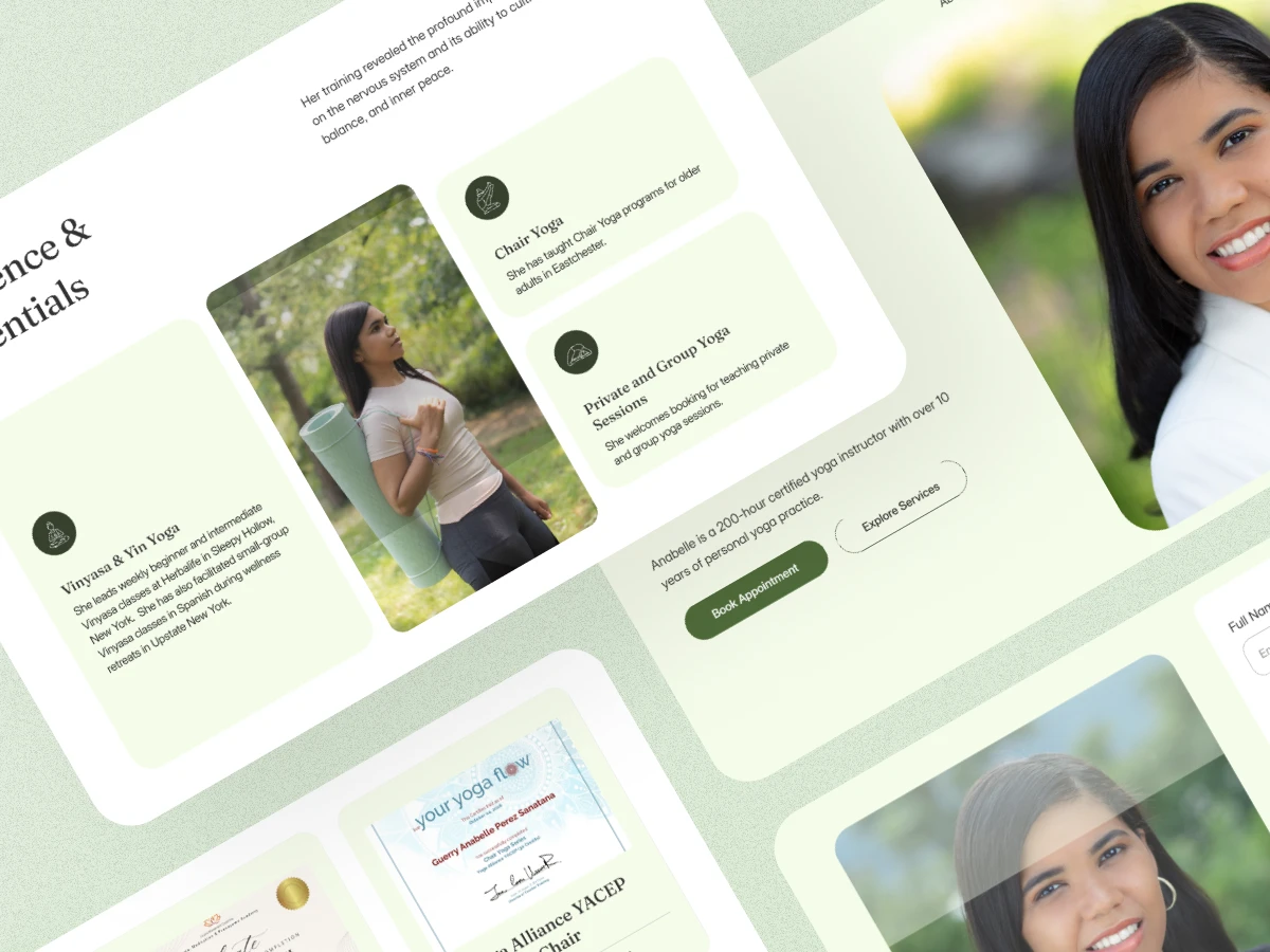
What Anabelle Was Looking For
When Anabelle approached me, she already had the experience and information she wanted to share.
What she needed was a better way to bring everything together.
She wanted the new website to introduce her professionally, share her personal journey, explain her services, highlight her experience and certifications, and give visitors a better understanding of the values behind her work.
She also needed a simple way for potential clients and collaborators to get in touch.
The website needed to feel calm, professional, personal, and welcoming.
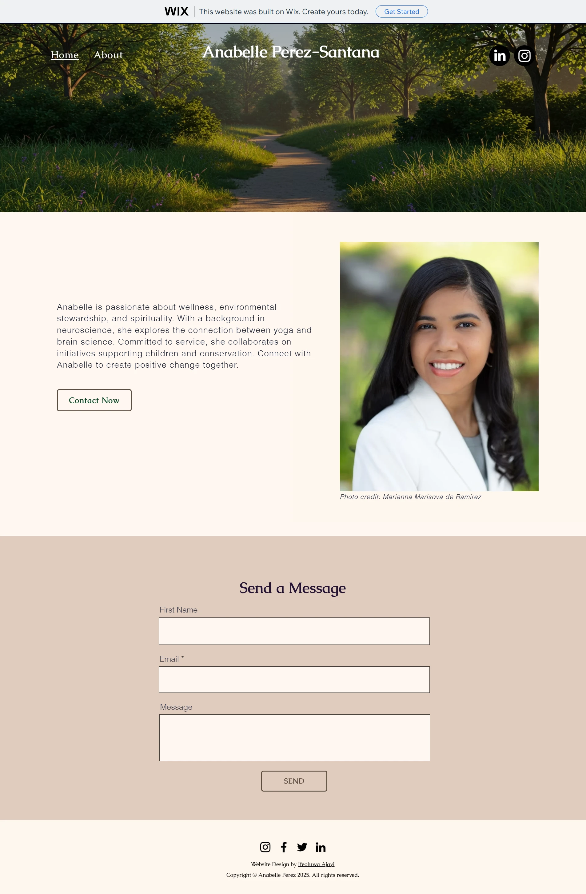
Before
Anabelle's previous website had a simple structure with a large hero image, a short introduction, a contact form, and social links.
It gave visitors a basic introduction, but there was limited space to explain her journey, experience, services, and qualifications.
I saw an opportunity to make the website do more than introduce her.
It needed to help visitors understand who she is, what she does, and how they can work with her.
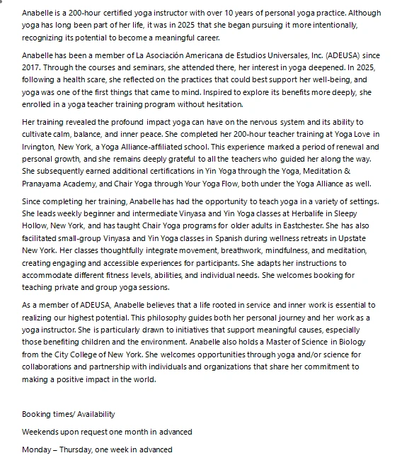
The Approach
I started by looking at the information Anabelle wanted to share and organising it around the questions a new visitor would naturally have:
Who is Anabelle?
What does she offer?
What experience does she have?
What is her approach?
How can I work with her?
This became the structure for the new website.
Instead of placing most of the information into one long introduction, I gave each important part of her story its own space.
The final page follows a simple journey:
Introduction → About → Experience & Offerings → Philosophy → Certifications → Contact
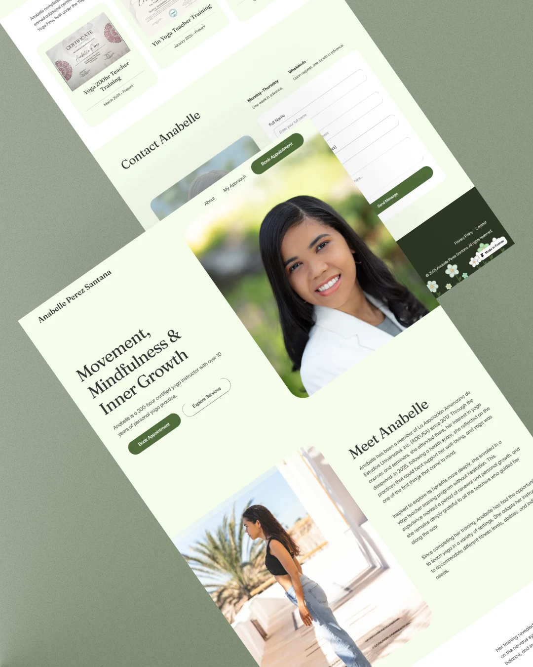
After
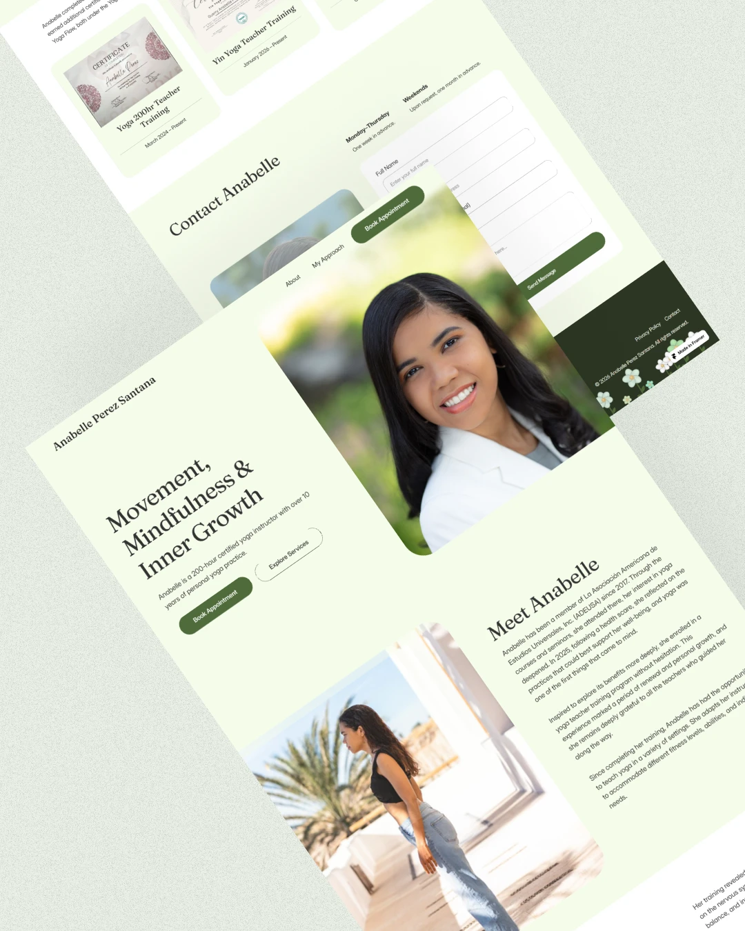
A website built around her work
The new website gives Anabelle a much clearer way to introduce herself and her work.
The design uses soft green tones, warm neutrals, rounded image shapes, and a mix of serif and sans-serif typography.
The overall feeling is calm and natural, while the structure keeps the information easy to follow.
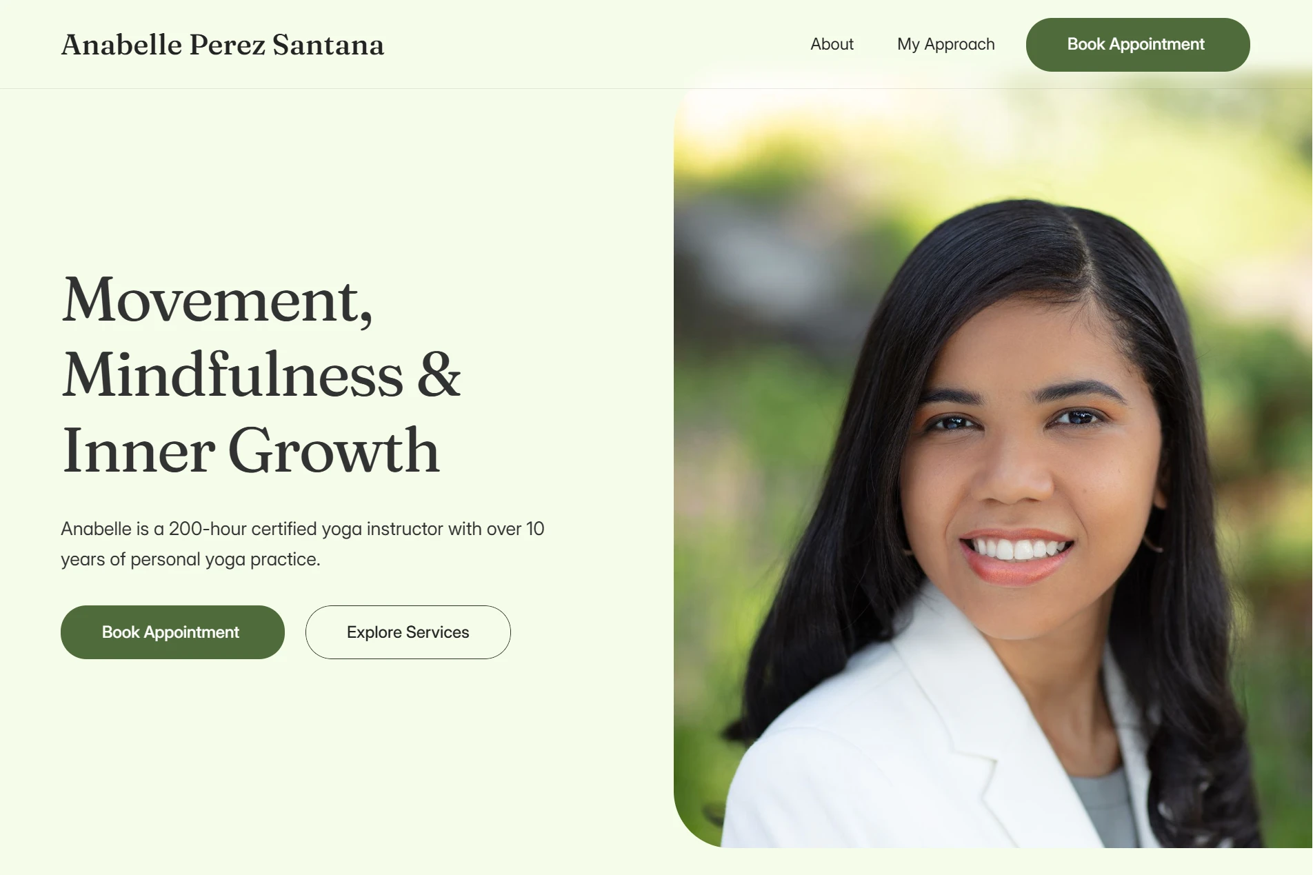
A Clearer First Impression
The first section needed to quickly tell visitors what Anabelle does.
Instead of opening with a large background image and a general introduction, I created a more focused hero section with:
"Movement, Mindfulness & Inner Growth"
The supporting text introduces Anabelle and her work, while the two buttons give visitors clear next steps.
From the first screen, visitors can either learn more about her work or move toward booking a session.
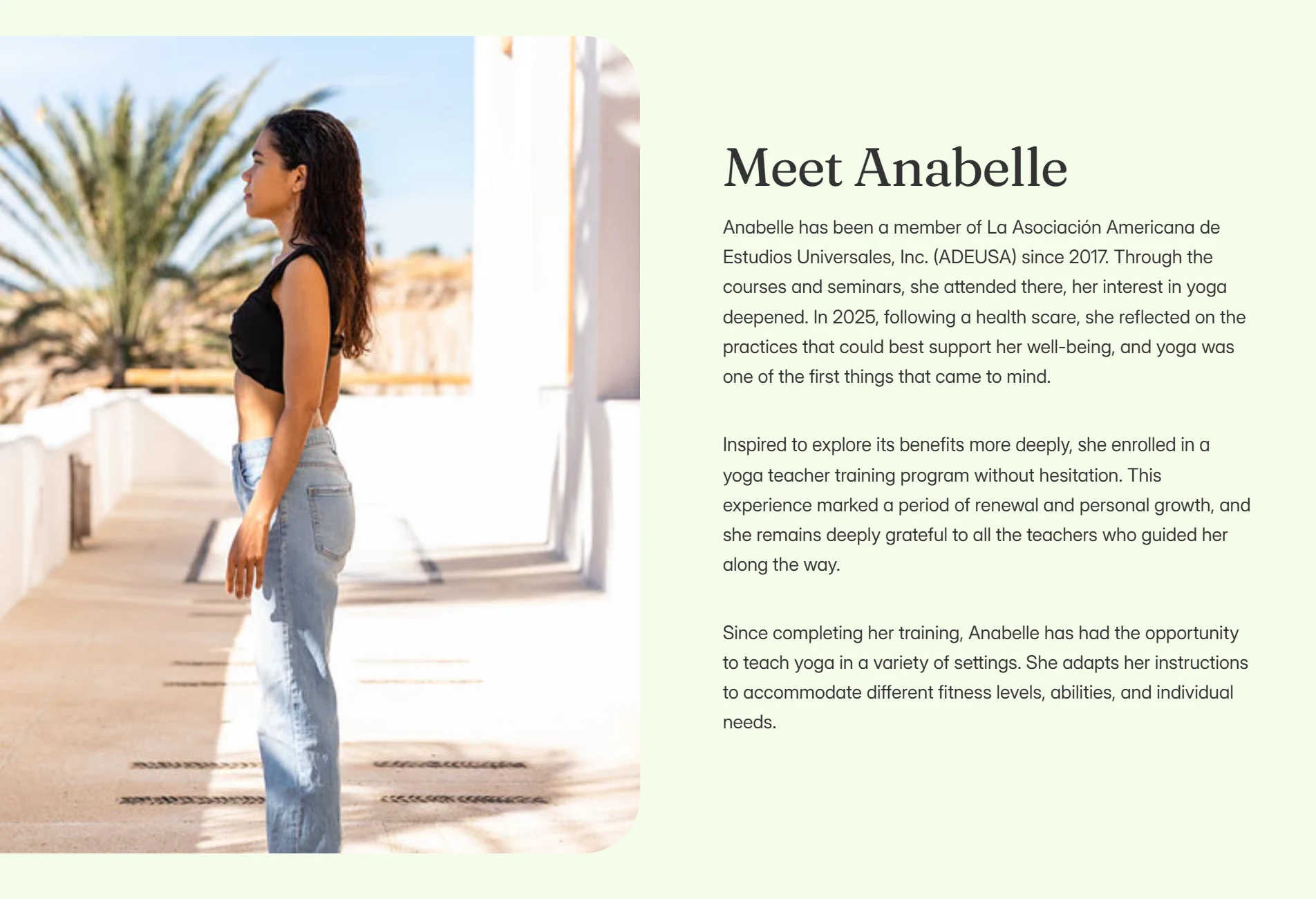
Giving Her Story More Space
Anabelle's journey is an important part of her story.
She has practiced yoga for over 10 years and began pursuing it more intentionally in 2025 before completing her teacher training.
Instead of hiding this information inside a long block of text, I created a dedicated section where visitors can learn more about her background and journey.
This makes the website feel more personal and helps visitors connect with the person behind the service.
Making Her Offerings Easier to Understand
Anabelle works with different groups and offers several ways for people to work with her.
Rather than placing everything into one paragraph, I separated her offerings into clear sections.
This makes it easier for visitors to quickly understand what she provides and find the option that is most relevant to them.
It also gives the page more visual balance while keeping the information simple.
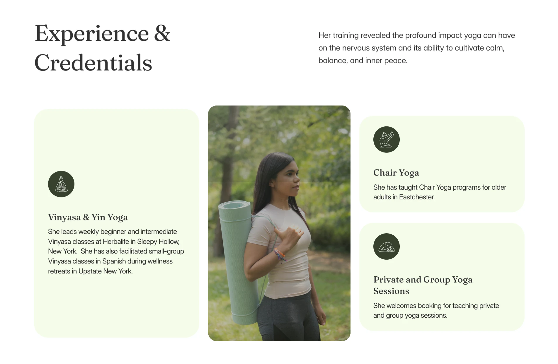
Showing Her Experience
The website also needed to show the depth of Anabelle's experience.
She has worked with beginners and intermediate students, older adults, and small groups at wellness retreats.
She also adapts her sessions to different fitness levels, abilities, and individual needs.
I used the experience section to make this easier to understand without overwhelming the visitor with too much information.
The goal was to show not only what she does, but who she has experience working with.
Making Her Certifications Visible
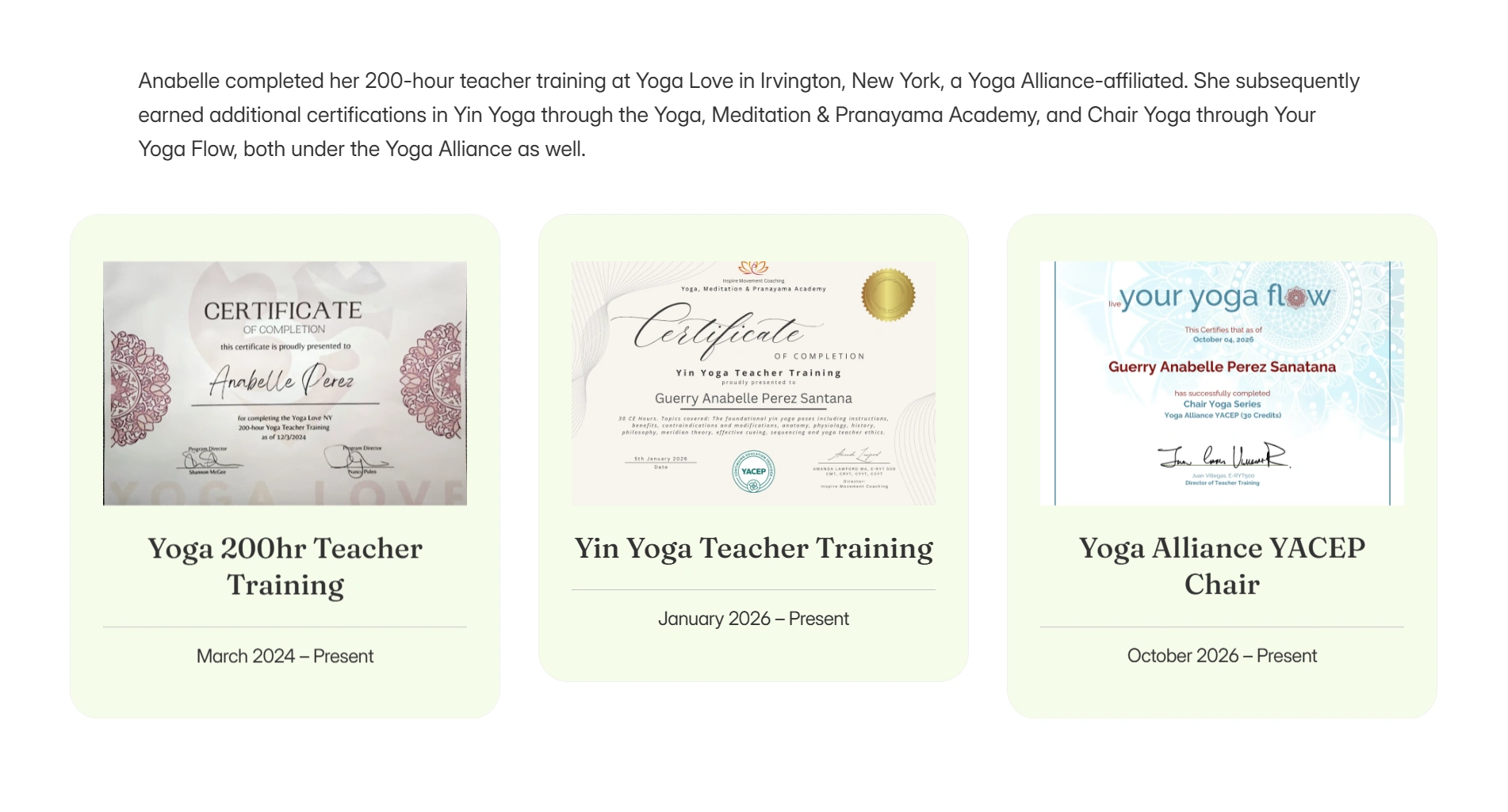
Anabelle has completed her 200-hour teacher training as well as additional training in Yin Yoga and Chair Yoga.
Instead of leaving these qualifications inside her biography, I gave them their own section.
The certificates are displayed visually so visitors can quickly see her training and credentials.
For a personal service, this helps build trust before someone decides to reach out.
Creating Space for Her Values
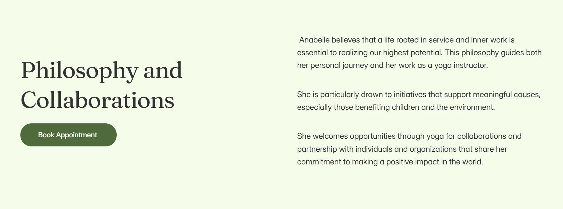
Anabelle's work is connected to service, personal growth, and meaningful causes.
I created a separate section for her philosophy and collaborations so she could talk about the kind of work she cares about and the people or organisations she would like to work with.
This gives the website another layer beyond simply listing her services.
It helps visitors understand what matters to Anabelle and the kind of work she wants to be part of.
A Clearer Way to Get in Touch
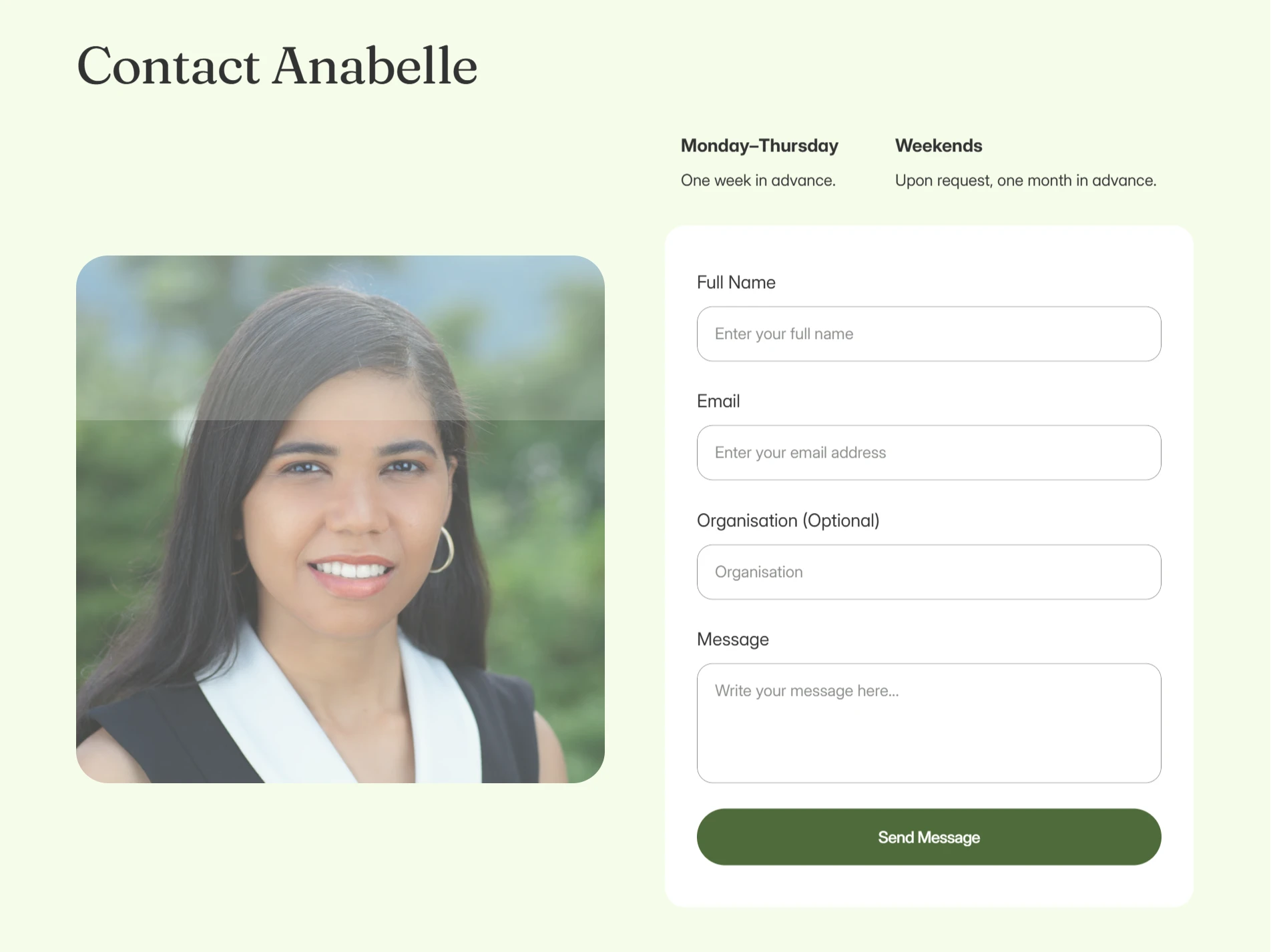
The final section brings everything back to action.
Visitors can see Anabelle's availability and send an enquiry directly through the contact form.
The section also uses her photography to keep the page personal and remind visitors that there is a real person behind the service.
A Small Detail With Intention
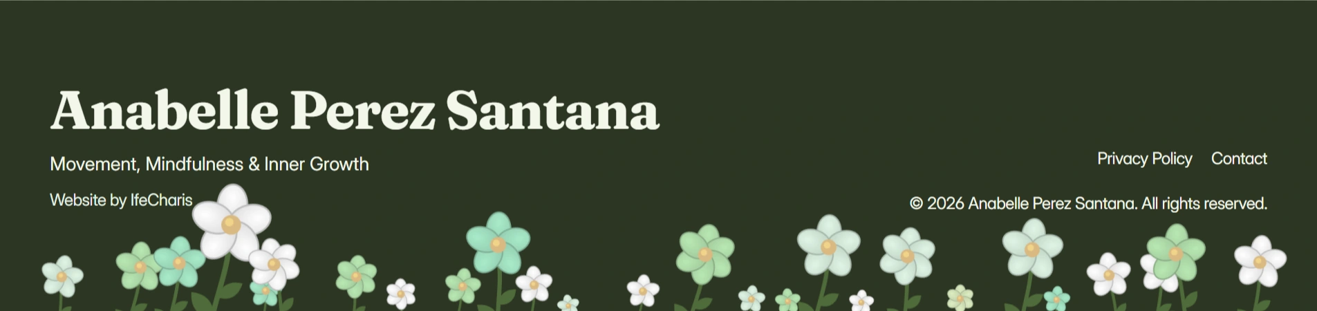
One of the smaller decisions in the design was how to bring nature into the website.
Anabelle had previously loved the use of nature in an earlier design direction, but she was unsure about whether it should remain part of the new design.
Rather than making nature a major visual element throughout the website, I chose to bring it in more quietly.
I added a subtle nature-inspired animation to the footer, where flowers appear along the bottom of the page.
It gives the design a small connection to nature without taking attention away from the content.
It is a small detail, but it helps the website feel more complete and intentional.
Responsive Design
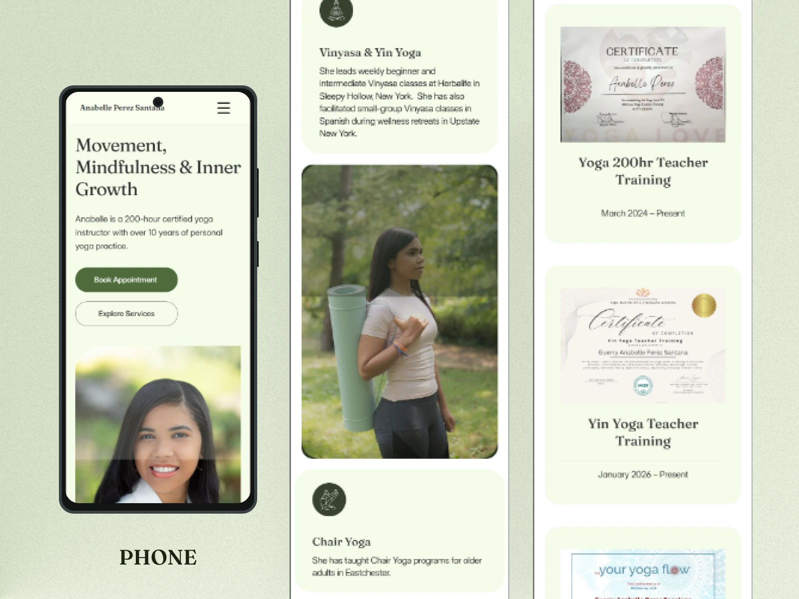
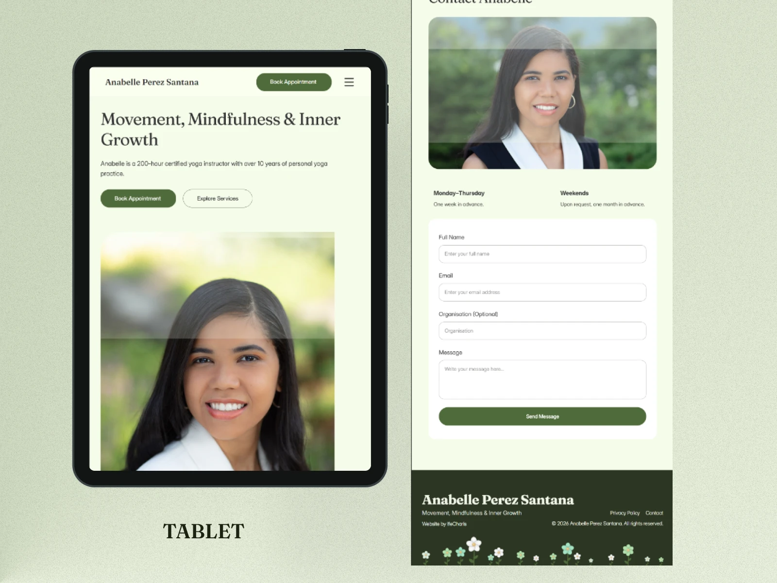
The website was designed and adjusted for desktop, tablet, and mobile screens.
Because the website contains a lot of information, responsive design was especially important.
Sections, images, cards, spacing, and text sizes were adjusted so the experience still feels clear on smaller screens.
The Result
The final website gives Anabelle a more complete online presence that reflects her work and personality.
Instead of a simple introduction and contact form, she now has a website where visitors can learn about her journey, understand her services, see her experience, view her certifications, learn about her approach, see when she is available, and send an enquiry.
The website was designed to feel calm, professional, personal, and easy to understand, while giving Anabelle a stronger foundation as she continues to grow her practice.
The Outcome
Anabelle already had the story, experience, and qualifications.
My role was to bring those pieces together into a website that makes them easier to see, understand, and connect with.
0 likes · 1 view · Nov 12, 2026
A website redesign for Anabelle Perez Santana, creating a calm and professional digital home for her practice. The new website gives her a clearer way to share

