Built with Framer
Reveal in Radiance, Jewelry Website Design

Ajayi Jacob


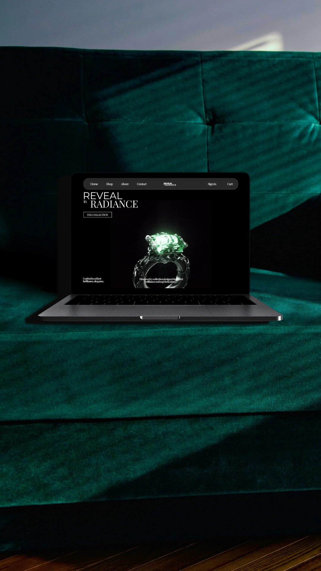
REVEAL IN RADIANCE
The Beginning
This project didn’t start with complexity. It started with a question — how do you present a single piece of jewelry in a way that feels meaningful, not just visual?
The goal was clear from the start.
Not to design a website that looks good, but one that feels intentional.
Luxury is not built on noise. It’s built on control.
The Challenge
Designing for luxury is a different problem.
You are not trying to show more.
You are trying to say more with less.
The challenge was to:
Keep the interface minimal without losing presence.
Maintain focus on the product at all times.
Create a sense of value through design, not decoration
Every decision had to earn its place
Design Direction
The direction was built on restraint.
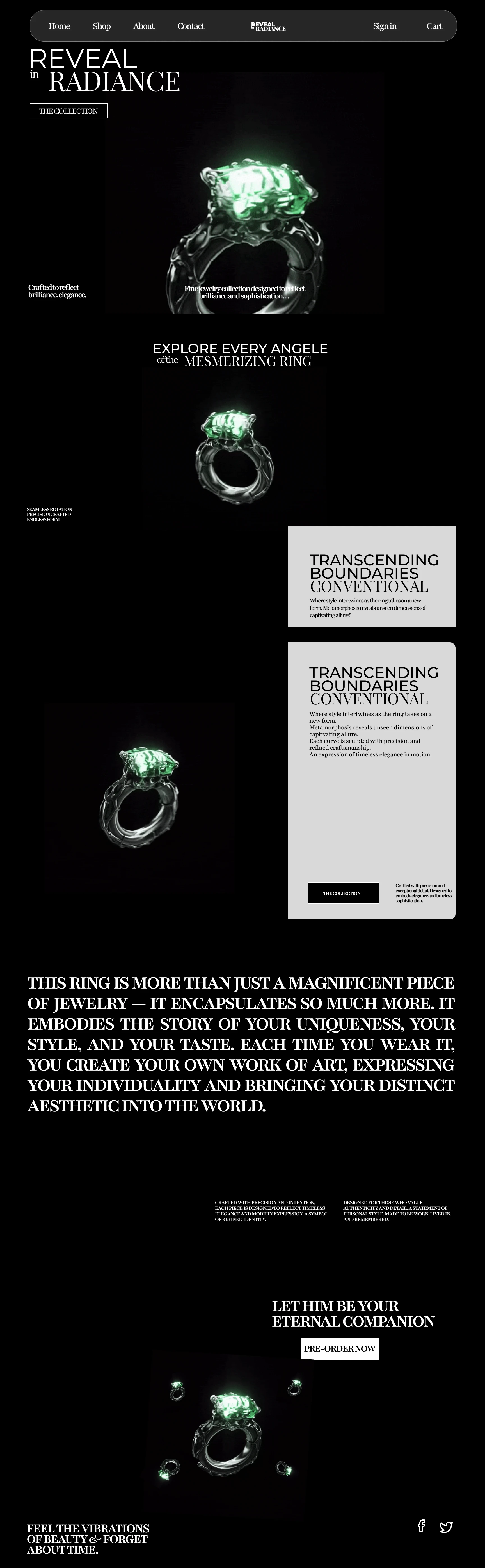
A dark interface was chosen to create contrast and depth.
It allows the product to stand out without competition.
Color was reduced to a minimum.
The gemstone carries the visual weight naturally.
Nothing distracts. Nothing competes.
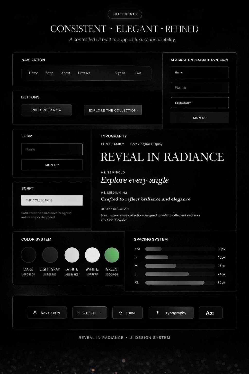
Typography & Composition
Typography leads the experience.
Large, editorial-style headings create structure.
Tight spacing keeps everything controlled.
The layout is not decorative.
It is deliberate.
Each section is spaced to give the product room to exist.
The Experience
The site is designed as a sequence.
Not everything is shown at once.
The user moves through:
Introduction
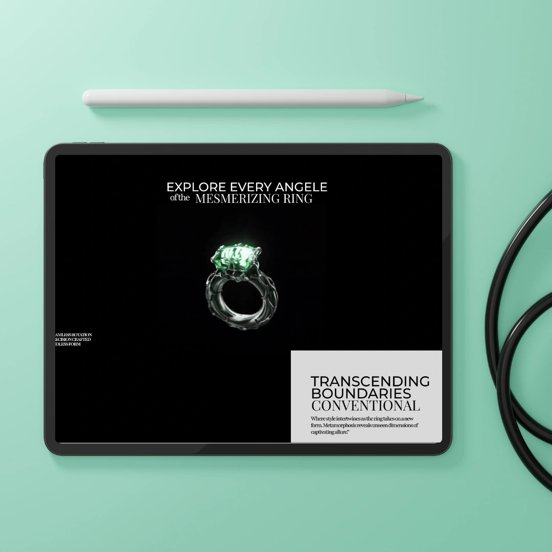
Detail
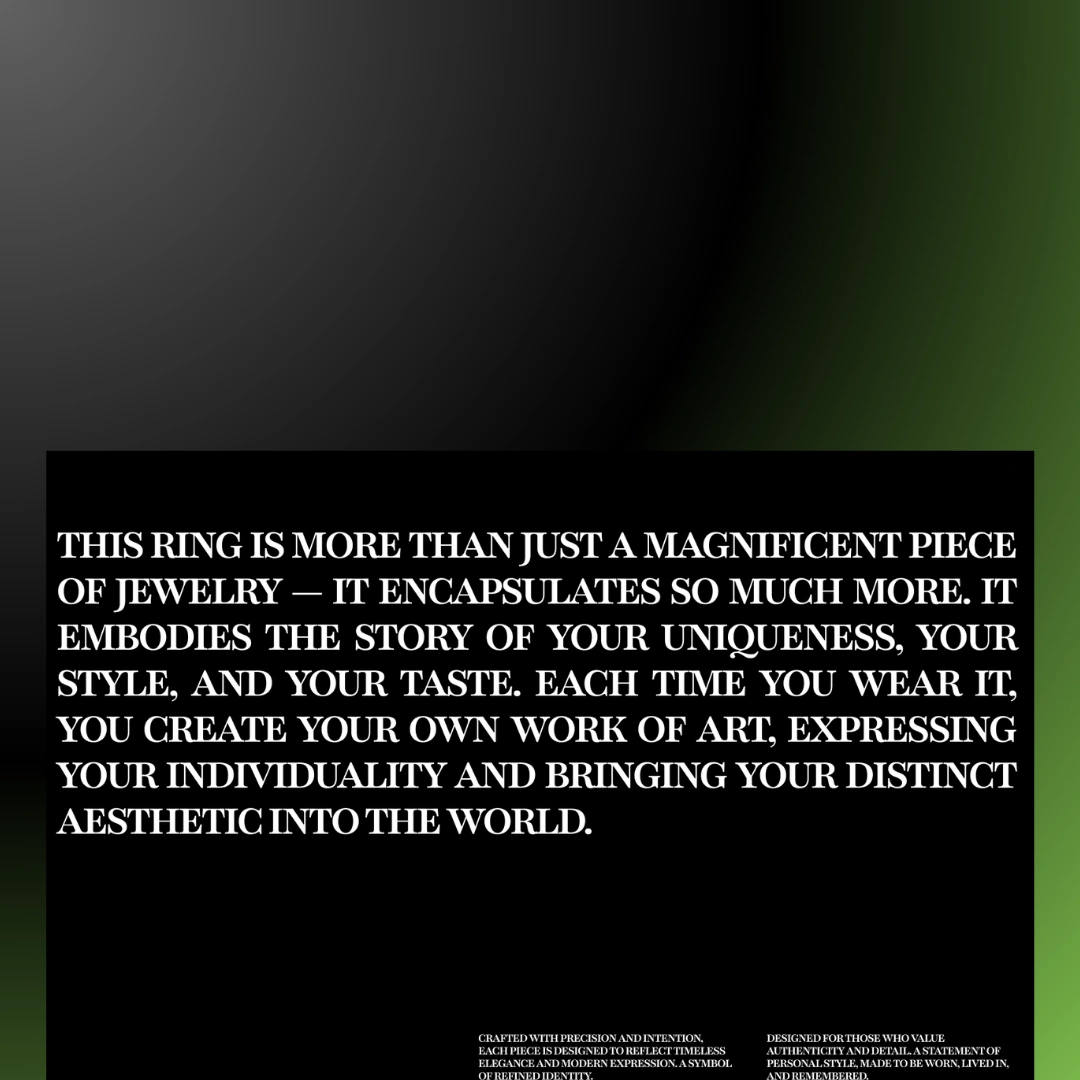
Emotion
Decision
Each stage builds on the last.
This pacing is what creates engagement.
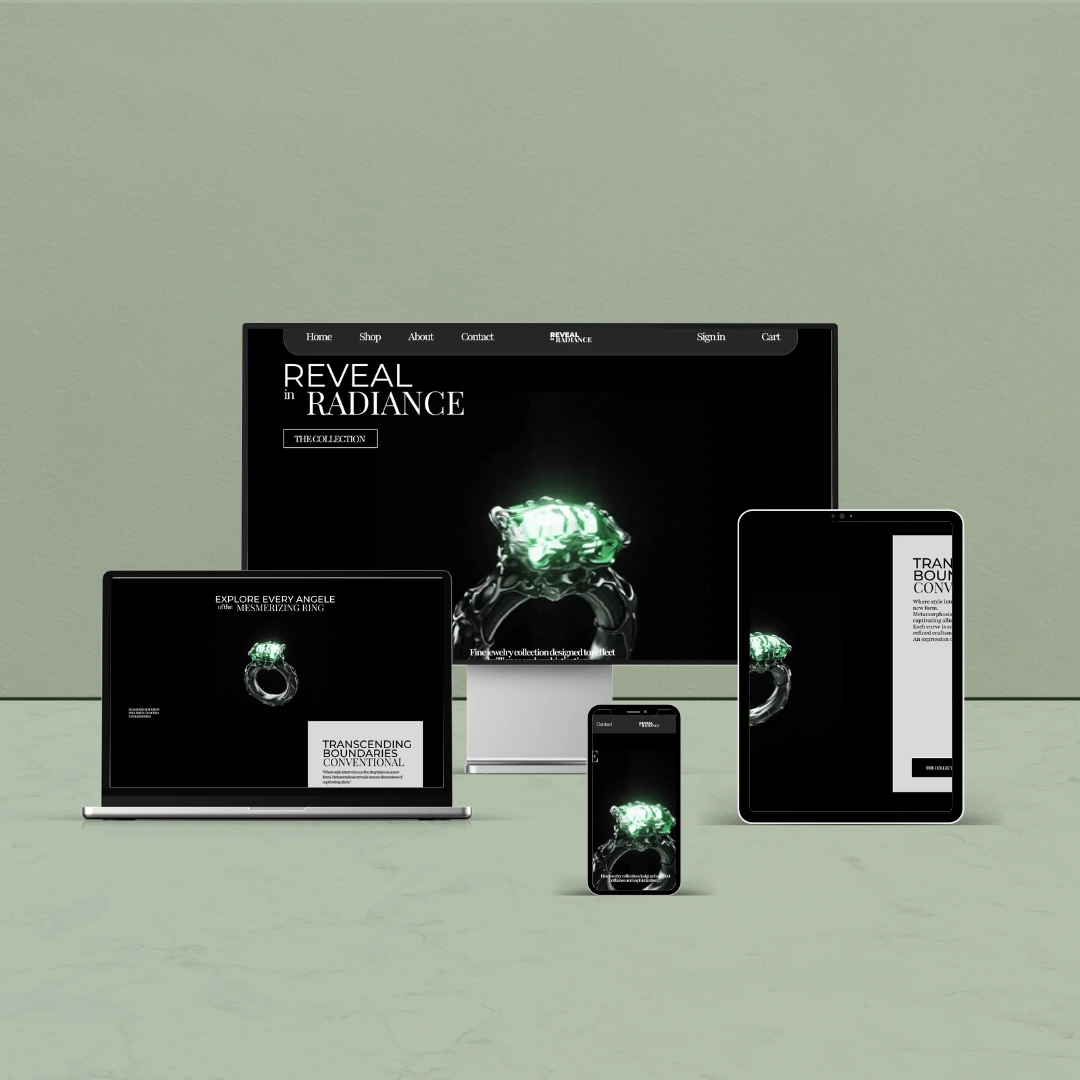
Product Focus
The product is not treated as content.
It is treated as the subject.
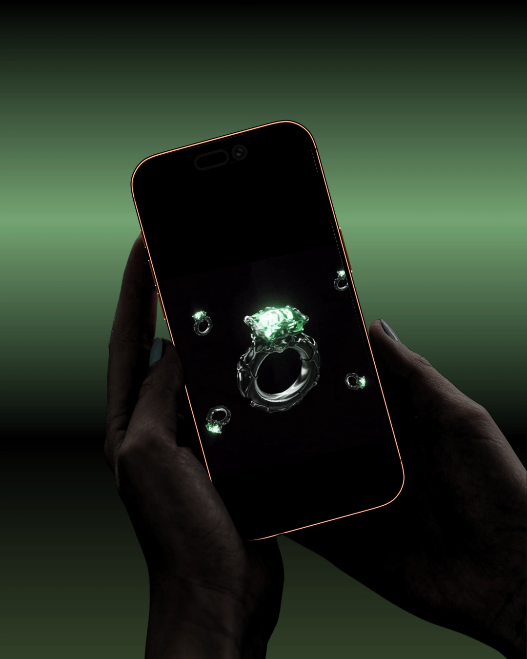
Isolated placement
Controlled lighting
Minimal surroundings
This approach creates presence without forcing attention.
Structure
The layout follows a clear intention:
Strong entry point
Focused product sections
Clear statement
Direct call to action
Nothing interrupts the flow.
UI System
The interface is built on consistency.
Minimal navigation
Clear call-to-action
Structured spacing
Controlled components
Every element supports the same goal — clarity.
Outcome
The final result is a controlled, focused experience.
It presents the ring as more than an object.
It becomes something personal, expressive, and intentional.
The design does not try to impress.
It holds attention.
Reflection
This project was about discipline.
Removing what is unnecessary is harder than adding more.
But in this case, that is exactly what gives the design its strength.
Like this project
Posted Mar 28, 2026
Luxury jewelry website focused on minimal design, strong typography, and a refined product experience built around clarity and visual presence.
Likes
1
Views
2
Timeline
Mar 14, 2026 - Mar 25, 2026