Brand Identity Development for Chef John Robinson

Elexia Johnson


B R A N D I D E N T I T Y & A R T D I R E C T I O N
Cooking Up Something Devilish
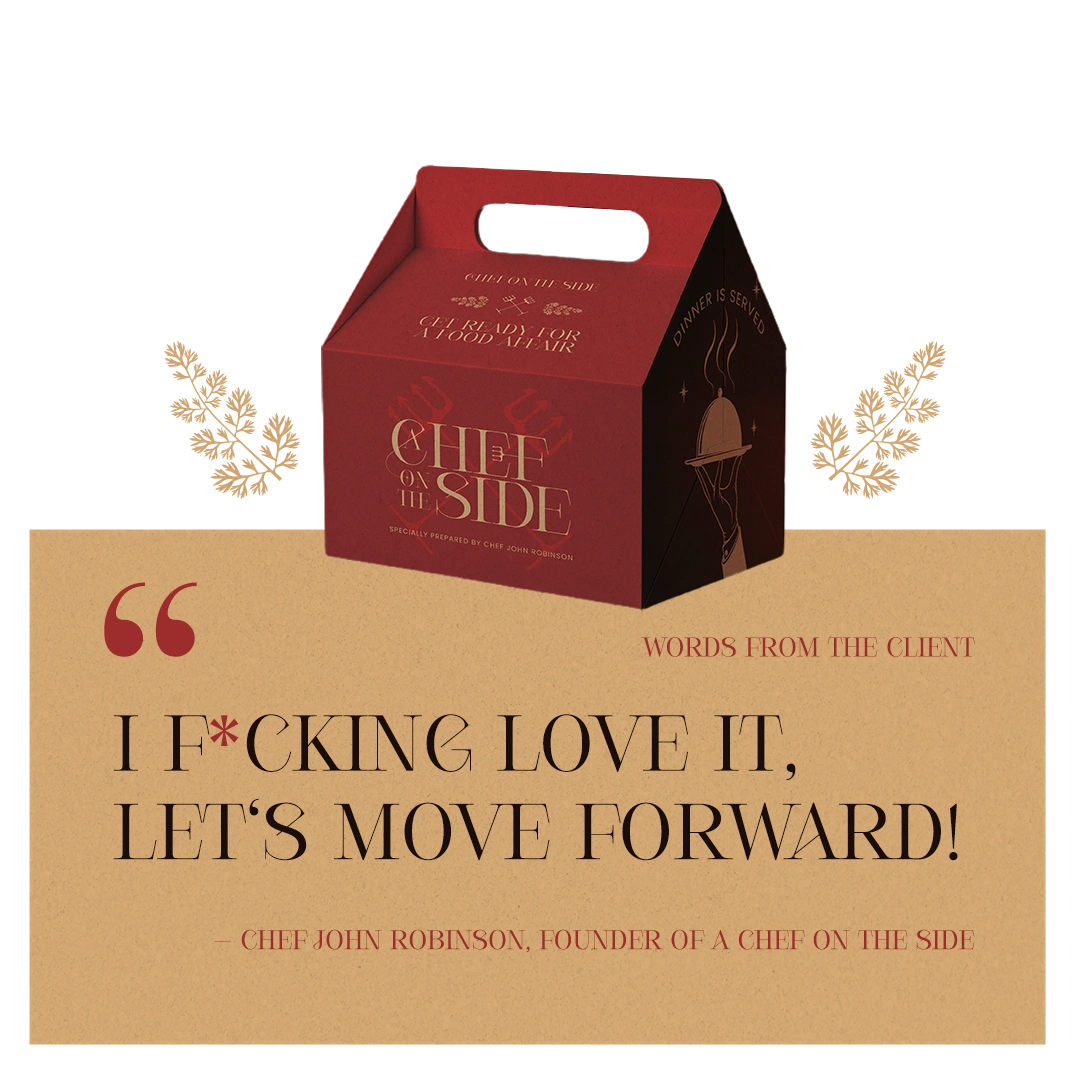
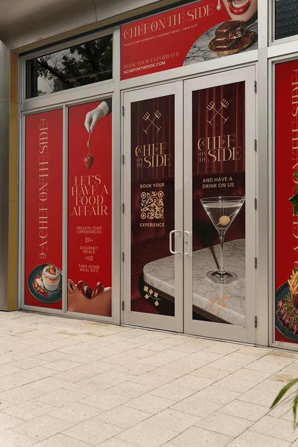
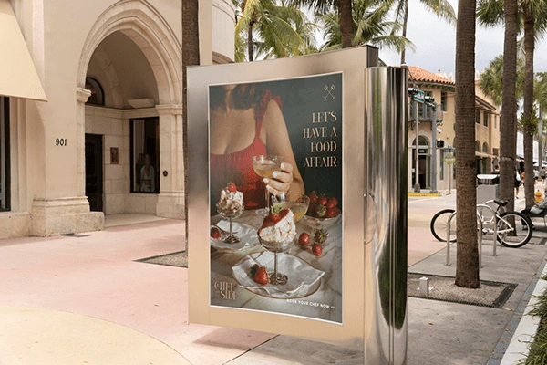
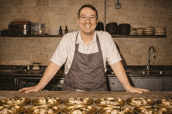
Everyone knows what a private chef does. Almost no one knows what makes booking one worth it. Chef John Robinson has cooked alongside some of the industry's most respected names, and set out to build something entirely his own: curated, private culinary experiences that needed a category, and a brand, built from scratch to match.
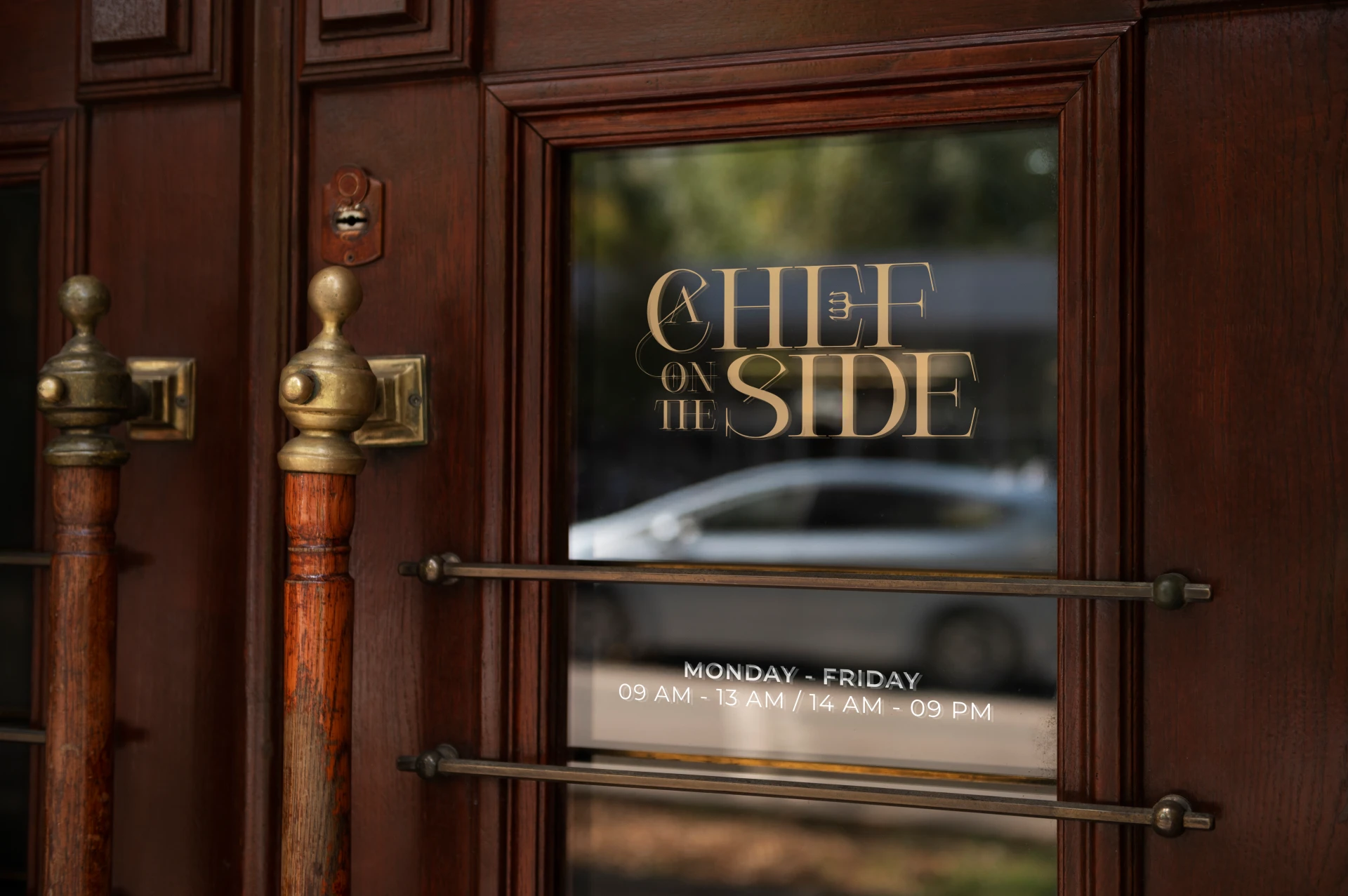
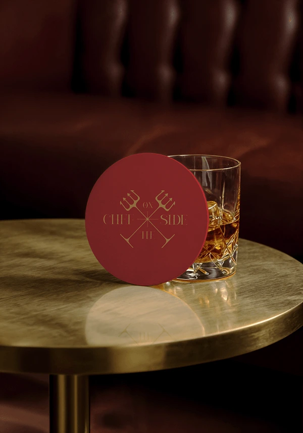
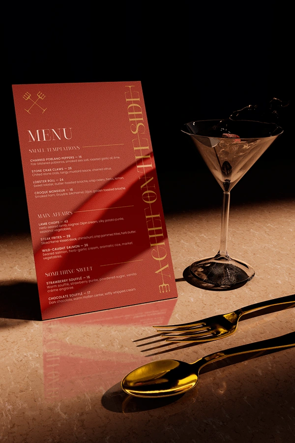
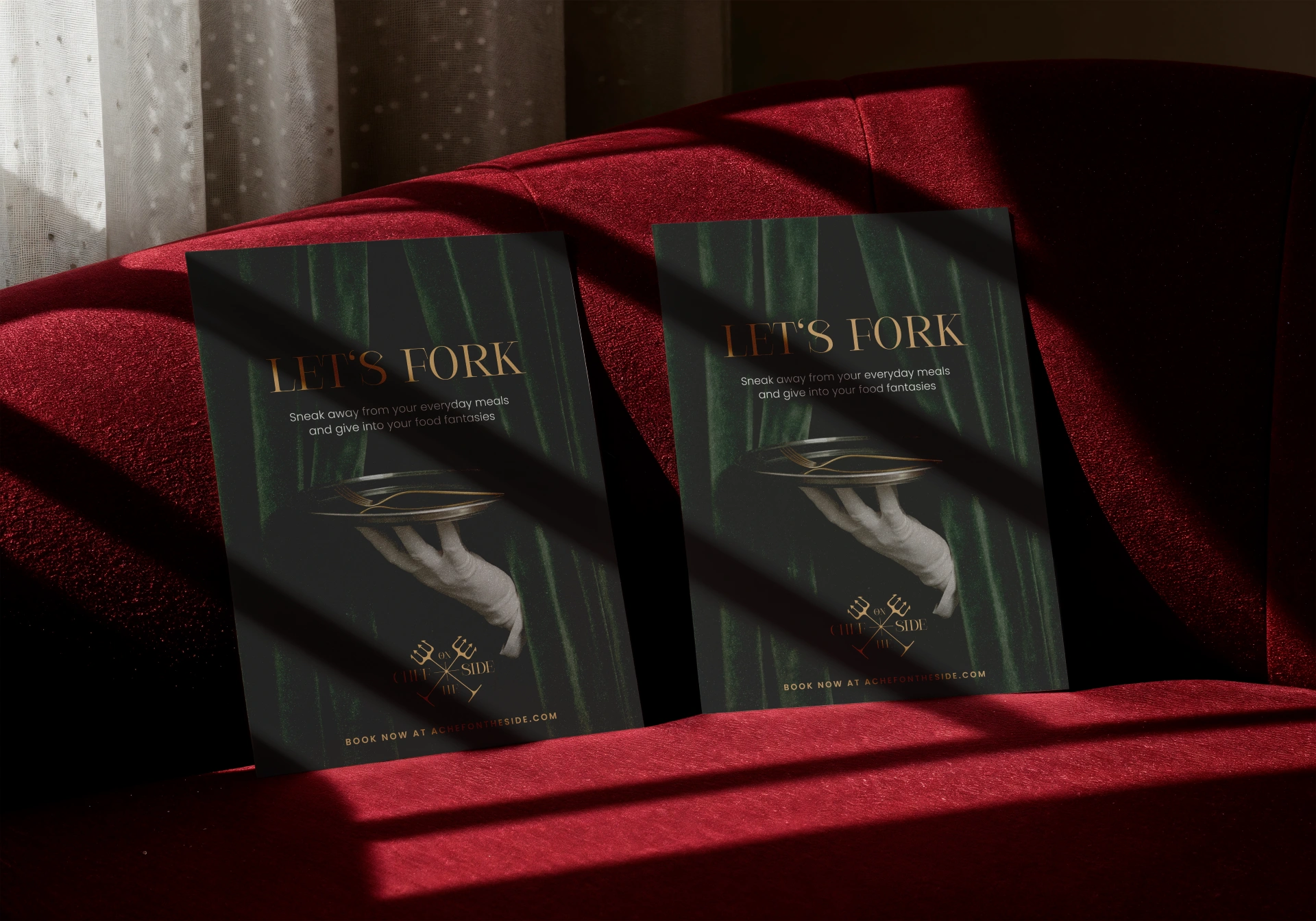
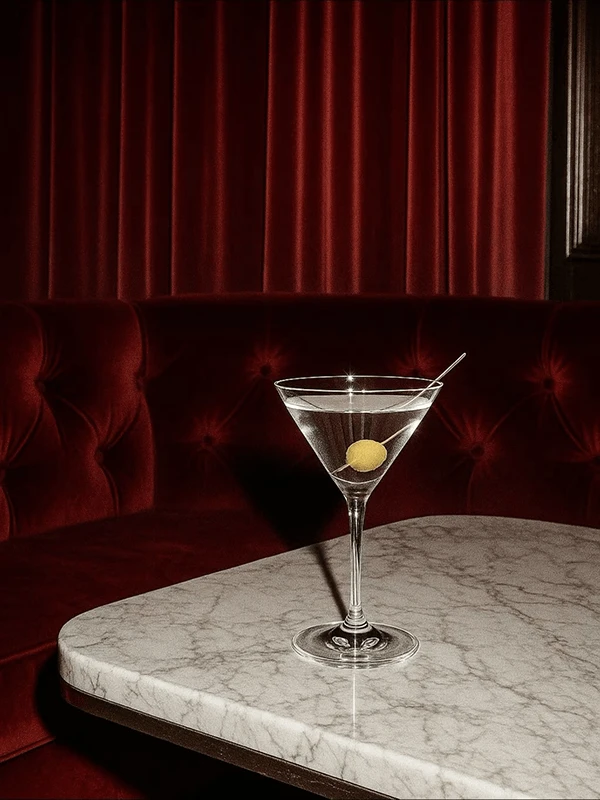
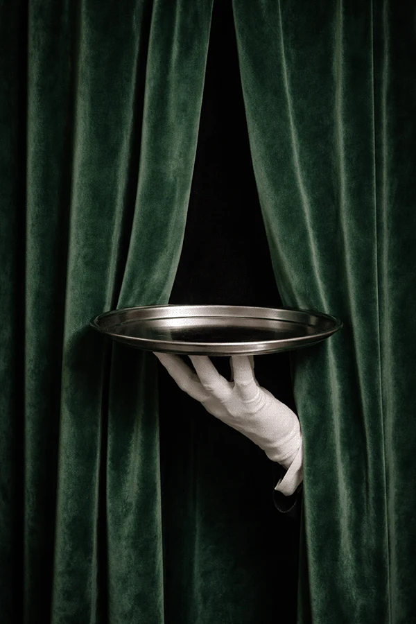
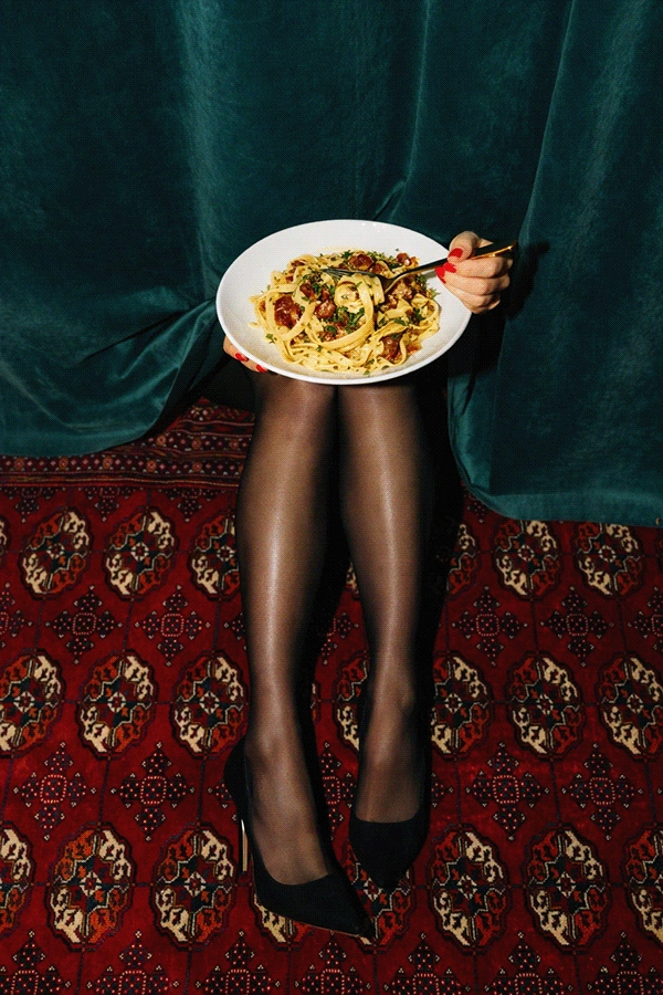
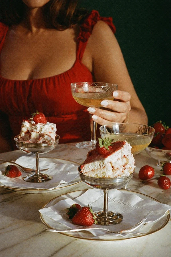
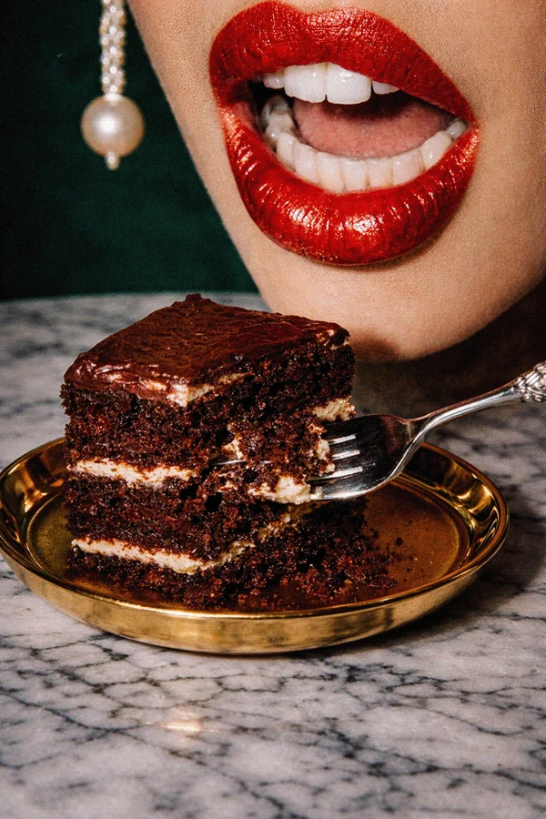
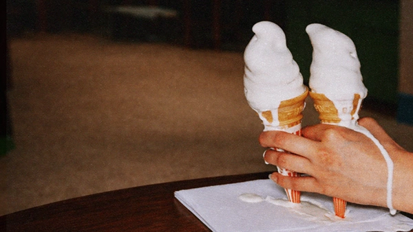
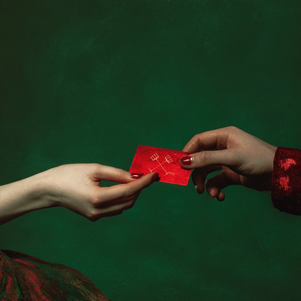
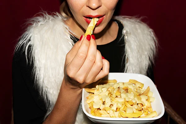
Brought on by Funny Farm Agency for art direction, I set the mood boards the whole team built from, then developed my own concept alongside two others from the team. The direction I brought forward, dark, seductive, and speakeasy inspired, was the one Chef John chose to move forward with. From there, Devon and I built out the full identity together: a pitchfork mark that winks at both mischief and appetite, a palette of deep reds and gilded gold, and a type system built for elegance without losing legibility.
elexiajohnson.com @elexia96
What's Cooking Next
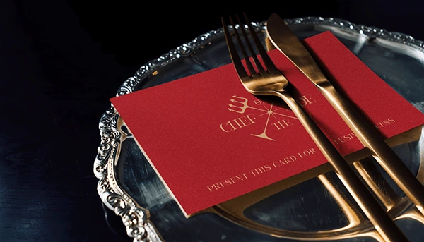
A Chef On The Side is heading toward launch, and I'm continuing to support Chef John and Funny Farm Agency as the brand moves into new touchpoints, from a members only card leaning further into the speakeasy concept to his product offerings and website. What I'm proud of most is that we found room to be a little different, a little devilish, in an industry that rarely takes the risk.
You can follow along at @elexia96 or elexiajohnson.com.
Let's Make Something Great Together
Lord knows it can be tough to navigate the everchanging landscape alone. Get the support and dedication your need from an experienced designer. Get started today and contact me on my portfolio: elexiajohnson.com
Like this project
Posted Aug 26, 2026
Developed a distinct brand identity for Chef John Robinson through art direction.
Likes
0
Views
6
Clients
Funny Farm Agency