Great dashboard design isn't just

Keitoto Studio

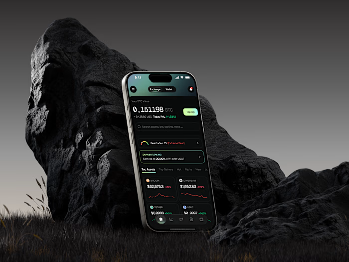
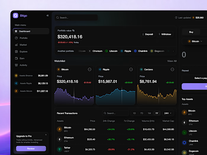
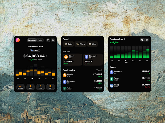
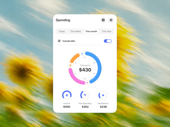
Great dashboard design isn't just about showing numbers—it's about making complex metrics effortlessly scannable!
Here is a quick micro-component showcase featuring 4 distinct UI blocks from 4 different product case studies. From clean personal spending trackers showing monthly peaks to stacked USDC portfolio equalizers, live blue Ethereum price curves, and glowing 3D isometric productivity columns, each element was engineered to reduce data anxiety and boost visual trust.
Slide through all 4 attached images right now to review the detailed UI blocks up close, and let me know how the visual balance lands with you! 🚀📊👇
Like this project
Posted Aug 4, 2026
Great dashboard design isn't just about showing numbers—it's about making complex metrics effortlessly scannable! Here is a quick micro-component showcase f...
Likes
0
Views
9
Timeline
Jul 20, 2026 - Jul 24, 2026