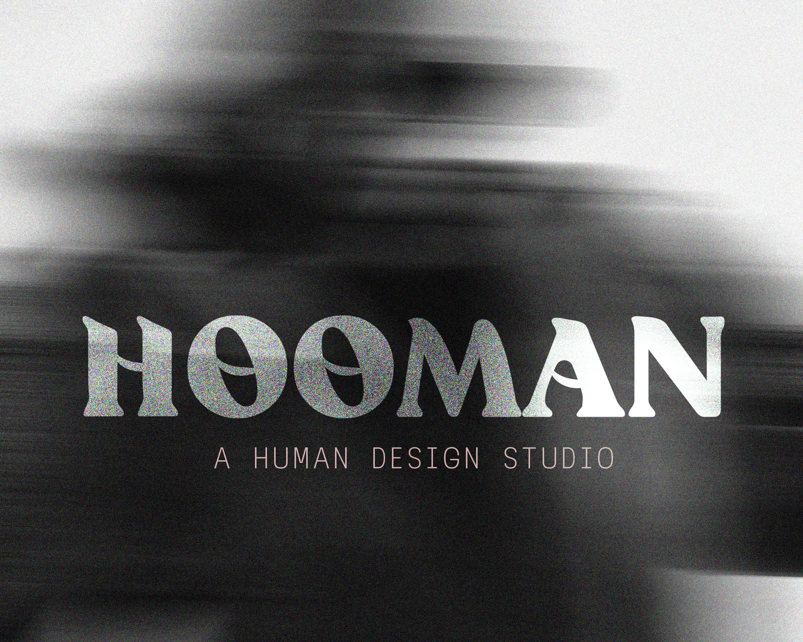
HOOMAN Brand Identity and Creative Art Direction
Annie Hatuanh
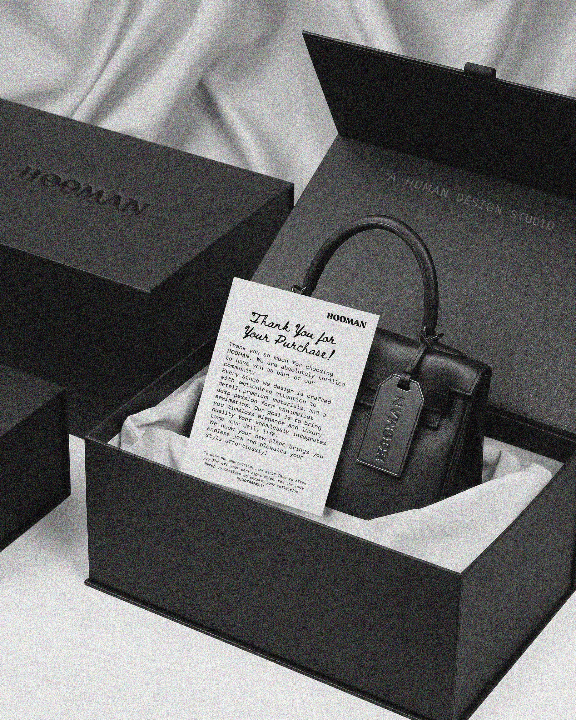
HOOMAN is a contemporary design studio specializing in handmade, ultra-premium luxury handbags and curated apparel essentials. Moving away from the unfeeling, industrial perfection of traditional high-end fashion houses, HOOMAN explores the warmth, tactile vulnerability, and physical geometry of pieces crafted by human hands, for human lives.
As the Lead Designer, I spearheaded the holistic visual development of the brand, bridging the gap between raw, organic human touch and high-fashion editorial sophistication.
The Challenge & Solution
The Challenge
The luxury market is oversaturated with sterile, perfectly symmetrical, machine-made aesthetics. The challenge was to position HOOMAN as an ultra-premium brand while celebrating the "imperfections" and physical warmth of human craftsmanship without losing a high-end, editorial feel.
The Solution
We achieved this by utilizing a sharp contrast: monospace/brutalist typography alongside soft, intimate, black-and-white fashion photography.
"Moving away from unfeeling industrial perfection to explore the warmth and physical geometry of pieces crafted by human hands."
By pairing structural product design with raw, human-centric art direction, the brand identity instantly feels both grounded and deeply sophisticated.
The Execution
1. Brand Identity & Typography
We chose a striking, minimalist monospace typeface for the subtext to contrast against a clean, spaced-out logotype. This represents the intersection of structured design ("studio") and organic existence ("human").
2. Editorial Photography & Art Direction
The visuals relies on high-contrast, black-and-white editorial photography. The model’s styling and the bag's prominent hardware emphasize form, texture, and tangible vulnerability.
3. Short Motion Design
To translate this tactile feel into digital spaces, I produced short-form motion content. These pieces highlight:
The raw physical geometry and angles of the luxury handbags.
The transition from architectural sketch lines to the final handmade product.
Dynamic editorial typography transitions for digital touchpoints and social media campaigns.
To translate this tactile ethos into digital spaces, I produced short-form motion content inspired by raw paper scraps, highlighting the handmade, organic nature of the brand's physical geometry.
Like this project
Posted Jun 24, 2026
Designed HOOMAN's brand identity highlighting human craftsmanship in luxury fashion.