Razzo Atelier | Revitalizing a timeless but modern brand
Paloma Iberico
Razzo is a design atelier dedicated to exploring cement as a material for crafting unique pieces through traditional handmade processes, combined with constant creative innovation to transcend fleeting trends with works that become bearers of unique stories of dedication and craftsmanship.
Terrazo is known as an old technic that mixes cement with chips made out of colored plaster ending in a handcrafted yet elegant look.
The project
Mid-october 2023, I was approached by a couple of young product designers that were looking to re-brand their business. The first step of the project involved a deep investigation of the potential local customers, the home decor industry and what people understands as terrazo. Added to this, we had three workshops to develop and understand their mission as a company, what they’re looking to achieve in the future and the brand’s values. With all the collected information, I was finally able to set forth with the core of the project.
Developing the concept
Aside from defining the brand statement, mission, vision, values and personality, I designed a concept based on what my two clients had told me. They like working with cement and terrazo, because of the final look: it never looks the same. The pieces are unique, since the chips will always vary in size and arrengement, and, most importantly, they don’t use any machines to work cement, which means that every piece will have the marks of their hands in every detail of it.
Artisanal work involves a personalized and detailed approach, where each piece can be unique due to the skill and individual attention dedicated to its creation. Craftsmanship highlights the uniqueness and distinctive character of each item. The uniqueness of each piece is imparted by the artisan, who, through the manual work involved in its creation, leaves an imprint that gives it a distinctive sense of identity—one that reflects the relationship between the finished product and its creator.
The idea of the fingerprint as a unique and distinctive impression left by a set of patterns on the artisan’s fingertips serves as the starting point for developing the brand’s visual identity.
Also, it was crucial to ask: why cement? Well, they like that it has volume and weight, presence in a three dimensional space.
By combining both concepts, the image of the fingerprint is used and reduced to the patterns that make it unique—the ridges and valleys that run across the fingers. When seen in a certain way, these patterns resemble rocky surfaces found in nature or terrazzo pieces, which create unique and unrepeatable patterns in each object.
Revitalizing the brand's key elements
The visual identity of the new brand was based on that: volume, weight and the imperfections that make the pieces exclusive and unique. The logo emphasizes the concept of how different not identical elements can build an object and also refers to the chips that can be seen in terrazo, while the typography used in it highlights the structure and strenght of the cement, building together a recognizable and elevated brand. The colour palette was also inspired in the minerals that are used to make the cement mix.
The imagotype presents Razzo as a timeless brand that seeks balance between the complexity of the creation processes and the simplicity of its products, the weight of the material it works with and its versatility, the perfection and attention to detail in its designs, and the authenticity found in the imperfections of handmade craftsmanship.
The proposed color palette for the brand is inspired by the hues of limestone, the primary material used in cement production. Various shades of gray and complementary derivative colors enrich this palette, adding depth and authenticity to the material.
However, to avoid an exclusively gray and muted composition, a warm yellow is introduced as a nod to the oxidized tones found in minerals. This addition helps create a stronger connection between the brand and its consumers. Beyond serving as a visual focal point due to its intensity, this color also symbolizes the human and artisanal essence behind the creation of each piece.
The process ended up in the delivery of a brand manual and all the graphic elements they needed to move the brand forward.
Reels and stories edited and designed for the brand's social media
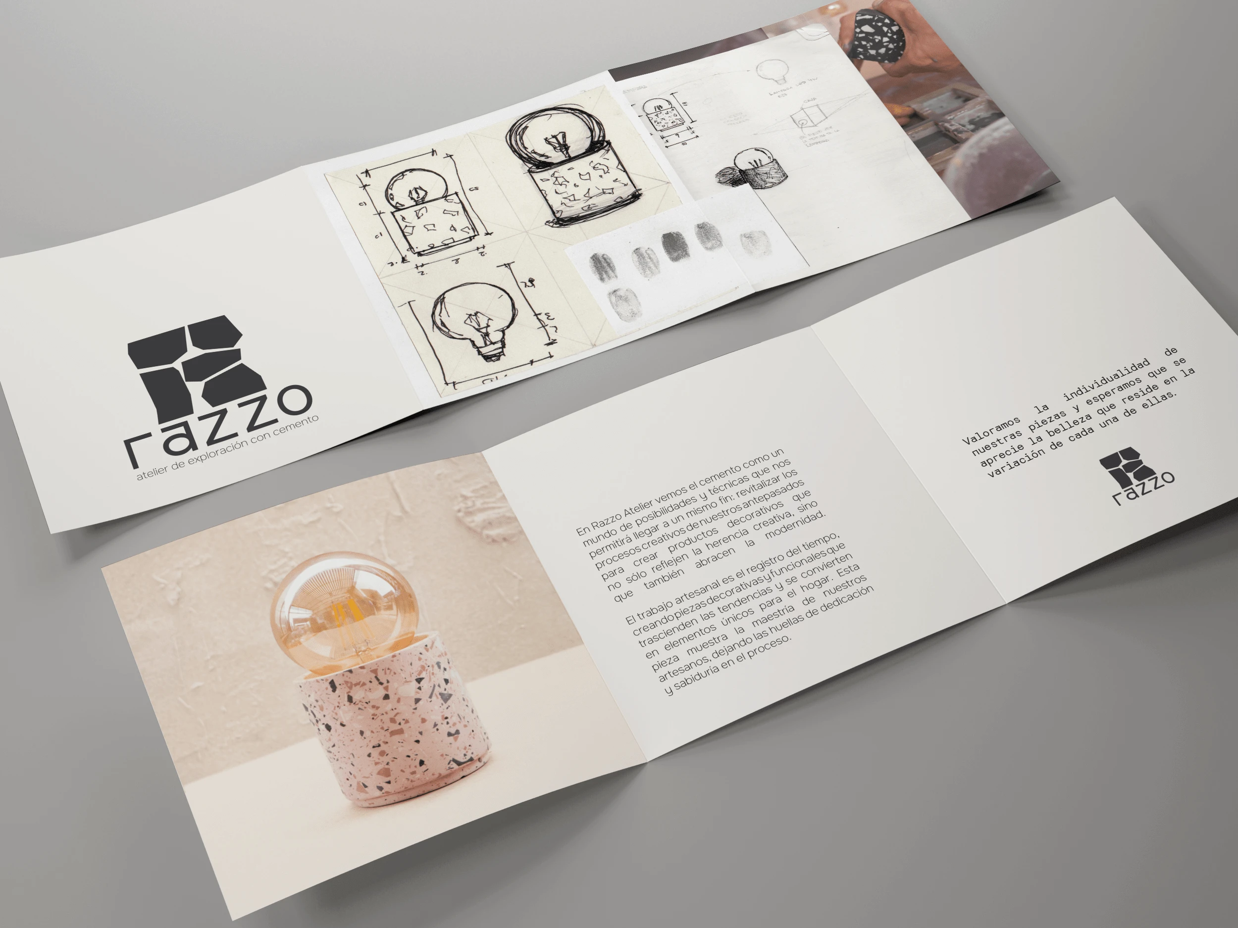
Booklet designed to be included with every order.
Like this project
Posted Feb 20, 2025
The process ended up in the delivery of a brand manual and all the graphic elements they needed to move the brand forward.