Magnetic Forest | Branding

0
Brand Designer
Graphic Designer
Logo Designer

Adobe Illustrator

Adobe Photoshop
The purpose of this project was to create a new brand identity for Magnetic Forest to reflect their core values. In order to accomplish this, I created the logo family, a custom color palette and typography pairing, as well as the tagline "Building with nature's finest".
Magnetic Forest - Building with nature's finest.
Magnetic Forest specializes in selling a variety of high-quality wood products. They source their wood from sustainably managed forests and carefully select each piece to ensure that it meets their standards for durability and appearance. They offer lumber in a range of sizes and types, including hardwoods, softwoods, and exotic species.
Process
The inspiration for this project was the location of the company itself. Magnetic Forest is located in a remote area in the Carpathian Mountains in Romania. Because all of the area is surrounded with beautiful mountains and green forests, I knew that the logo and the color palette should reflect this beautiful place.
Logo
In the logo I wanted to capture the letters M and F, but at the same time the connection with nature. Having this in mind, I came up with this diamond shaped icon.
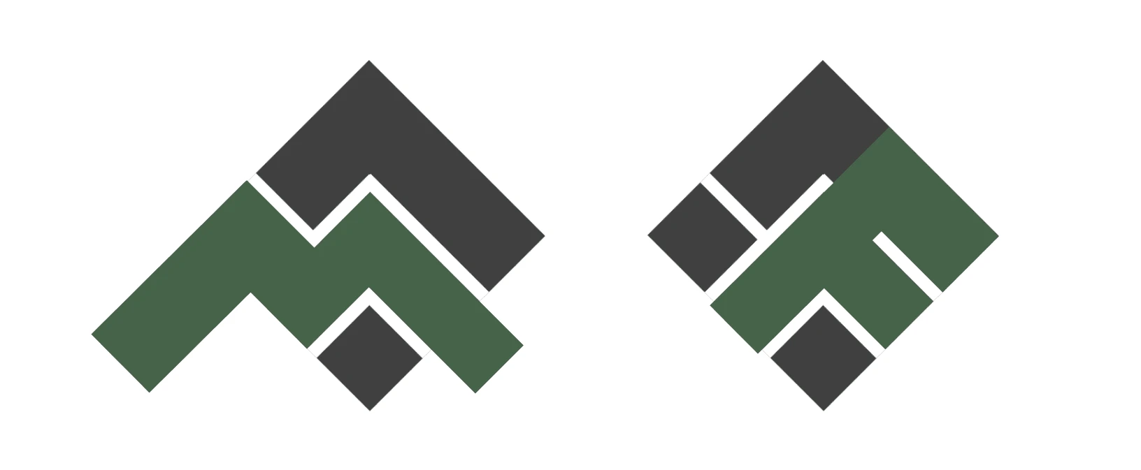
'M', 'F' characters in logo
I opted for one main logo(dark green) and two secondary logos: one more complex to enhance the color palette and one simpler(dark gray) for when color is not available or needed.
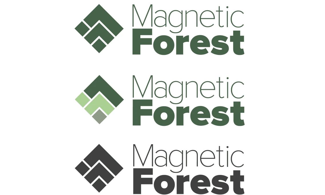
Final logo variants
The connection with nature is best shown in the multiple coloured logo: the dar green represents the mountains, the light green in the middle represents the forests that cover the mountains and the small square at the bottom the tree trunks, in this way encapsulating the beautiful landscapes surrounding the company.
Color Palette
Using a mainly green color palette for Magnetic Forest communicates the connection to nature, environmental responsibility, and natural, organic materials. The color green is often associated with growth, renewal, and sustainability, making it a suitable choice for this brand.
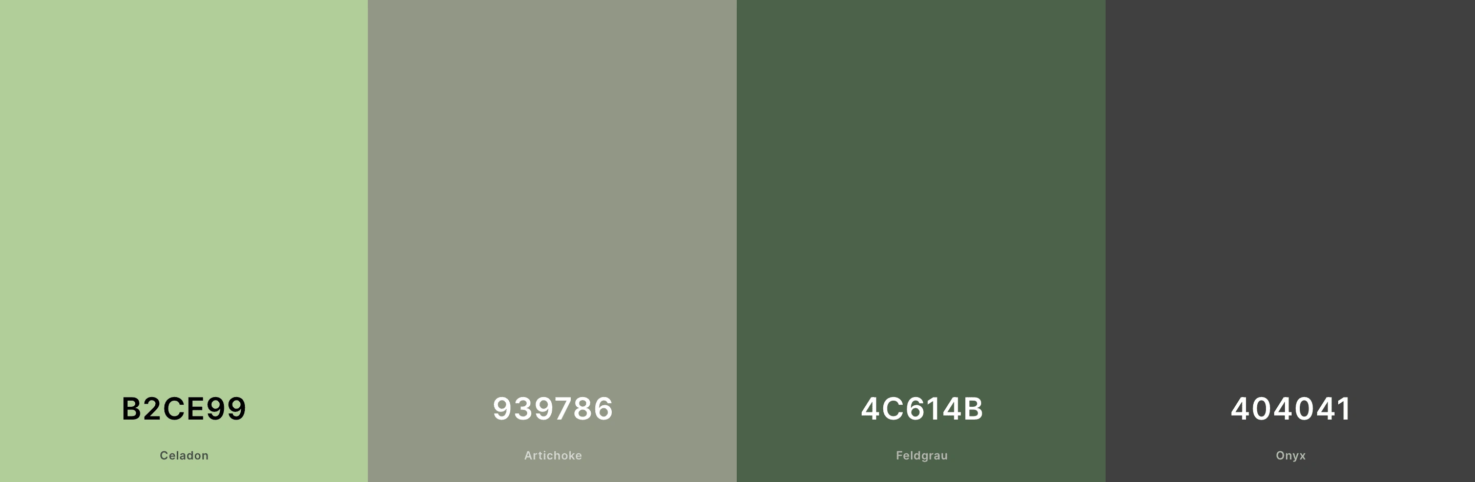
Color Palette
Typography
I chose a simple, minimal, sans serif typography pairing because I wanted a clean and professional aesthetic. Because the company is based in Romania, all the main content will be in romanian, so I wanted to have typefaces that have the romanian special characters included.
League Spartan - Extra Bold
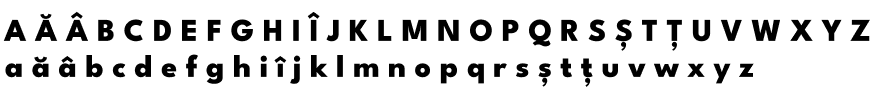
Proxima Nova - Light
Results
"Olga was professional and efficient, she was able to clearly understand our vision and goals for our company. The logo and visual identity that she created for us perfectly captures the essence of our company, and we have received numerous compliments on it. The guidelines and assets that she provided have also made it easy for us to consistently apply our brand across all of our marketing materials."
- Robert Szocs, owner of Magnetic Forest
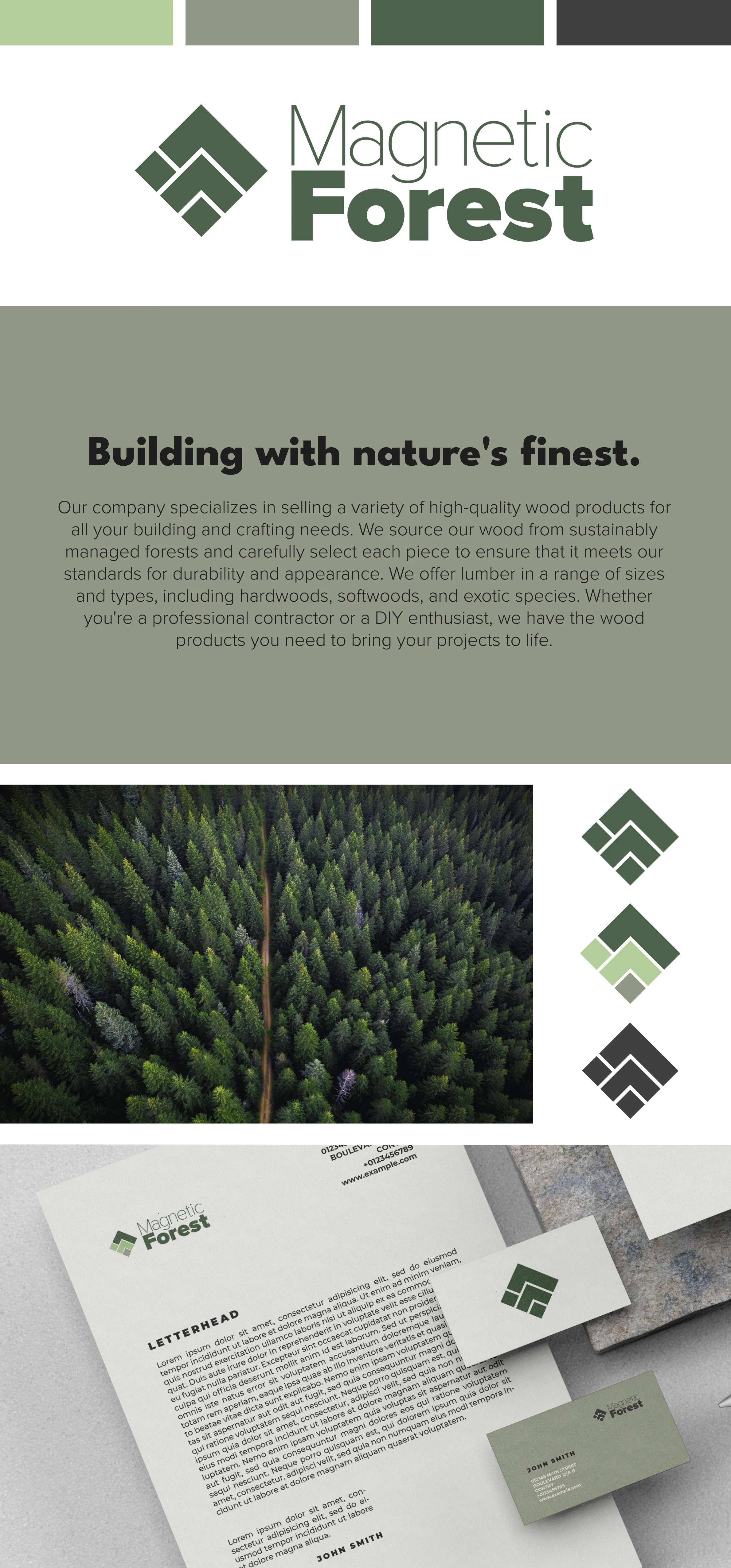
Final presentation for Magnetic Forest
Like this project
0
Posted Jan 5, 2023
Magnetic Forest is a wood selling company. The focus was on creating logos/marks, define the colour palette and the typography.
Likes
0
Views
37
Tags
Brand Designer
Graphic Designer
Logo Designer
Adobe Illustrator
Adobe Photoshop


E-commerce | UX/UI Design

E-commerce Mobile | UX/UI Design

NFT Online Game | UX/UI Design