Hashimotive Healthcare Application
Katie Mendoza
Tools
Mural
Figma
Notion
Excalidraw
Mindmeister
Canva
Deliverables
Competitive Analysis
Risk Analysis
Stakeholder Research
User Interviews
Diary Study
Thematic Analysis
Wireframes
Prototypes
User Testing
My Role
UX design
UX research
UI Design
UX Writing
Product Manager
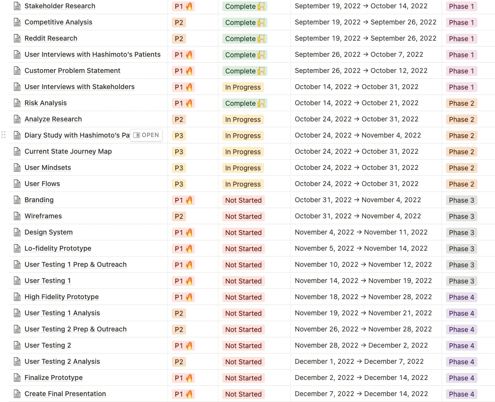
Timeline
Overall: 16 weeks
Discovery & Research: 10 weeks
Design & testing: 6 weeks
Introduction
Personalized health care management app designed for people with Hashimoto’s disease to empower them to take control of their thyroid health.
Hashimotive is a healthcare application that I designed as part of my thesis project at MICA over a 16-week period. As someone living with Hashimoto's Thyroiditis, I recognized the need for a more personalized and holistic approach to managing the condition. With this in mind, I designed an app that provides a range of features, including medication reminders, symptom tracking, and access to personalized health content. My goal was to create an app that would not only help users manage their condition more effectively but also provide a sense of empowerment and control over their health. In this case study, I will describe my design process in detail, from conducting user research to creating wireframes and prototypes, to the final implementation. I will also explain how I integrated user feedback throughout the design process and made design decisions that prioritized the user's needs and preferences.
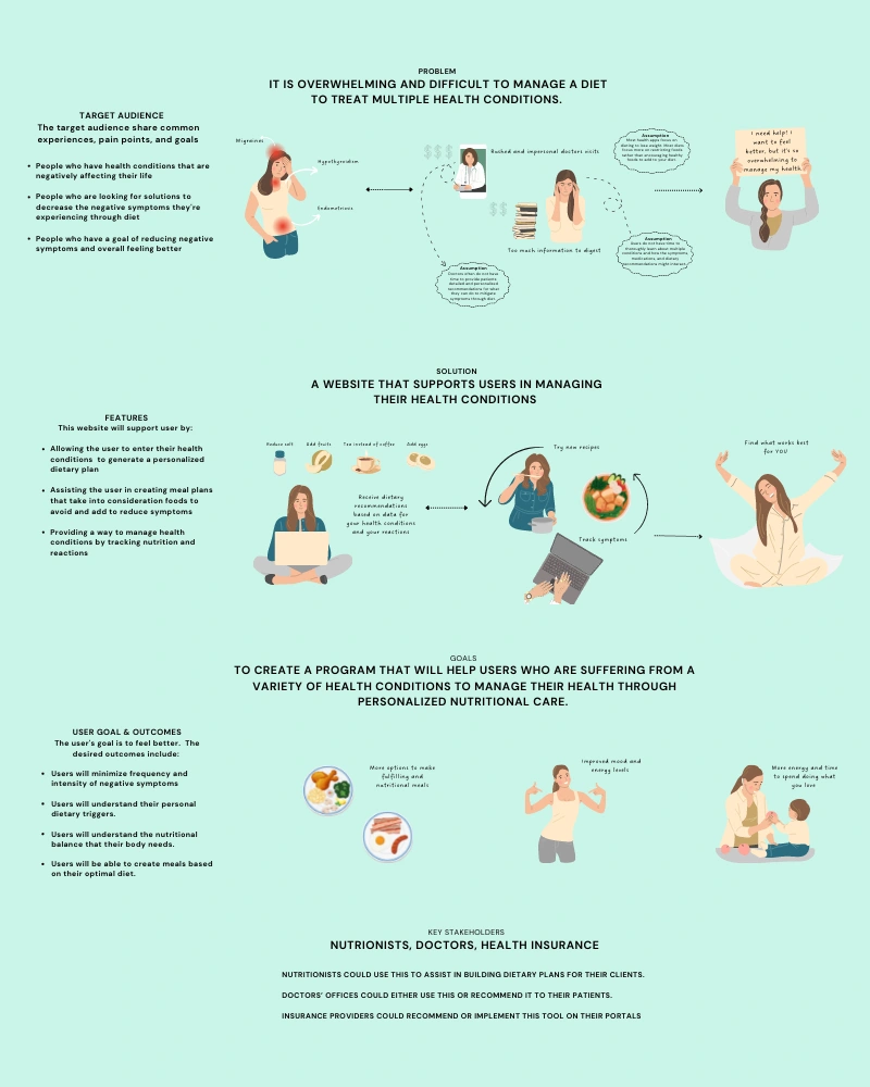
Visual snapshot: Project's essence from problem to stakeholder impact.
🎯 Problem Statement
The Need
People with Hashimoto's need more support, information, and realistic steps to take to manage and improve their condition.
The Desired Outcome for Users
Understand trends in the effects experienced Understand personal triggers Understand what they can do to minimize adverse effects Ultimately, minimize those adverse effects and feel better
How might we create a product for those with Hashimoto's, that will support users in managing their condition, so that they can be empowered to minimize adverse effects?
Research Phase
🦋 Understanding Hashimoto's
What is Hashimoto's?
Hashimoto's disease is an autoimmune disorder in which the immune system attacks thyroid hormone-producing cells. The thyroid hormones help regulate many functions in the body. Hashimoto's usually results in a decline in thyroid hormone production-hypothyroidism. (Source)
Who is affected by Hashimoto's?
Hashimoto's is the most common thyroid disease. It is estimated to affect 14 million Americans. The condition is most common in women between the ages of 30-50. (Source)
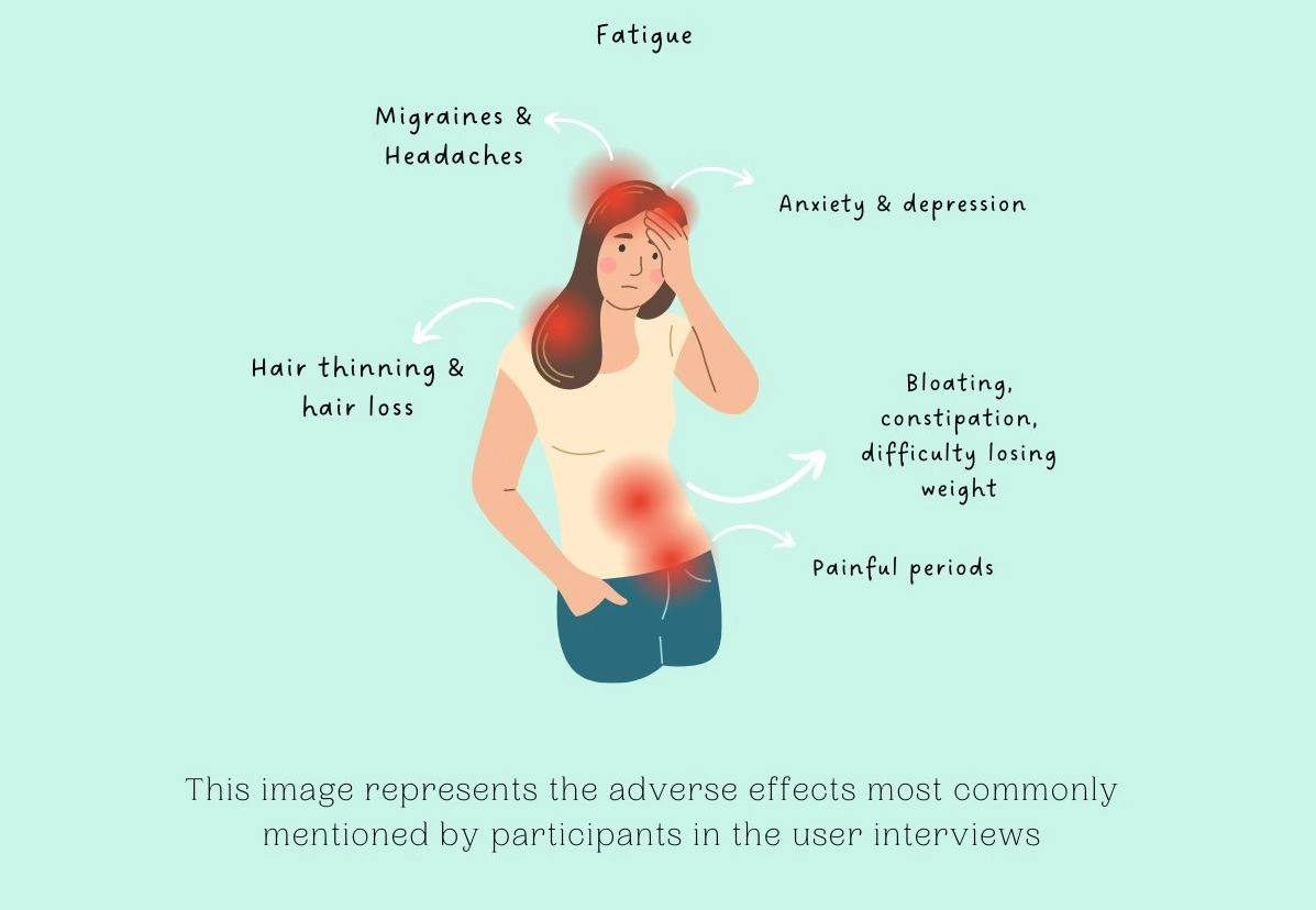
What are the symptoms of Hashimoto’s Disease?
Fatigue and sluggishness
Sensitivity to cold
Dry skin
Constipation
Muscle weakness
Hair loss
Depression
Irregular menstrual periods
Problems with memory or concentration
14 Million
Americans with Hashimoto’s Disease
10x
More common in women than men
Up to 60%
of Americans are Undiagnosed
Why is this a problem?
In researching posts within Hashimoto support communities, it became apparent that there are many people who struggle to lead normal lives with Hashimoto's.
I have been feeling super overwhelmed by the smallest tasks lately. This feeling isn’t new to me, however it feels more intense lately. I get extremely tearful and emotional over things that do not warrant that reaction. I haven’t been able to get stuff done lately because of this overwhelming feeling. Whenever I do have a bit of downtime I stay in my room watching Netflix. I work part time, around 25 hours a week. Lately I haven’t been able to handle the work load. Ive cried about going to work and even considered quitting my job. Something feels extremely off and I’m not sure whats causing it.
I’ve been suffering since 1998. I have never felt the same as I did. Some days, some month, some years are better than others. I can’t work. I use to be an athlete and now just take walks and do light weights. I had live-in help to help raise my children. I had to get a hysterectomy because of excessive bleeding. I wake up every morning feeling as if I have a hang over and I feel as if I never get enough sleep.
There are hundreds of other anecdotes like these of people who are suffering, of people who have seen multiple doctors, tried many methods, and still experience devastating effects due to this auto-immune condition.
Who needs a solution to this problem?
The primary stakeholders that I am designing for are the product users themselves, people who:
Have a diagnosis of Hashimoto's Disease
Are experiencing adverse effects of Hashimoto's
Are looking for support to manage their condition
It is estimated that up to 60% of American's with a thyroid condition are unaware of that condition- and Hashimoto's is the most common thyroid disease, this indicates that diagnosis' will increase over time (Source)
💡 UX Strategy and Approach
Jamie Levy's 4 Tenant's of UX Strategy
My approach
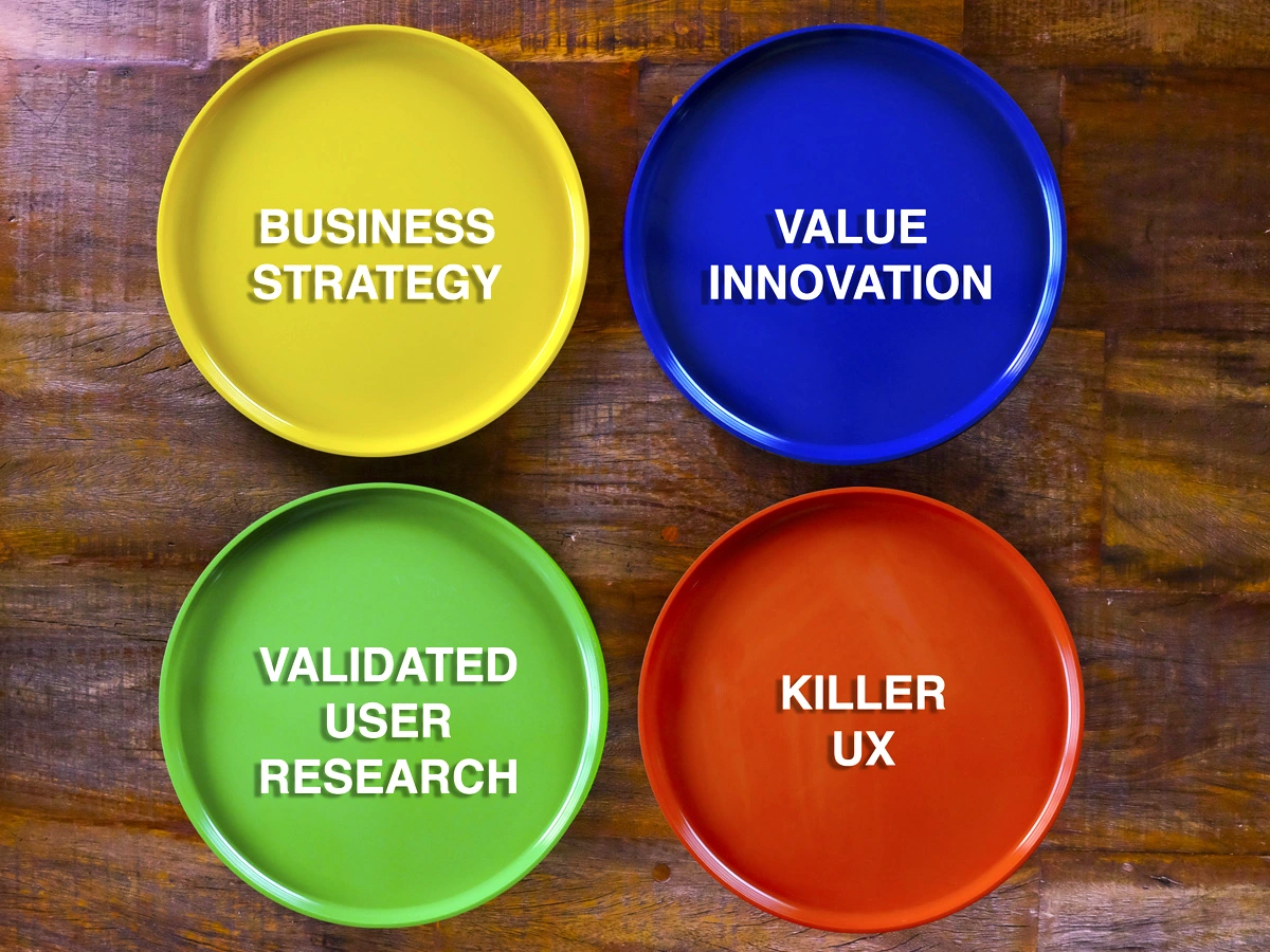
I approached this project pulling from practices and mindsets I have learned from reading UX Strategy by Jaime Levy. Jaime’s UX Strategy formula is UX Strategy= Business Strategy + Value Innovation + Validated User Research + Killer UX Design.
Extensive research and critical analysis guided my understanding of the project's business strategy. I conducted a thorough review of competitors and engaged in brainstorming sessions to foster value innovation. However, my primary focus was on Validated User Research and crafting a Killer UX Design.
While the ideal user research process involves multiple collaborators, my strategy revolved around building a Minimum Viable Product (MVP) and subjecting it to early and frequent user testing. This iterative approach aimed to validate the MVP's viability before proceeding to develop the full solution, ensuring that user feedback played a pivotal role in shaping the product.
Throughout the design phase, I concentrated on prototyping key features critical to the product's success and innovation. For the final prototype, I utilized Figma as my design tool of choice. Acknowledging that prototyping is not my primary strength, I leveraged community resources for inspiration and frameworks, directing my efforts towards refining the most crucial screens for optimal user interaction and experience. This data-driven strategy served as a compass to navigate the complexities of the project, ultimately leading to the development of Hashimotive's user-centered healthcare application.
🛣 Project Roadmap
🗺 Original Mindmap
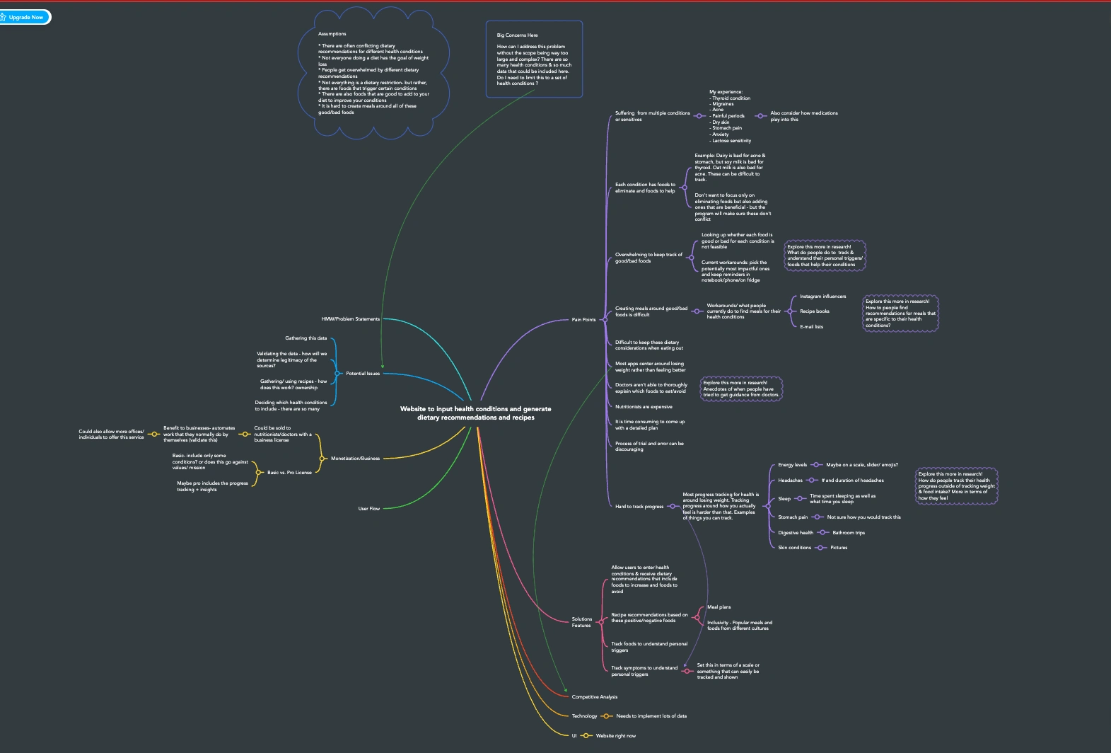
To kickstart the creative process, I used Mindmeister to create a Mindmap. This mind map allowed me to visually link together a myriad of essential concepts and ideas related to the app's design, functionalities, and user needs. I began gathering preliminary assumptions about the unique challenges of medication management, symptom tracking, and lifestyle adjustments. By organizing these interconnected elements through the mindmap, I gained a deeper understanding of the interplay between user needs and design solutions, thus setting a solid foundation for the subsequent stages of the UX Design process.
👥 Stakeholder Research
Who is the solution for?
The primary stakeholders of the initial product are the users themselves, people who:
Have a diagnosis of Hashimoto's Disease
Are experiencing adverse effects of Hashimoto's
Are looking for support to manage their condition
Market Potential
It is estimated that up to 60% of American's with a thyroid condition are unaware of that condition- and Hashimoto's is the most common thyroid disease, this indicates that diagnosis' will increase over time (Source)
Additional Stakeholders
Health Professionals, who specialize in treating Hashimoto's in private practice (dieticians, holistic health coaches, nutritionists, functional medicine pharmacists)
Insurance companies looking to implement tools to support their patients in preventing and mitigating the effects of chronic health conditions
Extended Beneficiaries
Parents and loved ones of people who suffer from Hashimoto's
Health Care Groups and Doctor's Offices looking to implement tools to support their patient
Research groups looking to understand more about Hashimoto's
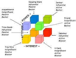
Stakeholder Analysis
Savior: Health Professionals in Hashimoto's, Health tech innovation strategists.
Friend: Non-health professional social media influencers.
Saboteur: Non-specialized primary care doctors and endocrinologists, digital partner operations.
Time Bomb: Legal entities in insurance and medical sectors.
Sleeping Giant: Investors including universities and angel investors.
Acquaintance: Marketing and product strategy teams.
Irritant: Users concerned about cybersecurity.
How will this product relate to Health Insurances' strategic goals & priorities?
Digital Wellness platforms are growing in the insurance industry. These may be provided as part of an employee health program or directly to enrollees.
The primary goal of these wellness programs are to motivate and guide enrollees to enact lasting lifestyle changes to prevent or mitigate the effects of chronic health conditions. (Source)
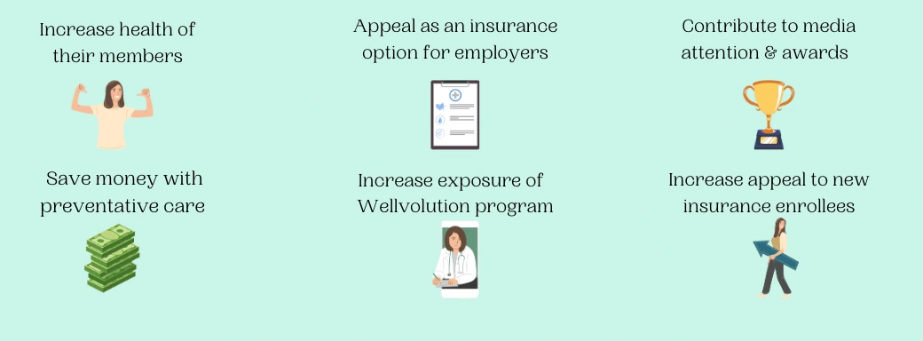
How will this project benefit Health Insurance Stakeholders?
How will this product benefit Hashimoto's experts?
These Hashimoto's Experts have their own programs and books for sale. Many of them also promote products, programs, and books on their social media account.
A partnership with a healthcare professional focused on Hashimoto's could be beneficial in:
Increasing exposure of both programs
Providing discounts for users of both programs
Potentially integrating program material together
How will this product relate to Hashimoto Expert's strategic goals & priorities?
There are several healthcare professionals who focus their expertise in Hashimoto's. Most of these people have Hashimoto's themselves, and their goal is to educate and guide others to make lifestyle, diet, and medical changes that will treat the symptoms of Hashimoto's.
Many of these Hashimoto Experts focus to build the reach of their brand.
The most popular Hashimoto's -focused professionals on Instagram (12k-100k+ followers) are:
Doctors of Pharmacy
Certified Holistic Health Coaches
Functional Medicine Pharmacists
Certified Holistic Health Coaches
How will this product benefit customers of the app?
Many people with Hashimoto's feel that medication is not enough to treat the symptoms and feel that they have little help from their doctors. Research on Hashimoto's sufferers showed that most people are overwhelmed by the diets and programs offered to support Hashimoto's.
An application like this can support people with Hashimoto's by providing them a place to easily track their symptoms and empower them to understand their personal triggers.
It can also provide them education in a digestible form, and guide them towards actionable steps to make lifestyle and nutrition changes that will reduce their negative symptoms.
How will we measure success for users of the app with Hashimoto's ?
Symptom reduction- measured by user data trends, and official clinical research of the effects with healthcare stakeholders
User behavior change- measured with surveys and interviews
Education- Measured by pop-up, 1 button feedback, after presenting educational informationThe desired outcome for the user is that they will ultimately reduce their adverse feelings, by implementing recommendations and education of Hashimoto's provided by the application.
🔍 Competitive Analysis
Competitive Exploration and Objectives
To gain a deeper understanding of the existing marketplace for the targeted application, I embarked on a competitive analysis journey. My goal in completing this research was to answer these questions:
What solutions already exist for this problem? How are these solutions received by the target users?
What features of these products are praised most? What features of these products are requested?
What gaps exist in the marketplace? How can my solution address those gaps?
What mental models already exist for the target users, and how can those be integrated or reshaped in our design?
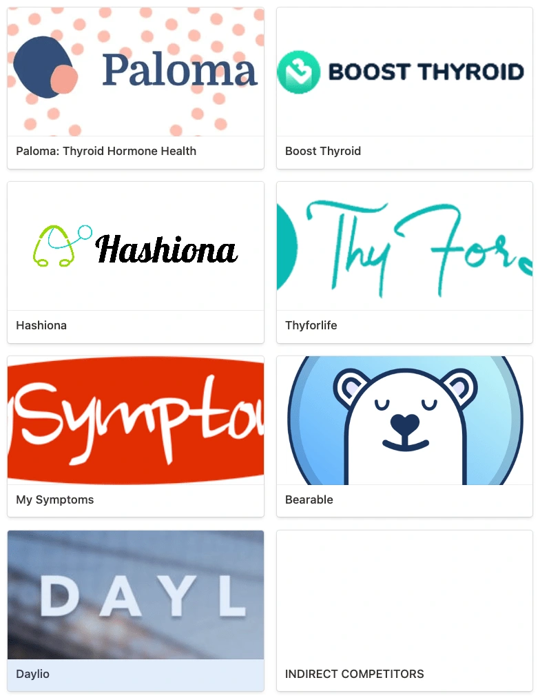
Competitor Apps Evaluated
Competitor Interaction and Analysis Methodology
In my pursuit to adopt a user-centered approach, I dedicated significant time interacting with competitor apps. By adopting a real user persona, complete with authentic profiles and data over a period of at least a week for each direct competitor, I was able to extract valuable insights into usability issues and discover unique UX opportunities for our solution.
I implemented the Competitive Analysis Matrix Tool template provided in the book UX Strategy by Jaime Levy as a basis for gathering and organizing data. I found four direct and four indirect competitors and collective several quantitative and qualitative data points for each one.
Year founded
Product purpose
Feature set
Customer reviews
Revenue streams and partnerships
Community engagement strategies
Contacts within the company
Utilizing Notion for custom table creation, I tagged and filtered features to recognize commonalities among competitors. In addition to the data I collected from first hand interaction, I leveraged other channels for information gathering, including social media, Google Play reviews, Crunchbase, and LinkedIn, ensuring a rich mix of user feedback and business insights.
Findings and Strategic Implications
From heuristic evaluations to benchmarking analyses, the gathered quantitative and qualitative data permitted me to pinpoint industry best practices and red flags. I leveraged this information to decode users' existing mental models and baseline expectations.
The current marketplace has room for an application tailored to Hashimoto's with existing solutions suffering from UI issues and offering minimal insights.
By embracing these findings, this application has the potential to lead and redefine the experience for those suffering from Hashimoto's.
Key Findings
Hashiona: As a direct competitor, Hashiona was noted for its alignment with the desired value proposition but faltered in visual design, content management, and tone.
Bearable: An indirect competitor, Bearable demonstrated success in comprehensively tracking symptoms and engaging its community. Their revenue generation was notably higher due to these factors.
Market Opportunities
Key areas to focus on for improvement in a new product include:
Visual Design Enhancement: Curating an aesthetic appeal with consistent visuals.
Data-Driven Insights: Enhancing symptom tracking for more nuanced understanding.
Credible Content Curation: Including reputable educational content.
User-centric features: Assisting users with creating and fulfilling actionable health goals.
Competitor Inspired Features
The product can benefit from the inclusion of:
Customizable symptom tracking and note-taking
Medication reminders
Shareable, exportable charts for medical consultations
A robust community engagement platform
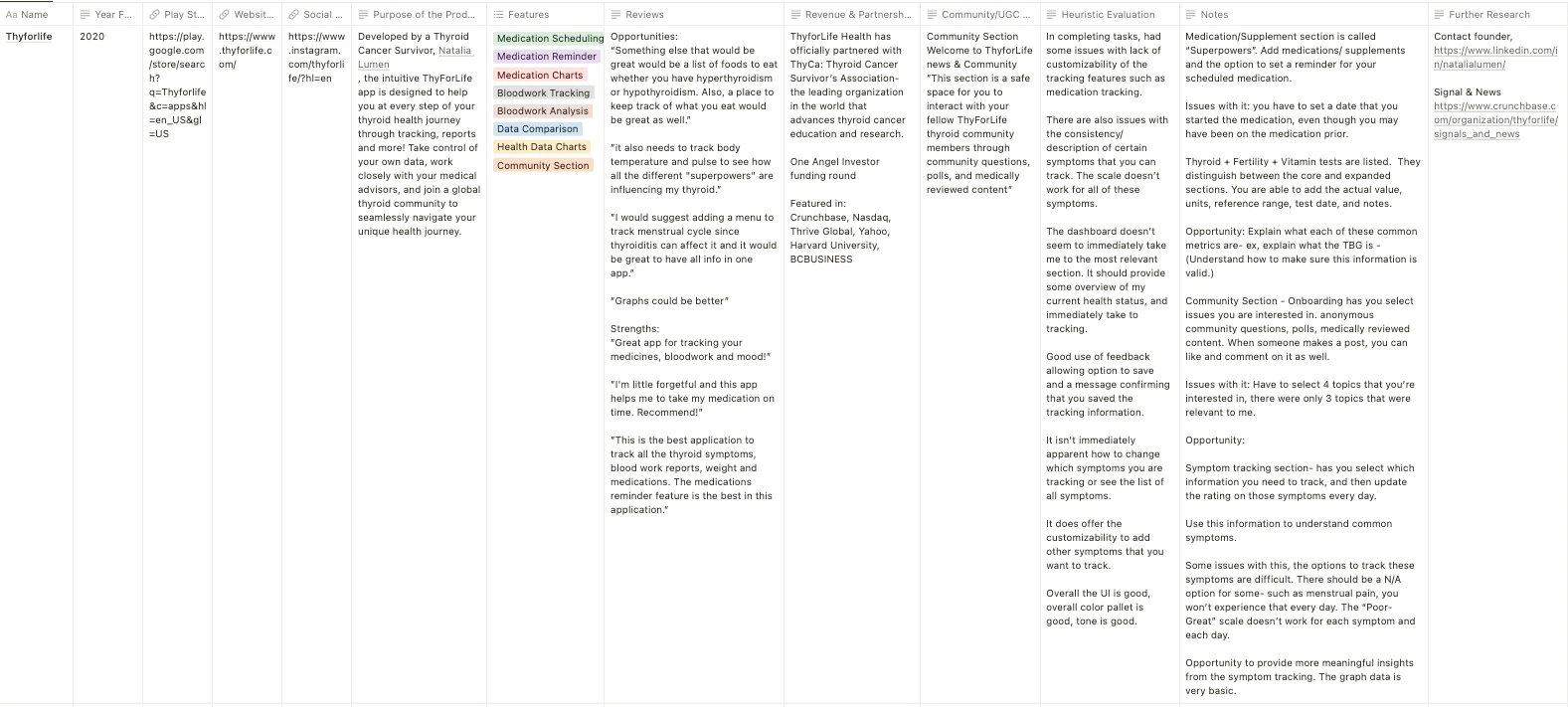
Data collected on the direct competitor: Thyforlife
🗣 User Interviews
Recruitment and Selection
I initiated the research by reaching out to members of the r/Hashimotos subreddit and the Blue Butterfly Guild on Discord. From the enthusiastic pool of 40 respondents, I meticulously screened individuals not only to confirm their Hashimoto's diagnosis, ongoing thyroid replacement hormone treatment, and enduring adverse symptoms, but also to ensure a diverse representation. This meant selecting participants with varied backgrounds in terms of age, duration since diagnosis, and other associated conditions they might have. This rigorous selection led to six individuals being chosen for comprehensive formal interviews. Alongside these, I also engaged in enlightening chat-based discussions with eight women across platforms like Discord and Reddit, further broadening the spectrum of experiences and insights.
Research Goals and Methodology
The interviews sought to answer five primary objectives:
Capturing the daily life impact of Hashimoto’s Thyroiditis.
Discovering methods individuals use to lessen the negative repercussions of the condition.
Understanding the role of nutrition in managing the condition.
Delving into how individuals keep track of their physical well-being.
Identifying other health concerns that accompany Hashimoto's Thyroiditis
A structured user interview script paved the way for deep dives into each topic. The questions were categorized based on the nature and intent
Context Setting
My aim here here was to immerse myself in the early stages of an individual's diagnosis. I sought to gauge the initial reactions, symptoms felt, interactions with healthcare professionals, and the emotional gravity of receiving an official Hashimoto's Thyroiditis diagnosis.
Sample Questions:
When did you first experience symptoms of Hashimoto's Thyroiditis?
What was the process of receiving a diagnosis?
Uncovering Pain Points
In this section, I delved into the day-to-day challenges of living with Hashimoto's. through personal anecdotes, I aimed to grasp the most prevailing symptoms that persisted even after treatment.
Sample Questions:
How does Hashimoto's affect you day to day life?
How has Hashimoto's affected your professional (or academic) life?
Coping Mechanisms
Here, I explored the strategies individuals employed to alleviate their symptoms. By understanding what resonated and what fell short, I aimed to discern how a potential solution might integrate into or enhance their current self-management methods.
Sample Questions:
What have you done to mitigate [negative effects]?
How do track your progress with [negative/positive effects]?
Ideal Future
As we neared the end of the conversation, I shifted the focus towards the future. I was keen to gather insights on what an ideal support system would look like for them, unbounded by constraints like finances or access to healthcare. Their aspirations provided invaluable direction for potential design solutions.
Sample Questions:
What would help you manage your condition?
What would you like to know about your condition?
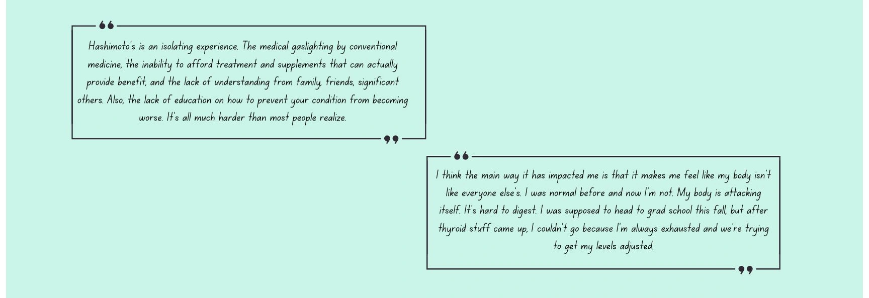
Quotes From User Interviews
Preliminary Insights
Through these conversations, patterns began to emerge;
These insights, both quantitative and qualitative, become the foundation upon which the next phase of UX design is built, ensuring that it is deeply rooted in user needs, aspirations, and lived experiences.
📝 Diary Study
Diary Study Objectives
I conducted a diary study because I wanted to contextualize and understand current user habits. The diary study method allowed participants to expressively convey personal details about their day-to-day life. This method allowed me to get a snapshot into the target users’ symptoms, activities, how their condition affects their day, and what their ideal solutions might look like. This method allowed me to see minor moments in a participants’ week that built up to a bigger picture of how Hashimoto’s affects their life.
Methods & Execution
The diary study was conducted remotely over the course of 7 days using Google Docs, e-mail, and Discord to collect responses. Originally, I was able to recruit 5 participants for the diary study, however, life circumstances led to one person withdrawing before the study commenced and another discontinuing on the fourth day.
To capture both real-time experiences and end-of-day reflections, the study design involved in-situ symptom logging along with follow-up questions and daily reflection prompts. This balanced approach provided both granular insights into symptom-specific reactions and holistic views of their day.
Ensuring Ethical Practices
Recognizing the sensitive nature of the data, thorough preparations were made to ensure the utmost ethical standards. I dedicated time to deepening my understanding of diary studies, particularly when they intersect with personal healthcare information.
Every participant was provided with a comprehensive consent form. This form not only delineated the objectives, expectations, and terms of the study but also laid out clear guidelines on data collection, storage, and sharing protocols. A critical feature was the flexibility offered to participants regarding the extent of their data sharing.
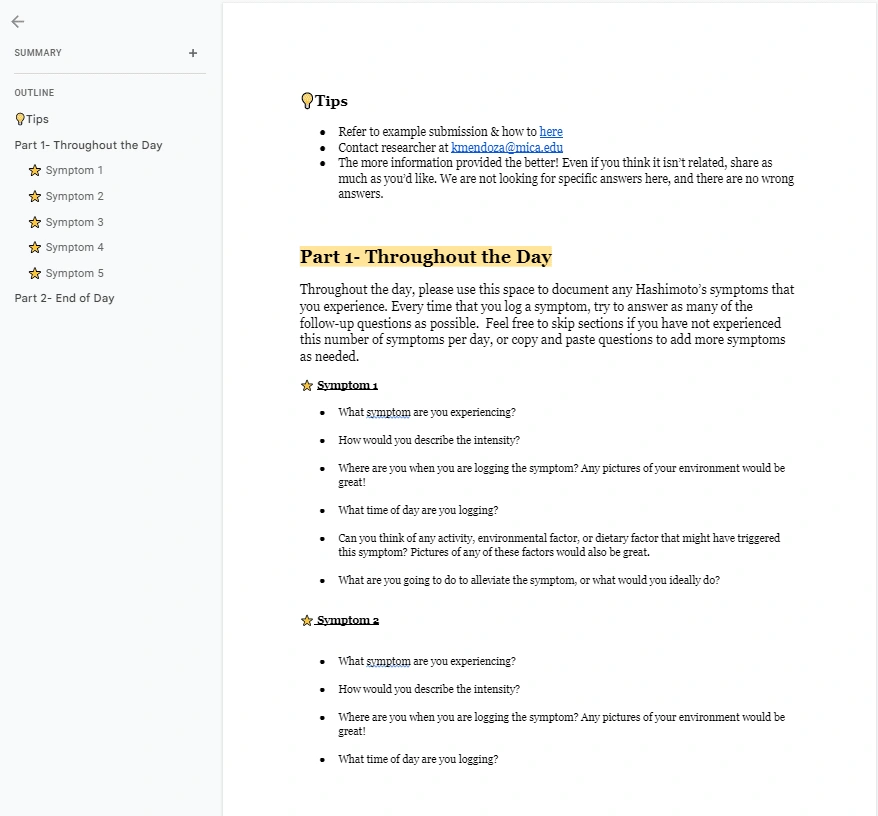
To ensure clarity and aid participation, individual documents were prepared for each day of the study, supplemented by example responses for reference
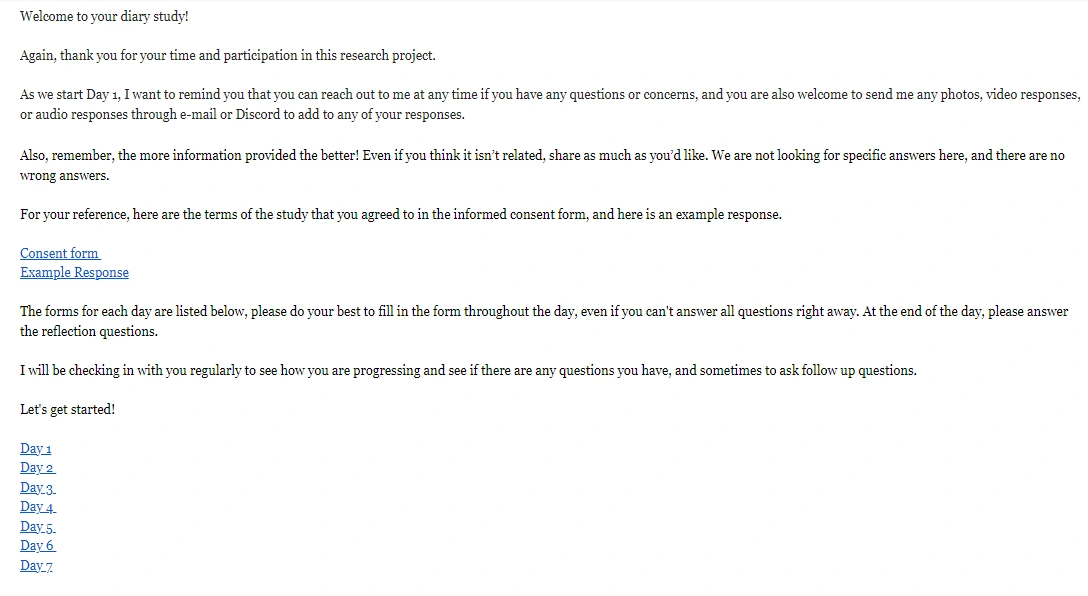
Document Templates that I shared with each participant
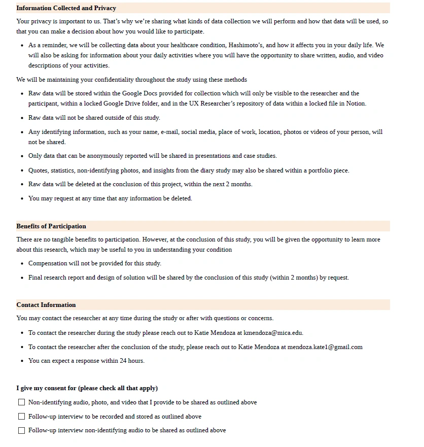
Informed consent document shared to all participants prior to beginning the study
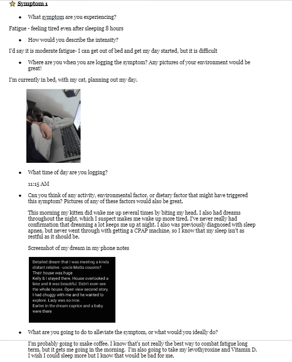
Example responses I prepared for participants
Document for participants to fill out daily
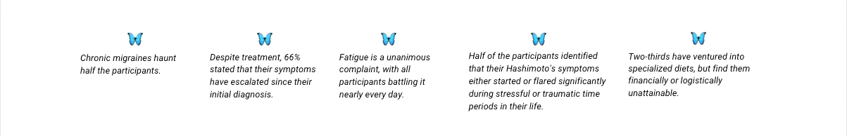
Findings
The diary study had a significant impact on the Hashimotive application's design approach. It highlighted the importance of addressing users' emotional and psychological well-being alongside physical symptoms, leading to the integration of features for holistic tracking. Additionally, the study emphasized the value of community support, inspiring the exploration of community-based solutions within the app. Users' positive feedback on self-documentation influenced the consideration of self-reflection elements. Overall, the diary study informed a more comprehensive design strategy for Hashimotive.
Nature of Shared Content
Insight
The sketches, photos of environments, and activities hinted at participants' desire to convey not just their physical state, but also their emotional and psychological landscapes
Impact for design
In the design of the app, integrate features that allow users to visually express and track their emotional and psychological well being, alongside their physical symptoms.
Patterns in Symptom Logging
Insight
Participants most frequently reported fatigue and mood fluctuations. This points to the pervasive impact of Hashimoto's on energy levels and emotional well being.
Impact for design
Focus on solutions that address energy management and emotional support.
Shared Coping Mechanisms
Insight
Many participants mentioned community support, like Reddit groups, as crucial to their coping strategy, underscoring the importance of communal connections in managing chronic conditions.
Impact for design
Investigate the potential of community-based solutions or support groups.
Feedback on Diary Study Process
Insight
Participants found value in the act of documenting itself, suggesting that periodic self-reflection might help individuals understand their condition better.
Impact for design
Consider the integration of self-reflection elements in the tool.
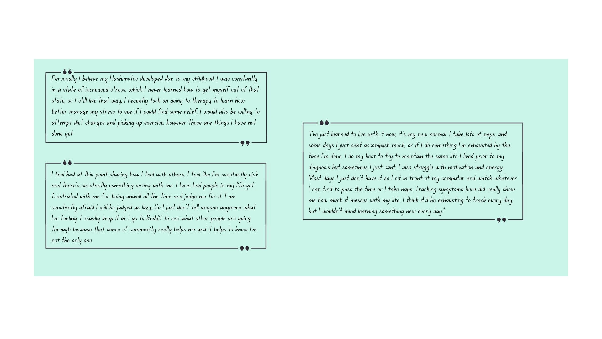
Quotes from Participants
👩 User Personas
Crafting Personas
Engaging with women aged 18-45 who shared their Hashimoto's journey provided me a rich tapestry of experiences, emotions, and needs. These narratives became the foundation for my personas. Although 1/8 of Hashimoto's patients are men, the personas were molded based on my participants, which is why both representations are of women.
Every individual I spoke with, although bound by the common thread of Hashimoto's, had unique challenges, backgrounds, and aspirations related to their condition. One might be navigating the early stages post-diagnosis, desperate for understanding and direction. In contrast, another might be a seasoned warrior, seeking advanced tools to refine her daily management routine. Capturing these nuances was critical as they directly influence how users would interact with our app.
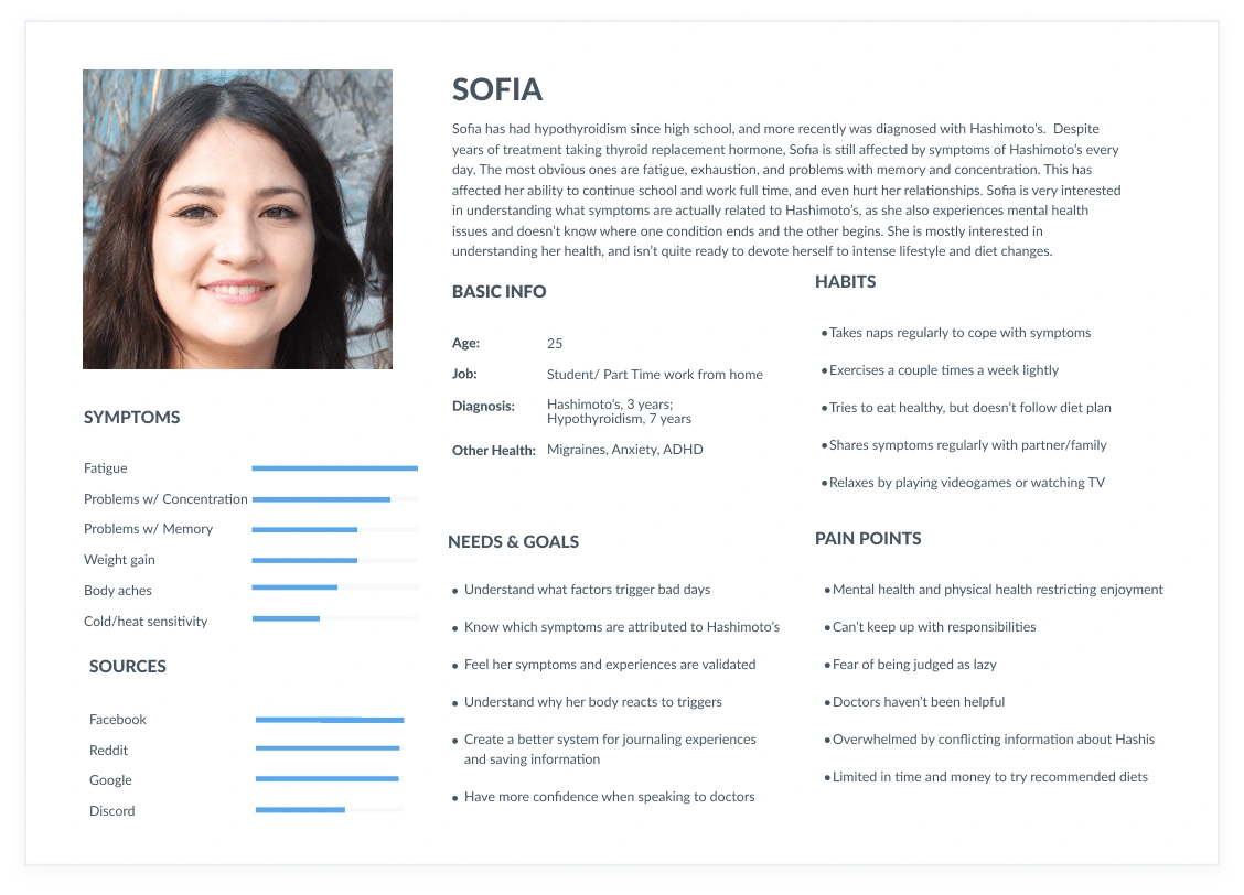
Sofia’s lifestyle as a student and part time employee allows her to let her body rest more often, and she is hyper aware of symptoms and shares her struggles with her loved ones. She feels at a loss as to what to do to improve her symptoms, but her goal is first to learn as much as she can about her own symptoms and triggers.
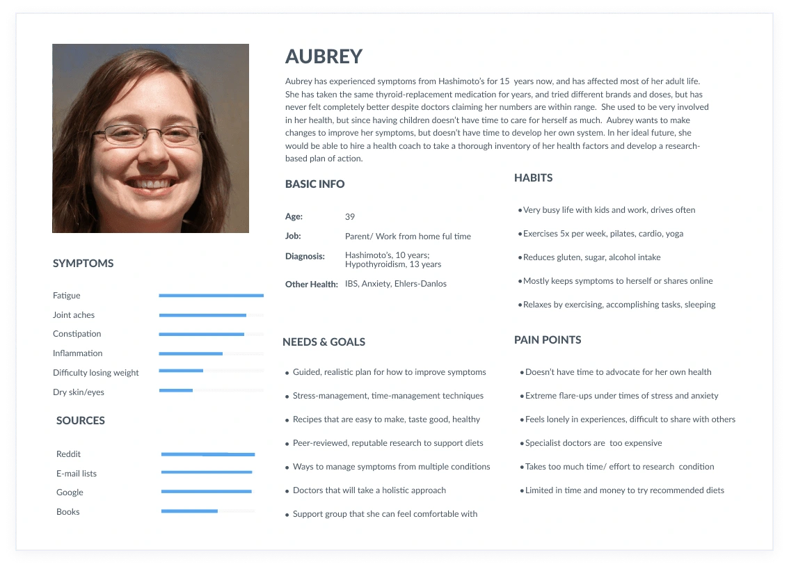
Aubrey's lifestyle as a parent and full time employee keeps her life very busy and leaves little time for her to advocate for her health. She often keeps her struggles to herself as it has been a part of her life for so long now. Her primary goal would be to find a program that is research-based and provides a detailed, action-oriented plan to improve her symptoms.
Influencing Design Through Personas
The two distinct personas I crafted aren't just representations; they're echoes of real-world voices, guiding our design decisions. For instance, a university-going persona may necessitate a focus on easy symptom logging amidst a hectic schedule, while a working professional persona might benefit from comprehensive data insights to plan her workdays better.
By aligning features and design elements to the specific challenges and needs outlined in these personas, I ensured that our app is tailored to serve these voices. Every design element, be it notification preferences, content depth, or user interface, is a response to the personas' needs.
📊 Thematic Analysis
Synthesizing Data
By the end of my research collection phase, I had an abundance of data to organize. The data from user interviews and diary studies comprised over 50 document pages, and the secondary research I had conducted analyzing Reddit posts in r/Hashimoto's, background research on Hashimoto's, stakeholder research on wellness programs, brought the total data to 80 pages of research.
The depth of the information I had collected was staggering. My immediate challenge was to bring coherence to this plethora of voices and distill tangible insights.
I crafted a robust tagging matrix, categorizing diverse elements from symptom-focused tags like "Headaches" to broader experiential themes like "Affects Social Life".
Notion for Coding Data
Understanding the significance of recurring sentiments and patterns within my gathered data, I turned to Notion to build a structured database. By methodically coding information extracted from Reddit posts and participant data, I could segment, categorize, and identify common themes. Through a blend of qualitative analysis (deep diving into individual experiences and narratives) and quantitative analysis (identifying frequency of recurring symptoms and patterns), I gained a multi-dimensional view of the user's journey and needs.
This codification also played a vital role in determining the scope of features in the design. By pinpointing the most prevalent symptoms through quantitative analysis, I could prioritize features that addressed these immediate concerns. The qualitative insights provided an understanding the users' vernacular guided the app's user interface design. Identifying aspects users frequently tracked cemented the necessity of incorporating comprehensive tracking functionalities tailored to their unique needs.
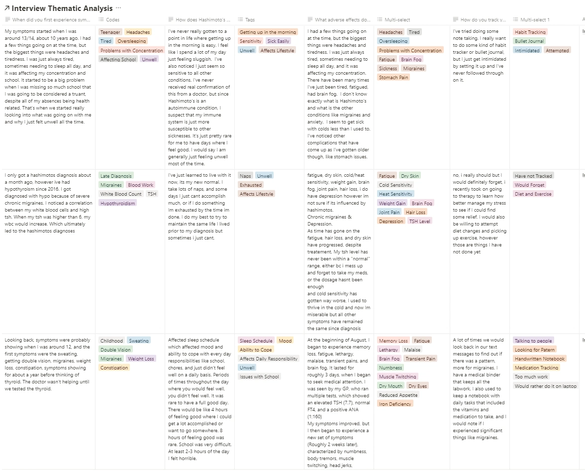
I crafted a robust tagging matrix, categorizing diverse elements from symptom-focused tags like "Headaches" to broader experiential themes like "Affects Social Life".
Affinity Mapping
I leveraged affinity mapping as a structured approach to distill complex, varied insights into cohesive themes. By using Figjam as a visual tool, I began the process by jotting down key insights from each interview and diary study on individual sticky notes. Each note represented a singular thought, emotion, or pain point expressed by the participants. Systematically grouping these notes based on similarities and overarching ideas, I was able to visually discern patterns and clusters.
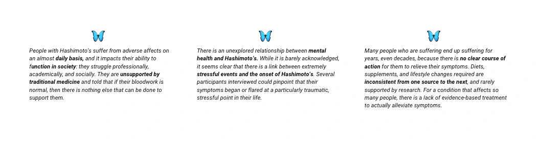
From these clusters, three distinct yet interrelated themes emerged. These themes not only highlighted the shared experiences and challenges faced by the users but also illuminated potential areas of intervention and design. By layering the insights from affinity mapping with contextual research I had amassed, I developed a comprehensive perspective. This methodical and iterative process underscored my commitment to ensuring that the design was firmly rooted in genuine user needs and experiences, making it a pivotal step in shaping the direction and focus of the solution's features.
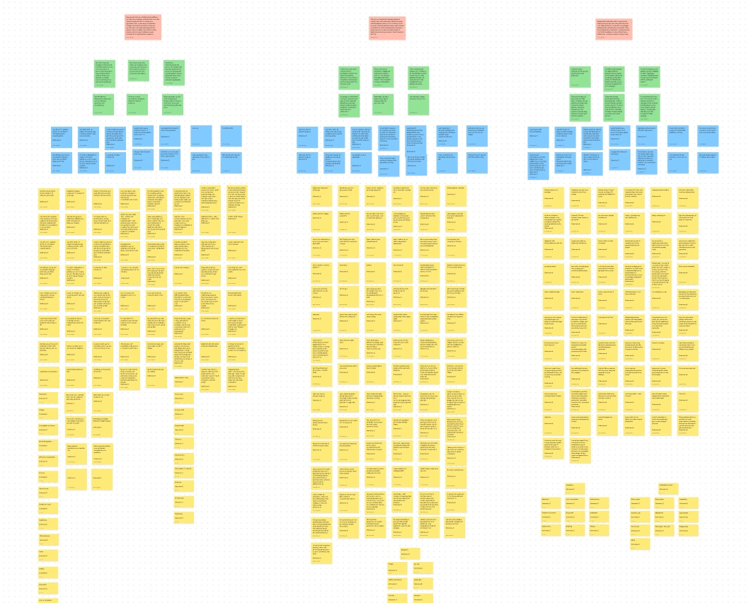
A snapshot of my affinity mapping journey in Figjam, plotting the spectrum from individual symptoms to life-altering themes
Key Research Insights
Design Phase
⚡️ Lightning Demo
Lightning Demo Method for Wireframing
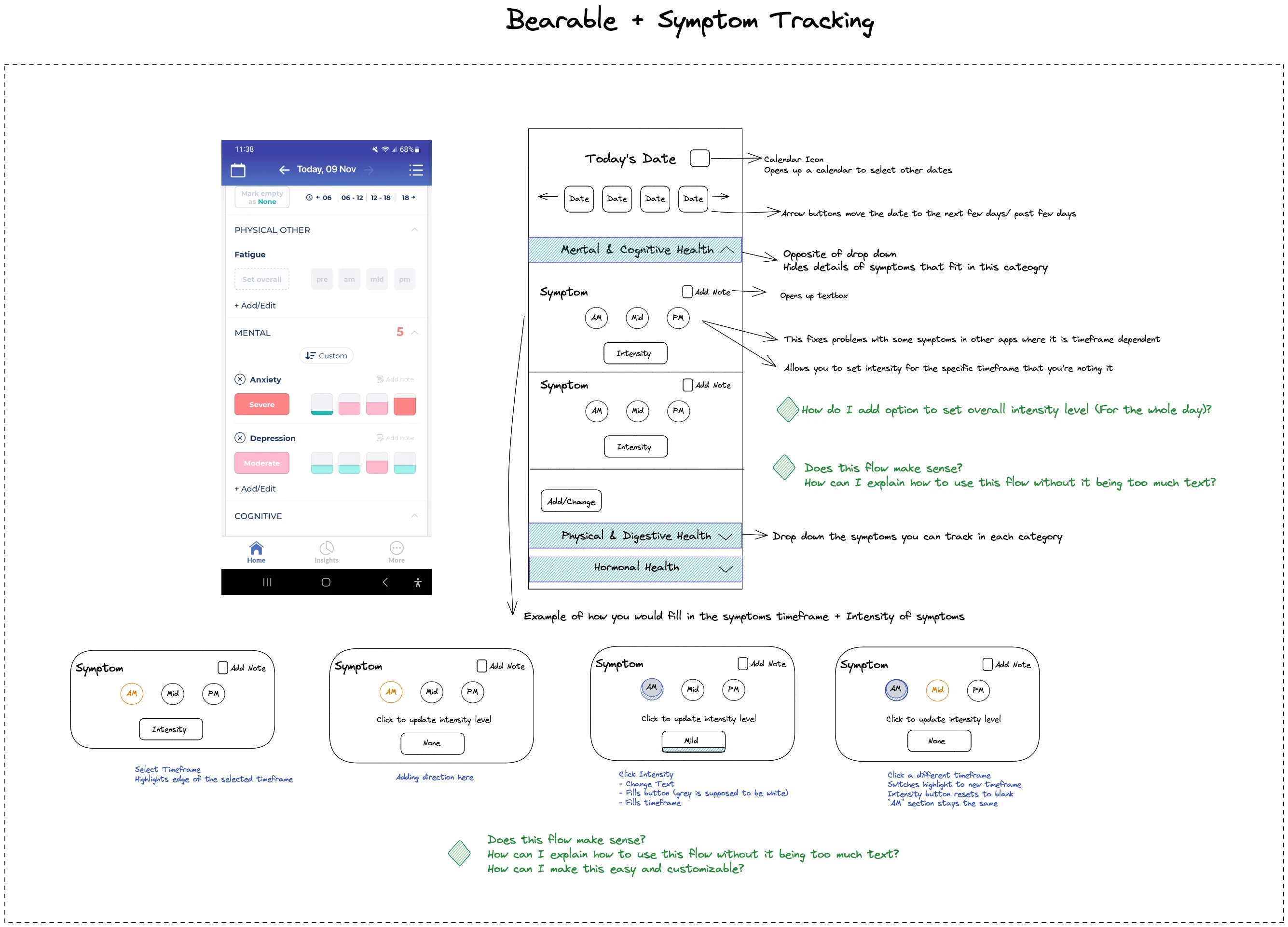
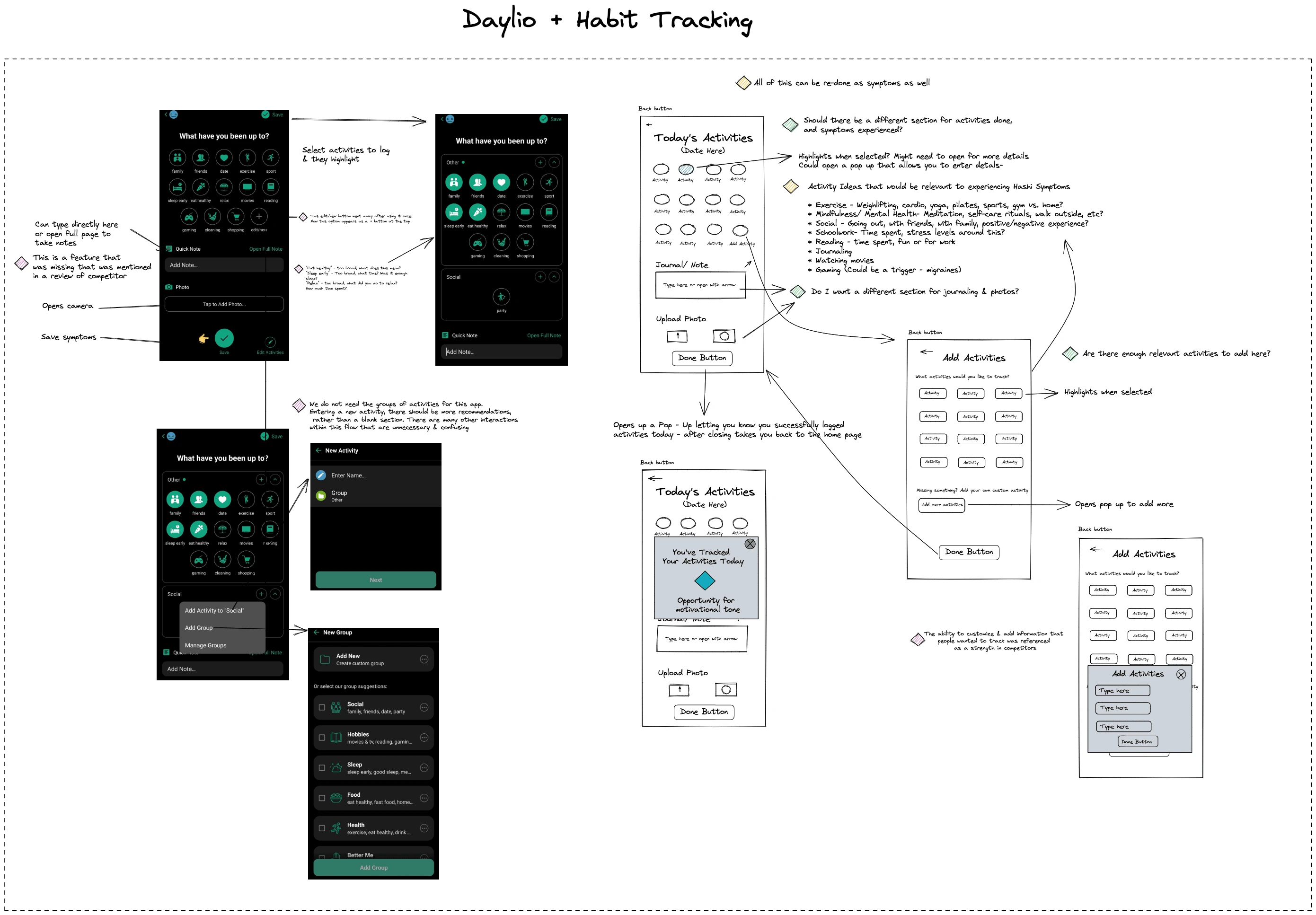
"A lightning demo is basically an exercise in stealing and adapting.” - (Source) I chose this method to begin designing because I wanted to pull from the competitive analysis that I've done for inspiration on building a symptom tracking feature. I used the tool Excalidraw to complete this process.
I explored three competitor apps in-depth, capturing screenshots of their designs. For each, I noted the possible user actions, pinpointed strengths and weaknesses, and checked alignment with my previous research findings.
Using these insights, I created wireframes for Hashimotive. I annotated them with critical questions, screen explanations, potential feature ideas, and any anticipated implementation challenges.
This lightning demo approach streamlined my design process. It ensured that I borrowed the best from existing designs, but more importantly, identified areas for innovation and improvement in Hashimotive.
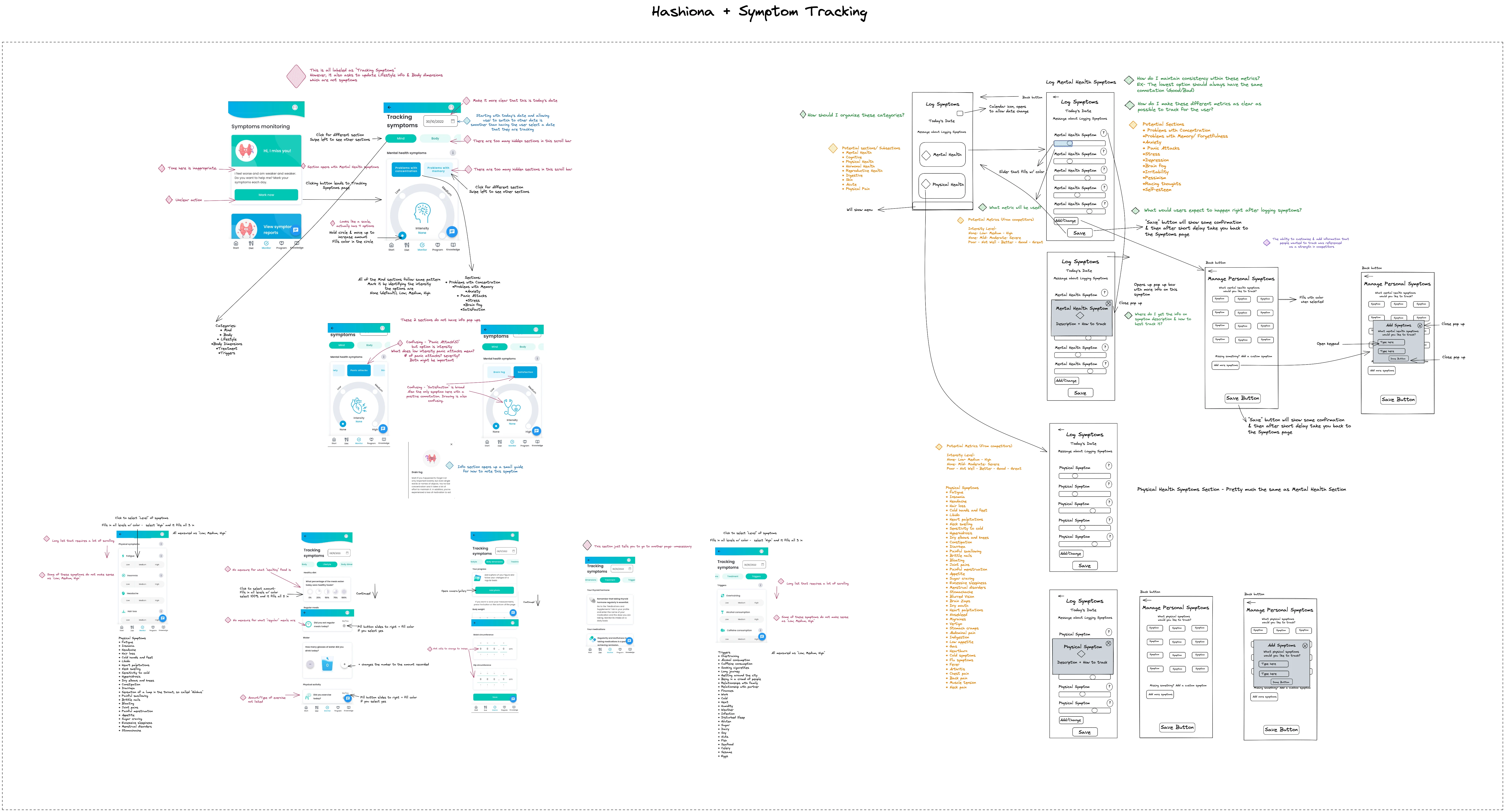
The left hand side shows screens from competitors, and the right hand side shows my adapted wireframes
✏️ Low Fidelity Prototype & Testing
Early Testing as a Component of the UX Strategy
Utilizing Excalidraw, I swiftly translated my conceptual ideas for Hashimotive into a low-fidelity prototype. This tool not only allowed me to visualize the app's foundational layout and features but also made the process of sketching out my preliminary thoughts efficient. I dove straight into user testing with this initial prototype, both in person and remotely via Zoom and Discord.
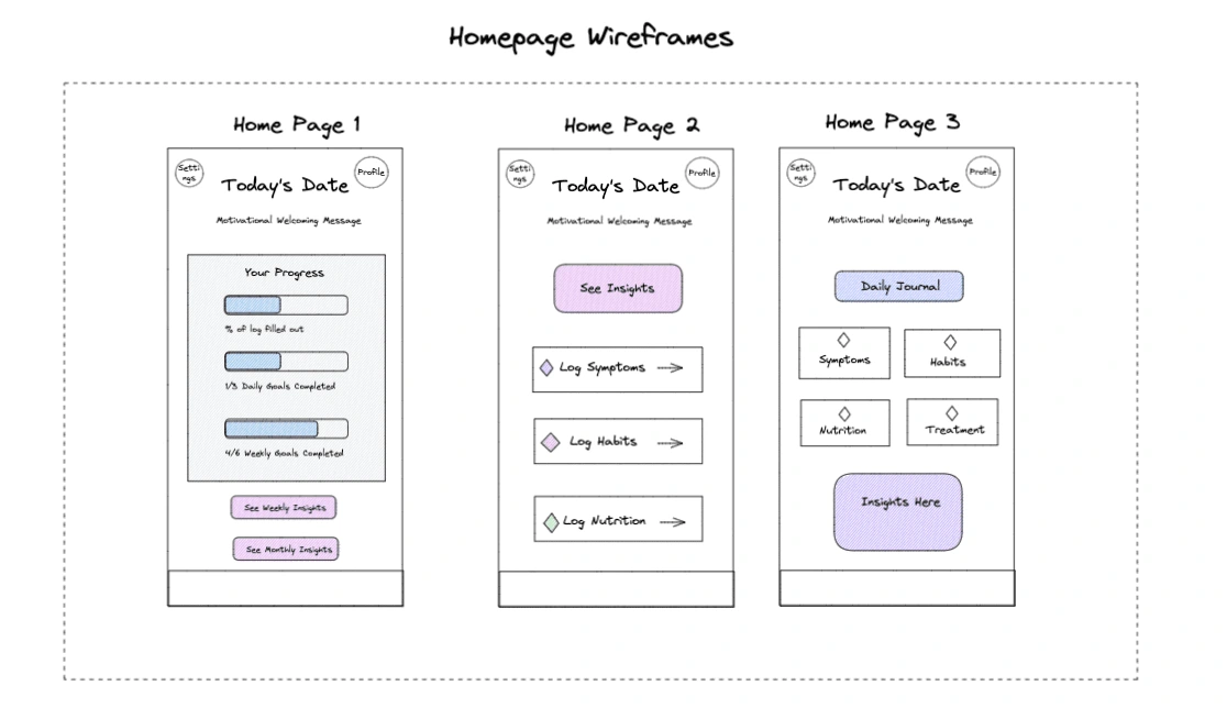
Three homepage sketches to compare design approaches
One inquiry I posed to participants was their preference for the home page design. The feedback, however, surpassed design preferences. A couple of participants suggested amalgamating elements from various layouts to enhance the user experience. They clearly conveyed their expectations for the initial screen upon logging in, emphasizing that the app should exude a sense of relief and simplicity rather than come across another chore.
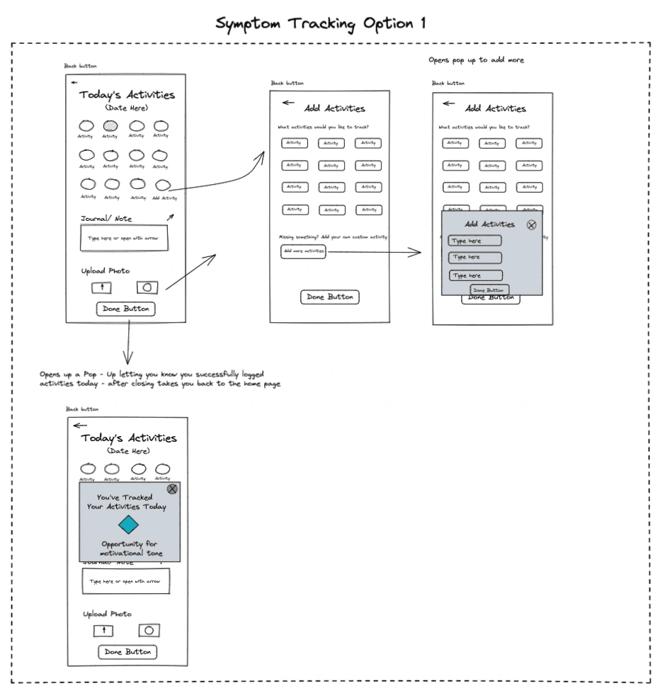
The first design of symptom tracking was most similar to Daylio
A standout piece of feedback came from one participant who assessed the symptom tracking design through the lens of data accuracy. This individual highlighted the essentiality of clarity in data capture. He emphasized that for users to derive the most meaningful insights, the design should unequivocally specify what symptom is being tracked. Additionally, the organization of data inputs is crucial, ensuring they not only capture the required information but also accurately measure the intended behavior. This perspective underscored the need to meld intuitive design with precise data collection to provide users with actionable insights about their health.
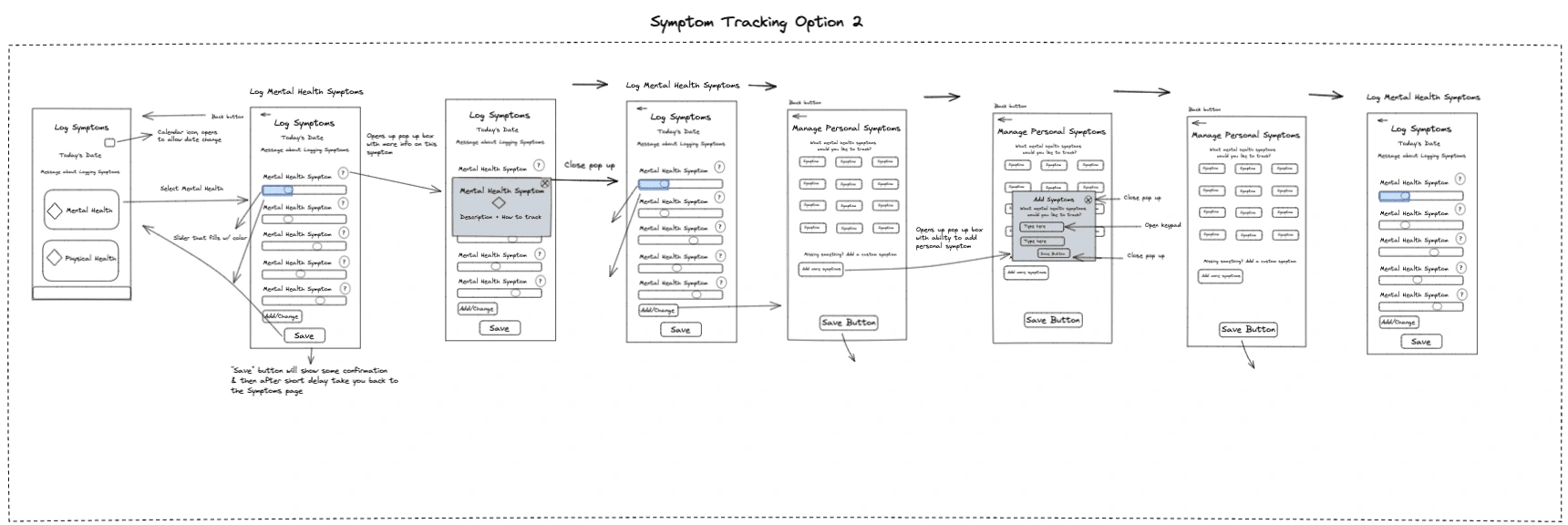
The second design of symptom tracking was most similar to Thyforlife
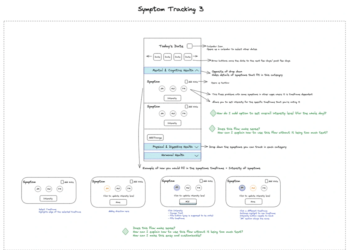
The third method of symptom tracking was most similar to Bearable
Another key observation was made regarding the user's motivation and perspective towards symptom tracking. A participant astutely noted that the design should not just serve as a mechanical tool for logging symptoms. Instead, it should remind users of the purpose behind this tracking: to better understand and manage their health. The design should encourage users to engage more deeply with their health journey, fostering a sense of mindfulness. It's not just about recording symptoms but about deriving insights, seeing patterns, and making informed decisions for one's well-being. This feedback shed light on the broader vision for the app — it's not just a health tool, but a partner in the user's journey towards better health.
⚙️ Mid Fidelity Prototype & Testing
Creating the Mid Fidelity Prototype
Having advanced from the initial design stages, I transitioned to a more detailed representation of my app. Using Figma, I developed the mid-fidelity prototype, incorporating Canva to craft the graphics. My intention was to move closer to the final version while leaving room for iteration based on feedback.
Four participants, a mix of remote and local testers, dived into the prototype with the task of evaluating its overall visual appeal, the onboarding process, and the symptom tracking options. Their insights provided a clearer direction on subsequent refinements.
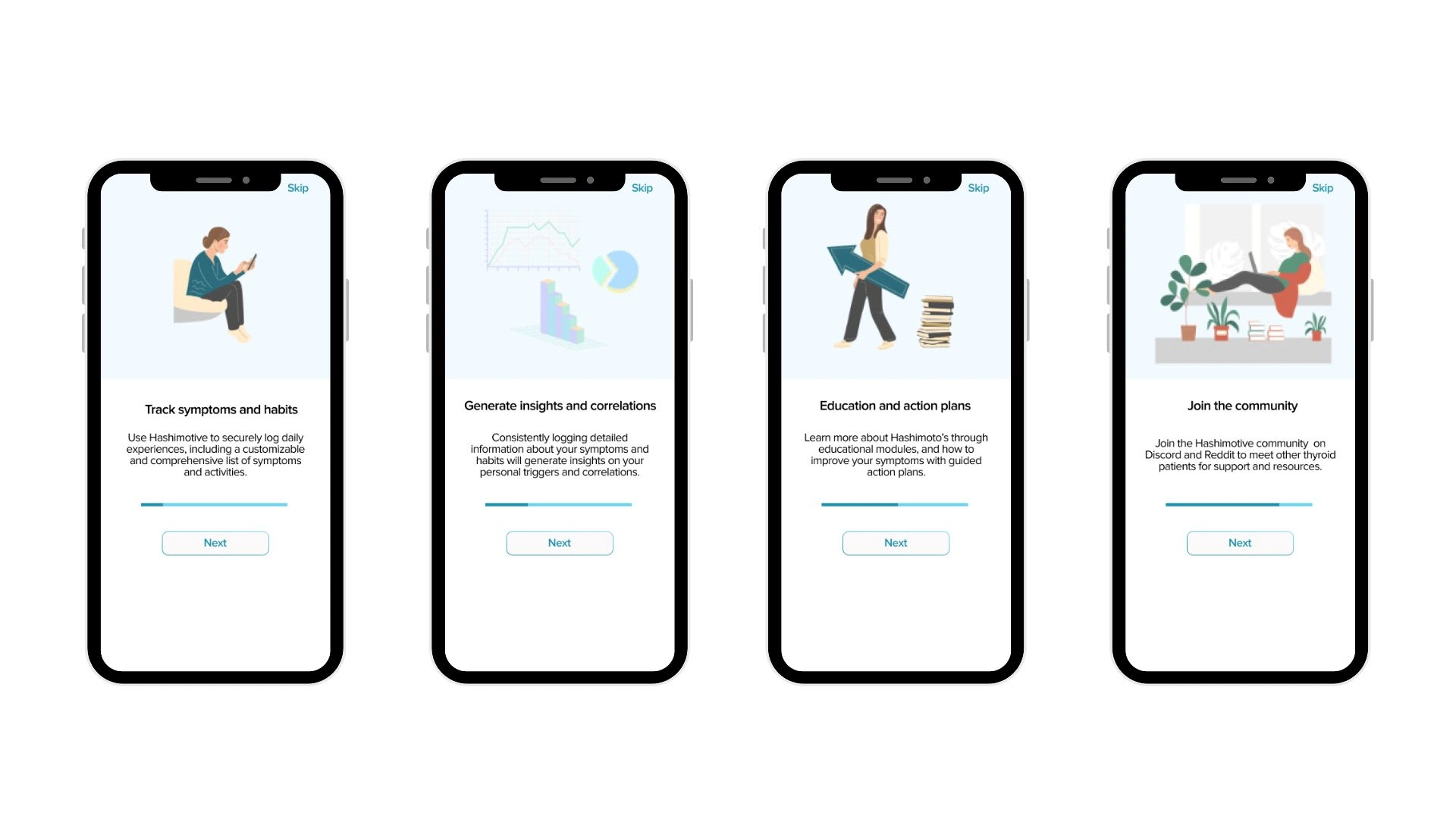
The initial onboarding screens provide an overview of Hashimotive features
The app's introduction received commendation for its clarity and welcoming nature. It served as a positive initial touchpoint for users, laying the foundation for their experience with the app. Despite the strong start, there was a clear call for further guidance. First-time users expressed the desire for more explicit direction as they navigated the app, suggesting that while the intro was intuitive, subsequent stages felt a bit more ambiguous.
On the visual design front, while many aspects were lauded, there were pointed remarks about certain inconsistencies. Participants particularly noted the stark contrast in color schemes between screen 1 and 3. This feedback underscored the importance of a cohesive visual language throughout the app. The incongruent themes, although seemingly minor, could potentially detract from a seamless user experience and thus warranted attention in further design iterations.
The next screens ask for users' relevant health information and preferences
The onboarding process of the healthcare application emerged as a crucial touchpoint during user feedback sessions. Users highlighted the dynamic nature of healthcare details and stressed the importance of revisiting and modifying initial onboarding inputs. They emphasized the need for flexibility, allowing them to update their health situations or preferences as they evolve.
Additionally, the feedback accentuated the need for explicit progression cues within the onboarding journey. Absence of clear indicators transitioning users from one screen to the next became a recurrent concern. In response to this feedback, I integrated distinct signposts and feedback loops to bolster user confidence during the onboarding process. By implementing these enhancements, I aimed to provide a seamless navigation experience, reducing ambiguity and eliminating moments of doubt or hesitation for users.
Symptom tracking was initially the primary task available on the homepage
In testing designs for symptom tracking, three out of four participants favored the design of the final option for symptom tracking. However, delving deeper into its practical application revealed a pivotal insight: the majority expressed a reticence towards tracking a multitude of symptoms consistently. Responding to this, I reconsidered the feature's scope, striving to balance design appeal with tangible practicality, ensuring that the tracking process is not overwhelming or tedious.
Further questioning revealed that participants had a stronger inclination towards education and community features within the app. Their rationale was rooted in the belief that they might not engage with tracking features daily long term- and that symptom tracking would be more suited to a short term process. This revelation underscored a significant shift in design direction and necessitated a major pivot in the app's primary focus.
Final Prototype & Iterations
🎨 Design System
Creating a Design System
Within the evolution of the design system, several components underwent significant transformations. Initially, the app employed more gradient colors, especially within button designs, which were predominantly blue with a gradient and sported a squarer shape. However, after recognizing legibility issues and receiving user feedback, the button designs were refined to enhance readability. The initial design also featured larger button sizes, but this was modified for a more balanced aesthetic.
Additionally, each symptom button was initially accompanied by an icon. Yet, upon reviewing, it was evident that the plethora of icons created visual clutter, detracting from user experience. As a result, they were removed. Lastly, while an alternate color was originally chosen for the app's background, feedback steered the design towards a more neutral white, ensuring a cleaner and more versatile backdrop for all app elements.
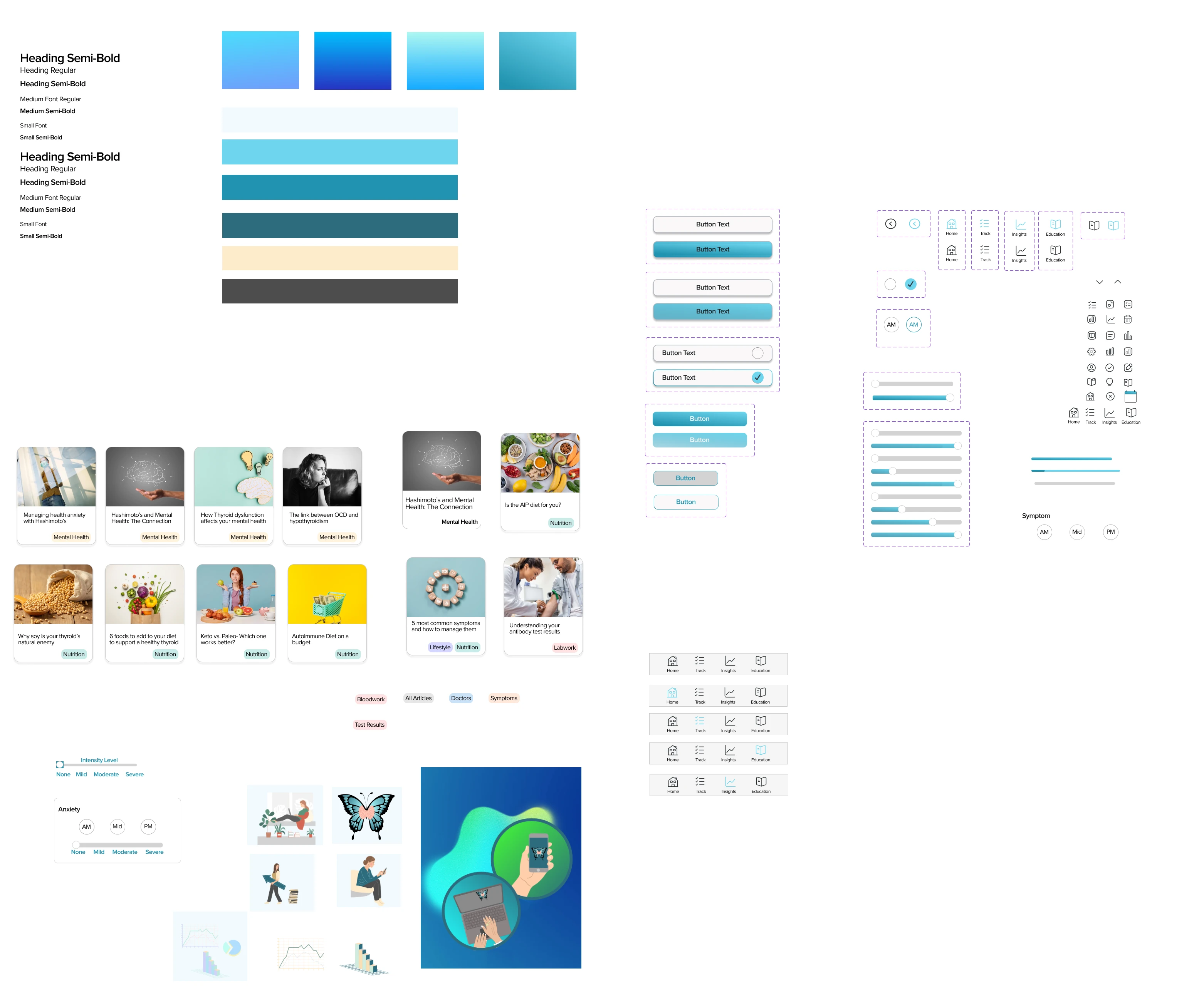
Design system elements in Figma
Color
Blue was selected as the dominant hue for its symbolic and emotional impact. Firstly, it echoes the imagery of the blue butterfly, representing the thyroid. This visual association strengthen's the user's connection to the app's core function.
Secondly, blue inherently carries a calming ambiance. Feedback from user testing emphasized the importance of the app exuding a relaxing feel. The addition of tan and brown as sub colors complements the primary blue, enhancing the pallette's depth while preserving the desired calming aura.
Typography
Typography was chosen with readability and mobile user experience in mind. Proxima Nova was selected as the primary typeface. Its geometric proportions and modern aesthetics are well-suited for digital interfaces, particularly mobile apps.
Within the app, two levels of headings create a clear information hierarchy, complemented by medium and small font sizes for optimal mobile readability. The choice of regular and semi-bold font weights offers text contrast, emphasizing key information while maintaining a user-friendly reading experience.
UI Components
In the application, three distinct button designs serve specific user interactions. The primary large button changes to blue on hover, offering intuitive feedback. Another large button incorporates a checkbox component, mirroring real-life to-do list habits, a design choice stemming from insights gathered during user interviews. Sliders were introduced to allow users to gauge the intensity of a symptom, providing a smooth and tangible way to express varying degrees.
Distinctive icons, which turn blue upon selection, facilitate clear navigation at the app's bottom. For the educational section, I employed cards which users can tap into to access articles, streamlining information access. Additionally, articles are accompanied by tags, which not only categorize content but also provide a filtering mechanism, ensuring users can find relevant content efficiently.
📱 High Fidelity Prototype
Incorporating User Insights into the Final Prototype
As the design journey progressed, integrating user feedback became paramount in shaping the final prototype. Through rigorous user testing, I sought to bridge the gap between design intent and user expectations. Engaging with participants provided a wealth of insights, guiding the evolution of the prototype to ensure its alignment with real-world needs and preferences. The subsequent sections will delve into how these user-driven insights influenced the design decisions, molding the final prototype into a more intuitive and user-friendly version of its predecessors.
Prototype Evolution- Onboarding
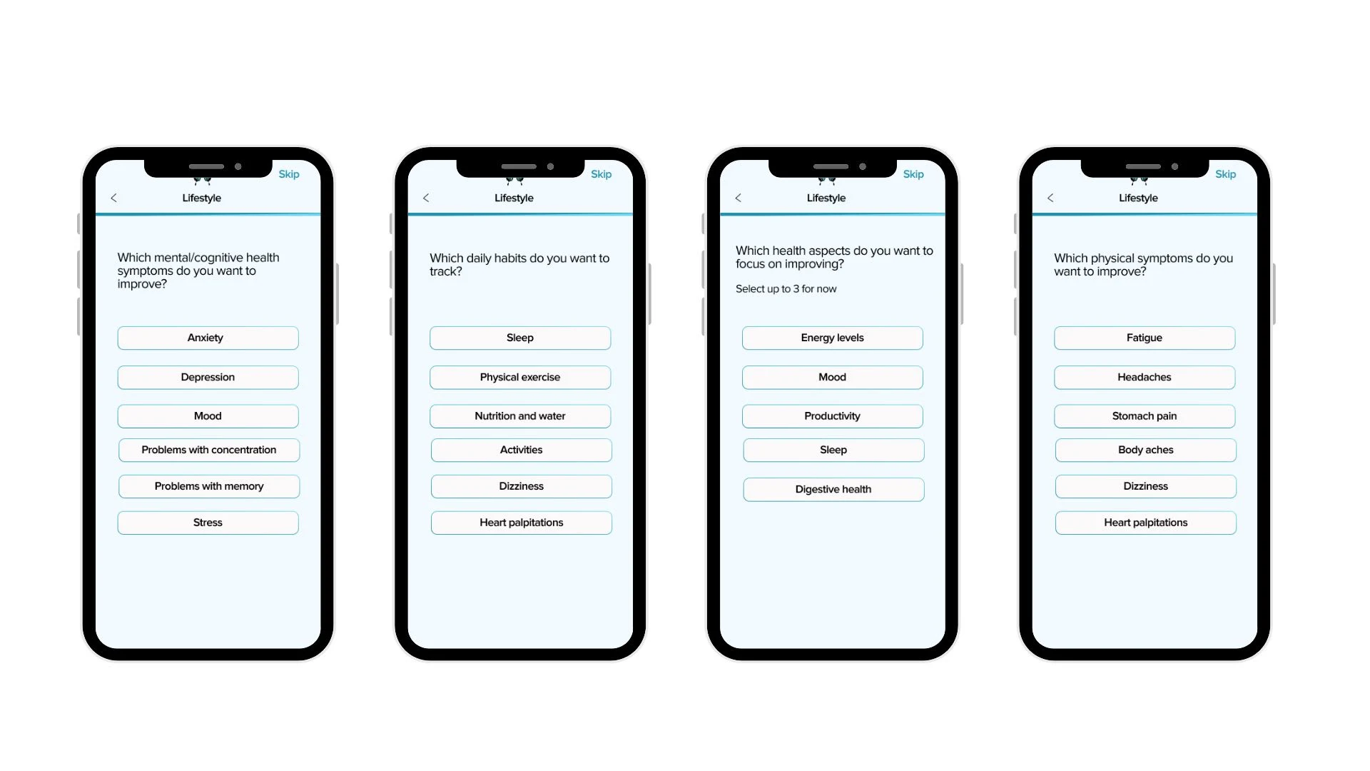
In refining the onboarding experience within the prototype, I revisited and iterated on my prior research findings, drawing insights from the data collected from Reddit and secondary research on Hashimoto's disease. This informed the formulation of relevant questions, with a focus on the most common symptoms experienced and common comorbidities. This data-driven approach was instrumental in ensuring that the onboarding process was tailored to address specific user needs and preferences, aligning the app's functionality with the real-world experiences of individuals living with Hashimoto's disease.
To refine this essential phase, I engaged users in testing various styles of buttons. These iterations included determining the method to progress to the next section—whether the "continue" button would initially appear grayed out or as an arrow, the style of the onboarding buttons—whether they would feature a blue border or not, button sizes, and the inclusion of checkboxes.
The evolution of the onboarding experience aimed to establish a natural flow that seamlessly guided users through the initial setup process, drawing from user feedback and preferences to optimize user engagement and comprehension.
Interactive Checklist: Demonstrating conditional component states and multi-selection capability, with a dynamic 'Continue' button enabled upon selection
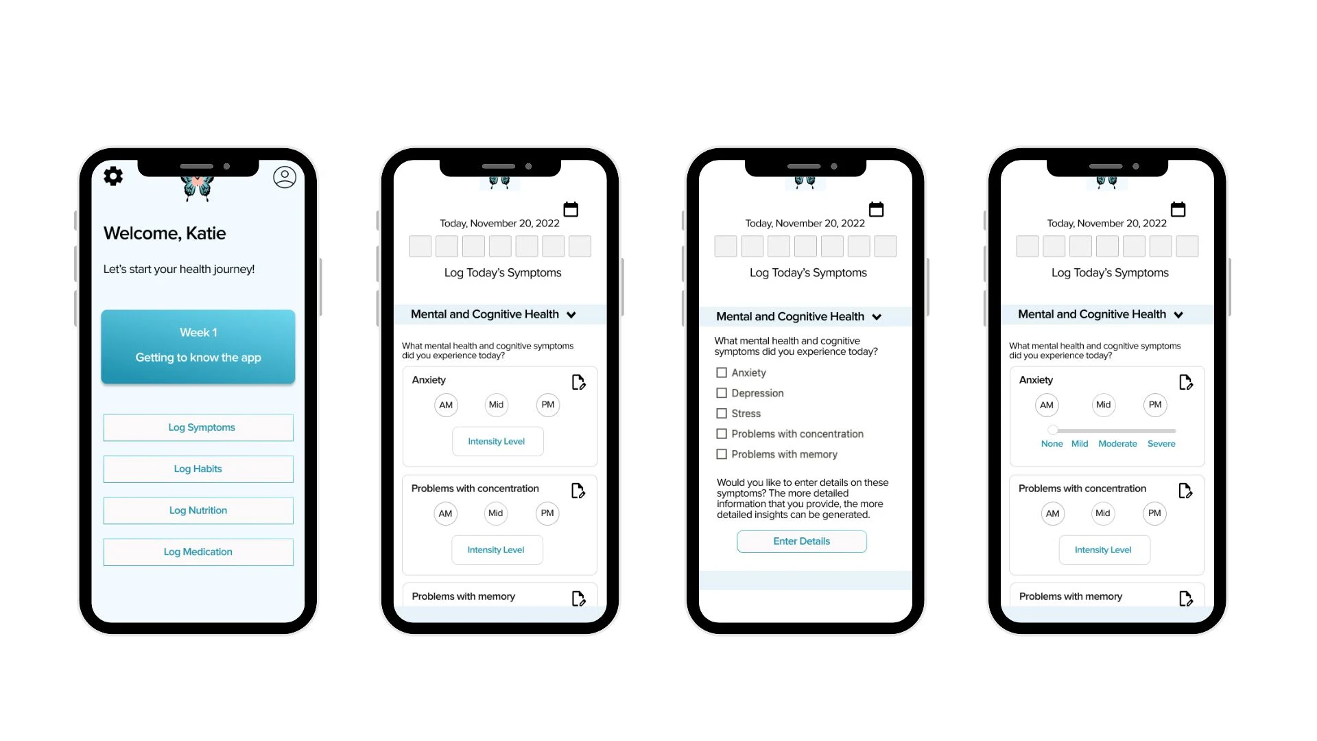
Prototype Evolution- Symptom Tracking
In my project, I faced the challenge of developing an efficient symptom tracking system. My goal was to strike a balance between user-friendliness and data richness, ensuring that I collected enough information to generate meaningful insights without overwhelming the user.
I explored several iterations during user feedback sessions to refine this crucial feature. One version involved a simple checkbox for daily symptom reporting, followed by an option to enter additional details like time and intensity. Another version allowed users to specify symptom occurrence during different parts of the day, recording intensity and notes for each period. Yet another approach presented users with options to record symptoms in the morning, midday, and evening, followed by an intensity slider.
Ultimately, the final prototype introduced a refined solution. Users could indicate symptom intensity at different times of the day (AM, Midday, PM) by adjusting a slider, providing the necessary data without overwhelming the user. This evolution in symptom tracking was informed by user feedback, emphasizing simplicity and user-friendliness while retaining the core functionality required for generating valuable insights.
Dynamic Option Selector: Showcasing interactive single-option selection, coupled with responsive sliders that reset and adapt based on the chosen option
Additional Features for Final Prototype
In response to valuable feedback that encouraged a broader focus beyond symptom tracking, I introduced several significant features to elevate the overall user experience and provide more comprehensive support for individuals with Hashimoto's disease.
These additions were carefully designed and implemented to align with the project's overarching goal of providing holistic support for individuals with Hashimoto's disease. They reflect a responsive approach to user feedback and a commitment to addressing the diverse needs of the user base, ensuring that Hashimotive becomes a valuable resource for those navigating the complexities of Hashimoto's disease management.
Education Section
In response to user feedback and insights gathered through extensive research, I introduced an Education section to Hashimotive. Drawing from user interviews and research, I curated a selection of article templates that addressed the most pressing concerns and questions expressed by the Hashimoto's community. By aligning the content with the real-world struggles of users, this section aims to empower individuals with knowledge that goes beyond medical jargon, offering practical insights and solutions for symptom management and overall well-being.
Horizontal Scroll & Tag Filter: Highlighting horizontally-scrollable card components that extend off-frame, complemented by a dynamic tagging system that refreshes the display to showcase cards aligned with the selected tag.
Community Section
Informed by user insights and an understanding of the Hashimoto's community's needs, I introduced a "Join the Community" section to Hashimotive. This feature was designed to create a space where users can connect, share experiences, and find solace in a supportive and understanding community.
Inspired by the success of competitors who leveraged Discord and Reddit communities, this addition recognizes the value of peer support. It provides users, especially those identified as Persona 1, with an opportunity to engage with others who share their struggles and challenges. The active and interactive nature of these communities encourages open dialogue, allowing users to discuss symptoms, treatments, and daily experiences, ultimately strengthening their sense of belonging within the Hashimoto's community.
Scroll & Modal Interaction: Presenting a design that supports both horizontal and vertical scrolling capabilities, paired with an intuitive modal frame.
Conclusion
➡️ Next Steps
What's next?
Continuing this project would involve diving deeper into several pivotal areas to truly optimize the user experience. From a design standpoint, a commitment to iterative prototyping is essential. Each subsequent version, grounded in user feedback, provides an opportunity to refine both the visual elements and interactive components of the app. While my journey with Figma has been a learning curve within a constrained timeframe, it has been instrumental in refining my design approach, pushing boundaries and tapping into the platform's vast potential. There's a world of opportunity in delving deeper into advanced UI patterns, animations, and micro-interactions that resonate with users, creating an engaging and dynamic user experience.
Furthermore, looking ahead, ensuring accessibility is paramount. Creating an app experience that is inclusive for all, including those with disabilities, requires dedicated testing and potential feature integrations like voice commands or enhanced contrast settings. Pairing this with the inclusion of sophisticated analytics tools would provide a comprehensive view of user journeys, enabling data-driven refinements that amplify the app's usability and efficiency.
Next Step 1
Firstly, I would focus on developing the ability to export data from the app. This feature would empower users, particularly Persona 1, who often struggle to effectively communicate their health information to their doctors. Enabling users to easily share their symptom tracking and other health data could significantly improve their healthcare management.
Next Step 2
Additionally, the creation of educational modules would be a valuable addition, catering to the needs of Persona 2. These modules would guide users through a structured plan to help reduce their symptoms. Providing actionable and evidence-based guidance can be a game-changer for individuals seeking to better manage their condition.
Next Step 3
Lastly, implementing user settings to update profile information and modify responses to onboarding questions would enhance the personalization of the app for all users. This flexibility would ensure that the app continues to evolve in line with their changing needs and preferences.
This project has been an invaluable opportunity for my growth as a designer. Throughout this experience, I acquired new hard skills, honed existing ones, and embraced various design practices that have significantly influenced my approach to UX Research and UI design.
One of the most notable aspects of my growth during this project was in the realm of prototyping. I delved into the intricacies of creating multi-layered components within the symptom tracking feature, refining my ability to simplify complex interactions while maintaining functionality. This hands-on experience has equipped me with a deeper understanding of how to translate intricate design ideas into user-friendly prototypes.
My passion for user research was reignited during this project, solidifying my love for this crucial aspect of the design process. I relished the freedom to select and employ diverse UX research methods, each revealing unique insights into user needs and preferences. The diary study, in particular, emerged as a powerful and effective methodology, adding a valuable tool to my UX research arsenal.
Additionally, my personal connection to Hashimoto's disease made this project particularly meaningful. It allowed me to empathize deeply with my interview participants and provided a unique perspective that enriched the quality of my interactions and questioning. Furthermore, it illuminated the clear need for a product like Hashimotive in the market, highlighting areas where existing solutions could be improved to provide more comprehensive support for Hashimoto's patients.
In summary, this project has been instrumental in my growth as a designer, expanding my skill set, reinforcing my passion for user research, and reaffirming my career aspirations. It has also underscored the significance of empathy in design and the importance of addressing real-world needs through thoughtful and user-centric solutions.
🪞 Learnings & Reflections
This project has been an invaluable opportunity for my growth as a designer. Throughout this experience, I acquired new hard skills, honed existing ones, and embraced various design practices that have significantly influenced my approach to UX Research and UI design.One of the most notable aspects of my growth during this project was in the realm of prototyping. I delved into the intricacies of creating multi-layered components within the symptom tracking feature, refining my ability to simplify complex interactions while maintaining functionality. This hands-on experience has equipped me with a deeper understanding of how to translate intricate design ideas into user-friendly prototypes.My passion for user research was reignited during this project, solidifying my love for this crucial aspect of the design process. I relished the freedom to select and employ diverse UX research methods, each revealing unique insights into user needs and preferences. The diary study, in particular, emerged as a powerful and effective methodology, adding a valuable tool to my UX research arsenal.Additionally, my personal connection to Hashimoto's disease made this project particularly meaningful. It allowed me to empathize deeply with my interview participants and provided a unique perspective that enriched the quality of my interactions and questioning. Furthermore, it illuminated the clear need for a product like Hashimotive in the market, highlighting areas where existing solutions could be improved to provide more comprehensive support for Hashimoto's patients.In summary, this project has been instrumental in my growth as a designer, expanding my skill set, reinforcing my passion for user research, and reaffirming my career aspirations. It has also underscored the significance of empathy in design and the importance of addressing real-world needs through thoughtful and user-centric solutions.
Like this project
Posted Sep 7, 2023
I conducted UX Research and designed an app to support those with a thyroid disease.
Likes
0
Views
60