Personal Branding Refresh
Switch Hart
Autumn '25
The much needed refresh of my own branding.
I love to explore identity—I’ve spent a long time figuring myself out—being able to choose how you present yourself is so much more valuable than folks give it credit. It’s why I’m a designer, It’s why I changed my name! Online spaces give everyone an opportunity to explore who they are, each site is a new place to figure yourself out.
Locking down the domain deercross.ing has done a lot for steering the visual direction. A play off of my last name (a hart, if you’re unfamiliar) and a URL hack, I couldn’t love it more.
The overall aesthetic is rural highway meets information superhighway. Muted, natural tones contrasted by bright, colorful signage. A return to liminal spaces and digital artifacts. It’s a perfect cross section of my personal sensibilities.
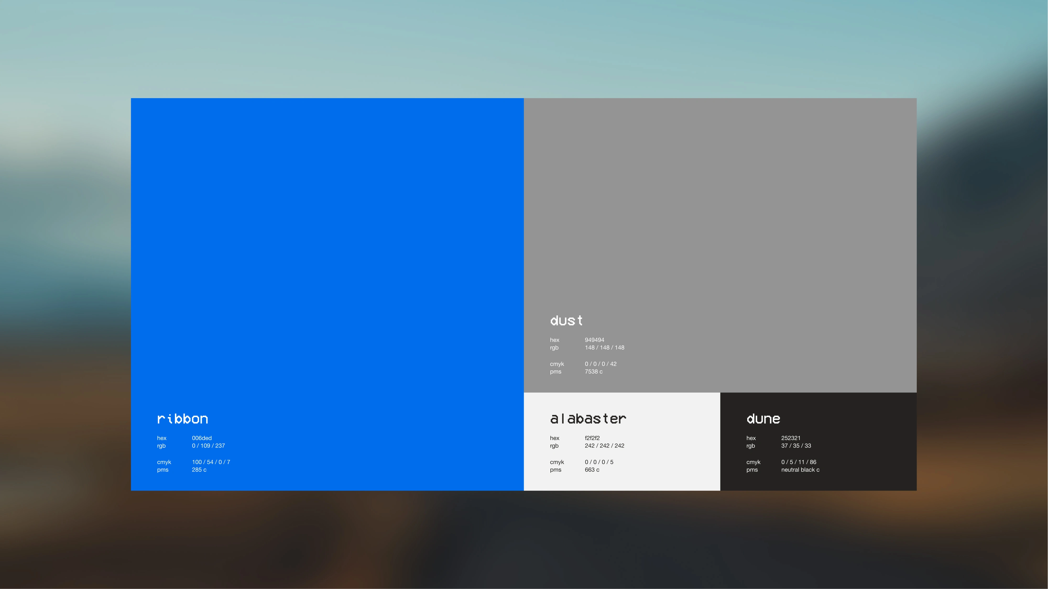
Primary palette.
An easier-on-the-eyes version of the “computer blue” being the featured color. Striking in both digital and physical spaces.
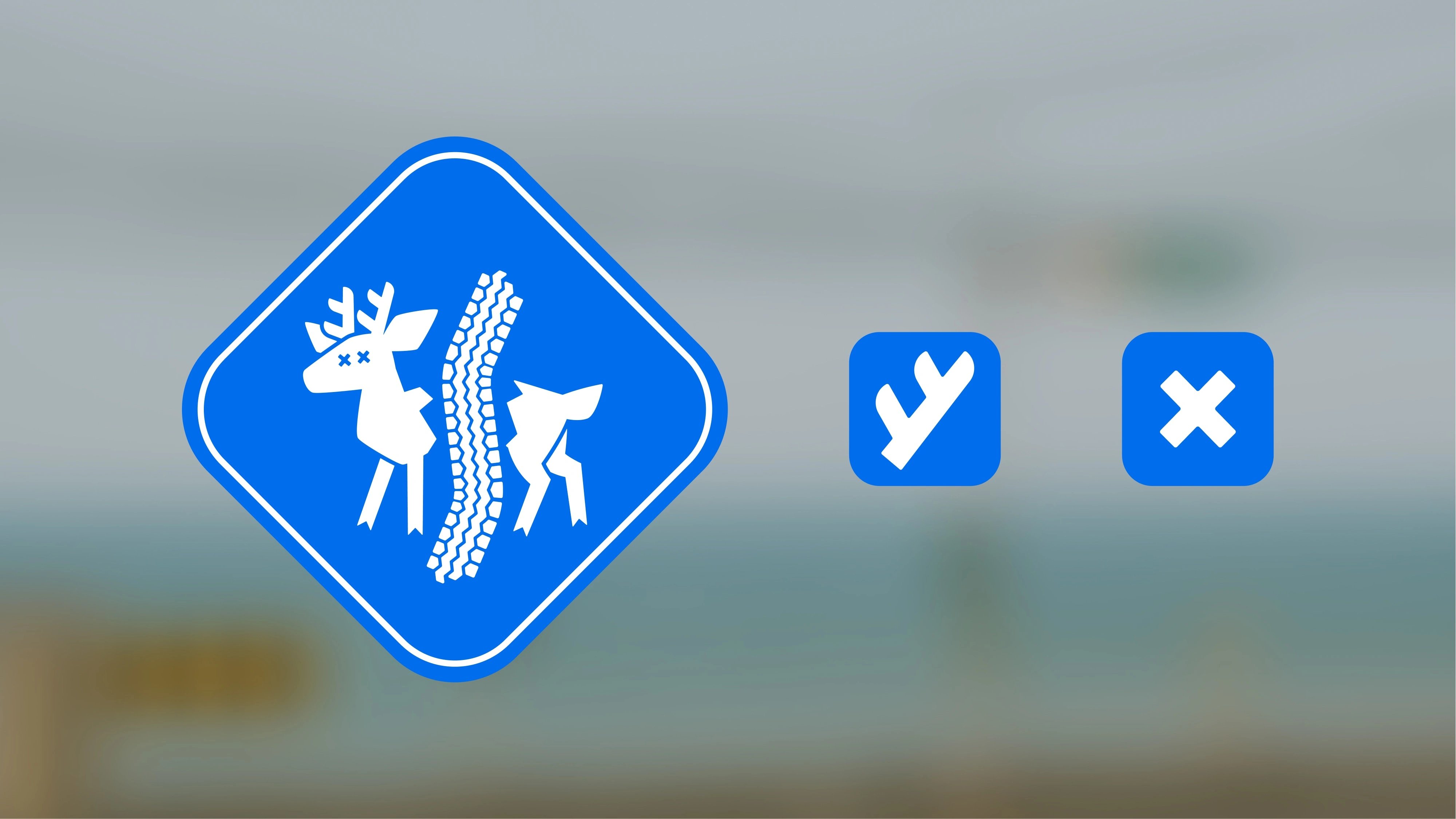
Logo and glyphs.
Not all roads are safe. Antler and cross to be used in areas where the finer detail of the logo is lost.
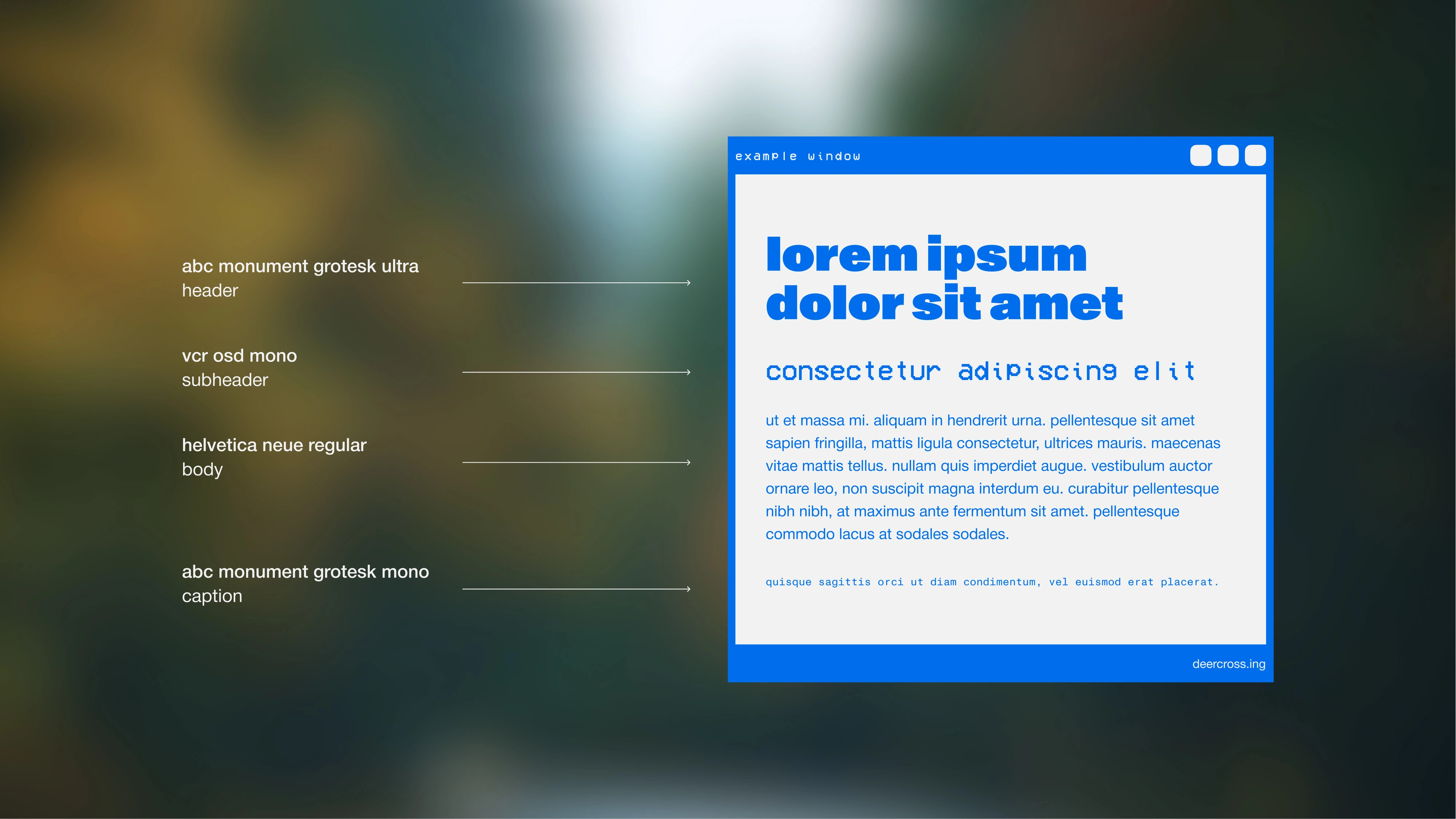
Type in use.
Monument Grotesk as a contemporary attention grabber. VCR OSD Mono to emphasize the digital aspect, it’s a little decorative but the wonkiness of a mono font has a certain charm. Helvetica Neue as a safe and readable option for body copy. With Monument Grotesk Mono for the smallest type, to set itself apart from the body copy and tie back to the largest type in use.
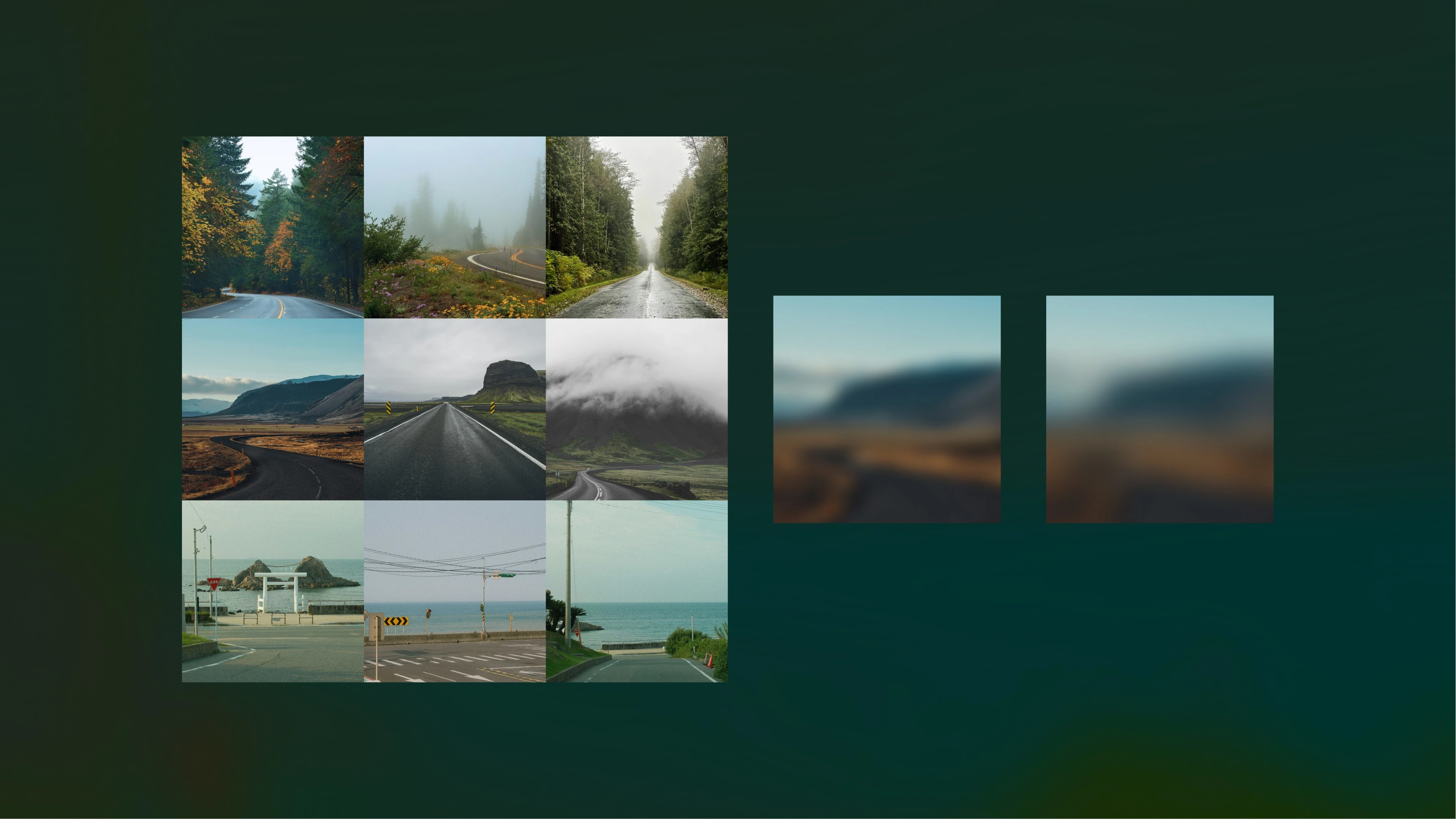
Photos and treatments.
Pacific northwest forests, Icelandic countryside, and Japanese coastal roads. Blurred versions to be used as a backdrop treatment.
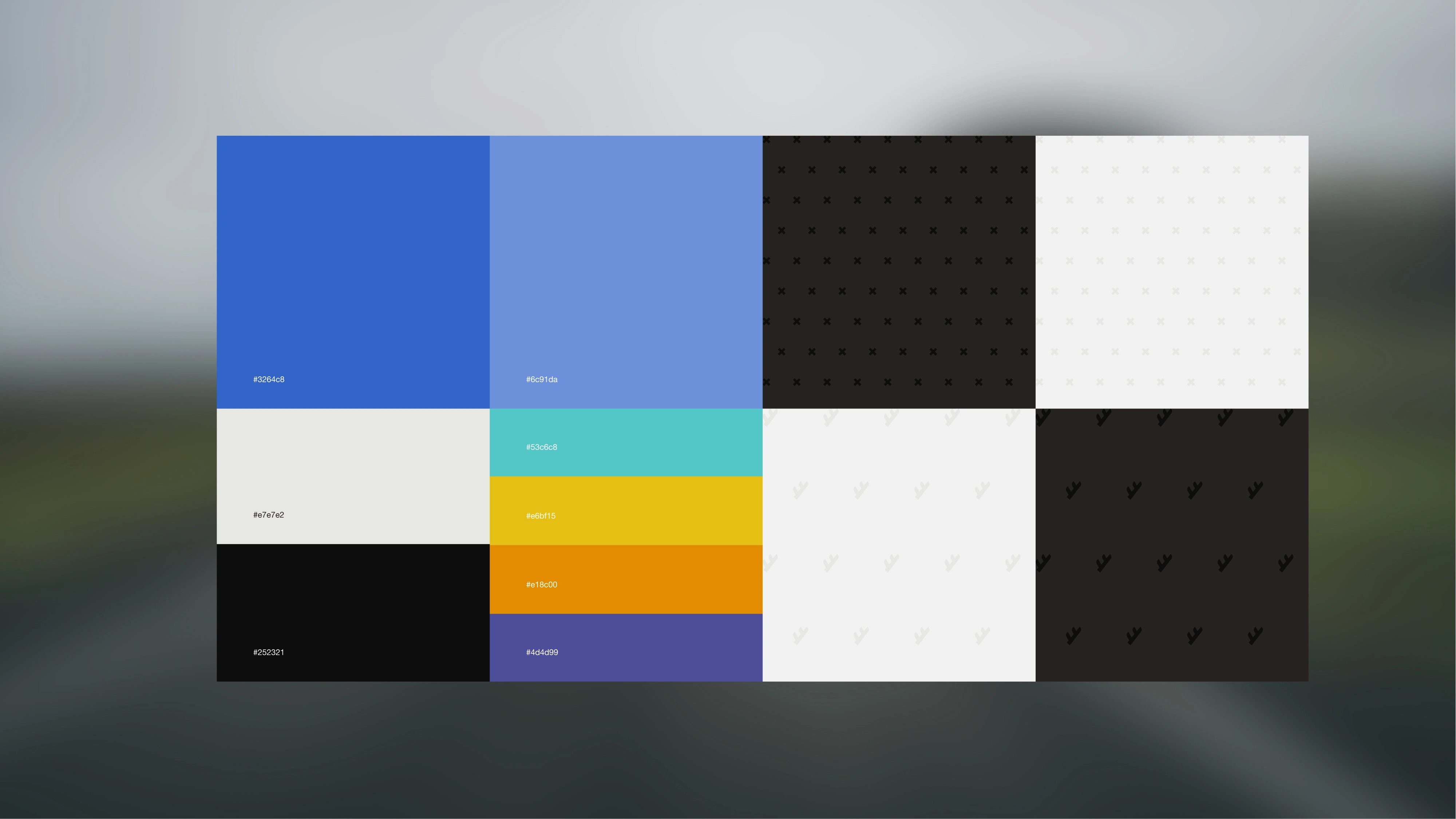
Supporting pallette and pattern options.
With accessibility considered additional colors were added, with pop colors for sparing use. All type placement is a 3:1 contrast ratio minimum.
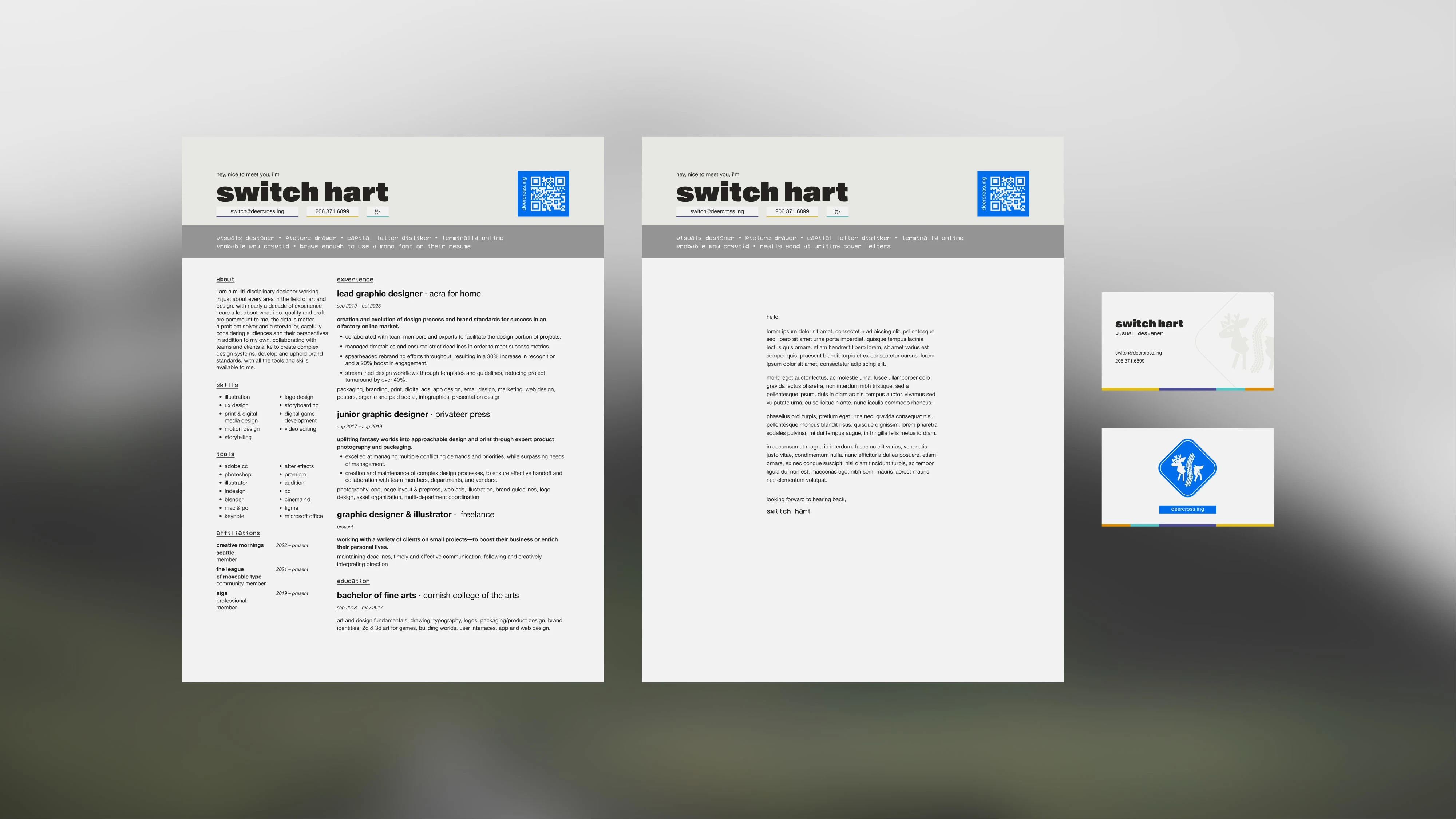
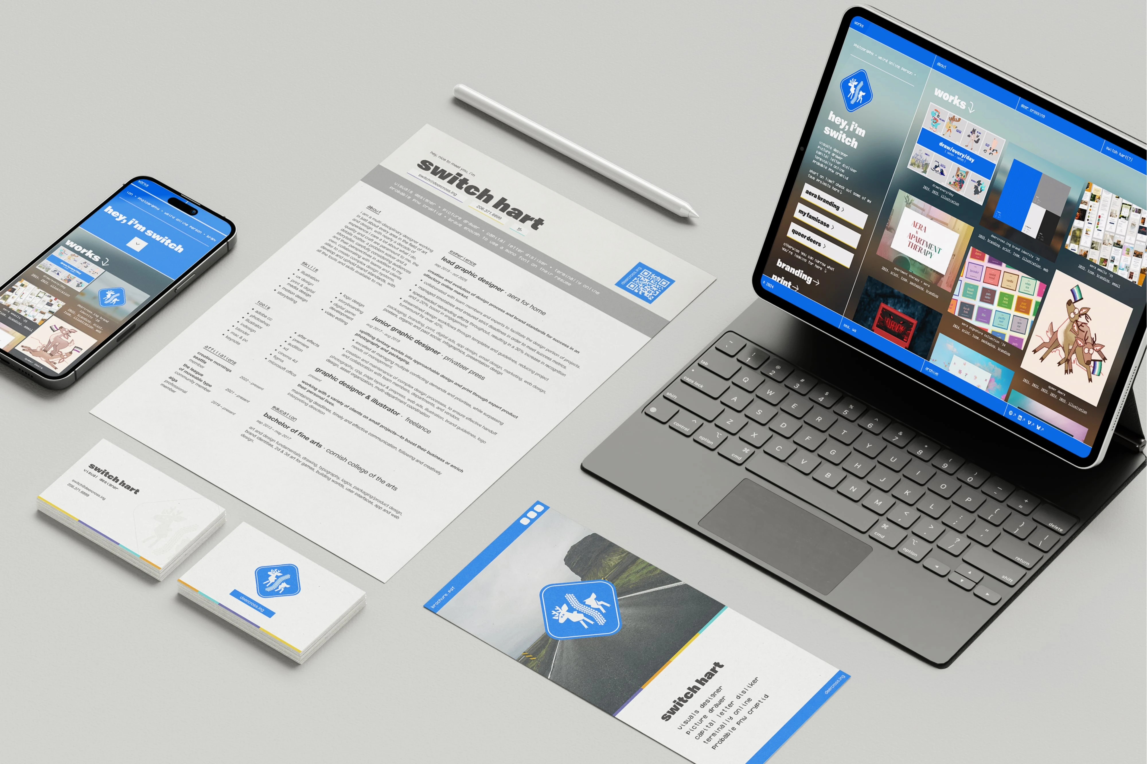
Resume, cover letter, and business cards.
I keep an ATS friendly resume elsewhere, this version is mostly for myself. Cover letter shares the header but kept largely simple to emphasize the writing.
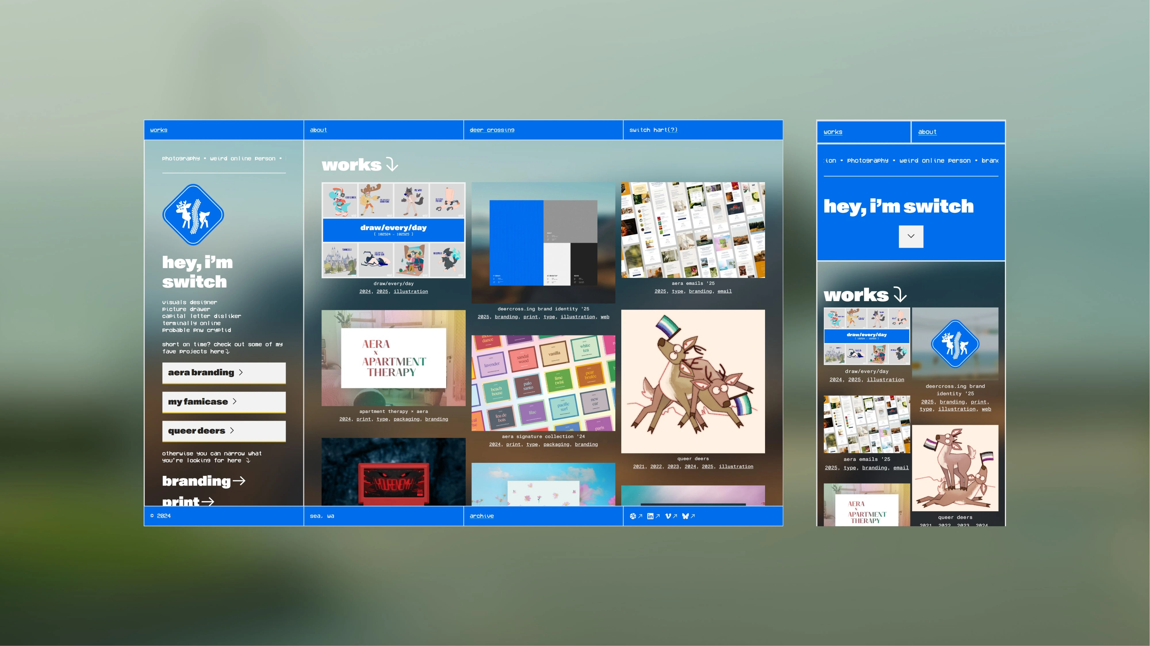
Homepage in desktop and mobile.
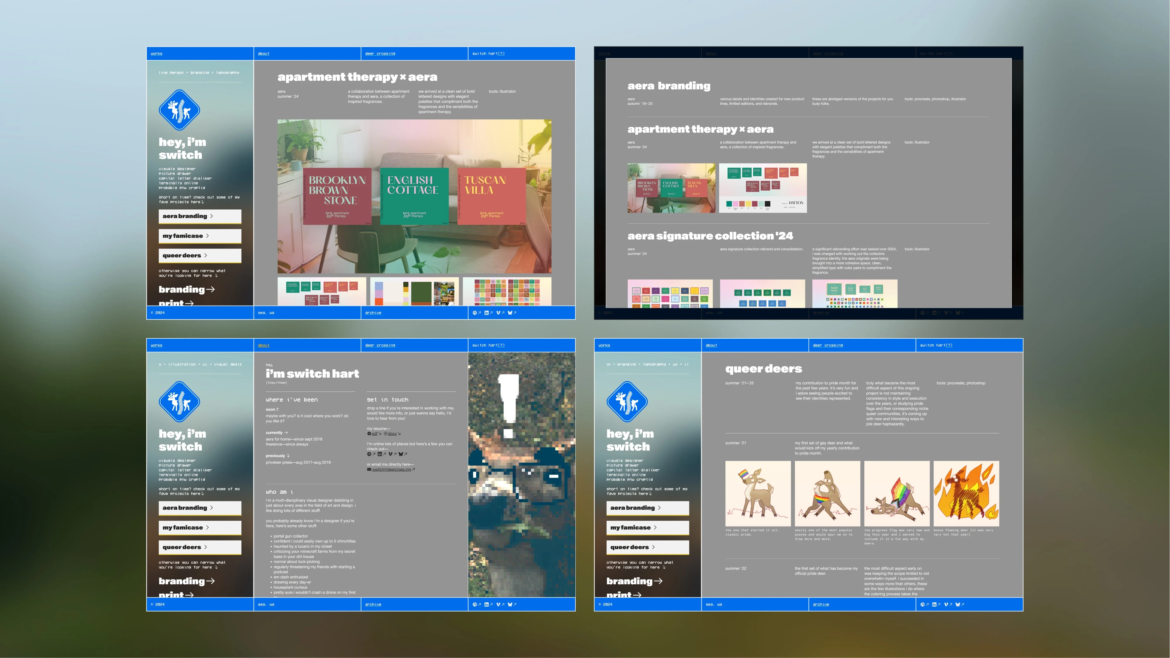
Additional pages, quick project overlay, and about section.
Like this project
Posted Dec 5, 2025
Completed a personal branding refresh, emphasizing visual identity online.