Primo's Soda Branding & Packaging

Ahmed Badr


The Brand Challenge
How do you make a soda brand feel fresh, local, and rebellious in a market dominated by global giants? The brief was to create a youth-centric beverage identity that could stand out both on the shelf and online.
The brand needed to:
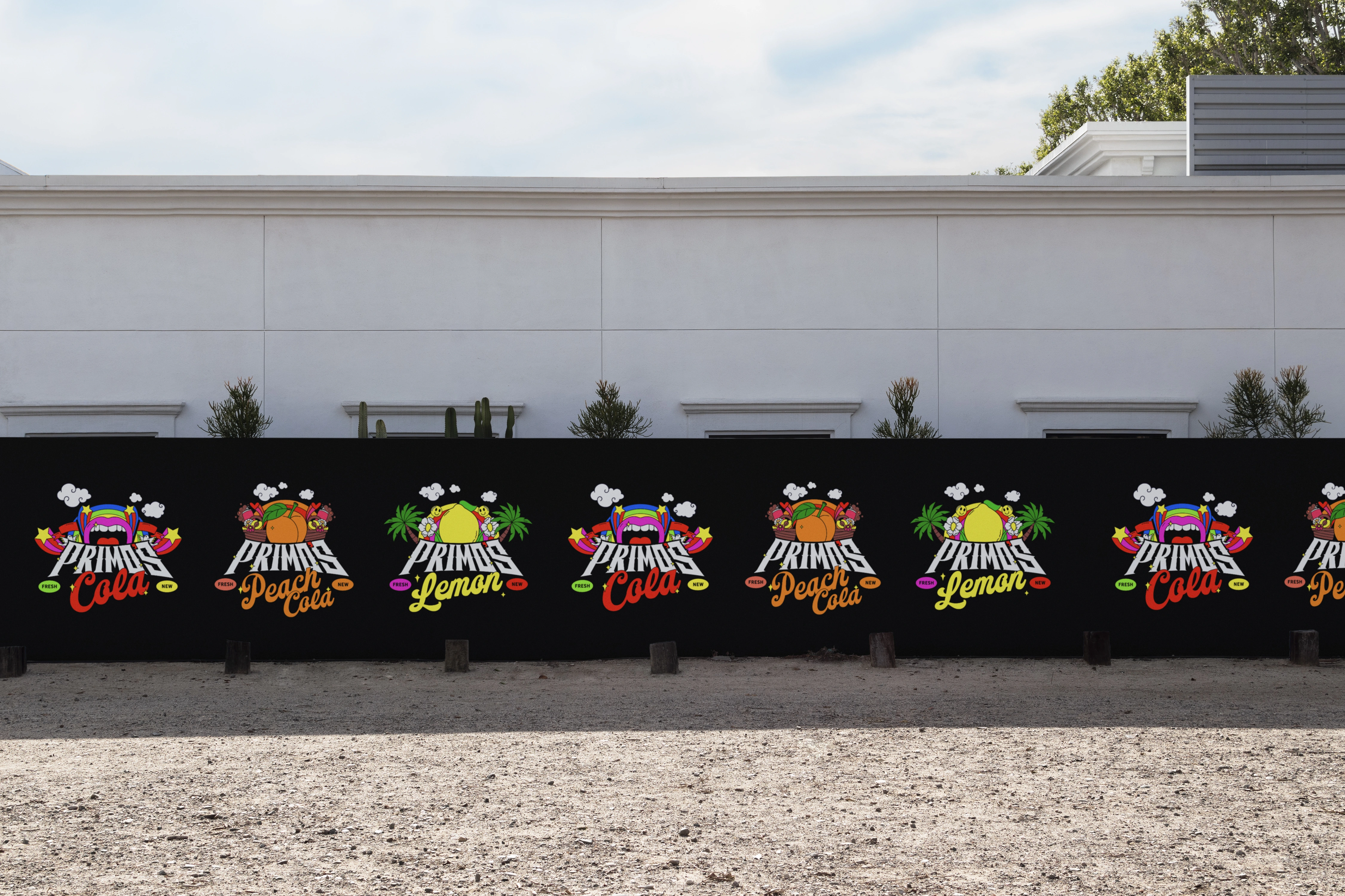
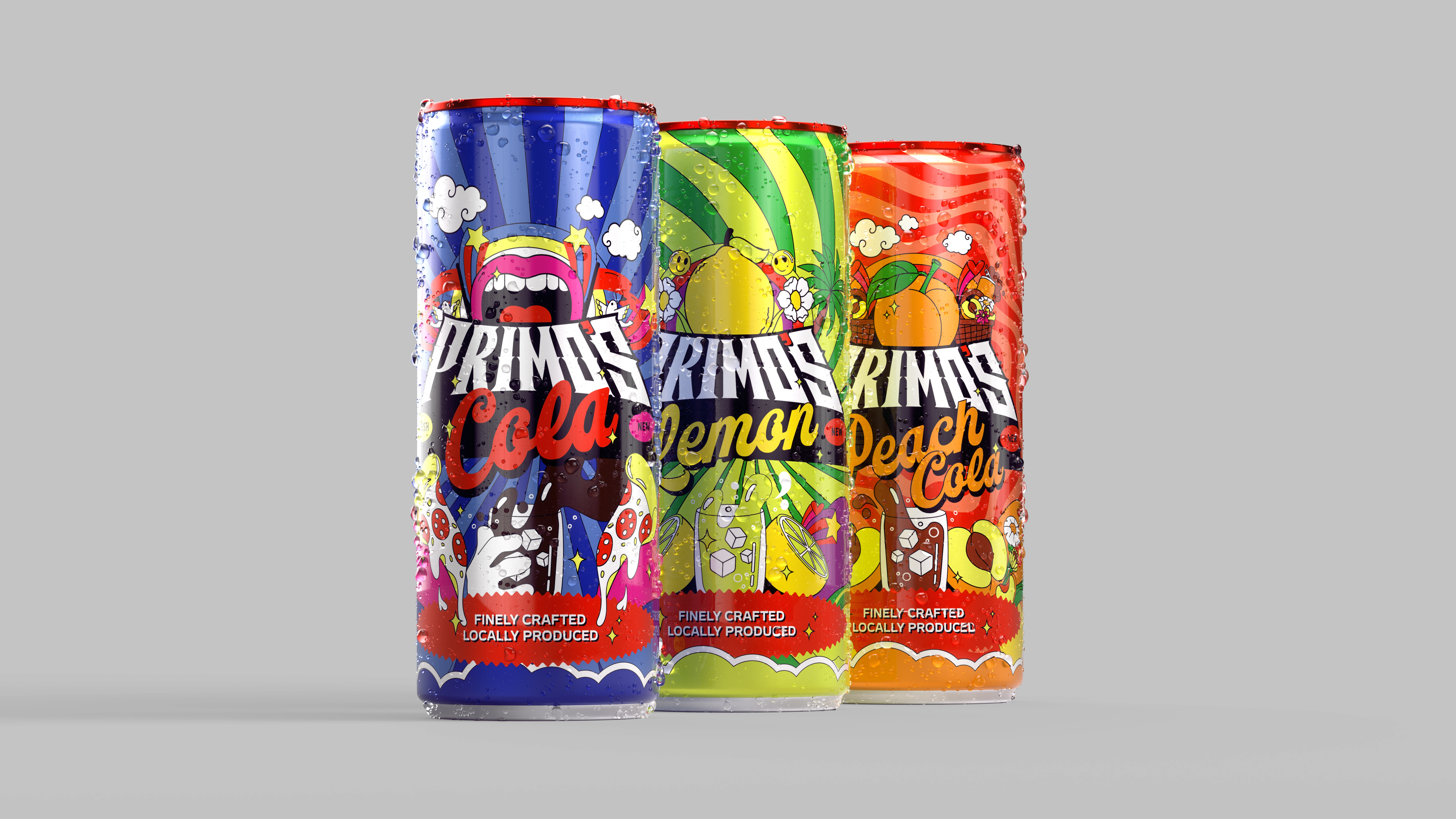
Capture Gen Z’s bold energy through playful design, Express local pride in a way that still feels global and trendy and be instantly recognizable across flavors (Cola, Lemon, Peach Cola) while allowing each variant to have its own personality.

Design Hierarchy
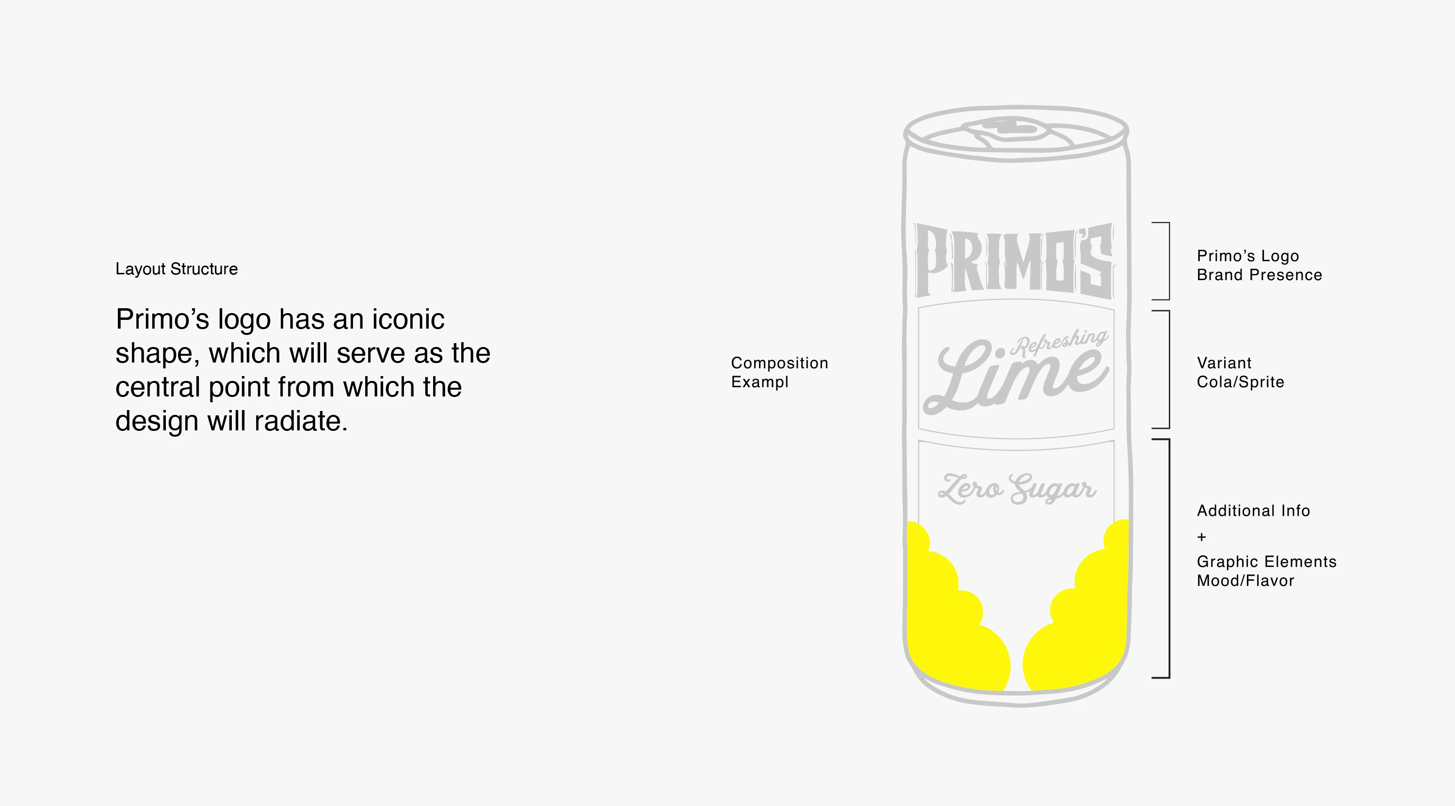
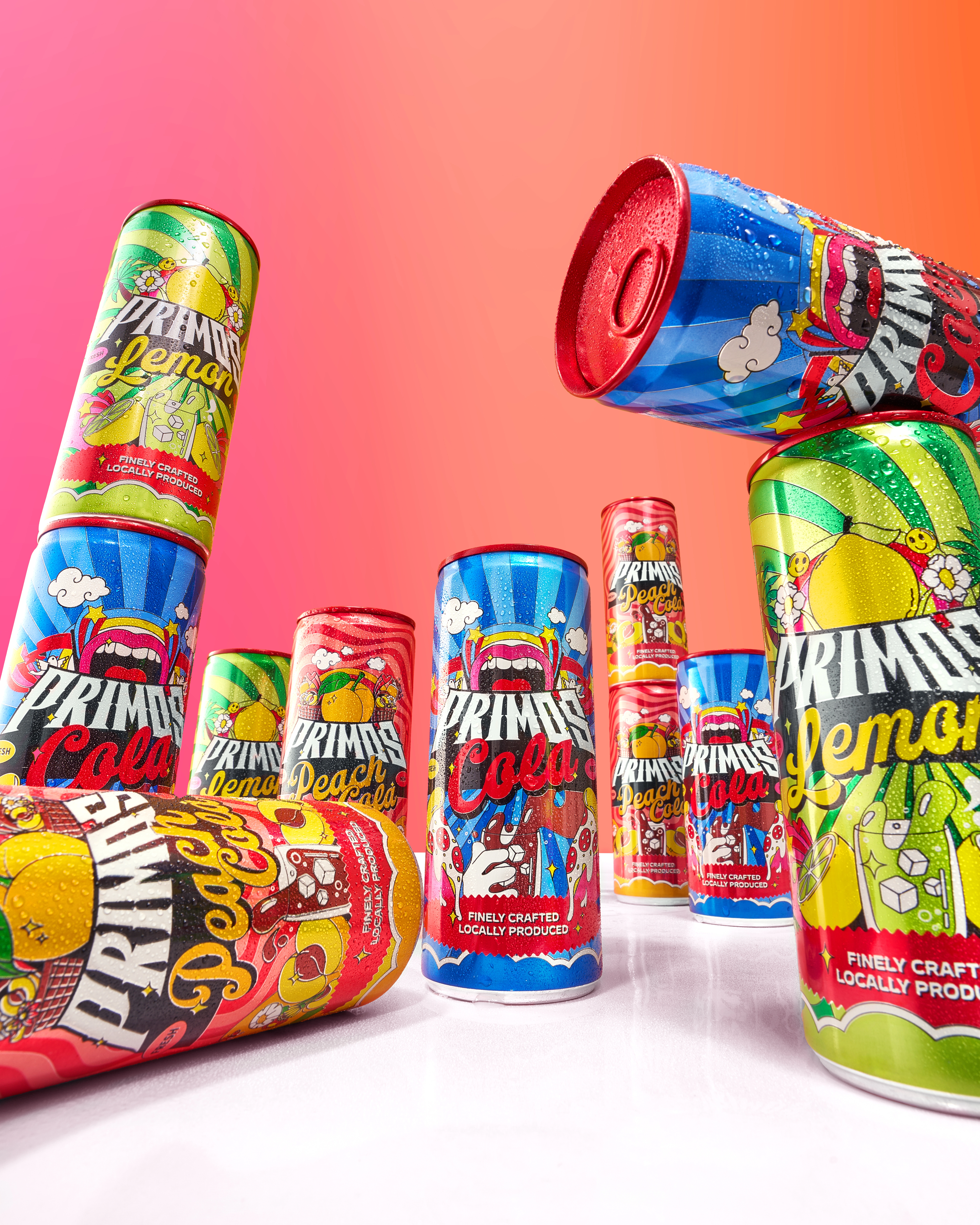
A clear hierarchy defines every pack: Primo’s Master Logo — dominant and consistent. Flavor Sub-logos — customized typography and color. Graphic Elements — icons and patterns that set mood + flavor. This structure balances creativity with clarity, ensuring the brand is both playful and professional.
The Visual Language
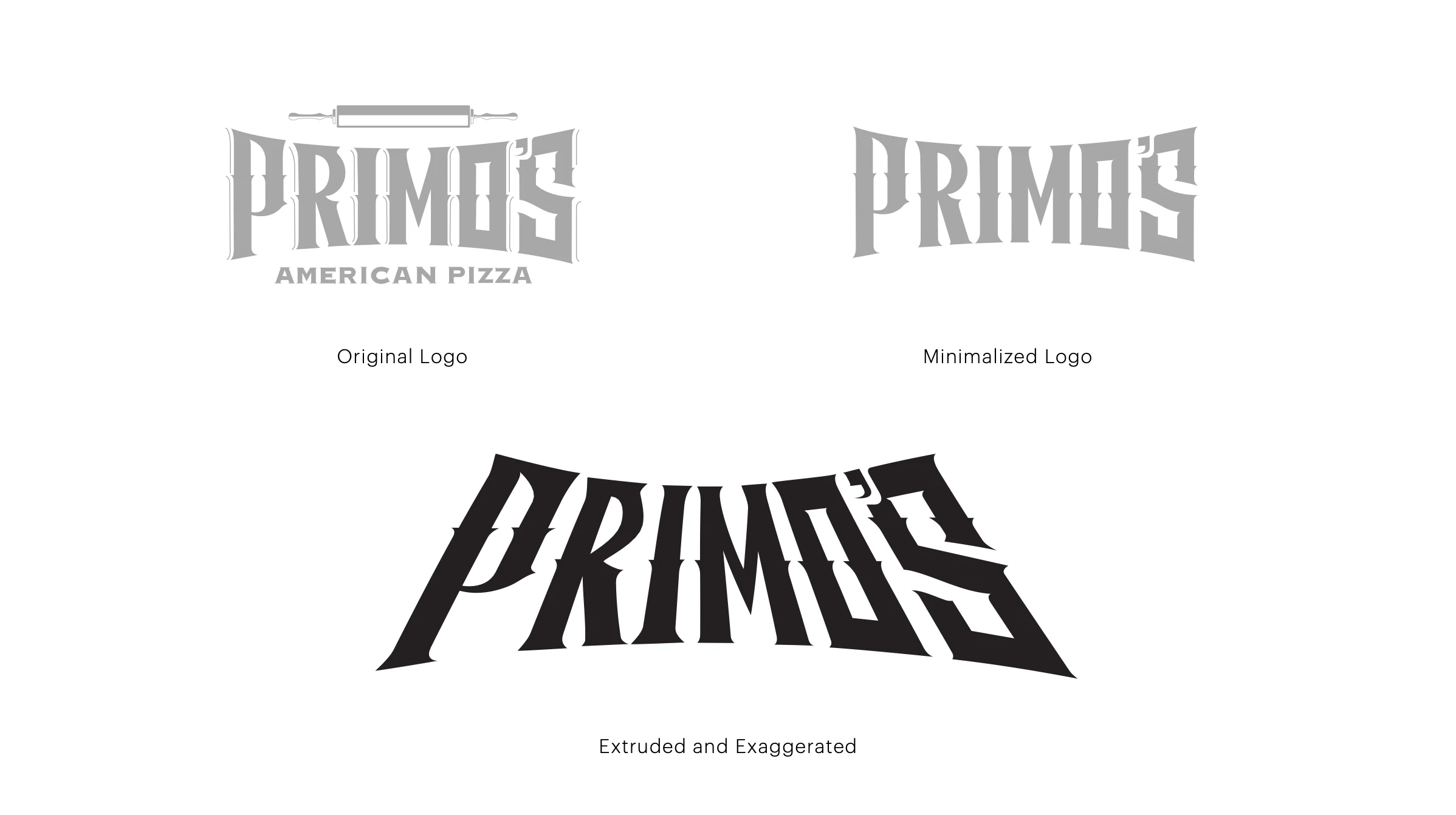
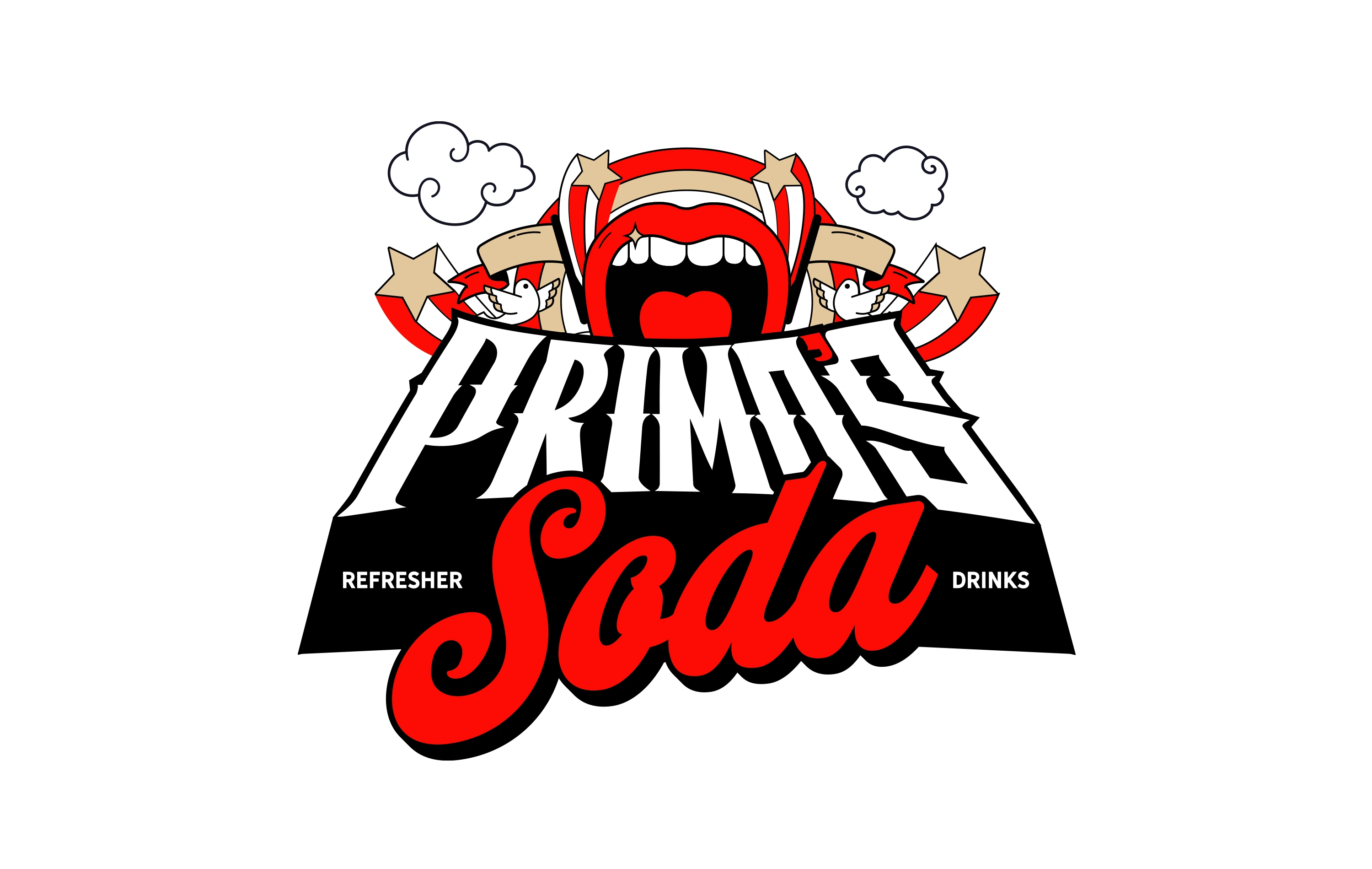
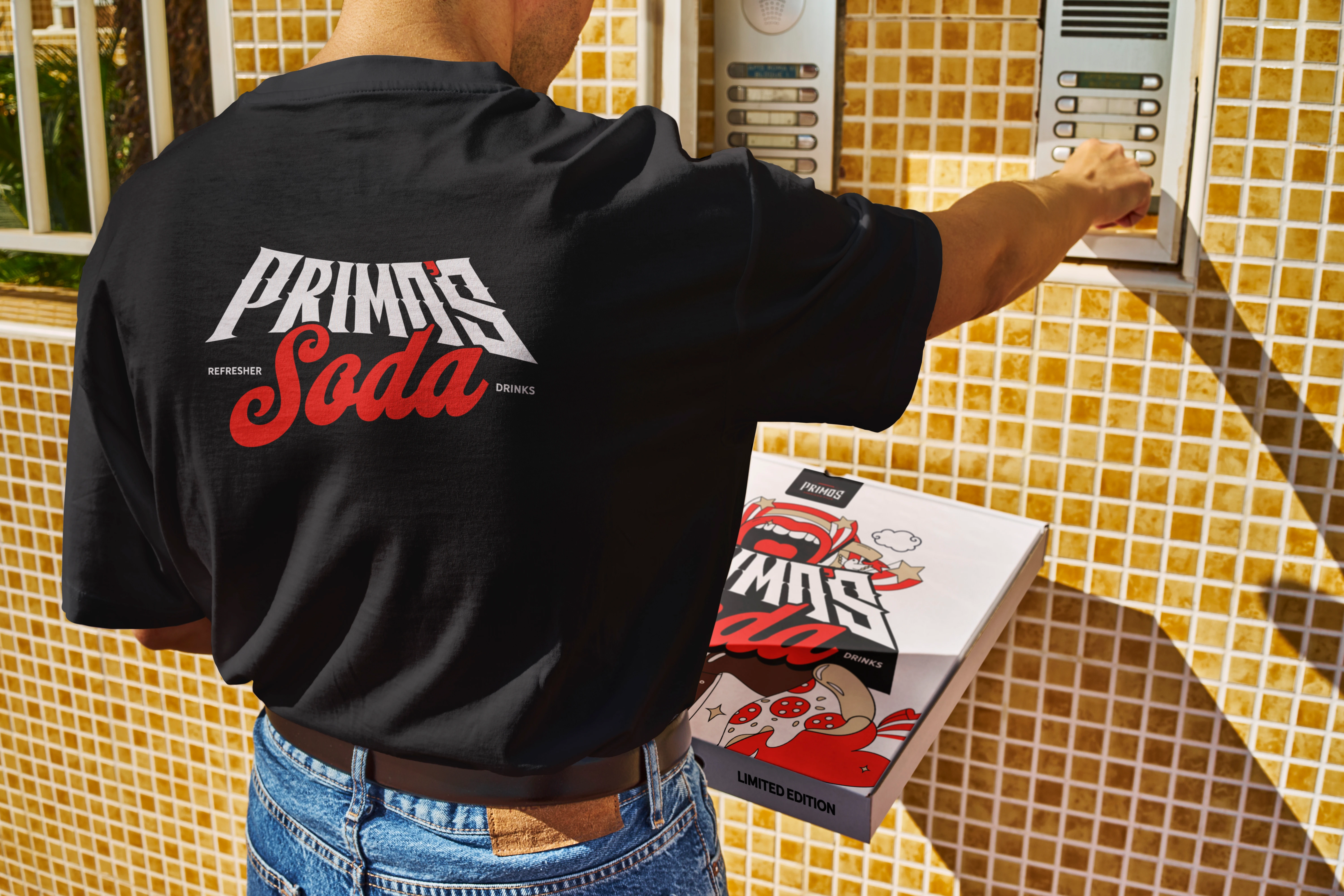
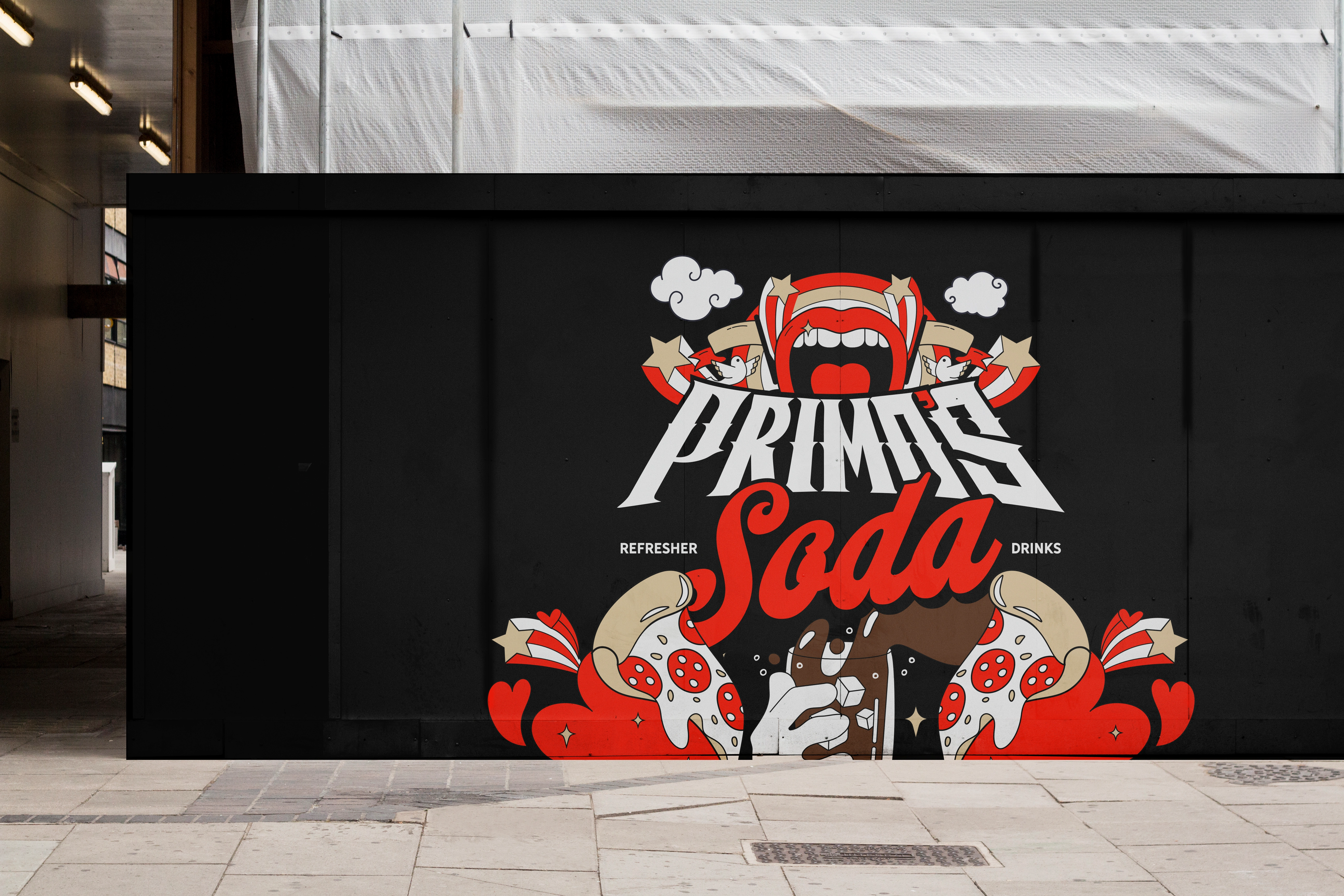
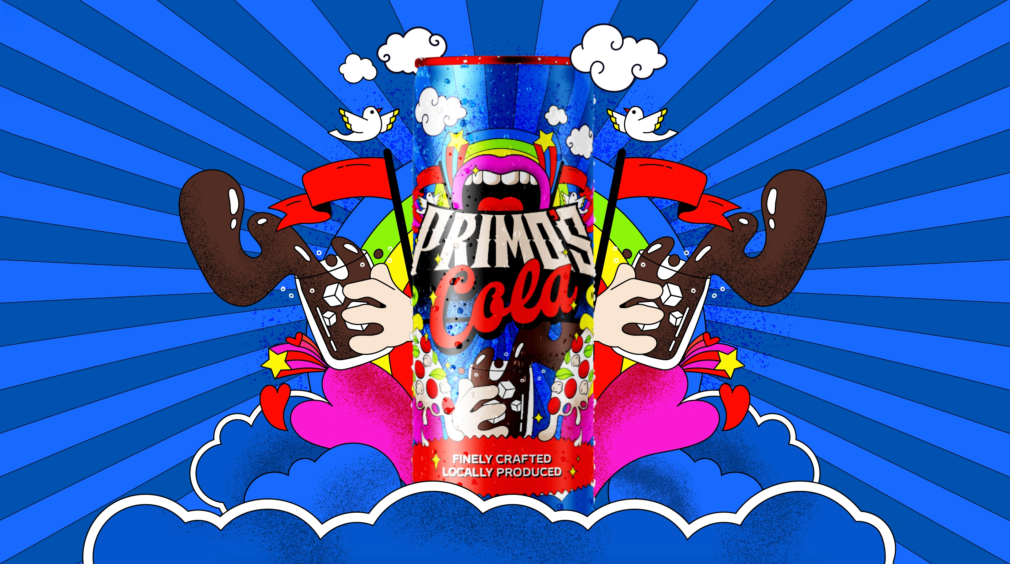
Logo: A bold, retro-comic inspired wordmark that anchors the brand presence.
Patterns: Wavy and radiating backgrounds that act as an ownable system.
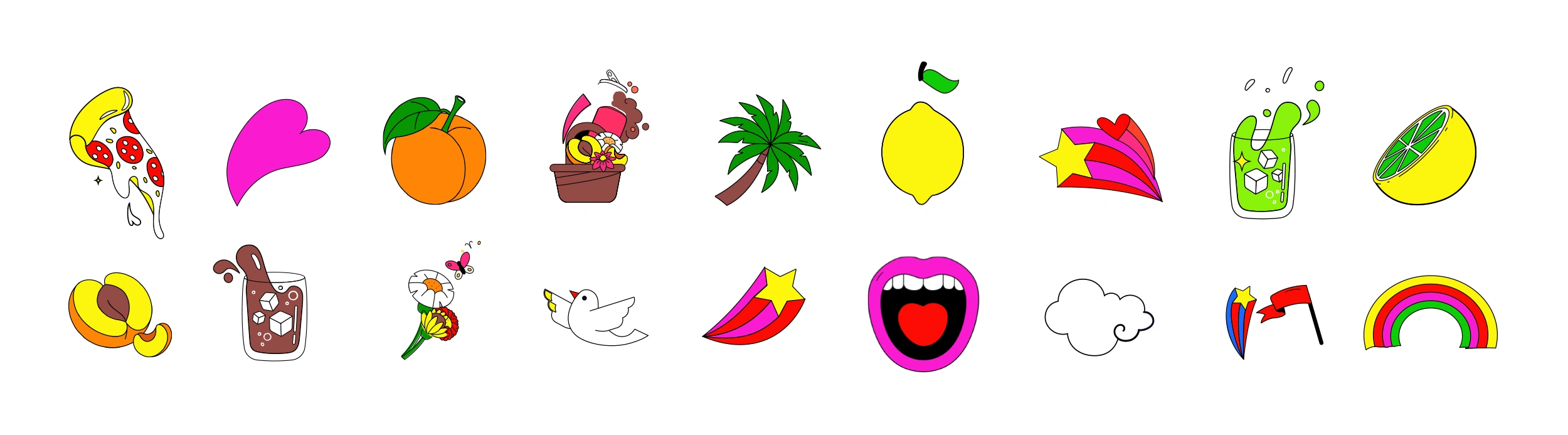
Illustrations: A custom library of icons (pizza slices, palms, rainbows, etc.)
Color System: Loud, high-contrast palettes, distinct for each flavor, cohesive as a set. Sub-logos: Each flavor carries its own subsidiary logo, allowing individuality.
The Brand Concept
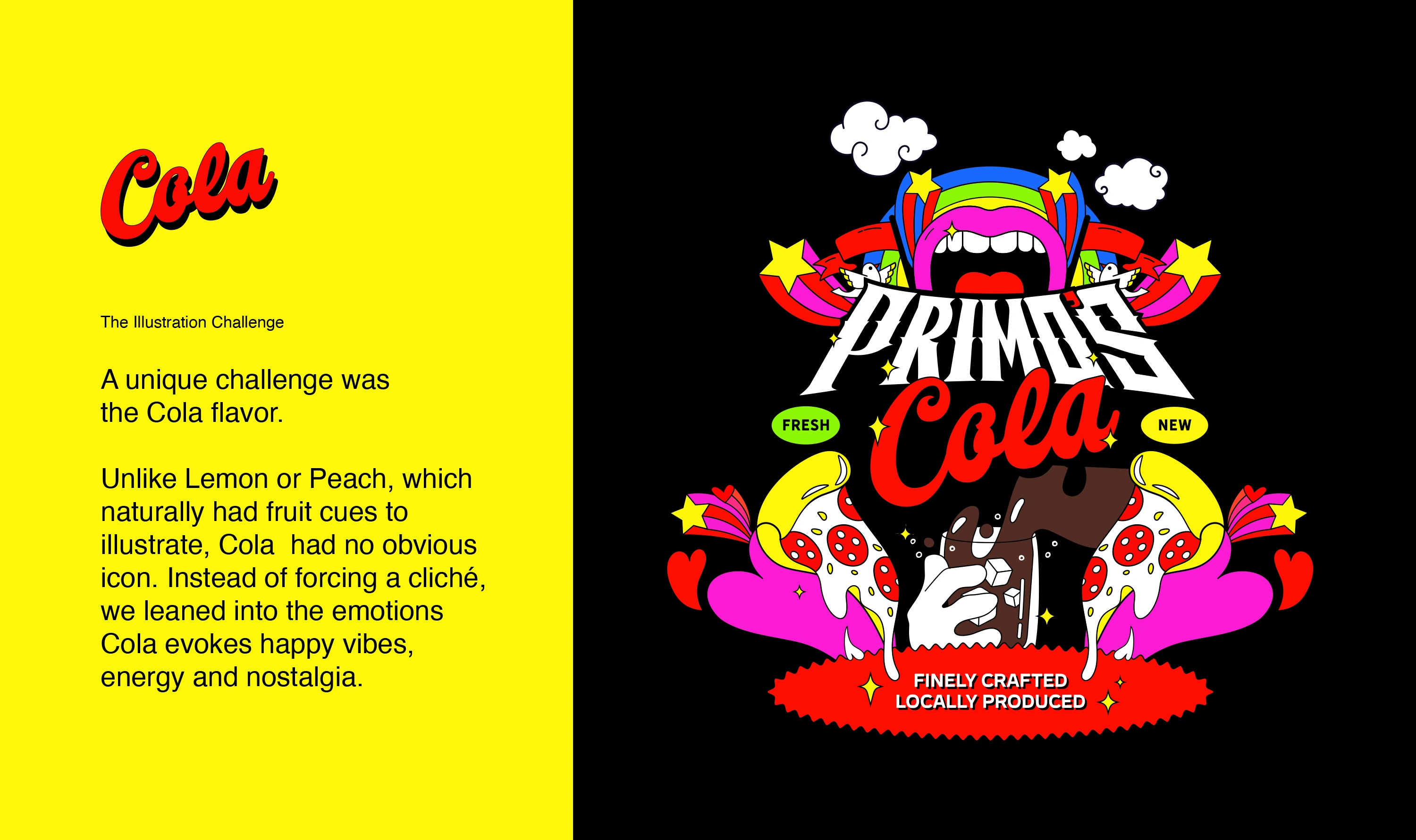
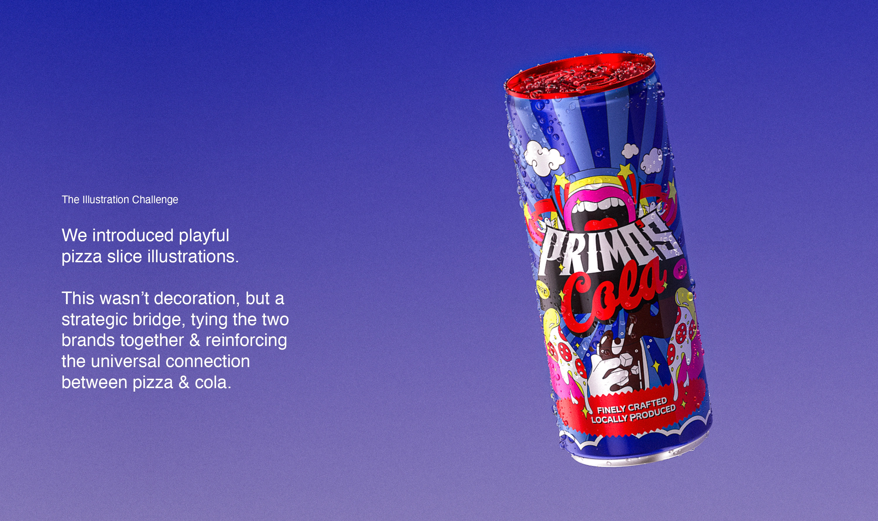
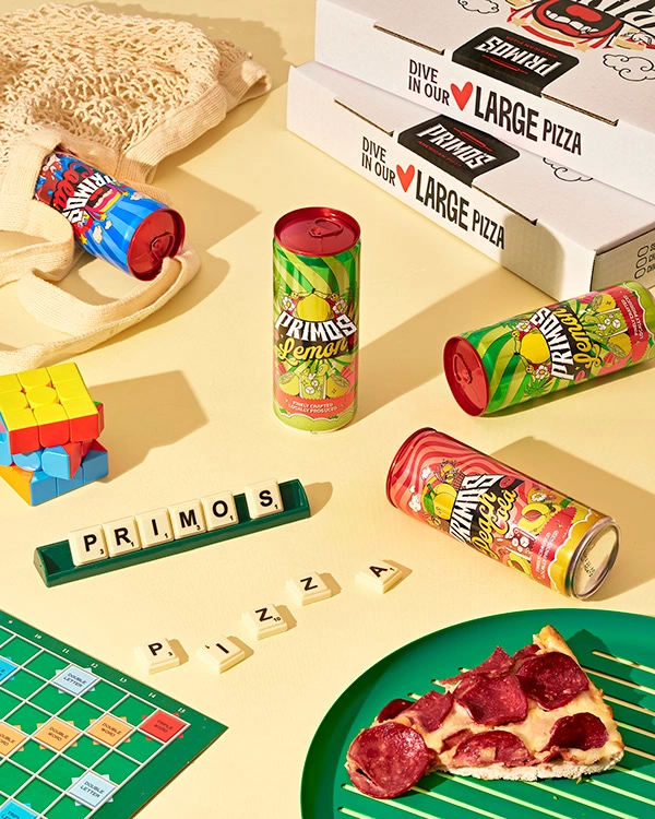
The design is rooted in “Pop Art Energy”—a mash-up of bold colors, playful illustrations, and cultural nostalgia. Facts: Each can highlights “Finely Crafted, Locally Produced”, grounding the brand in authenticity. Feelings: Saturated palettes, cartoon exaggeration, and nostalgic motifs create emotional connection. Fun: Pizza slices, smileys, clouds, and psychedelic patterns break convention, turning the cans into cultural accessories.
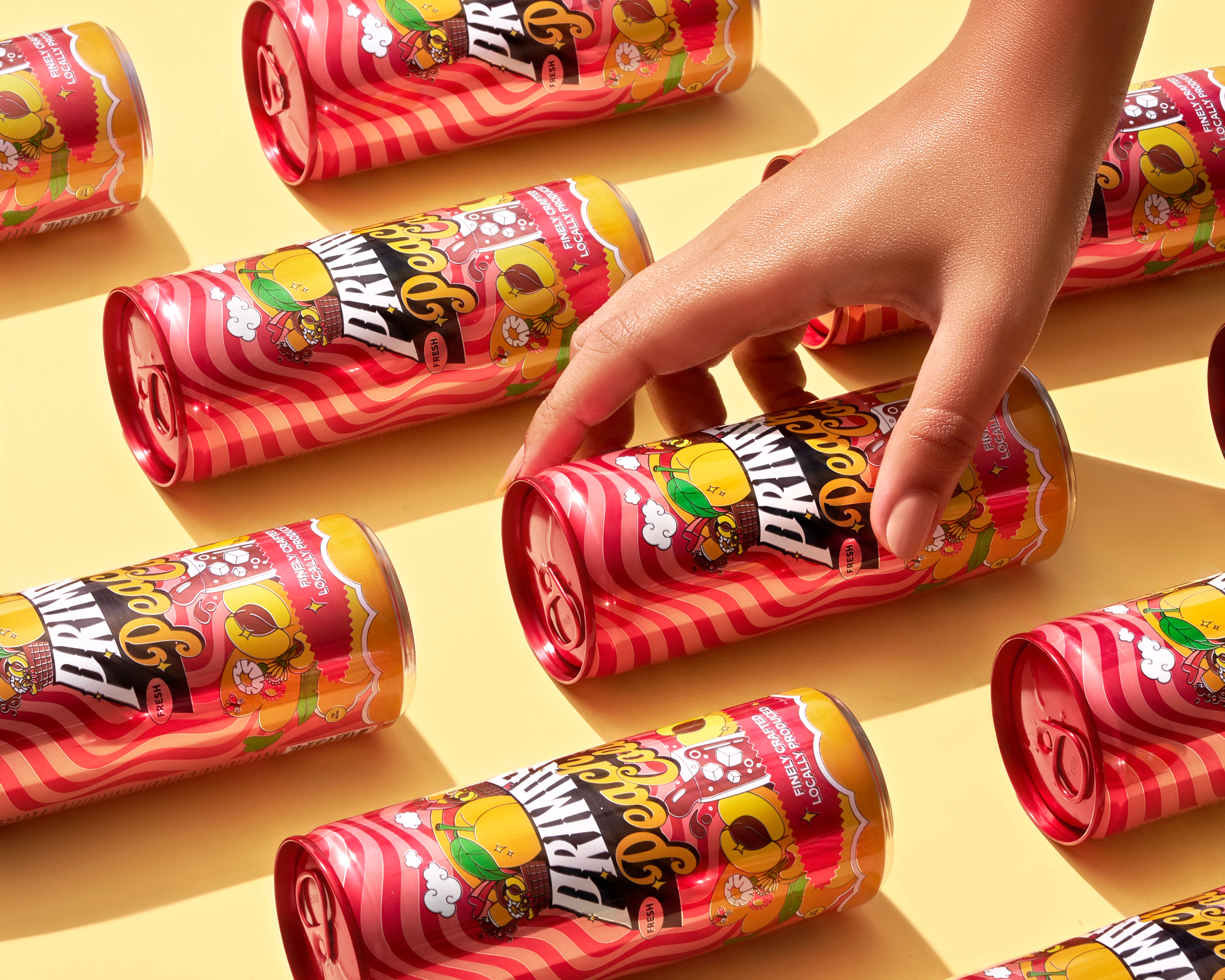
Signature Detail: Red Caps
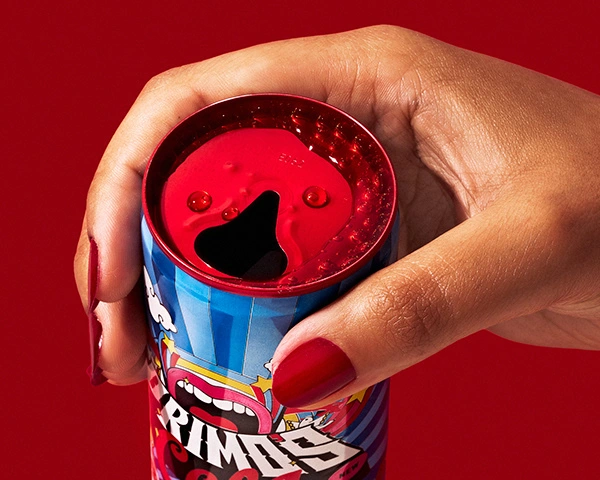
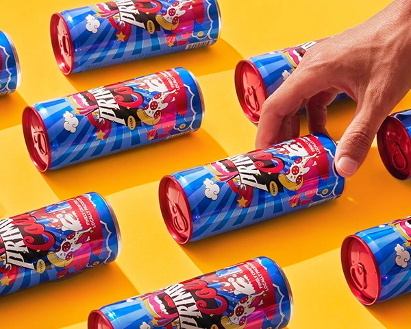
To guarantee shelf distinction, we introduced a signature red cap across all variants. Like the red soles of Christian Louboutin, this became Primo’s ownable branding device simple, bold, and instantly recognizable.
The red caps serve as:
Differentiation in a crowded aisle. Consistency across changing illustrations and colors. Brand Memory that anchors the brand in consumers’ minds.
The Packaging System
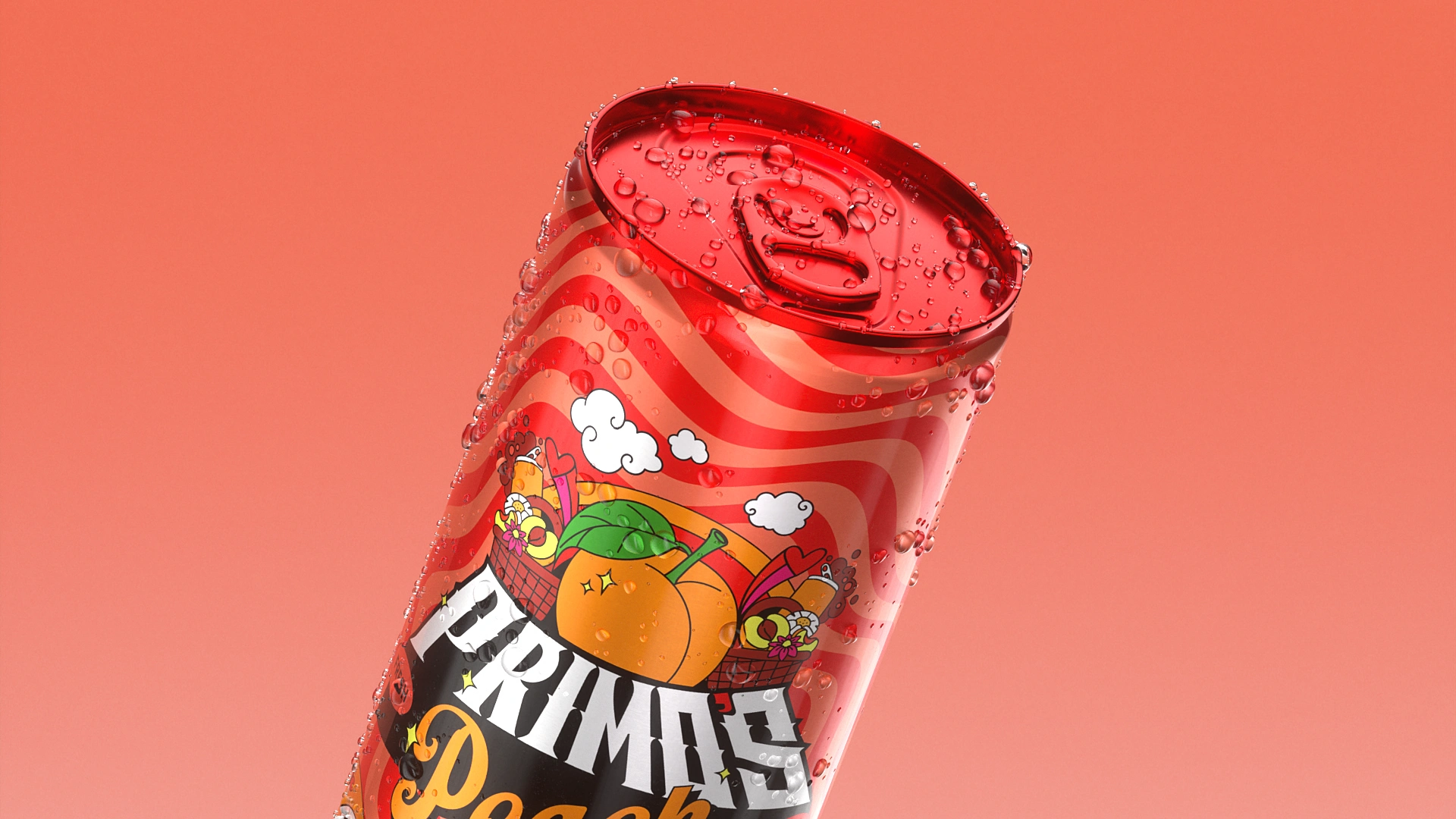
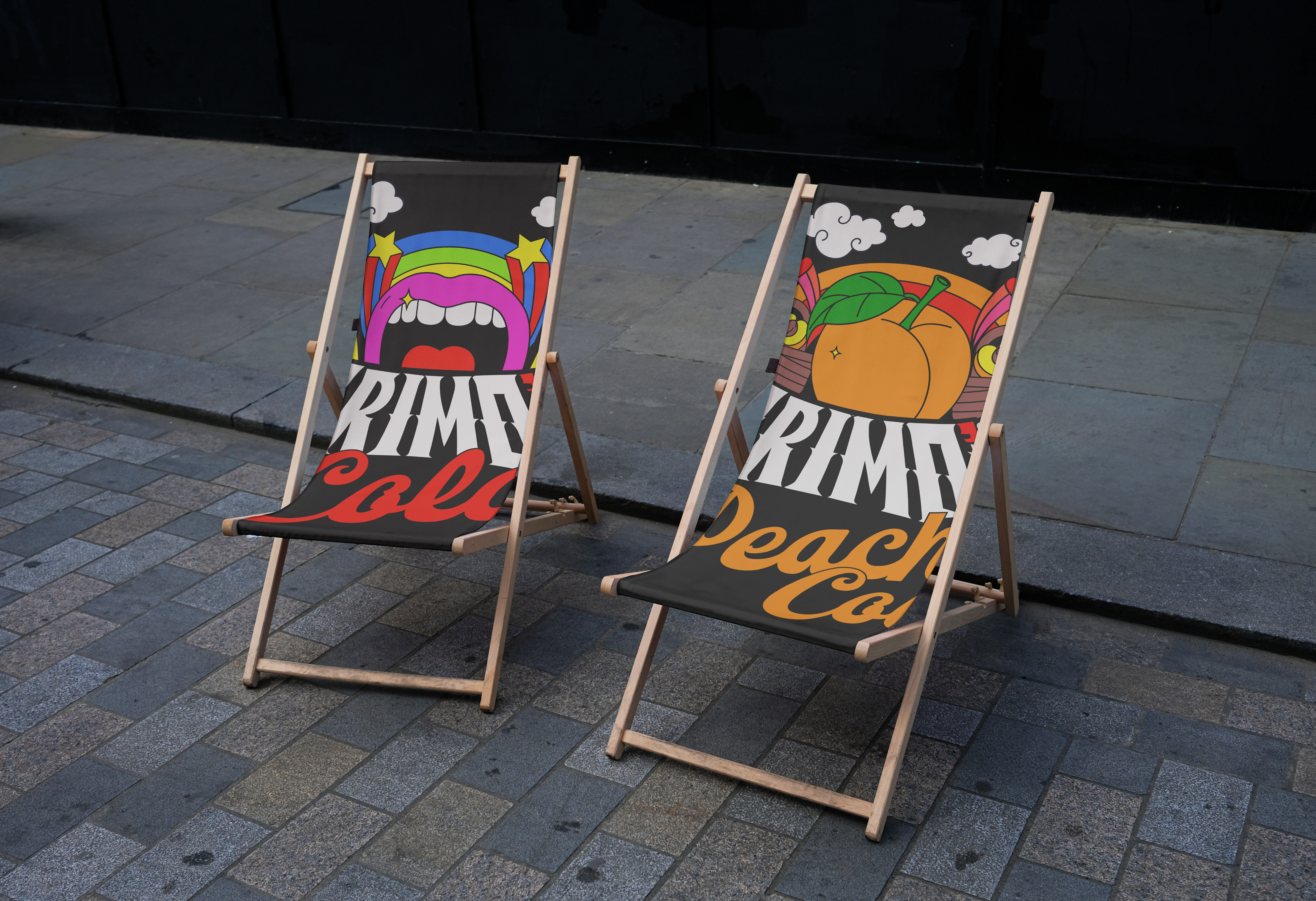
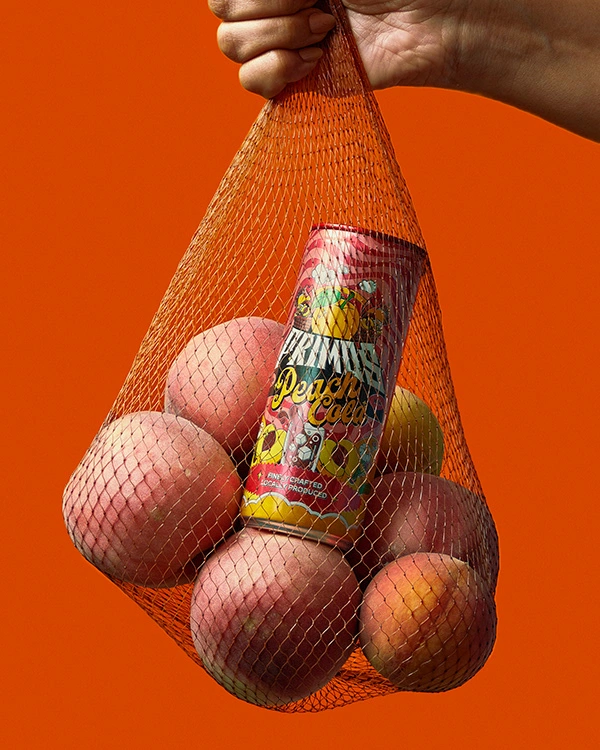
Each can and poster works both individually and as a family: Unified by the Primo’s wordmark, signature patterns, and red crafted badge. Differentiated through flavor-specific illustrations, color palettes, and sub-logos. Versatile enough to live on shelves,
in fridges, vending machines, or Instagram feeds.
Project Credentials
Agency: The Bored Members
Client: Primo’s Pizza
Account Director: Alaa Mostafa
Creative Director: Ali Naguib
Art/Design Director: Maram Youssef
3D Designer/Motion: Mohamed Omran
Sound Designer: Airat Murtazin
Photographer: Ahmed Osos
Food Stylist: Mawada Montaser
Senior Designer: Ahmed Badr
Mid-Weight Designer: Marwan Ezz
Junior Designer: Olivia
Like this project
Posted Aug 25, 2026
The Project Outcome The result is a soda brand that feels alive, unapologetic, and fun. Primo’s Soda isn’t just a drink—it’s an attitude in a can, tightly connected to its Primo’s Pizza heritage. Visually disruptive in crowded markets. Emotionally resonant with Gen Z’s appetite for authenticity and play. Strategically connected to pizza culture, building lasting visual memory. Culturally distinctive, positioned not as another soda, but as a pop icon.