Redesigning Zap Mobile App

Usama Memon


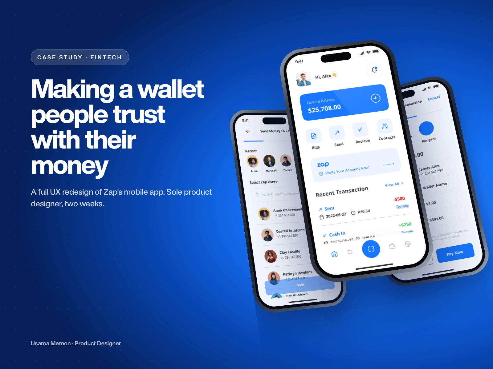
Snapshot
Client: Zap, a digital wallet startup
My role: Sole product designer, from flows to final UI and handoff
Timeline: 2 weeks
Scope: Full UX redesign of the mobile app: onboarding, home, send, receive, scan to pay, bills, verification and settings
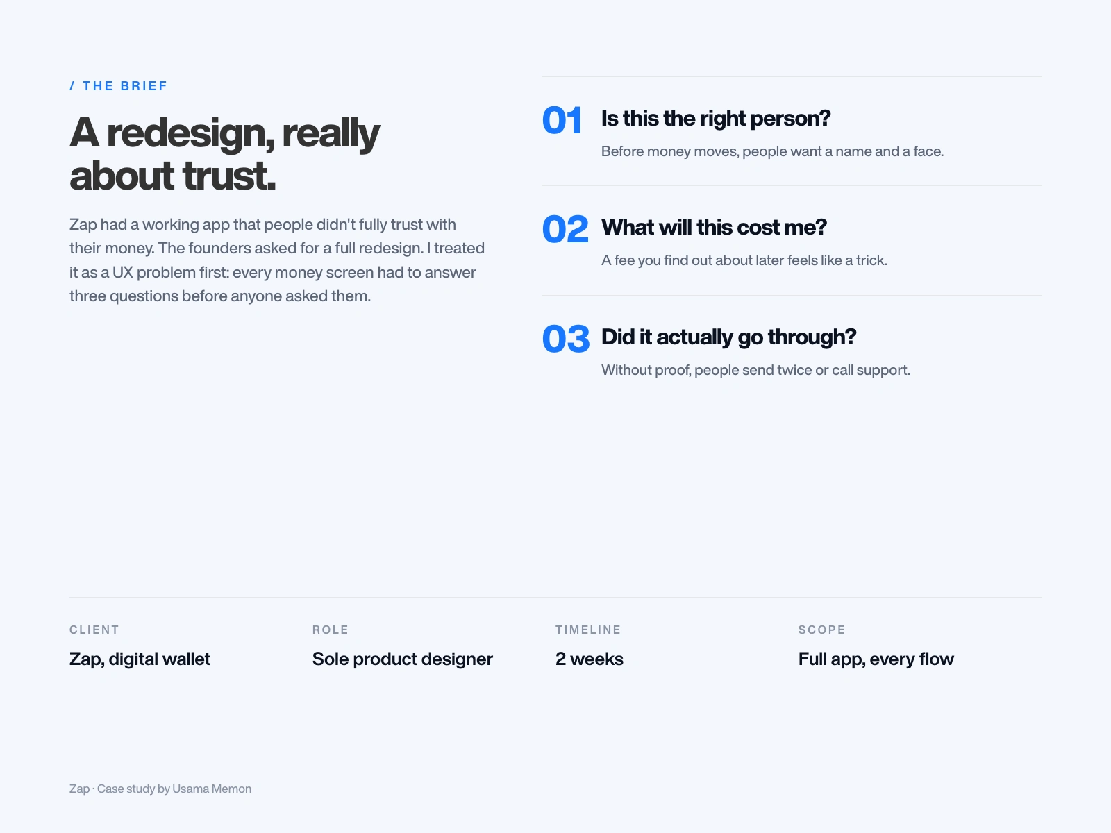
The brief
Zap already had an app. It worked, but people didn't fully trust it with their money. The founders asked for a full redesign.
I treated it as a UX problem first. Sending money is the moment people get nervous: Is this the right person? What will it cost me? Did it actually go through? Every money screen had to answer those questions before anyone asked them.
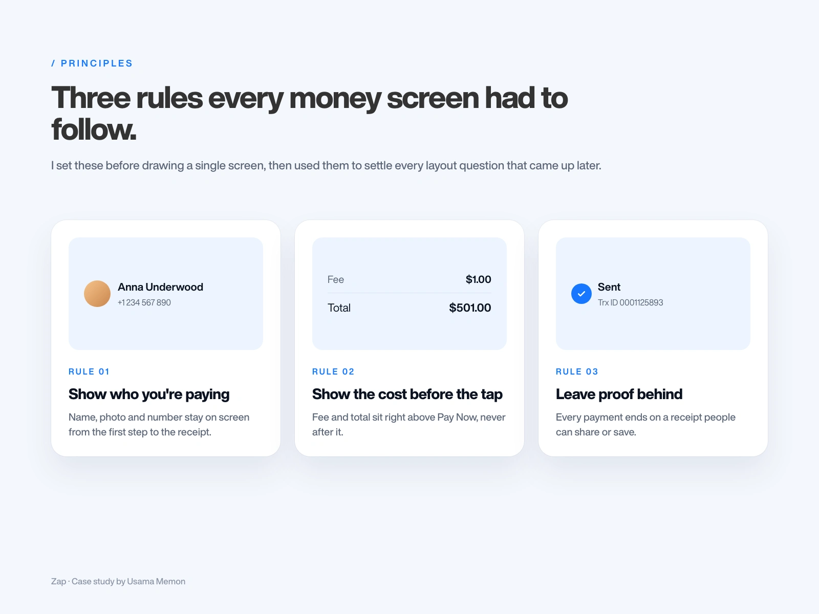
Three rules every money screen had to follow
I set these before drawing a single screen, then used them to settle every layout question later: show who you're paying, show the cost before the tap, and leave proof behind.
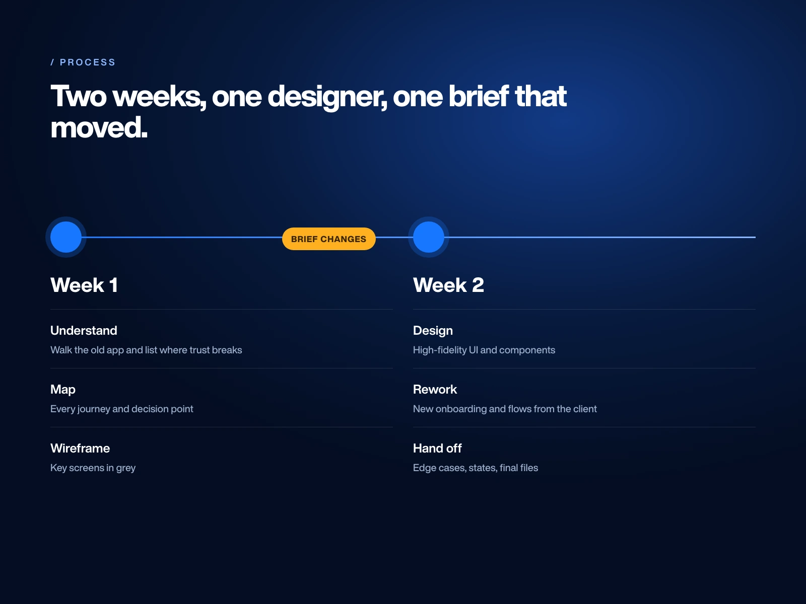
Two weeks, and a brief that moved
Week one went into understanding the old app, mapping every journey and wireframing the key screens. Week two was high-fidelity UI, edge cases and handoff. Halfway through, the client reshaped onboarding and several flows, so I reworked them inside the same two weeks.
Mapping the app before drawing it
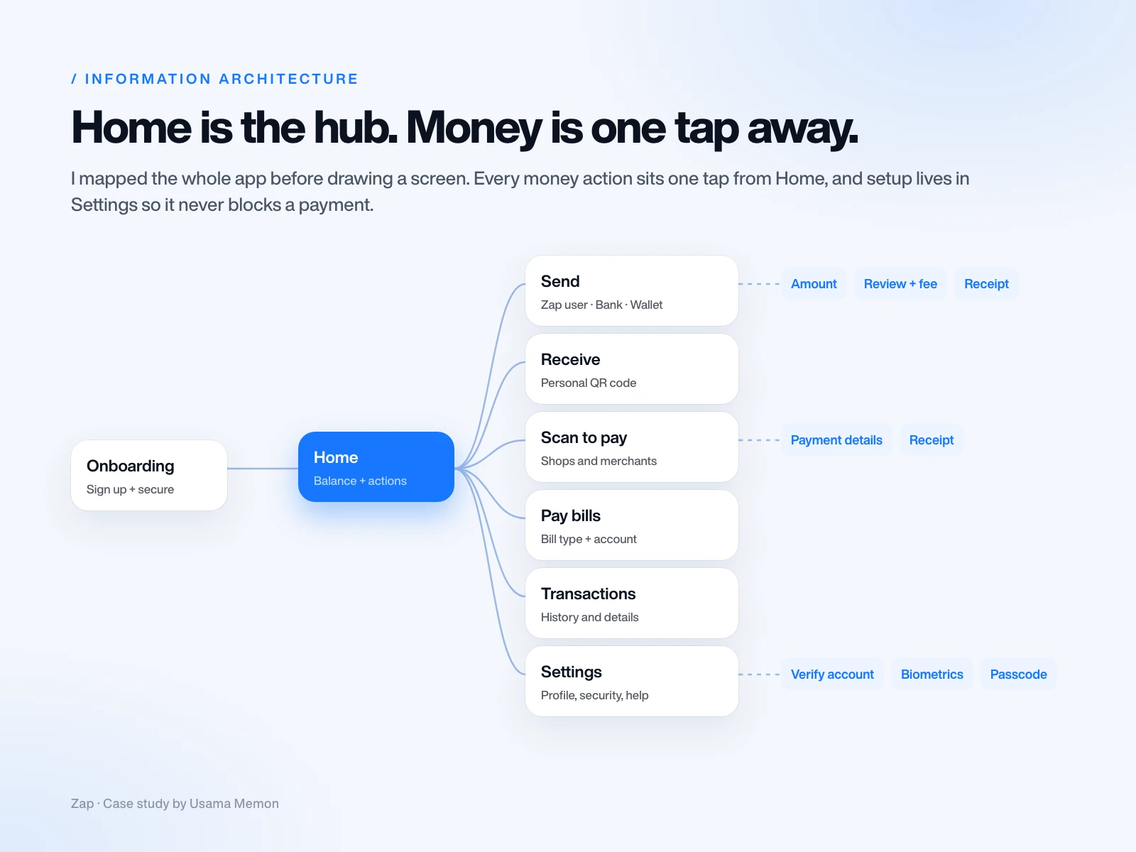
Home became the hub. Send, Receive, Scan and Bills sit one tap away. Settings and verification live in their own space so they never get in the way of moving money.
Every journey, end to end
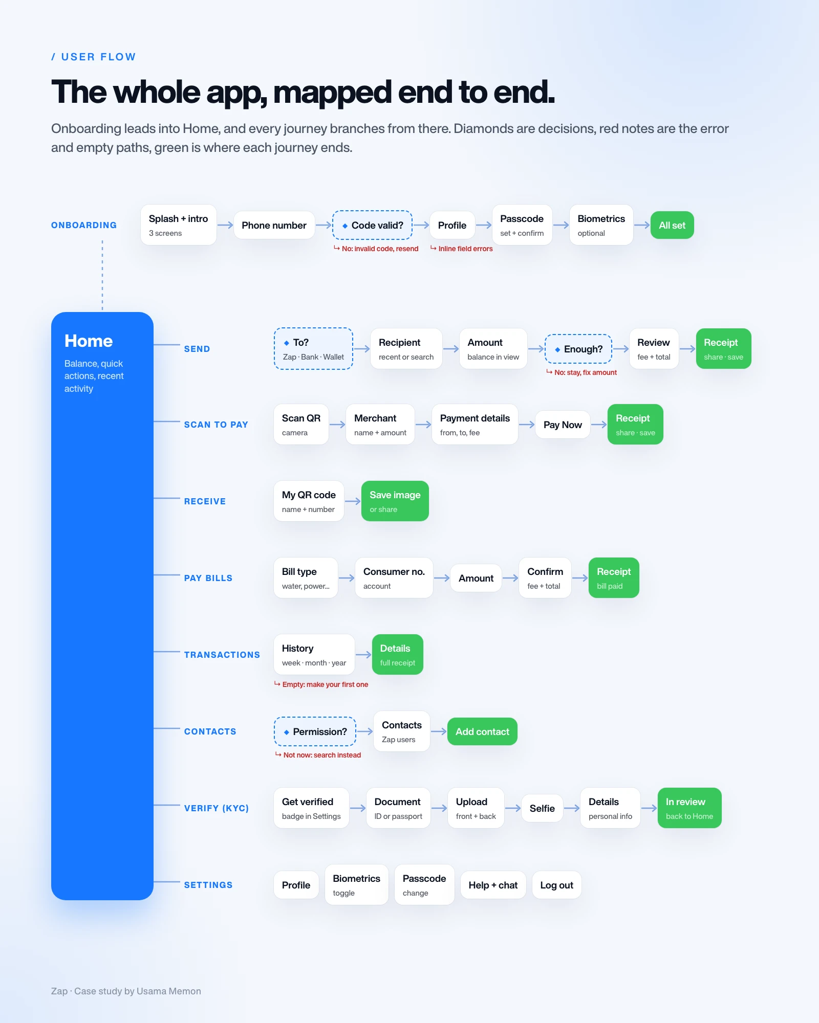
Then I mapped every journey: onboarding into Home, and from Home to send, scan to pay, receive, pay bills, transactions, contacts, account verification and settings. Each one has its decisions, its error and empty paths, and a clear end point, so nothing leads to a dead end.
The send flow, step by step
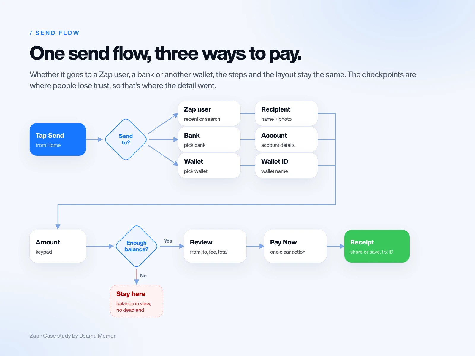
Sending matters most, so I mapped it in detail: where the money goes (a Zap user, a bank or another wallet), who exactly, how much, whether the balance covers it, a full review, and a receipt. Whichever path you take, the steps and the layout stay the same.
Wireframes: hierarchy first, colour later
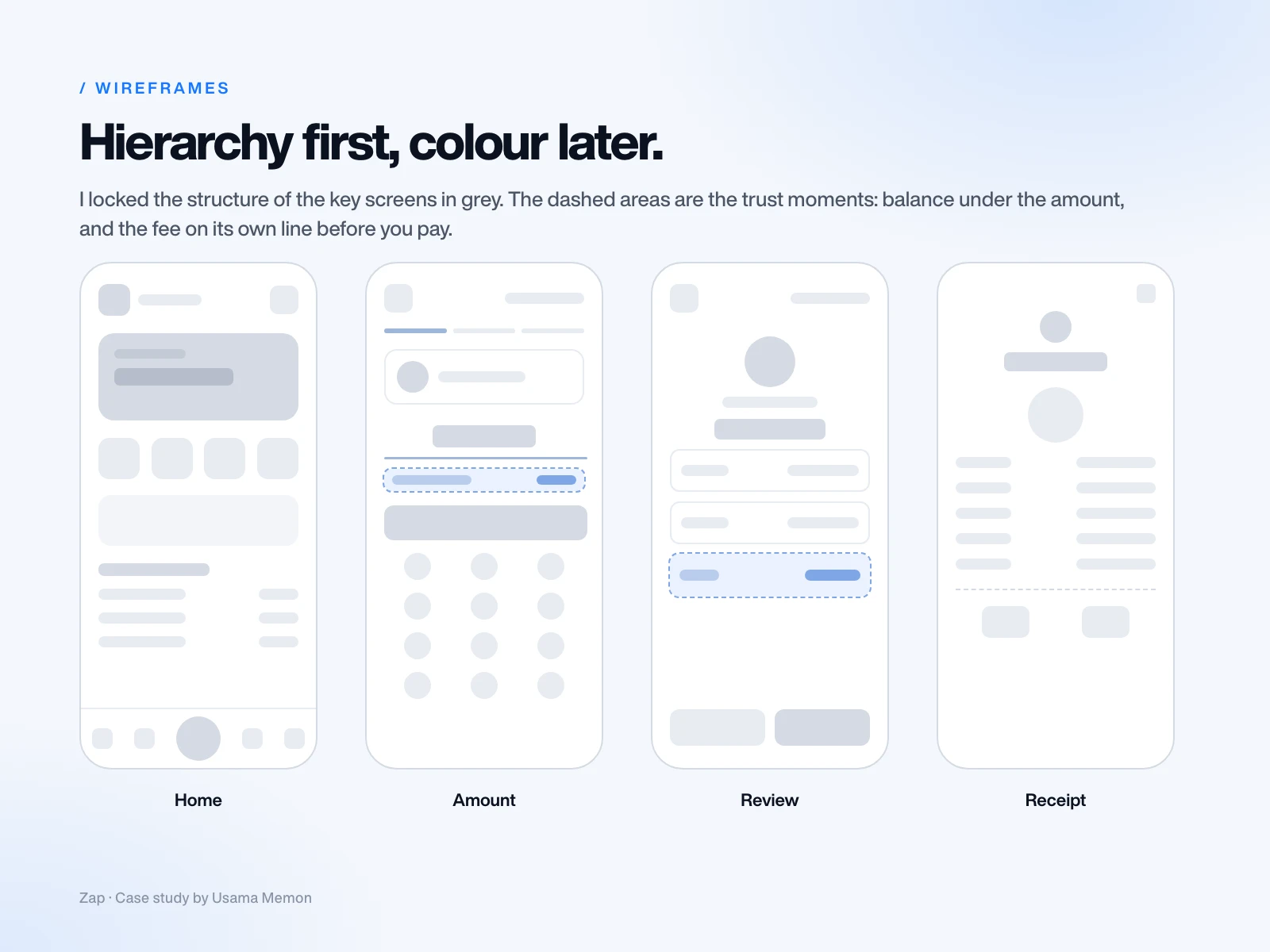
I locked the structure of the key screens in grey, so the decisions were about hierarchy, not styling. What's the one thing on this screen? Where does the thumb go? What can wait?
Decisions that shaped the product
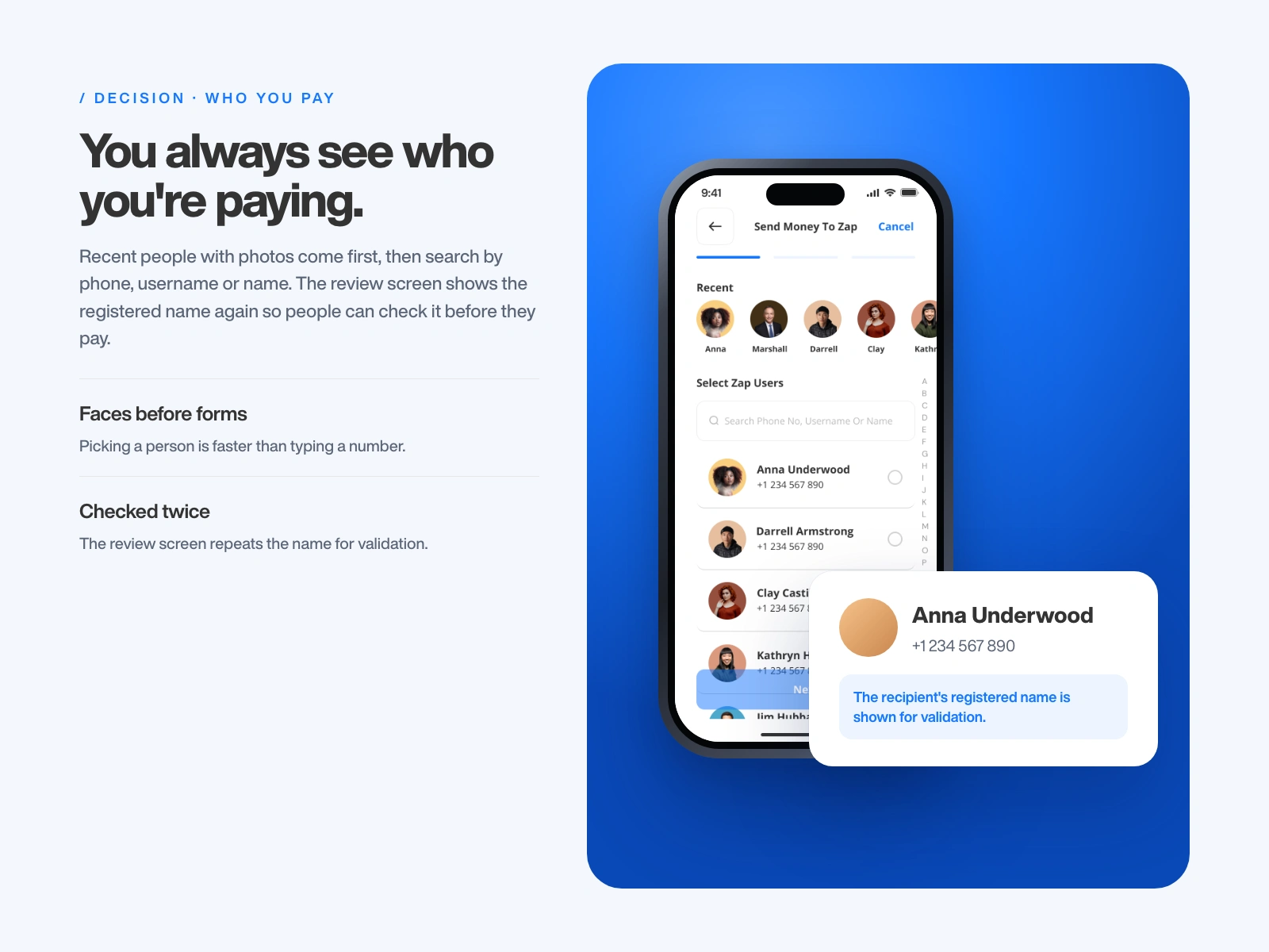
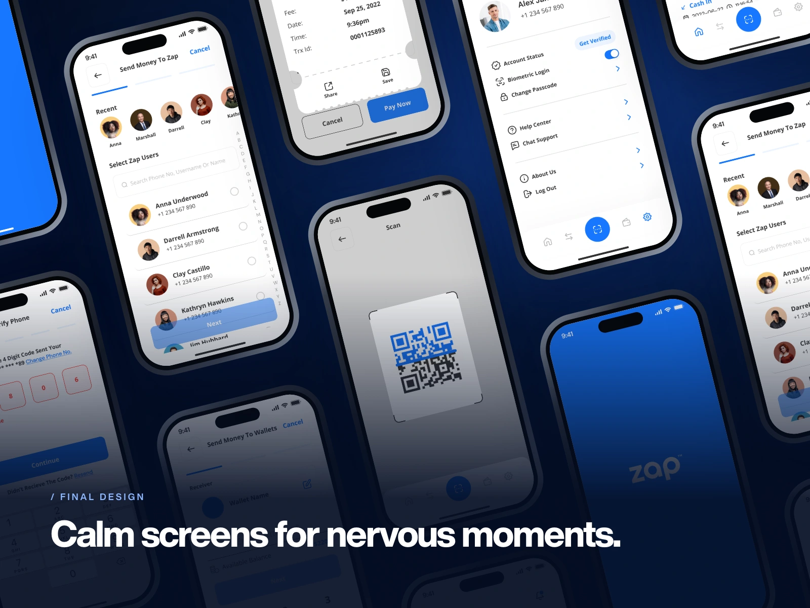
You always see who you're paying. Recent people with photos come first, then search by phone, username or name. The review screen shows the registered name again so people can check it before they pay.
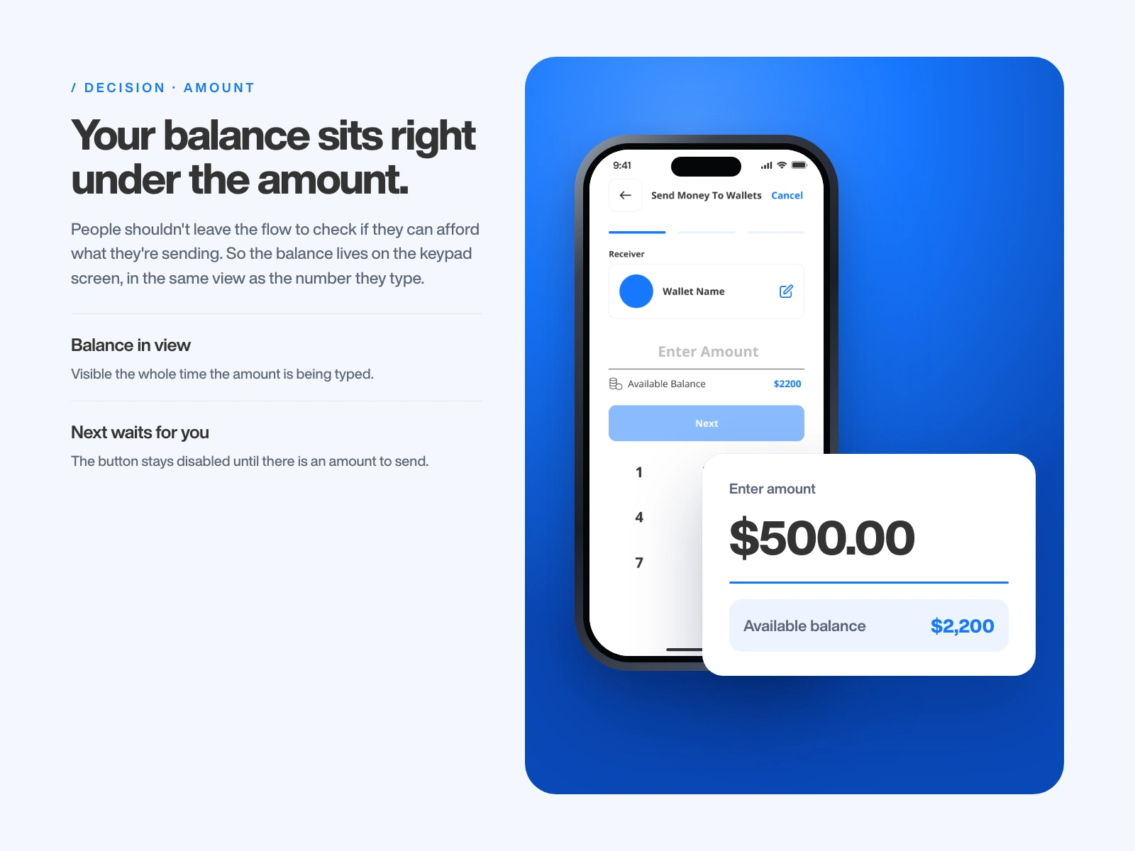
Your balance sits right under the amount. People shouldn't leave the flow to check if they can afford what they're sending, so the balance stays in view while they type, and Next stays disabled until there is an amount to send.
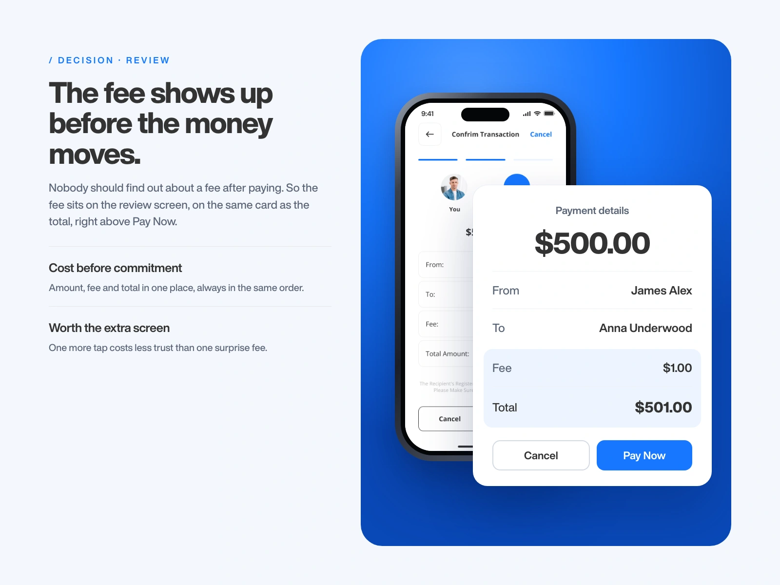
The fee shows up before the money moves. Fee and total sit on one card right above Pay Now. It costs one extra screen, and I kept it, because a surprise fee costs more trust than one tap.
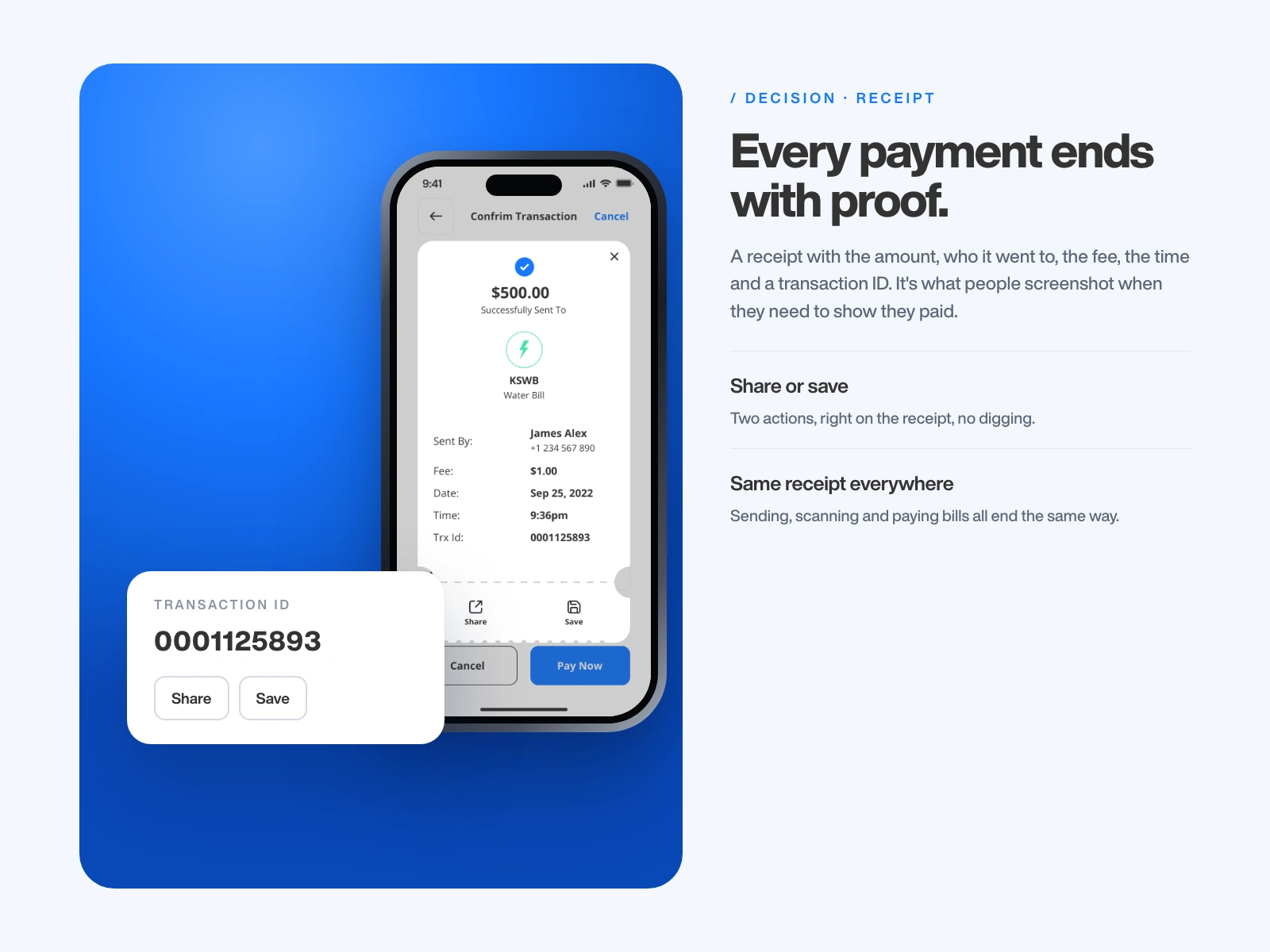
Every payment ends with proof. A receipt with the amount, who it went to, the fee, the time and a transaction ID, plus Share and Save. It's what people screenshot when they need to show they paid.
Onboarding, one small step at a time
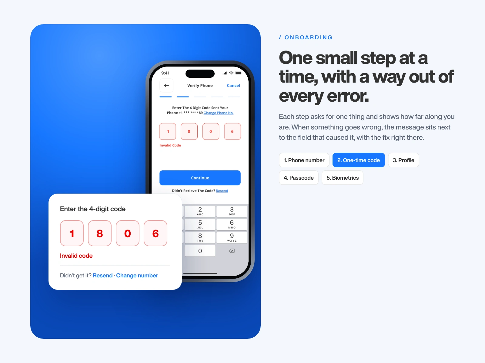
Phone number, a one-time code, profile, passcode, then biometrics. Each step asks for one thing and shows how far along you are. Errors sit next to the field that caused them, with a way out: resend the code or change the number.
The screens new users see first
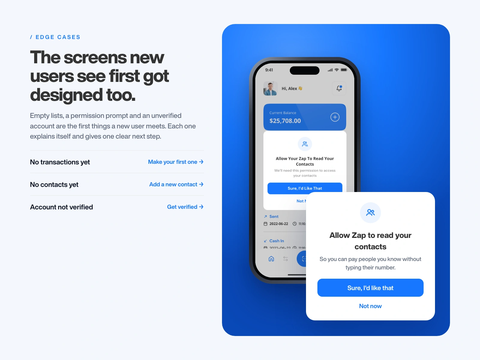
No transactions yet, no contacts, a contacts permission prompt and an unverified account. Each one explains itself and gives one clear next step instead of an empty page.
Visual system
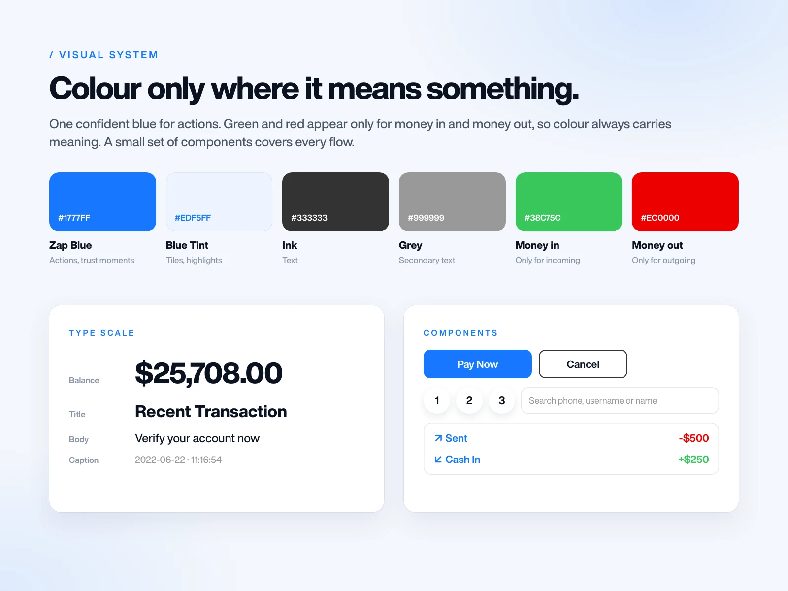
One confident blue for actions and trust moments, neutral greys for everything else. Green and red only for money in and money out, so colour always means something. A small set of components covers every flow.
When the brief changed
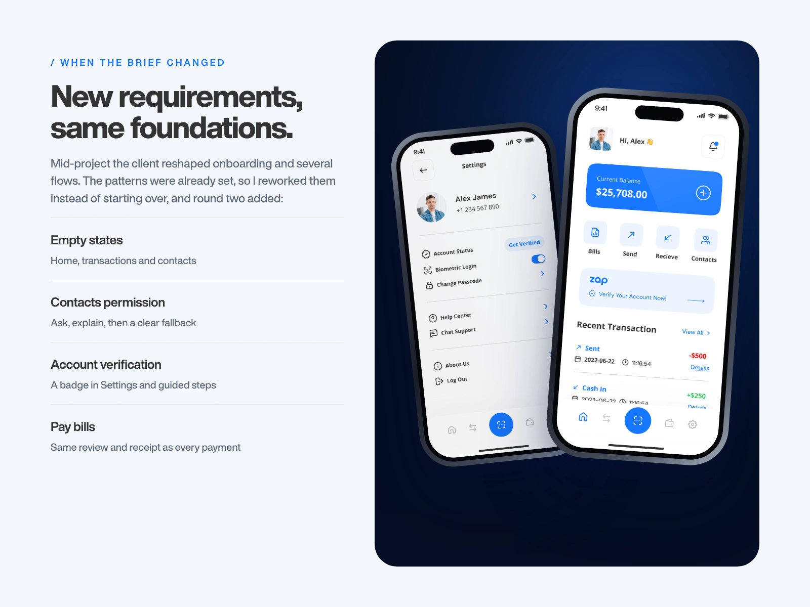
Because the patterns were set early, I could rework onboarding and the changed flows without starting over. Round two also added empty states, a contacts permission flow, account verification and bill payments that reuse the same review and receipt.
The final app
What I'd do next
With more time, I'd test the send flow with first-time wallet users and watch where they hesitate. I'd also add spending limits and clearer failed-payment states, which were next on the client's list.
Have a fintech or mobile app that needs a calmer, clearer flow? Start with my UX Audit & Quick Wins, or book a call.
Like this project
Posted Oct 21, 2026
I redesigned Zap, a digital wallet app, as the sole product designer. Two weeks, a brief that kept changing, and every flow rebuilt from onboarding to receipts.