Payday Website Redesign
AjaNwachuku Mike-AjaNwachuku
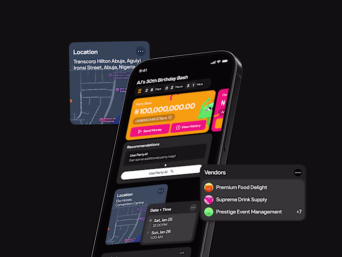
Designing Payday
Payday entered the Nigerian fintech space in 2023, aiming to hack global virtual payments. In a few months the brand was moving fast and gaining attention. With designers I looked up to shaping the product, this project became more than a redesign. It became a personal benchmark, and thankfully, my friend Goodness felt the same way.
The Challenge
In 2023, Payday was everywhere. Ads, influencers, timelines. People joked about seeing Payday ads in their sleep. The brand was loud, confident, and culturally relevant, with a design team I really respected.
The website didn’t match that energy.
It felt generic and disconnected, like it had been left behind while everything else moved forward. That gap stuck with me. During a school break, I reached out to my friend Goodness, and we decided to take it on as a passion project. Maybe we’d get some recognition from designers we admired. Maybe it would lead to more. Either way, it felt worth trying.
The question wasn’t about redesigning for the sake of it. It was about this: how do you translate Payday’s voice, confidence, and craft into a web experience that actually feels alive?
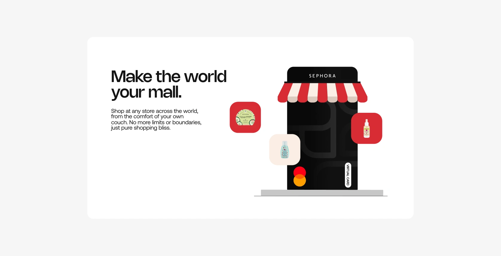
the Original Payday Cards Website
After a few iterations, we landed on a simple, clean landing page with the cards as the hero of the story. They became the thread that runs through the entire experience, moving across sections that highlight Payday’s core promises: shop anywhere, manage payments, and stay in control of your spending. In every section, the card is the main character. We layered visuals around it to support the narrative, creating smooth, continuous transitions as you scroll.
We had settled into the overall direction and locked in the core sections, but something still felt missing. One of the perks of this being a passion project was freedom. We could make decisions based purely on instinct. No approvals. No long debates. Just taste.
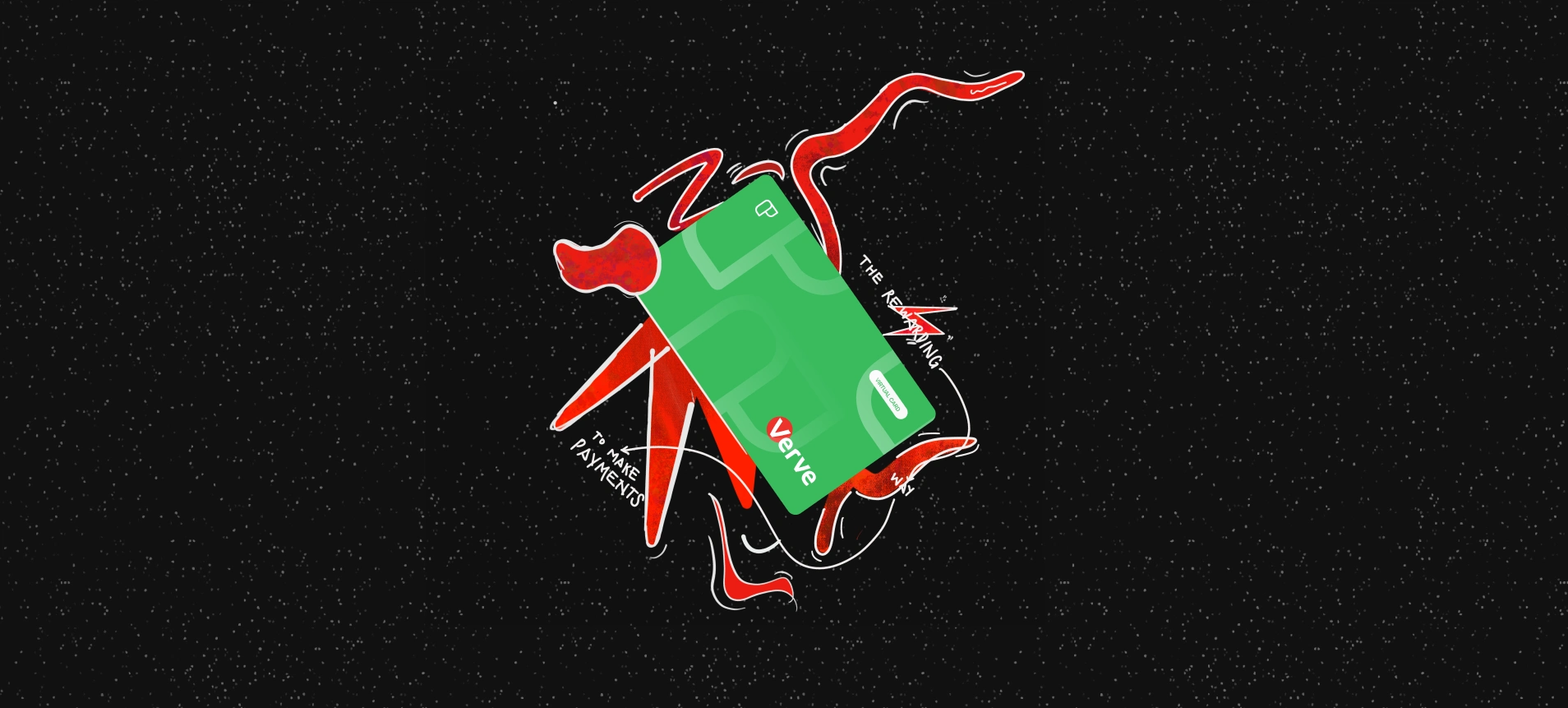
About 48 hours before our deadline, I fell into a Pinterest rabbit hole of graffiti art and started doodling directly over the card designs we already had. Thick strokes. Rough edges. Imperfect lines. I pulled inspiration from classic brand language like Mastercard’s “For everything else, there’s Mastercard” from the Priceless campaign, and suddenly it clicked.
The cards stopped feeling like UI elements and started feeling like culture. They felt tagged, marked up, and lived in. Loud, expressive, and confident. The kind of visuals that don’t just explain a product, but make a statement. It was the missing energy the page needed, and once it landed, the whole site finally felt complete.
Of course, these were entirely unnecessary, but, again, ✨passion project✨
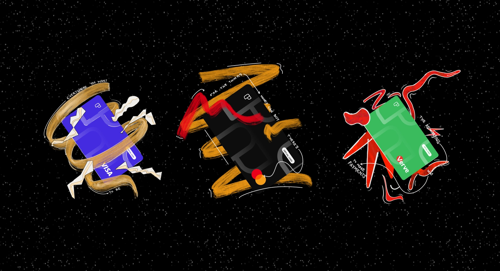
Graffiti Cards
And here's the final reveal!
Final Website!
Looking for a designer that gets it? Reach out, or send an e-mail: hi@ajanwachuku.work
View my full portfolio: www.ajanwachuku.work
Cheers.
Like this project
Posted Jan 12, 2026
Reimagined Payday’s Cards page from scratch, translating their high-energy marketing into a web experience that finally matched the brand.