Usability Test of a Mobile App for LGBTQ+ Affirming Services
Executive Summary
AsylumConect is the first nonprofit scale-up to address the holistic needs of persecuted LGBTQ+ people for safe and verified legal, medical, mental health, and other social services in North America. To help the organization improve the user experience of version 1.0 of its native mobile apps, together with 3 other UX researchers, I designed, moderated, and analyzed remote usability tests with 5 service providers who used the app to gather verified services for their clients.
5 Priorities
1. Vetting Process: Adding a hyperlink about the vetting process (new page opens) to verified info badges and ensuring the information/hyperlink is accessible on desktop and mobile might help users gain more trust in the resources they found.
2. Additional Filters: Apply filters” button is needed for the mobile view because service providers were not confident additional filters were properly applied when they searched for resources for their clients.
3. Language: Ensure the language icon is clear and stands out. A dropdown with country flags and country names in alphabetical order might help.
4. Share Resources: Redesigning the share icon by adding clarifying text might help users better recognize the purpose of the symbol. Adding at least one sharing option like sharing via email for users without a user account might keep the retention high.
5. Search Organization by Name: Adding a search by name of the organization (in addition to the ability to search by location) might quickly aid service providers to refer clients more efficiently to organizations they already know.
Task Experience
We asked all service providers about their perceived confidence and difficulty after each usability task. I summarized the results in two tables. The lower scores motivated us to seek qualitative interpretations. This approach helped us derive 5 priorities.
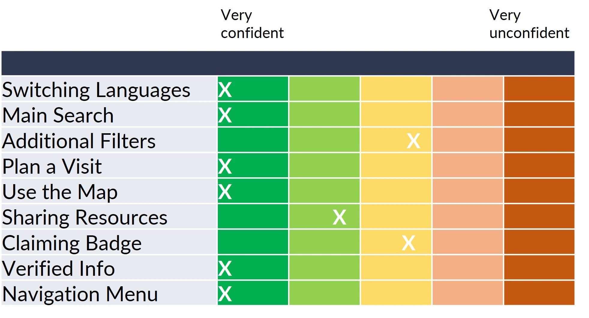
Table 1. Single Task Confidence Average
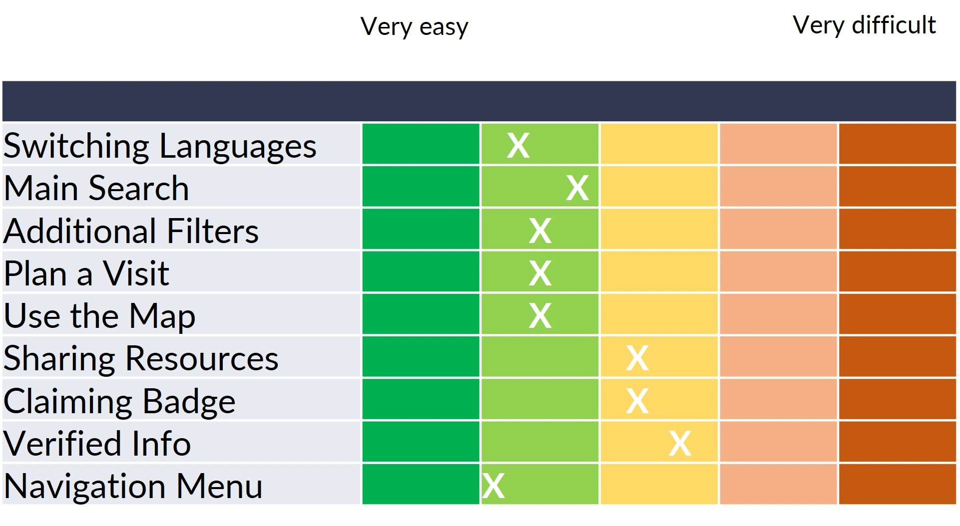
Table 2. Single Ease of Use Average
Legend

Product Experience
After completing all tasks, service providers filled out the System Usability Scale (SUS), which I provided in Google Forms. I calculated the SUS score, which gave us an immediate insight into the overall usability of the app and a benchmark for future studies. Our score of 78.13 fell above the average SUS score of 68 and it was within the acceptable usability level.
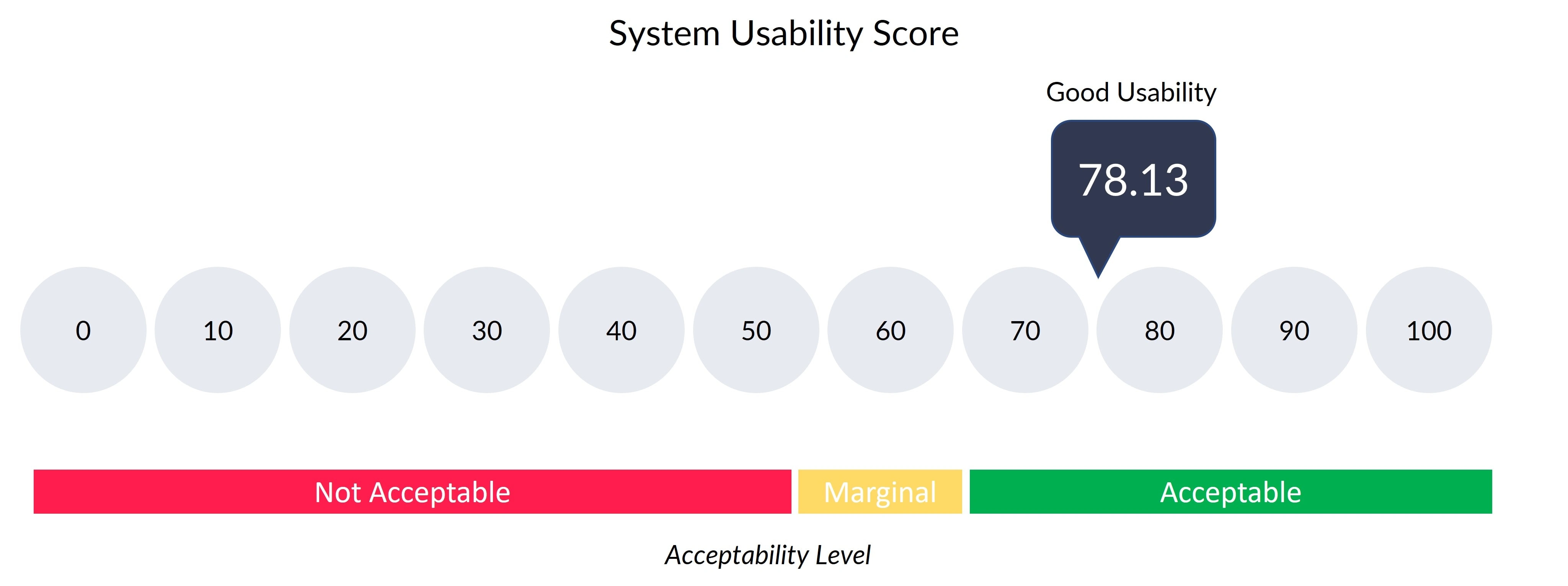
Figure 1. System Usability Score is not a percentage, but a total score out of 100
Background
The problem within the LGBTQ+ community
LGBTQ+ asylum seekers face unique obstacles. They must navigate through discrimination from social services and prejudices from fellow asylum seekers in their new home due to their LGBTQ+ identity.
About AsylumConnect
Co-founded in 2016 by a gay asylum seeker and American trans-man, AsylumConnect is a New York-based 501(c)(3) nonprofit scale-up providing the world’s first free tech platform matching LGBTQ+ people with safe, verified services in North America.

Image 1: Product Mockups
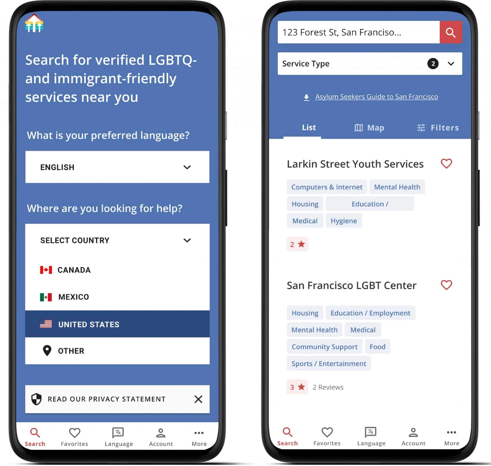
The AsylumConnect App is the first free tech platform to address the holistic needs of persecuted LGBTQ+ people. It is available on web, mobile web, and native iOS and Android
Video 1. AsylumConnect Mobile App Demo
Audience
Resource Seeker
With the app, every LGBTQ+ person regardless of their sexual orientation, gender identity, race, immigration status and/or income level can find verified and safe legal, medical, mental health, and other services.
Service Provider
Immigration attorneys, resettlement agencies, state and local governments, and other service providers also use the free app to gather verified information for their clients.
Every direct service provider listed on AsylumConnect undergoes a unique and rigorous vetting process designed to ensure they are immigrant-friendly and welcoming to the diverse LGBTQ+ members.
Objectives
In November 2019 AsylumConnect launched version 1.0 mobile app for iOS and Android.
In 2020 I joined the first-ever UX research team of 4 researchers. The Executive Director asked us to test the major user flows with service providers and share insights with key stakeholders: UX Design Lead, Tech Lead, and Executive Director.
In addition, my team had to lay the foundations of the research operations.
Summary of main research objectives
1. Evaluate major user flows with the mobile app
2. Discover concerning issues
3. Understand how service providers scrutinize resources for their clients
4. Gather feedback on task and product level
Methods
We recruited 5 service providers from 5 legal nonprofits that signed a Memorandum of Understanding (MOU) with AsylumConnect. They took part in 1-hour long remote usability tests via the UserTesting platform between 2020 and 2021. Thanks to a grant from UserTesting, which I extend every year, we were able to conduct and record the interviews. I moderated 3 interviews and took notes during the other 2 interviews.

Figure 2. Remote Moderated Usability Test with UserTesting
Process
These were the steps my team and I took to establish the research practice and operations at AsylumConnect for the first-ever usability testing of the mobile app. As volunteers on two continents with limited resources and scattered availability in the midst of the COVID-19 pandemic and political turmoil during the U.S. presidential elections, the project took us about one year.

Key Findings
1. Vetting Process
When was the organization vetted?
None of the participants could easily find when an organization, that offered services to LGBTQ+ resource seekers, was vetted without a prompt from the moderator.
I had to click and hold down, which I don’t think I would think to do on a mobile device. - participant 1
I would not ever think to do that! - participant 2
Recommendations:
Immediate fix (engineering):
Update hover mouse text to: “The information on this page was last updated on DATE. AsylumConnect prioritizes accuracy and user safety, and updates all information at least once every 6 months. For more information on our vetting process, please click here. [link to vetting process website page]“
More permanent fix (UX design):
Improving the accessibility of the hover text description and ensuring the information is reachable on both desktop and mobile should help service providers discover and understand the vetting process so that they can trust an organization and eventually refer a client to it.
2. “Apply Filters” Button
Was my choice saved?
Most participants were not confident that the additional filters were applied correctly.
Video 2. Service provider confused if “Additional Filters” were applied (0:20)
Recommendation:
“Apply Filters” button is needed for mobile view and desktop to ensure users know that their selected choices are active.
3. Switching Language
What if my client didn’t speak English?
Most service providers were concerned that their clients may not be able to switch languages if their clients didn’t speak English.
If my preferred language wasn’t English maybe I wouldn’t understand it. - participant 3
Recommendation:
Ensure the language icon is clear and stands out. A dropdown with country flags and country names in alphabetical order might help.
4. Sharing Resources
How can I share a resource with my client?
All participants were confident that they knew how to share a resource, but they got confused about why a login was required. They looked for alternative ways like twitting or emailing.
Some service providers were concerned that their clients would not recognize the share symbol.
Recommendations:
Redesigning the share icon by adding a clarifying text might help users better recognize the purpose of the symbol.
Adding at least one sharing option like sharing via email for users without a user account might keep the retention high.
5. Search by Organization Name
What if I didn’t know the location of an organization?
Finding their own organization troubled the majority of service providers.
Video 3. Service provider struggling to find an organization (0:30)
Recommendation:
Adding a search by name of the organization (in addition to the ability to search by location) might help service providers quickly refer clients to organizations they already knew.
Impact
The UX research team delivered 3 quick fixes to the November 2020 product release following heuristic and competitor analysis:
Updated Footer and Call to Action
Added labels for service icons on Search Results and Organization Profile Pages
Added “Verified Information” and “Claimed” badges to organizations’ profile page
Following the usability tests, the product team adopted 3 recommendations in 2021:
Added a hyperlink with the vetting processes to the verified info badges
Added the ability to search by organization name (in addition to by location) to enable users to easily identify whether a direct service provider has been certified as affirming by the AsylumConnect team
Added drop shadow and clarifying icon to the language dropdown menu
Reflections
Thanks to tools such as Slack, Google Drive, Google Meet, Zoom, Miro, and UserTesting, I could collaborate with 3 UX researchers and other stakeholders synchronously and asynchronously.
With the help of the cross-functional team, I supplied our research operations with a recruitment flyer, participant referral form, CRM with service providers, and consent forms.
The biggest challenge with the project was recruiting participants. Initially, we wanted to talk to migrant resource seekers, but the pandemic, the closed US-Mexico border, and political events during the U.S. elections prevented us from researching this target group. Once community centers and legal nonprofits opened their offices, we could connect with them and ask service providers to participate in remote usability testing. The UX Research lead and I emailed 30+ organizations from a list provided by the Executive Director. I managed a participant recruitment form.
Testing the mobile app was a hurdle. As a nonprofit without a budget for a commercial testing platform, we considered implementing the so-called “hug the laptop” procedure. However, this required our participants to have a laptop and a mobile device. Luckily, one team member found out about the One World program with UserTesting. When one teammate dropped in 2021 I continued managing the relationship with UserTesting as well as granting platform access to new teammates.
Because most of the activities at our tech nonprofit were carried out by volunteers, not everyone had the possibility to invest an equal amount of time in the project. Towards the end, the UX research lead, one UX designer, and I finalized the user interviews.
Our research findings could not immediately be implemented because the engineering backlog was full of items. Donations could help us hire full-time staff members to speed up product development. We hired a full-time engineering lead in September 2022.
I kept the continuity of the research project in times when 3 Tech Leads and 2 UX Design Leads changed. After the end of this research project, the UX Research lead left and the Executive Director appointed me as the new UX research lead in 2021.
Like this project
Posted Aug 28, 2023
I designed, moderated, and analyzed remote usability tests with 5 service providers who used a resource app to refer their clients to LGBTQ+ affirming services.


