Comeheal™ Brand Identity
Ege Caymaz

Comeheal - Brand Identity Design
Project Overview
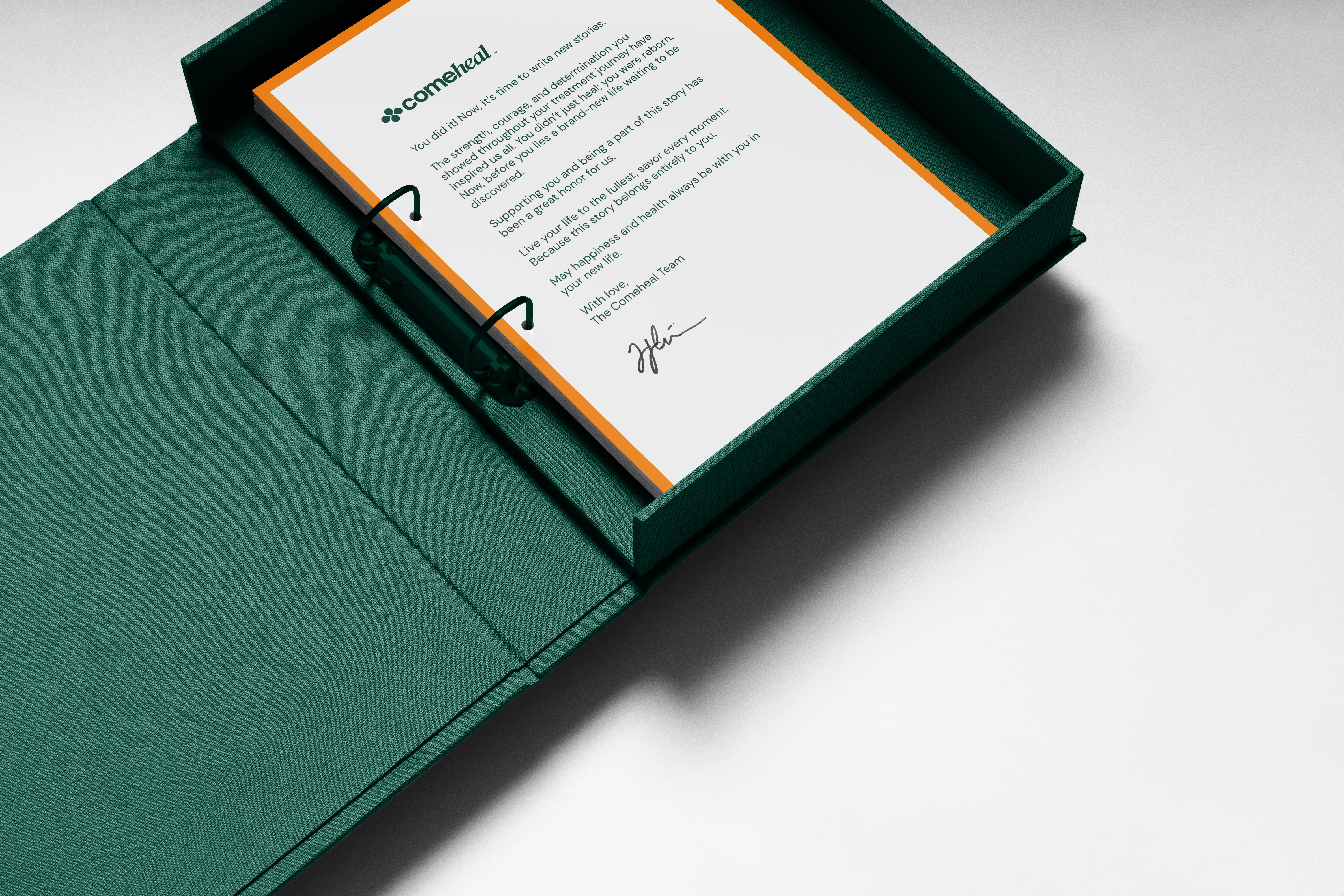
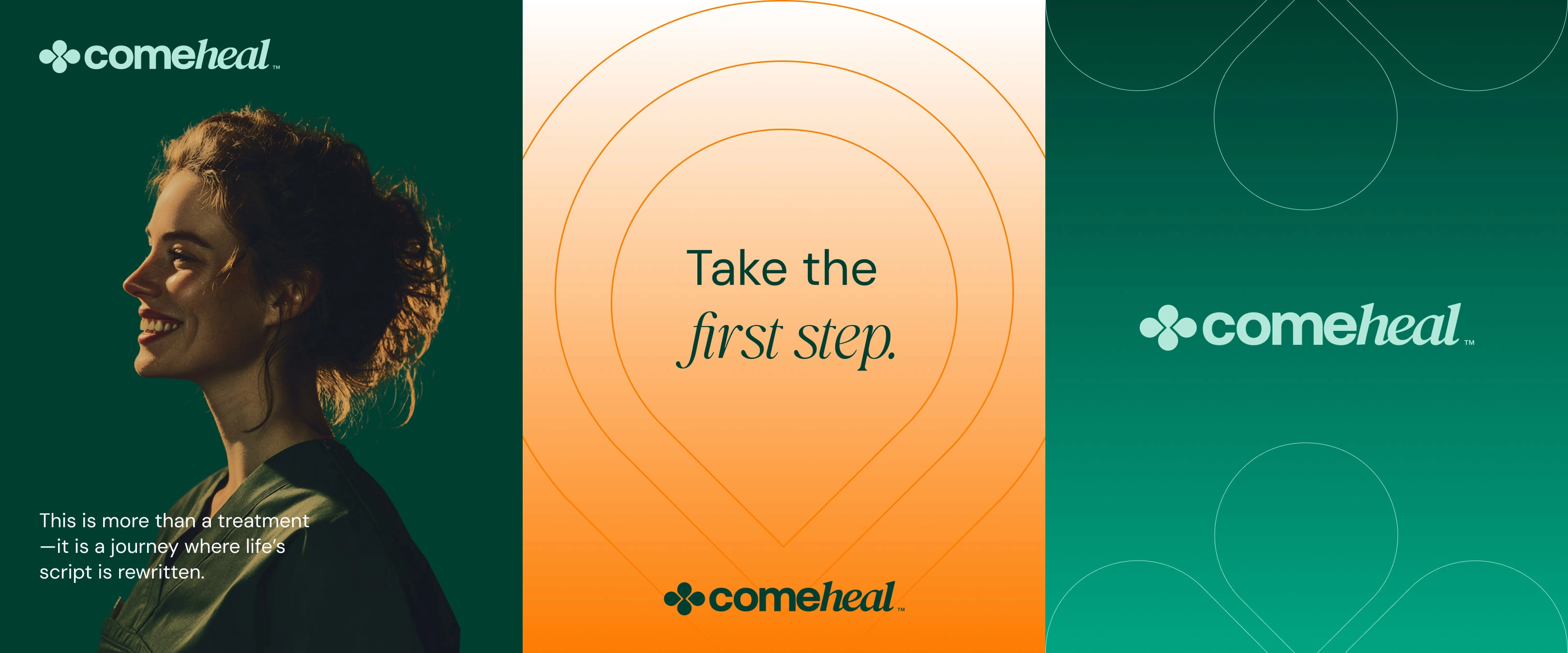
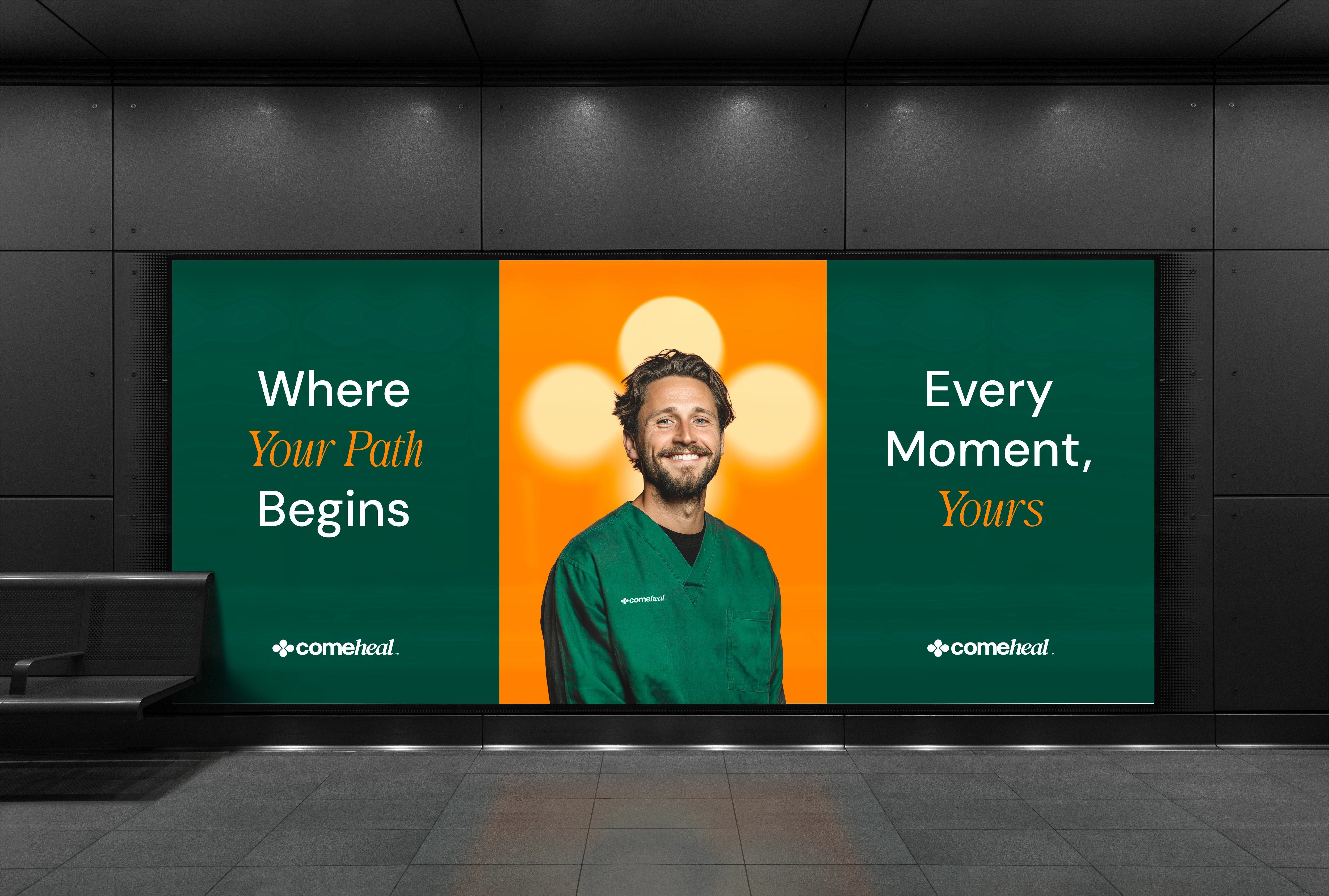
Comeheal is more than just a treatment brand—it is a narrative of transformation, resilience, and rediscovery. Rooted in the belief that every life is a story and every story is a journey, Comeheal positions itself as a compassionate guide, helping individuals take their first brave steps toward healing and renewal. The brand manifesto emphasizes that this is not simply about clinical treatment, but about rewriting life’s script, rediscovering hope, and embracing the strength to begin again. By framing healing as a journey rather than a destination, the brand creates a human-centered experience that resonates with trust and empathy.
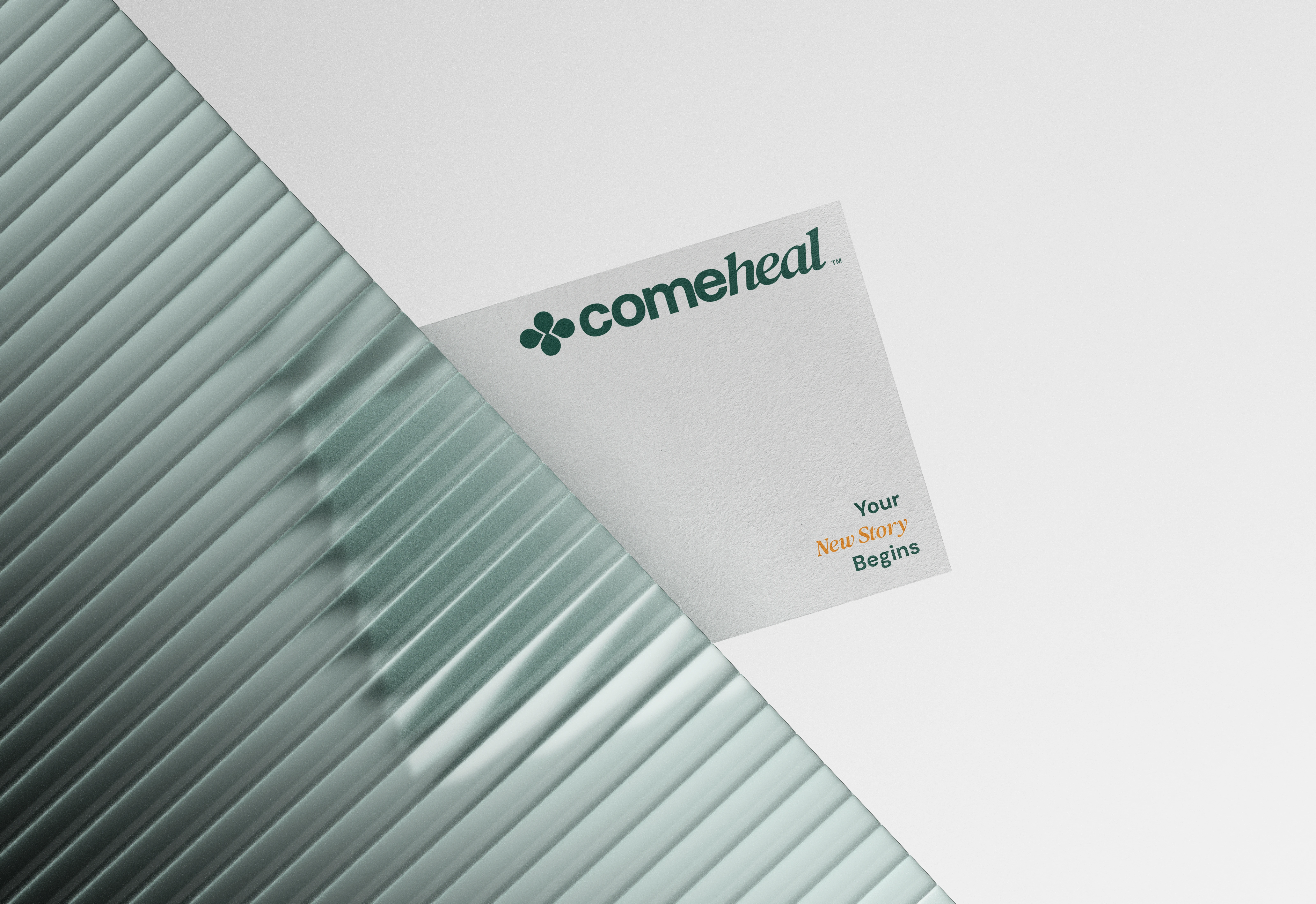
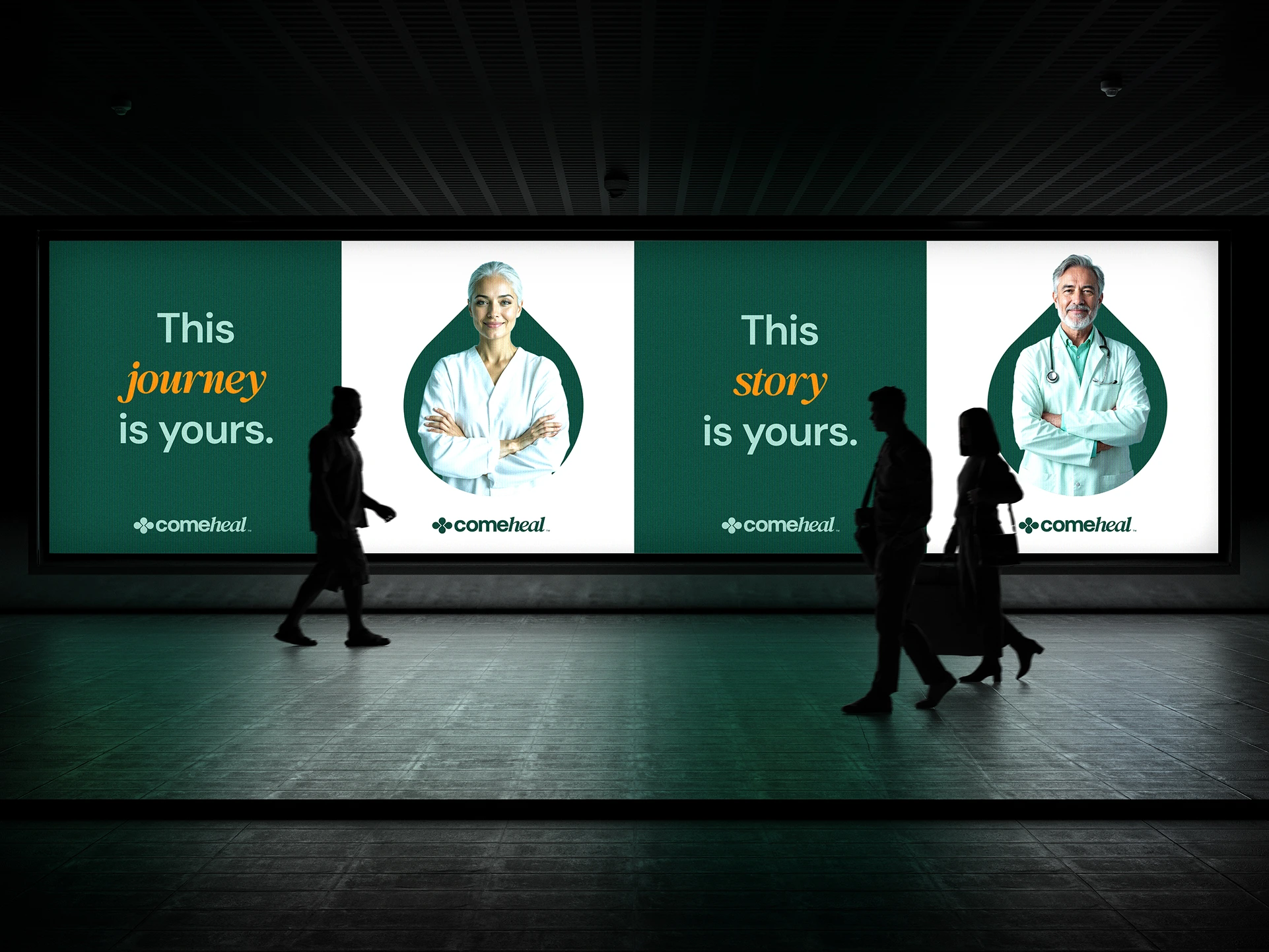
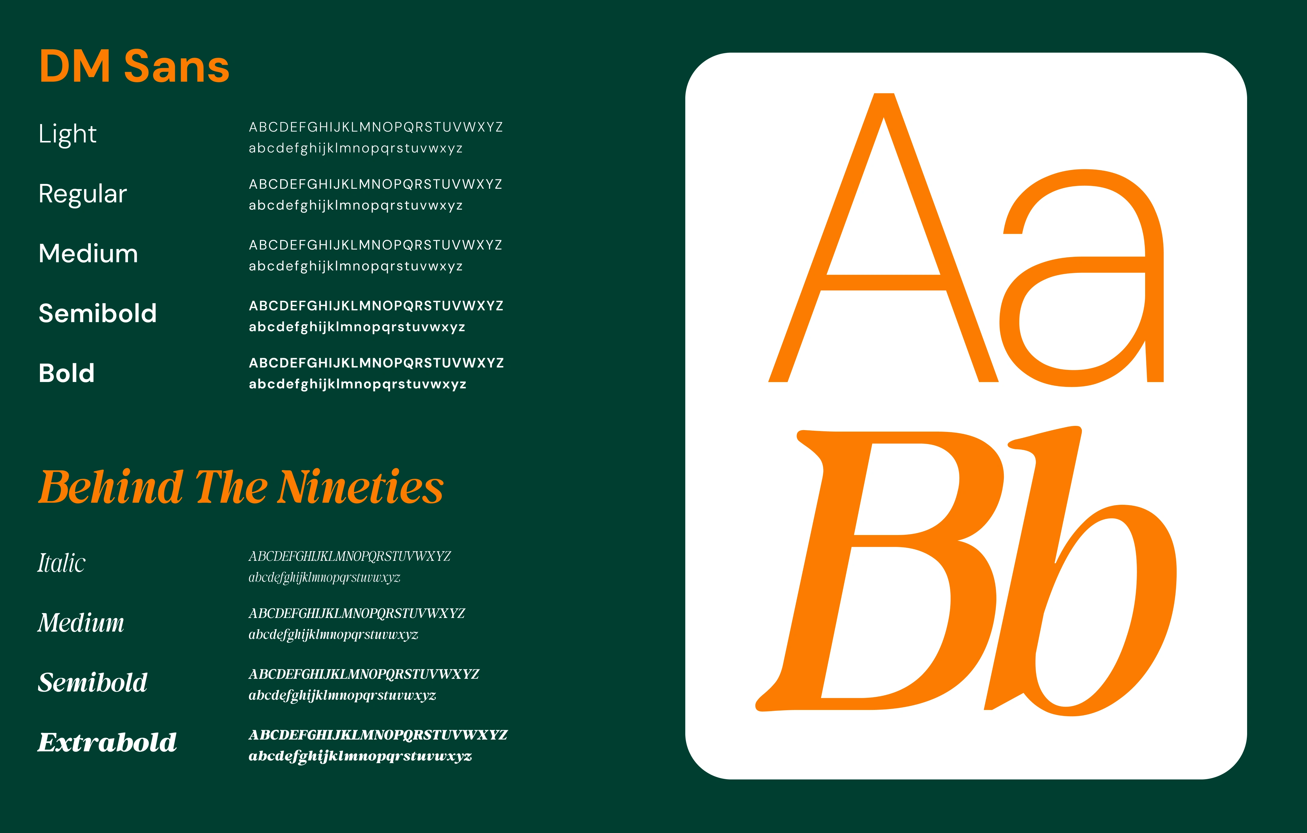
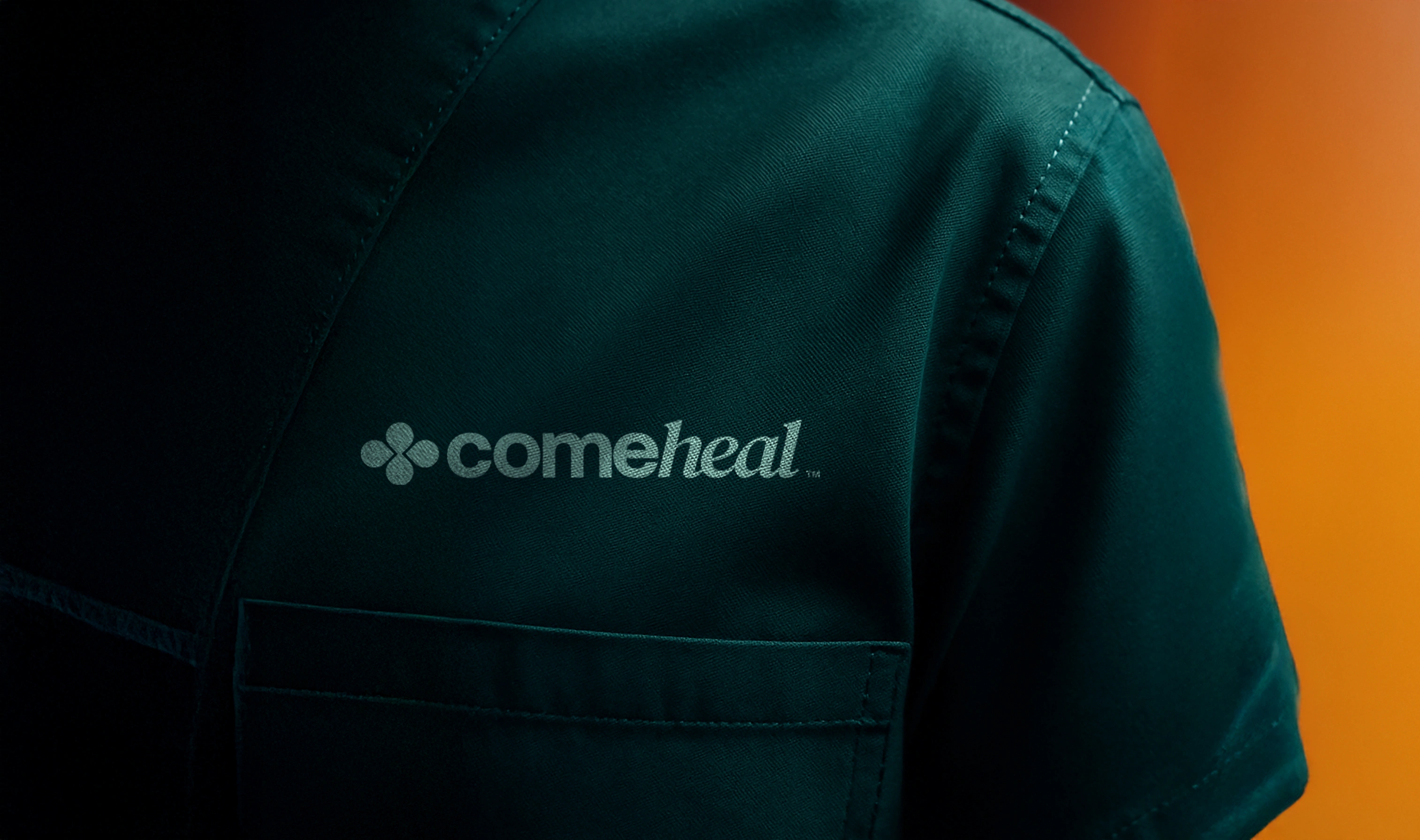
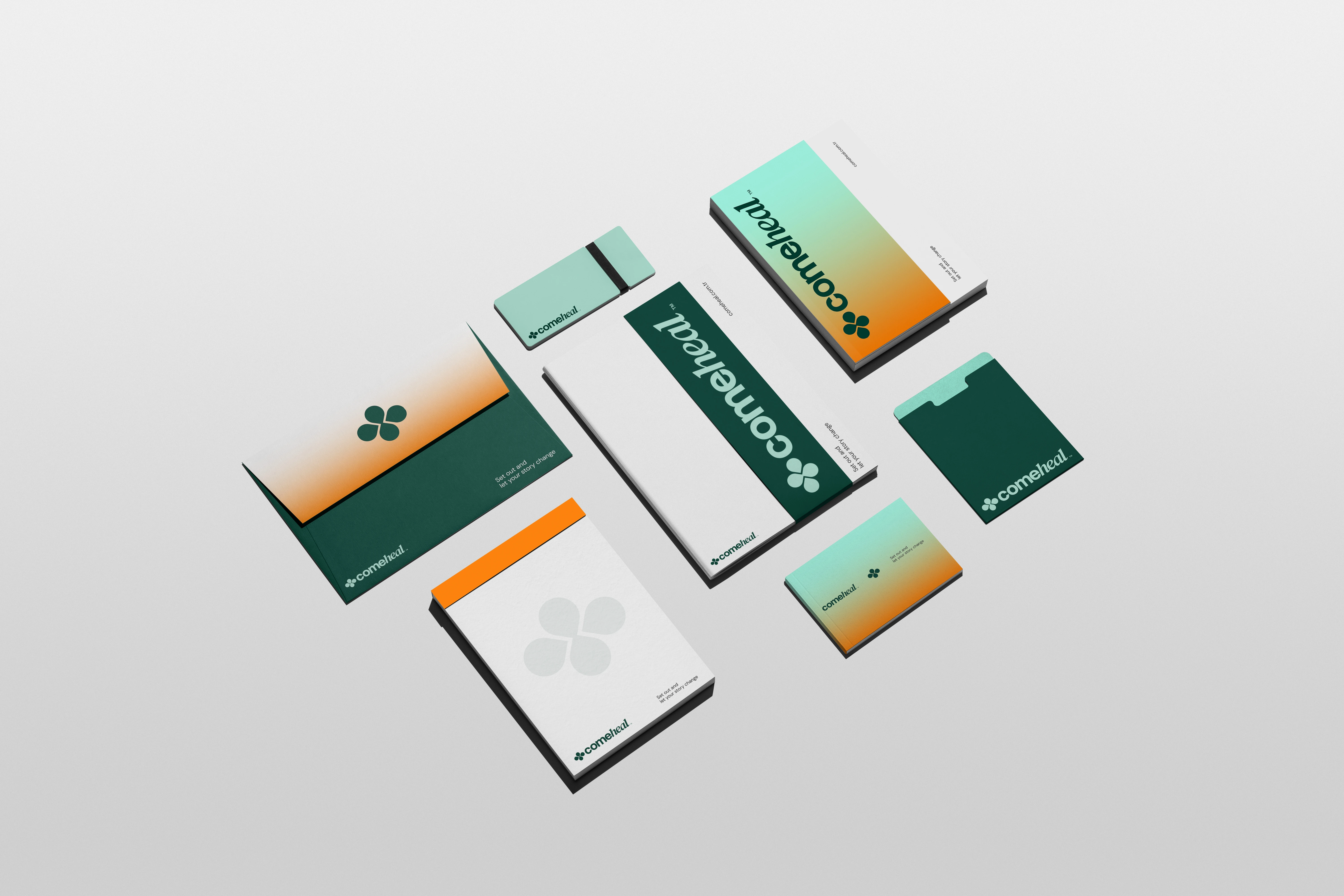
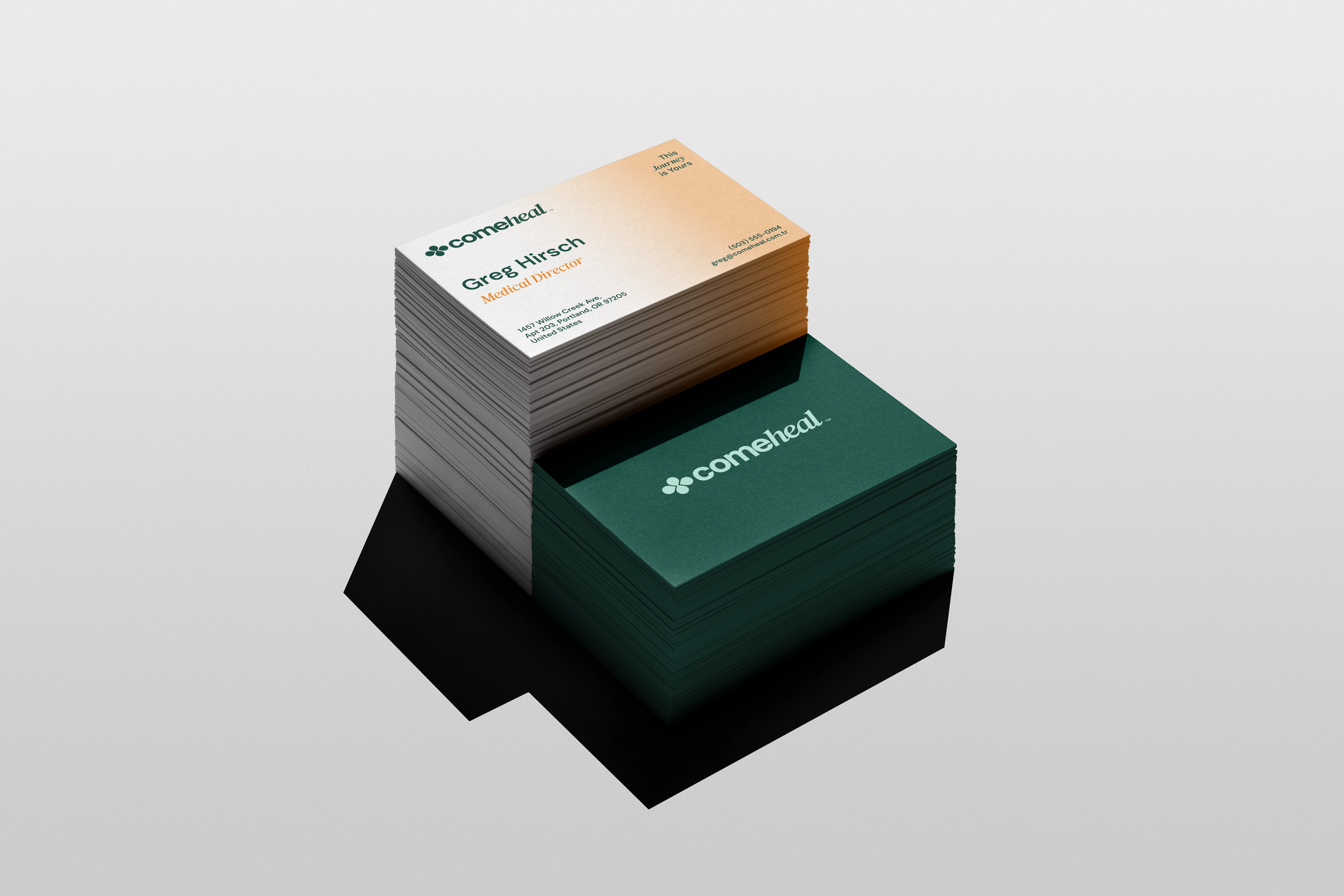
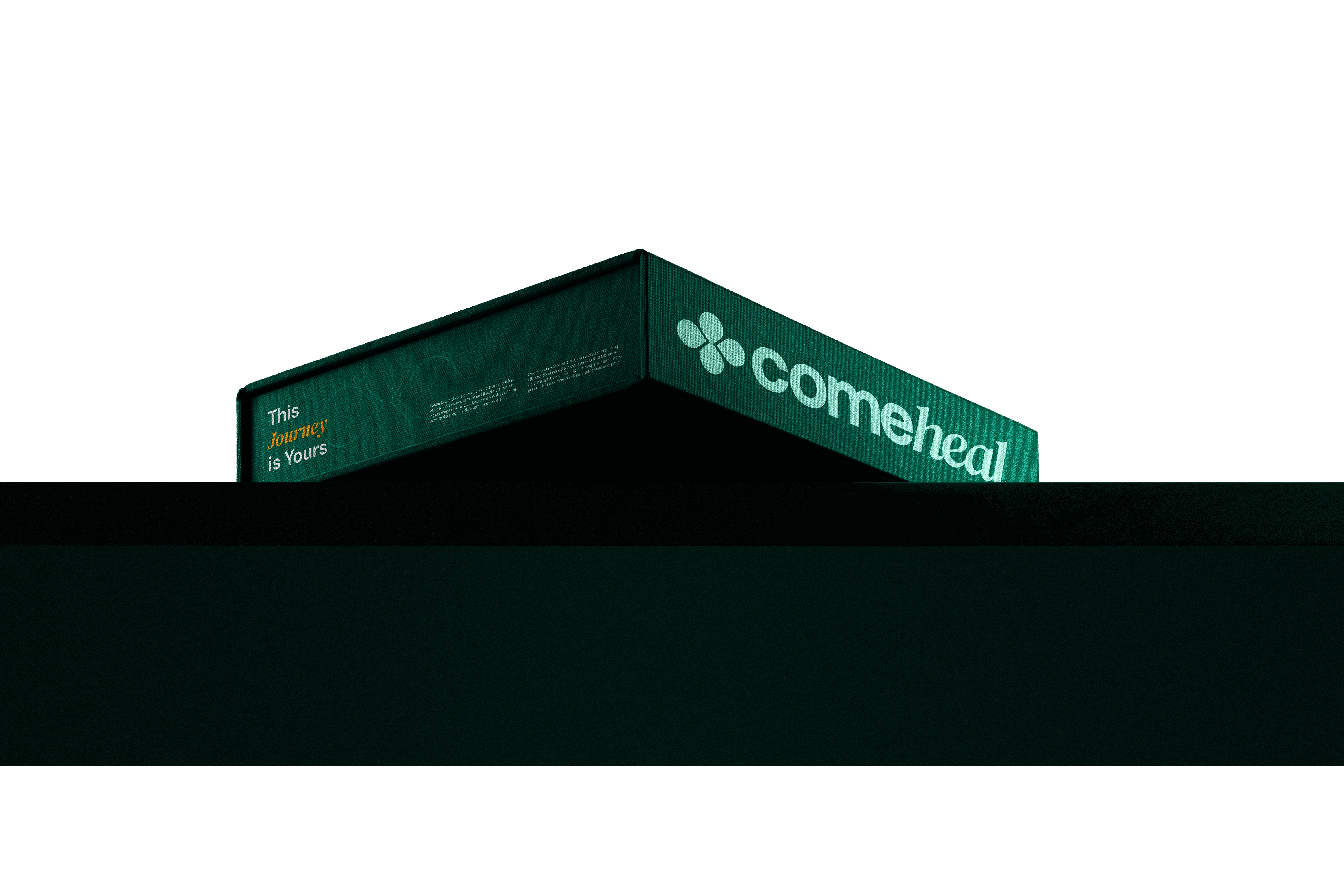
The visual identity of Comeheal reflects the spirit of optimism and new beginnings. Deep green tones form the foundation of the palette, evoking renewal, balance, and grounding, while accents of warm orange bring an uplifting sense of energy and optimism. Typography choices are clean and modern, ensuring clarity while maintaining a welcoming and approachable personality. The logo centers around a four-leaf clover, a universal symbol of life’s rare miracles. Each leaf embodies a stage of healing—beginning, belief, support, and healing—forming a complete cycle of transformation. Together, these visual elements establish a cohesive identity system that feels both professional and deeply human, reminding every individual that their healing journey is also a story worth telling.


Like this project
Posted Aug 21, 2025
Visual identity design for health tourism start-up Comeheal™
Likes
2
Views
11