Becoming Monsters
This 160+ page publication was created with the intention of exploring unique and underground communities, in this case: Roleplay and Creepypasta.
Initial Research
When I was asked to research a very specific community and create a publication, I had gone through several different iterations which eventually led me to the Creepypasta and Roleplay community. Creepypasta is a form of internet horror legends that is derived from the word Copypasta (text that is often copied and pasted throughout the internet). It was most popular during the early 2010s and died off a couple of years later. At some point, however, there was a surge in youth roleplaying with one another as these Creepypasta legends, which led to more unique stories and adaptations.
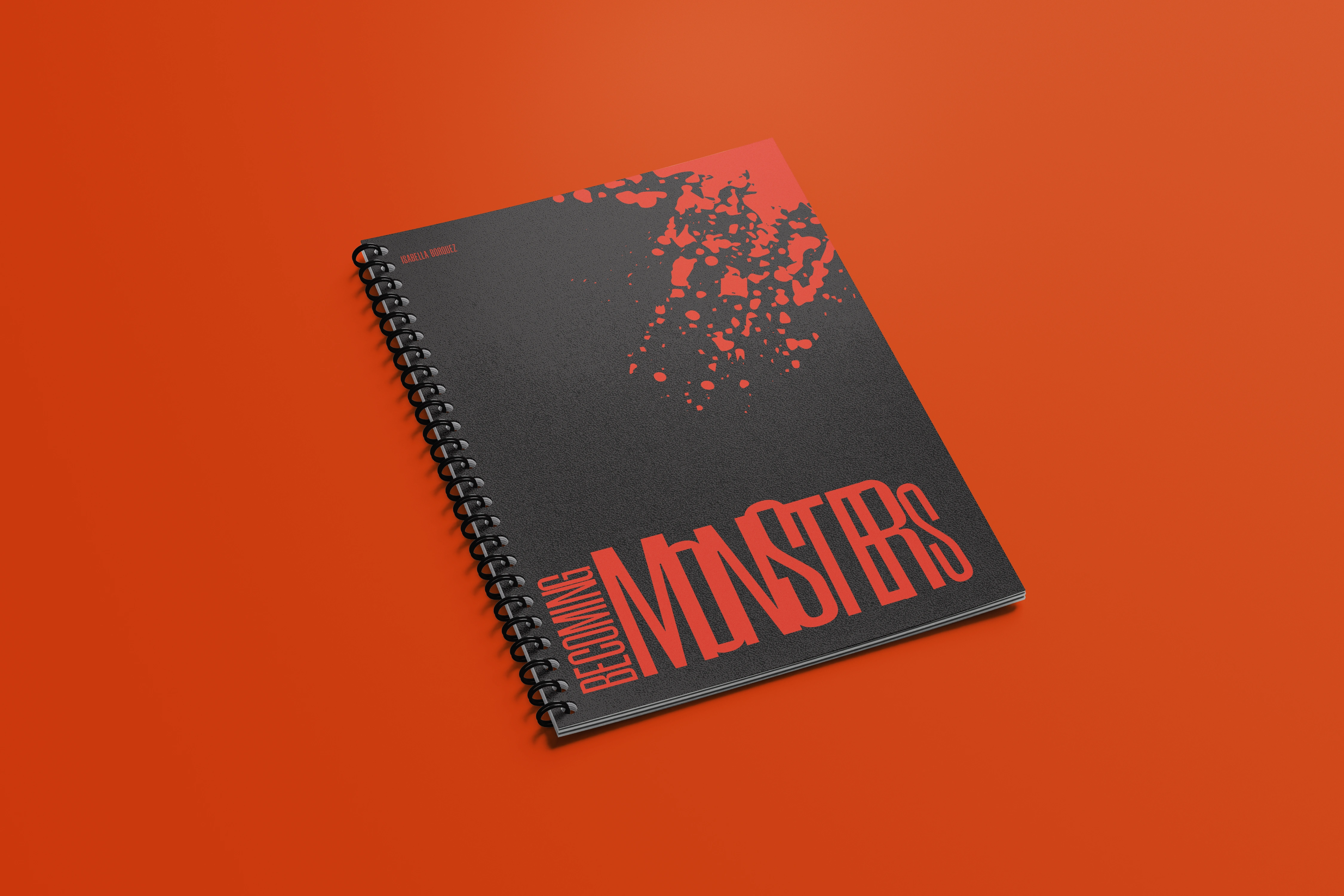
Cover
Becoming Monsters is a publication meant to introduce a newer generation to these legends as well as be a guide to creating these stories and characters.
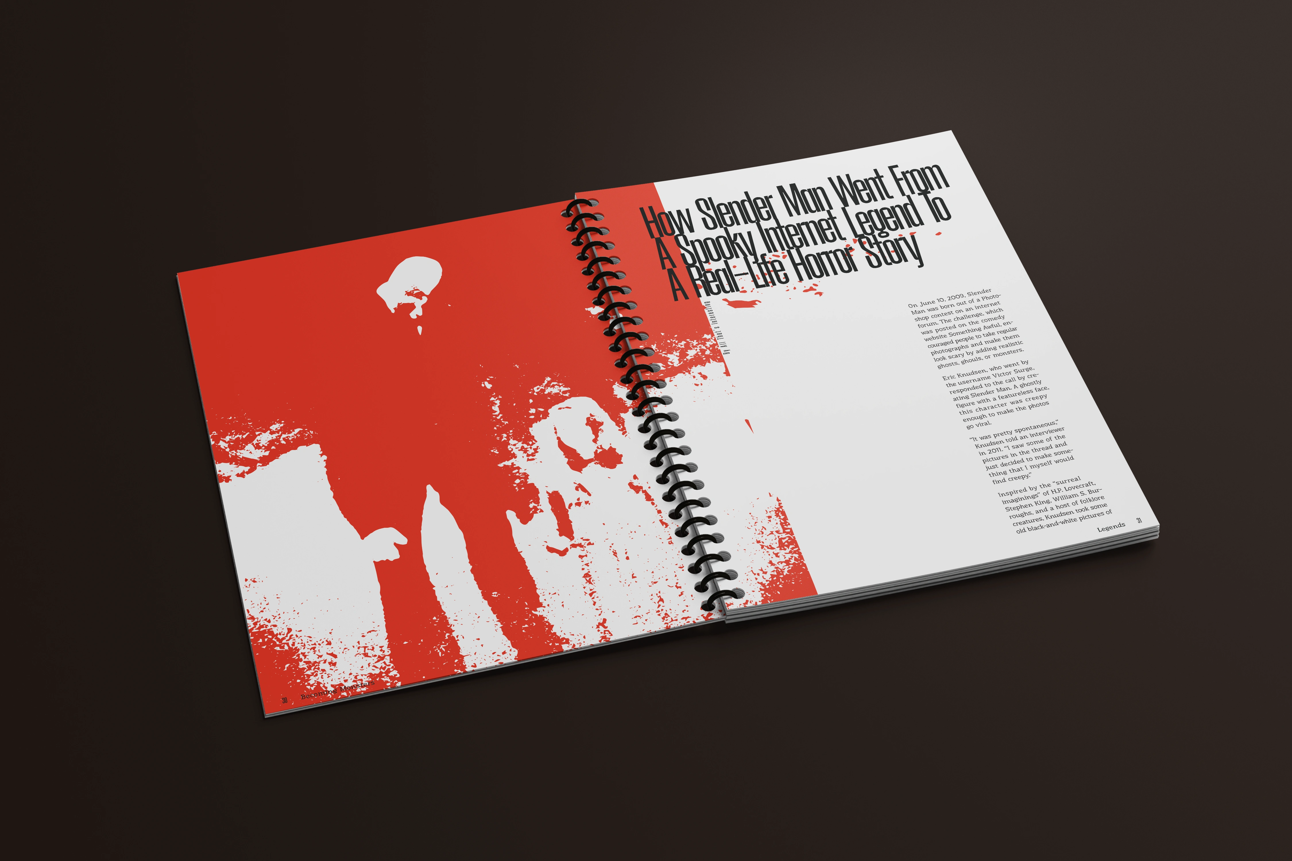
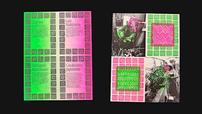
Interior Pages 30-31
Process
Approaching the design for this project was, at first, incredibly difficult as it challenged me to communicate a sense of horror to the reader without explicitly showing it. It was because of this that I was extremely aware of all the choices I made for the entire publication: fonts, colors, kerning, leading, etc. I wanted to lean away from relying too much on visuals or stereotypically ‘scary’ typefaces which allowed me to push myself.
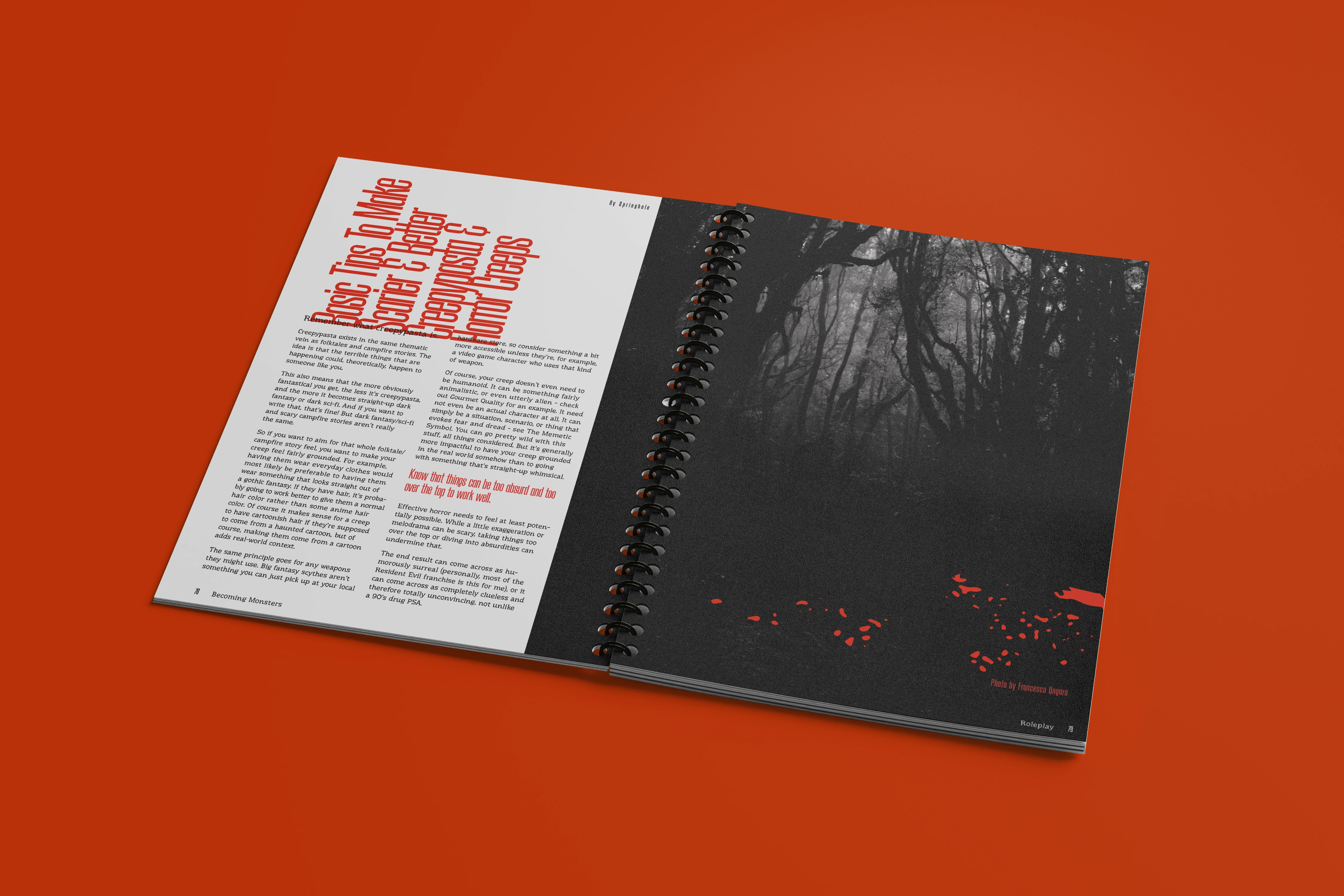
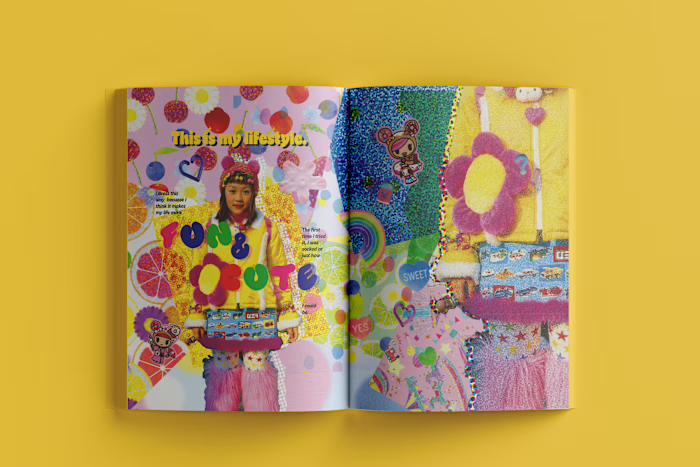
Interior Pages 78-79
Like this project
Posted Feb 28, 2023
This 160+ page publication was created with the intention of exploring unique and underground communities, in this case: Roleplay and Creepypasta.
Likes
0
Views
110

