Crypto Recruit Website Redesign Project

Toniloba Jolayemi


Crypto Recruit Website Redesign Project
Project Overview
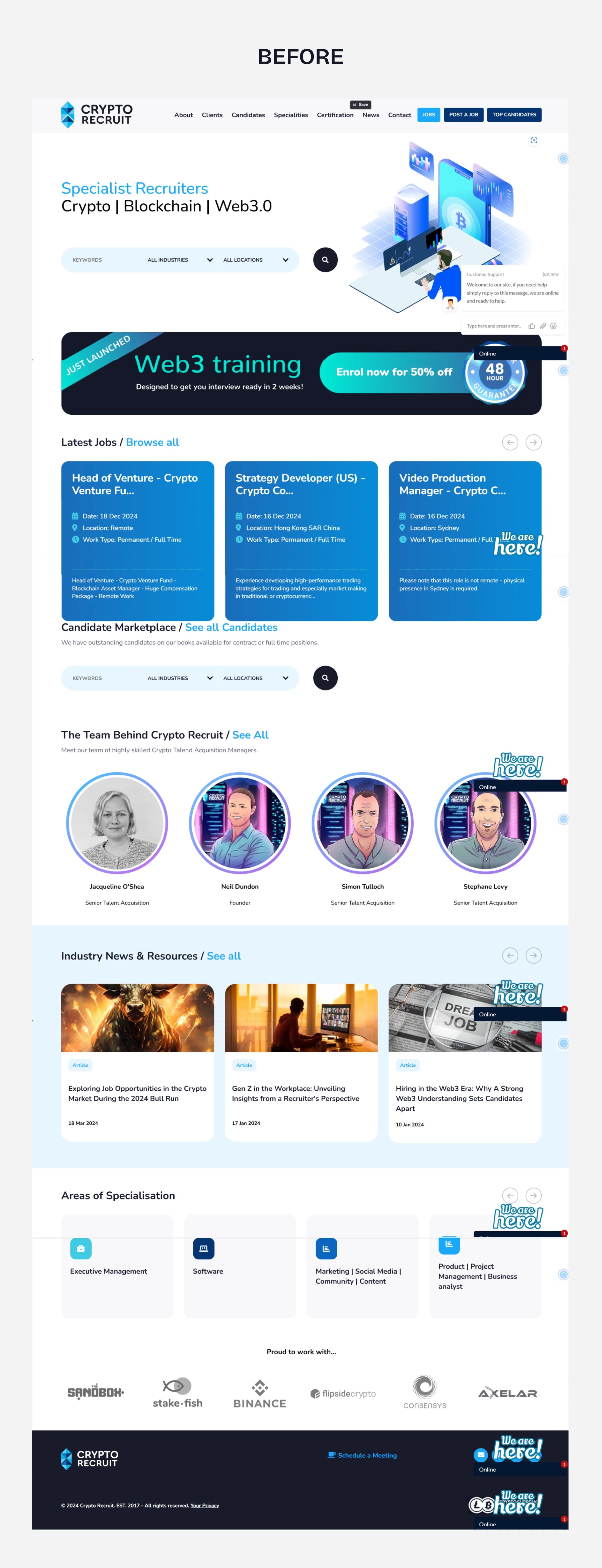
Crypto Recruit’s old landing page was confusing, cluttered, and didn’t clearly speak to its two key audiences - recruiters and job hunters. CTAs overlapped, the visual hierarchy was off, and the layout lacked excitement. The goal was to refresh the site to improve clarity, engagement, and UX for both job seekers and recruiters.
Here is the previous design
My Approach
I teamed up with @sashdsgns to bring a playful yet professional feel to the redesign, avoiding the dark, overused Web3 aesthetic. We kept things light, clean, and interactive.
Key Improvements
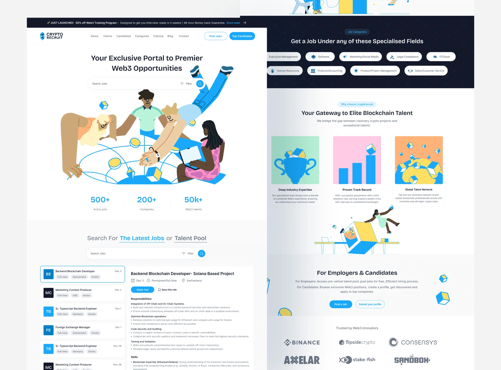
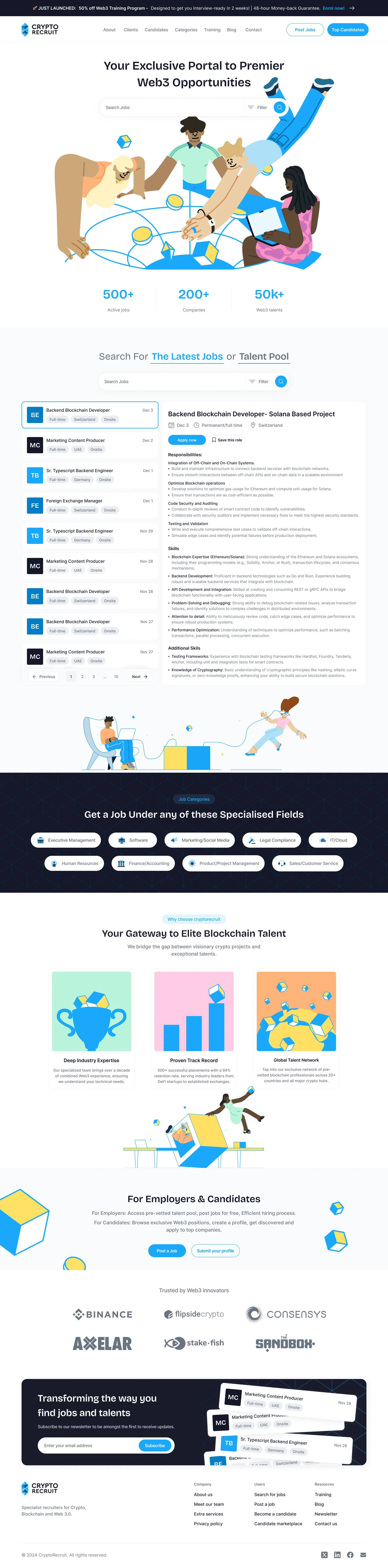
Hero Section
Introduction of clear CTAs for Recruiters (Top Candidates, Post a Job) and Job Seekers (Search bar): In order reduce decision fatigue and to help users quickly identify their next step. It speaks directly to both audiences without overlap.
The introduction of custom illustration + refined copy to reflect the Web3 ecosystem: To better reflect the Web3 space without defaulting to the typical dark theme. Visual storytelling makes the brand feel more approachable and engaging.
Addition of social proof (e.g., “500+ active jobs”) to build credibility, reduces hesitation, and creates FOMO, encouraging users to explore and act.
Job Listings
Inline job descriptions on the homepage: This keeps users on the landing page, reduces friction, and speeds up decision-making. No need to click around multiple pages to view details.
Renamed “Candidate Marketplace” to Talent Pool for clarity: This is a more intuitive and industry-aligned terminology. It also helps users understand the section without extra explanation.
Content & Footer
Renamed "Areas of Specialization" to "Job Categories" + Added Icons: The reason behind this is that “Job Categories” is clearer for first-time visitors, and icons boost scannability, especially on mobile.
Introduced a "Why Choose Crypto Recruit" section with illustrations: This adds persuasive content to boost trust and conversion, especially for first-time recruiters or job seekers.
Added a New CTA zone, newsletter opt-in: This is great for user retention, and it helps keep the brand at the top-of-mind of visitors and encourages return visits with job alerts or updates.
Enhanced Footer with Quick Links & Socials: This Improves navigation, SEO, and access to secondary pages like blog, privacy policy, or contact.
“You’ll never know what lies beneath until you step inside the portal... But we already know what lies beneath and that’s where the opportunities are.”
✅ Outcome
The redesigned landing page gave CryptoRecruit a more focused, user-centric experience that clearly serves both job seekers and recruiters. The updated layout, simplified navigation, and strategic content hierarchy improved usability and reduced confusion. Visual enhancements and added social proof increased credibility, while the modular layout and clean design system ensured a smooth developer handoff and scalability across future pages.
View full redesign here 👇
Pay4Me App Landing Page Redesign
Like this project
Posted Feb 19, 2025
I redesigned CryptoRecruit’s landing page to boost clarity, engagement, and trust for Web3 job seekers and recruiters with clean UI and focused UX.
Likes
2
Views
2


Birthyay- A birthday reminder mobile app case study
Landing page & Dashboard designs Collection

Streamlining the Loan Request Experience for Business Owners
Crafting AI Shopping Agents for Fashion & Personal Care Websites