Queendom Farms
Stephen Warren
Queendom Farms
Description:
Queendom Farms is an urban flower and fruit farm based in Georgia, aiming to establish itself in an industry traditionally dominated by men.
Founded by two women inspired and empowered by agriculture, they set out to create a strong and authentic brand identity of their own
Goals:
Establish a bold, authentic brand rooted in empowerment and agriculture.
Differentiate Queendom in a male-dominated farming industry.
Create a visual identity that reflects both strength and natural beauty.
Challenges:
Entering a competitive space with limited existing brand recognition.
Balancing femininity and authority in a traditionally rugged market.
Communicating values of sustainability, empowerment, and quality in a cohesive way.
Solutions:
Developed a confident and earthy visual identity that honors both founders’ spirit and the land.
Crafted brand language that celebrates women in agriculture without relying on stereotypes.
Built a brand system that’s flexible across packaging, signage, digital, and farmers market presence.
Moodboard
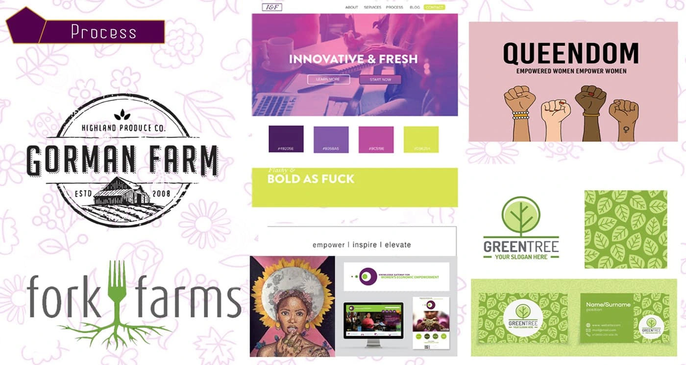
A visual collage capturing the brand’s essence—rooted in nature, empowerment, and modern femininity.
Sketches & Prototypes

Early logo sketches and digital prototypes exploring symbolism, balance, and brand voice.
The Logo
The official Queendom Farms logo—a bold, elegant mark reflecting strength and authenticity.
Formats
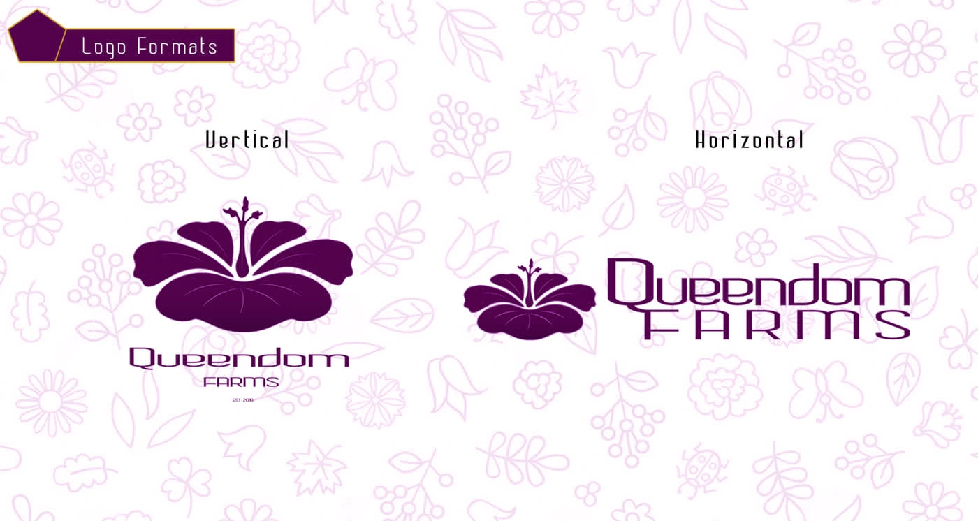
Multiple logo file types and layouts for flexible use across packaging, web, and print.
Typeface
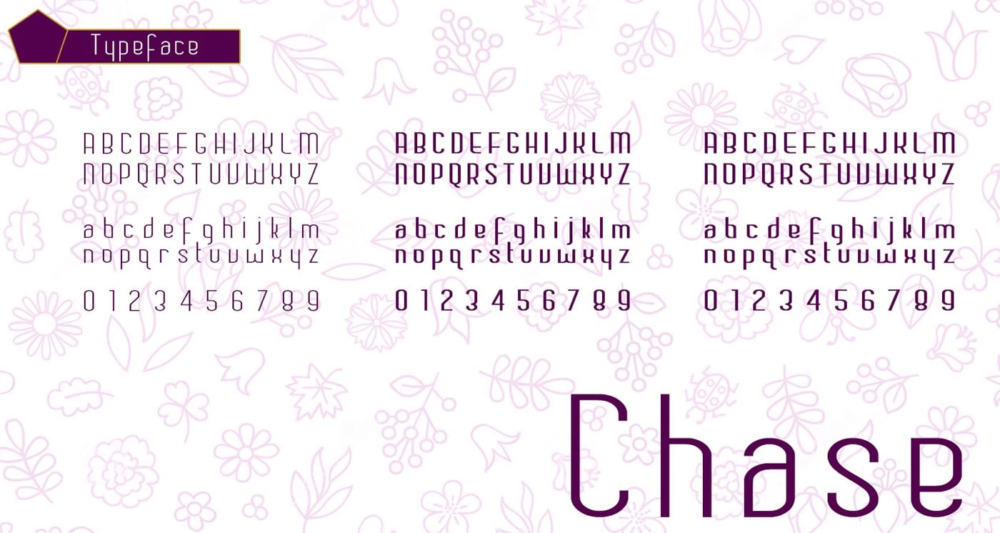
A custom font pairing chosen for legibility and style, reinforcing the brand’s grounded tone.
Colors

A warm, earthy color palette inspired by organic growth, soil, and harvest seasons.
Variations
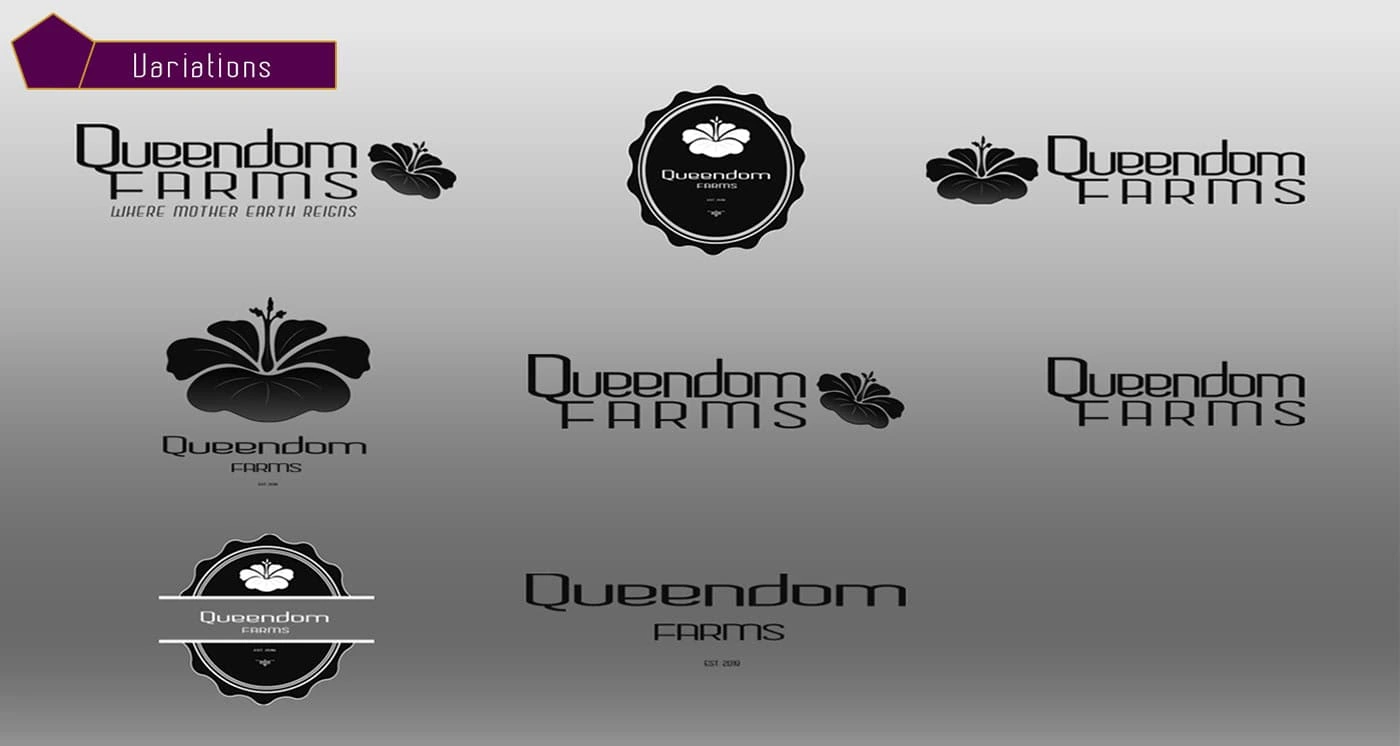
Alternate logo versions optimized for light, dark, small-scale, and vertical applications.
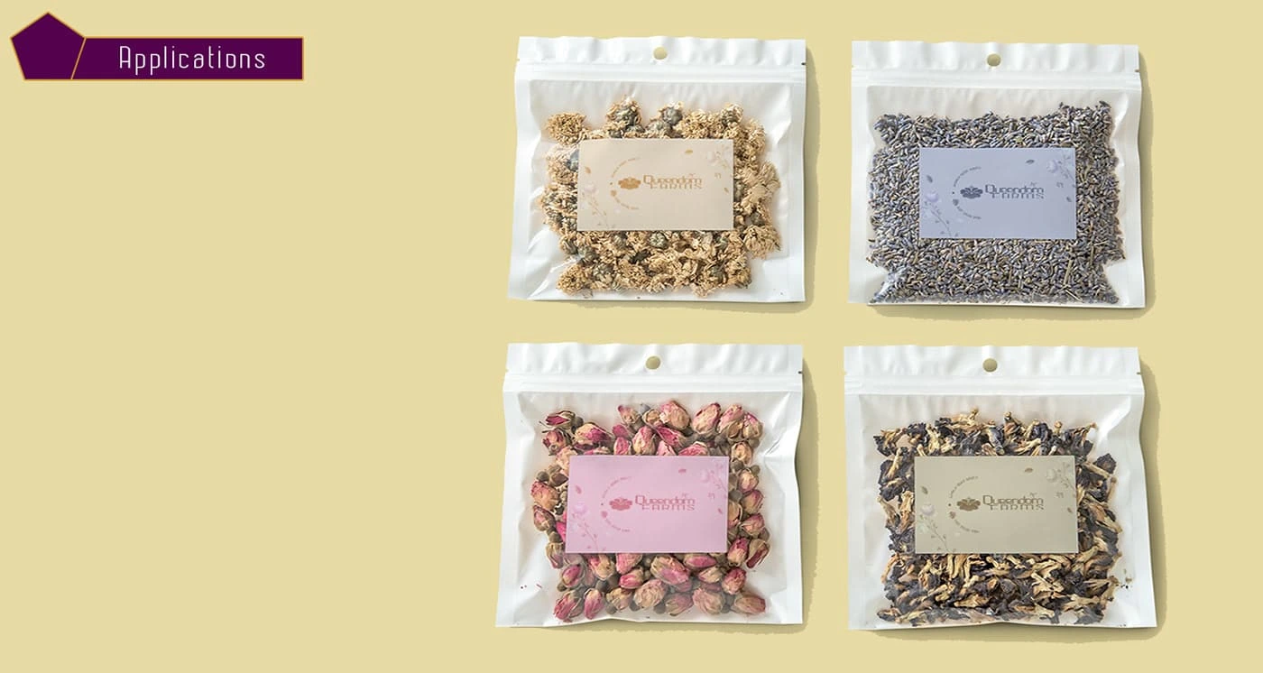
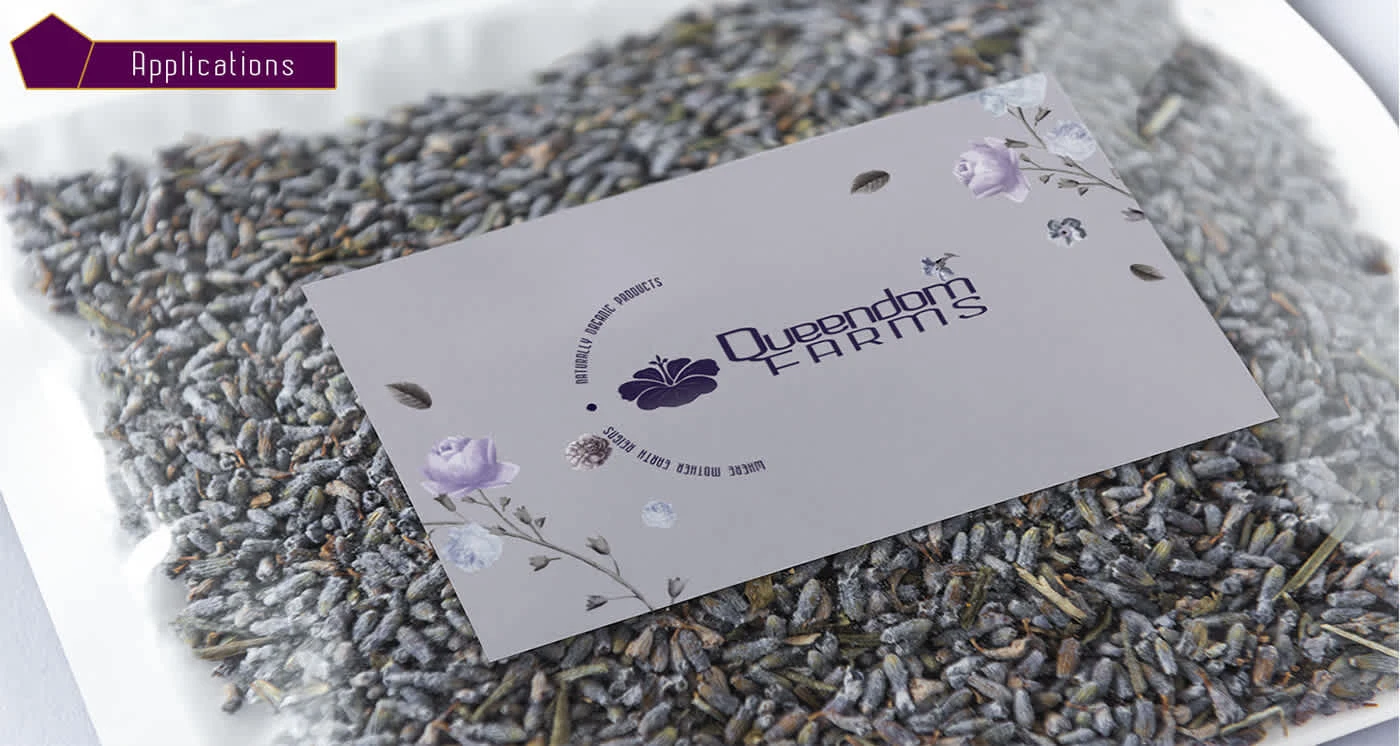
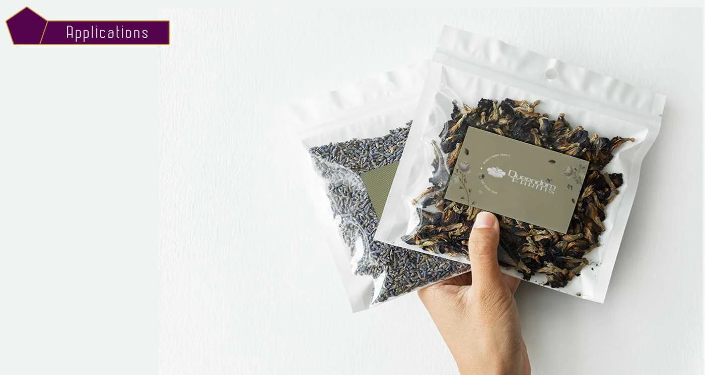
Applications
Like this project
Posted Jun 5, 2025
Queendom Farms is an urban flower and fruit farm based in Georgia, aiming to establish itself in an industry traditionally dominated by men.