Strategic Visual Identities Using Narrative-Driven Design
Bryan Munoz
Building Identity Systems from the Soul
Great brands have a story to be seen before it is heard. These logos weren't design to fulfill a marketing need, they were built to make people feel and declare.
Each identity in this collection was forged through intentional narrative, cultural context and strategic symbolism. From culturally rooted coaches and data scientists to whistleblowers and warrior gyms, the work you see here reflects more than client needs. It reflect who they are when no one's watching. Our world is noisy and design should do more than just look good...
It should speak for you.
Looking to build a brand that speaks before you do?
Let's get to work.
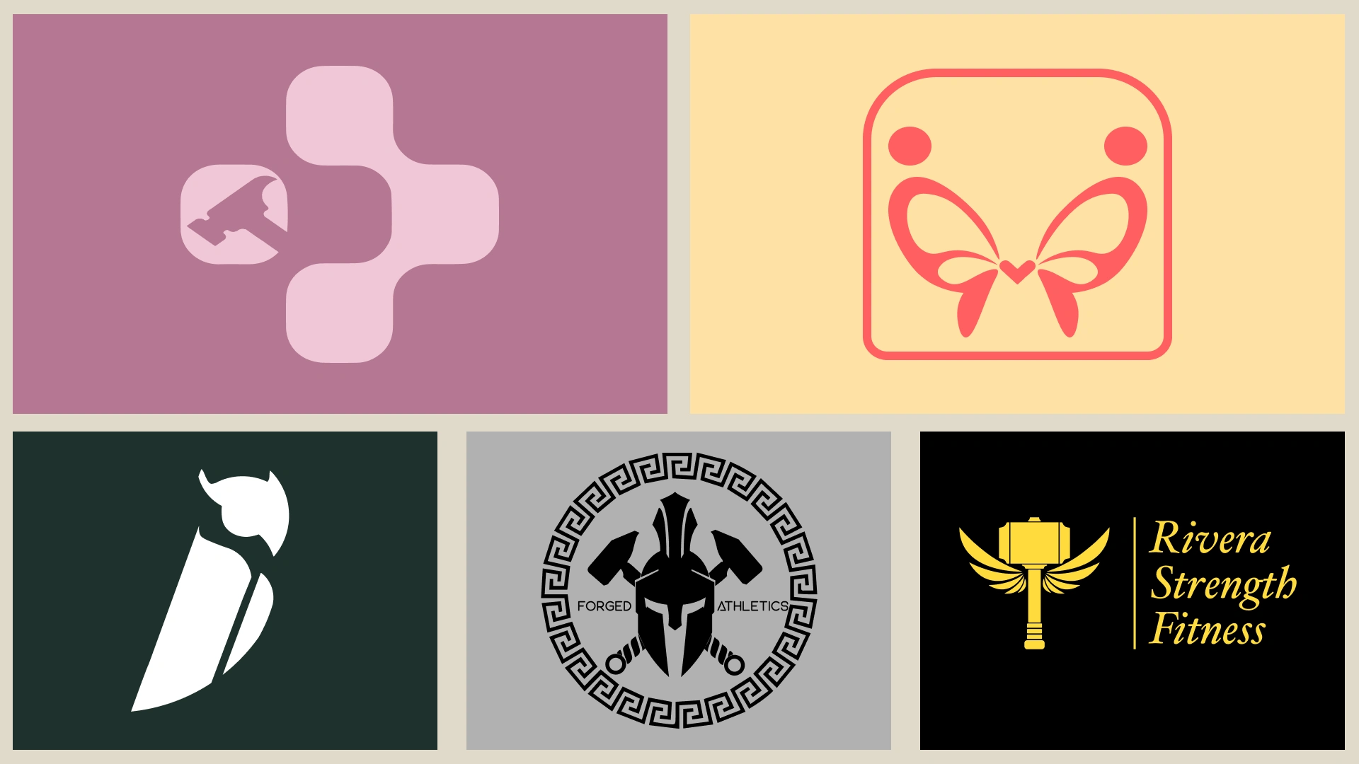
From Upper Left to Right (Individual Client, Executive Coach, Ivory Insider, Forged Athletics, Rivera Strength Fitness)
The Data Builder
This brand was designed for a polymath in a sea of specialists. Someone who doesn’t just run analyses but weaves insight across philosophy, economics, and technology. The design had to capture her ability to see across domains, to connect the abstract and the technical, and to build frameworks others can’t see yet. It’s data science, with soul and systems thinking.
Logo Concept + Visual Device:
A modular network of interconnected nodes subtly reveals a hammer at its core—an elegant nod to action, engineering, and construction. It balances structured logic with organic movement, evoking the essence of data as both discipline and discovery. The hammer is nested, not loud—because this client doesn’t scream their talent, they signal it.
Used For:
Portfolio site, content development, speaking decks, LinkedIn branding, personal IP launches.
Ivory Insider
This is a brand that doesn’t seek the spotlight but demands accountability. The client, a higher ed professional, built this identity to remain anonymous while surfacing truth. The owl is a nod to both surveillance and scholarship. The twin I’s are a cipher representing “Ivory Insider” while doubling as a subtle critique of institutional opacity.
Logo Concept + Visual Device:
The owl, traditionally a symbol of wisdom, is constructed entirely from two mirrored “I” characters—forming both the body and wings. The owl’s head doubles as a dot, completing the implied typographic symbol. A deep green palette reinforces themes of trust, clarity, and moral authority.
Used For:
Anonymous blog, whistleblower tip line, investigative collaborations, long form reports.
Forged Athletics
Forged Athletics isn’t a gym. It’s a crucible. This client wanted to communicate that physical transformation wasn’t separate from mental fortitude and that community wasn’t built from convenience but from pressure and shared pain. The brand blends classical strength with industrial symbolism. The helmet represents tradition. The hammers? Reinvention. This is strength forged.
Logo Concept + Visual Device:
A black Spartan helmet sits at the center, flanked not by weapon but by forging hammers, crossed in stoic symmetry. Surrounded by a traditional Greek meander border, the entire form is both historical and personal. Red, black, and grey tones create visual gravity and grit.
Used For:
Gym branding, apparel, signage, digital workout platforms, and community events.
Rivera Strength Fitness
Rivera Strength Fitness is about rebirth. The founder envisioned a space where discipline wasn’t punishment, but freedom. The brand needed to capture that tension: between struggle and flight, between groundedness and transcendence. The result is a logo that feels like a crest and a compass. It tells every client: your power isn’t just within, you’ve already been building it.
Logo Concept + Visual Device:
A gold hammer, balanced with upward-facing wings, stands beside an elegant serif lockup. The wings give it vertical lift, while the hammer anchors the form—symbolizing grounded power and personal flight. The color palette of black and gold speaks to prestige, excellence, and earned transformation.
Used For:
Fitness programs, client kits, social media, branded challenges, and long-term coaching brand equity.
CASE STUDY: Executive Coach (Culturally Rooted Leadership Brand)
This brand project involved creating a comprehensive and culturally rooted brand identity for a visionary leadership expert specializing in fostering authentic leadership and driving transformative change. The client’s leadership philosophy is about mutual growth, cultural truth, and shared elevation. The goal was to develop a brand that seamlessly integrates cultural heritage with global leadership principles, resonating with both local and international audiences.
Process -
Shaping (Prototyping and Drawing):
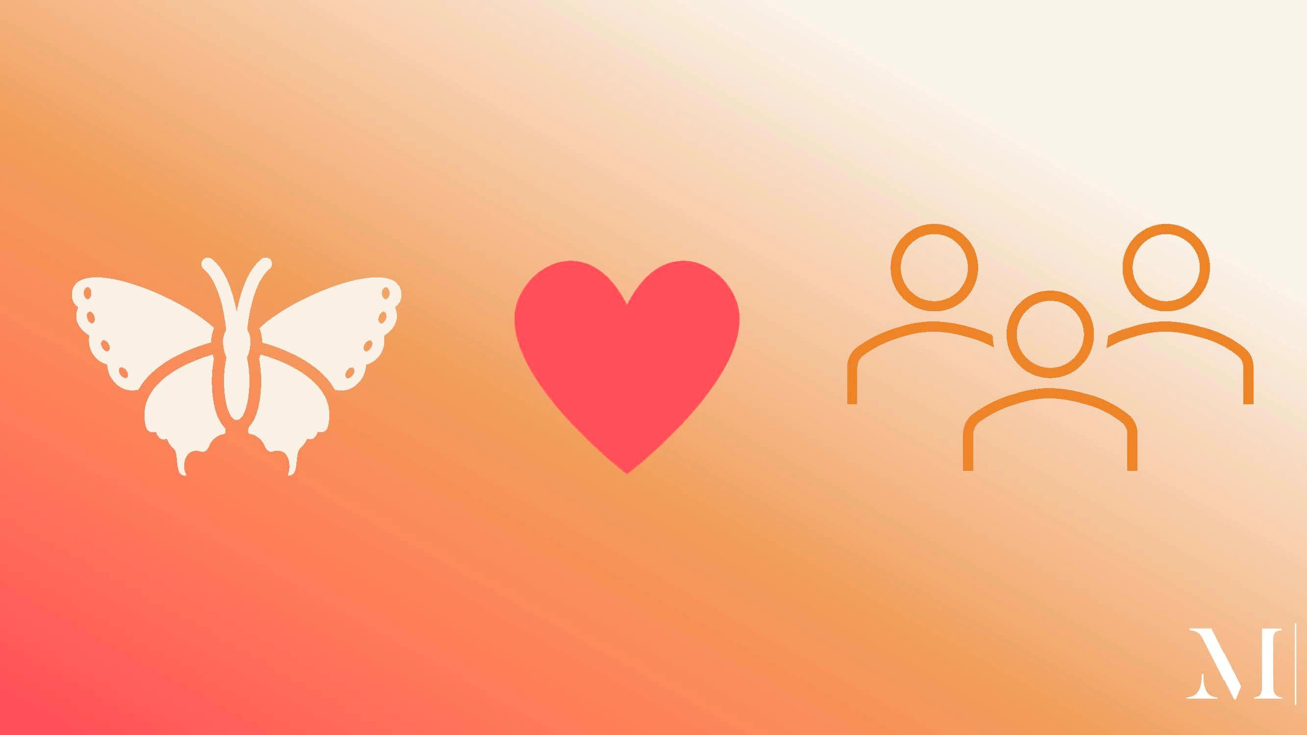
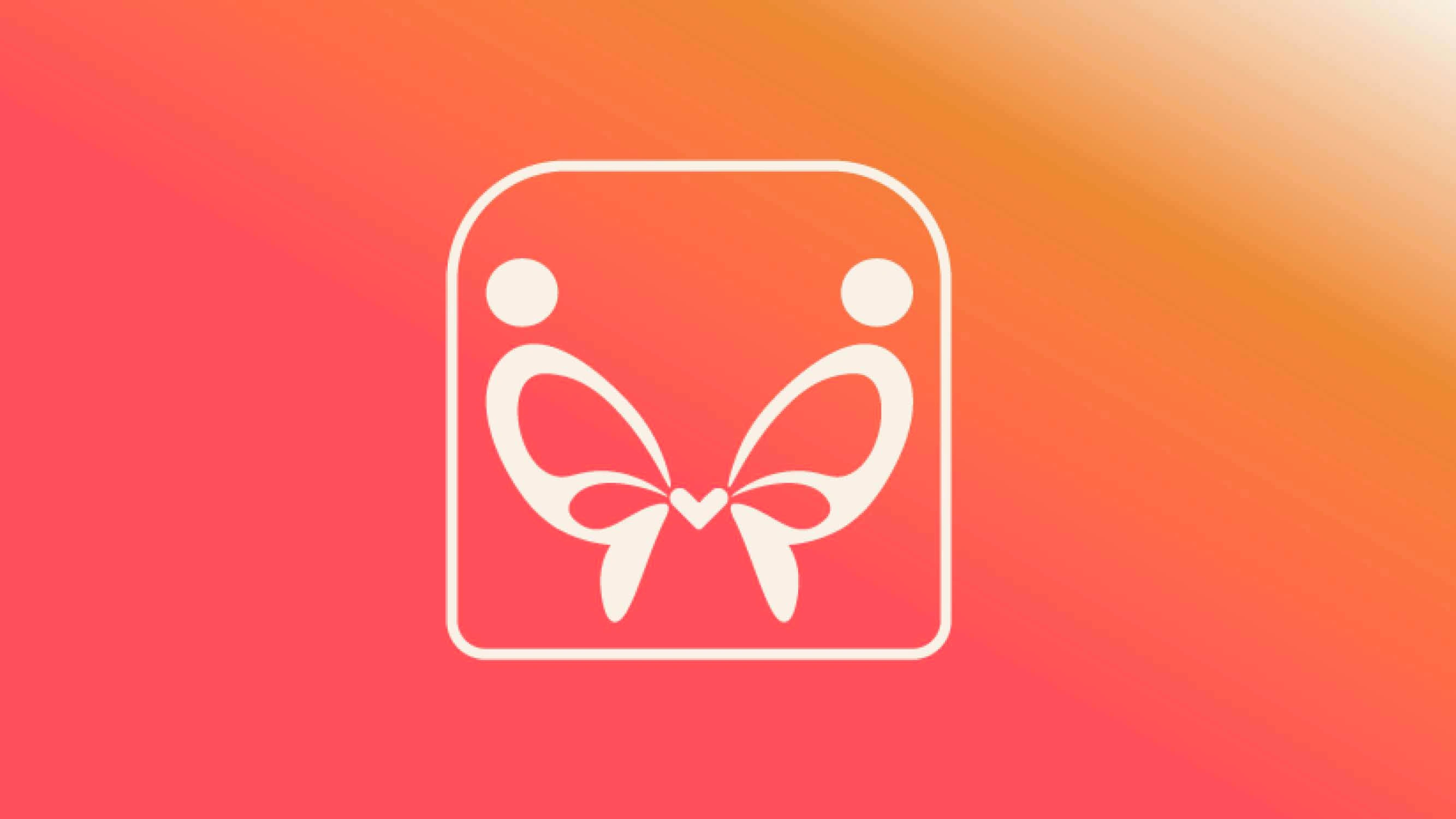
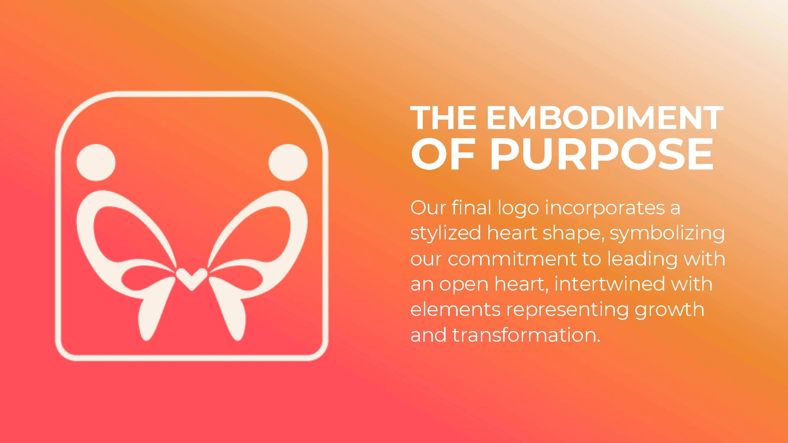
The creative process began with interpreting themes of connection, openness, and transformation. Through multiple iterations, we arrived at a symmetrical figure, two human forms curved like wings, suggesting motion and mirroring. At the center, we placed a heart, not as ornamentation, but as a compass, representing emotional intelligence and cultural integrity.
Purpose (Cultural Rooting):
Visual language was drawn from Latin American design sensibilities: organic forms, warm tones, and familial intimacy. Nothing cliché. Everything intentional. The design is universally readable, but ancestrally grounded. It doesn’t sell ethnicity, it embodies identity with grace and substance.
Logo Concept + Visual Device:
Two mirrored human forms create butterfly wings, joined at the center by a heart. The square border is a nod to precolonial hieroglyphs common in South America, while soft coral and beige tones deliver warmth and inclusion. The result is a brand that is transformational, accessible, and rooted in care.
Executive Coaching Service Offerings:
Executive and group coaching
Organizational consulting
Workshops and keynotes
Leadership retreats
Personas:
Individual Latinx Clients and Corporations seeking multicultural leaders, mission-driven organizations, and executive teams seeking to evolve through authenticity, not assimilation.
Outcome:
The identity is now central to the coach’s growing brand, from their speaking tour collateral to their coaching frameworks. It’s a visual signature that expresses everything the client stands for: cultural intelligence, transformational growth, and empathetic leadership.
Tools & Skills Utilized:
Brand Strategy
Visual Design
Cultural Research
Strategic Messaging
Typography & Color Systems
Core Values
Shape the identity and explore
Drive through different ideas and processes
Finalize
Present
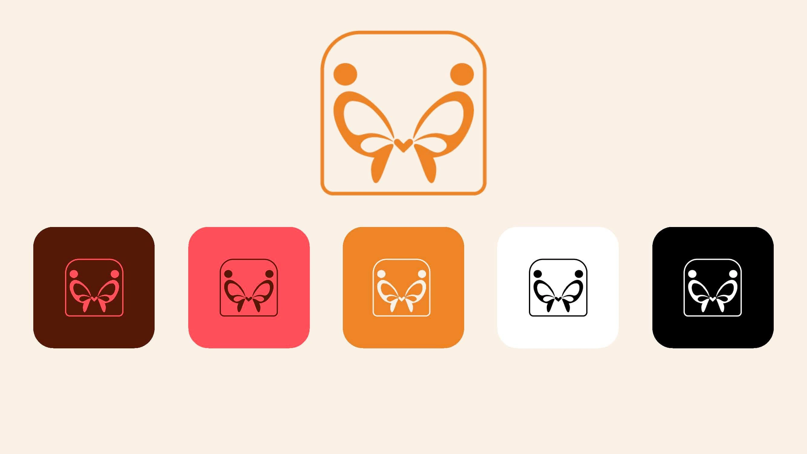
Color Palette
Like this project
Posted Jan 18, 2025
Developed brand identities for data science, exec coaching, higher ed, and fitness by translating narratives and core values into iconic logos.