Redesigning the product page to increase user confidence
Mobile App
Role | Project lead, working alongside my team's content designer, product manager and FE & BE engineers
Skills
Tools:
Figma
Wireframing
Prototyping
Chattermill (CX platform)
User research / Usertesting.com
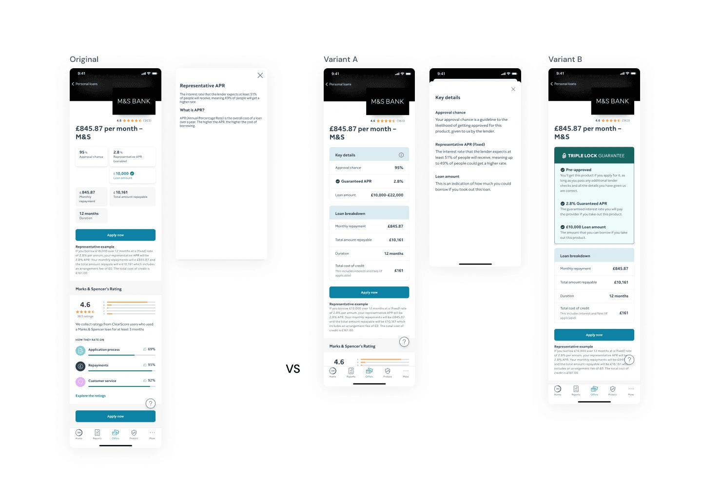
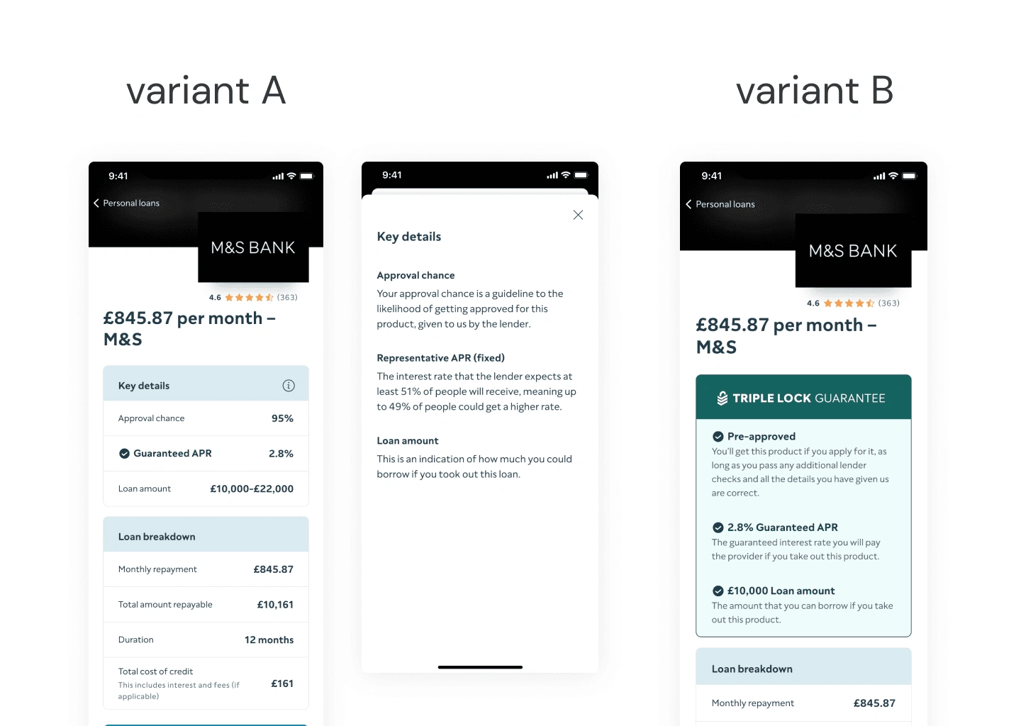
Original and the test variants
The Problem
We know through customer feedback and previous research that users’ confidence in applying through ClearScore and understanding of key terms (‘pre-approved’ and ‘representative APR’) is low.
Why is this important?
This could lead users to rejections and damaging hard searches which then damages their confidence and trust in ClearScore.
This could also prompt users to go to other platforms to search for credit.
Considerations & constraints
The current PDP is heavy with legacy code
Our team was tasked with delivering short experiments to gather insights & get quick wins
Usage of existing design system components
Other verticals & global markets
Success metrics
📈 Increase in user confidence
How: User testing following conclusion of the experiment
❌ No harm to business metrics
How: Monitoring key metrics - revenue, apply clicks
User Testing
I used usertesting.com to gather feedback from users and determine whether the test variants would be successful against the original.
Key findings
No negative reaction to the new test variants
Preference for the test variants
Participant quotes
“Nice... easy amount of broken down stuff here.”
“I think this looks more professional than the other layout”
Key learnings
Enhanced user experience and trust justify implementing improvements
UI is integral to the UX of this customer journey
Like this project
Posted Jul 26, 2024
Increasing customer confidence through improving the visibility of crucial information in applying for loans.
Likes
0
Views
2

