BLoved Publishing · Squarespace E-Commerce Site Redesign

Madison Green
Web Designer
UX Designer
UI Designer
CSS
Squarespace
Overview
The client, an influencer and emerging international distributor of Asian literature, sought a comprehensive overhaul of their existing website to enhance usability, improve customer engagement, and ensure compliance with legal standards. This redesign focused on restructuring the sitemap, refining the user interface, and integrating essential e-commerce functions while maintaining the brand's visual identity.
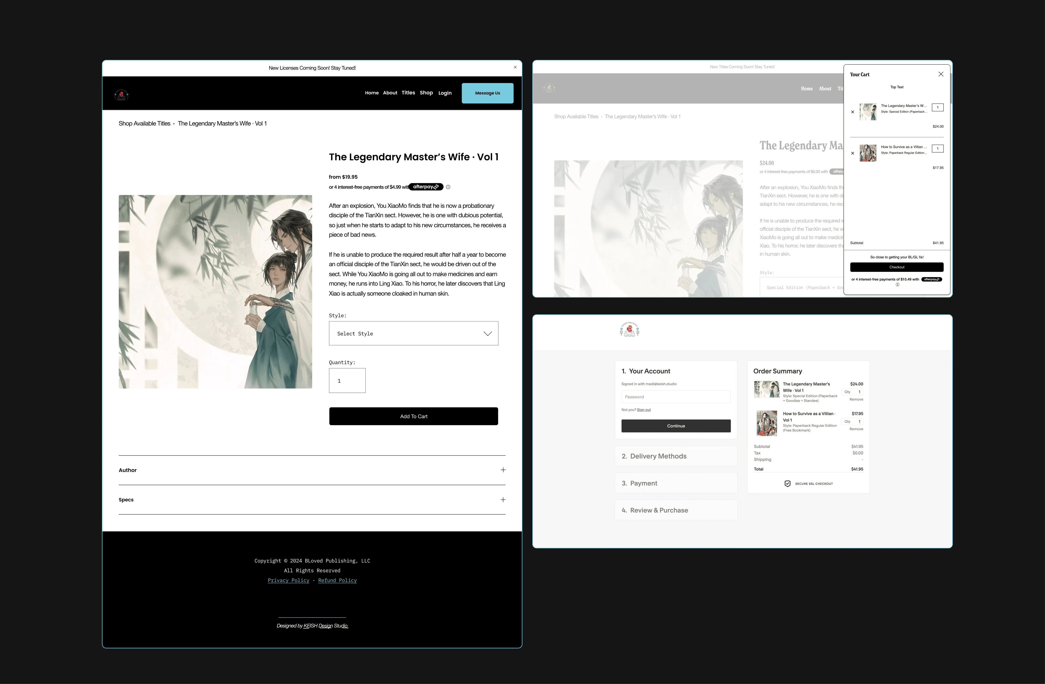
E-comm + Product details + Custom Cart
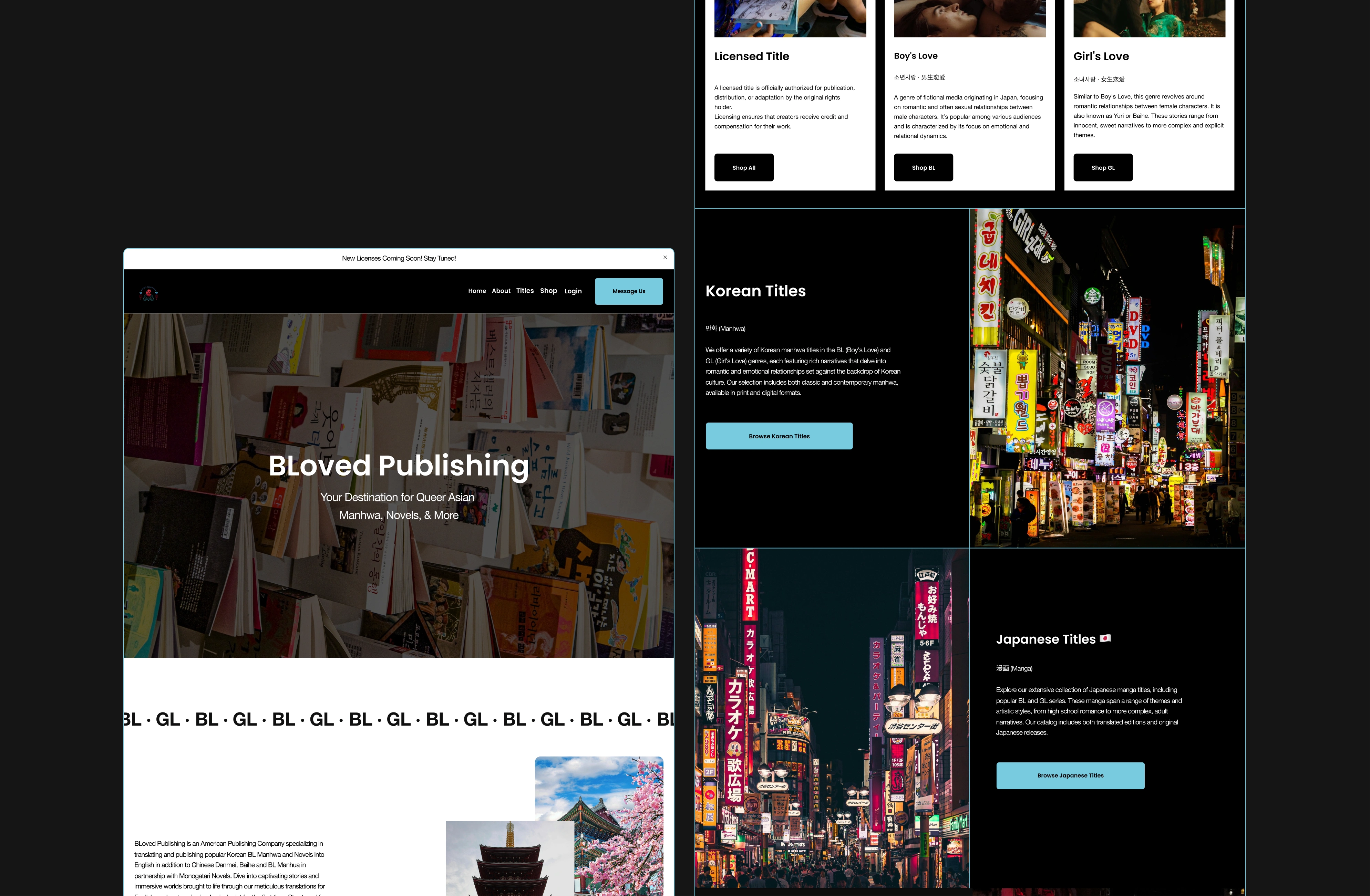
About Page with CTAs
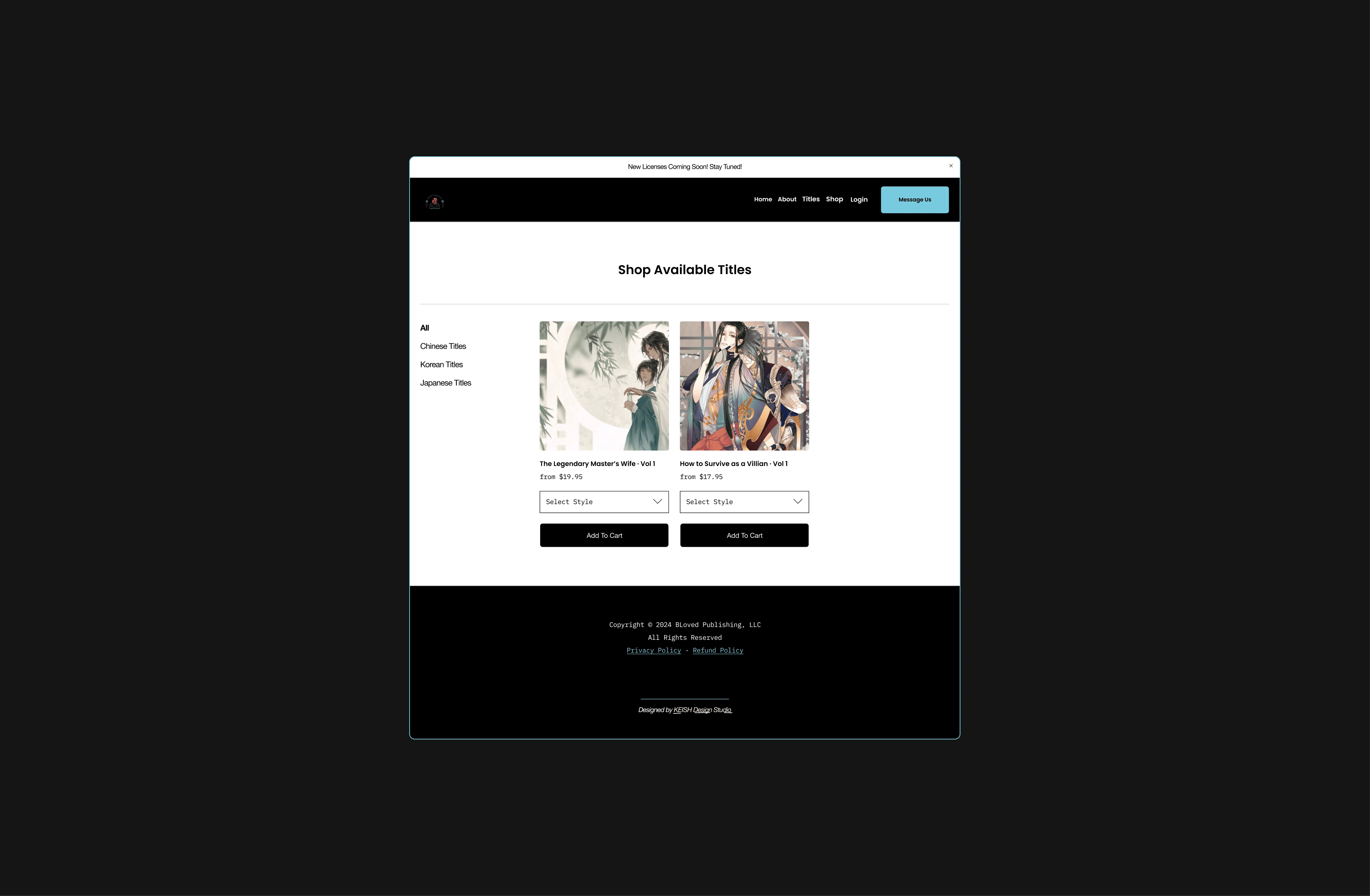
Product Listings (Shop) Page
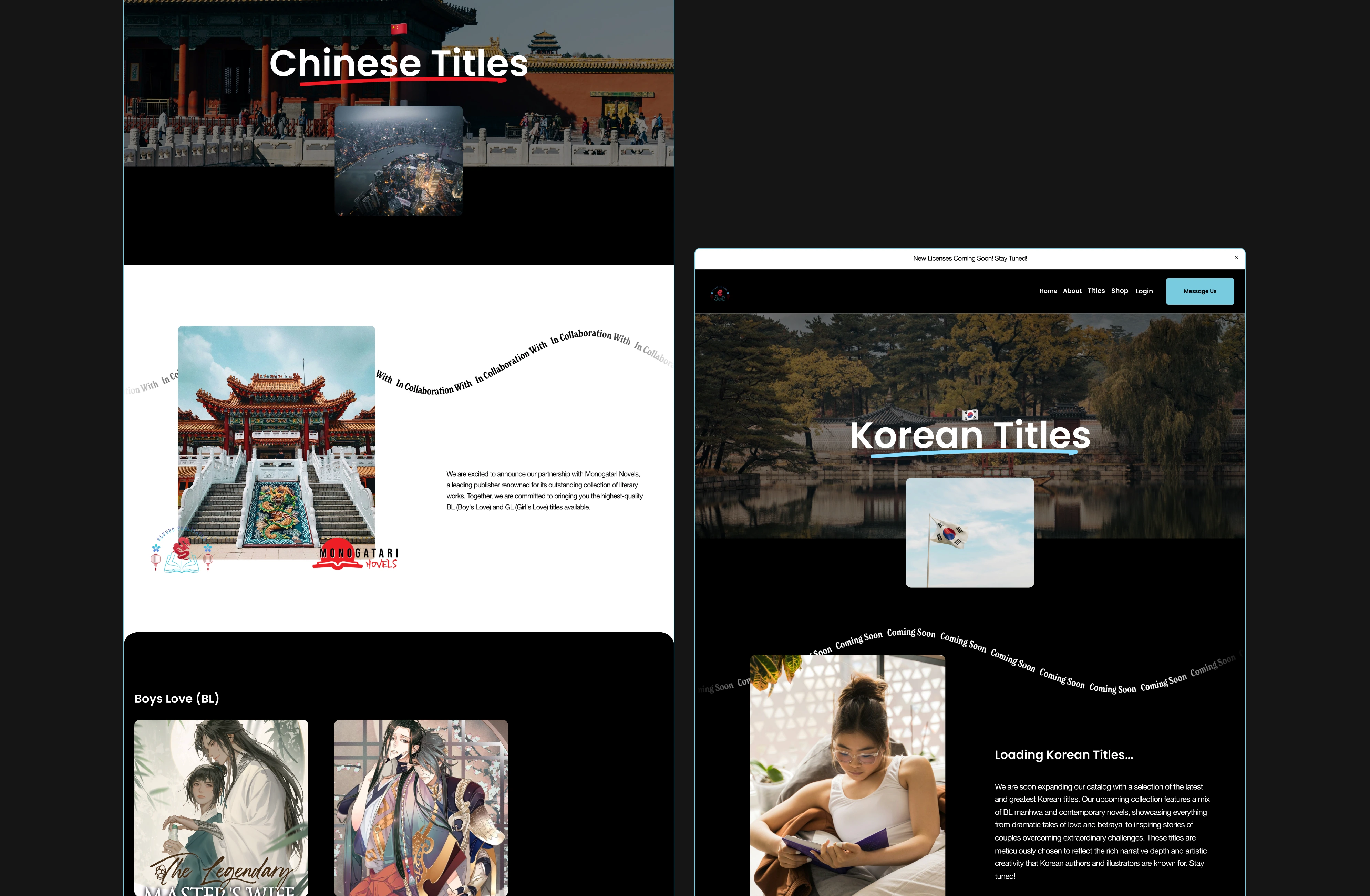
Available Titles by Country
Objectives
The primary objectives were to enhance the website's usability by reconfiguring the sitemap and refining the user interface. The project aimed to integrate essential e-commerce functions and maintain the brand's visual identity to reflect the owner's aesthetic preferences and color scheme. The project began with a detailed analysis of the existing website to identify key areas that needed improvement.
Challenges
Maintaining Brand Consistency: Integrating the owner’s specific aesthetic preferences without compromising on modern design principles and functionality.
SEO Optimization: Enhancing visibility in a highly competitive market without previous optimization benchmarks.
Legal Compliance: Ensuring all aspects of e-commerce are compliant with international and local laws, especially with varied regulations across different countries.
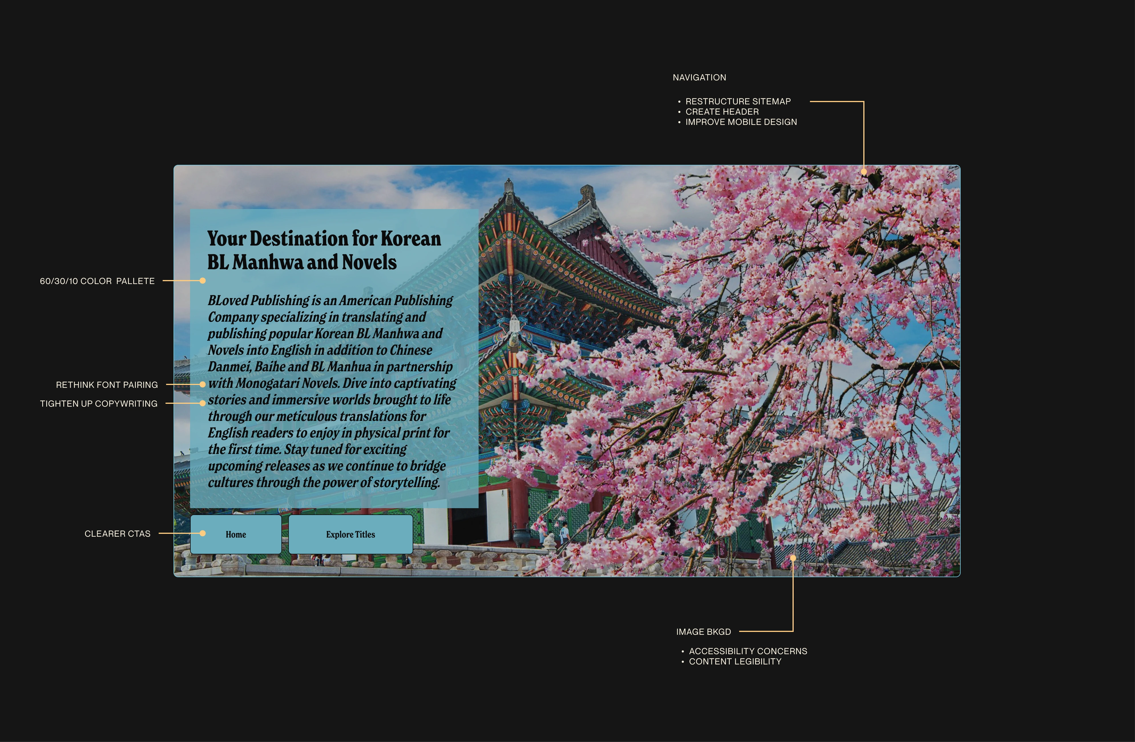
The client's original site
Before the redesign, the client's website faced several significant issues that hindered user experience and overall functionality. The initial site suffered from a lack of visual flow and coherence, which created a confusing navigation path for users. Here are the specific challenges addressed:
Clunky Call-to-Actions (CTAs): The original call-to-action buttons were not only inconsistently designed but also poorly placed, leading to low engagement rates. These CTAs lacked prominence and clarity, which often left users unsure of how to proceed with purchases or further interactions.
Muddled Site Structure: The website's original structure grouped different countries’ literature together in a manner that was not intuitive, making it difficult for users to find specific titles or genres. This was particularly problematic for a site aiming to cater to enthusiasts of Asian literature, where regional distinctions are significant and sought after by readers.
Inadequate Shop Setup: The e-commerce functionality was barely functional. The shop was not set up to handle transactions smoothly, lacked essential product descriptions, and did not provide adequate filtering options to help users explore the book catalog effectively.
Poor Accessibility: The initial design choices regarding color and font significantly impacted the site’s accessibility. The color contrasts were insufficient for easy reading, and the font sizes and styles used were not conducive to a wide range of users, including those with visual impairments.
Solutions
To address the site's issues, a comprehensive redesign was implemented. The new design focused on creating a clear visual flow through consistent and effective use of branding elements. Navigation was simplified by reorganizing content according to regions and genres, making it much easier for users to find and explore books of specific interest.
Overall, I sought to create a more logical structure that improved site navigation and user experience. I introduced well-defined CTAs that were strategically placed to guide users toward their desired actions, such as making a purchase or signing up for a newsletter.
Each page was carefully designed to maintain the brand’s existing aesthetic, incorporating the owner’s preferred color scheme throughout the design to ensure consistency and visual appeal while highlighting the media offerings available for purchase.
Custom CSS Enhancements
To address certain limitations inherent in Squarespace’s design functionality and to further align the website with the company’s brand identity, custom CSS code was implemented. These enhancements were critical in achieving a seamless user experience and maintaining design consistency across the platform. Specific customizations included:
Standardization of Design Elements: Custom CSS was added to ensure that all design elements such as buttons, input fields, and content containers had consistent border-radius and padding. This standardization brought a cohesive and professional look to the site, which improved the aesthetic appeal and made the user interface more intuitive.
Custom Checkout Cart: Recognizing the need to keep the website’s header uncluttered, a custom checkout cart was developed. This cart was designed to be minimalistic and only appears when items are added to the cart, thus maintaining a clean and organized header that enhances navigability and user focus.
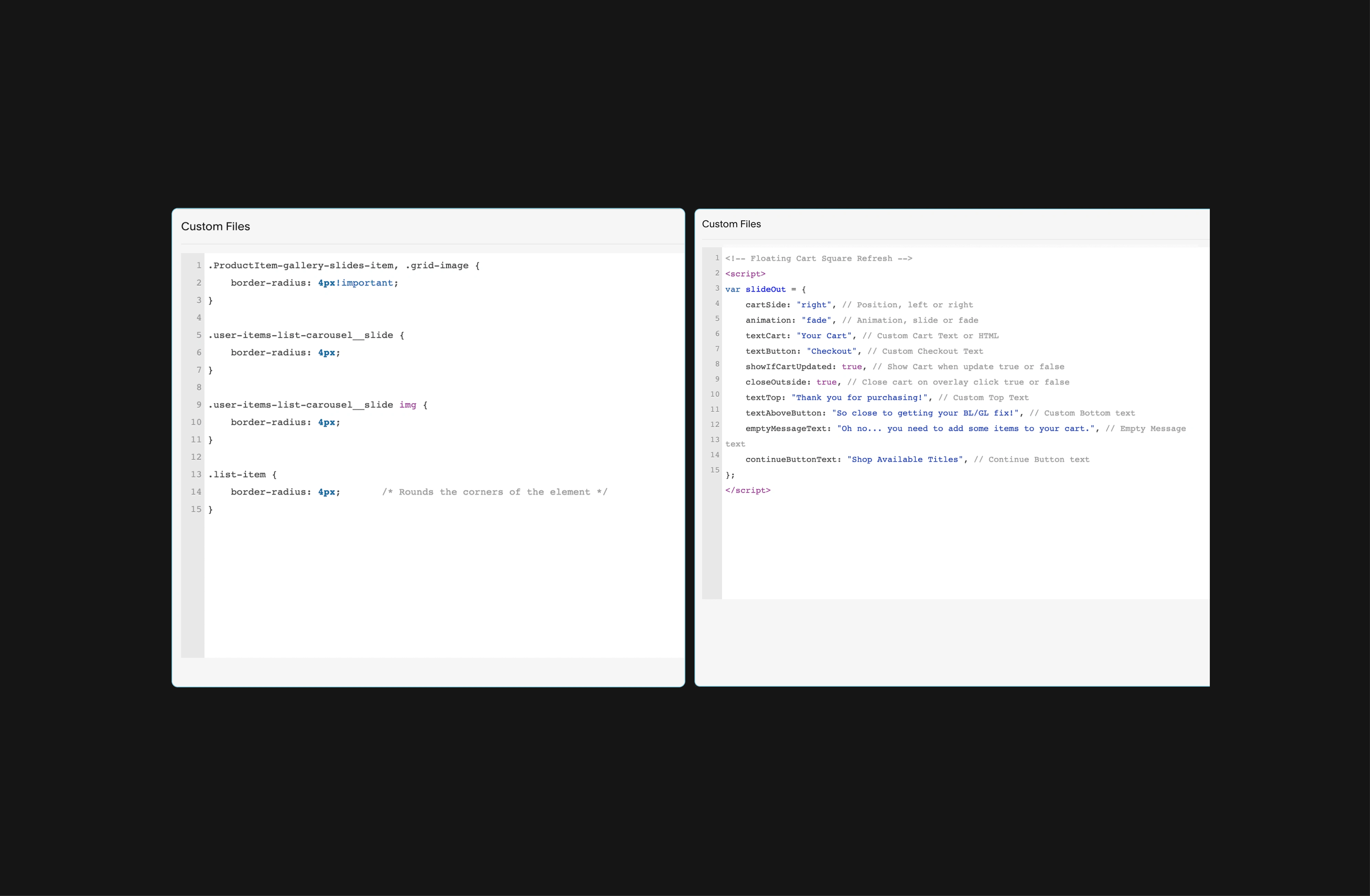
A snippet of custom CSS content
Results
Over 100k site visits in 2024 from users in over 20 countries 👀
Over $15,000 in pre-sale revenue on a single product
Top Google ranking & increased engagement on Instagram and Tiktok
From the Client


