GLOW Festival Branding
The Glow Eindhoven is a light festival held every November. This brief was to create a new branding system, redesigning the festival's current logo and visual branding.
Visual Identity
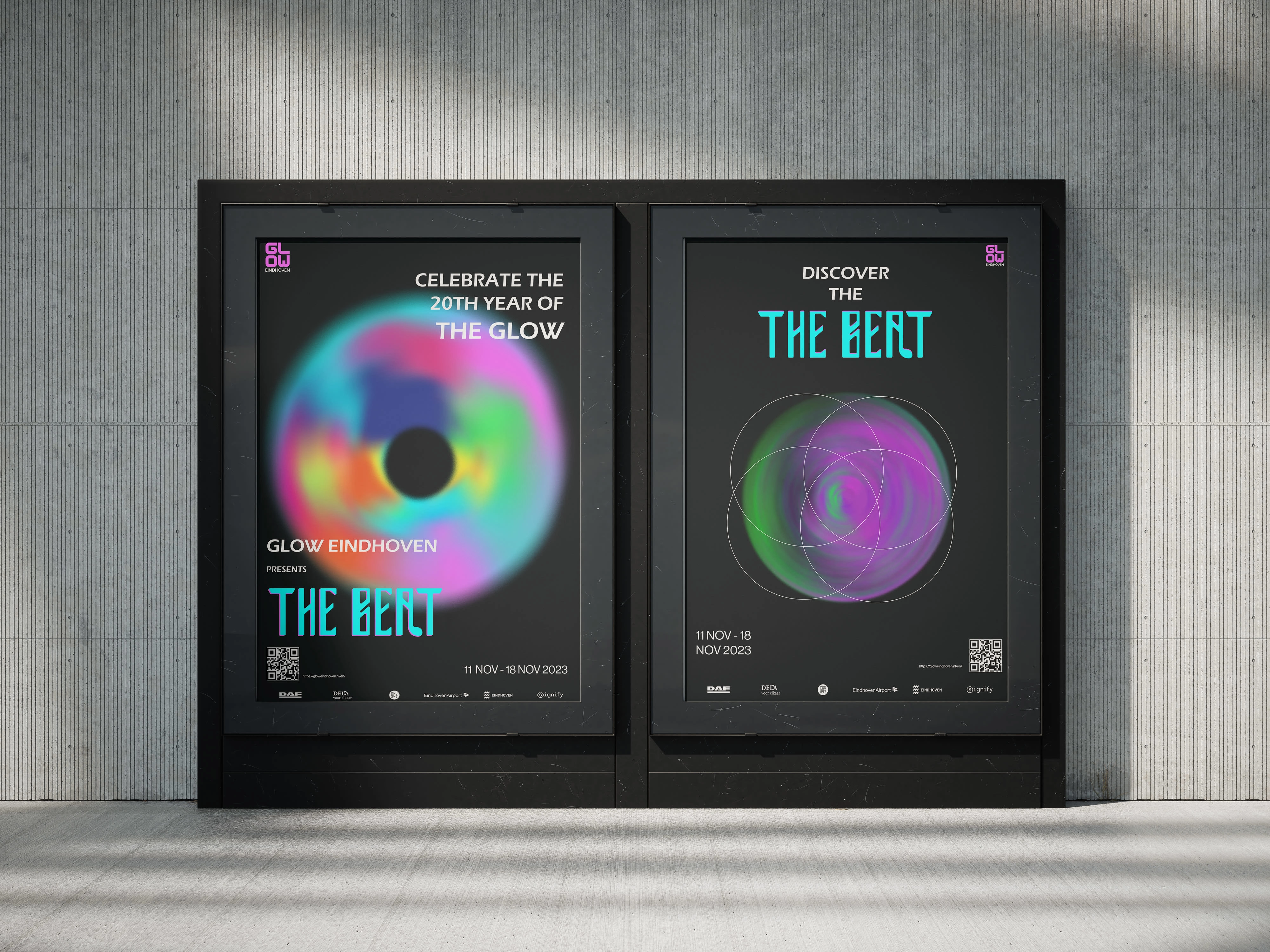
Their original logo projects a very straightforward idea of the festival branding. Through this rebranding concept, the effect of the ‘glow in the dark’ would be represented in their logo and branding. This would be appealing to people of all ages, including young children, as it would add a sense of fun and excitement to the festival’s branding seen online or physically.
Brandboard
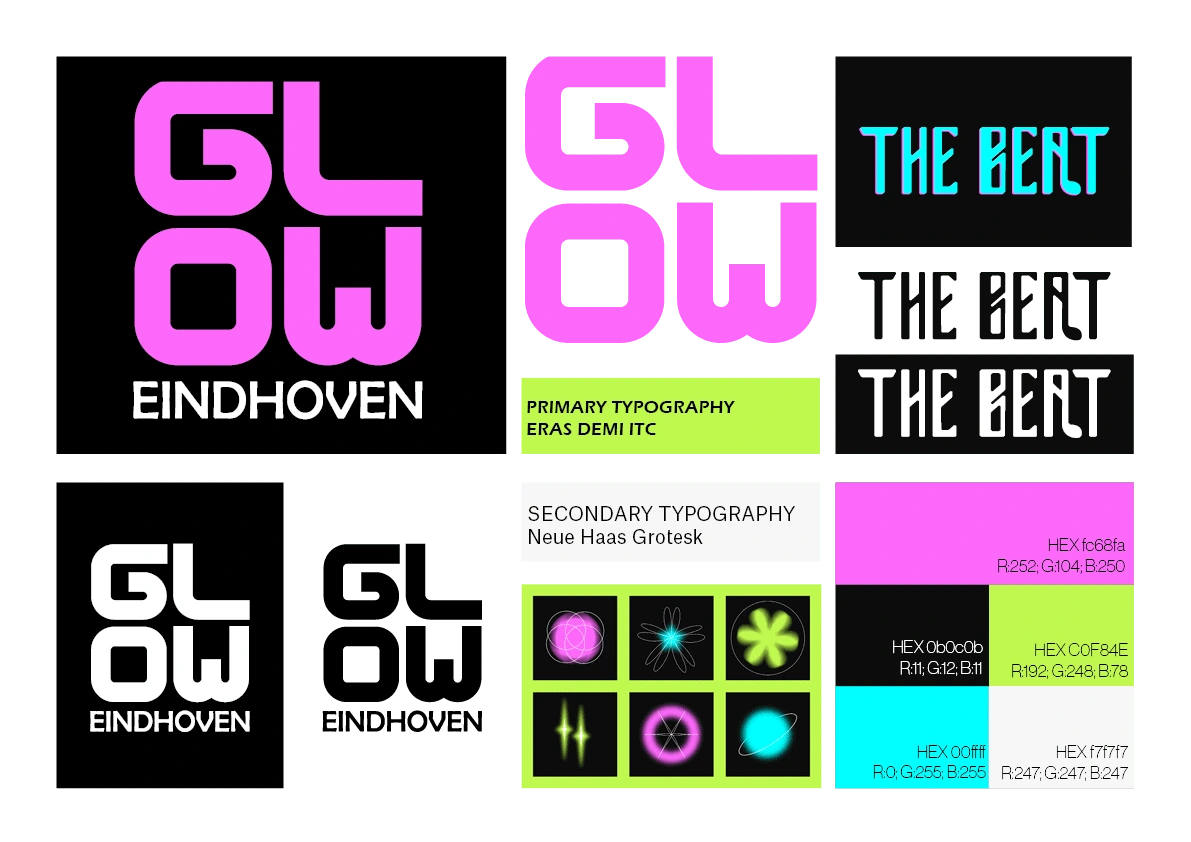
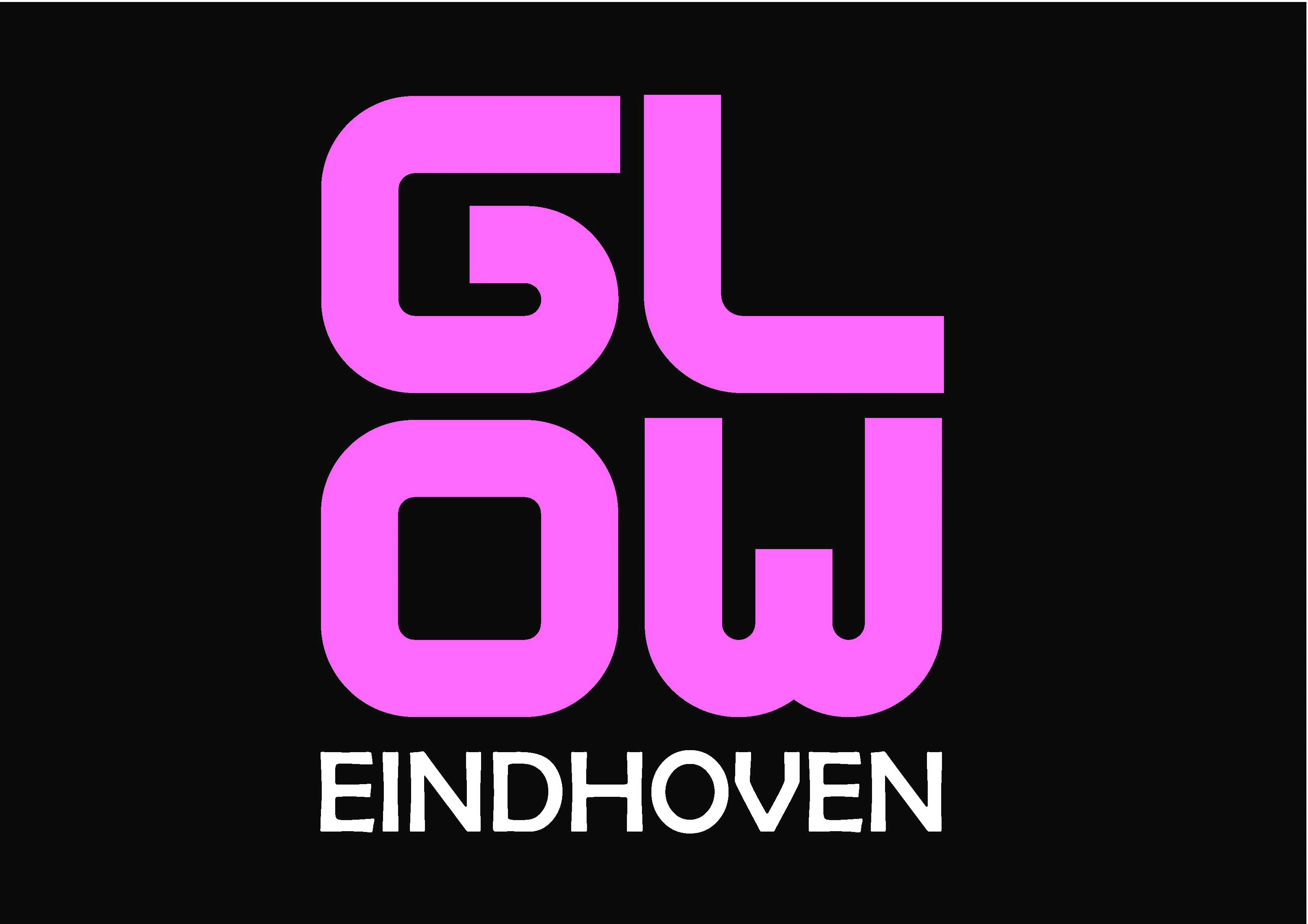
The concept of the logo originated from the history and heritage of the festival. The logo developments come from the ideas of representing the light bulb and/or the neon tube lights in the logo form, using dots to show bulbs, and straight right-angled lines to represent neon tube lights.
Logo Design
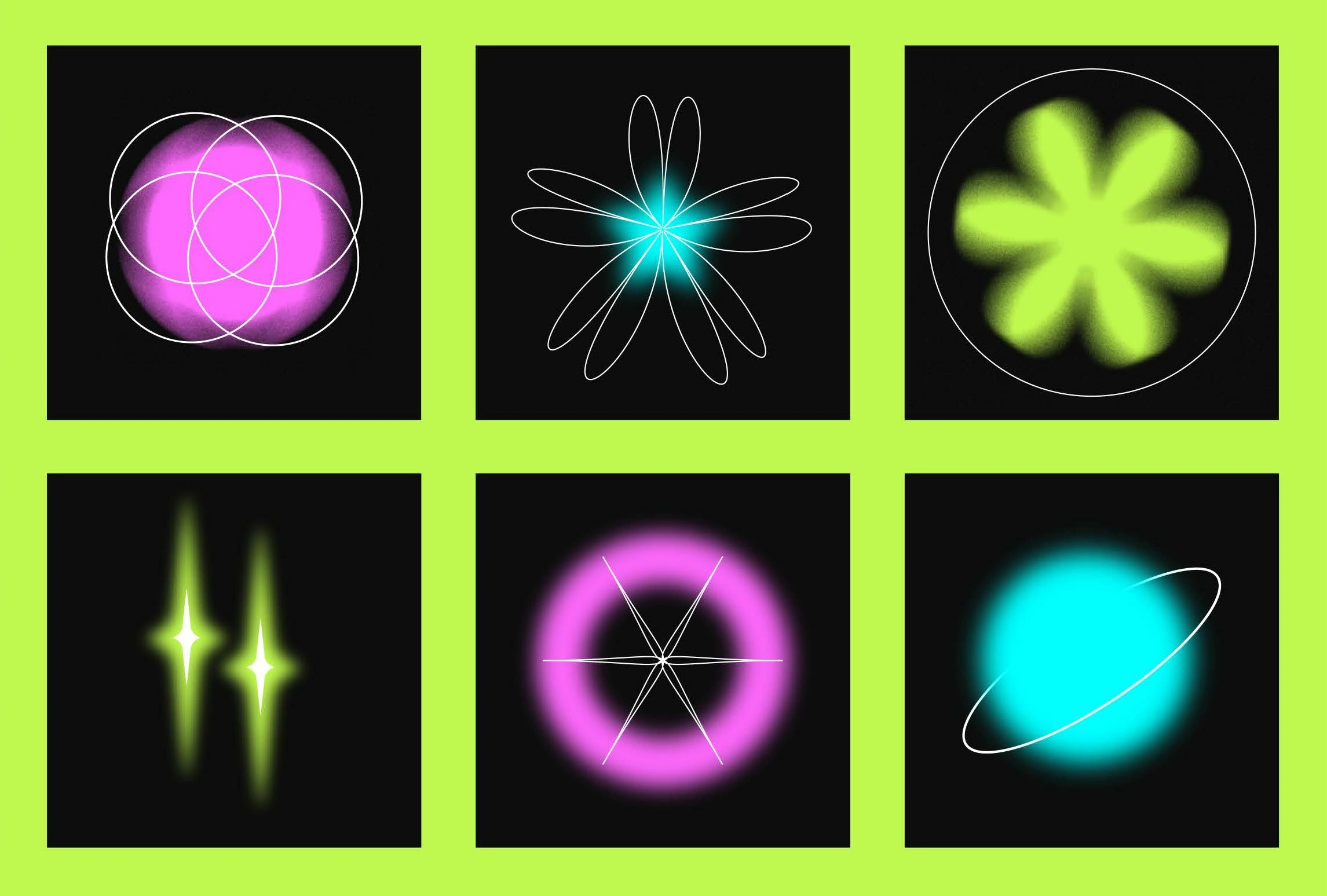
Brand Symbols
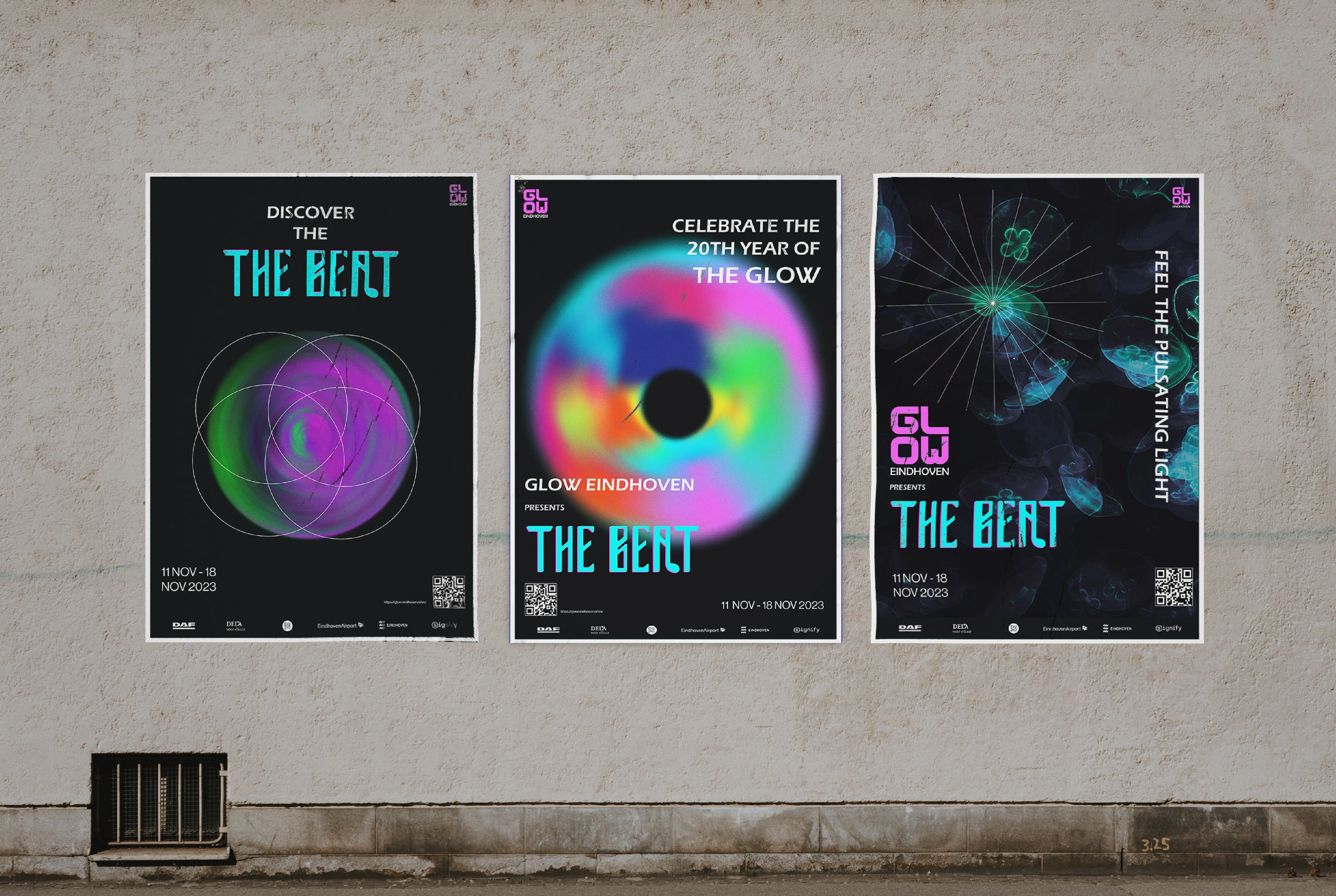
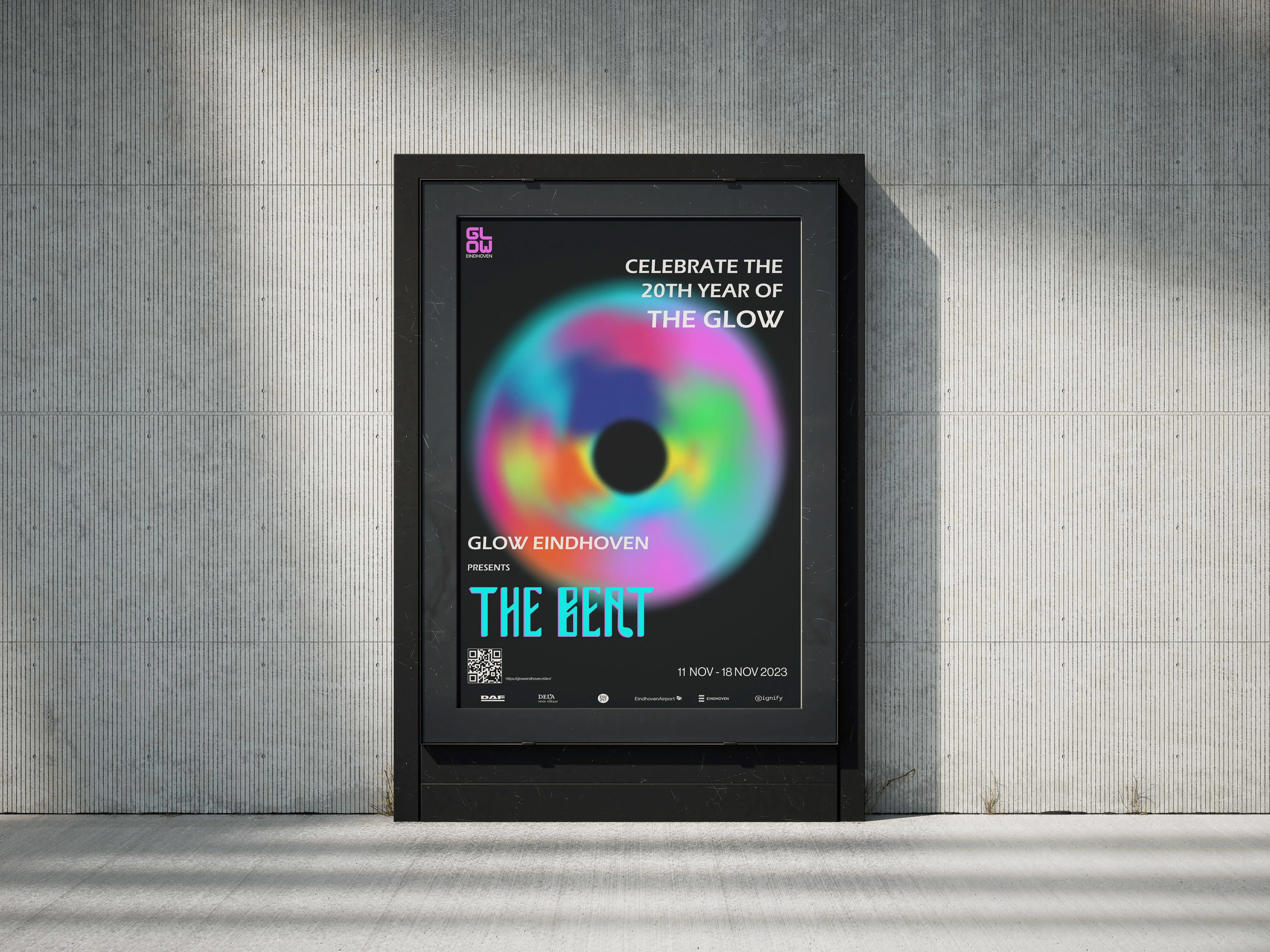
In addition to the festival logo development, the brand design also focused on the new year's upcoming theme 'The Beat'.
This branding design specifically refers to the thematic relationship with rhythm and light. The logo is created to represent this idea, using eccentric fluorescent colours and flowy typography that visually resembles musical notes.
Poster Design
Tickets for Festival

Like this project
Posted Apr 19, 2024
This is a rebranding design project aimed at creating a visual identity for the Glow Eindhoven light arts festival.
Likes
0
Views
8
