Aveo - Logo + Branding

Just Create It

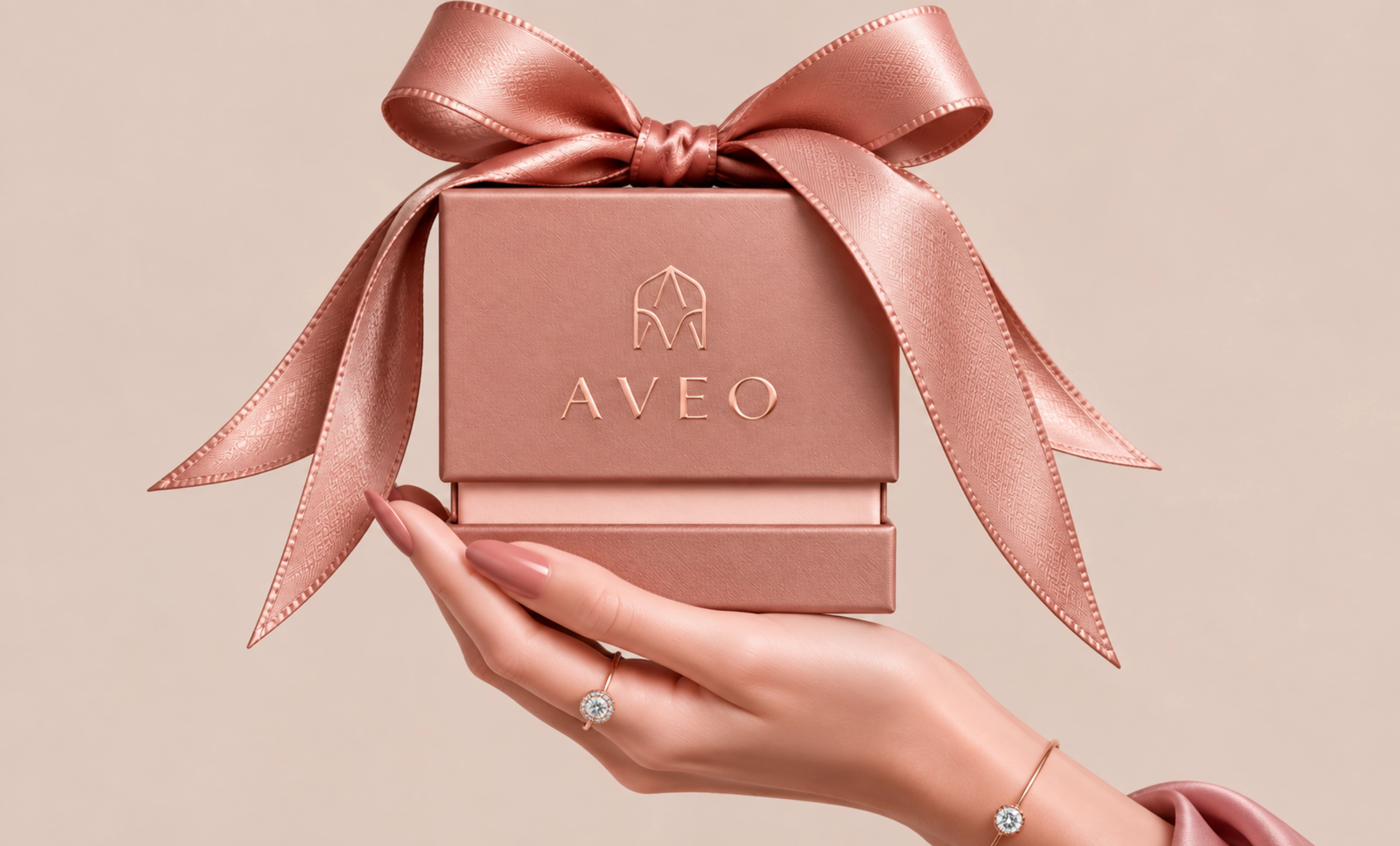
Aveo: A Modern Expression of Fine Jewelry
Aveo came to us looking for an identity that felt feminine, elevated and distinctive - with a sense of luxury that felt contemporary rather than overly traditional.
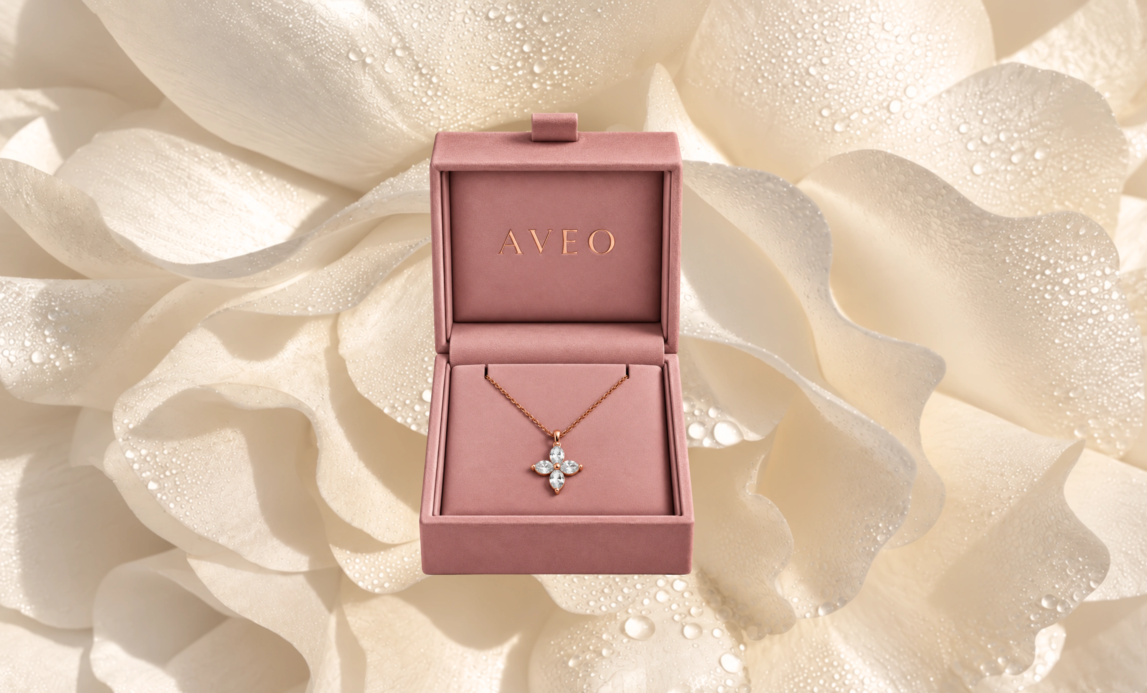
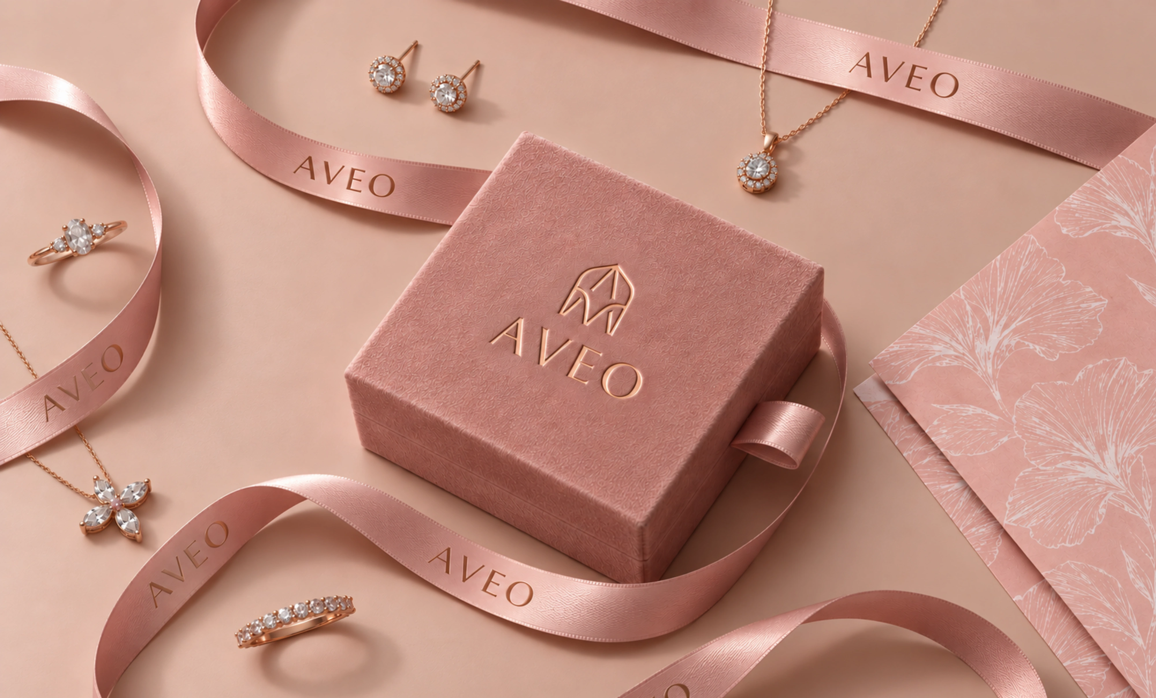
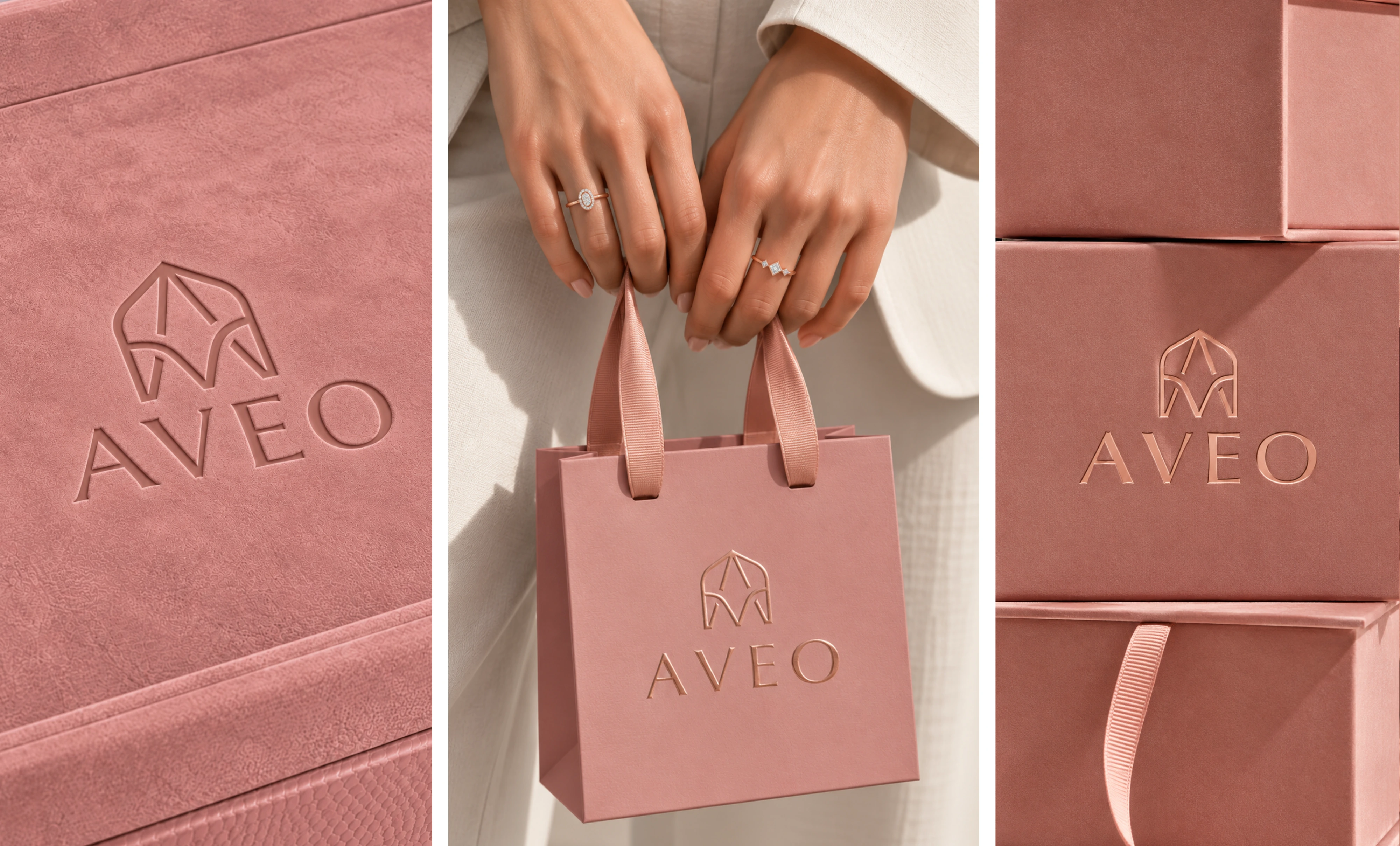
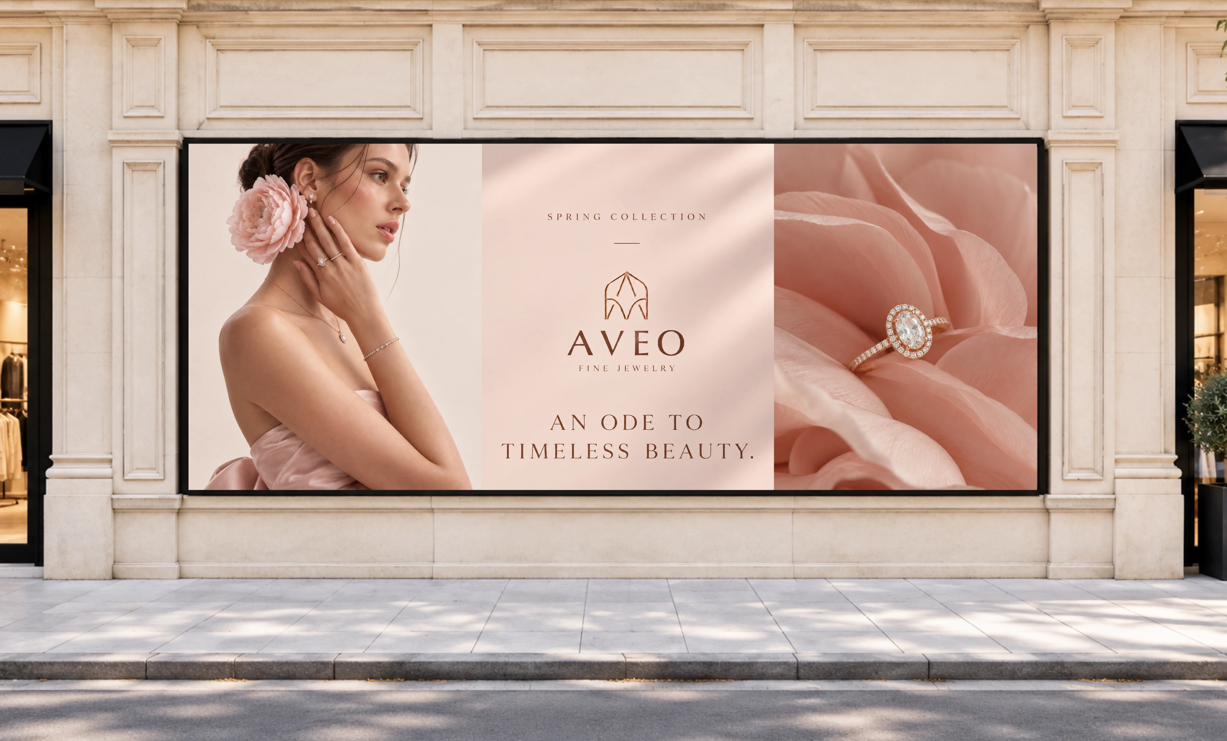
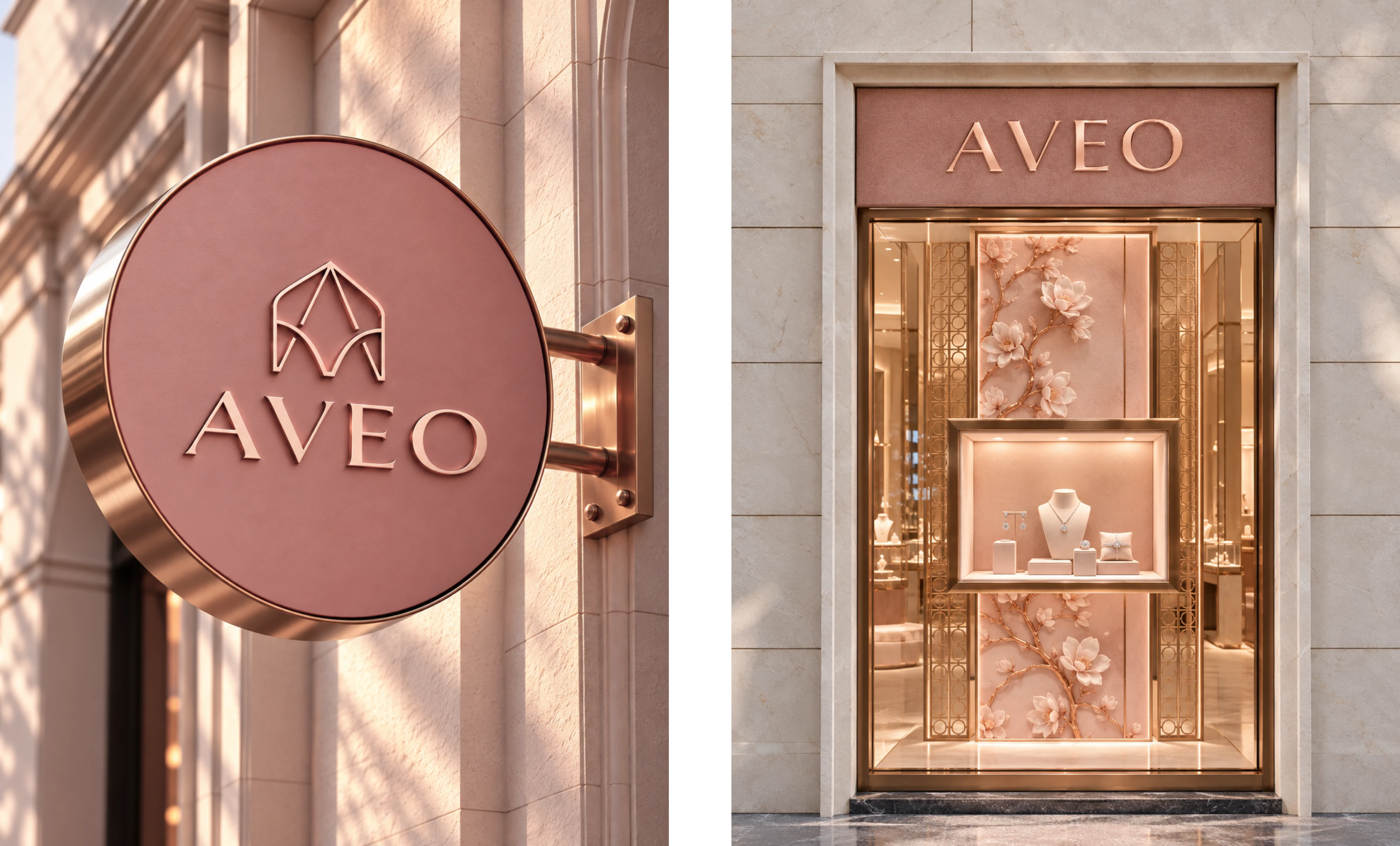
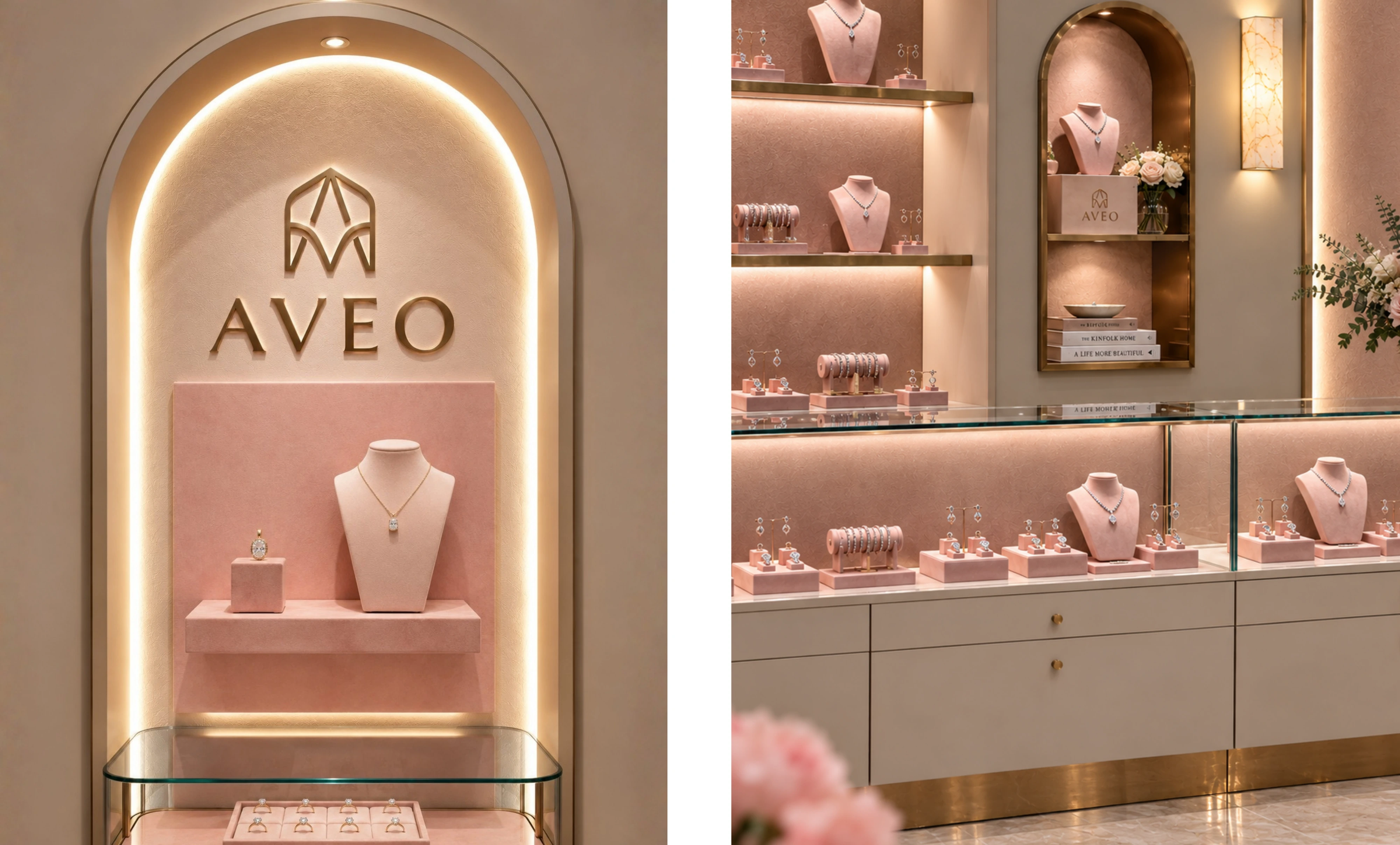
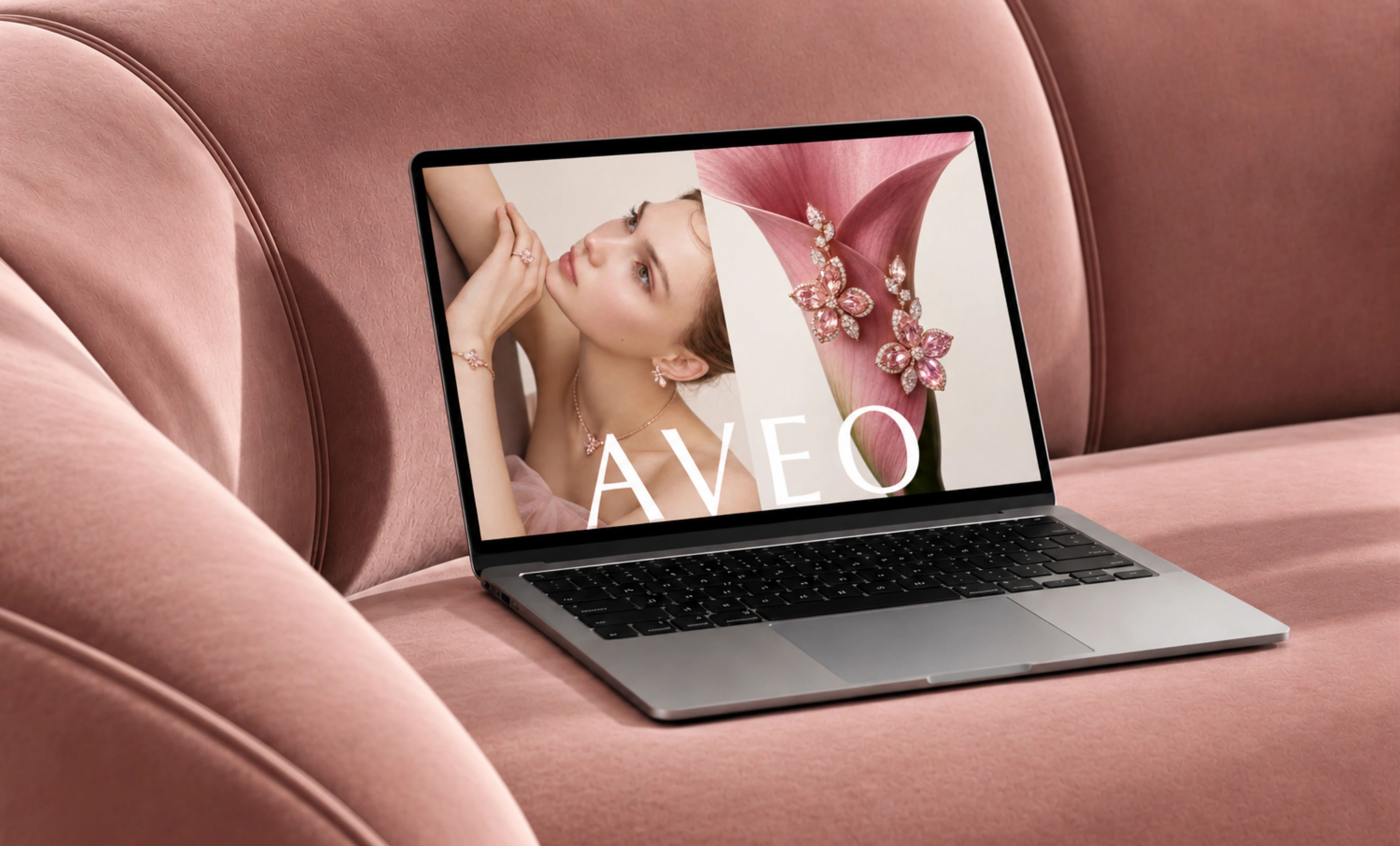
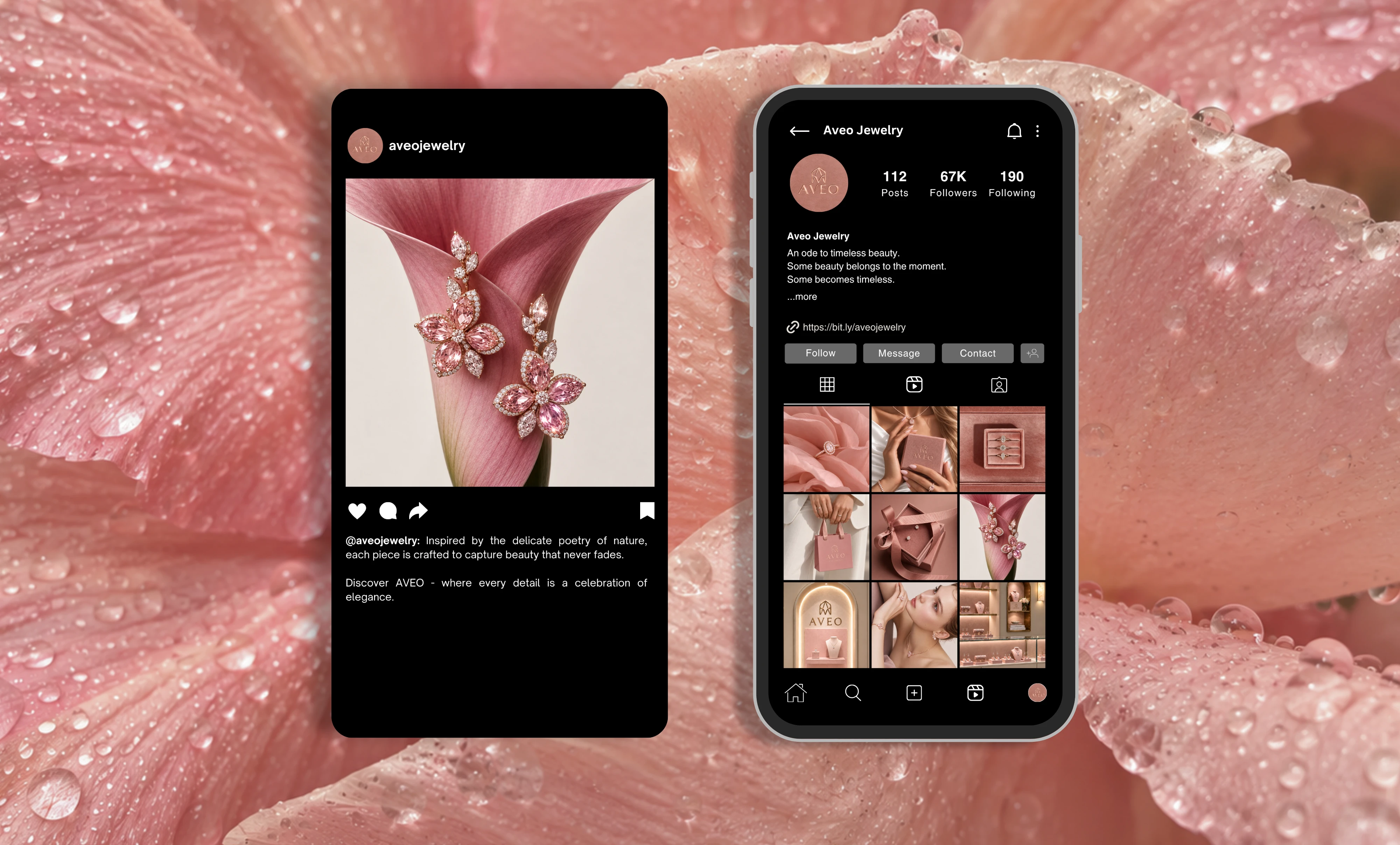
We developed the identity around a soft, romantic palette of dusty rose, warm blush and cream, accented with refined rose-gold finishes. The colour palette creates a world that feels warm and luxurious, while keeping the jewellery itself at the centre of attention.
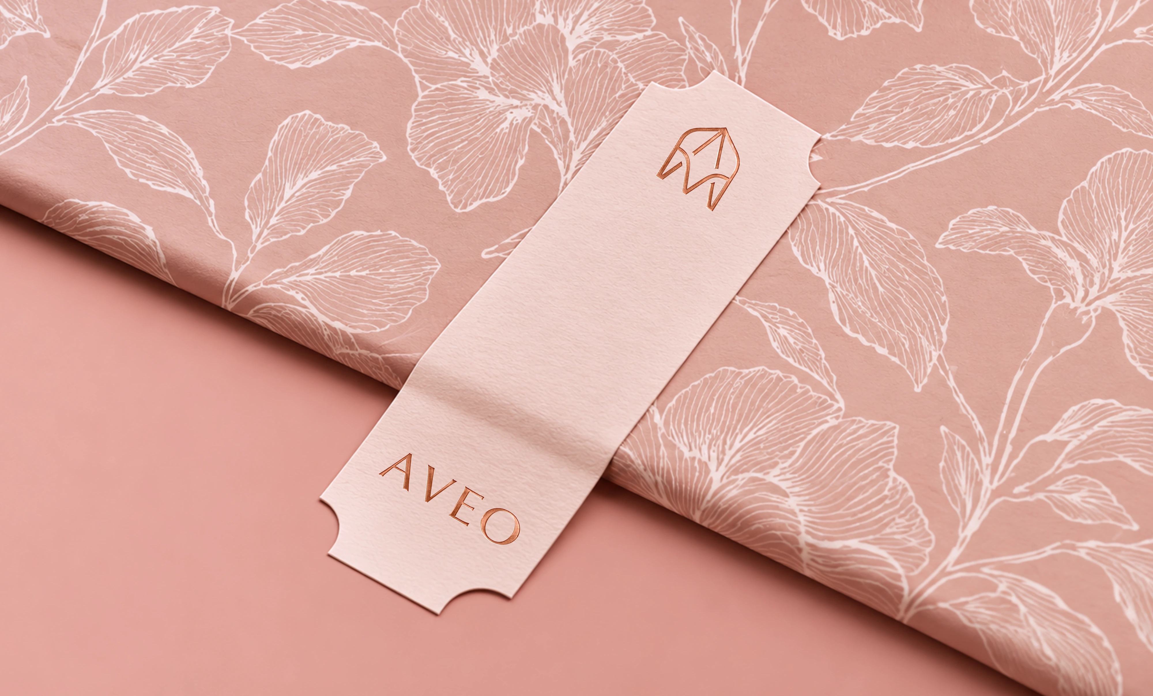
The visual language is inspired by the delicate relationship between jewellery and nature. Botanical forms, soft florals, tactile surfaces and subtle tonal contrasts are woven throughout the identity, creating a sense of beauty that feels considered rather than decorative.
At the centre of the brand is a bespoke A/V monogram, designed as a distinctive signature for Aveo. Its symmetrical, sculptural form gives the identity a recognisable hallmark - allowing the symbol to work beautifully across embossing, packaging, digital applications and physical brand touchpoints.
A refined serif wordmark complements the monogram, bringing an editorial quality to the identity. Combined with rose-gold detailing and tactile finishes, the typography gives Aveo a sense of permanence and sophistication.
We extended the visual direction across packaging, stationery, gifting, social media and retail environments, creating a cohesive brand world that feels consistent from the first digital impression through to the unboxing experience.
The result is Aveo: soft yet distinctive, feminine yet refined, and designed to make every piece feel like something worth keeping.
A modern fine jewellery identity, crafted for timeless beauty.

Like this project
Posted Sep 28, 2026
A modern fine jewellery identity blending quiet luxury, editorial elegance and feminine detail to create desire and elevate perceived value.