BrandHer

Toheeb Ajadi


About - BrandHer
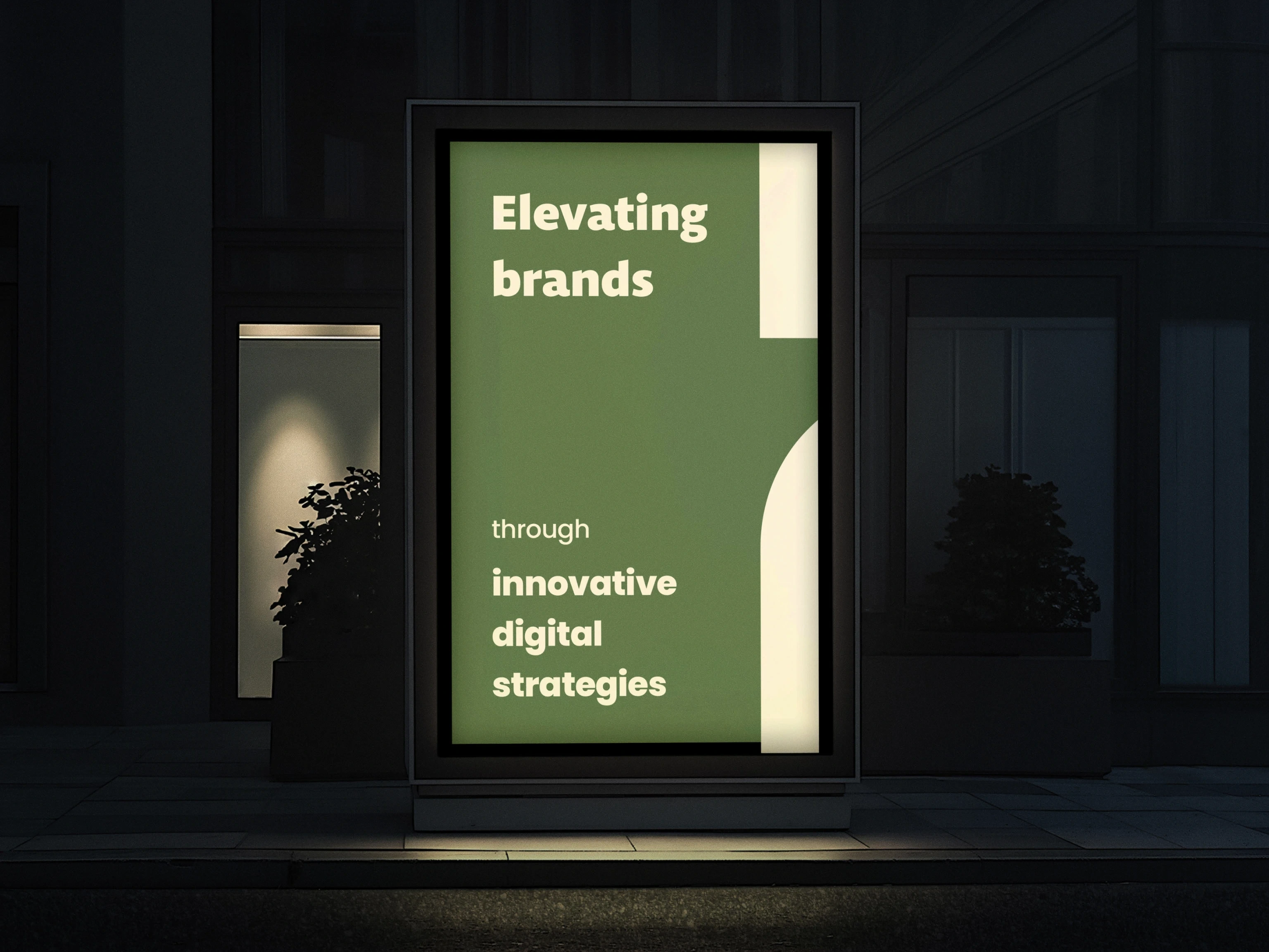
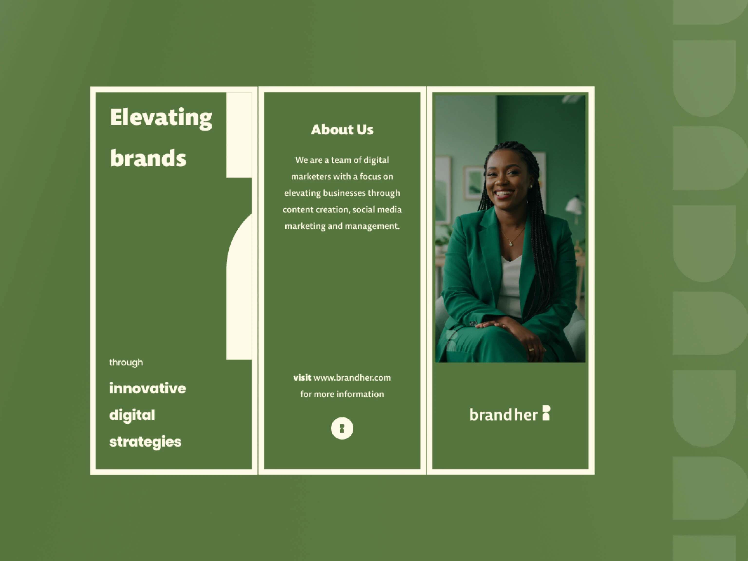
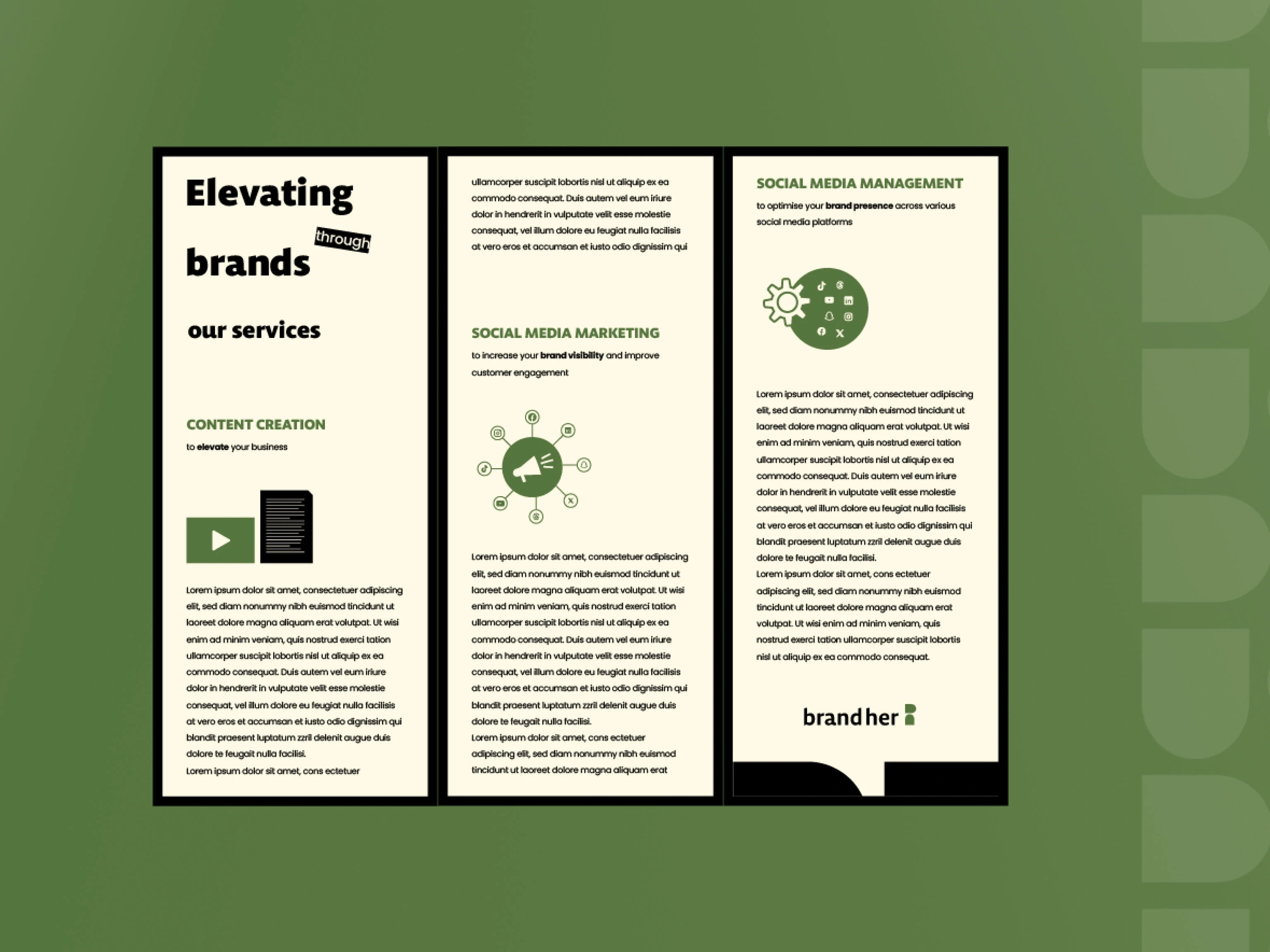
BrandHer is a social media marketing agency dedicated to helping brands and business owners market their way to the right audience. With a strong focus on social media marketing, social media management, and content creation, the agency is committed to elevating brands through innovative digital strategies.
The agency has the mission to help businesses grow their online presence through strategic social media management, impactful content creation, and effective marketing campaigns. BrandHer is positioned to become a leading agency that bridges the gap between brands and their ideal audience through a thriving creative network and effective digital strategies.
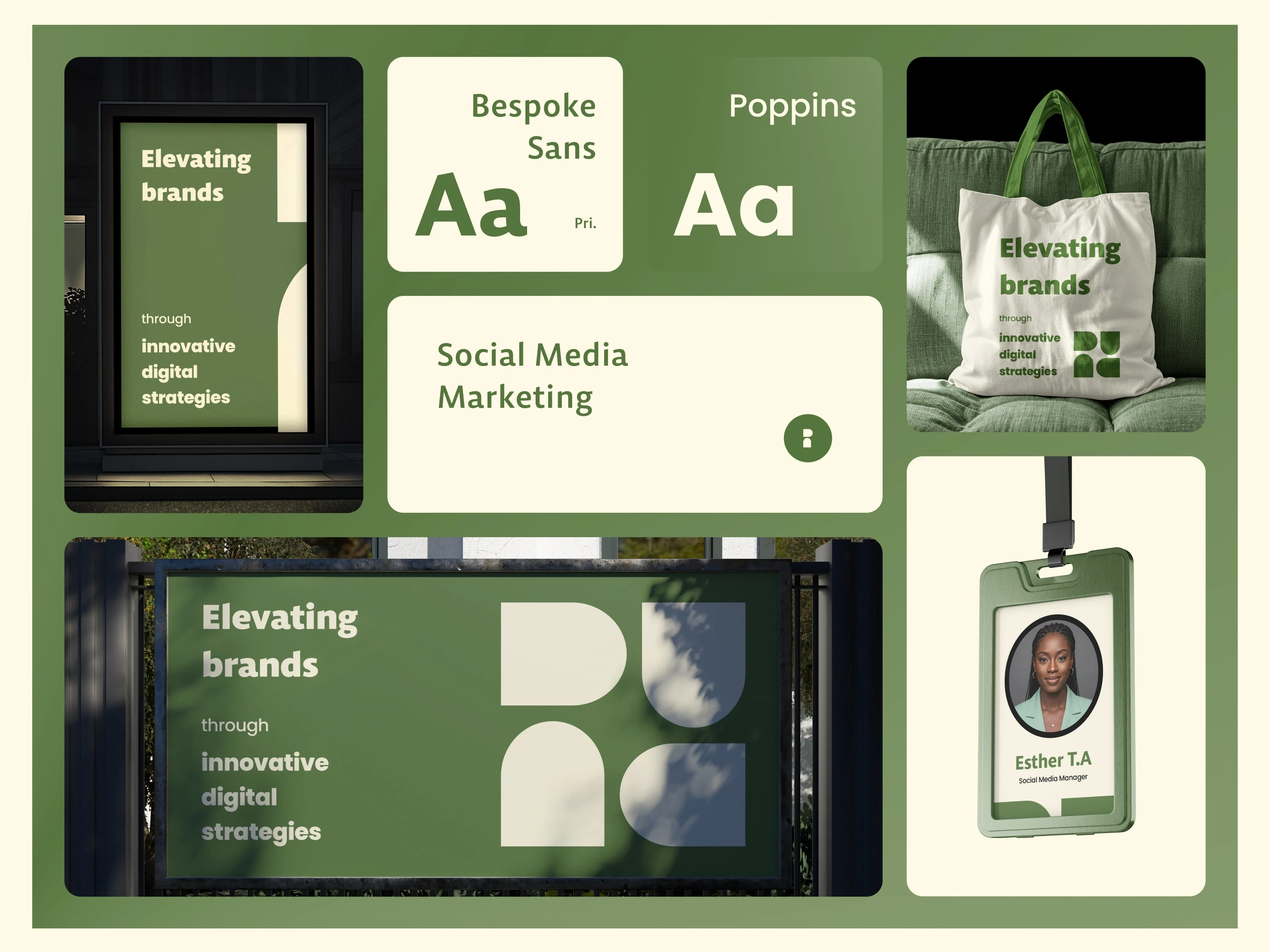
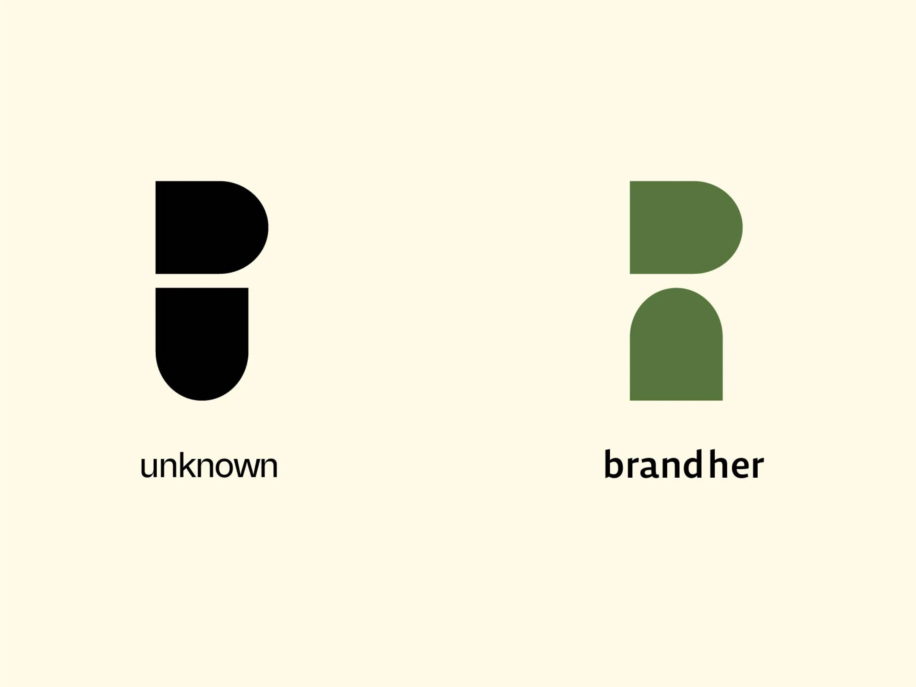
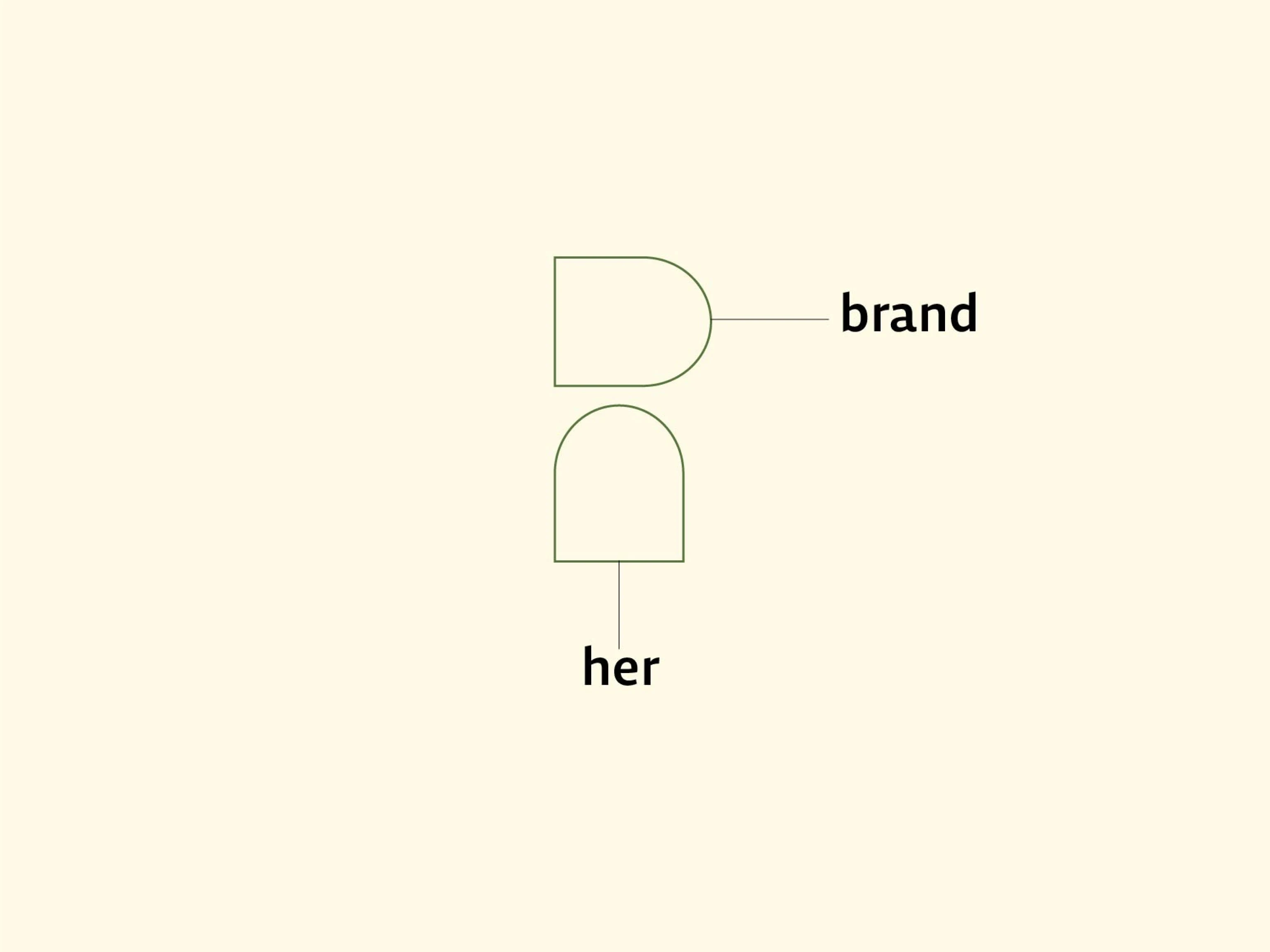
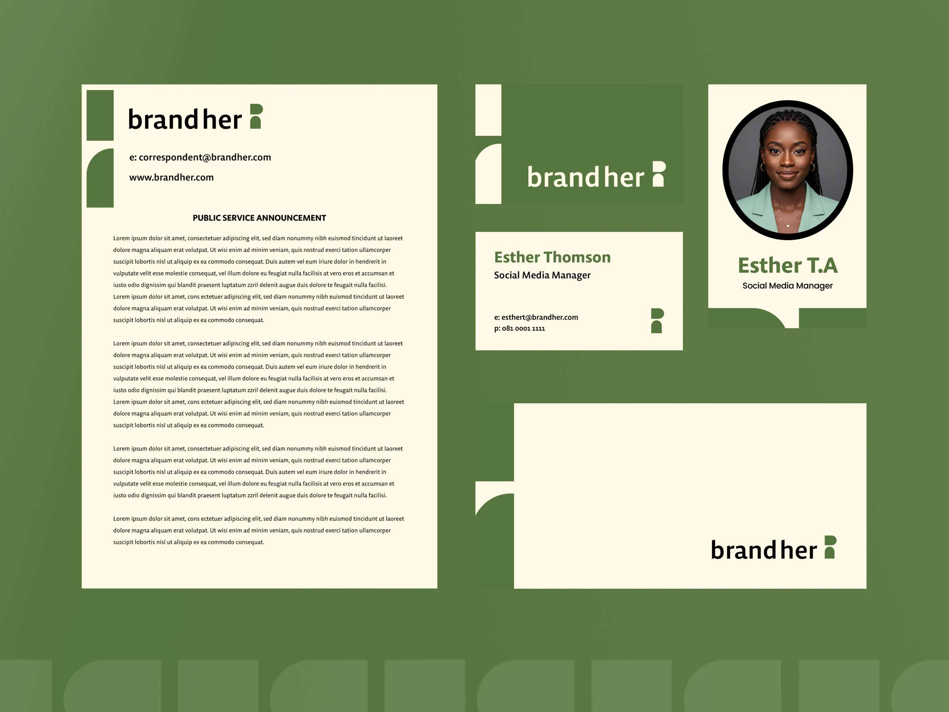
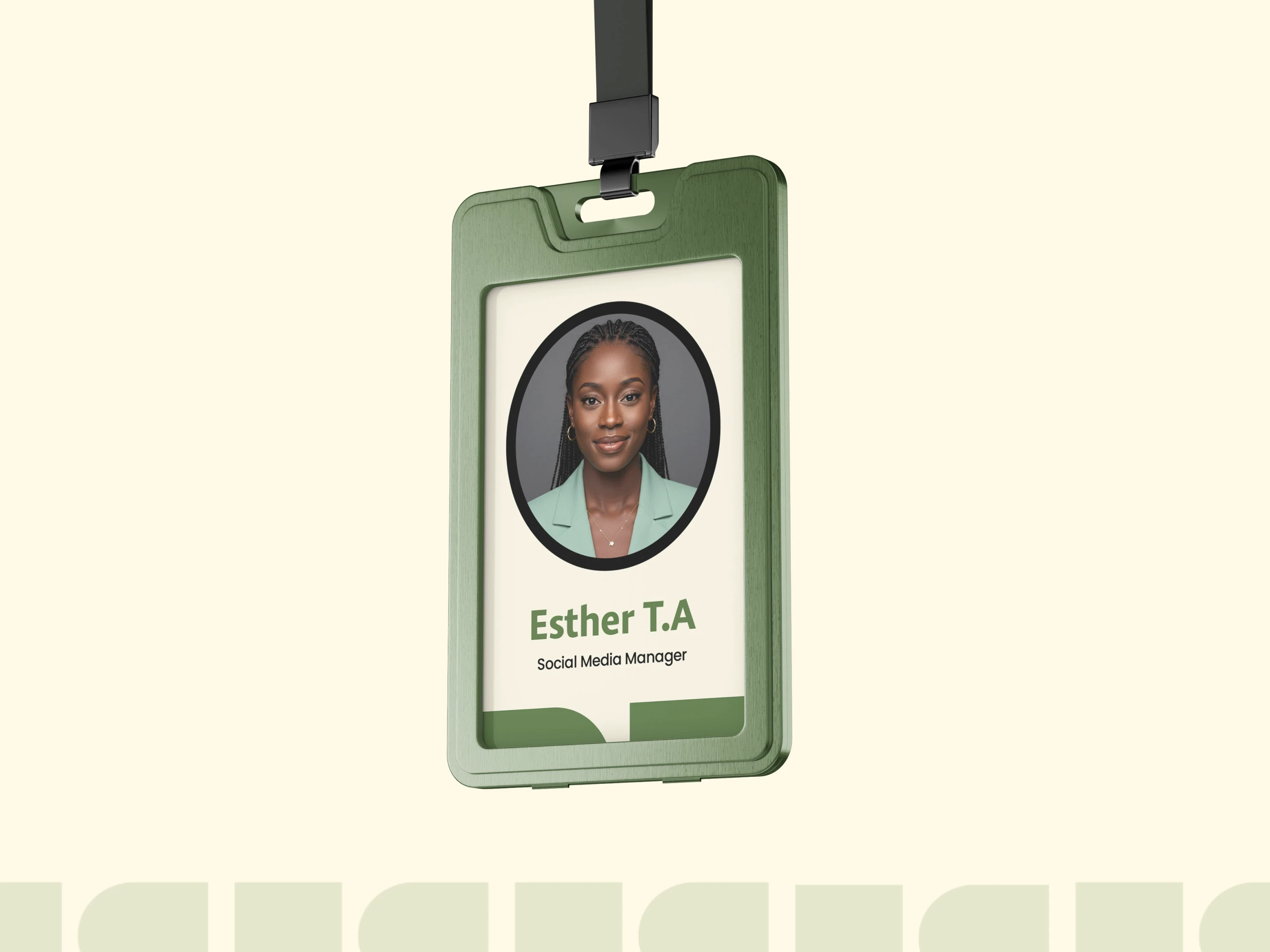
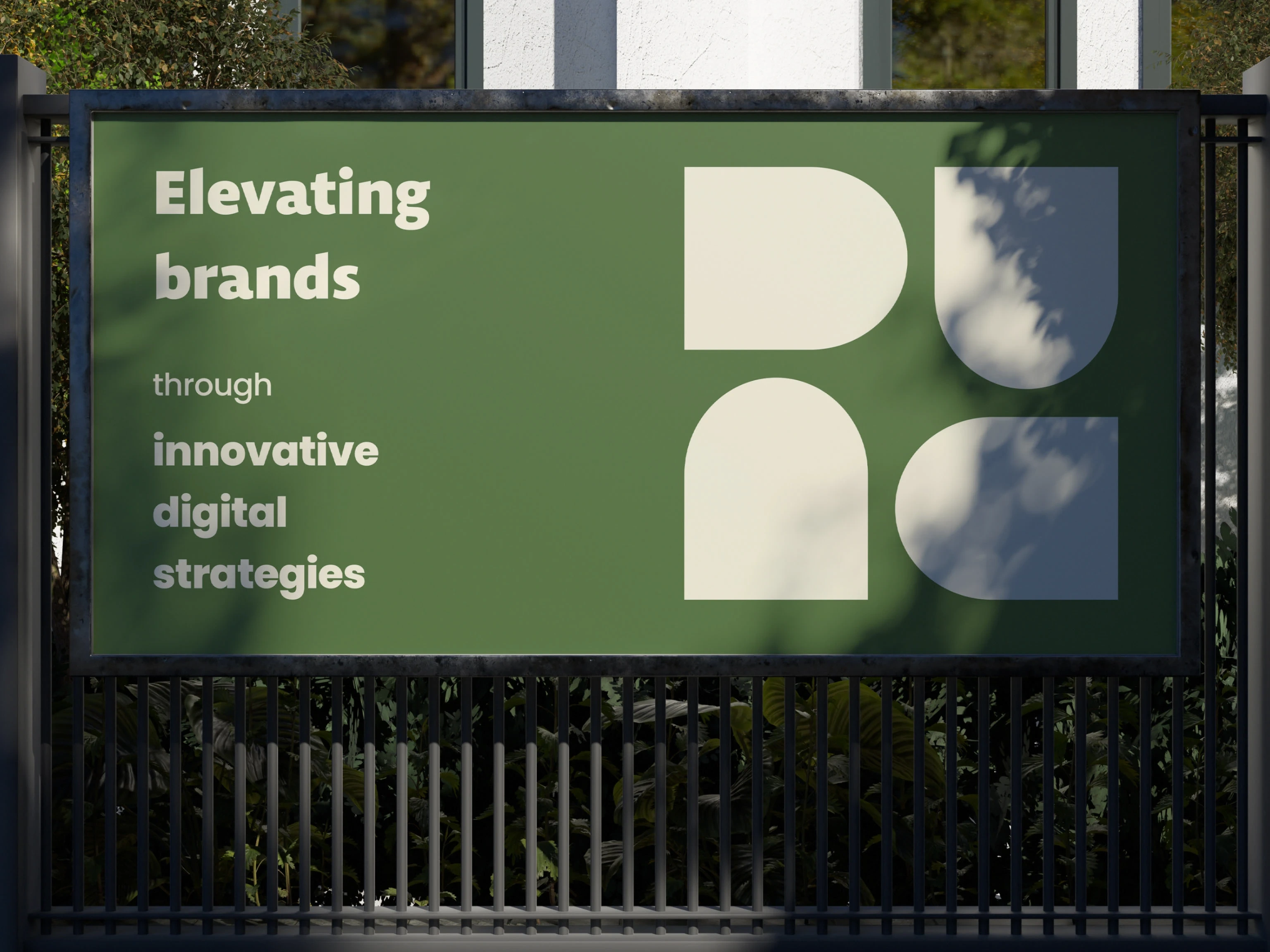
The identity is crafted to be versatile enough to work across various applications and stands out in the digital marketing space. The logo combines the name "BrandHer" into two geometric shapes, representing "brand" and "her". These shapes double as abstract letterforms and human-like figures, emphasising the agency's personal and people-first approach.
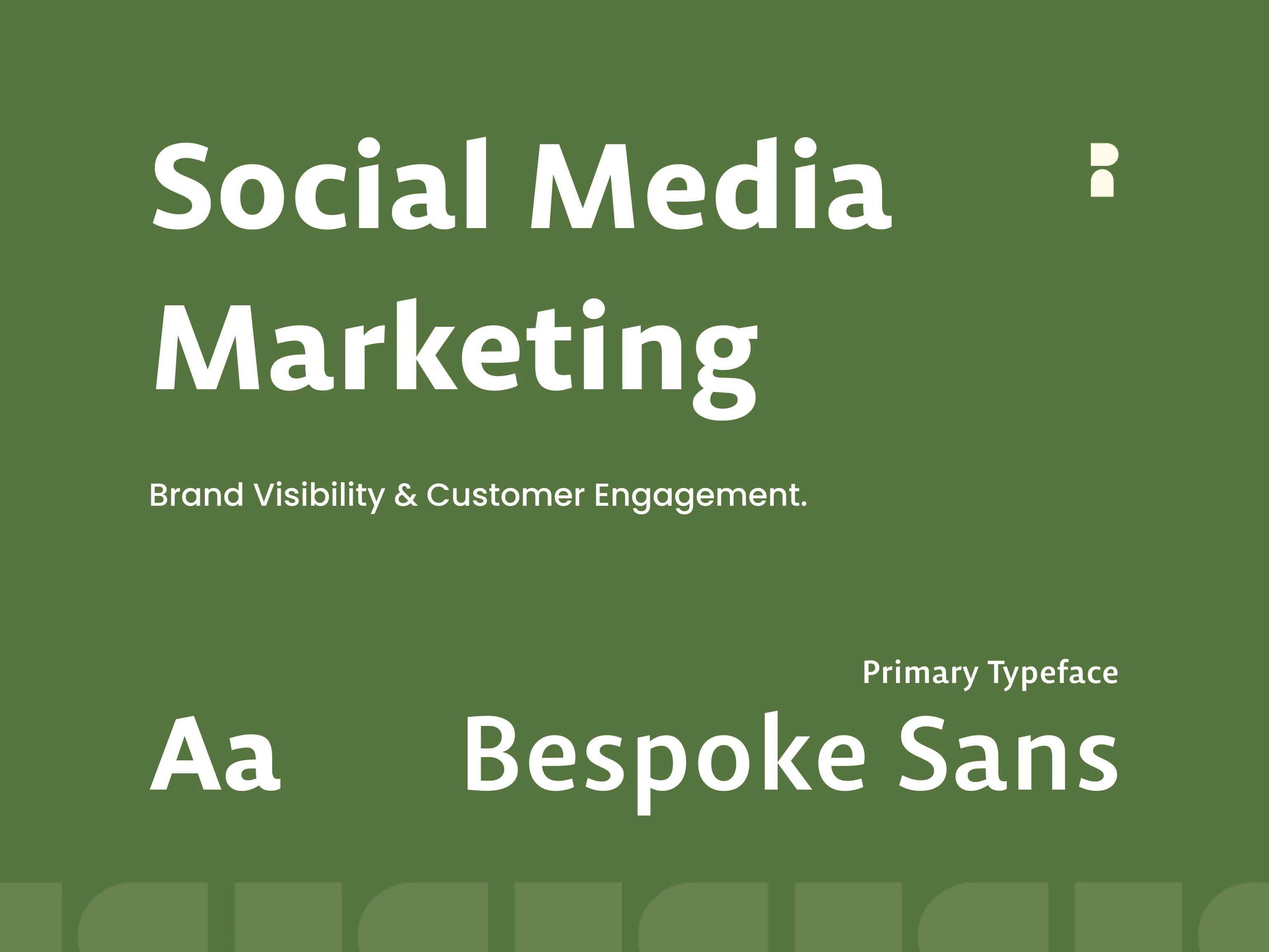
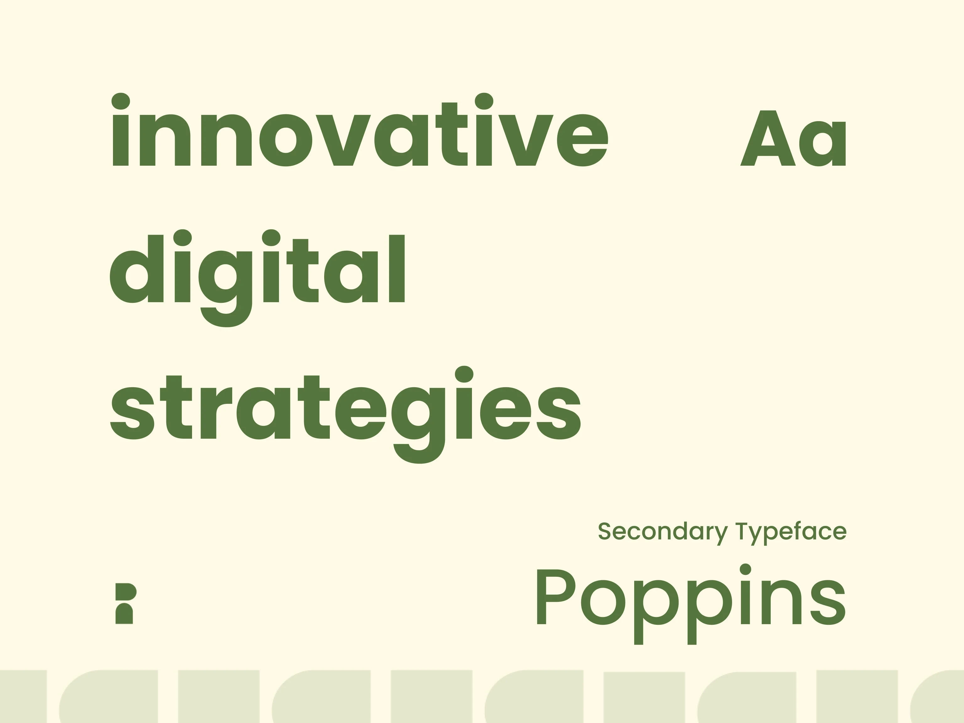
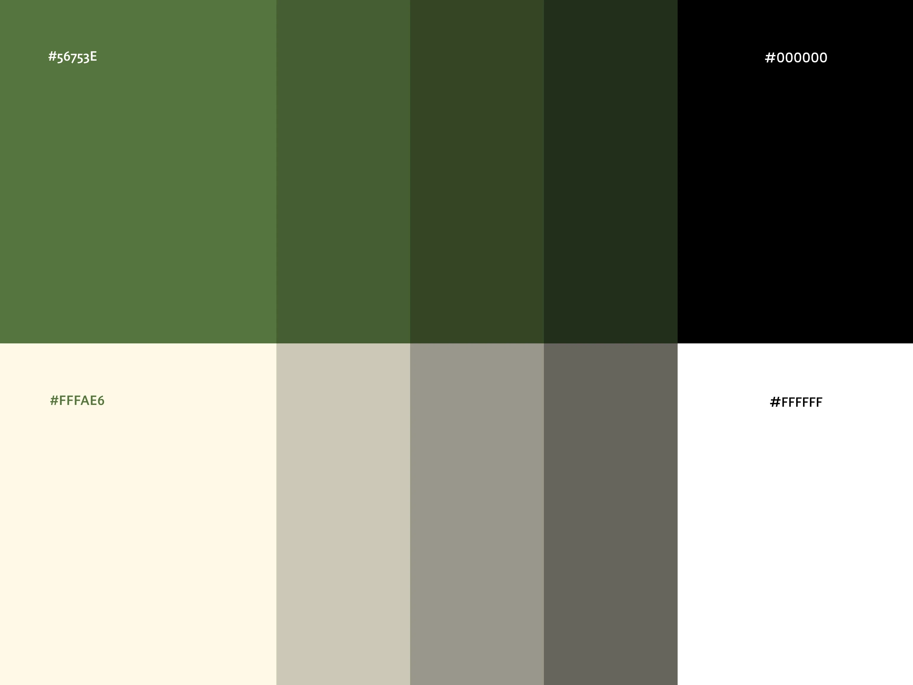
The type pairing strikes a balance between unique personality and readability, making the brand adaptable for both promotional materials and everyday communication. The colour palette choice caps it all, resulting in a clean, modern, and conceptually strong visual system.


Like this project
Posted Jun 2, 2025
Visual identity for a digital marketing brand


MIGHT COLLECTIVE

BuyFromJaddy

Nine 11 Homes

IVM EX02