OPS Healthcare Brand Identity & Web Design

John Kiunga


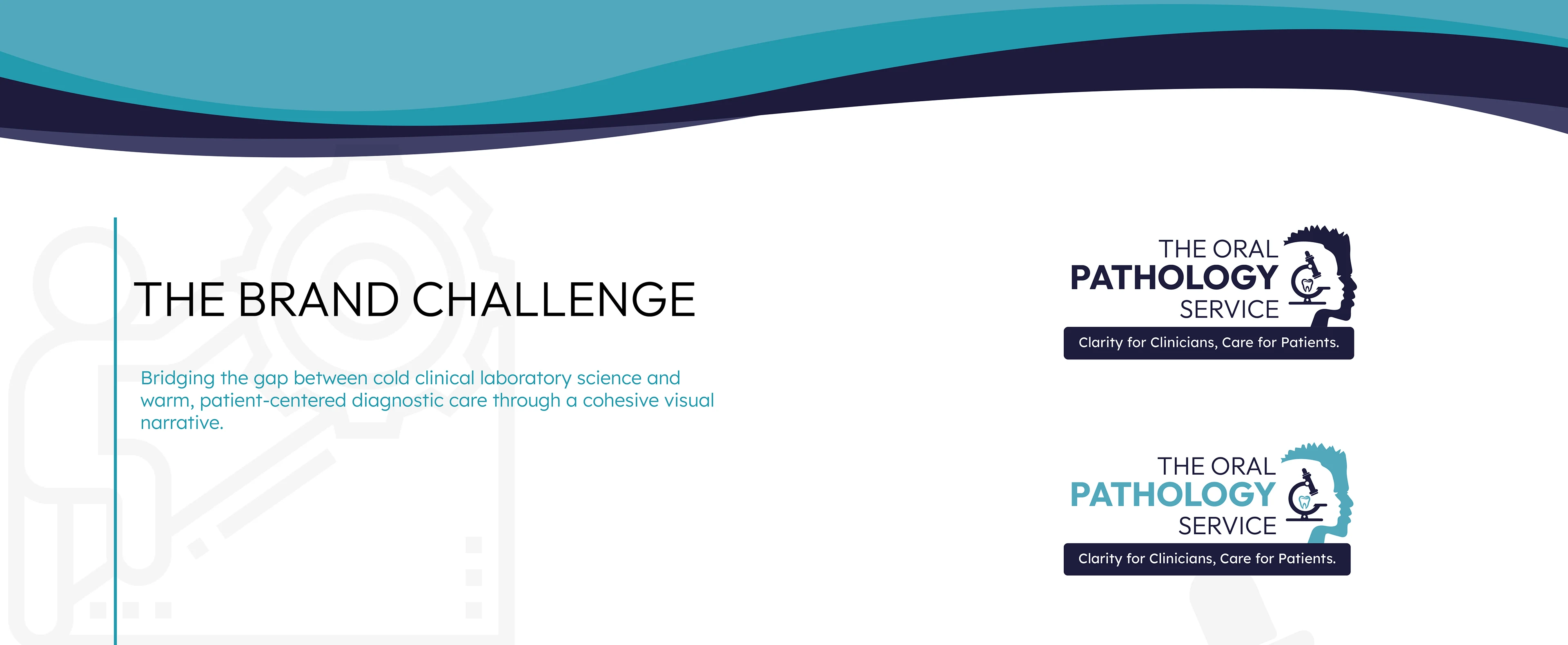
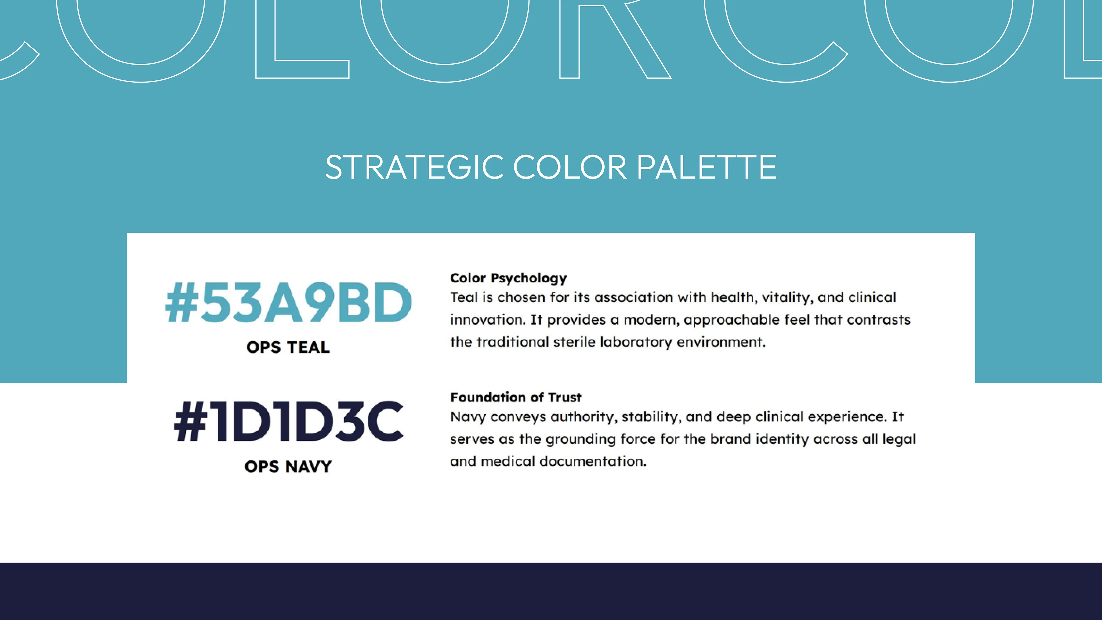
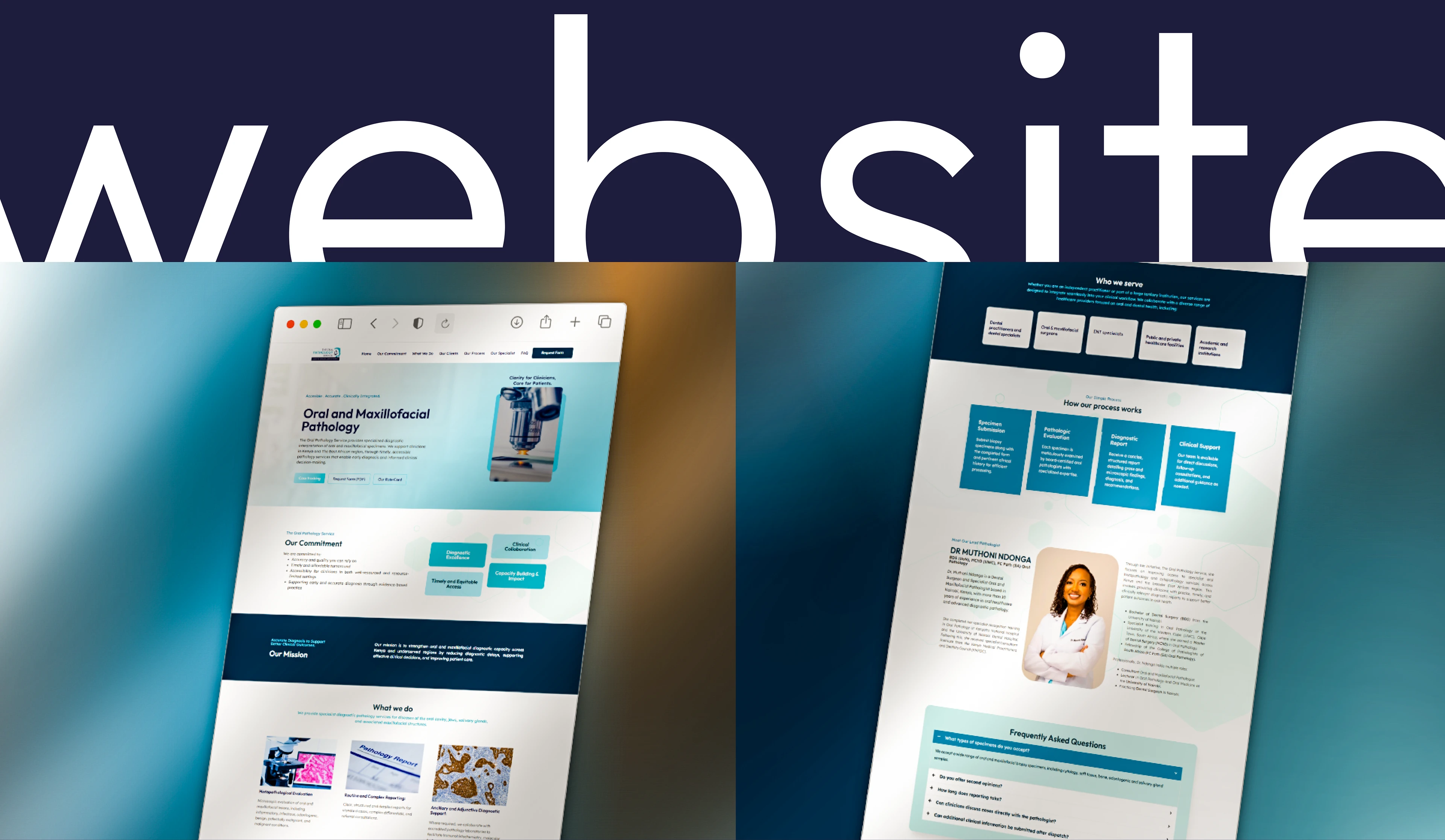
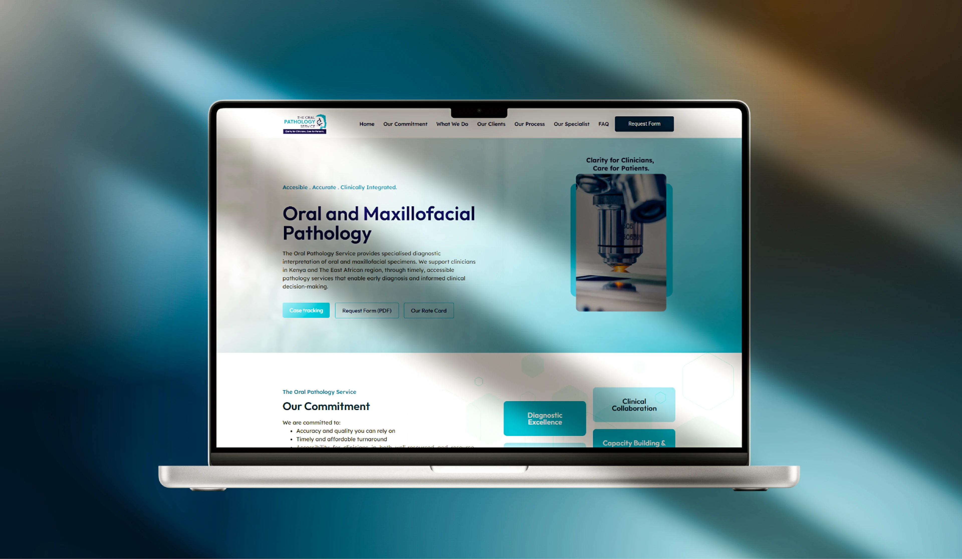
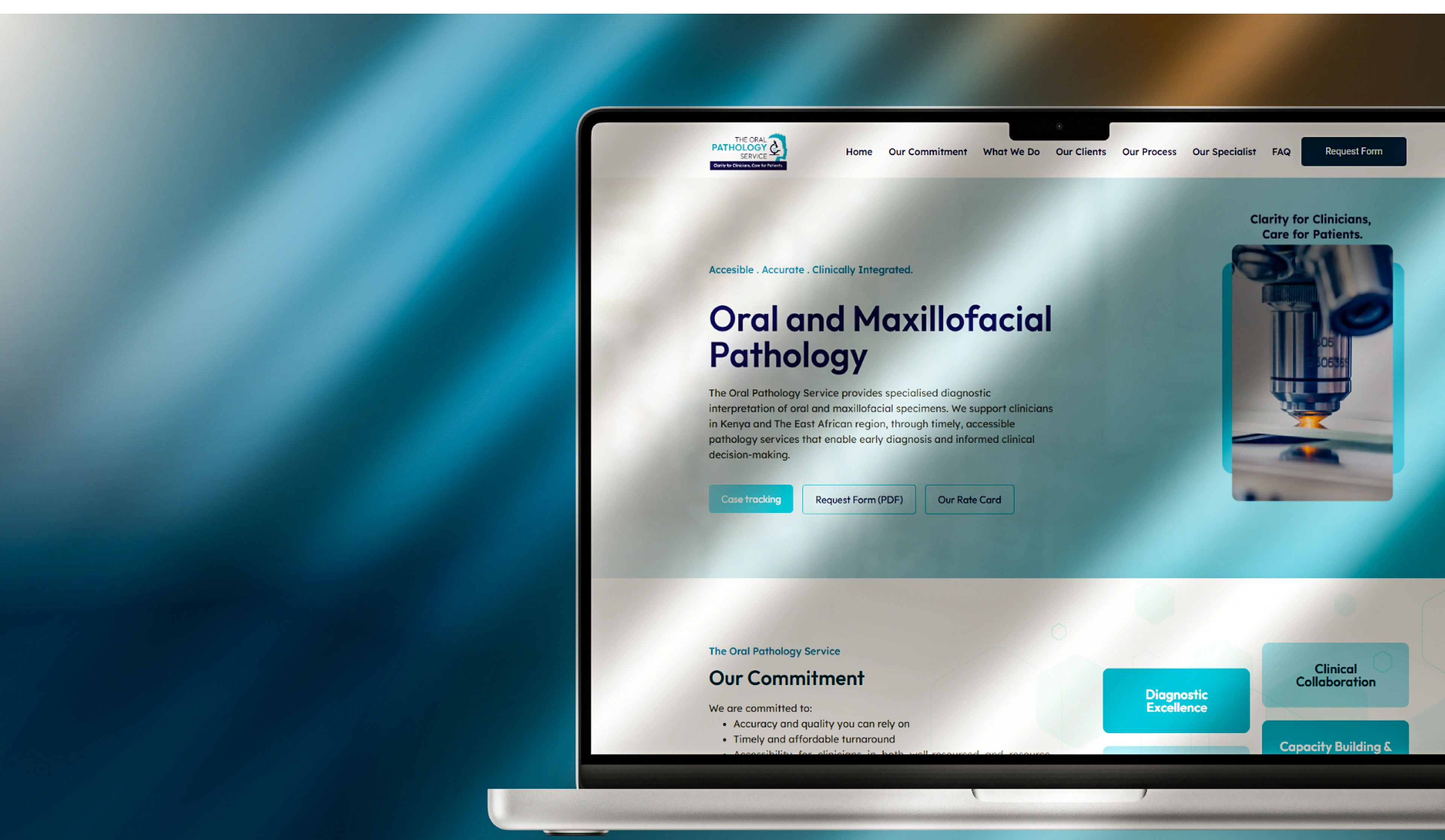
The Challenge: How do you visualize the intersection of clinical pathology and patient-centered dental care? For The Oral Pathology Service (OPS), the goal was to move away from sterile, intimidating medical tropes and toward an identity that projects both "Clarity for Clinicians" and "Care for Patients."
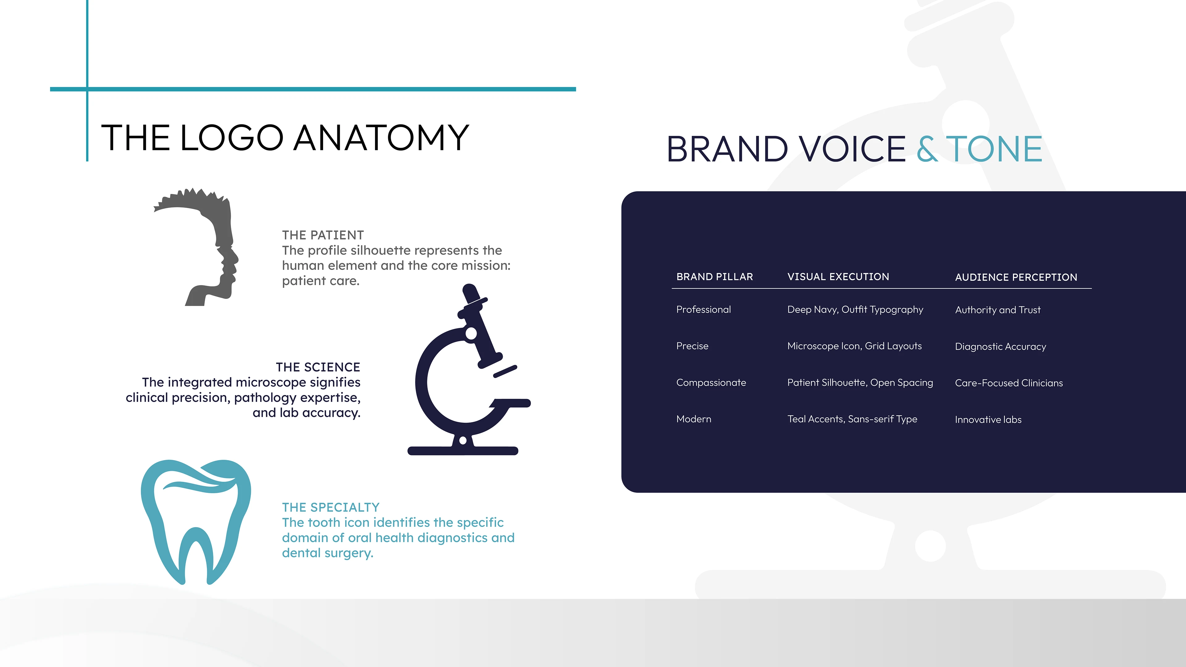
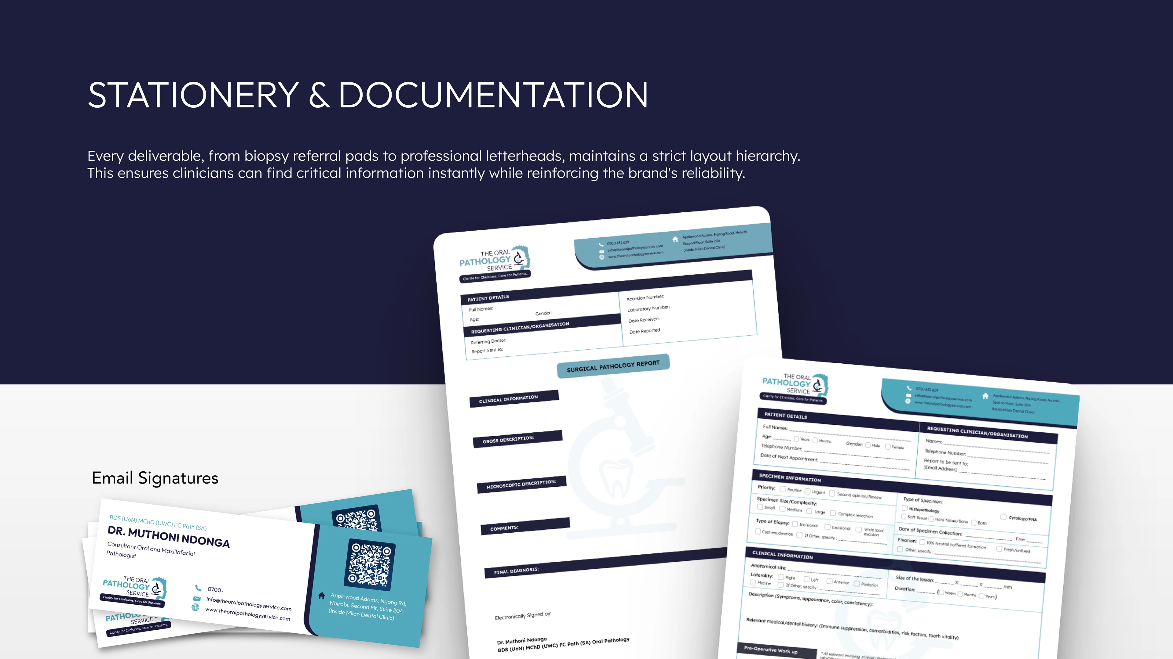
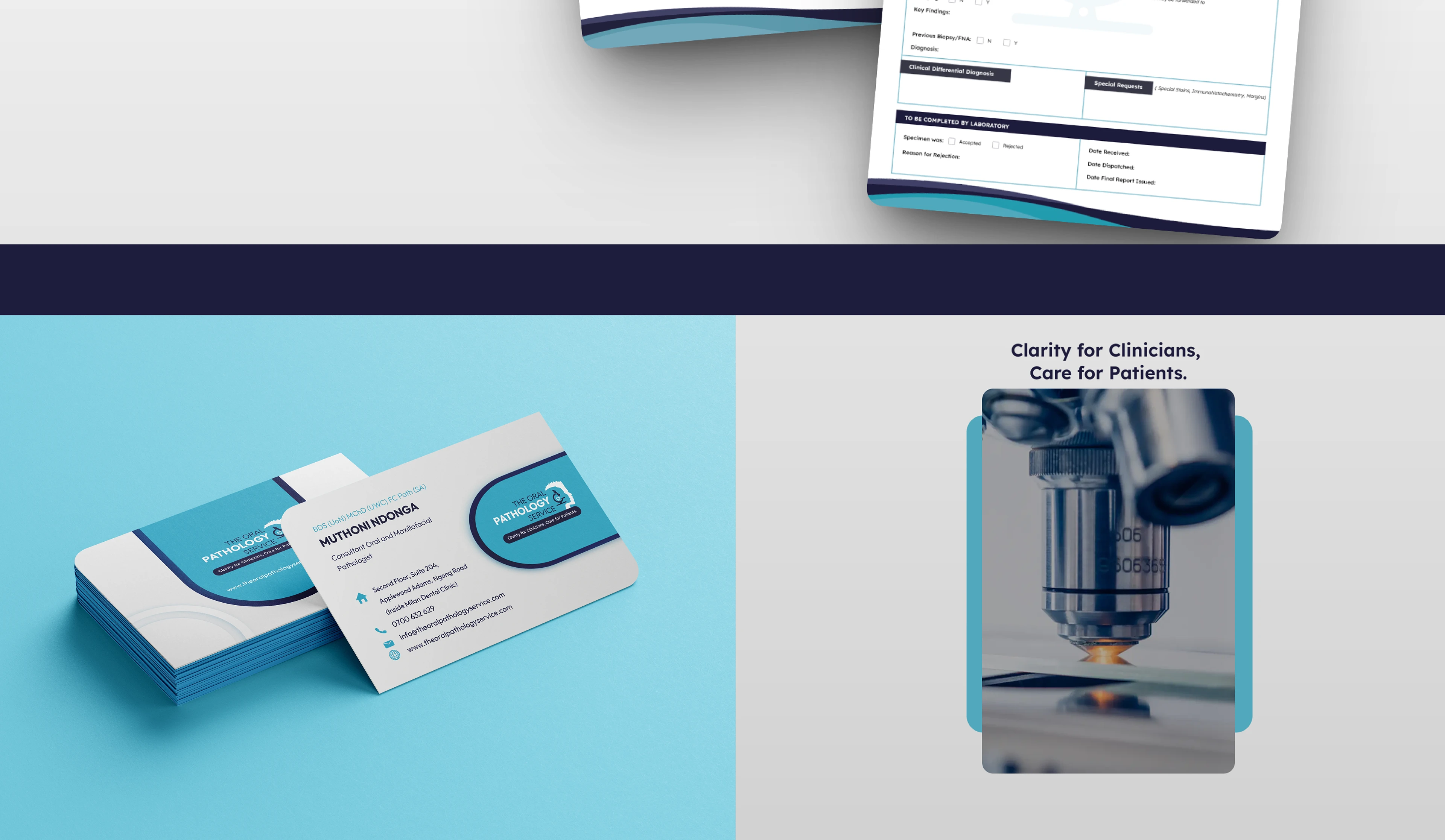
The Solution: We developed a sophisticated visual system centered around a custom-engineered icon. By merging the silhouette of a human profile with a laboratory microscope and a tooth, we created a singular mark that defines the special
Like this project
Posted Apr 8, 2026
The goal was to move away from sterile, intimidating medical tropes and toward an identity that projects both "Clarity for Clinicians" and "Care for Patients."