Frutide
Taimur Iqbal


Like this project
Posted Apr 22, 2026
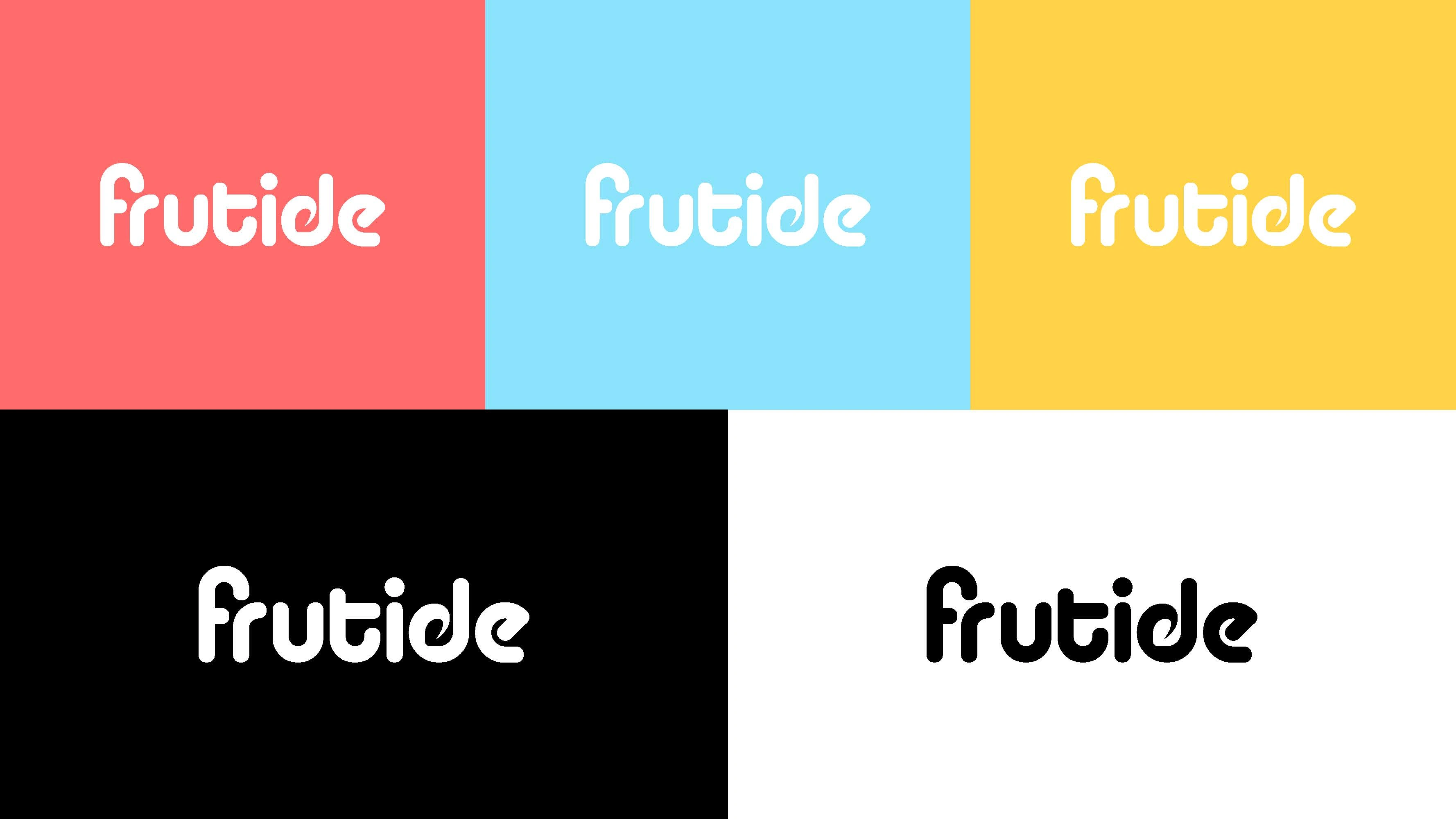
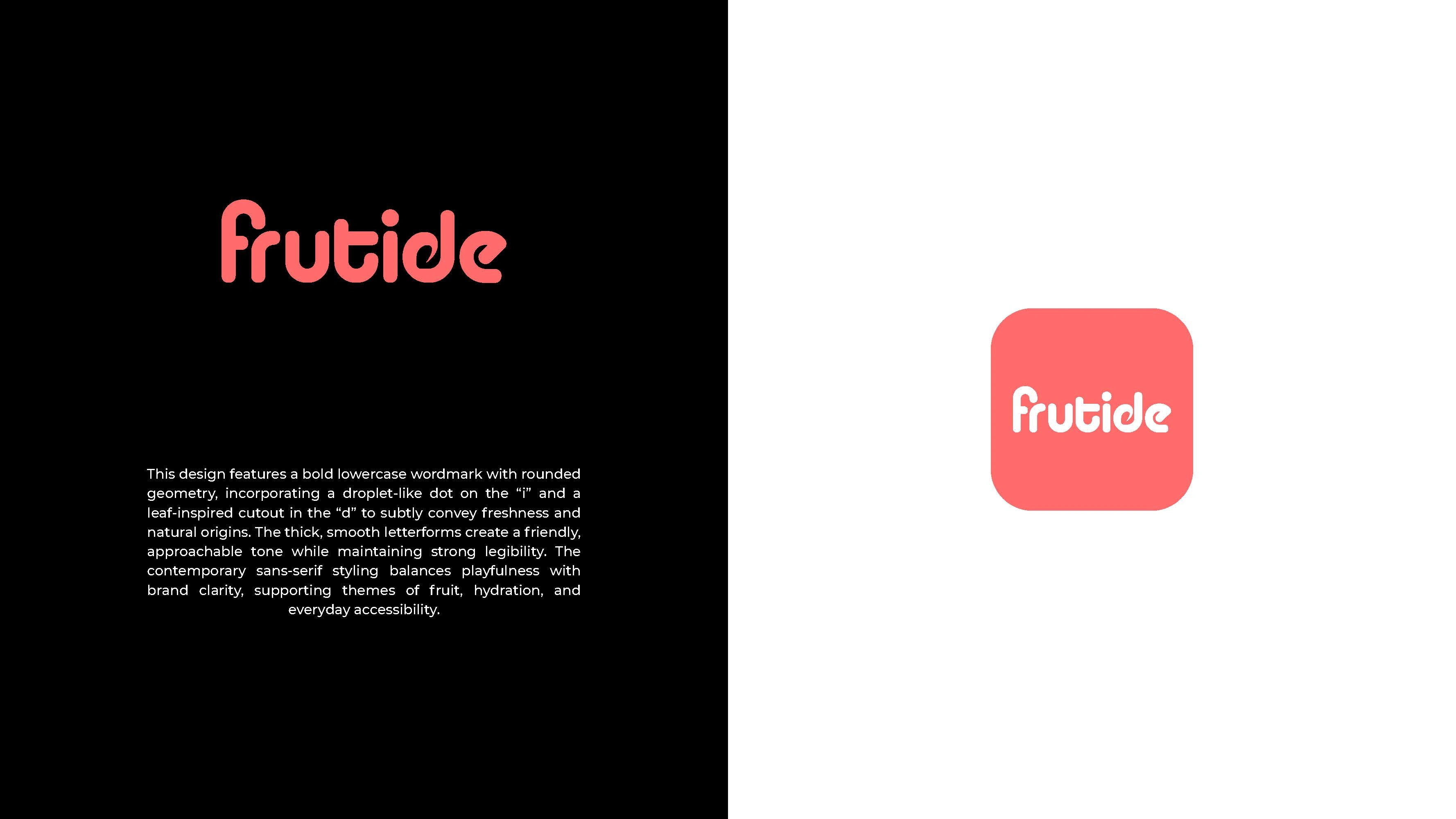
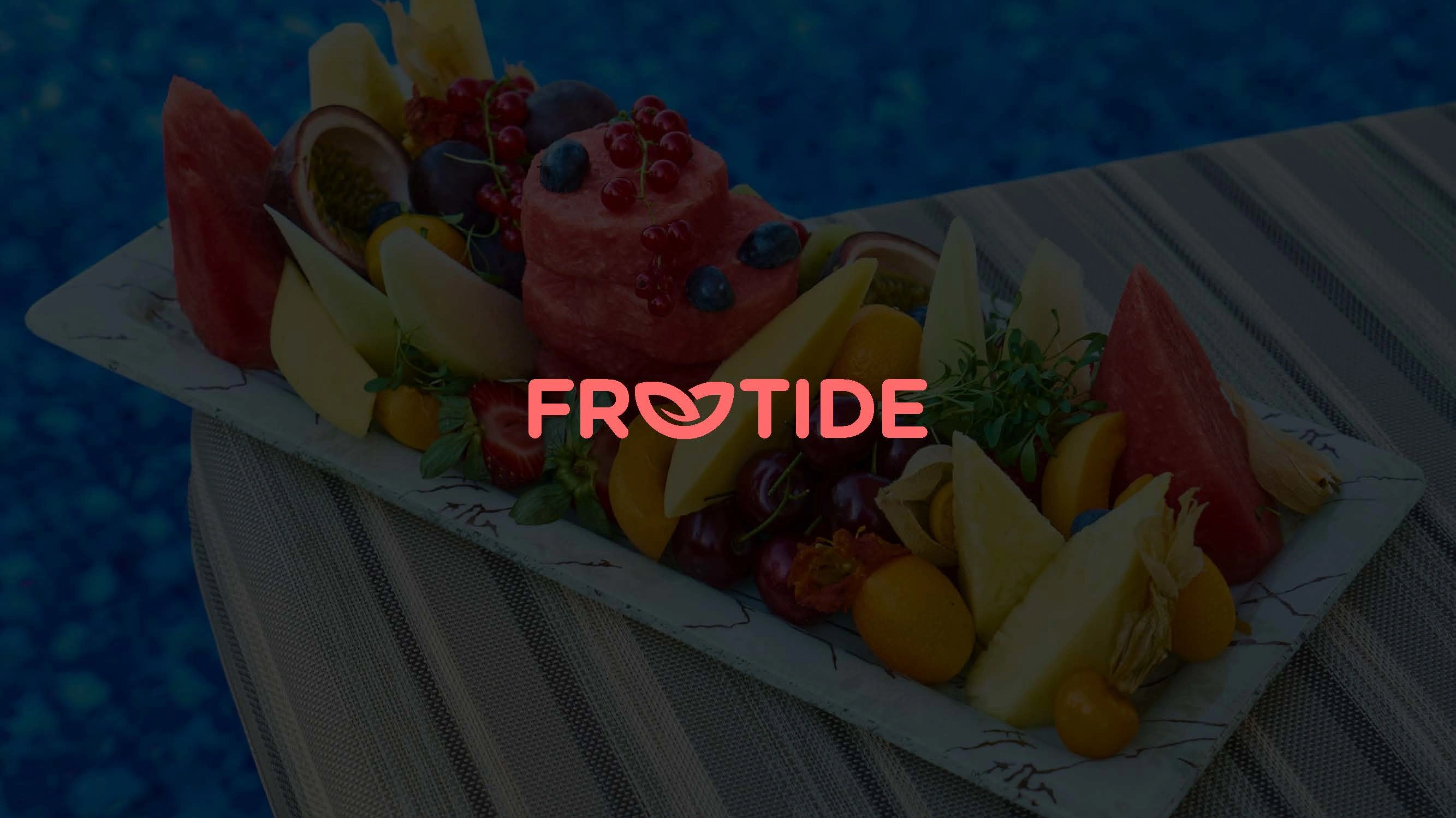
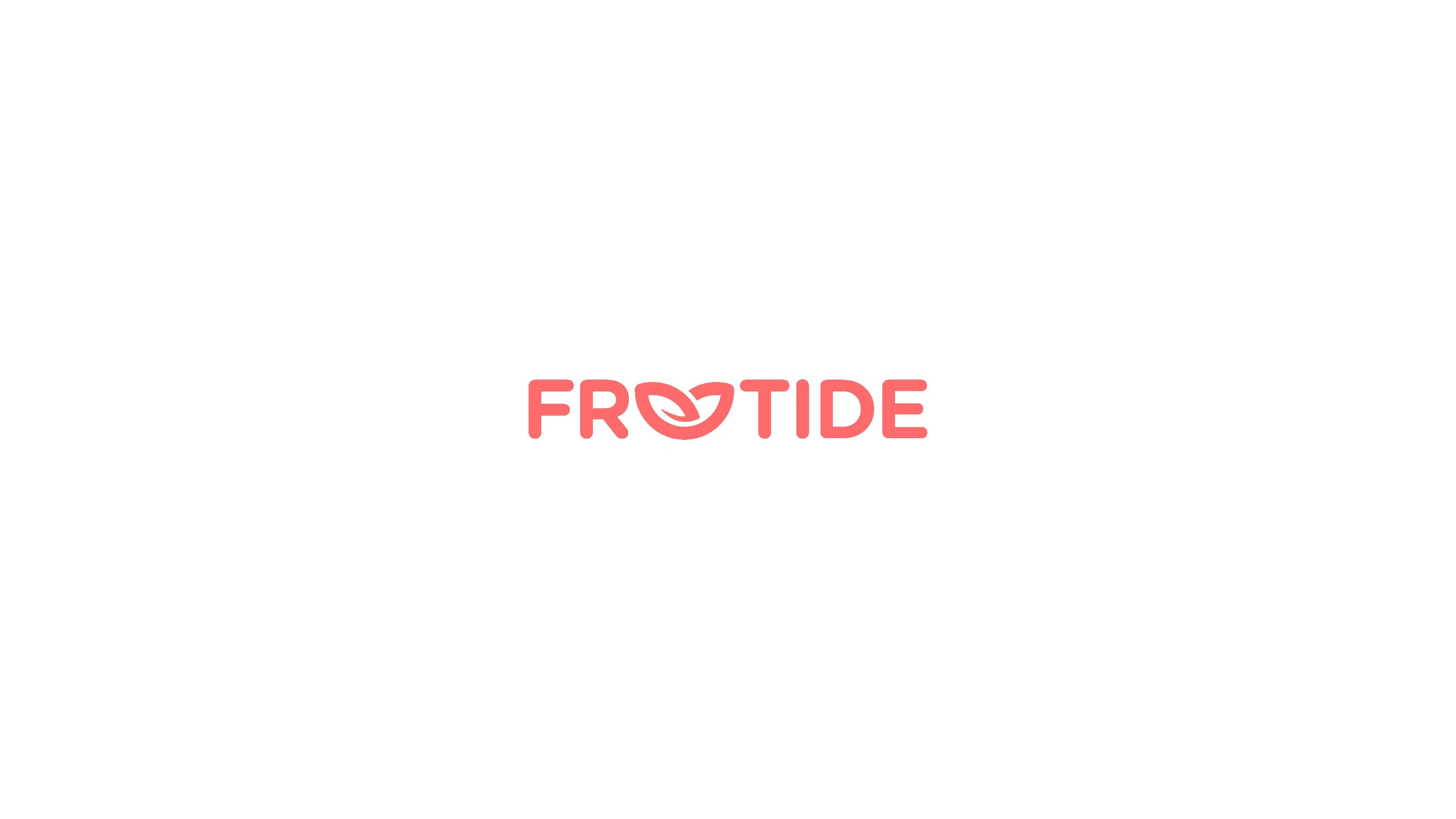
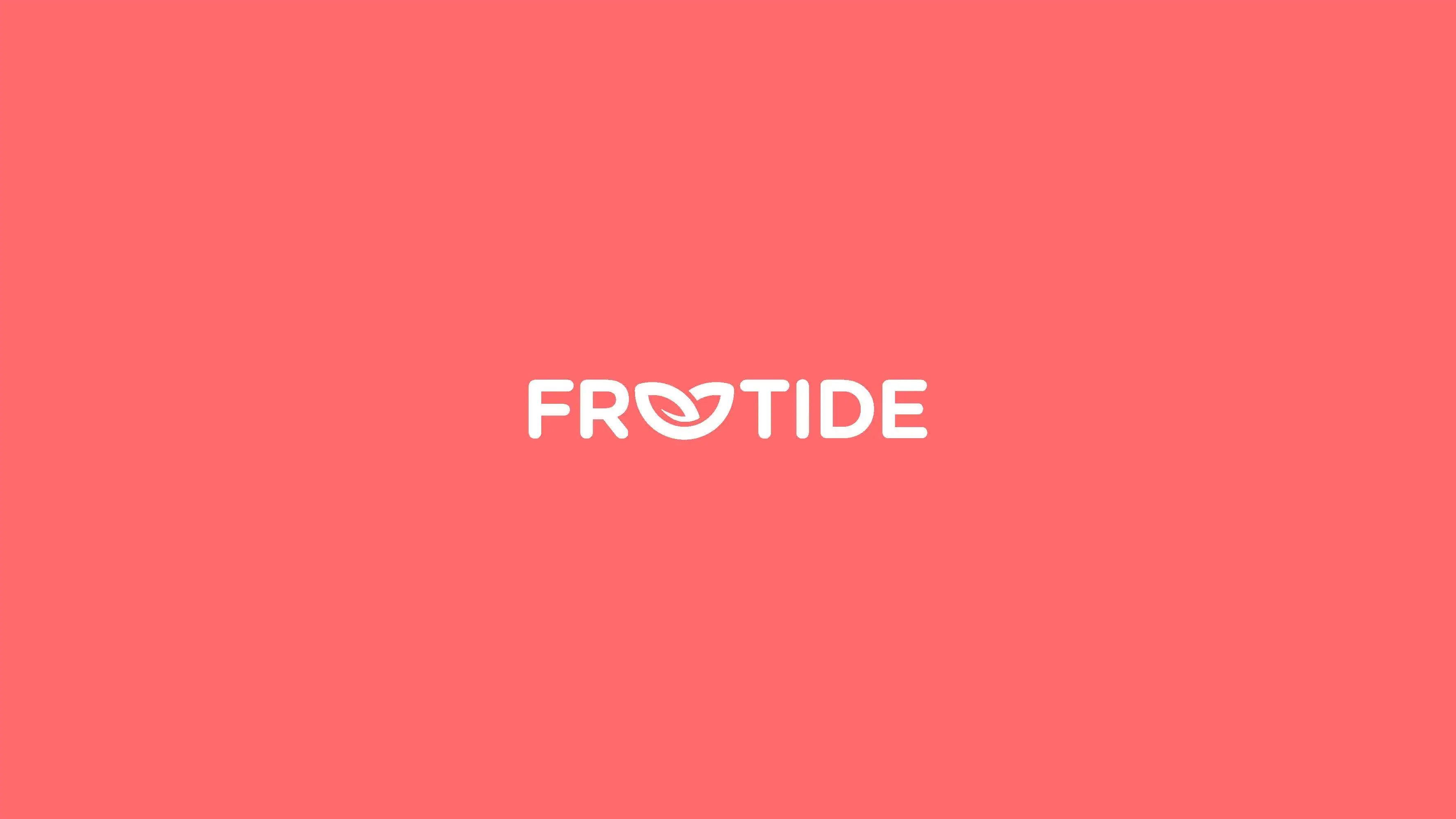
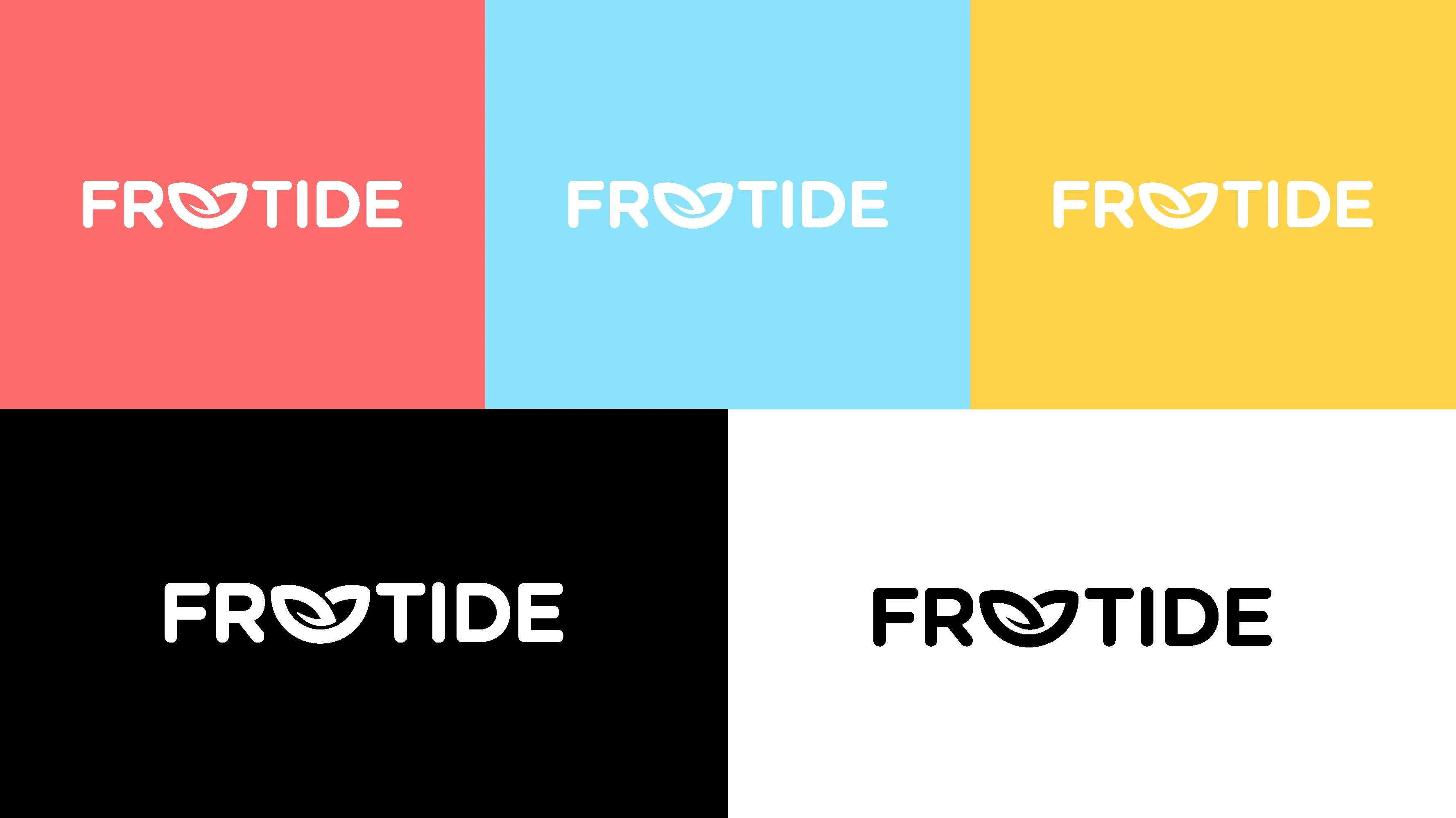
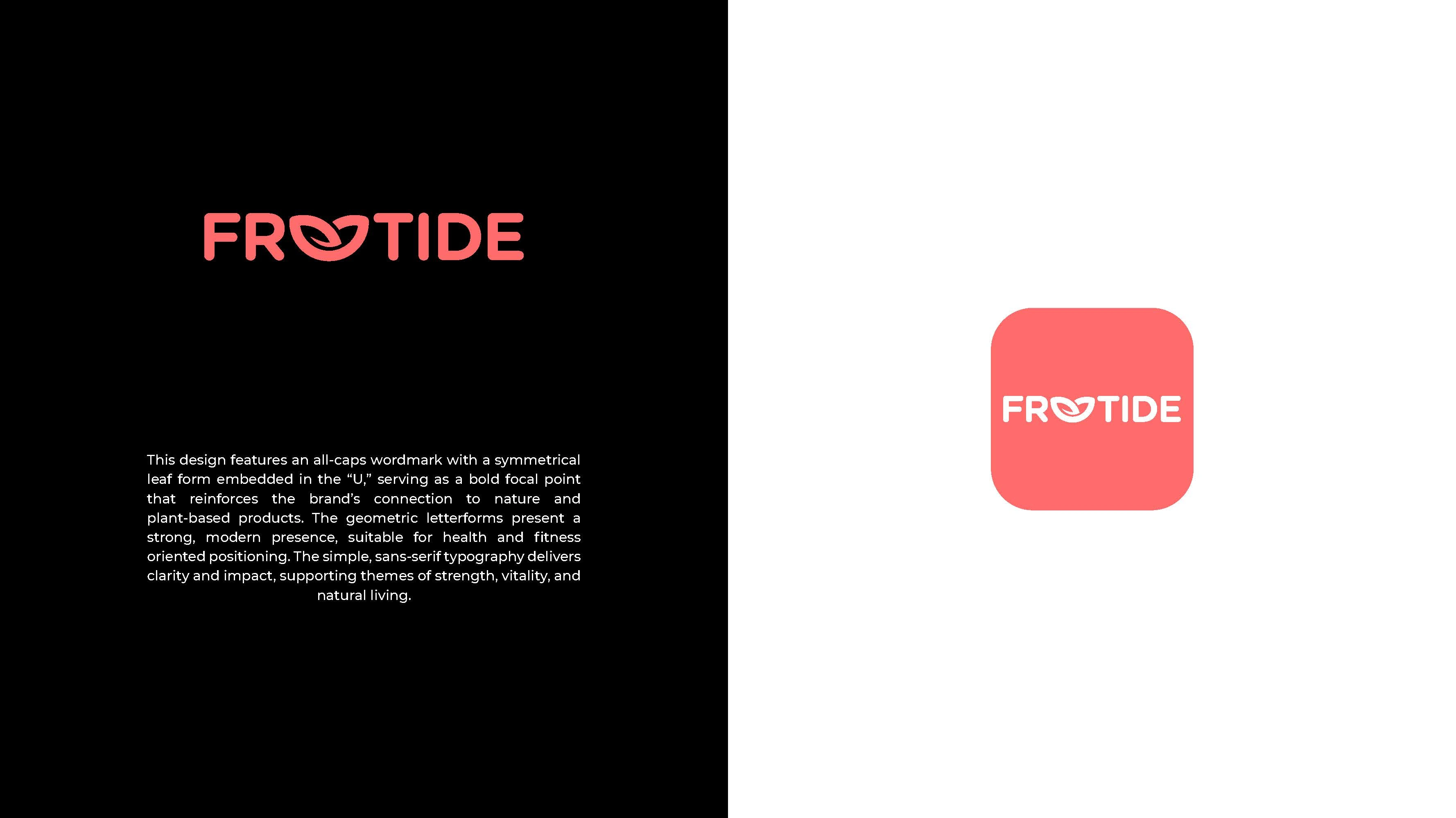
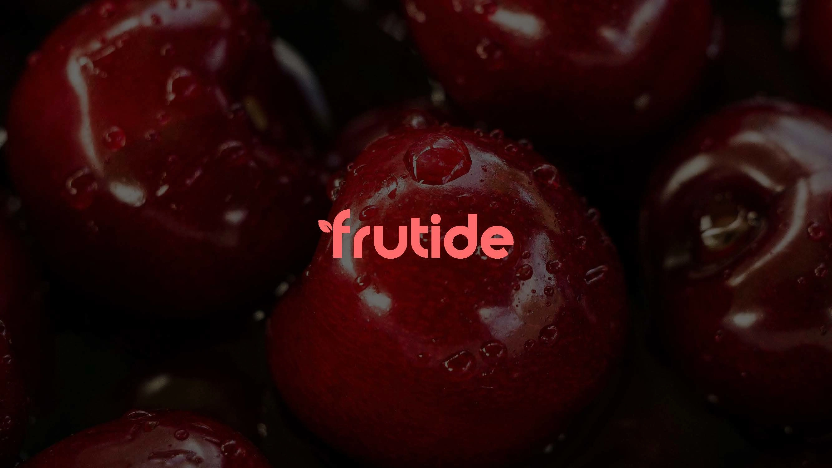
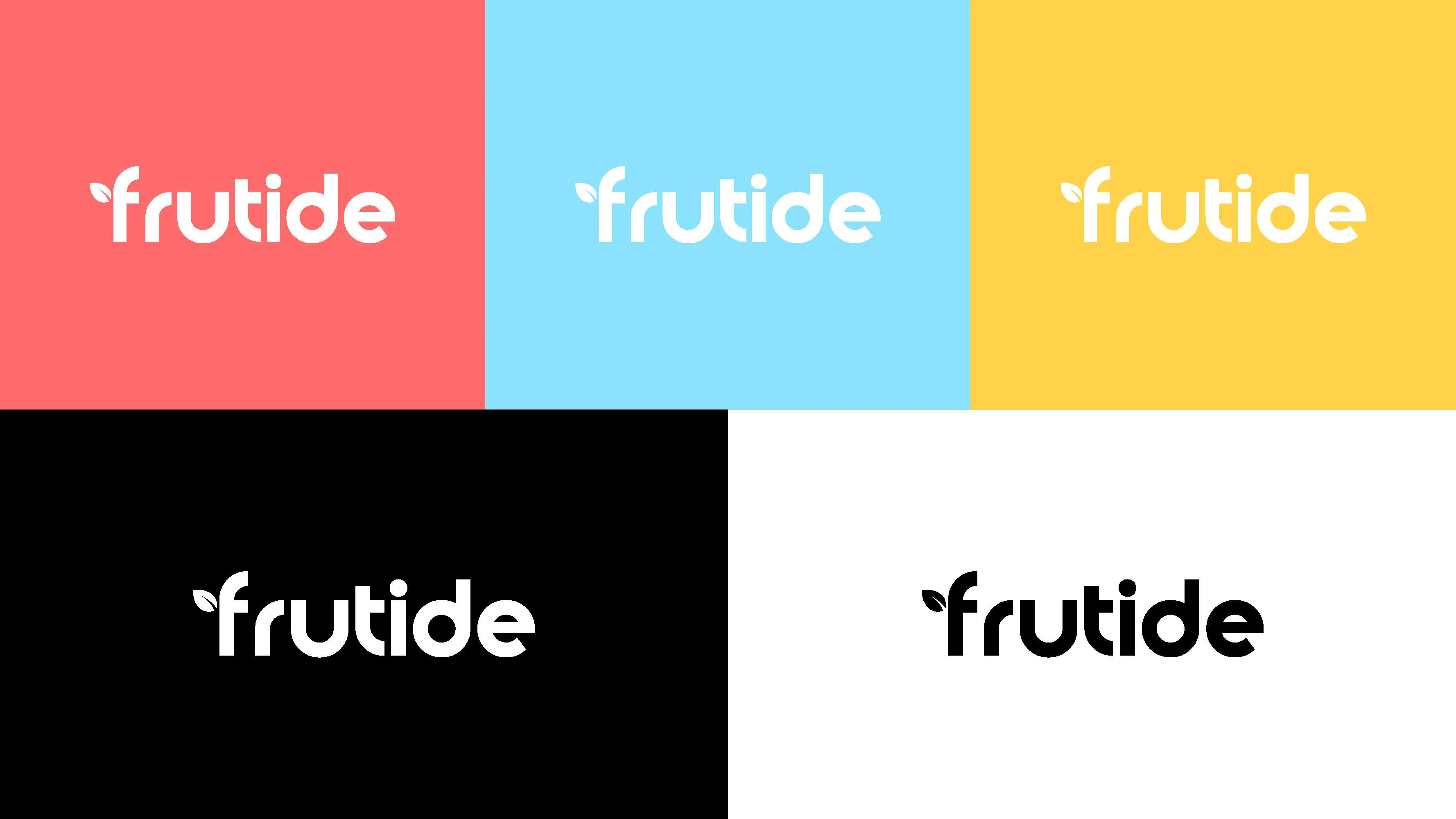
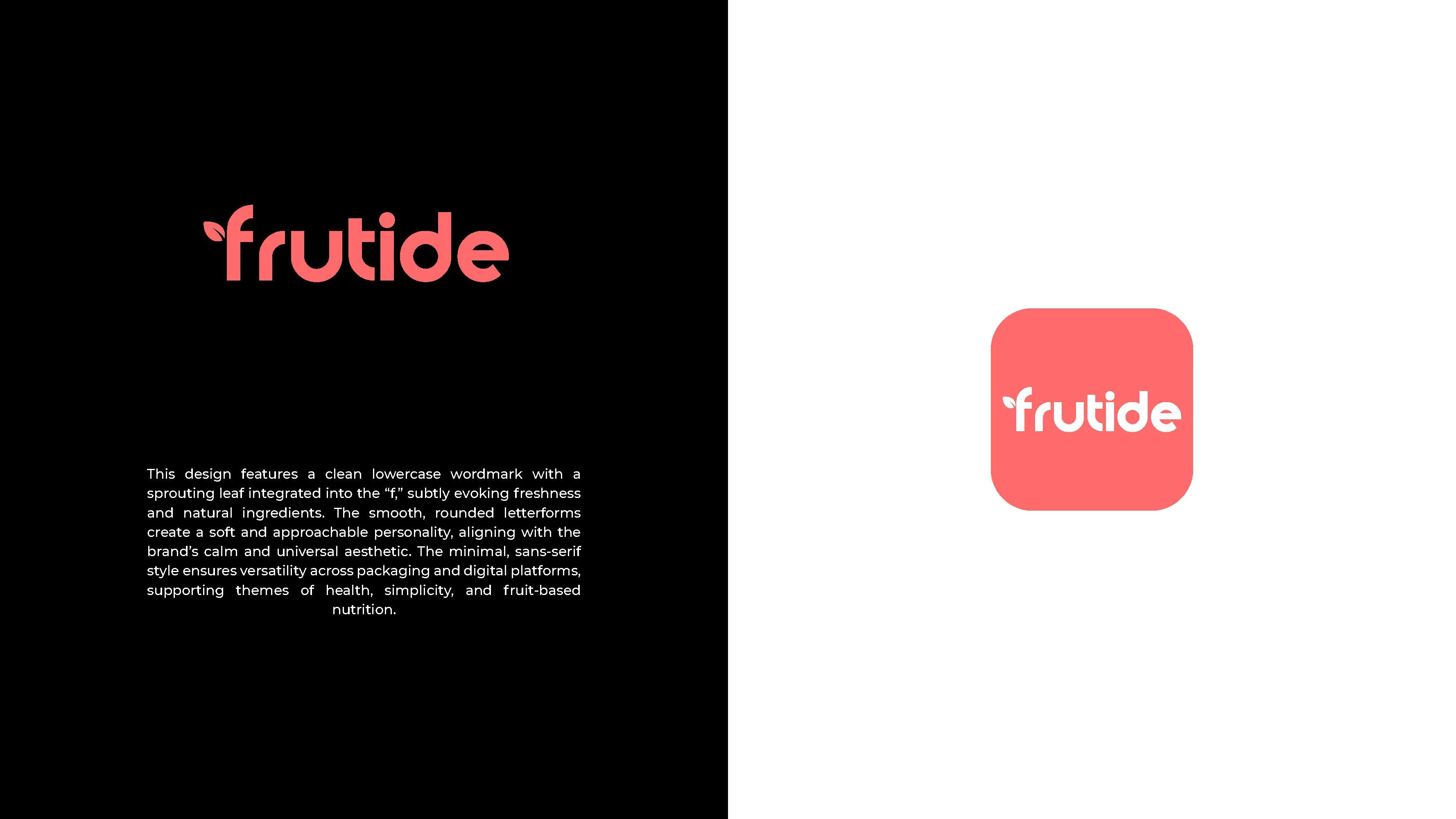
The three Frutide logo concepts each explore a modern, nature-inspired identity through distinct typographic treatments: Concept #1 uses a bold, rounded lowercase wordmark with subtle fruit and hydration cues like a droplet “i” and leaf detail, creating a friendly and approachable feel; Concept #2 takes a stronger, more structured approach with an all-caps geometric style and a prominent leaf embedded in the “U,” emphasizing vitality, strength, and a health-focused brand presence; while Concept #3 offers a softer, minimalist lowercase design with a sprouting leaf in the “f,” conveying freshness, simplicity, and a calm, natural aesthetic suited for versatile, everyday use.