Bayan Wasm Studio — Brand Identity & Visual System

Hafiz Muhammad Saad


About the Brand:
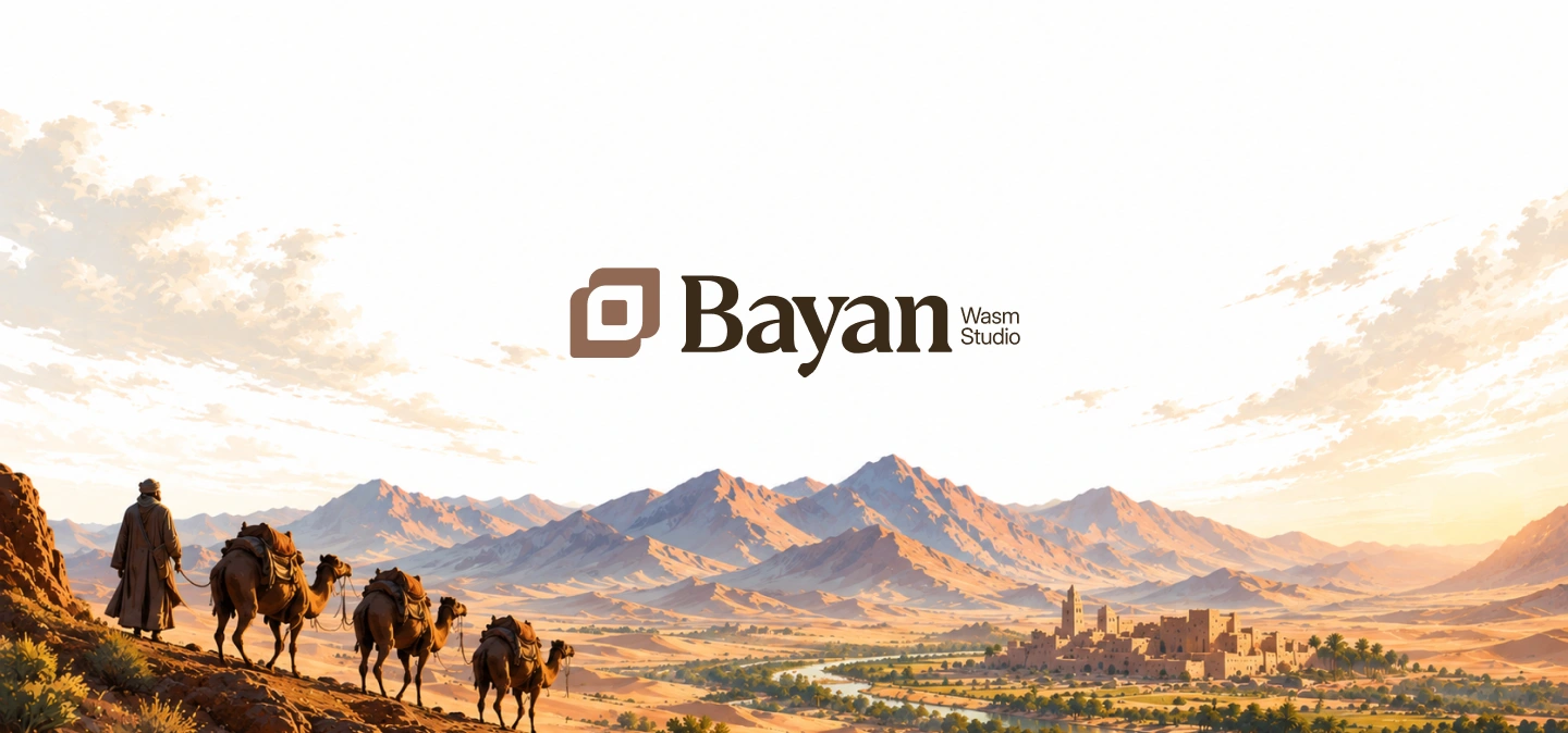
Bayan Wasm Studio is a brand identity and design studio rooted in the ancient Arab practice of the wasm — the mark burned into a camel's hide to declare ownership, identity, and lineage before the concept of a logo ever existed. Operating at the intersection of cultural depth and modern business outcomes, the studio engineers brand identities, visual systems, and digital experiences for founders and businesses who demand design that performs, not merely impresses. The name itself is a declaration of intent: Bayan (بيان) — to express and declare — and Wasm (وسم) — to mark with permanence. Together, they form the studio's foundational philosophy: every brand is a declaration, and every mark must be built to outlast the moment it was made in. Bayan Wasm positions itself not as a vendor of visual assets, but as a strategic partner for founders who understand that identity is infrastructure — the silent foundation upon which authority, trust, and market position are built.
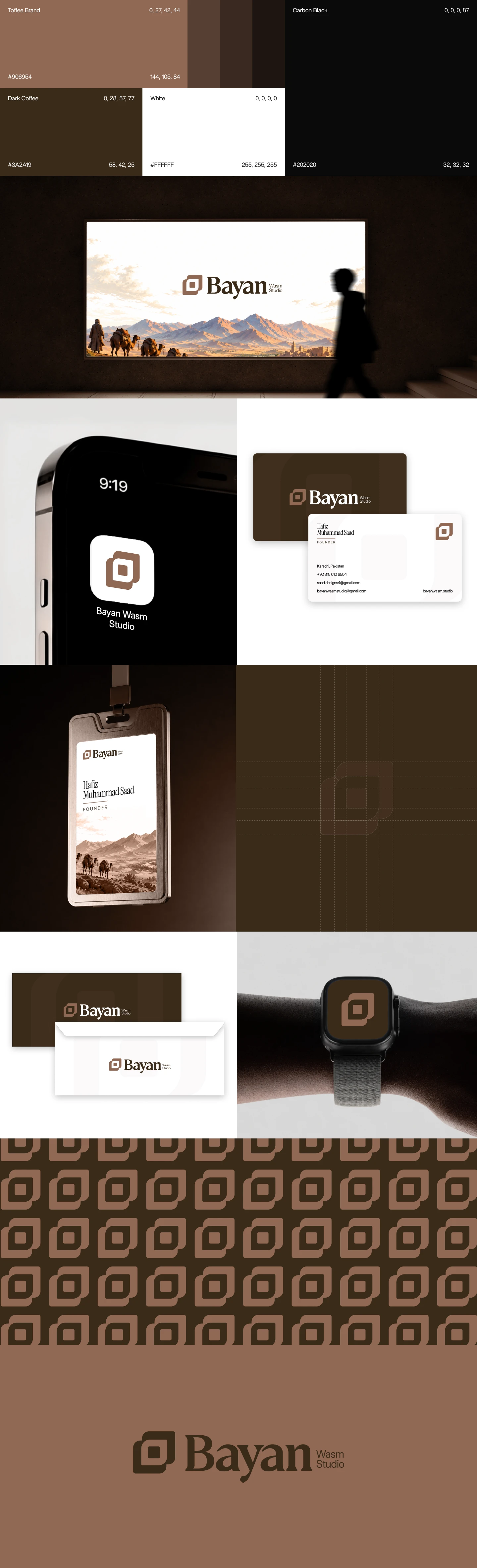
From a senior design perspective, the visual identity achieves a precise equilibrium between heritage and modernity. The primary mark — a layered, enclosed square form — references the sealed, geometric quality of ancient Islamic pattern-making and the structural permanence of architectural foundations, while maintaining the scalability and restraint demanded by contemporary digital environments. This is anchored by a deliberate earth-toned palette — deep camel brown, warm desert sand, and rich dark chocolate — extracted directly from the visual language of the Arabian landscape that inspired the studio's founding philosophy. The result is a brand world that is immediately distinct from the saturated, trend-dependent visual noise of the modern design industry. Paired with a heritage serif wordmark of refined weight and character, the complete identity system scales with authority across brand stationery, digital interfaces, large-format environmental applications, and motion — a production-ready identity built not for this season, but for the decades ahead.
Brand Identity | 2026
Like this project
Posted Sep 19, 2026
Bayan Wasm Studio engineers brand identities and visual systems rooted in Arab heritage—built for founders who demand design that performs and endures.
Likes
0
Views
1
Timeline
Jan 1, 2026 - Dec 31, 2026