Coachli rebrand


Coachli rebrand
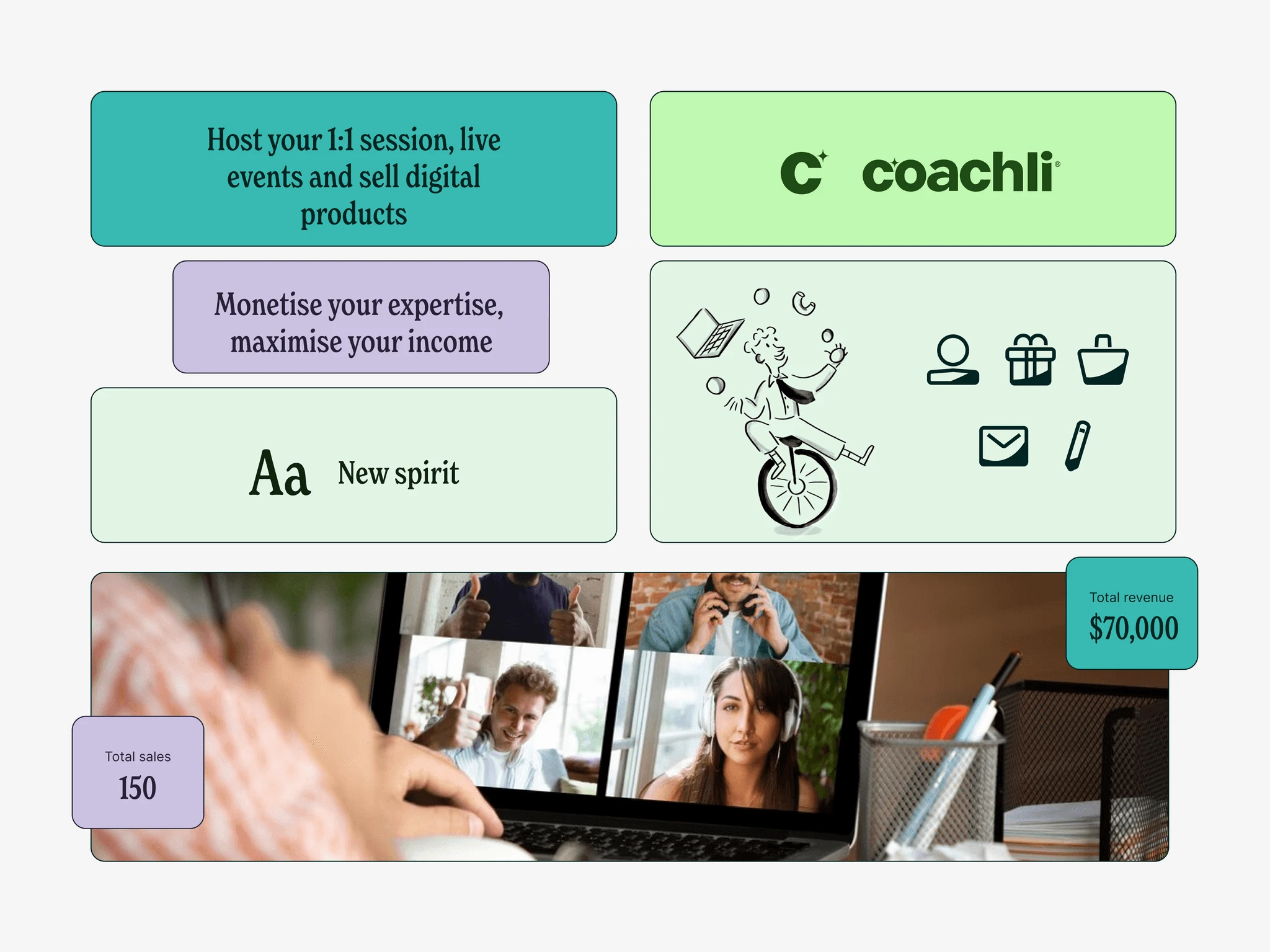
Coachli underwent a complete rebrand to enhance its visual identity, user experience, and overall appeal. This transformation included a new logo, updated typography, and a refreshed color palette. Additionally, we redesigned the landing page and dashboard to create a more engaging and seamless experience for users.
The problem
Before the rebrand, Coachli faced several design and usability challenges:
An outdated visual identity that lacked consistency and modern appeal.
A dashboard and landing page that were cluttered and unintuitive, affecting user experience.
Limited engagement and conversion due to ineffective UI and feature discoverability.
A design that did not align with industry standards, making it harder to compete.
The vision
The redesign aimed to elevate Coachli’s platform by improving functionality and user experience while introducing new features that address the evolving needs of coaches, mentors, and entrepreneurs. This included refreshing the visual identity with updated color schemes and fonts to create a modern and cohesive look. By enhancing the platform’s design aesthetics alongside its usability, the goal was to attract and retain users, support their ability to monetize their skills, and strengthen Coachli’s brand presence in the creator economy space.
My role
As a product designer, I made all the major design decisions. I restyled an existing design system and expanded it by adding new components.
Collaborating with the product team consisting of a brand designer and a product manager, we finalized UI screens and, through multiple sprints, refined designs based on user feedback.
I developed responsive layouts, implemented accessibility standards, and produced high-fidelity prototypes. Our efforts resulted in a successful product launch that met project objectives and garnered positive user feedback.
New brand identity
The rebranding of Coachli involved a complete refresh of its logo, color palette, and typography. The new logo was designed to reflect simplicity and strength, symbolizing growth and innovation. The updated color palette introduced vibrant and professional tones to create a welcoming yet confident atmosphere. Additionally, the new typography was selected to enhance readability while maintaining a modern and approachable feel, ensuring consistency across all brand touchpoints. The goal was to better align the brand with its mission to support coaches, mentors, and entrepreneurs in monetizing their expertise.
Design system
I revamped Coachli’s design system to ensure consistency and scalability across all platforms. This involved updating the color palette and typography to align with the refreshed brand identity, while also adding new components to enhance functionality and usability. My goal was to create a more flexible and cohesive design system that would improve the user experience, streamline development processes, and support the platform's growing features, ultimately delivering a seamless experience for coaches, mentors, and entrepreneurs.
Design process
In the design process for Coachli's rebrand, I worked closely with stakeholders, the development team, project manager, and marketing team to ensure alignment and effective collaboration at every stage. I began by revamping the landing page to reflect the refreshed brand identity and improve the user experience. Additionally, we introduced new key pages such as:
1:1 session page
Digital product page
Live events page, and
Multiple currency pages to expand the platform’s offerings.
I then focused on polishing the dashboard and updating colors and fonts to ensure consistency with the new brand direction. Simplifying the user flows was a key part of the process, making navigation more intuitive and seamless for both new and existing users. This design process was rooted in user needs and content strategy, ensuring that every decision—from visual design to functionality—resulted in a cohesive, efficient, and visually appealing platform.
Design journey
We conducted multiple design sprints, refining the designs through continuous feedback and adjustments. This collaborative process with stakeholders and the team allowed us to create a design that’s both visually impactful and highly functional. By prioritizing user needs at every stage, I developed an interface that not only looks polished but also provides a smooth, intuitive user experience. The result is a product that effectively balances aesthetics with usability.
Result and impact
The rebrand brought remarkable improvements in user growth and financial performance:
5000+ New Users: Before the rebrand, Coachli had 5000 users. After launching the new design, the user base doubled to over 10,000, showing a major boost in interest and engagement.
$144,000 Paid Out to Coaches: With an improved platform, more transactions took place, resulting in a total payout of over $144,000 to coaches. This reinforced Coachli’s value in helping professionals earn from their expertise.
Like this project
0
Posted Mar 24, 2025
-The user base doubled to over 10,000 showing a major boost in interest -More transactions took place, resulting in a total payout of over $144,000 to coaches
Likes
0
Views
0
Timeline
Nov 10, 2023 - Sep 16, 2025


Roomie Mobile app

Vault - A personal finance mobile app