Avant - Architecture studio

Naomie Nadeau


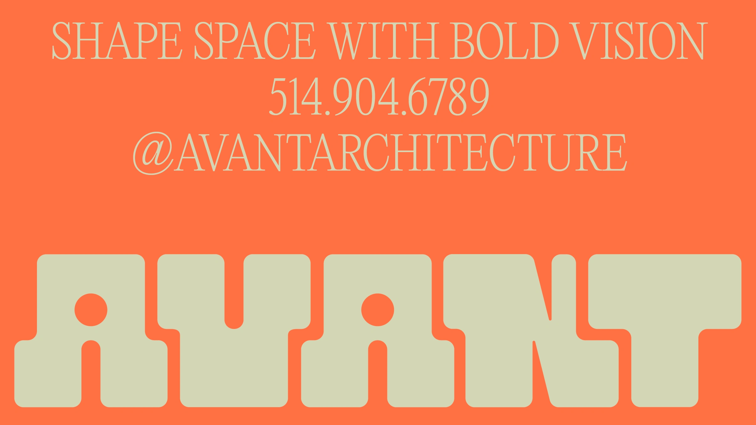
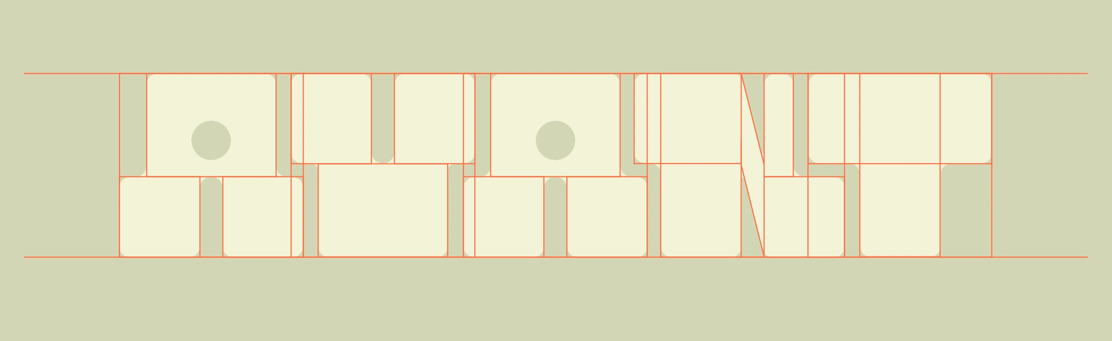
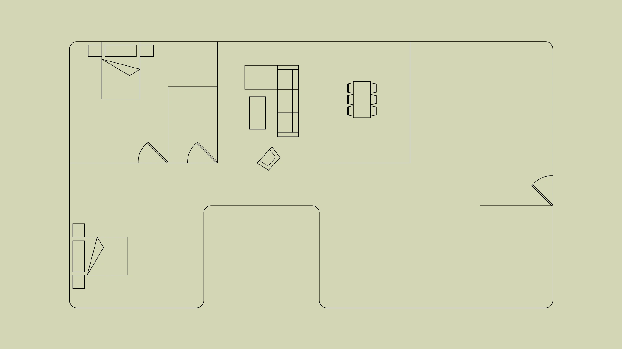
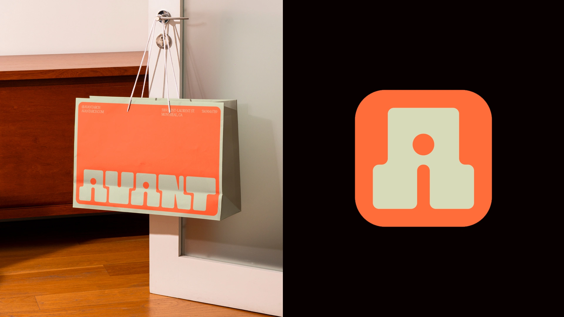
Avant is an architecture agency that redefines space with a bold and modern vision. Its visual identity is designed like an architectural plan: structured, modular, and meticulously crafted. The logo, built from scratch, is based on a modular grid inspired by the technical drawings used in architecture, creating a balance between precision and creativity.
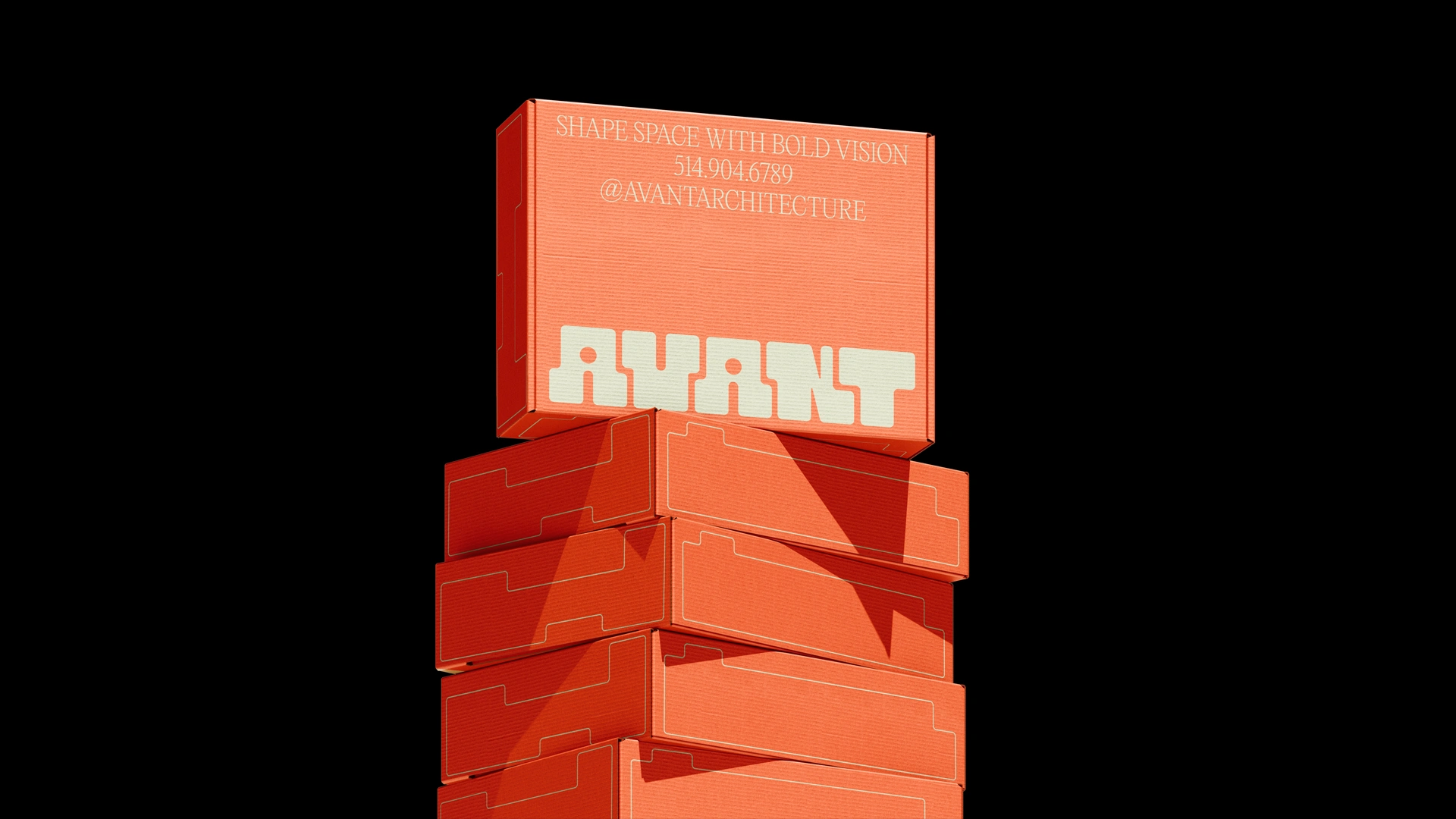
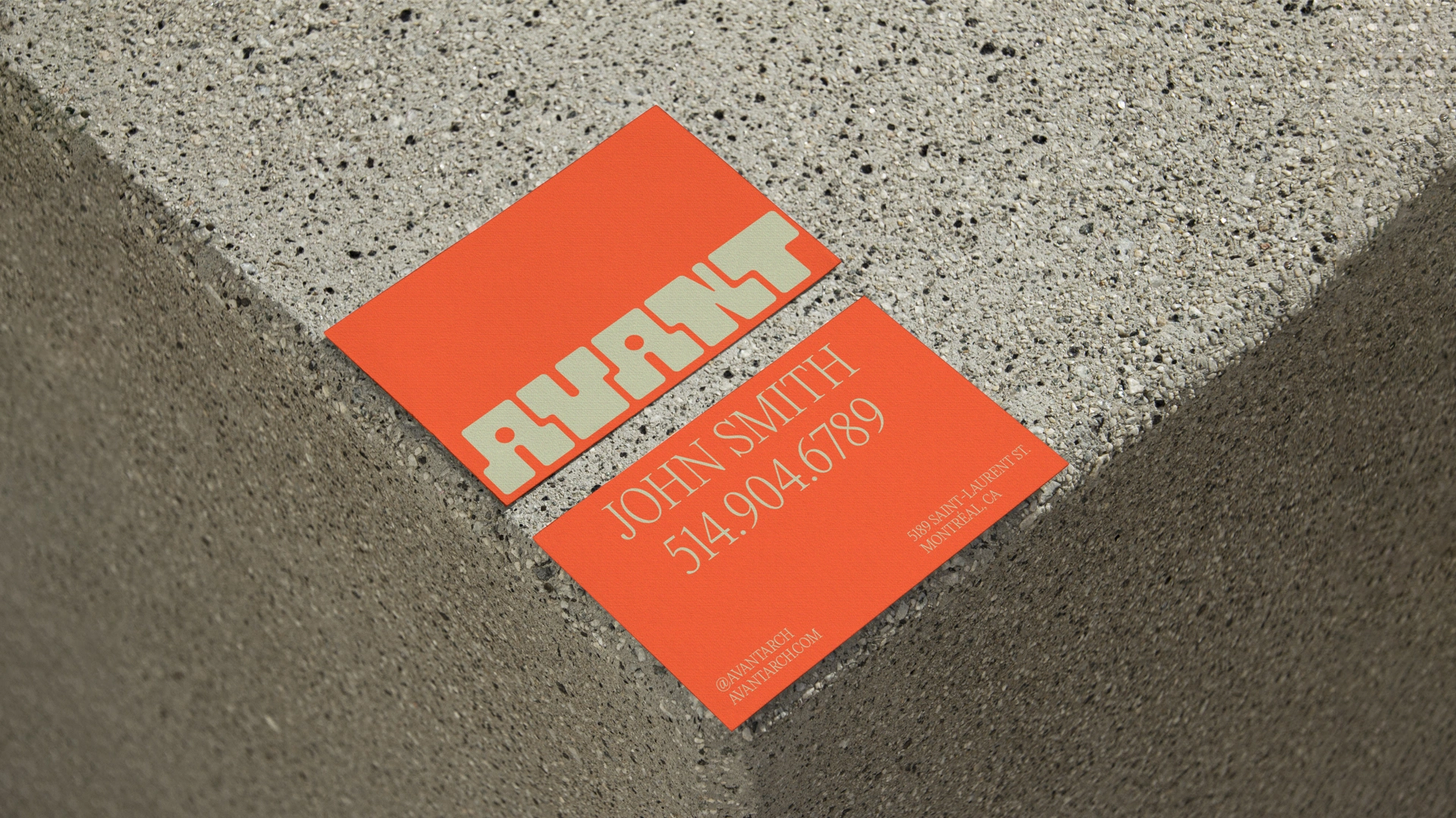
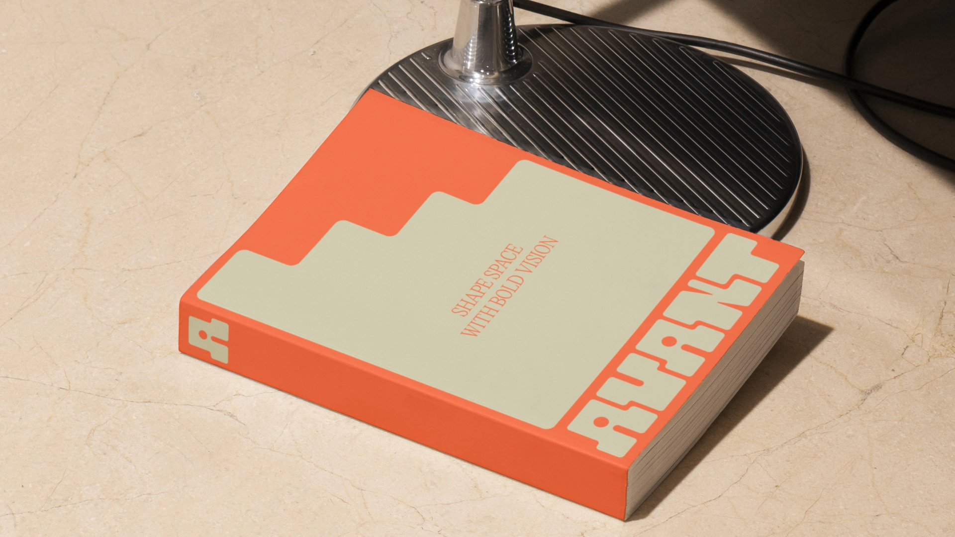
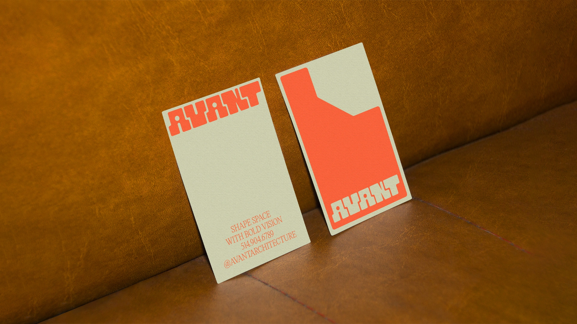
The use of vibrant orange injects dynamic energy and highlights the brand’s bold approach. It contrasts with neutral and refined tones, evoking raw materials and the clean lines of contemporary architecture. The typography, geometric and assertive, reinforces the technical aspect while remaining accessible and impactful.
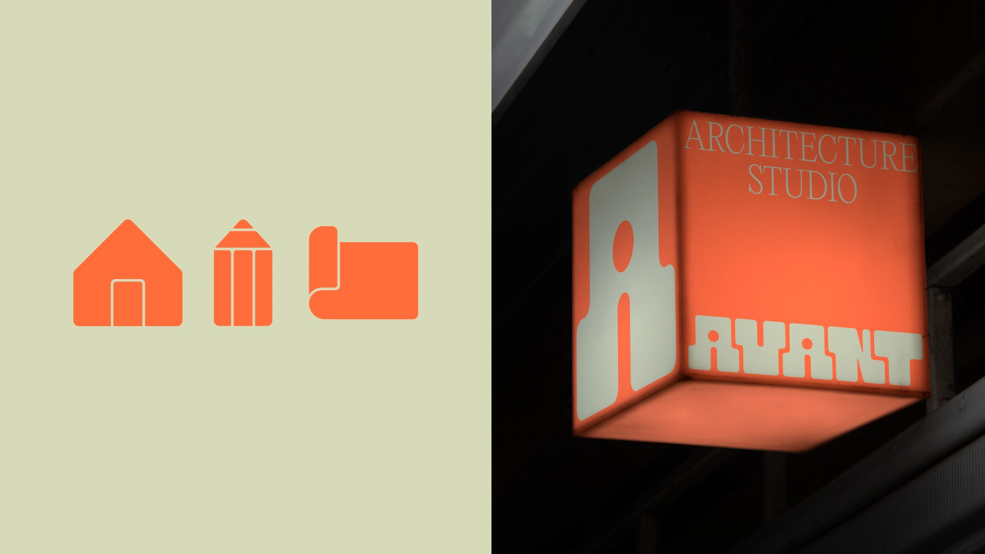
Avant’s visual identity is more than just a logo—it is an extension of its philosophy. Every graphic element—from the layout system to icons—follows a structured framework reminiscent of space construction, where every line has its purpose and every module finds its place.
With Avant, architecture is not just drawn—it is shaped with boldness and precision.
Like this project
Posted Sep 10, 2025
Architecture studio that redefines space with a bold and fresh vision. Its visual identity is conceived like an architectural blueprint: structured and modular.