Pro-Ject Audio Systems Visual Identity Redesign
Gabriel Magalhães

About
Pro-Ject Audio Systems has been crafting high-fidelity audio equipment for over three decades, from precision turntables and tonearms to speakers and streamers. Despite their technical excellence and diverse product range, their visual identity lacked personality and direction.
The previous logo was generic and forgettable. Without a cohesive visual system, Pro-Ject's communications often mimicked Apple's aesthetic, a puzzling choice for a brand whose craftsmanship and heritage are fundamentally different. This approach failed to resonate with audio enthusiasts who value authenticity over generic minimalism.
As vinyl experiences a renaissance and high-fidelity audio gains broader appeal, Pro-Ject needed an identity that would honor their engineering heritage while speaking to both seasoned audiophiles and newcomers.
The Solution
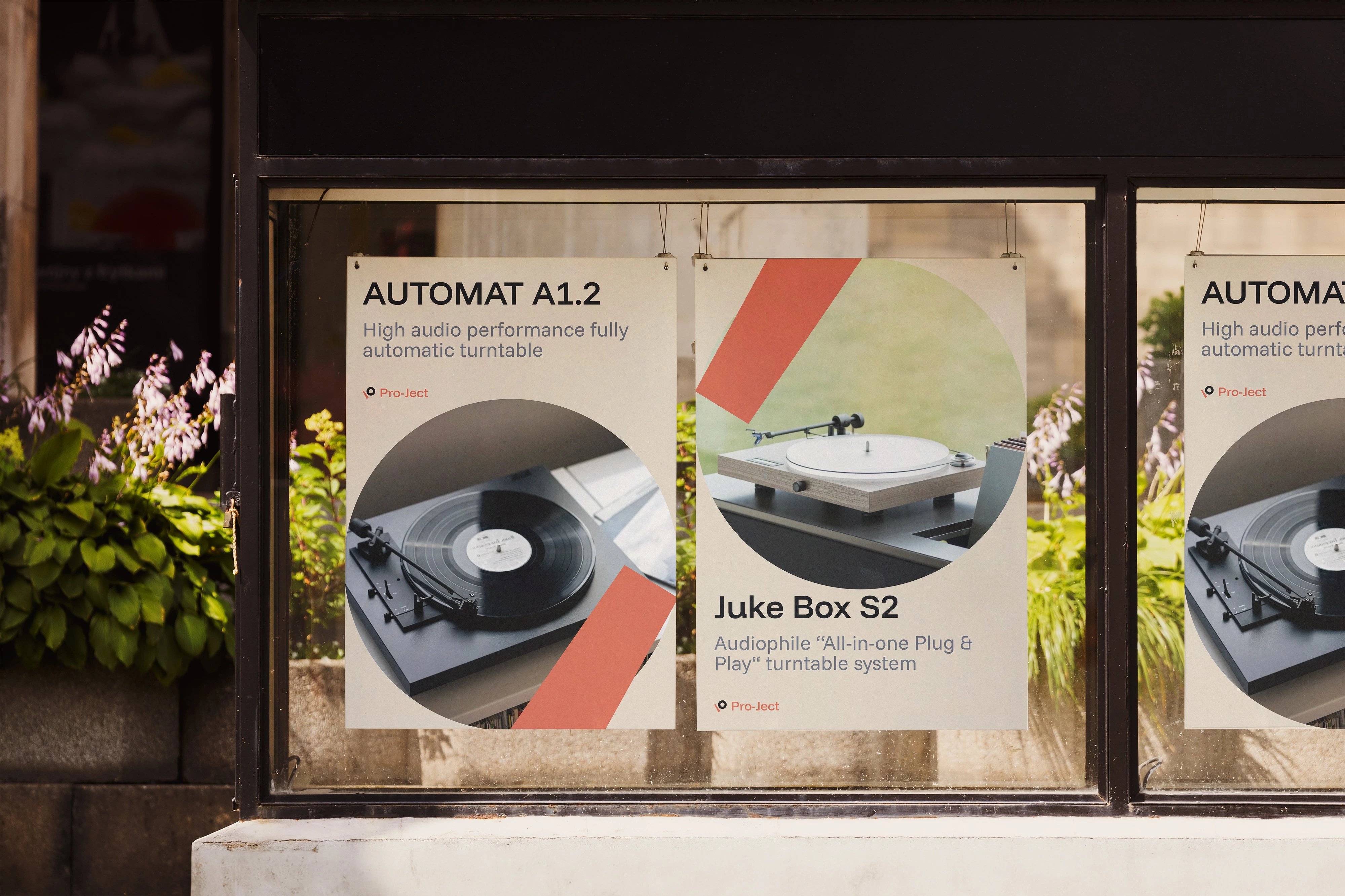
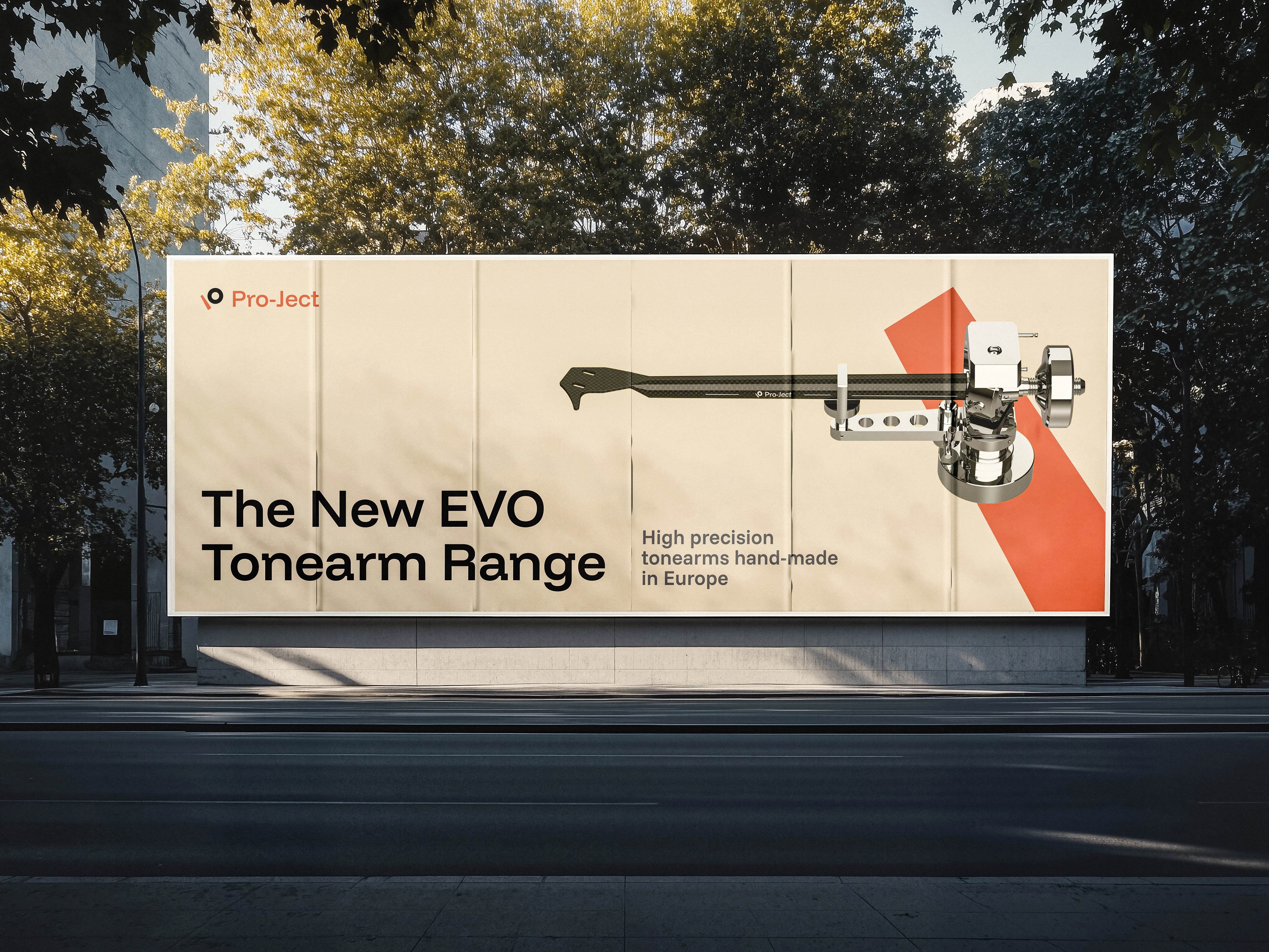
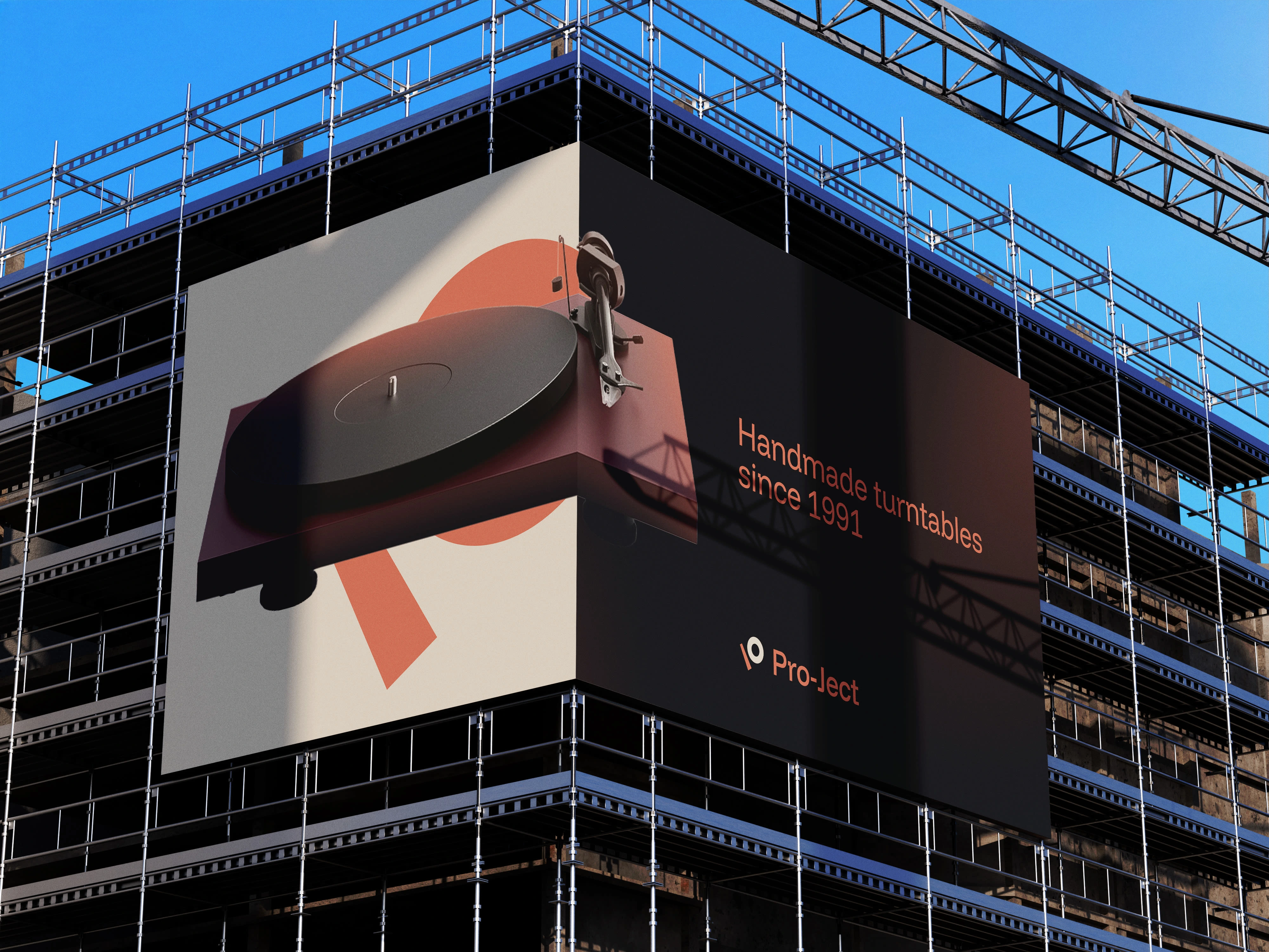
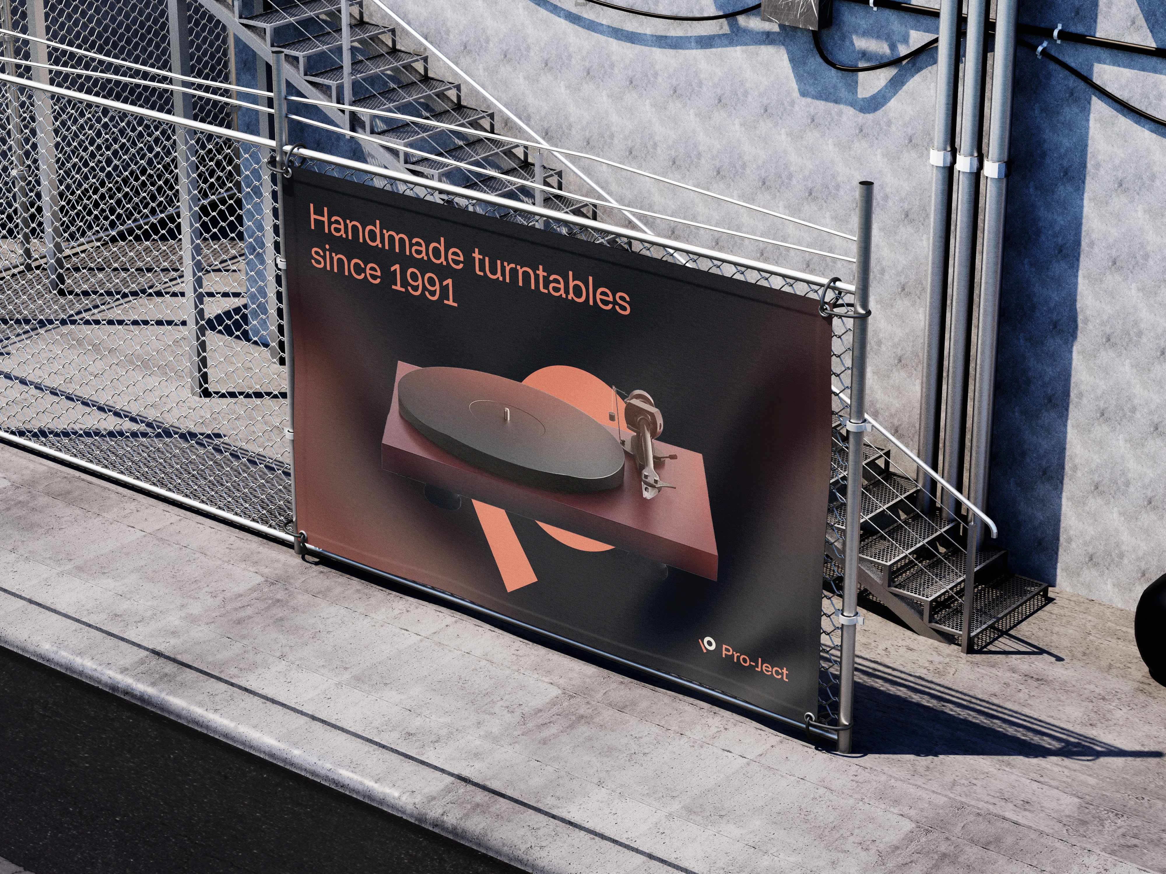
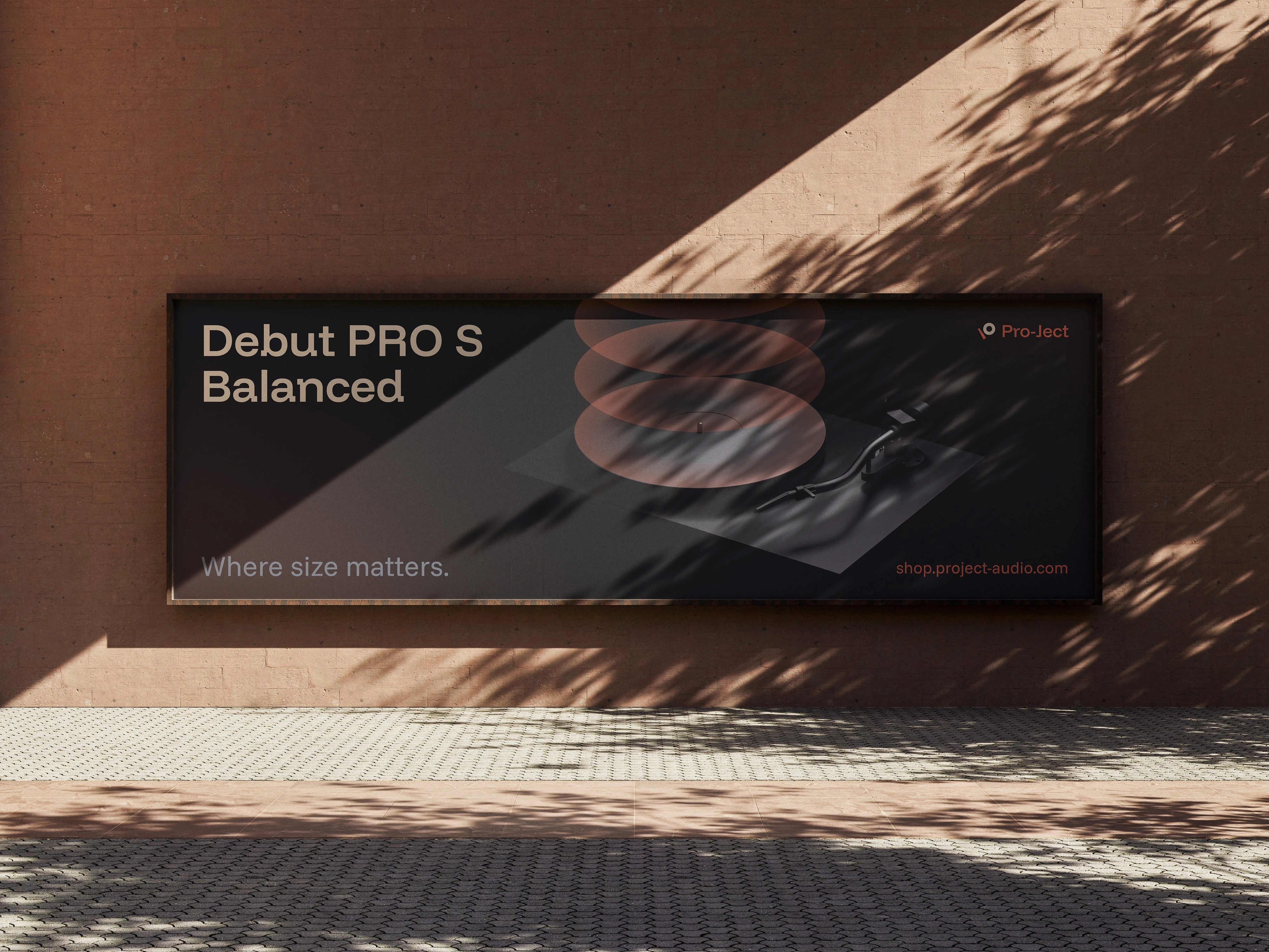
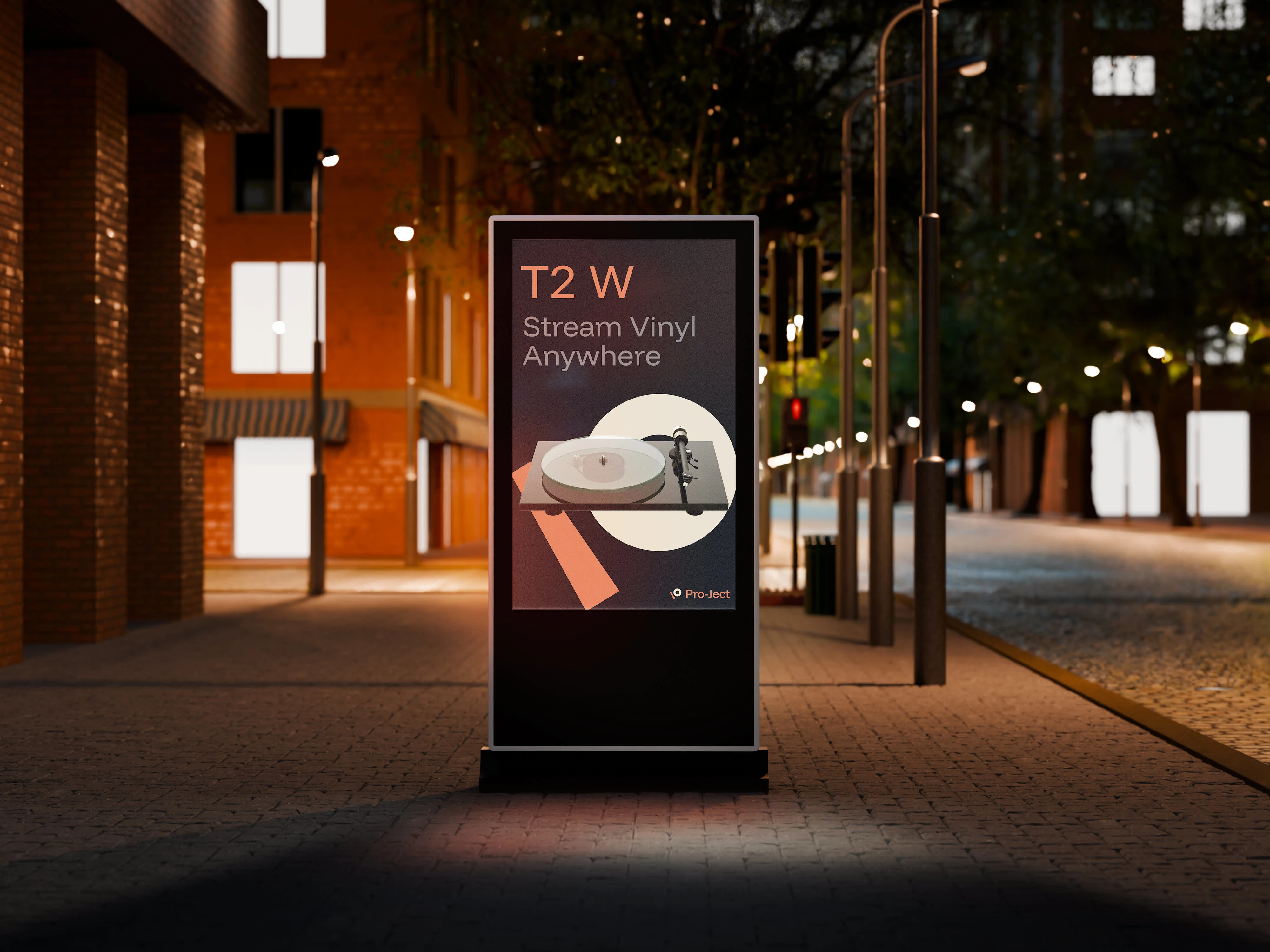
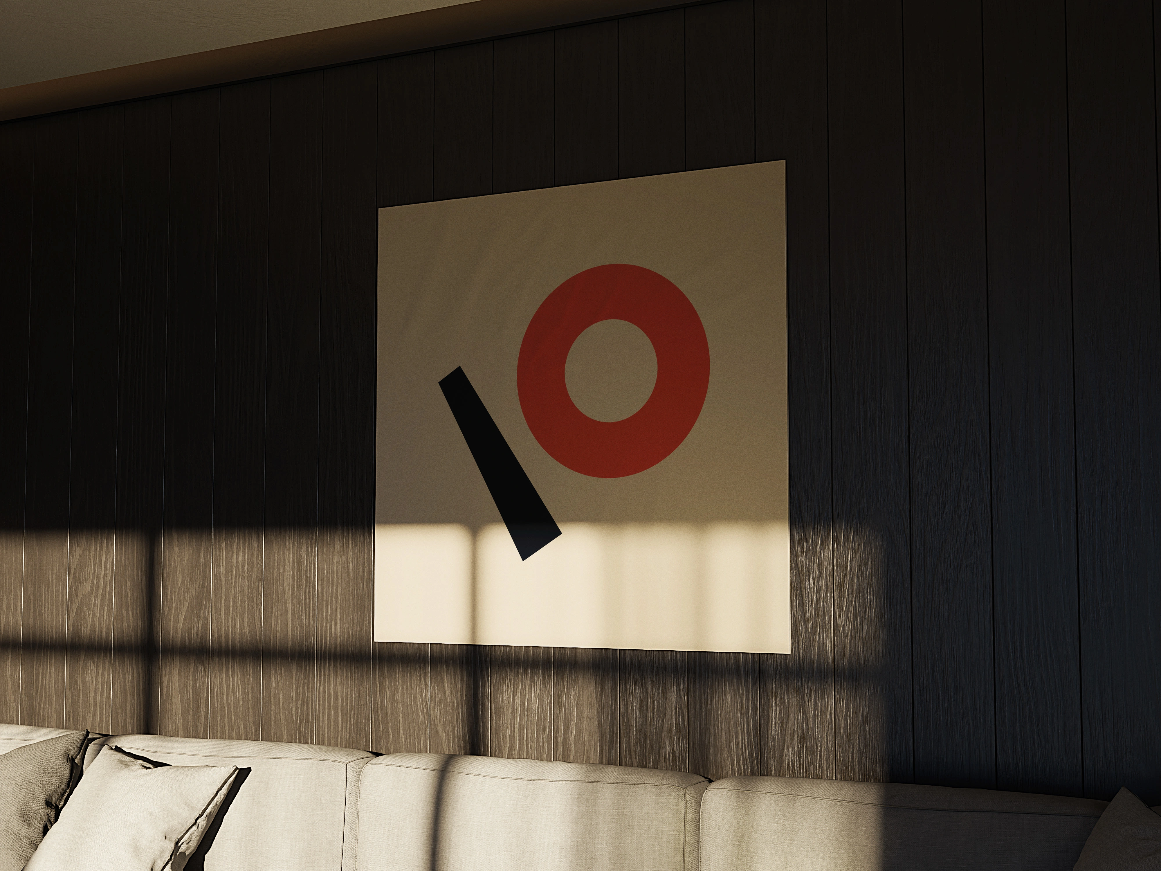
The new identity celebrates Pro-Ject's core expertise: vinyl reproduction. The symbol represents a vinyl record with its tonearm viewed from above, creating an abstract "P" through the interplay of the circular record and diagonal arm. This isn't decorative but reflects the precision engineering that defines Pro-Ject's approach.
The color strategy creates a sophisticated hierarchy: warm terracotta (#D66853) serves as the primary brand color for call-to-actions and key visual elements, supported by deep charcoal (#0C0F16) for backgrounds and primary text, warm neutral (#E1D6C4) for secondary surfaces, and refined grey (#666D7B) for supporting information. This palette brings warmth and craftsmanship to the brand while ensuring excellent functionality across digital and print applications.
The modular system works seamlessly across Pro-Ject's extensive product range. The separated symbol elements offer flexibility for digital applications, while the complete logomark provides strong brand recognition.
The typographic system features the Funnel family: Funnel Display for headlines and key messaging, with its distinctive square terminals that add crafted personality, and Funnel Sans for supporting text and interface elements. This dual approach creates clear hierarchy while maintaining visual consistency.
Impact
The new identity moves Pro-Ject away from generic tech aesthetics toward authentic brand expression. By embracing their unique position where technical excellence meets passionate craftsmanship, the visual system communicates with both dedicated audiophiles and newcomers to high-fidelity audio.
Pro-Ject now has a distinctive visual language that's as carefully crafted as their turntables, and as warm as the music they help bring to life.
Note: This is a personal design exploration and not an official Pro-Ject Audio Systems project.
Like this project
Posted Aug 13, 2025
Redesigned Pro-Ject's visual identity to reflect their craftsmanship and appeal to audiophiles.
Likes
8
Views
53