New Hire Training: Linux OS
I revamped the main design of the training presentations in one of my previous employers. The very first topic that I applied this on is in the Linux OS Training Session.
Look and Feel
The initiative was easy but challenging at the same time. Our company's old training materials are already dated in terms of design so the bar wasn't that high. But I also wanted to emphasize the content and ideas by utilizing crisp typography and efficient use of whitespace without it being too "white".
Sections
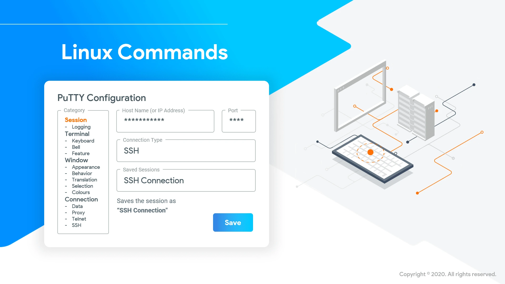
I also wanted to create a "state" indicator using the simple graphic on the side. Since the training session is technical, I categorized the sections into overviews (monitor), hands-on or setup (keyboard), backend, or machine-related (CPU).

Slide Type - Main Section

Slide Type - Main Section with Setup Configuration
Putting it all together
After establishing the look and feel of the presentation, I proceeded to apply it to sub-sections of the presentation.

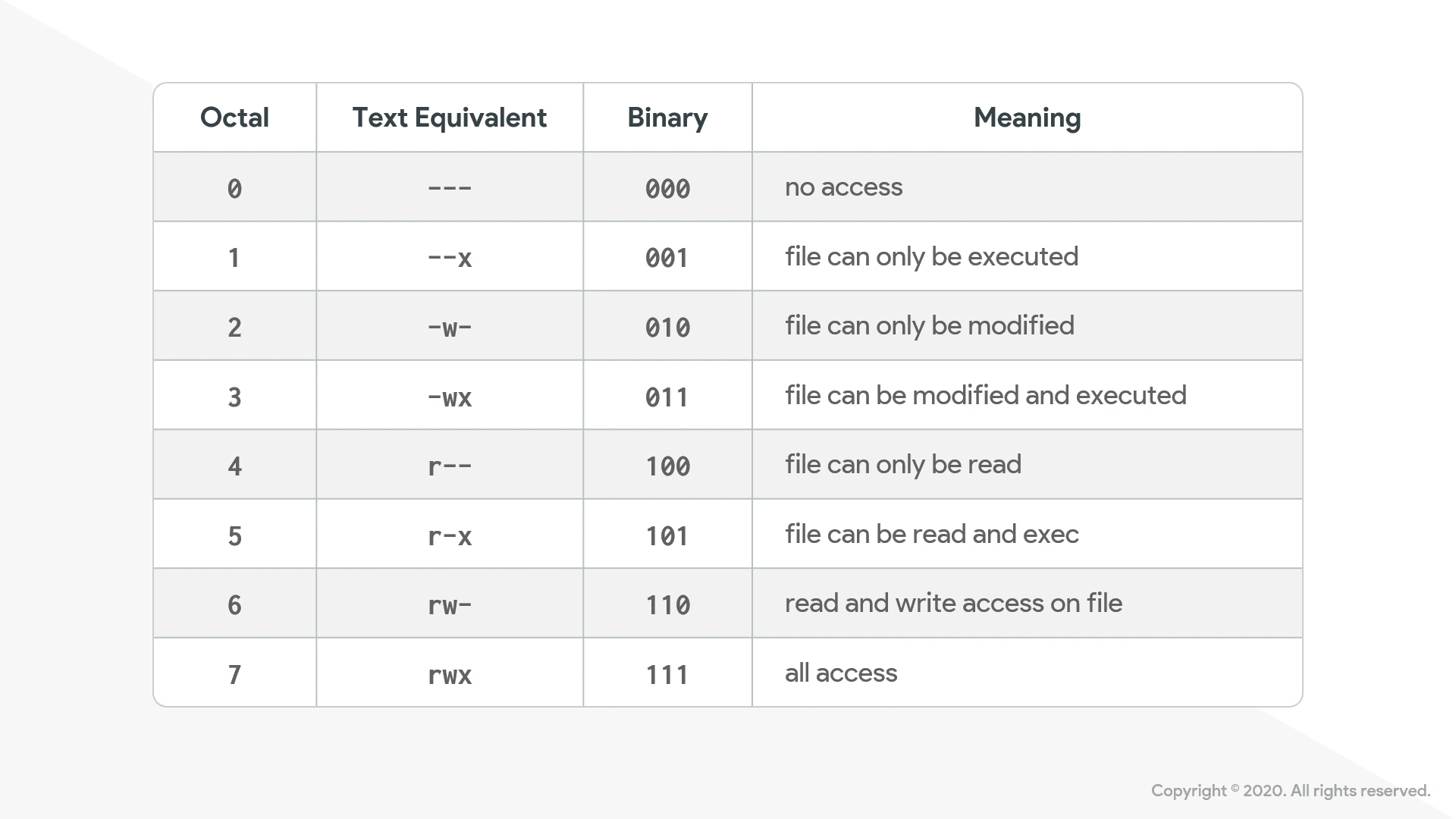
Slide Type - Tables

Slide Type - Divider

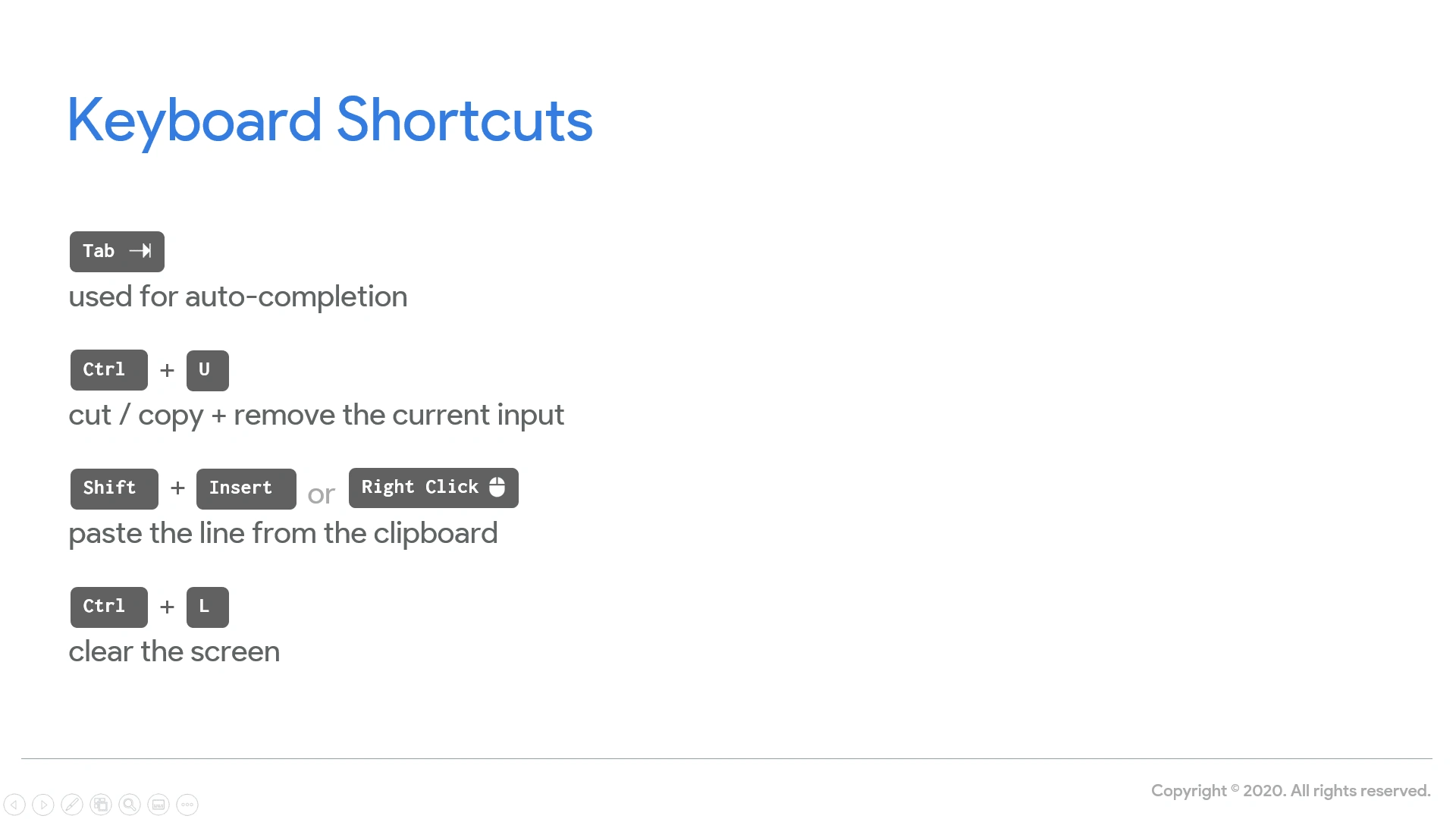
Slide Type - Keyboard Shortcuts

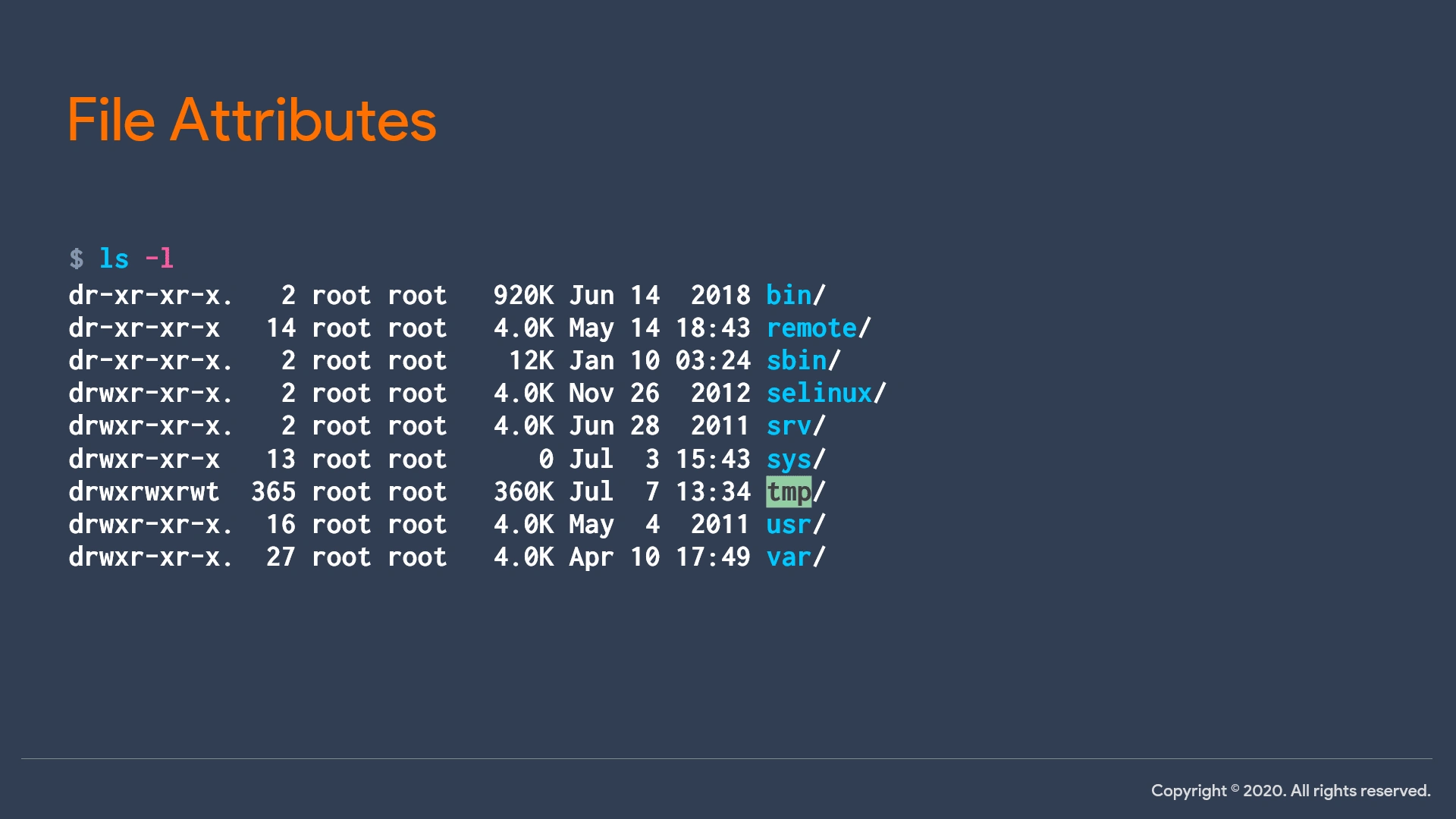
Slide Type - Command Hands-on
Like this project
Posted Jul 9, 2021


