Lido | Boutique Hotel Brand & Web Design
Khari Angel
A hotel that never lands.
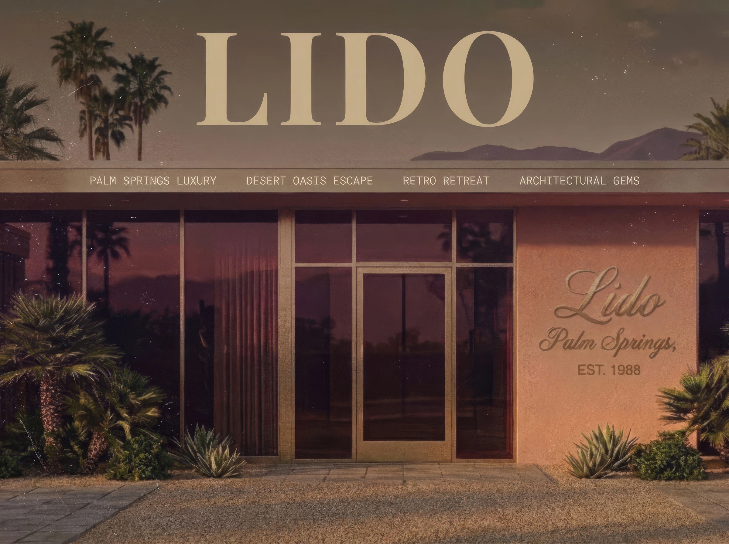
Lido is a fictional boutique hotel in Palm Springs, California. The brief I wrote for myself was specific: build a hospitality brand with a complete sensory world, a narrative scroll architecture, and a design language that makes people want to book a room at a place that doesn't exist.
The name comes from the original lidos of Venice: public bathing places built on the belief that water and sunlight were civic goods, not luxuries. Lido treats leisure the same way. It's not something you earn. It's something you're owed.
World-class, at your leisure.
The Concept
Most Palm Springs brands lean into the obvious: desert pool, mid-century modern, Joshua Tree energy. Lido pulls from a completely different sensory archive. The mythology underneath is transit luxury: the business-class cabin at golden hour, the executive airport lounge where time suspends, the feeling of being somewhere between departure and arrival with no urgency to land.
The property gives you the architecture (pool, lounge, studio, rooms) but never tells you what to do with it. Leisure at Lido is self-directed. Hang poolside. Take a yoga class. Sit in a leather swivel chair and watch a CRT monitor cycle through pixelated palm trees. Nobody is optimizing your time here.
The Aesthetic
Late-80s executive leisure. Not retro pastiche. Not vaporwave. The specific feeling of a first-class transit lounge at golden hour.
Polished chrome fixtures and tinted glass partitions. Plush leather and indoor banana trees. Faux-marble pillars and neon-lit reception desks. CRT monitors glowing in dark terminals, displaying pixelated flight paths and green-glow arrival times. Technology that hums instead of pings.
The color palette is airbrushed: dusk purple, salmon pink, turquoise blue, champagne gold. Colors that feel sprayed, not picked. Gradients that move like light falling across a surface.
Typography pairs Playfair Display (editorial luxury, brass-lobby energy) with IBM Plex Mono (terminal output, boarding-pass fine print). The display face carries the mythology. The mono face carries the system.
The Scroll Architecture
The single-page site is structured as a transit sequence. Each section is a space in the property, but the metaphor underneath is a flight that never lands.
01 — Departure. The boarding pass. Origin: LDO. Destination: LZR. Status: Boarding. The world is set before a single word of content loads.
02 — The Terminal. The lobby. A CRT check-in screen scrolls operational data: pool temp, rooms available, weather, bar status. "Your name is already on it."
03 — The Lounge. The pool and social spaces. 92 degrees, no wind, all afternoon. Cabanas reservable. Dress code: none enforced. "What you do next is your business."
04 — The Cabin. Three rooms, each with a distinct personality. The Palm Suite: velvet headboard, west-facing window, terrazzo floors. The Altitude Room: chrome fixtures, leather grain on every surface that earns it. The Cockpit: panoramic penthouse, wet bar already poured. "The city below does not concern you here."
05 — Cruising Altitude. Wellness without a schedule. The studio, the spa, the rooftop circuit, the garden. Open from six to whenever you leave.
06 — The Descent. You don't want to land. We understand. Here's how to come back.
The Design Decisions
The CRT terminal in the lobby section is the piece I'm most proud of. It's a functional design element that does more brand-building than a paragraph of copy could. Every line of terminal output reinforces the mythology: "ALTITUDE: CRUISING. DESTINATION: LEISURE. ETA: WHENEVER YOU CHOOSE." The data is the brand voice.
The room cards each carry a different emotional register. The Palm Suite is warm and grounded. The Altitude Room is precise and material. The Cockpit is detached and panoramic. Three rooms, three ways of being at Lido. The copy does the differentiation, not the layout.
The boarding pass interstitial at the top sets the entire world in five data points. No hero image, no tagline, no scroll prompt. Just a boarding pass with today's date on it. You're already checked in.
The Brand Voice
Lido's copy follows one rule: present the space, the option, the atmosphere. Never the itinerary. The hotel never tells the guest what to do.
The tone is first-class cabin crew. Warm but not familiar. Precise but not clinical. The kind of voice that says "your usual?" without asking what it is. No exclamation marks. No questions in headlines. Lido doesn't ask. It presents.
Where This Sits
Sensori Awakened shows I can build a premium brand from scratch, strategy through live site. Theseus shows I can design systems that think. Lido shows I can build a commercial hospitality brand with a complete sensory world, a narrative scroll architecture, and a design language that holds across every section of a deep single-page experience.
Together, the three projects say the same thing: I work at the intersection of brand strategy, sensory experience, and interaction design. I don't just make things look good. I make things feel like somewhere.
Like this project
Posted Jun 16, 2026
A fictional boutique hotel in Palm Springs that feels like checking into a first-class lounge that never lands. Brand identity, visual world, and a deep single-page scroll designed in Figma.