Social media Creatives
Aizaan Nafees
Fitness Social Media designs
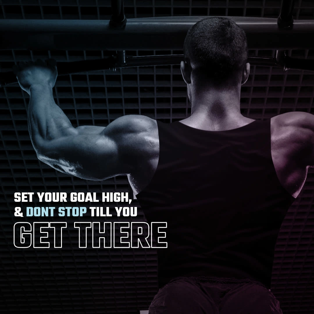
Case Study 1 — High-Intensity Fitness Campaign Visual
Overview
This design was created for a fitness brand aiming to motivate high-performance individuals. The goal was to visually communicate discipline, strength, and the mindset required to achieve long-term fitness goals.
Objective
To create a bold, high-impact social media visual that inspires users to stay consistent and committed to their fitness journey.
Approach
I focused on a strong visual hierarchy where the subject (muscular back pose) immediately communicates power and determination. The lighting and color grading were carefully adjusted to emphasize muscle definition and create a dramatic, almost cinematic tone.
The typography was designed to reinforce the message:
“SET YOUR GOAL HIGH” acts as the hook
“GET THERE” is emphasized with a heavier, outlined style to create impact
Design Decisions
Dark gradient overlay to maintain readability while preserving detail
Cool-toned lighting for a modern, performance-driven feel
Bold, condensed typography to match the intensity of the message
Outcome
The final design effectively captures attention in fast-scrolling environments and communicates a clear, motivational message aligned with performance-focused fitness audiences.
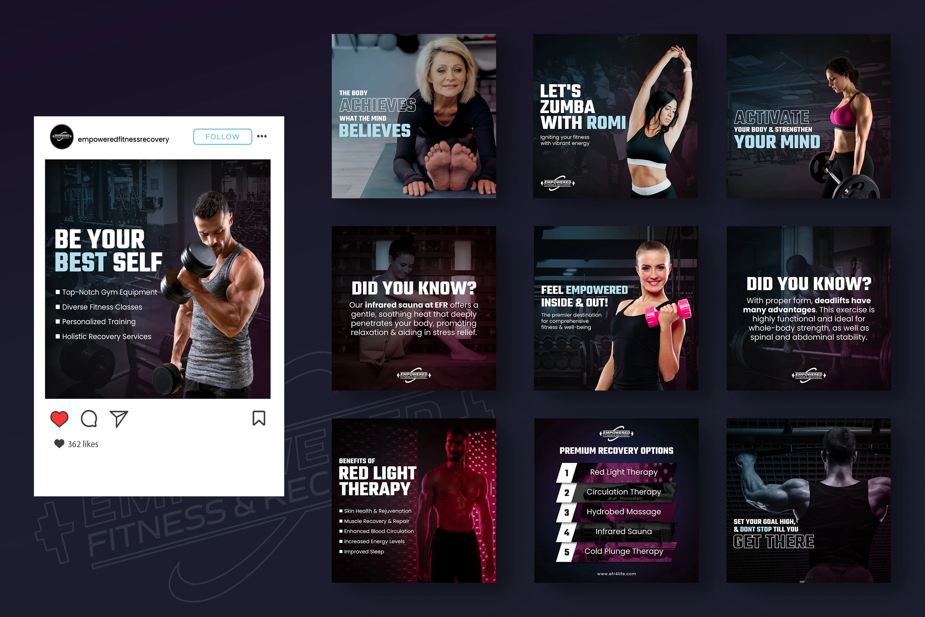
Case Study 3 — Social Media Content System (Fitness Brand)
Overview
This project involved creating a cohesive set of Instagram posts for a fitness brand, ensuring consistency while allowing flexibility across different content types.
Objective
To design a scalable social media system that maintains brand identity while supporting varied content such as tips, motivation, promotions, and education.
Approach
I developed a modular design system that could be reused across multiple posts while still feeling dynamic. Each tile follows a consistent structure but varies in layout, imagery, and emphasis.
Content Types Covered
Motivational quotes
Educational fitness facts
Workout promotions
Client transformation highlights
Engagement posts (e.g., “Did you know?”)
Design Decisions
Consistent color palette (dark base with neon accents) to unify the feed
Grid-based layout system for easy scalability
Strong typography hierarchy for readability on mobile
Balanced mix of text-heavy and visual-heavy posts
Outcome
The final grid creates a visually cohesive Instagram presence while keeping content engaging and non-repetitive. The system allows the brand to produce content quickly without compromising design quality.
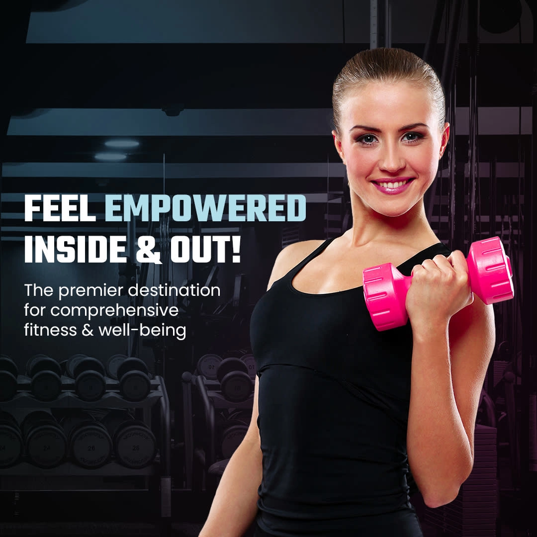
Case Study 2 — Empowerment-Focused Fitness Promotion
Overview
This visual was designed for a fitness and wellness brand targeting a broader, lifestyle-oriented audience, particularly women seeking confidence and well-being.
Objective
To create a welcoming, empowering visual that balances fitness with positivity and approachability.
Approach
Unlike the previous design, this concept shifts from intensity to empowerment. The subject is front-facing, smiling, and engaging — creating a sense of relatability and trust.
The messaging focuses on emotional appeal:
“FEEL EMPOWERED INSIDE & OUT!” highlights both physical and mental benefits
Design Decisions
Brighter lighting and warmer tones to create an inviting feel
Clean typography with a slight glow effect for clarity over background elements
Gym environment subtly blurred to maintain context without distraction
Use of pink dumbbells as a visual accent to add energy and contrast
Outcome
This design successfully appeals to a wider audience by combining fitness with lifestyle messaging, making it ideal for ads, onboarding campaigns, or social media engagement.
Case Study 3 — Social Media Content System (Fitness Brand)
Overview
This project involved creating a cohesive set of Instagram posts for a fitness brand, ensuring consistency while allowing flexibility across different content types.
Objective
To design a scalable social media system that maintains brand identity while supporting varied content such as tips, motivation, promotions, and education.
Approach
I developed a modular design system that could be reused across multiple posts while still feeling dynamic. Each tile follows a consistent structure but varies in layout, imagery, and emphasis.
Content Types Covered
Motivational quotes
Educational fitness facts
Workout promotions
Client transformation highlights
Engagement posts (e.g., “Did you know?”)
Design Decisions
Consistent color palette (dark base with neon accents) to unify the feed
Grid-based layout system for easy scalability
Strong typography hierarchy for readability on mobile
Balanced mix of text-heavy and visual-heavy posts
Outcome
The final grid creates a visually cohesive Instagram presence while keeping content engaging and non-repetitive. The system allows the brand to produce content quickly without compromising design quality.
Like this project
Posted Apr 3, 2026
Designed social media/Meta creatives for a Fitness brand and used Canva as a tool for designing these.